soft gradients
4 designs
Showing 4 of 4 (4 total)
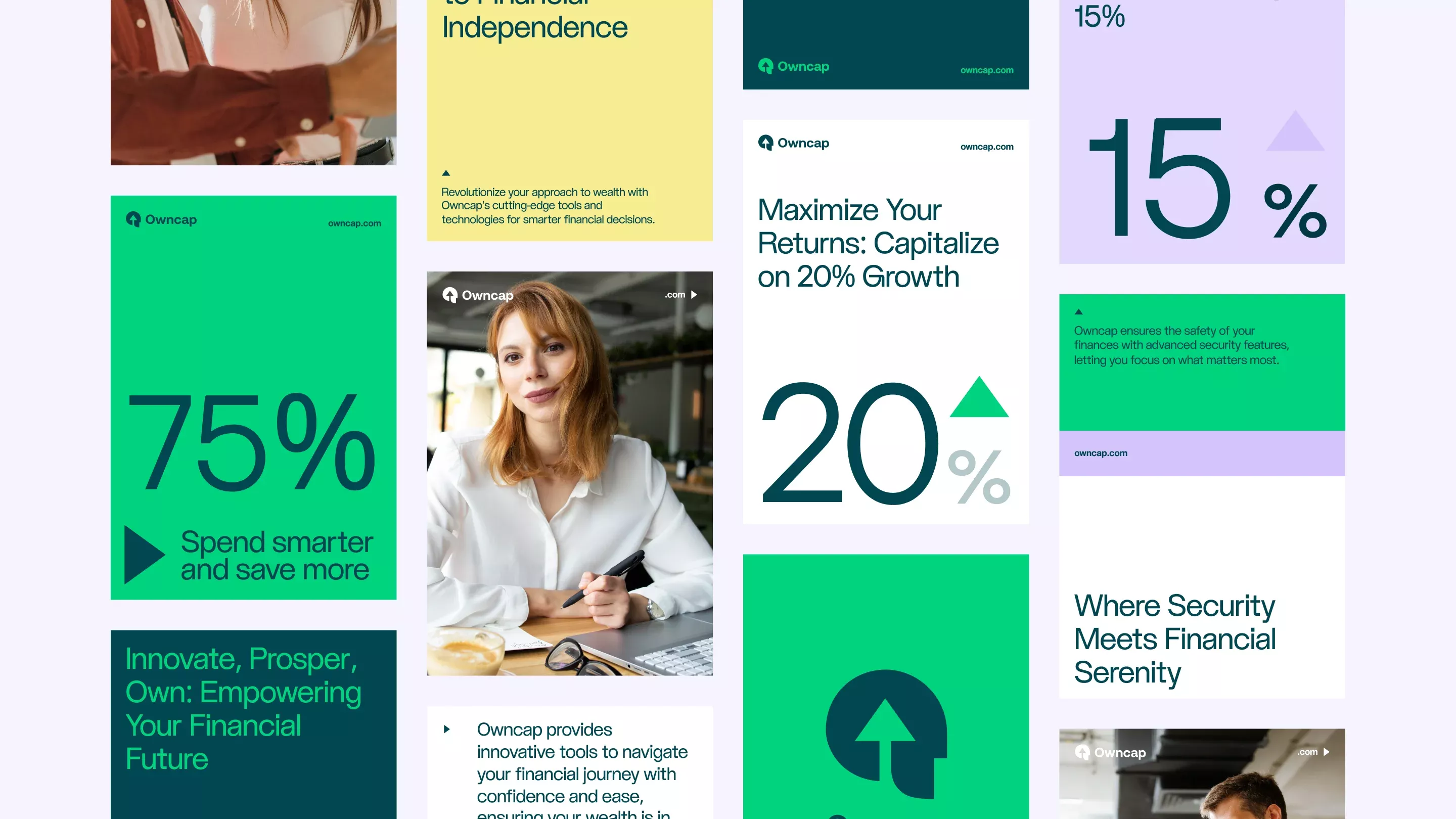
This graphic uses a clean, modern, and professional design language to present financial benefits. The visual hierarchy is strong, relying on large percentage numbers and concise text blocks to convey trust and growth potential. The use of geometric shapes and ample white space creates a sophisticated, organized feel.
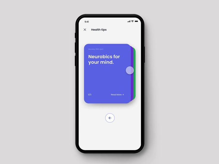
This interface demonstrates a clean, modern mobile user experience focused on delivering health information. The design uses vibrant yet soothing colors and ample white space to ensure high readability and a professional, calm feel.
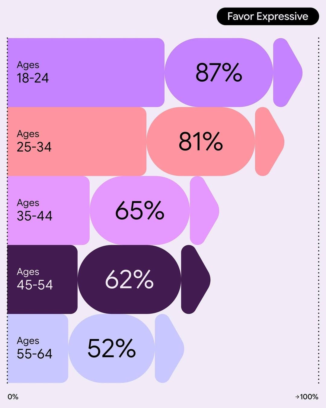
This data visualization employs a clean, modern aesthetic using soft, pastel colors to segment demographic data across different age groups. The design is highly organized and emphasizes clear hierarchy through distinct color coding, making the quantitative information easily digestible.
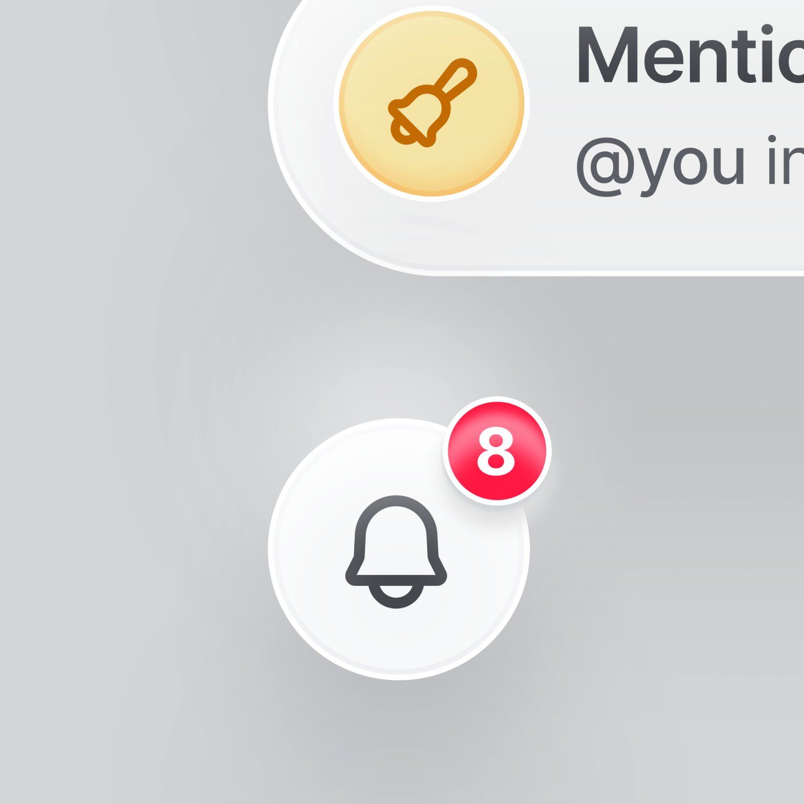
This is a clean, modern user interface design emphasizing clarity and functionality. It utilizes simple icons and soft color contrasts to present information in an accessible and friendly manner.