1 designs
Showing 1 of 1 (1 total)
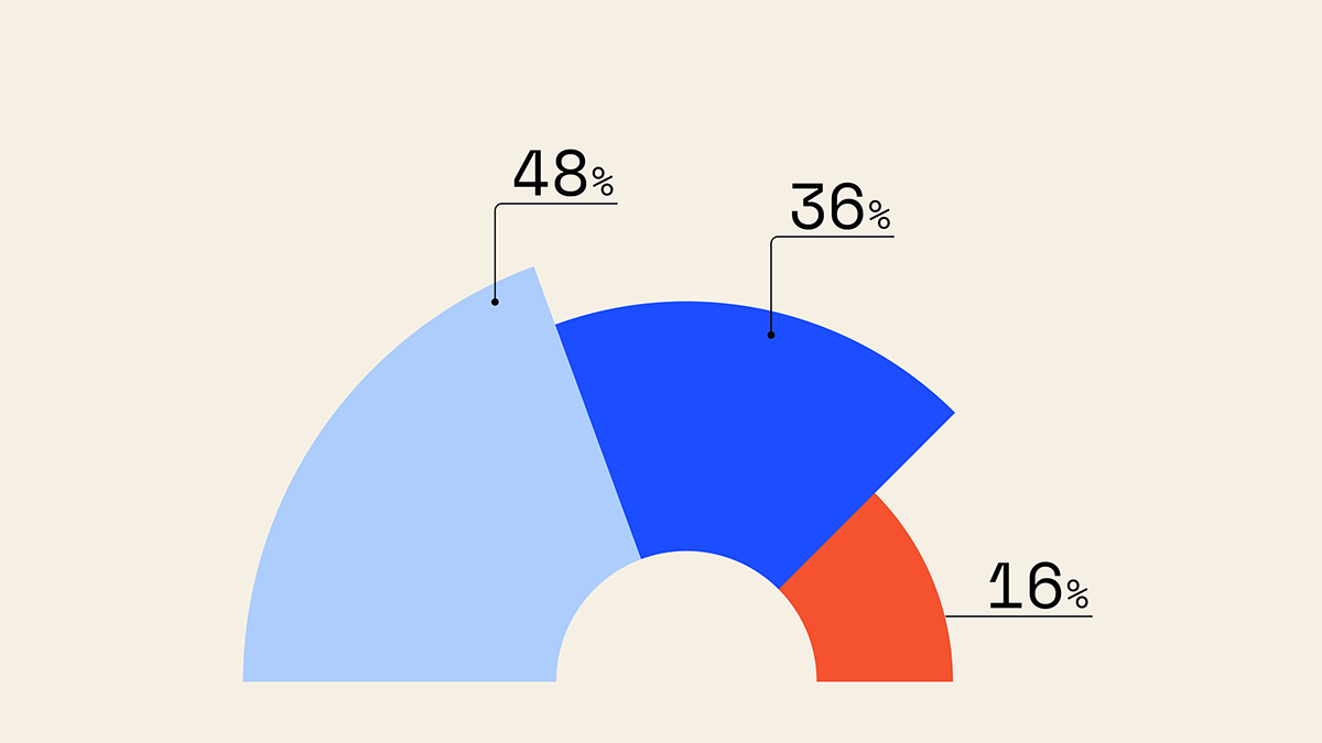
This is a clean, straightforward data visualization using a segmented circle chart to display proportional relationships between three distinct categories. The design relies on clear color separation and simple typography to ensure the data is immediately legible and easy to interpret.