scatter plot
3 designs
Showing 3 of 3 (3 total)
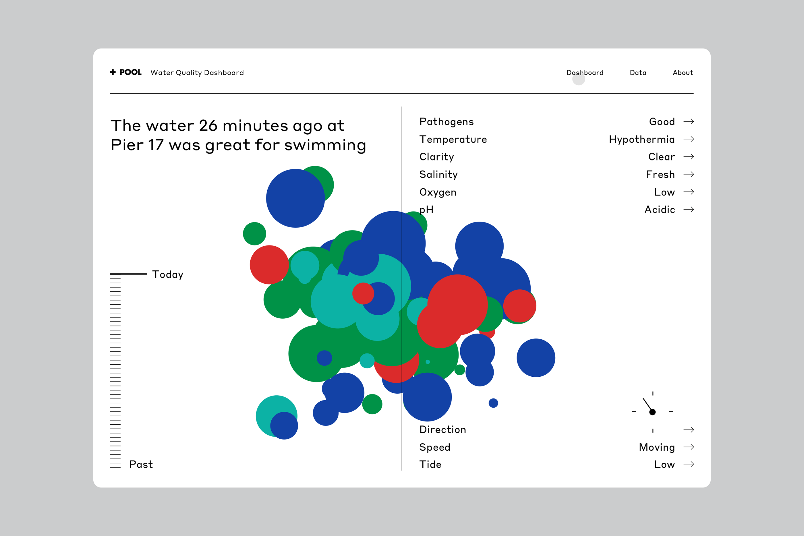
This is a data visualization dashboard presenting water quality metrics using a scatter plot or bubble chart format. The design is clean, functional, and uses color coding effectively to represent different parameters for a specific event (water quality).
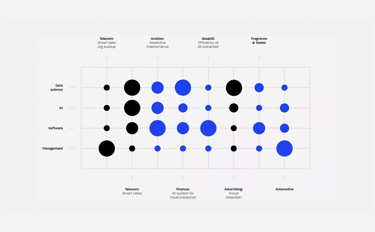
This is a scatter plot or matrix visualization displaying relationships between different technology domains (rows) and industry applications (columns). The design is clean, minimalist, and uses a simple dot pattern to convey data points across a grid structure.
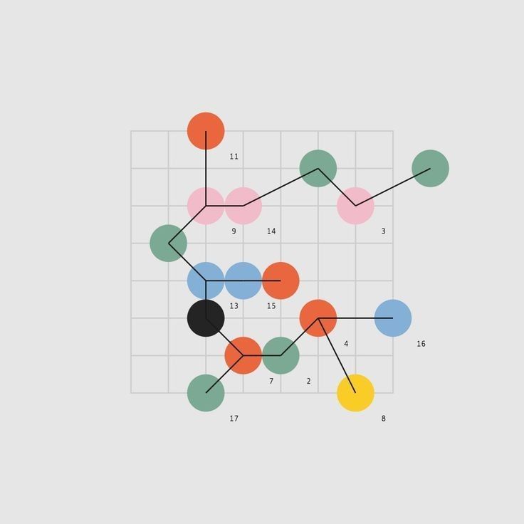
This is a scatter plot visualization using colored circles to represent data points, connected by lines to suggest relationships or sequences. The design is clean and minimalist, relying primarily on color and position to convey information.