report design
5 designs
Showing 5 of 5 (5 total)
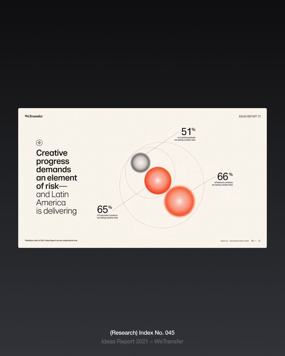
The design is clean, minimalist, and professional, utilizing a muted color palette and clear data visualization to present key statistics. It employs ample white space to ensure readability and focuses the viewer's attention directly on the reported progress metrics.
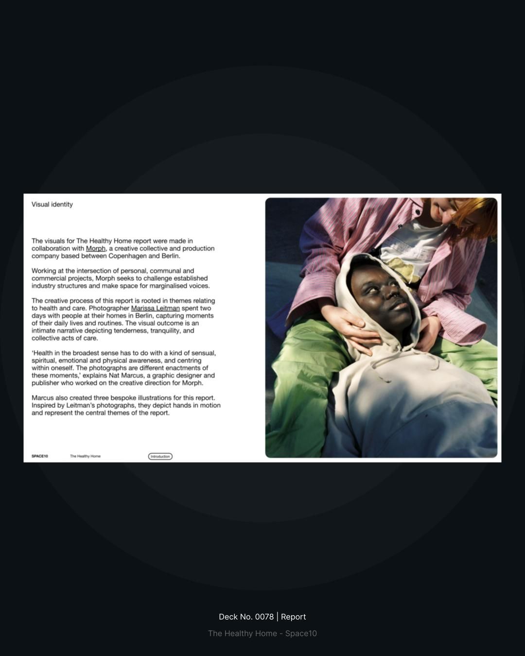
A minimalist editorial layout featuring a dark, sophisticated design with a prominent photographic image and accompanying body text. The composition balances typography and imagery with generous whitespace, creating a clean, contemporary aesthetic typical of high-end design publications or reports.
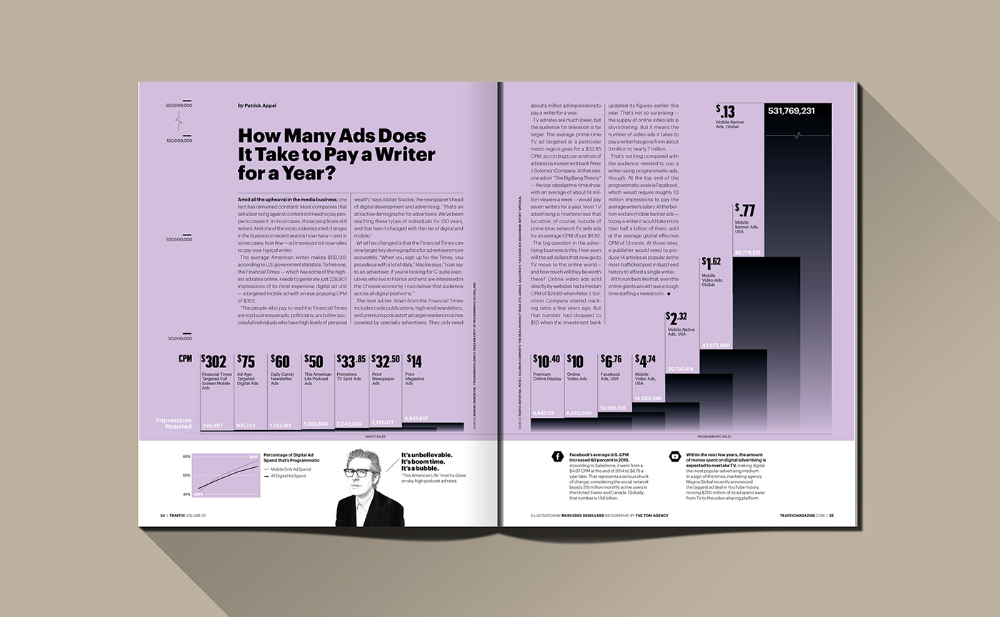
The image displays a professional, data-driven report or brochure layout using a clean, modern aesthetic. It utilizes strong visual hierarchy through varying shades of purple/mauve and stark black text against a light background, suggesting seriousness and financial transparency.
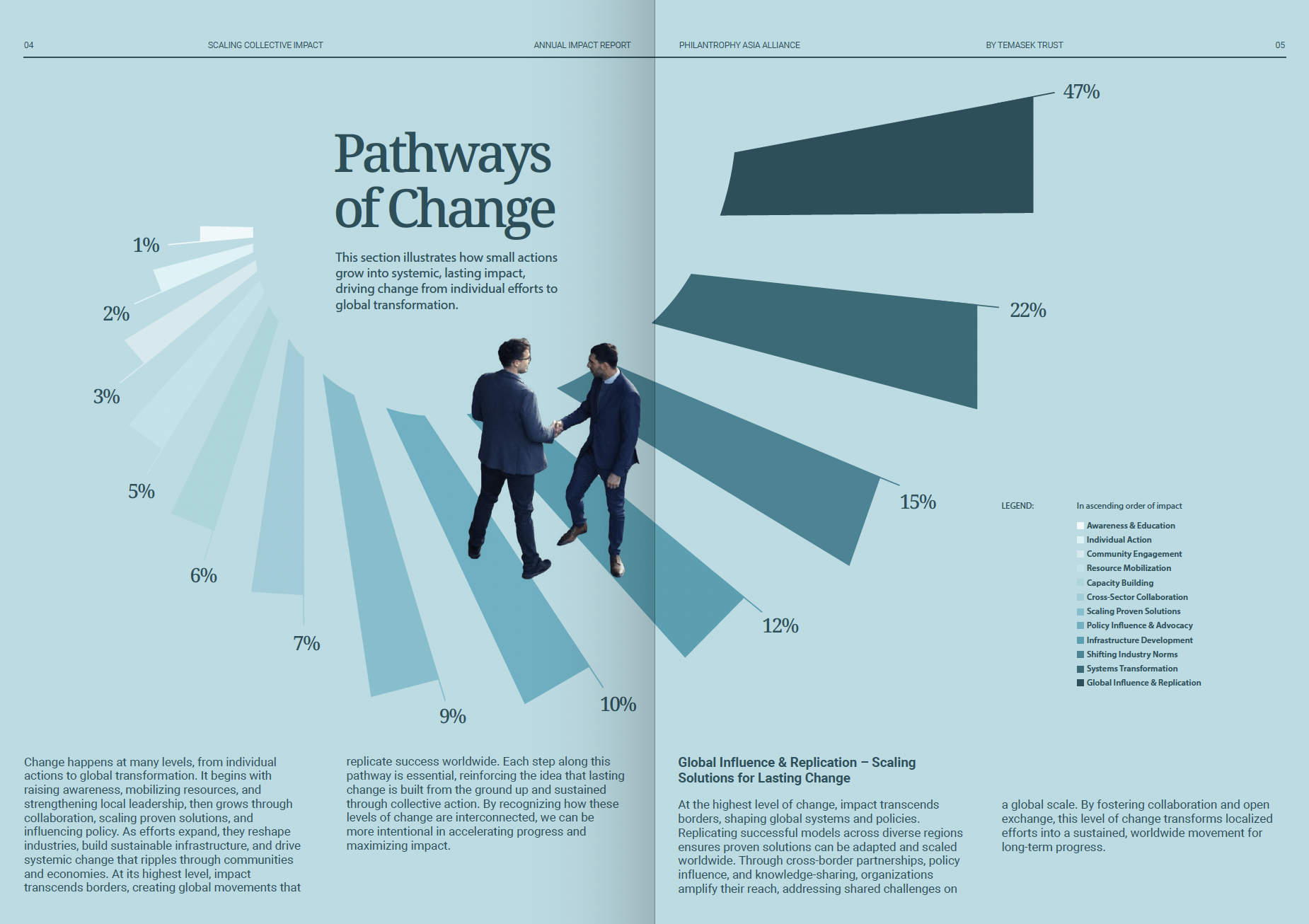
This is a professional, data-driven infographic utilizing clean lines and muted blues to illustrate scaling concepts. The design effectively combines percentage bar charts with stylized human interaction graphics to present complex pathways of change in an accessible, corporate manner.
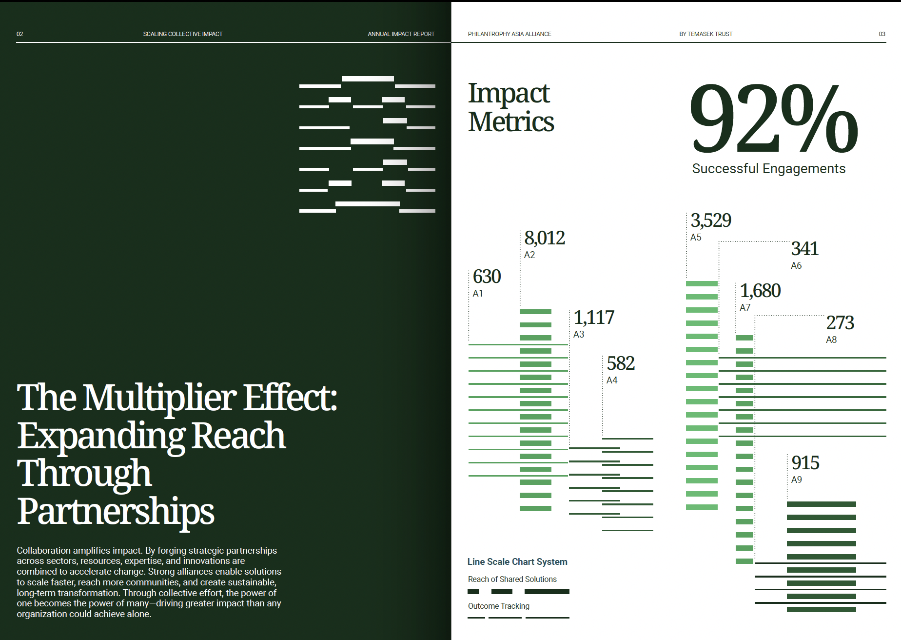
This design is a clean, professional data visualization emphasizing measurable success using a strong contrast between dark backgrounds and vibrant lime green accents. The visual language is modern and corporate, focusing on clarity and the structured presentation of complex impact metrics.