modern ui
140 designs
Showing 24 of 140 (140 total)
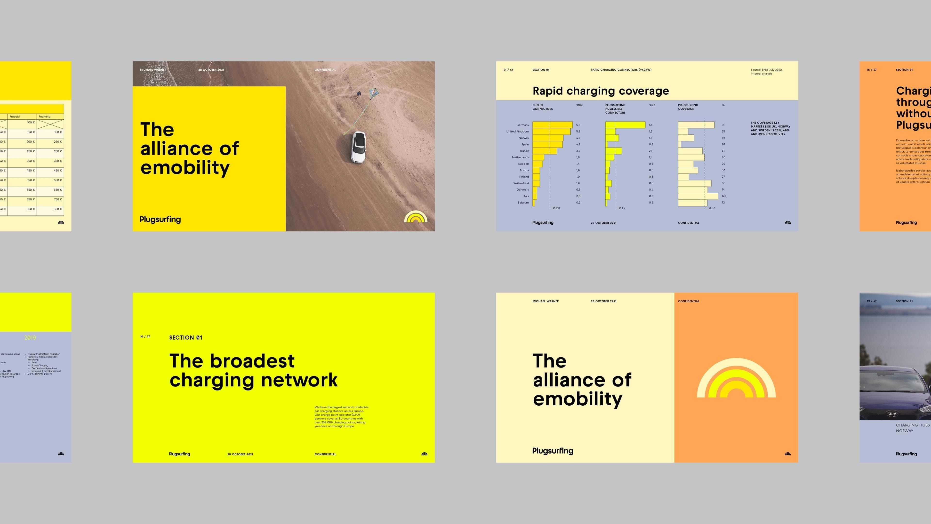
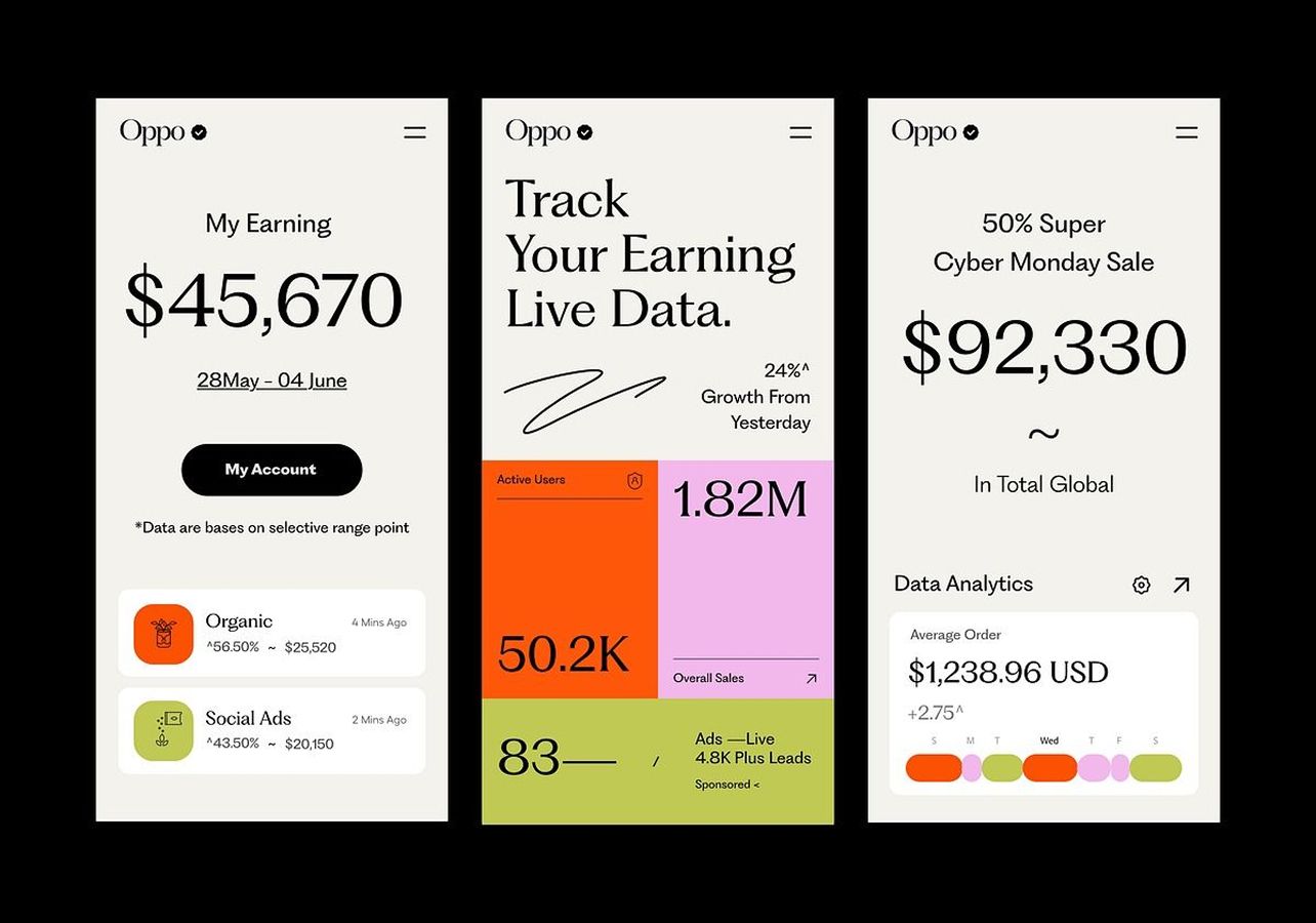
This design showcases a clean, modern interface utilizing strong color blocking and clear data visualization to convey technical information. The visual language is professional and organized, relying on high contrast between warm accents and a neutral background to guide the user's eye.
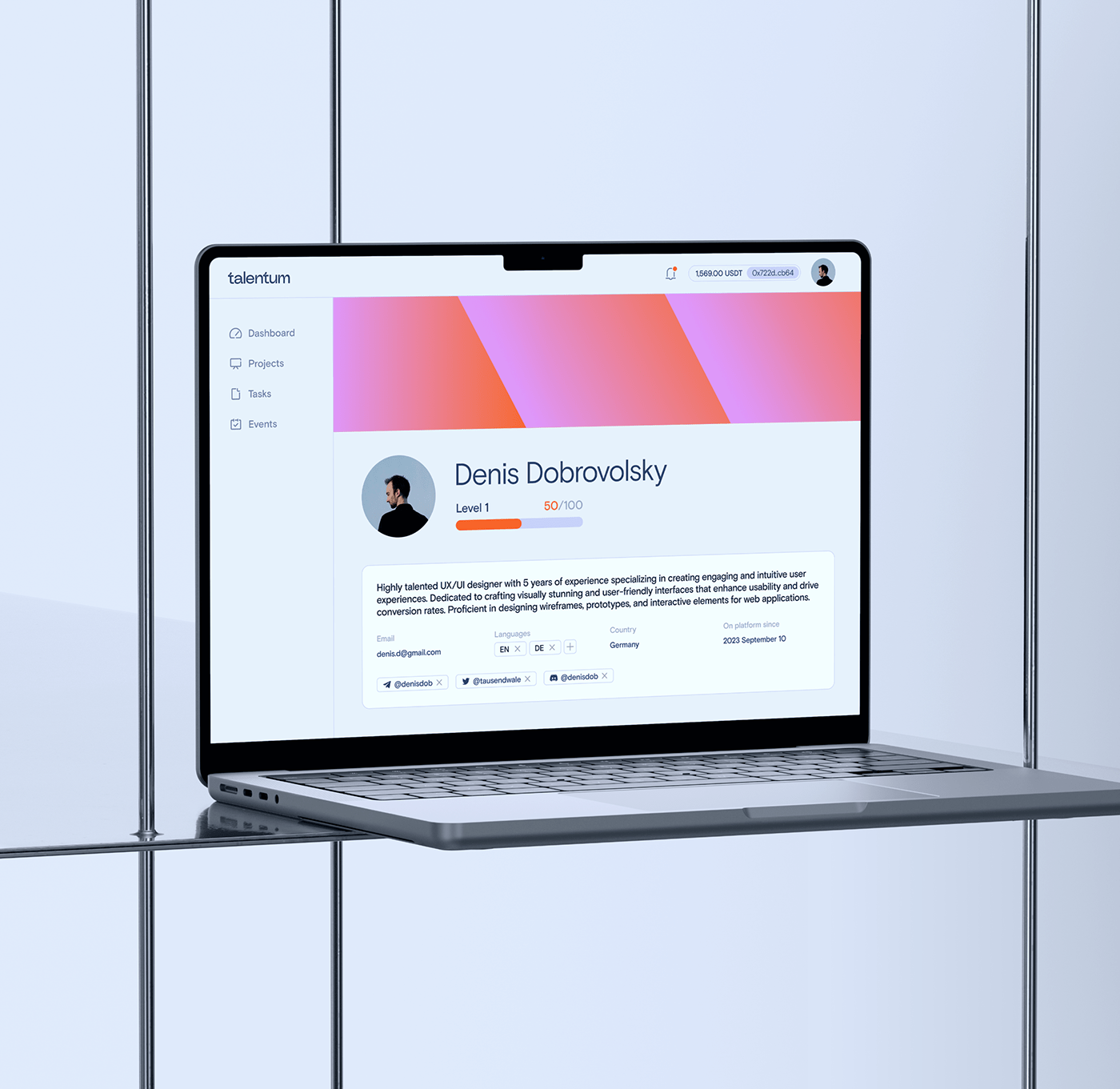
The design features a clean, modern user interface with a soft color palette accented by warm pinks, conveying professionalism and accessibility. The layout is highly structured, utilizing ample white space to ensure readability and a focused presentation of the user's professional profile.
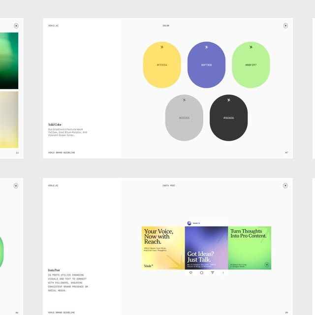
The design exhibits a clean, modern aesthetic characterized by bold color blocking and ample negative space. The visual language is professional and approachable, utilizing a limited yet vibrant palette to guide the user's attention effectively. The overall feel is polished, contemporary, and focused on clear communication.
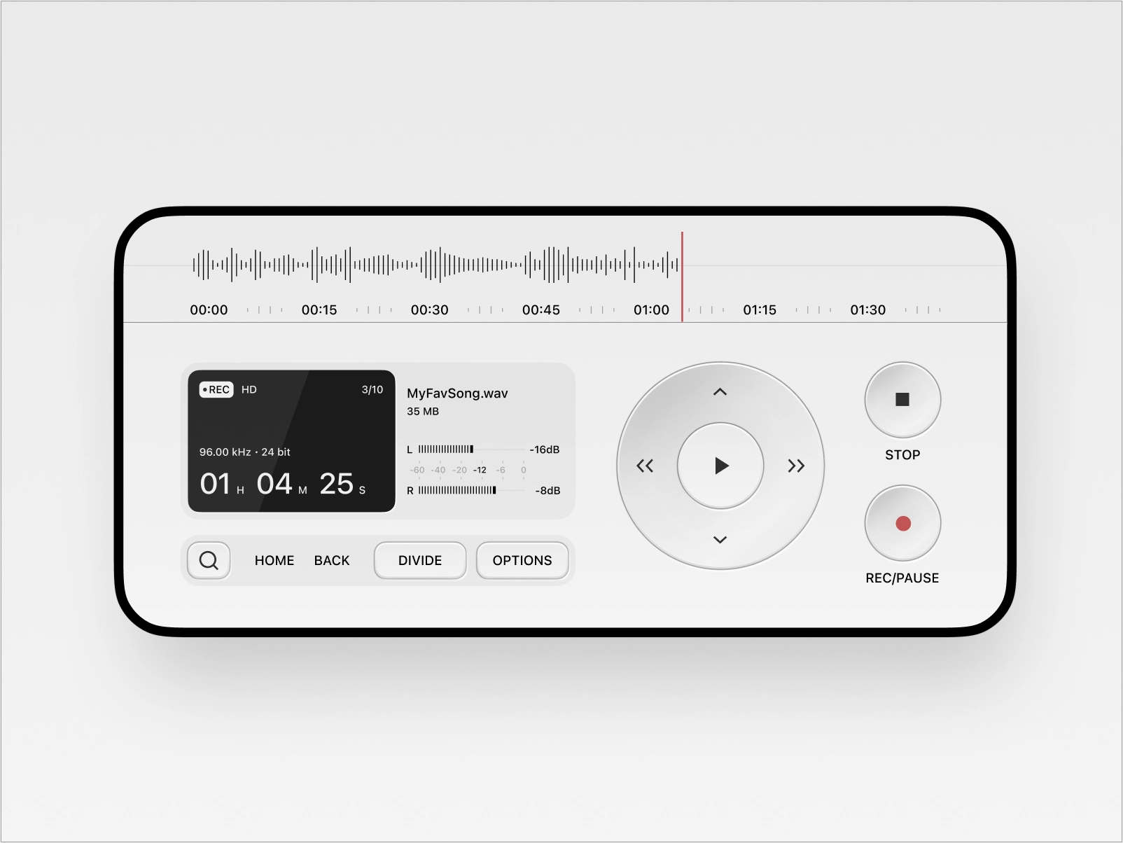
This interface showcases a clean, functional user interface design typical of modern media players. The visual language relies heavily on negative space and clear delineation between controls, emphasizing usability and a minimalist aesthetic. The design is highly organized, making complex playback functions intuitive and easy to navigate.
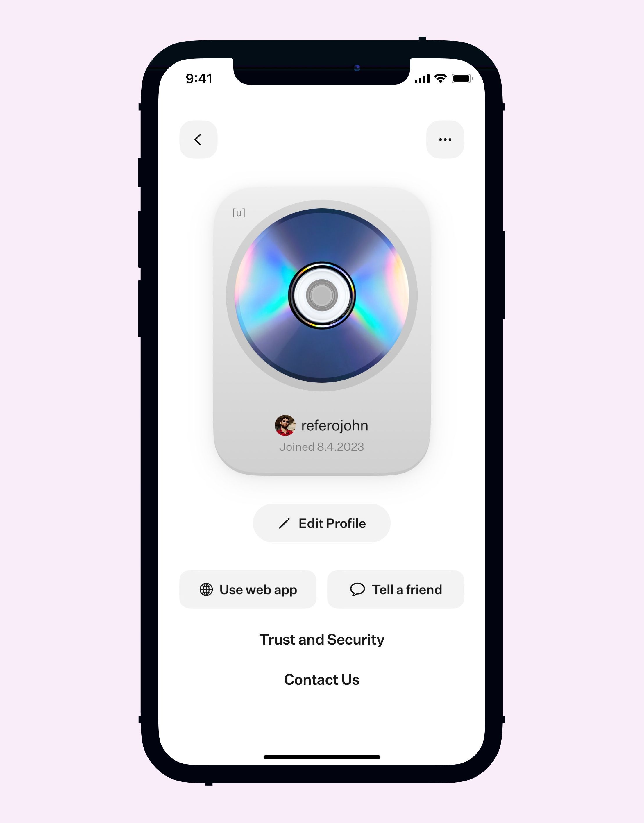
This interface demonstrates a clean, modern mobile user interface characterized by ample white space and clear hierarchy. The design relies on subtle gradients and simple iconography to present user information and actionable links in a highly accessible manner.
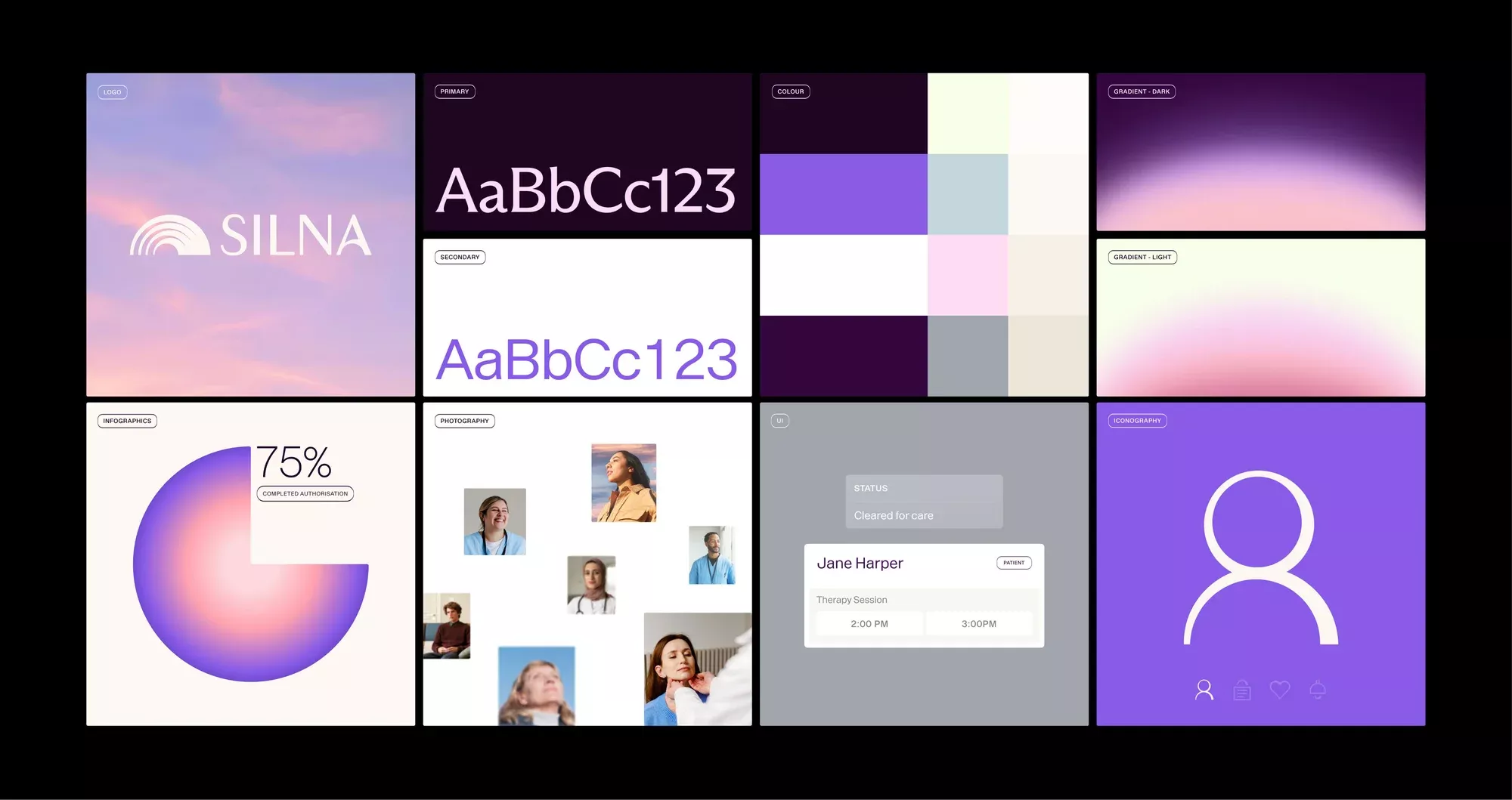
This collection showcases a modern and sophisticated UI design language characterized by soft gradients, deep purples, and clean white accents. The visual style balances abstract geometric shapes with clear functional elements like data visualization and user profiles, resulting in a polished and professional aesthetic.
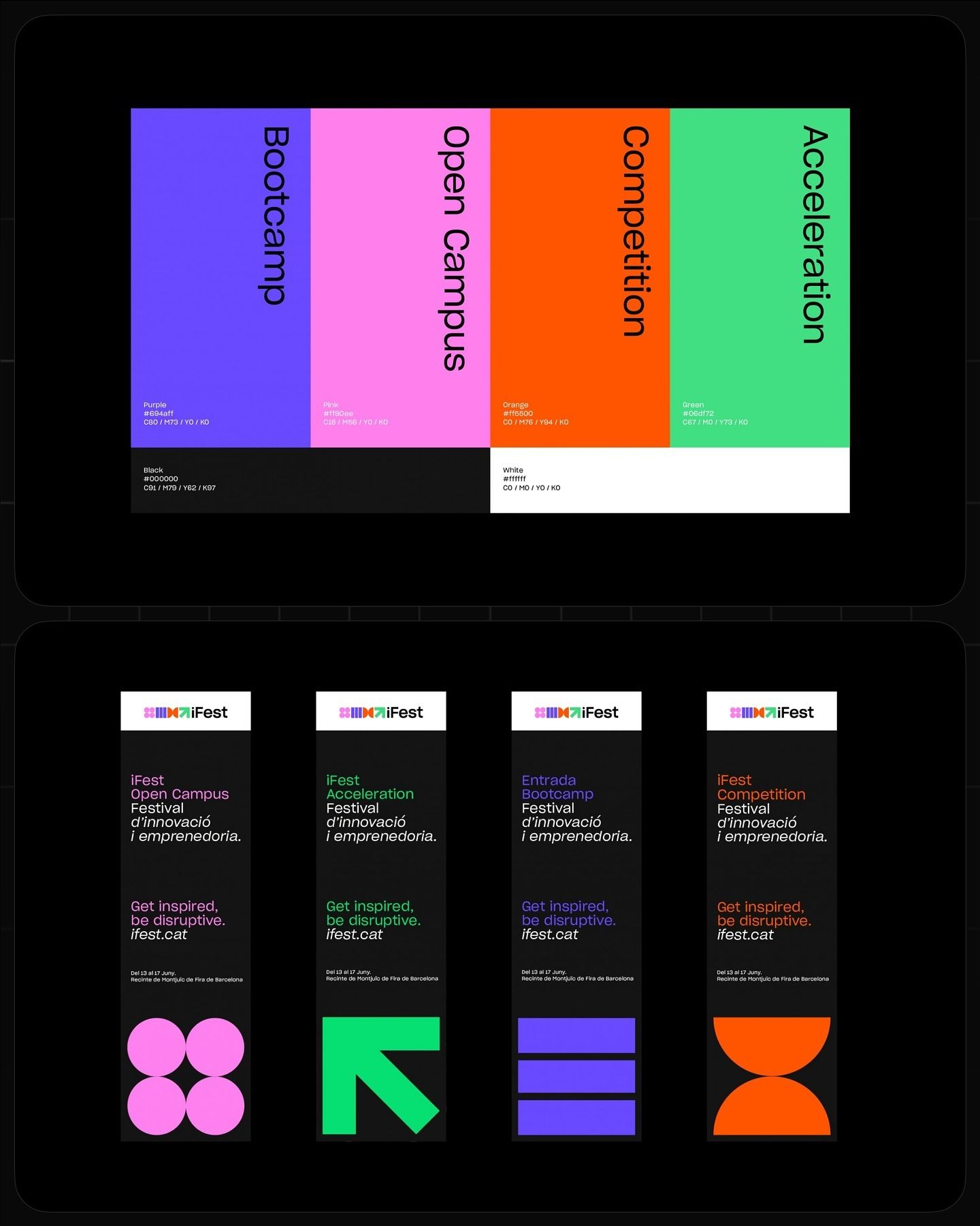
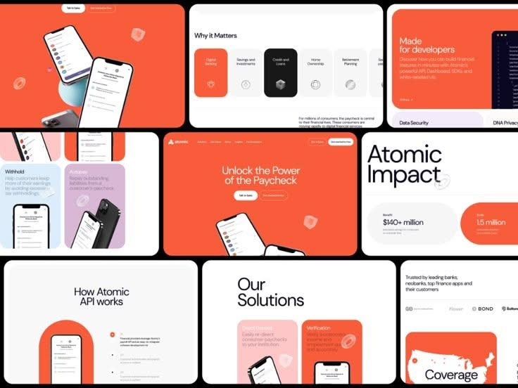
This design utilizes a bold, modern color-blocking approach to clearly segment and present different program offerings. The visual language is clean and energetic, relying on saturated hues to create immediate differentiation between services. The overall feel is professional, dynamic, and highly organized.
The design presents a clean, data-heavy interface characterized by clear segmentation and ample white space, establishing a professional and organized tone. The visual language relies on structured layouts to effectively communicate complex system information.

This design utilizes a vibrant, segmented grid layout to present distinct functional categories clearly. The visual language is bold and direct, relying on strong color blocking to separate information silos effectively. It conveys a sense of organized utility and professional transparency.
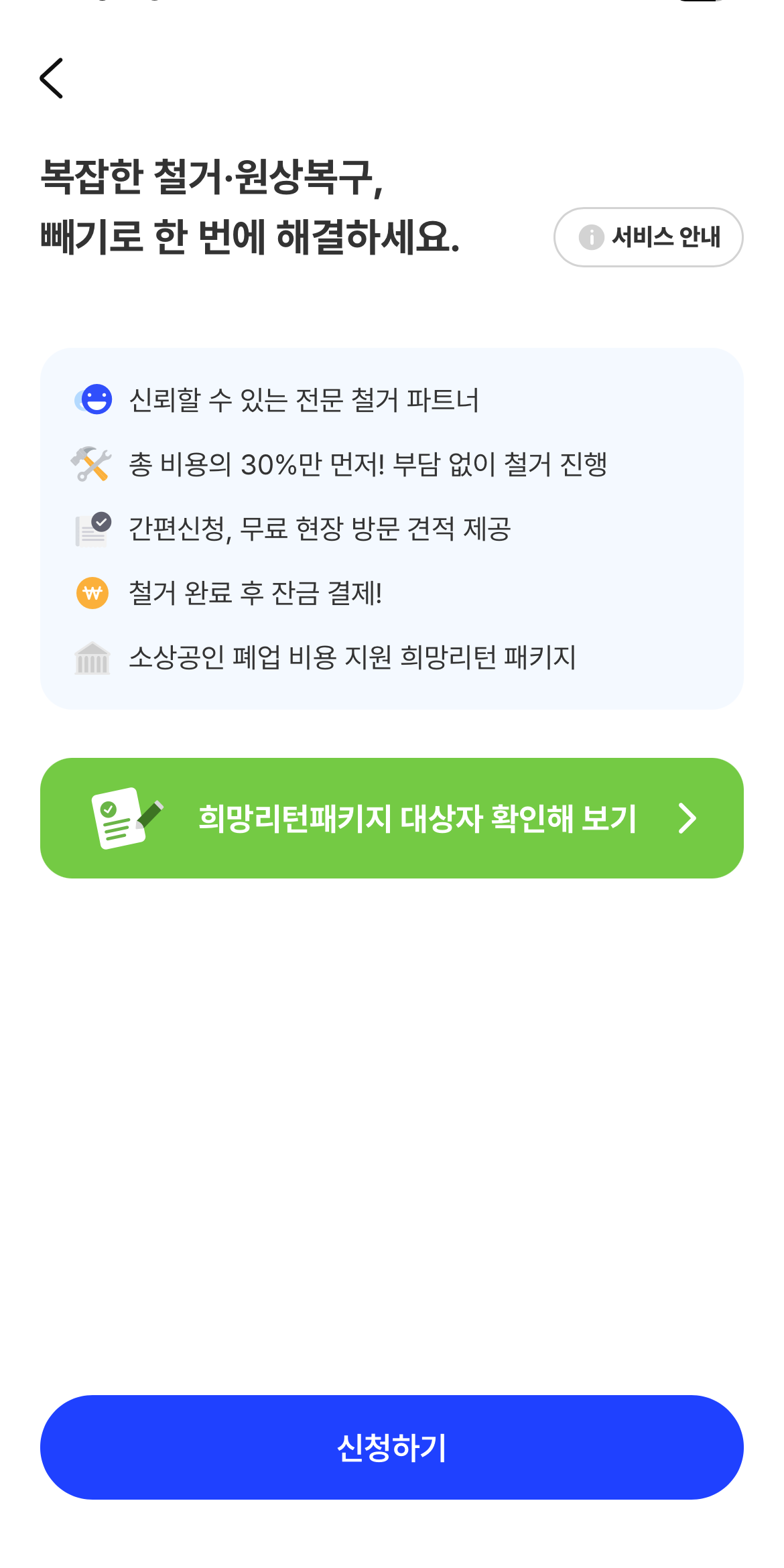
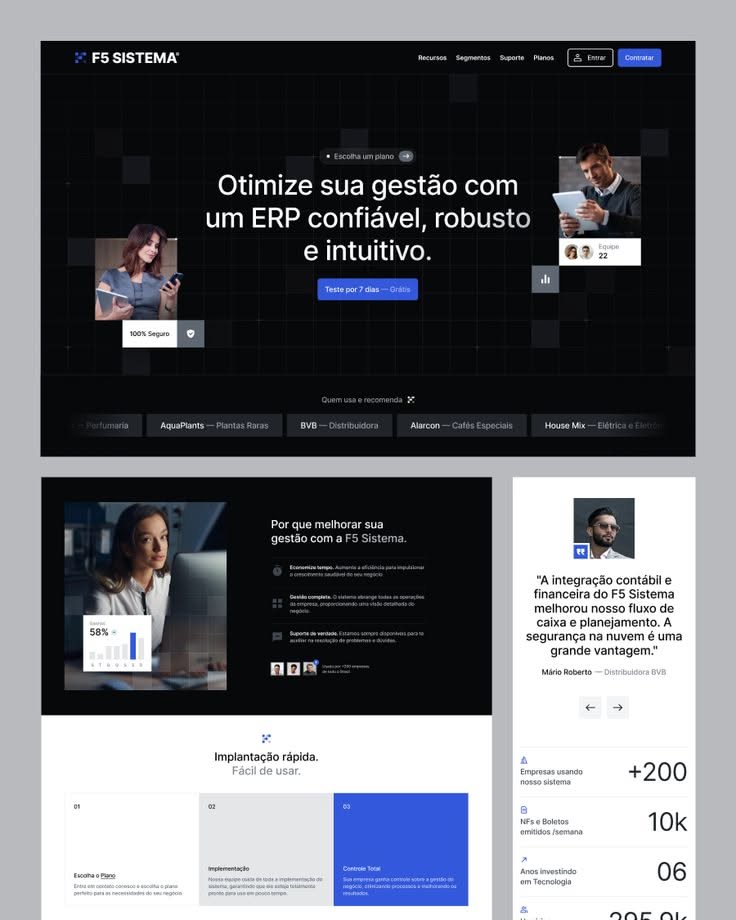
The design features a clean, highly functional mobile interface utilizing ample white space to present service information clearly. The visual language is professional and direct, employing a simple hierarchy with distinct color accents to guide the user toward key actions. The overall feel is trustworthy and efficient, prioritizing ease of understanding for complex services.
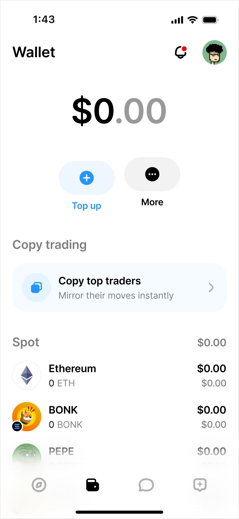
This interface exhibits a clean, modern minimalist design focused entirely on clarity and functionality. The visual language relies heavily on ample negative space and high contrast to ensure that key financial data is immediately accessible. The overall feel is professional, trustworthy, and highly efficient for a trading application.
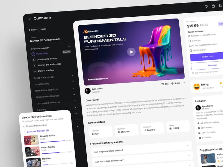
The design utilizes a clean, dark-mode aesthetic typical of modern software interfaces, emphasizing clarity and focus for educational content. The visual language is professional and minimalist, relying on strong contrast between dark backgrounds and bright accent colors to guide the user.
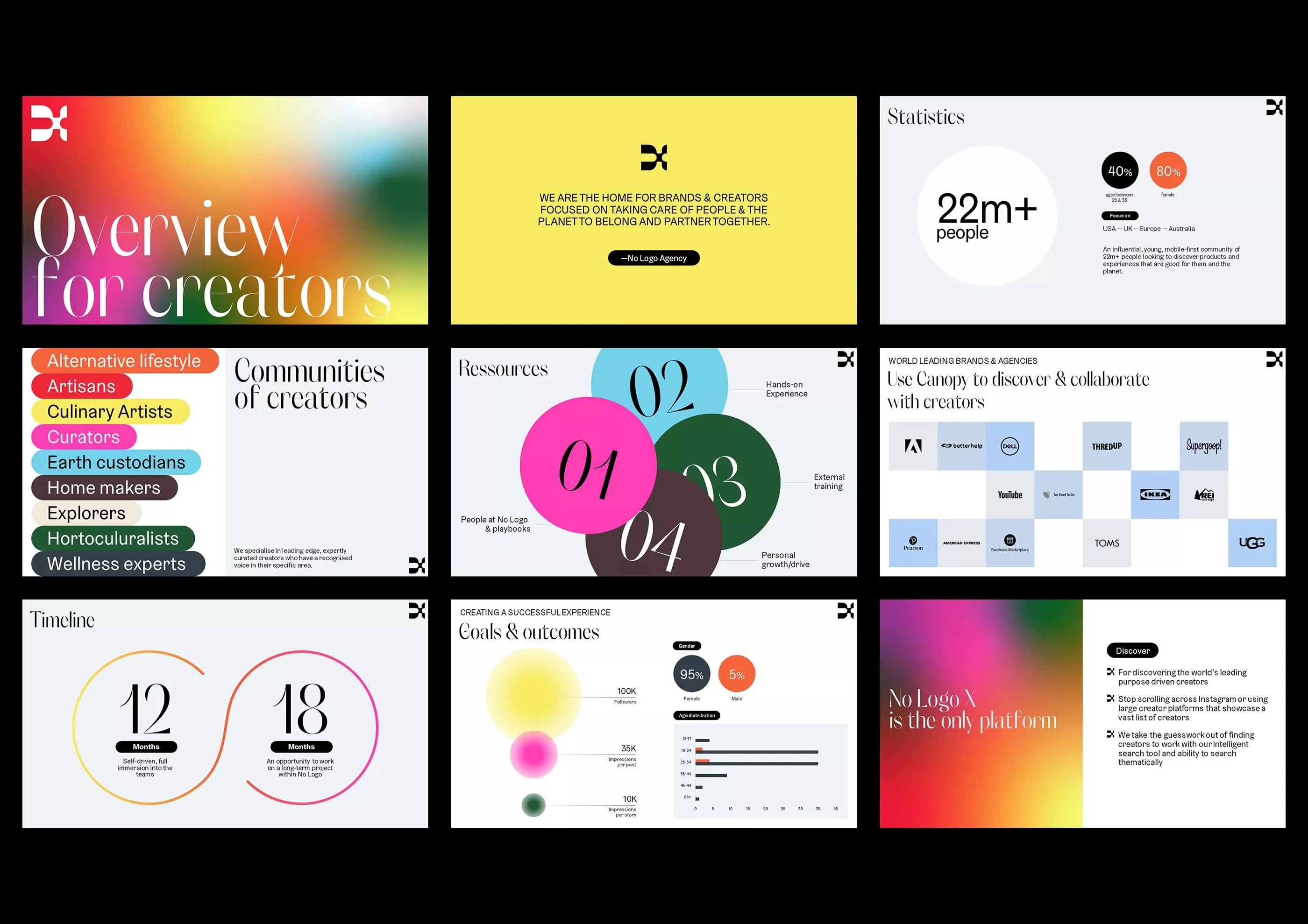
This collection of screens showcases a modern, clean user interface design characterized by vibrant yet balanced color accents and clear data visualization. The visual language is professional and organized, utilizing ample whitespace to ensure readability across various content types. The overall feel is energetic, trustworthy, and focused on creator-centric metrics.
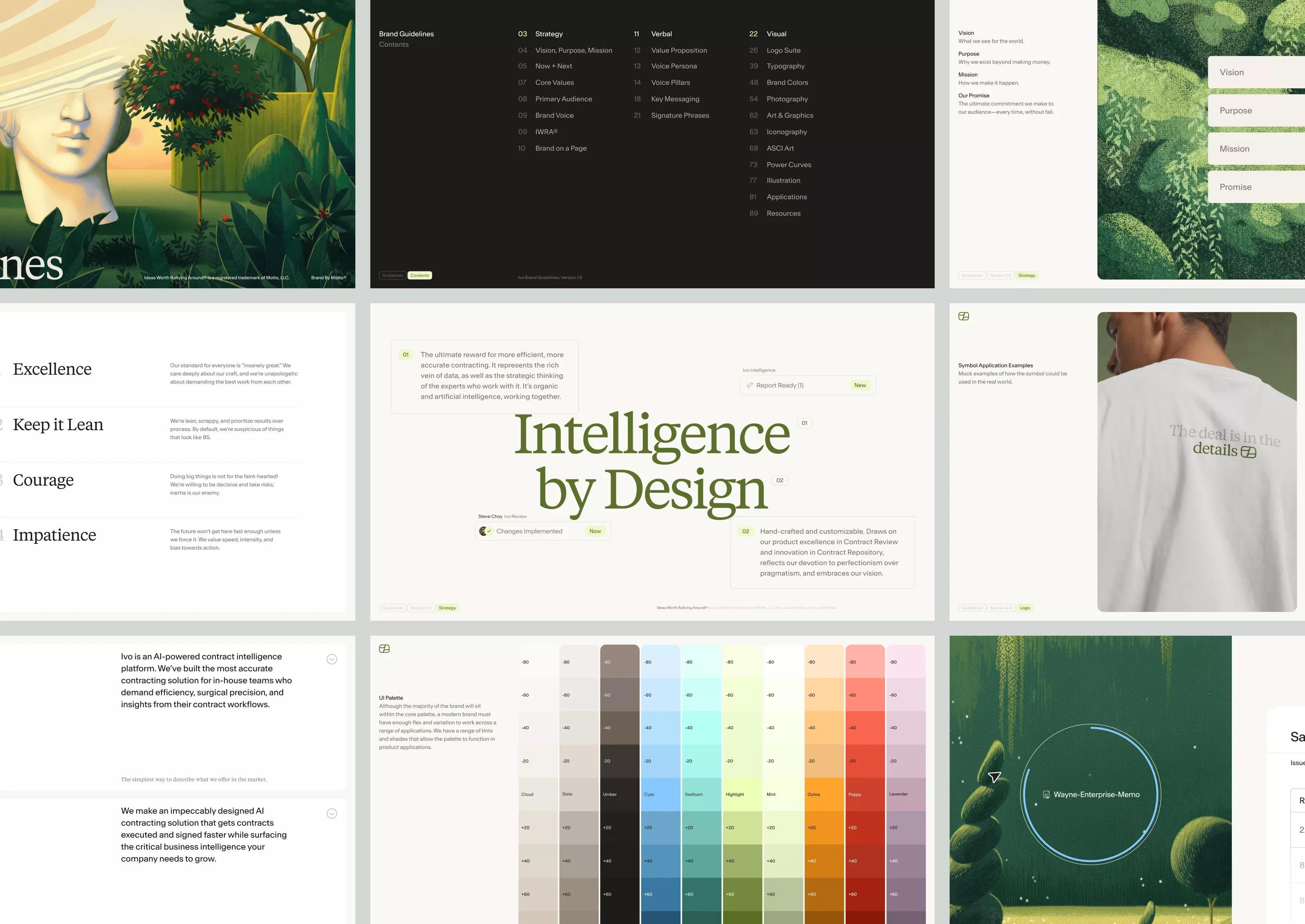
The design exhibits a clean, modern aesthetic characterized by ample white space and subtle natural accents, creating a professional and trustworthy user experience. The visual language relies on clear hierarchy and organized data presentation to ensure readability and intuitive navigation.
This collection showcases a modern, clean aesthetic utilizing bold typography and simple geometric accents to convey confidence and capability. The design relies on high contrast between dark backgrounds and vibrant accent colors to create a professional yet approachable visual language. The overall feel is polished, innovative, and focused on solving complex problems.
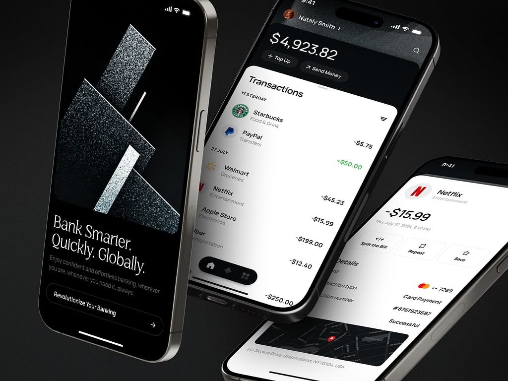
This image showcases a modern, dark-themed mobile banking interface emphasizing clarity and security. The design utilizes high contrast between dark backgrounds and light text to create a professional, organized, and trustworthy user experience.
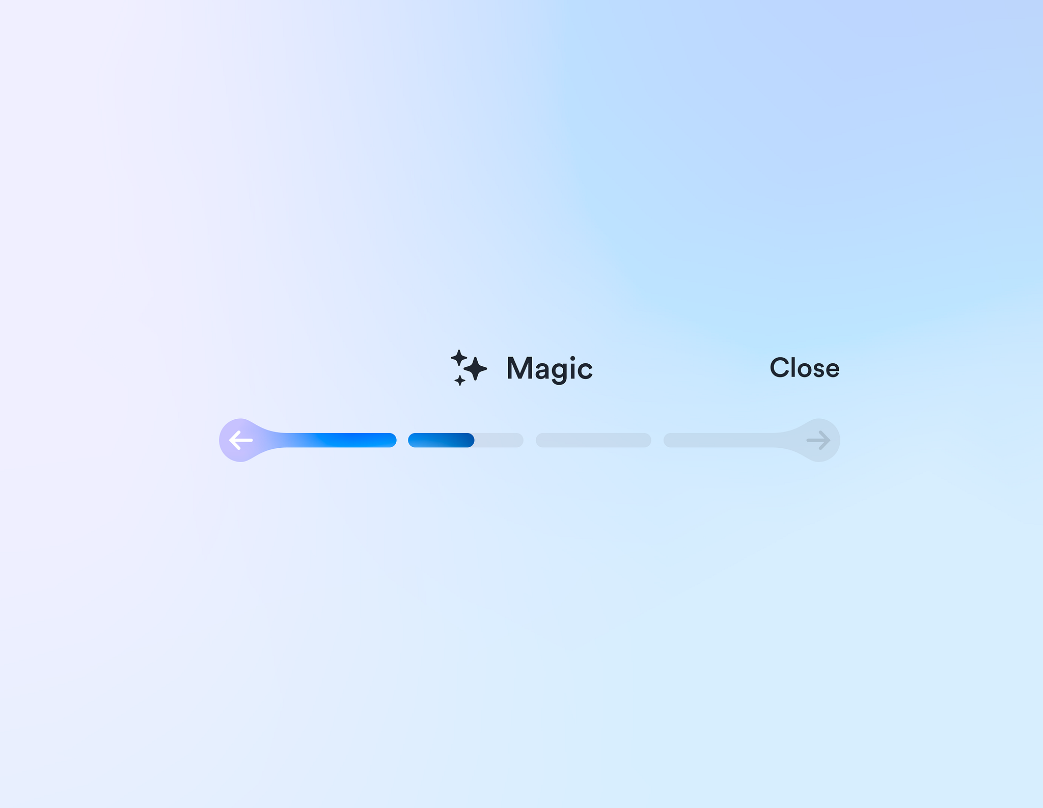
This interface utilizes a clean, minimalist design characterized by ample negative space and subtle use of color gradients. The visual language is modern and functional, prioritizing clear status indication through simple iconography and horizontal progress bars.
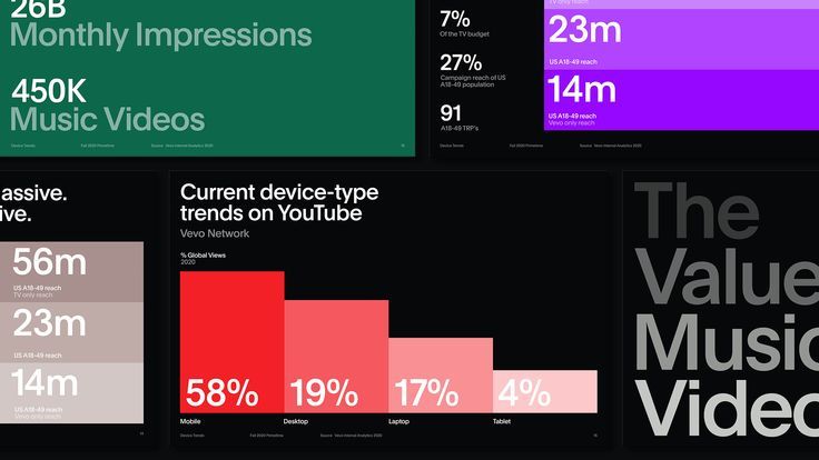
This is a highly functional and modern data visualization dashboard utilizing a dark theme to emphasize bright, contrasting metrics. The design successfully uses color blocking and large typography to present complex quantitative information in an easily digestible format for quick analysis.
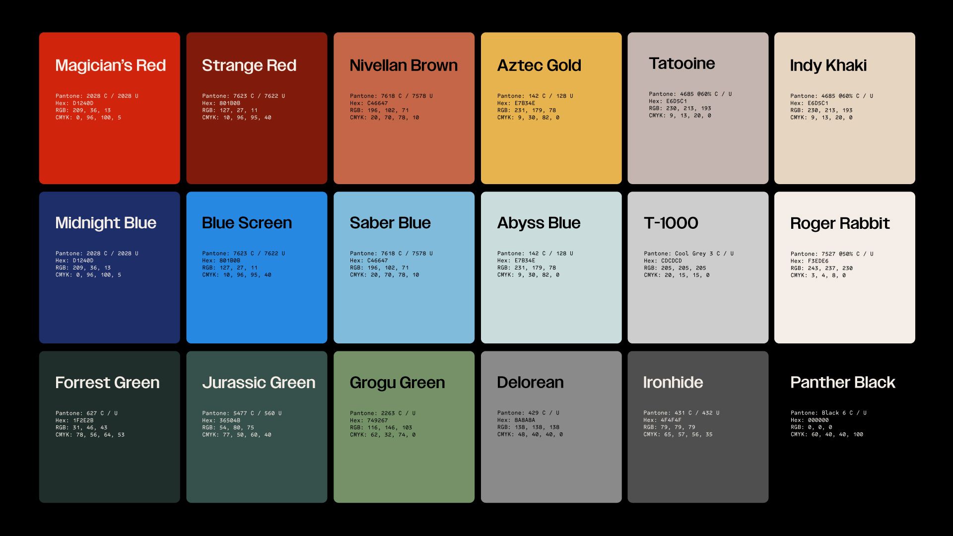
This image presents a highly organized grid of distinct color tiles, showcasing a strong emphasis on rich, saturated hues and clear segmentation. The visual language is clean and modern, relying on solid blocks of color to define individual options or brands. The overall feel is professional, organized, and visually striking due to the careful selection of complementary tones.
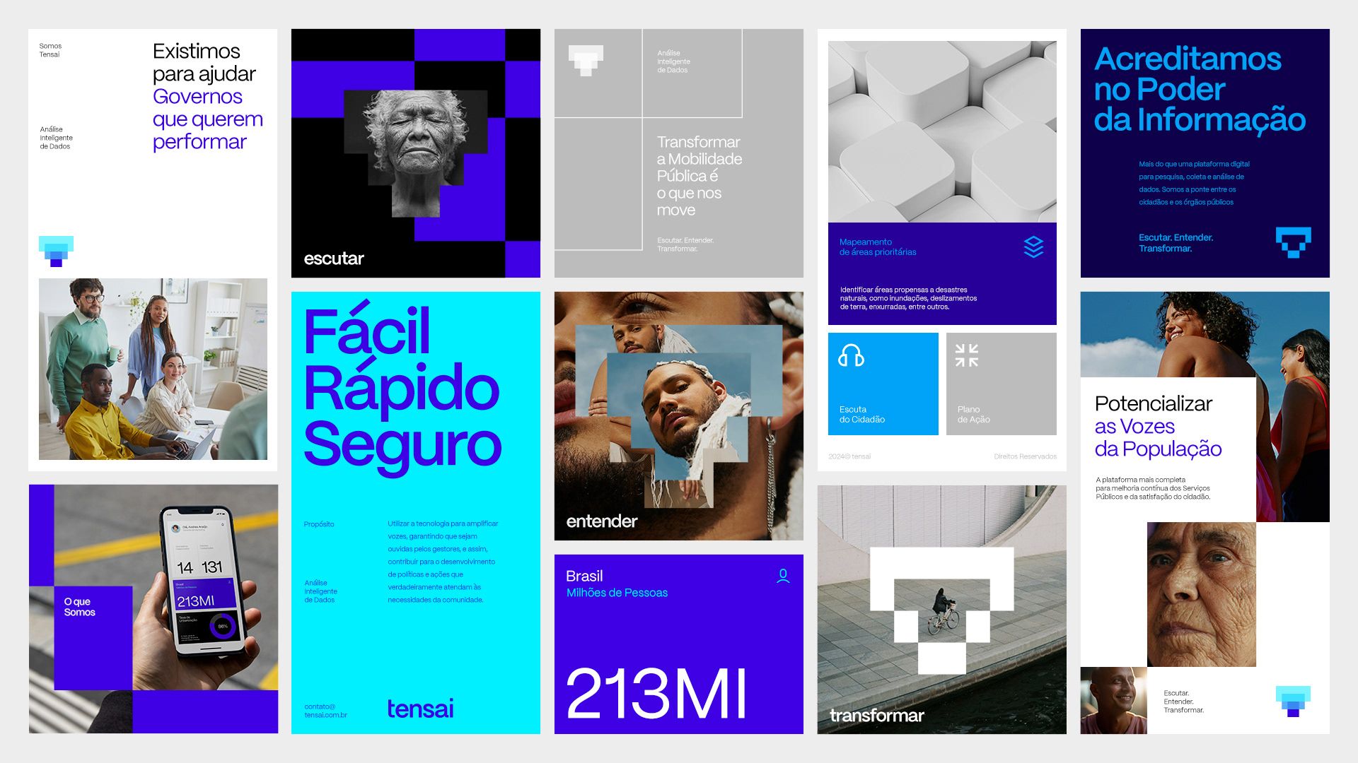
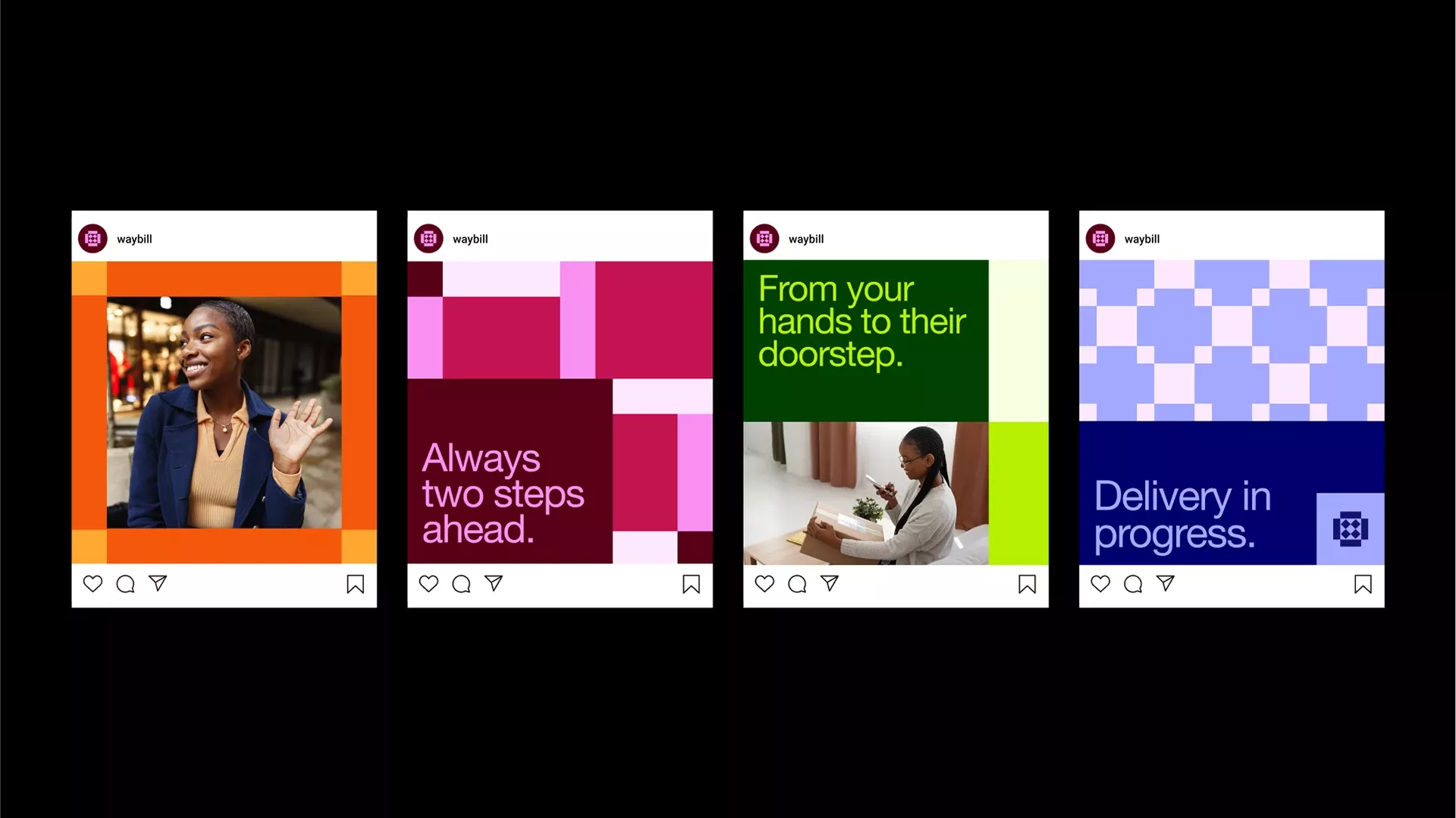
This visual collage showcases a modern, modular design language characterized by strong color blocking and high contrast. The overall aesthetic is clean, professional, and conveys a sense of trust and efficiency, typical of governmental or high-stakes technology services. The layout is highly structured, presenting diverse product features in a grid format.
This collection showcases a modern, clean interface design utilizing a strong color accent against a neutral background to convey professionalism and clarity. The visual language is highly structured, relying on card layouts and ample negative space to ensure key information is easily digestible. The overall feel is trustworthy, innovative, and highly functional.
This design utilizes a clean, card-based layout typical of modern analytics dashboards, prioritizing data clarity and hierarchy. The visual language is minimalist yet functional, using distinct color blocks to segment different metrics effectively. The overall feel is professional, analytical, and highly organized.
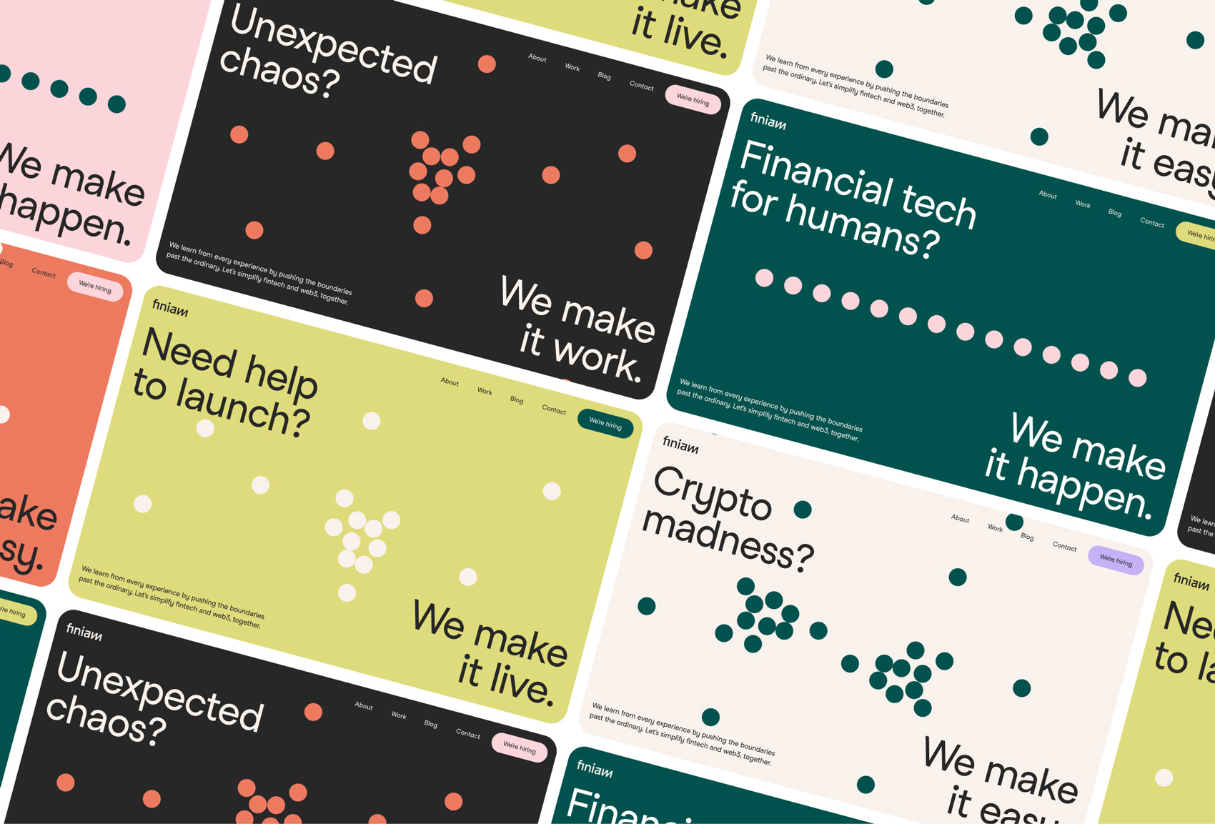
This set of visuals employs a clean, modern aesthetic utilizing bold blocks of color and subtle geometric patterns to convey trust and efficiency. The design relies on high contrast between vibrant primary colors and muted backgrounds, creating a professional and engaging user interface feel.
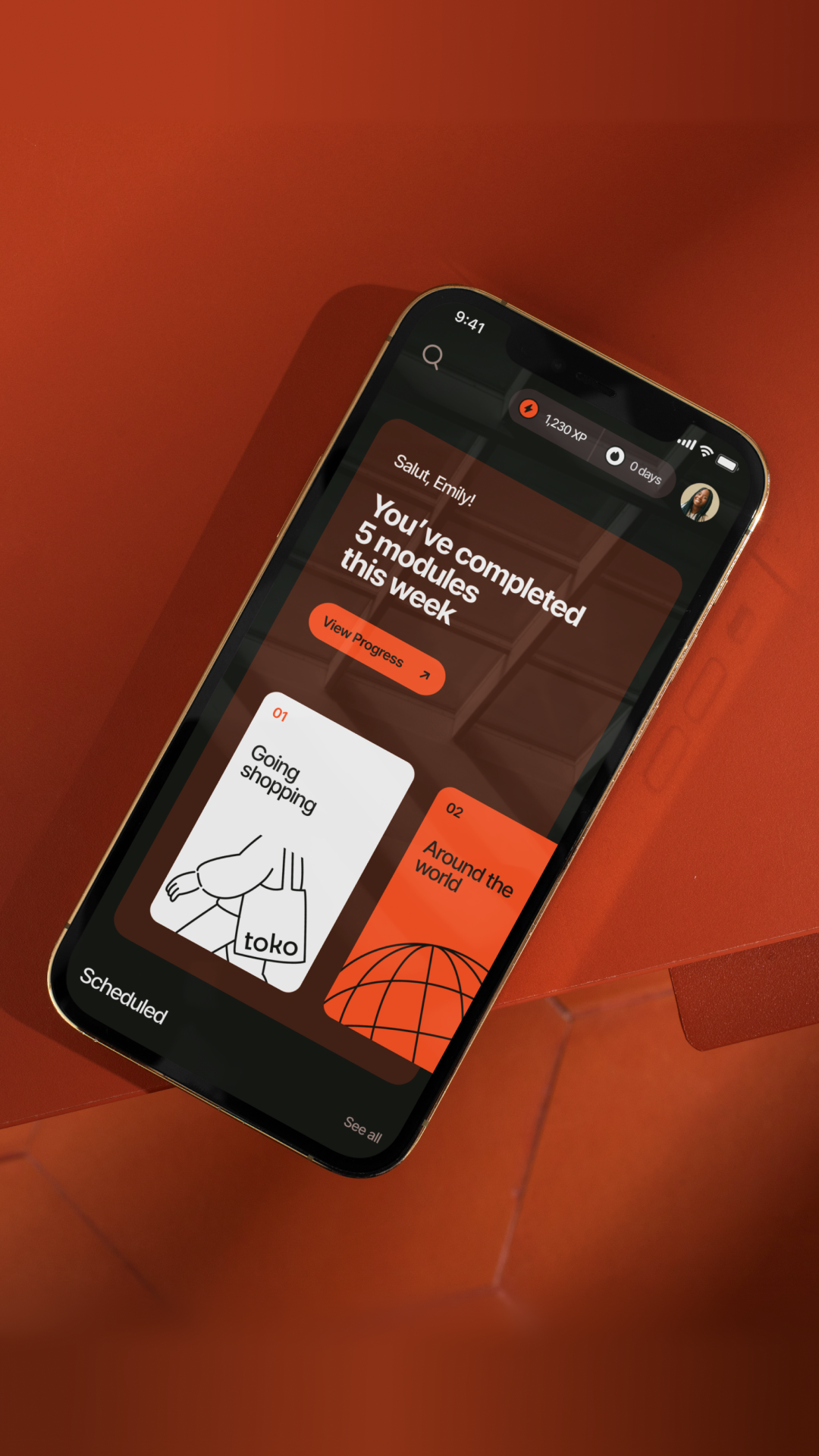
The design utilizes a warm, earthy color palette contrasted with dark mode elements to create a sophisticated and focused user experience. The layout is clean, employing clear hierarchy with strong use of orange accents to highlight progress and key information.