modern typography
15 designs
Showing 15 of 15 (15 total)
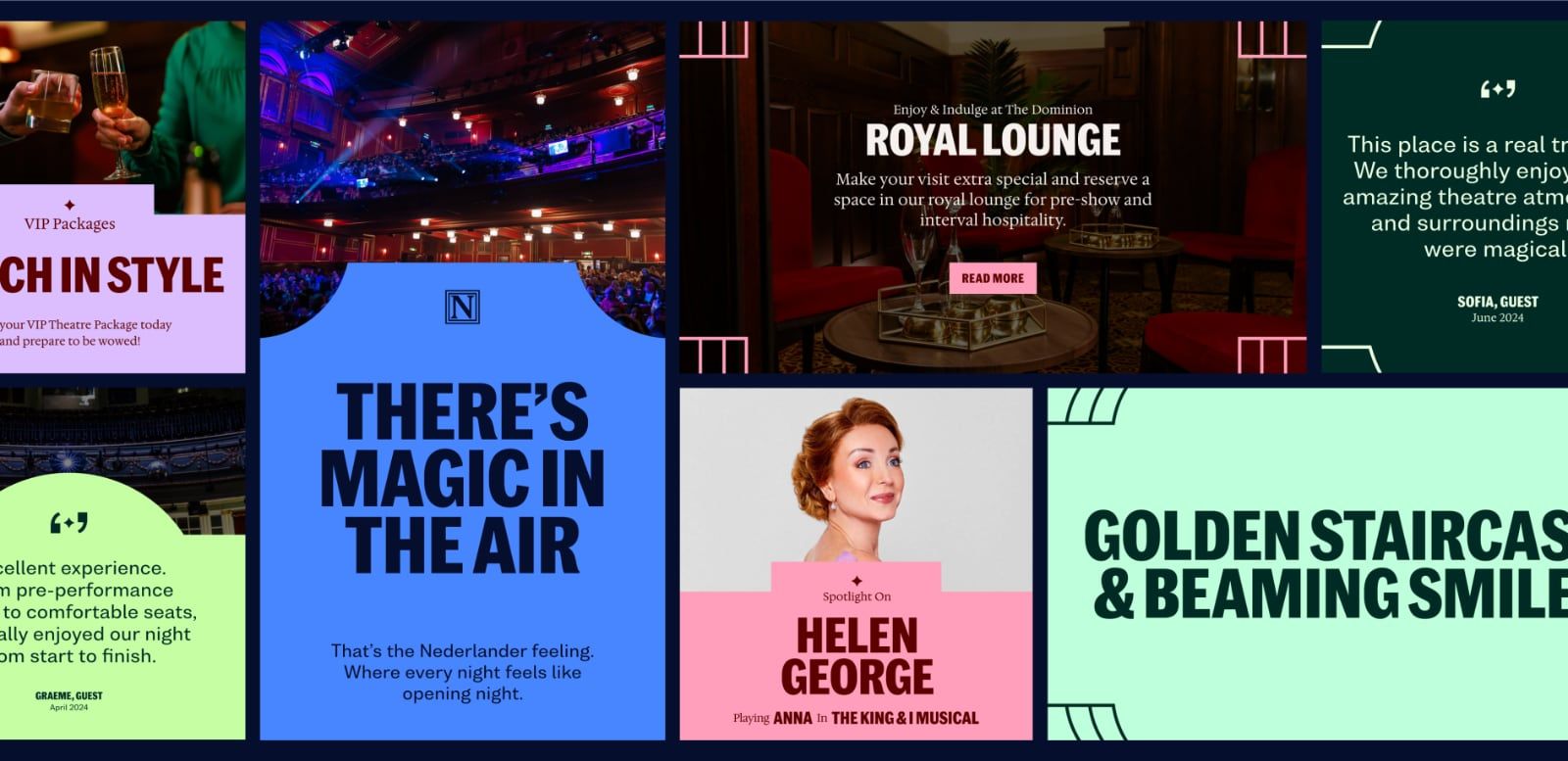
This image is a dynamic collage of promotional graphics, primarily for high-end entertainment or hospitality events, utilizing rich textures and contrasting color schemes. The overall visual language balances luxurious warmth with modern graphic clarity.
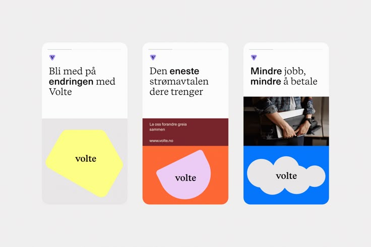
The image displays three distinct, card-like UI elements or informational tiles, characterized by a clean, minimalist design using a limited color palette and simple geometric shapes. The visual language is modern and direct, focusing on clear text hierarchy and strong color blocking to separate content.
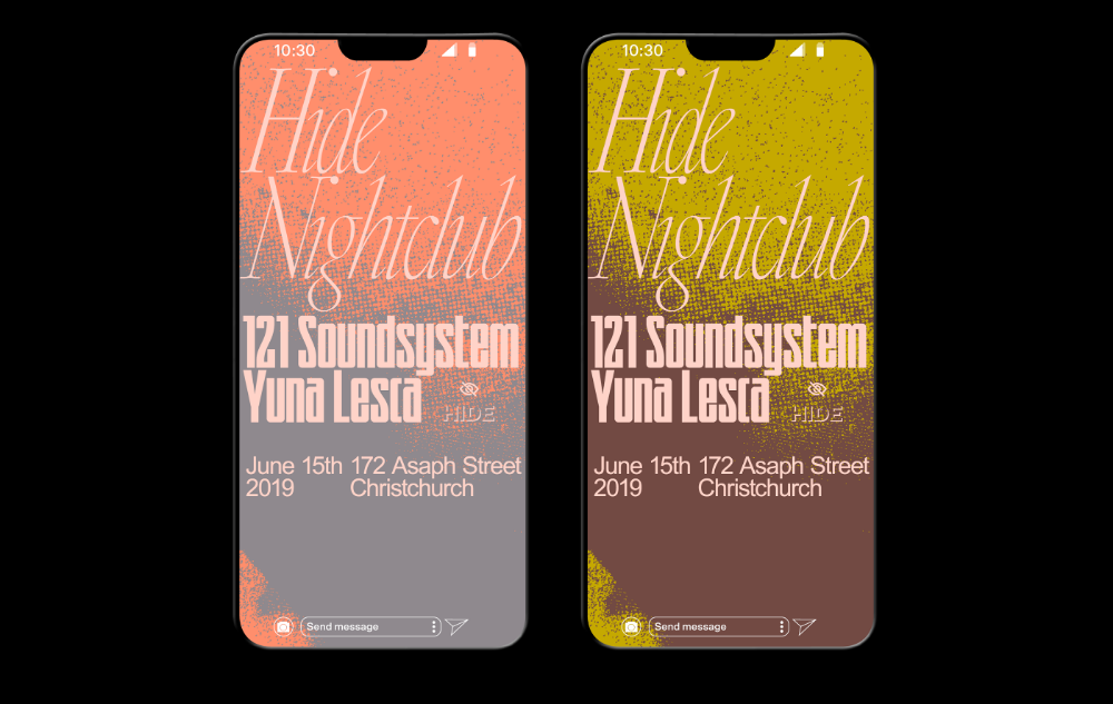
The image presents two mobile screen mockups with a cohesive, warm, and slightly vintage aesthetic. The design utilizes strong color blocking and contrasting textures to create a distinct visual identity suitable for an event or promotional material.
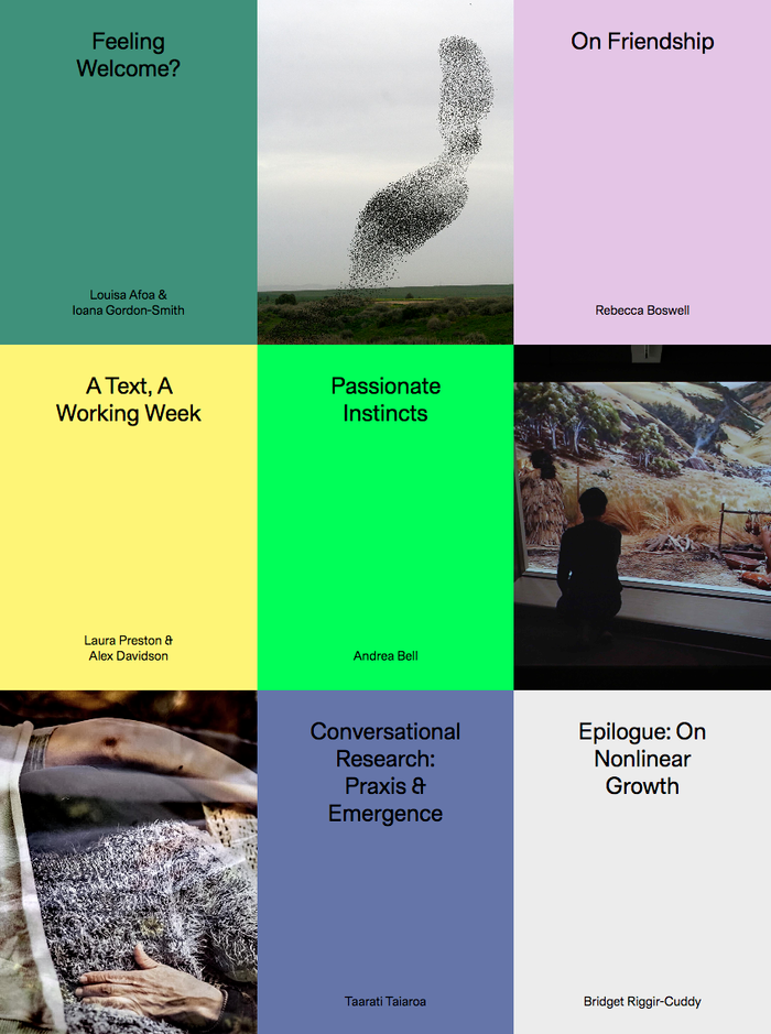
The image presents a grid layout of book covers or project titles, characterized by a clean, minimalist aesthetic with distinct color blocking for each entry. The design relies on negative space and subtle photographic elements to convey a sense of depth and introspection.
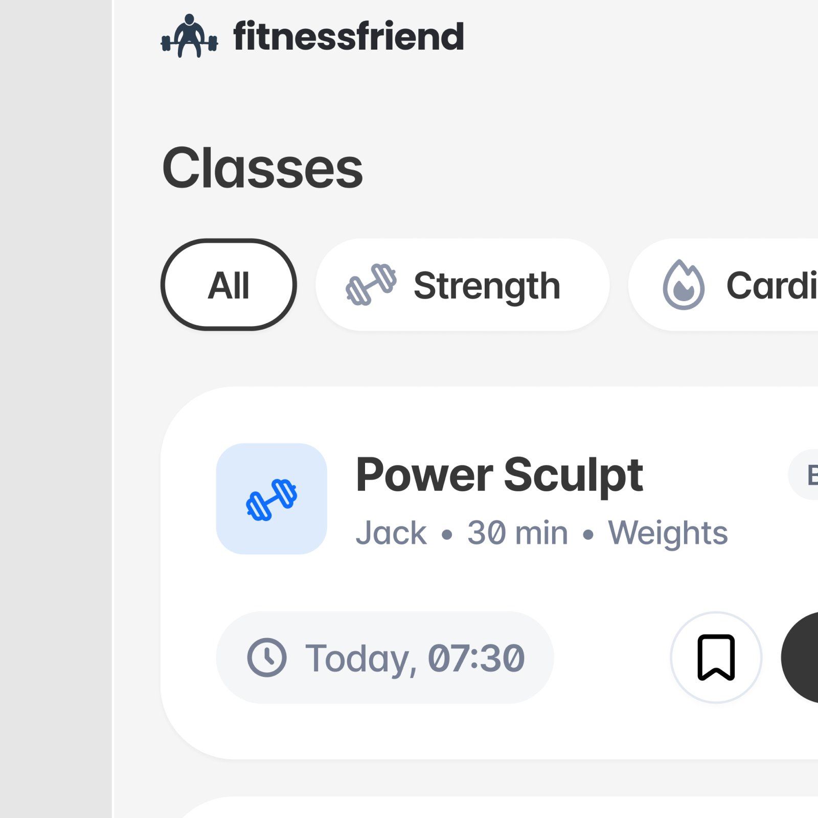
This is a clean, functional user interface design characterized by ample whitespace and clear information hierarchy. The visual language is modern and relies on simple iconography and subtle grays to present fitness class details in an organized manner.
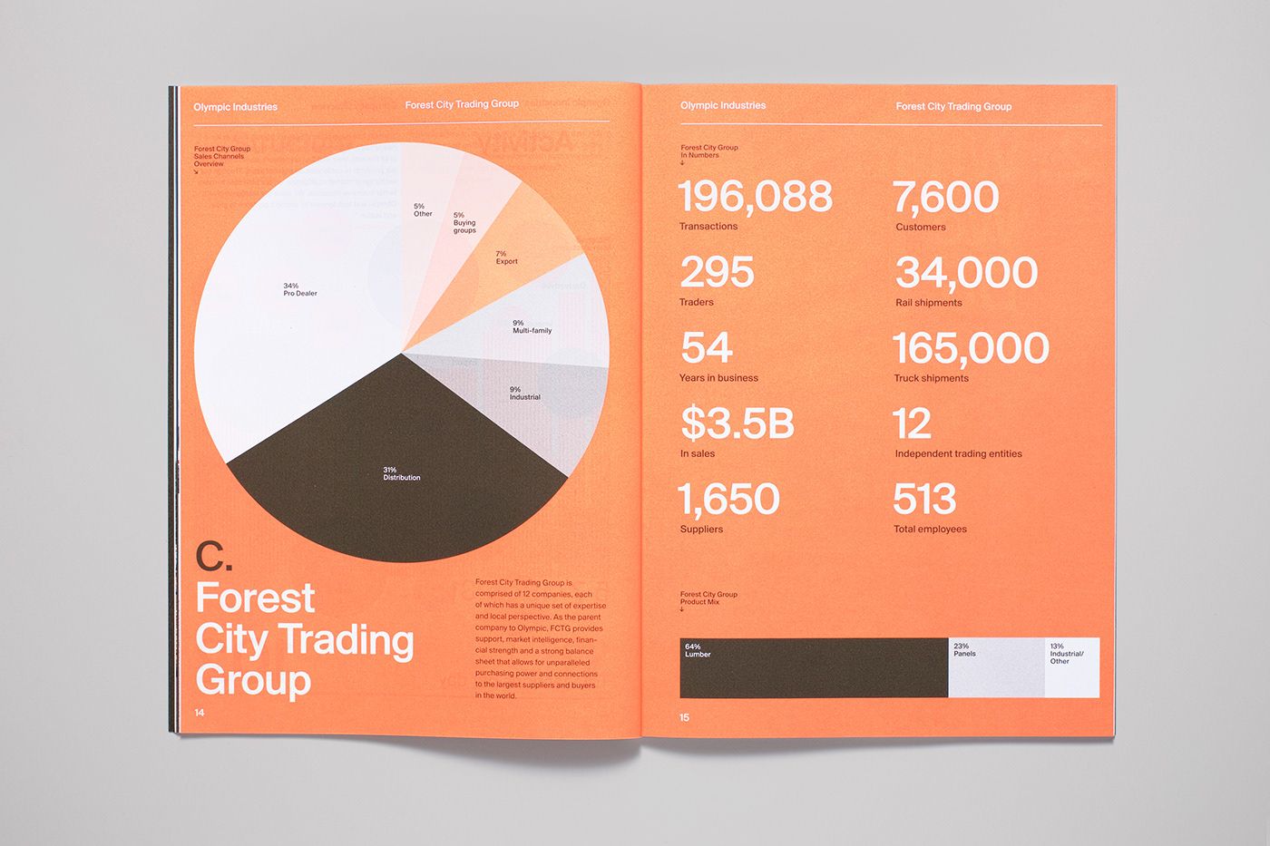
This infographic utilizes a clean, modern aesthetic to present complex business metrics through segmented circular charts and clear typography. The visual language is professional and analytical, effectively segmenting data points for easy comparison across different industries.
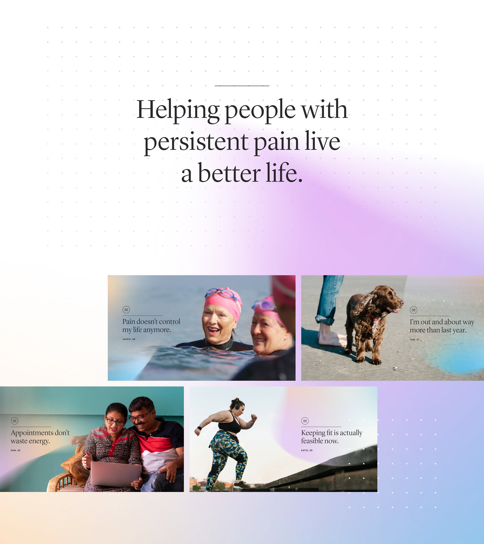
This design utilizes a clean, minimalist aesthetic with soft purple gradients to convey empathy and professionalism. The layout is balanced, using clear visual blocks of photographic evidence to illustrate the benefits of pain management. The overall feel is calm, hopeful, and supportive.
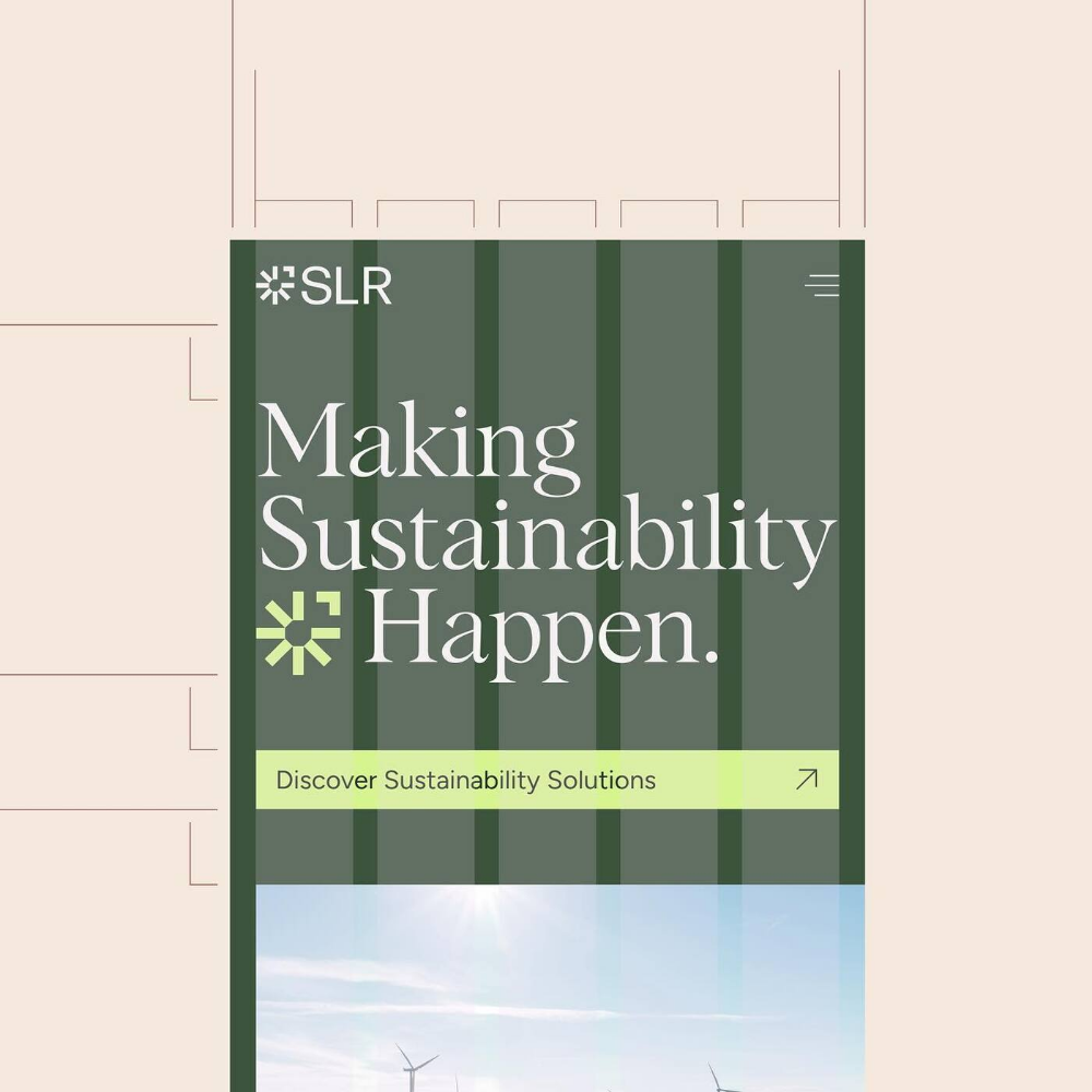
This cover utilizes a clean, corporate aesthetic characterized by muted greens and earth tones to convey professionalism and environmental themes. The design relies heavily on strong vertical lines and ample negative space to create a structured, trustworthy visual hierarchy.
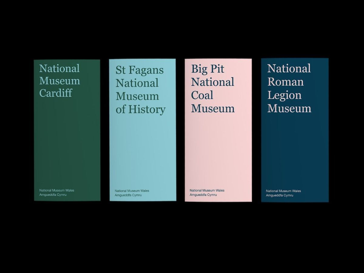
This design uses a structured, minimalist approach characterized by distinct color blocking and clean typography to present institutional information. The visual language is professional and calm, relying on sophisticated muted tones and ample negative space for clear hierarchy.
This design employs a clean, modern aesthetic characterized by high contrast and ample white space, effectively balancing physical signage with digital graphic elements. The visual language is professional and structured, using muted tones paired with a vibrant teal to create a sense of trust and opportunity.
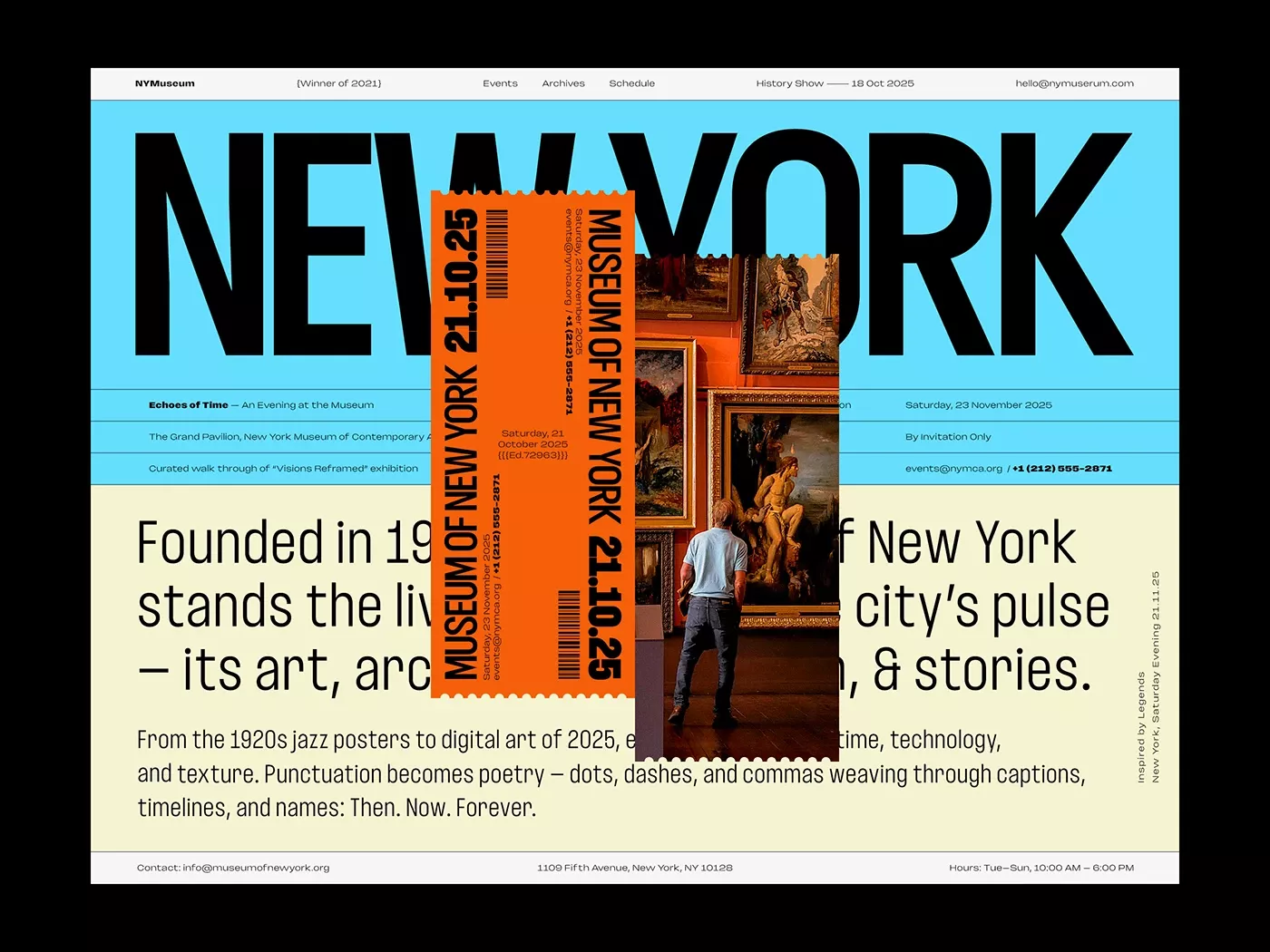
The design effectively balances bold, modern typography with textural, historical imagery to create a sense of depth and heritage. It utilizes a strong color contrast between the cool blue background and warm, earthy tones to guide the viewer through the publication's narrative. The overall feel is academic yet engaging and visually compelling.
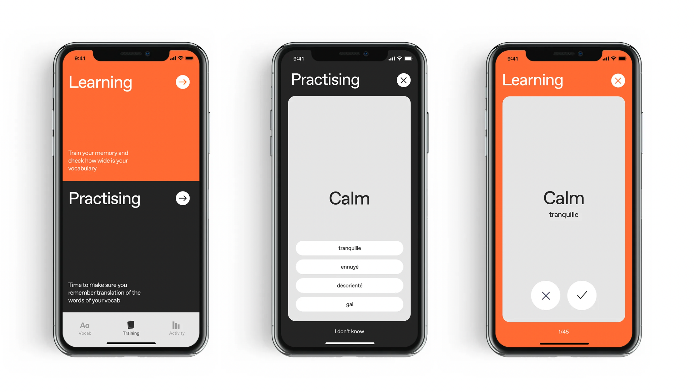
This set of screens presents a clean, modern user interface typical of educational mobile applications. The design emphasizes high contrast and ample negative space, creating a focused and intuitive learning experience through clear labels and simple interactive elements.
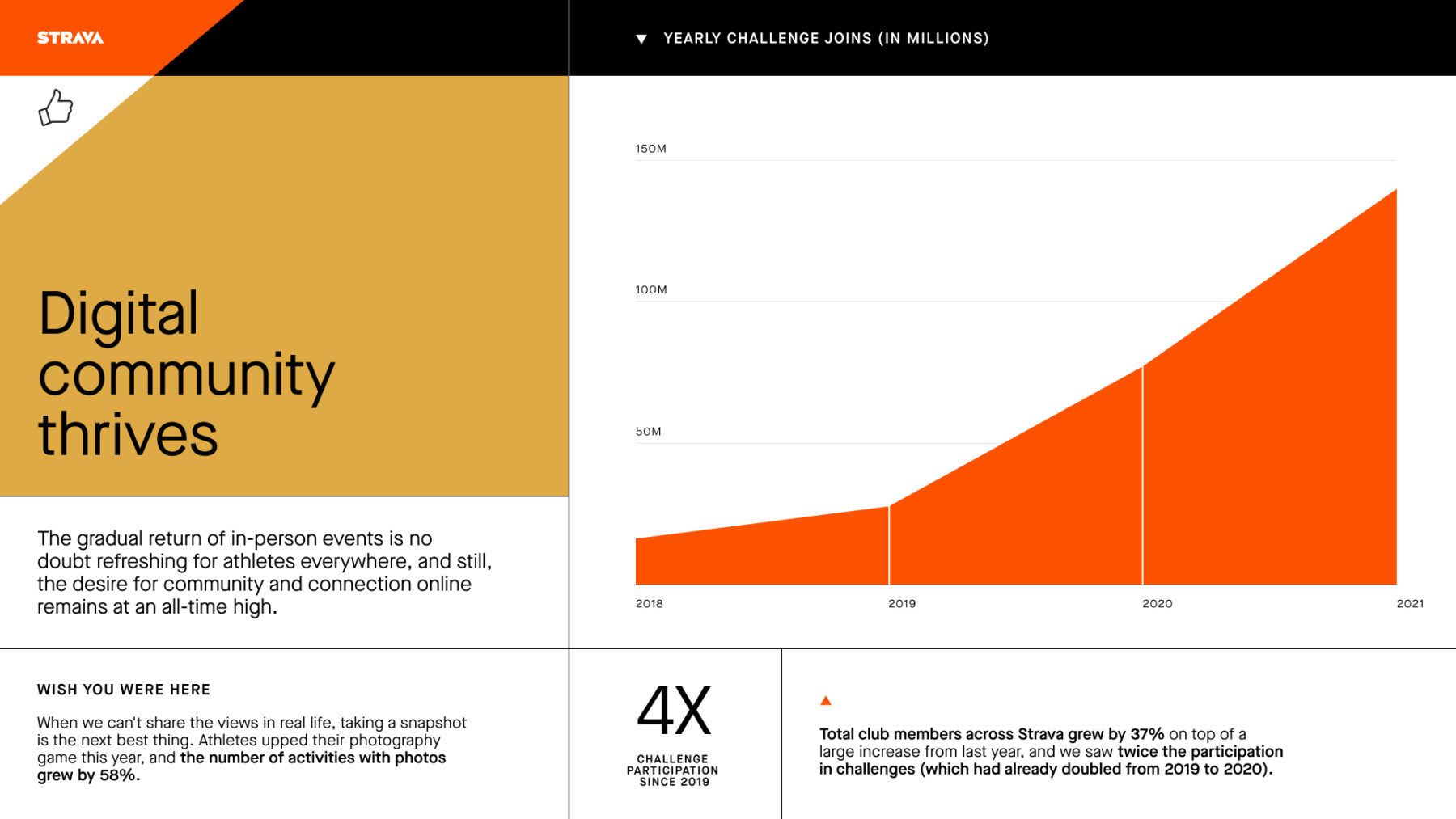
This is a clean, professional data visualization using an area chart to illustrate positive growth in community engagement metrics over time. The design effectively uses a limited, warm color palette and clear typography to convey information rapidly and credibly.
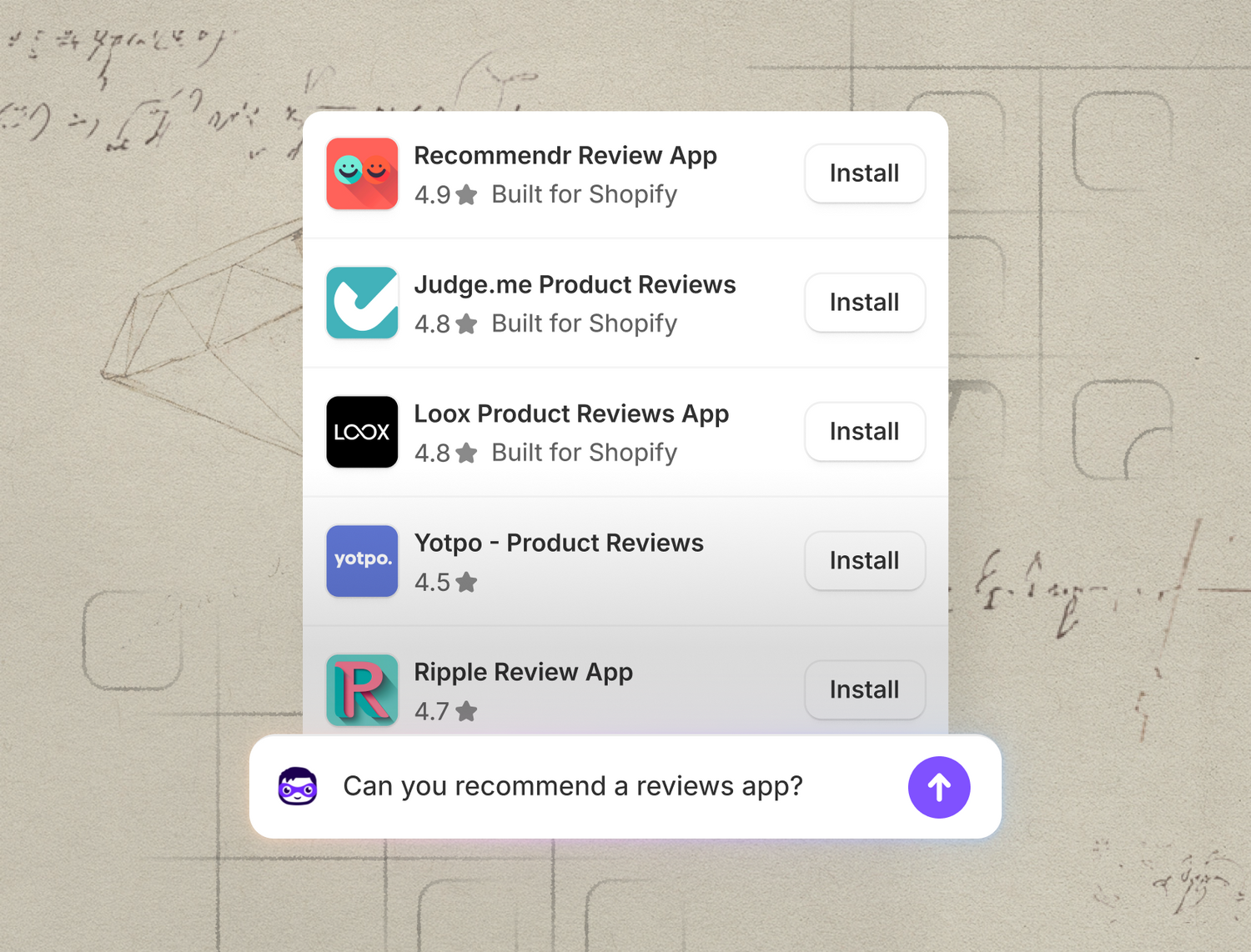
This image presents a clean, modern mobile interface featuring a vertical list of application recommendations set against a rustic, hand-drawn paper background. The design successfully balances crisp digital information delivery with an organic, sketched aesthetic, creating a visually engaging and trustworthy feel.
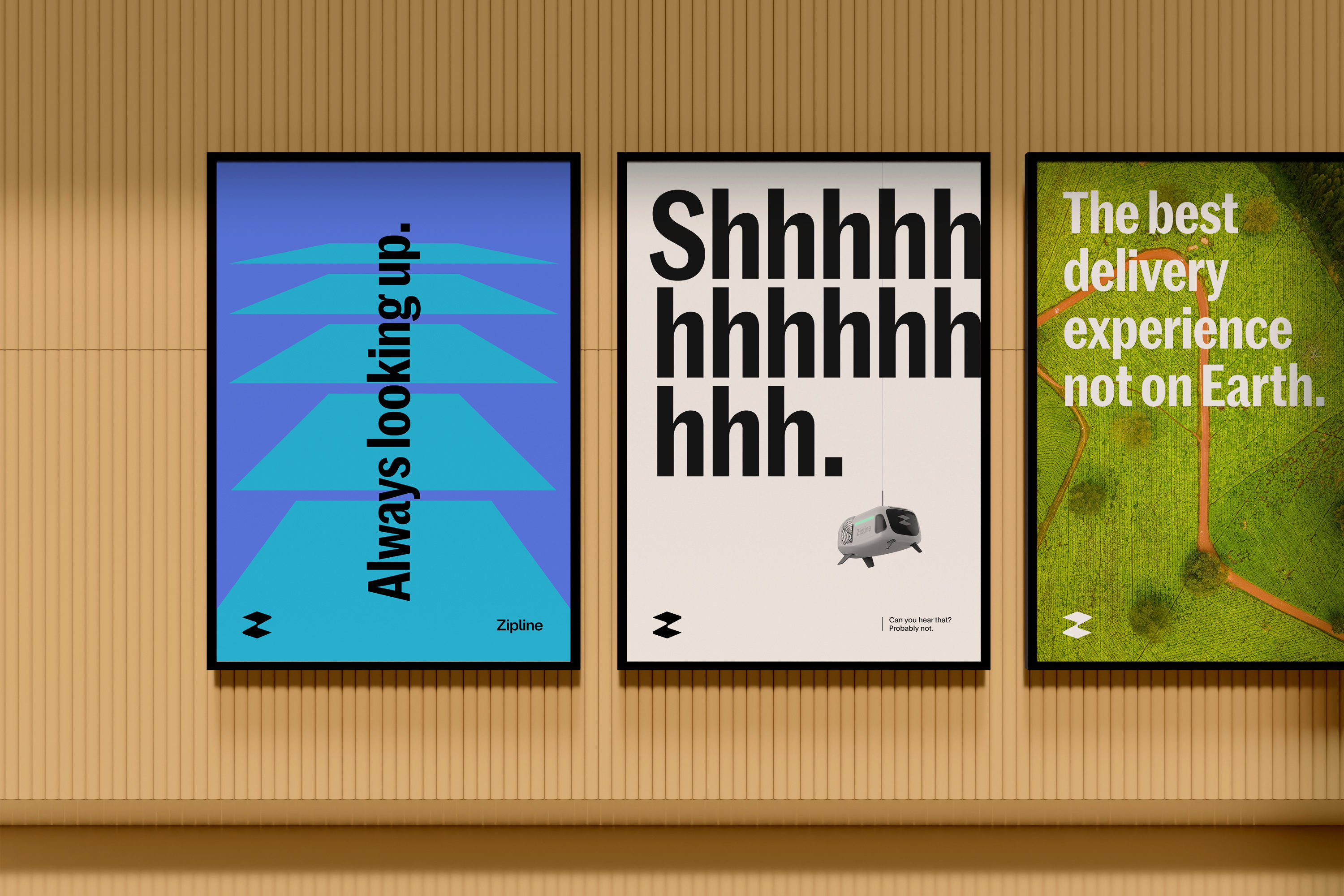
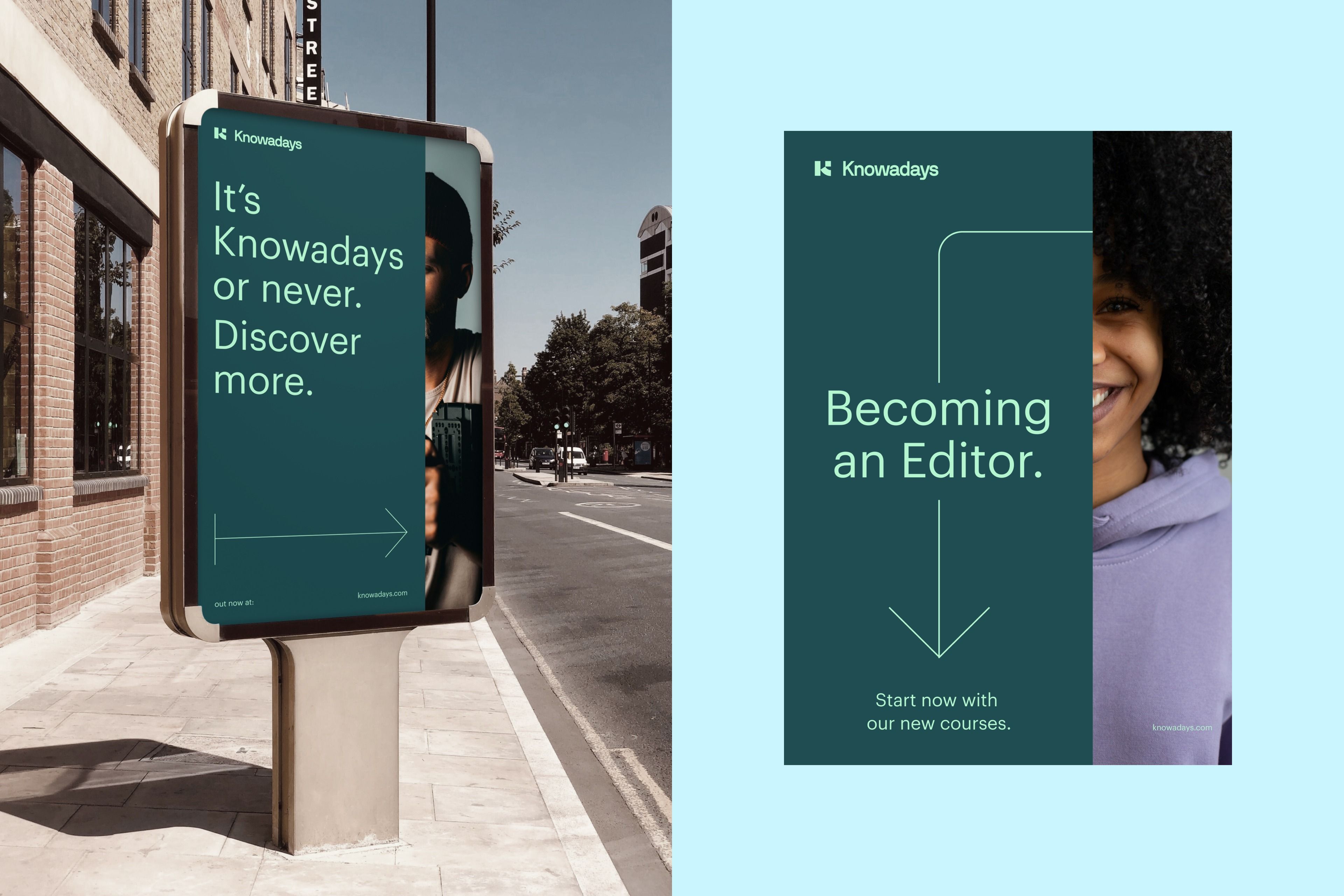
This display uses a minimalist and high-contrast visual language, employing bold typography against saturated background colors to convey themes of adventure and service. The design relies on clean geometric elements and stark text to create immediate, impactful messaging.