modern design
10 designs
Showing 10 of 10 (10 total)
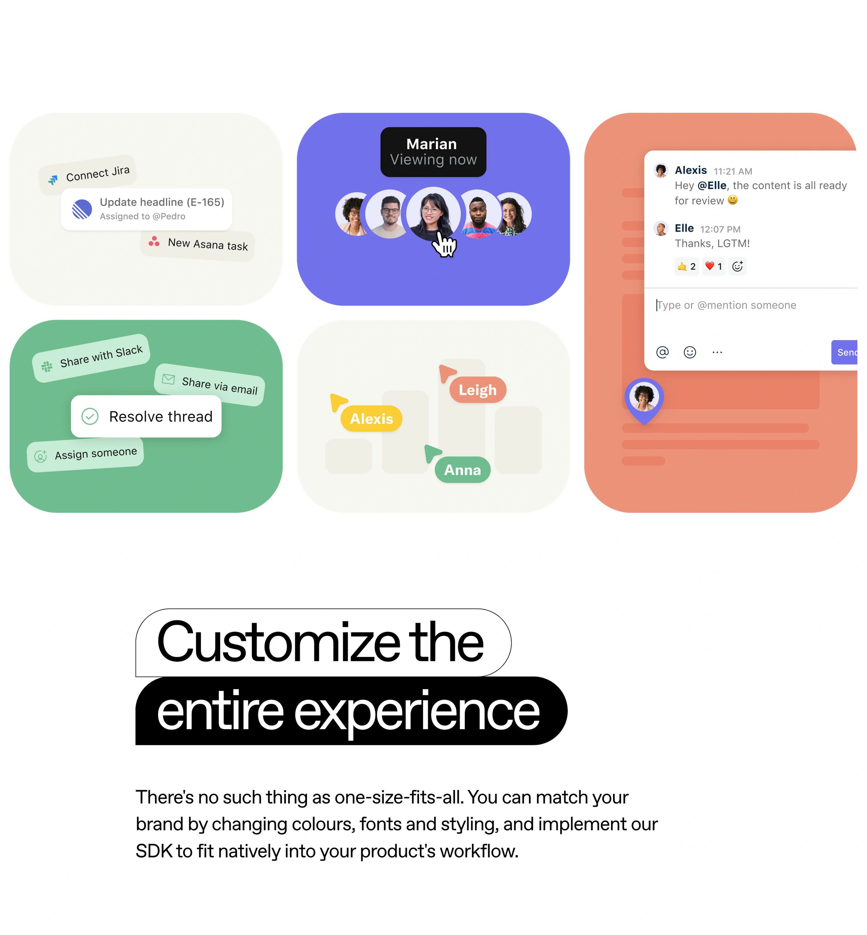
This design showcases a clean, modern card-based user interface emphasizing clarity and functionality. The visual language relies on soft gradients, rounded corners, and subtle shadows to create depth while maintaining a professional and approachable feel. The layout is organized, presenting various features in an easily digestible grid format.
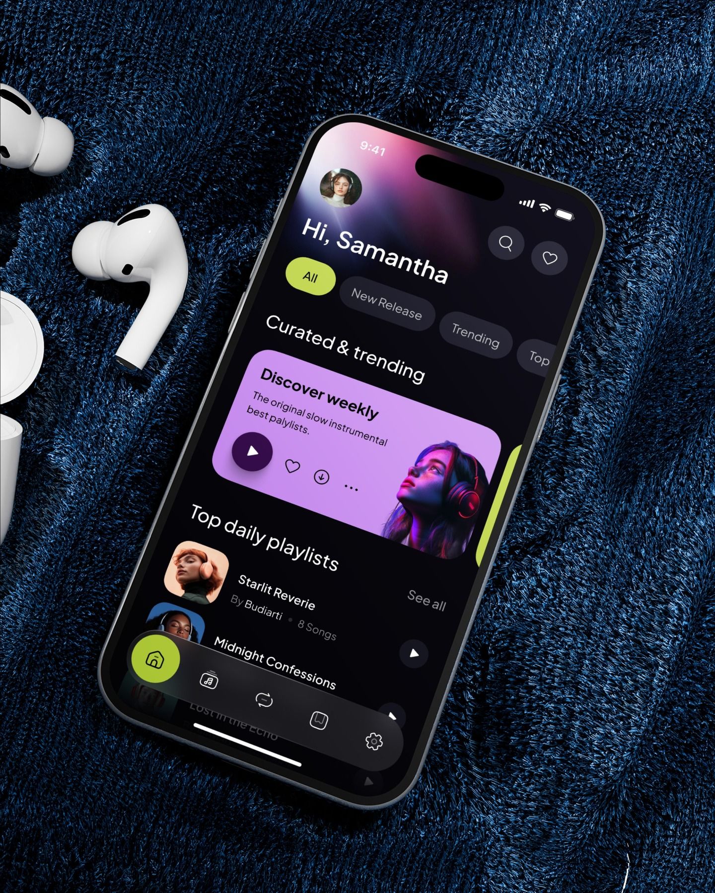
The image showcases a modern, dark-themed mobile application interface, likely for music or playlists, characterized by clean lines and a dark aesthetic. The design balances dark backgrounds with vibrant accent colors to create an immersive and sophisticated user experience.
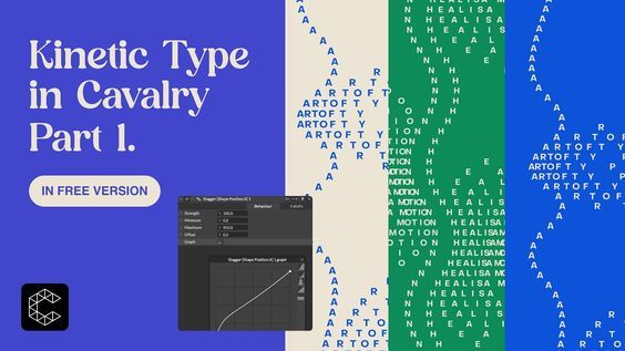
The image presents a clean, modern interface design focused on kinetic typography, utilizing a strong contrast between white text and vibrant green/blue backgrounds. The layout is structured to showcase the title alongside a visual representation of the kinetic text itself, suggesting a technical or artistic presentation.
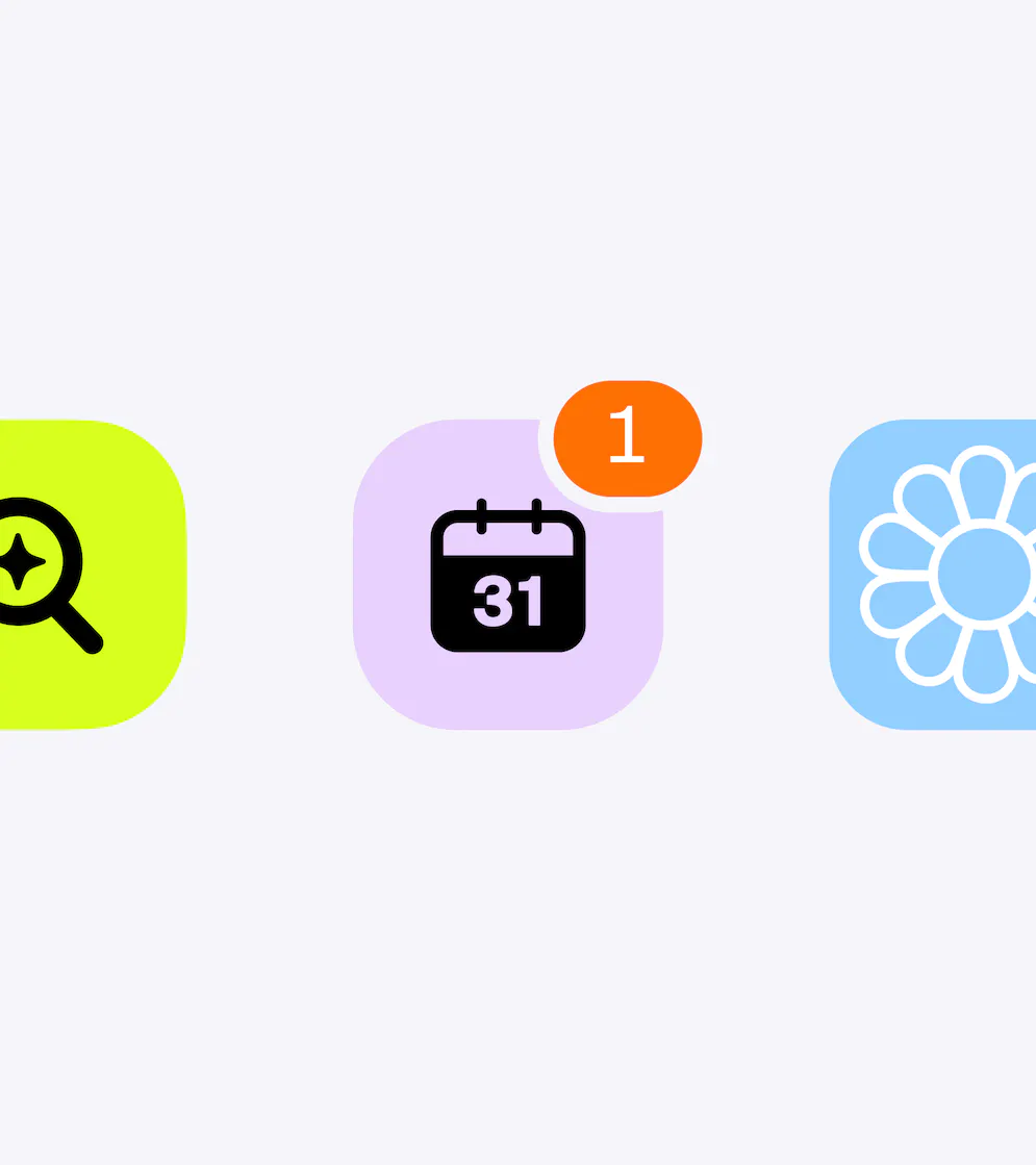
This image presents a set of distinct, brightly colored flat icons used for user interface elements or data visualization. The design relies on clean shapes and contrasting, soft pastel colors to create a modern and approachable visual language. The elements are clearly separated yet grouped horizontally, suggesting a step-by-step process or different categories of information.
This set of mockups demonstrates a clean, modern user interface with strong emphasis on readability and intuitive navigation. The design uses ample white space and clear iconography to convey helpful, supportive messaging in a professional manner.
This interface uses a dark, textured background and vibrant teal accents to create a modern and sophisticated digital feel. The design is clean and focused, clearly directing the user toward a sign-in action with minimal clutter. The overall aesthetic is professional and tech-oriented.
The design features a clean, modern, and professional aesthetic utilizing ample white space to create a sense of clarity. The visual language is organized and utilizes subtle color accents to guide the user through various feature blocks effectively.
This interface exhibits a clean, minimalist design focused on visual appeal and easy navigation for travel inspiration. The visual language relies heavily on white space and high-contrast dark elements, creating a sophisticated and organized user experience.
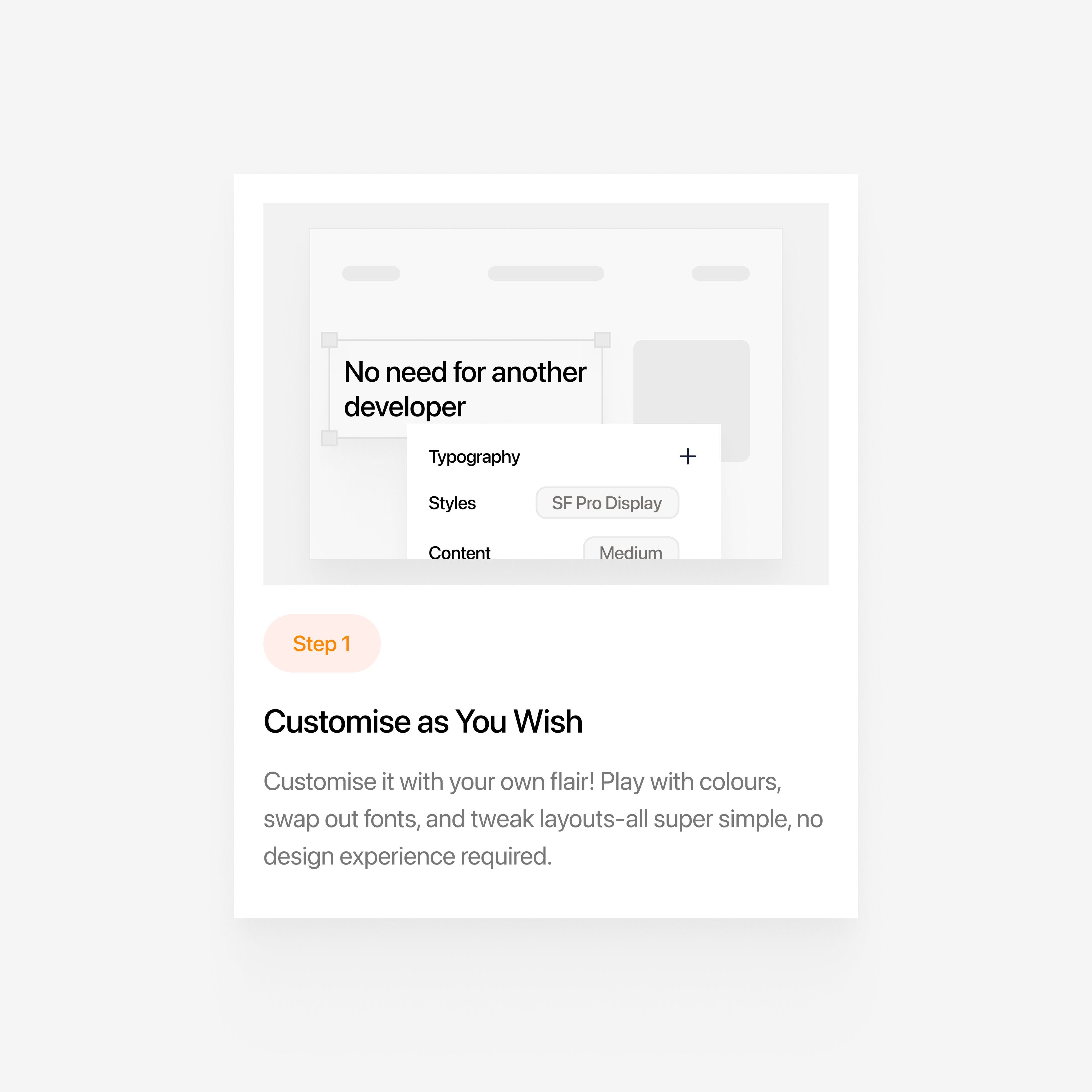
This design exemplifies a clean, minimalist user interface focused on presenting options and features. The visual language relies heavily on ample whitespace and clear hierarchy to guide the user through various components like typography and styles. The overall feel is professional, intuitive, and highly organized.
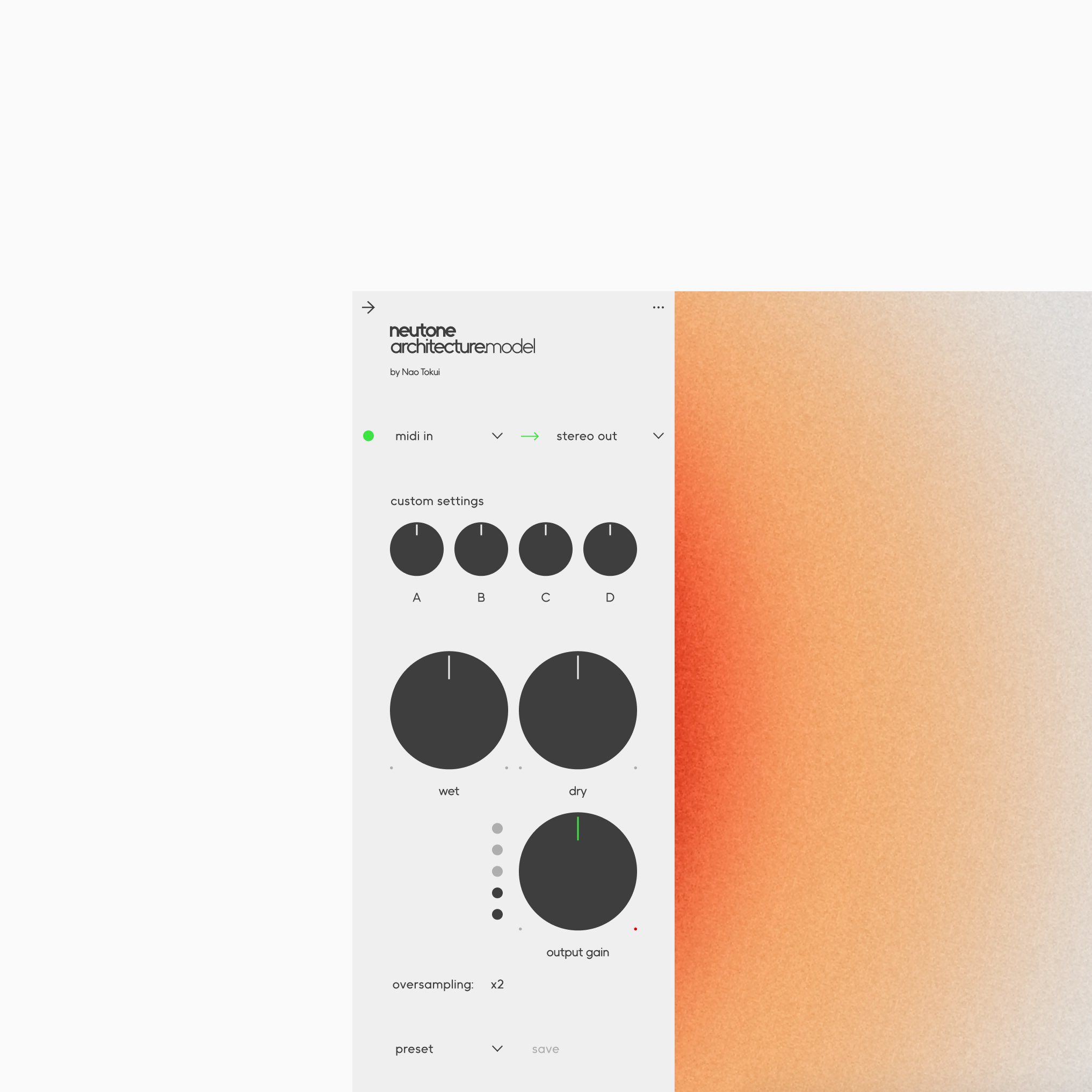
This interface exhibits a clean, functional modern design, utilizing soft gradient colors and clear typography to organize complex technical settings. The visual language prioritizes usability, using simple geometric shapes and strong vertical alignment to create a structured and professional experience.