informational
322 designs
Showing 24 of 322 (322 total)
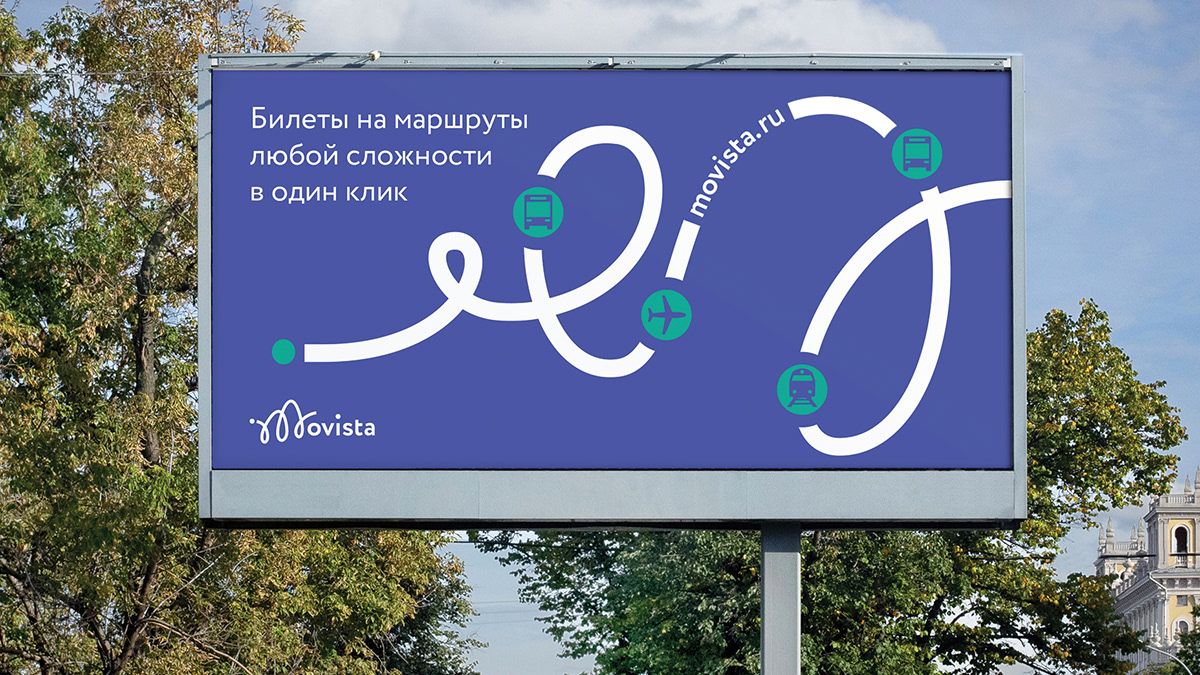
This is a highly functional public transit sign characterized by a clean, graphic approach to route visualization. The design effectively uses strong color contrast to clearly delineate complex travel paths against a deep blue background.
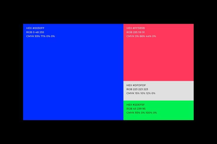
This image presents a highly technical and clean visualization of color separation, likely related to printing profiles or color mixing. The design relies on bold, distinct blocks of primary and secondary colors to clearly delineate different color spaces. The overall feel is analytical, precise, and purely informational.
This design employs a clean, minimalist aesthetic characterized by simple typography and subtle use of circular framing. The visual language is highly functional, prioritizing clear navigation and informational display with a muted, professional tone.
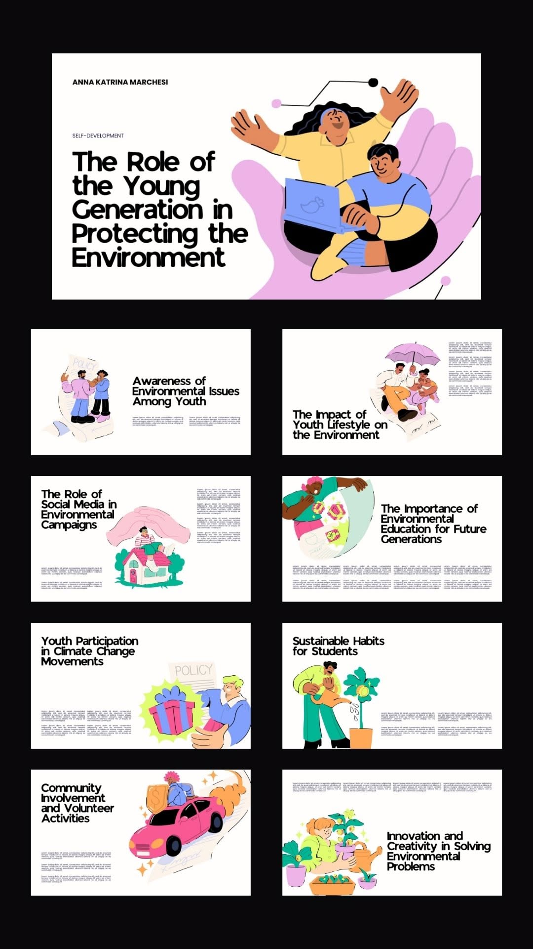
This visual collection uses a friendly, modern illustration style to present various topics related to environmental protection and youth engagement. The design is clean and modular, utilizing soft colors and engaging characters to make complex themes accessible and appealing to a younger audience. The overall feel is positive, educational, and action-oriented.
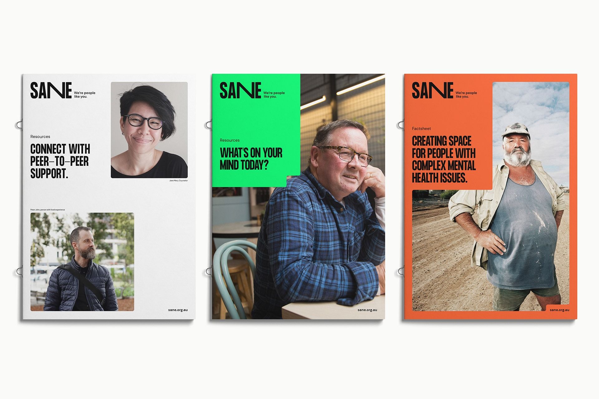
The design utilizes a clean, modern layout with high contrast between photographic elements and clear textual information. It employs distinct color blocking across the three panels to segment different support themes while maintaining a professional and empathetic visual language.
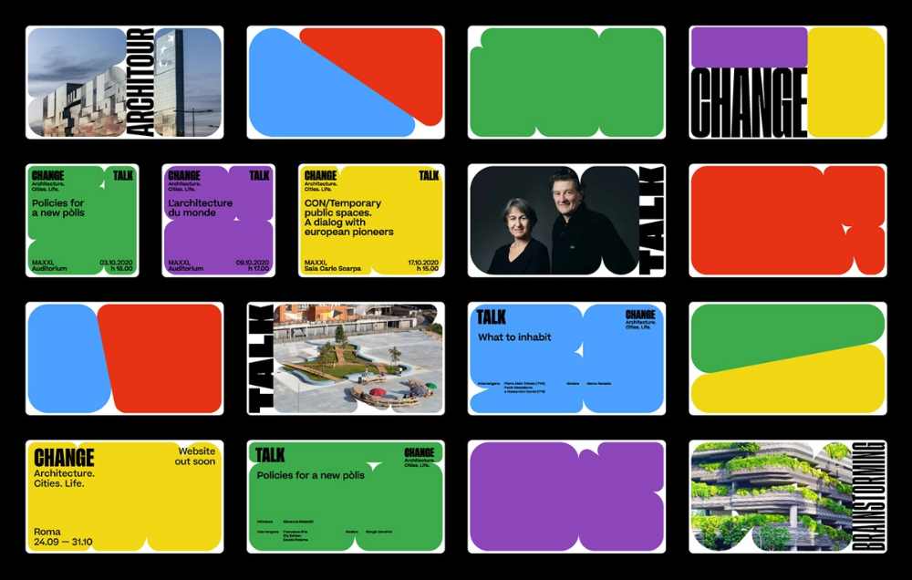
This image presents a highly structured grid of promotional graphics, utilizing bold color blocking and clean typography to convey information about architectural and policy discussions. The visual language is modern, utilizing strong geometric shapes and high contrast to create a dynamic and professional feel.
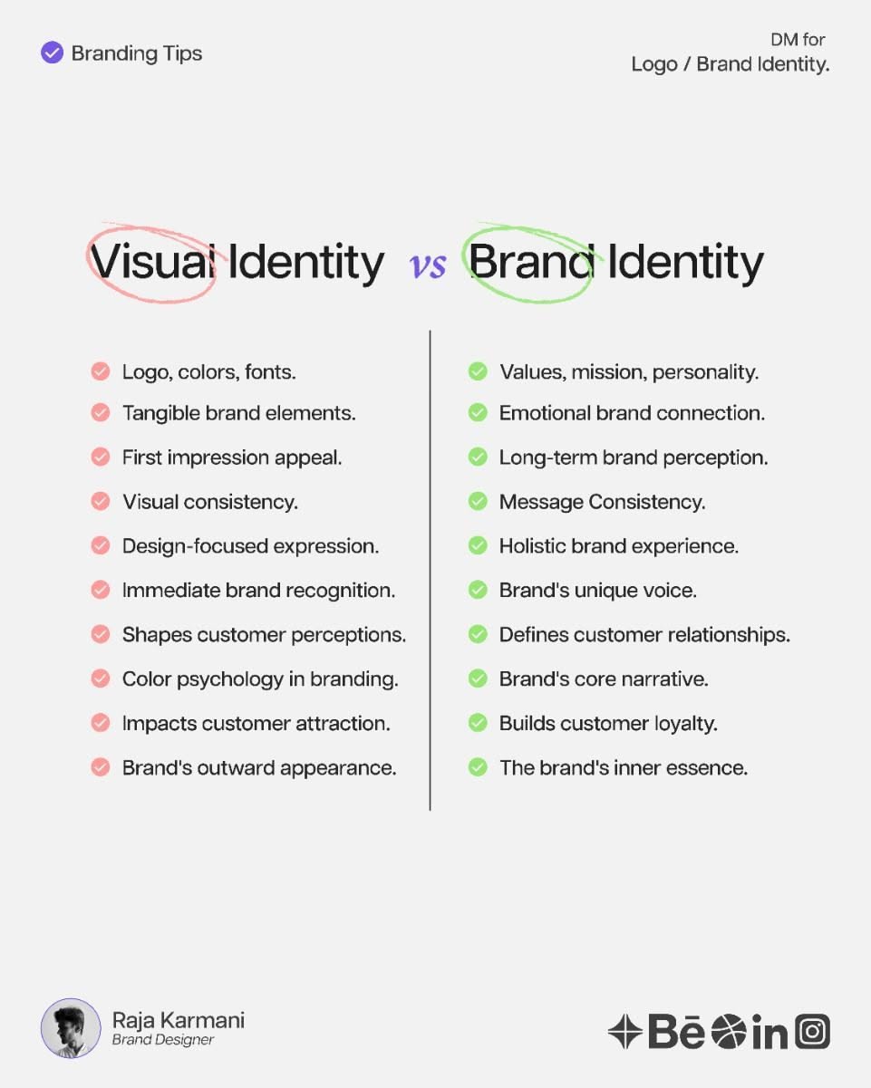
This is a clean, academic comparison chart designed to differentiate between Visual Identity and Brand Identity. The design utilizes clear typography and a minimalist layout to present complex concepts in an easily digestible format for educational purposes.
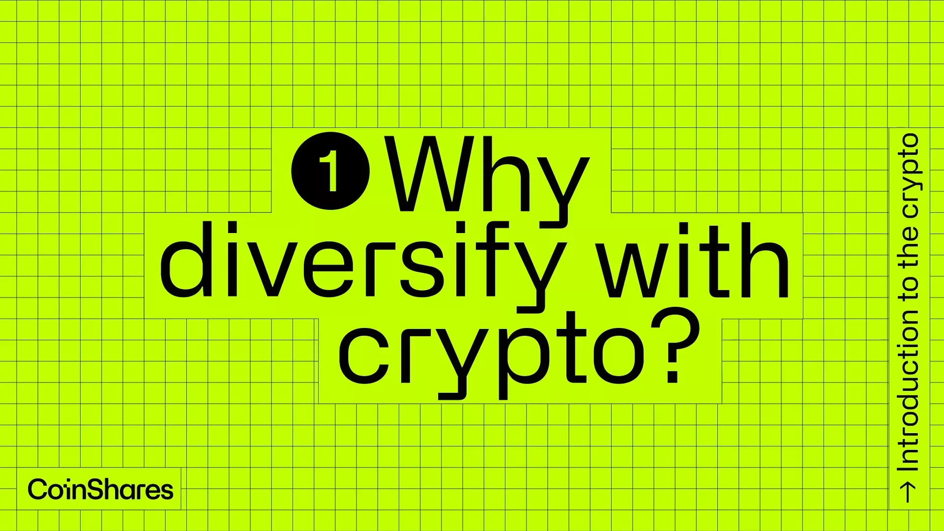
This is a clean, high-contrast informational graphic utilizing a vibrant lime green background overlaid with a subtle grid pattern to suggest structure and data. The design is modern, direct, and highly focused on presenting a key question related to cryptocurrency investment.
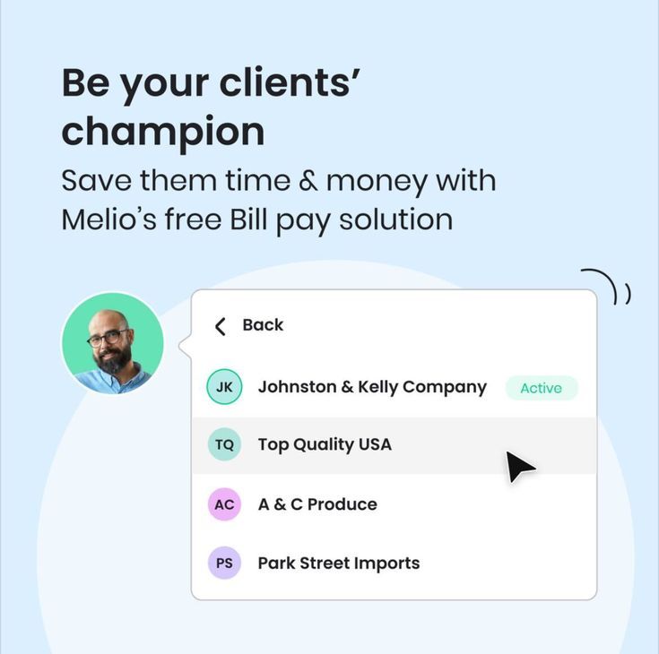
The image presents a clean, light-themed interface design promoting a business solution. It uses ample white space and soft pastel accents to convey a professional, approachable, and modern feel. The layout is simple, focusing on a clear headline followed by a list of client names.
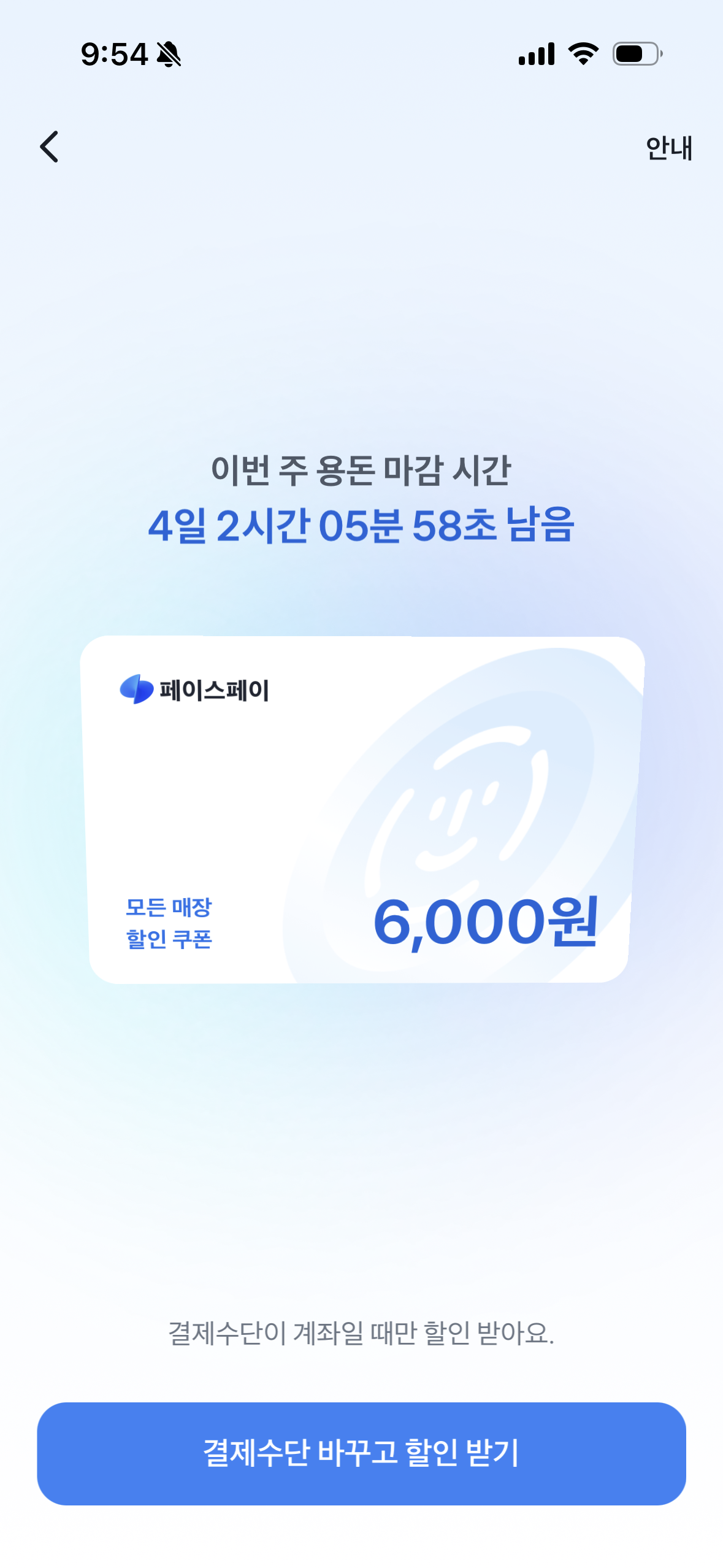
The interface presents a clean, minimalist design typical of a mobile application, focusing clearly on displaying important information regarding a scheduled event and a payment option. The layout is balanced, using ample white space to ensure readability and a light blue accent color guides the user toward the primary action.
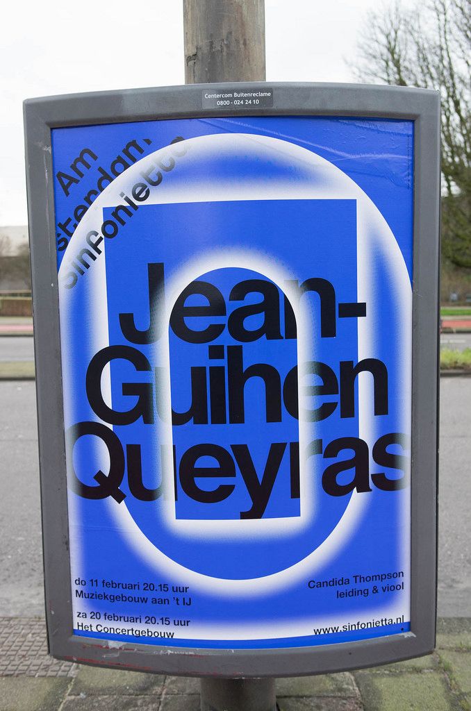
This is a formal, informational sign, likely for an event or venue, characterized by a clean, high-contrast design using a primary blue and white palette. The layout is structured with concentric circles and a prominent rectangular element to draw attention to the name.
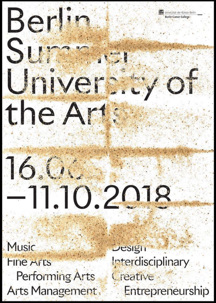
The design is stark, text-heavy, and utilizes a distressed texture to convey a raw, academic, or artistic atmosphere. The layout is straightforward, relying on strong typographic hierarchy to present an event announcement.
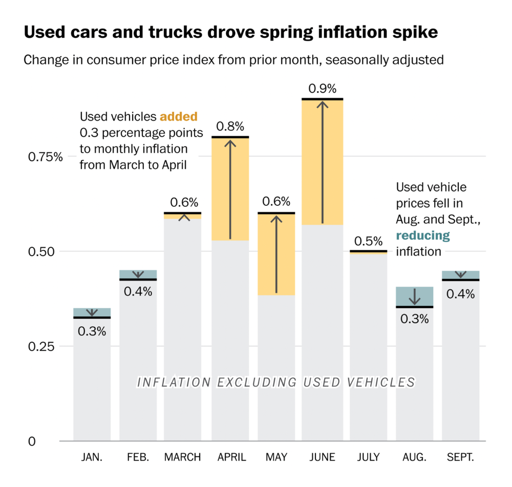
This is a data visualization presenting monthly inflation rates for used cars and trucks, adjusted for the prior month, spanning from January to September. The design uses a simple bar chart format with distinct color coding for different data series.
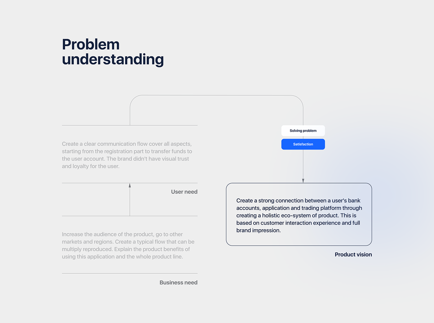
This is a clean, minimalist conceptual diagram illustrating the flow from problem understanding to product vision. The design uses simple lines and distinct text blocks to map out relationships between user needs, business needs, and the final product vision.
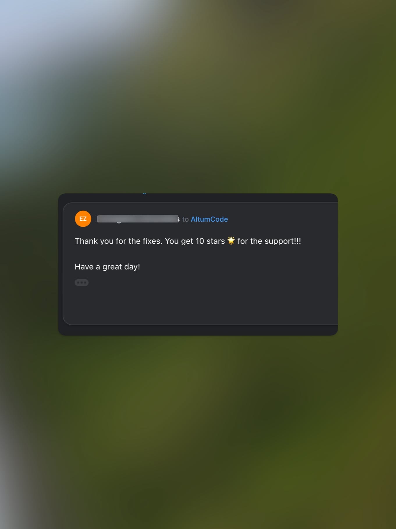
This design features a clean, dark-themed interface presenting positive user feedback and a thank you message. The visual language is minimalist, relying on high contrast between the dark UI elements and a soft, blurred background.
This design employs a clean, minimalist aesthetic relying heavily on negative space and precise typography to convey information. The visual language is highly structured, focusing on clear hierarchy and sophisticated readability suitable for an academic or cultural context.
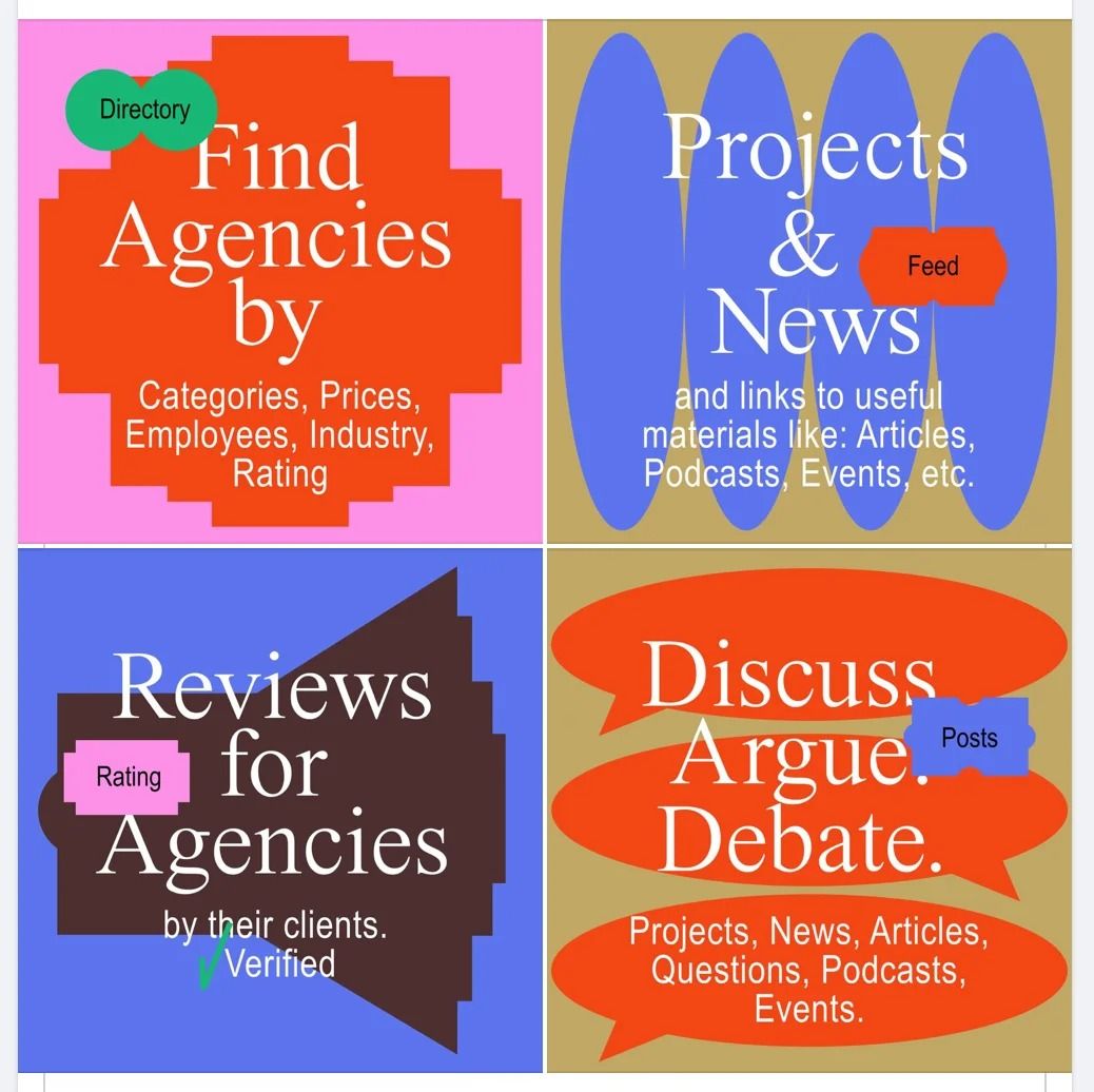
This design utilizes a vibrant, segmented grid layout to present distinct functional categories clearly. The visual language is bold and direct, relying on strong color blocking to separate information silos effectively. It conveys a sense of organized utility and professional transparency.
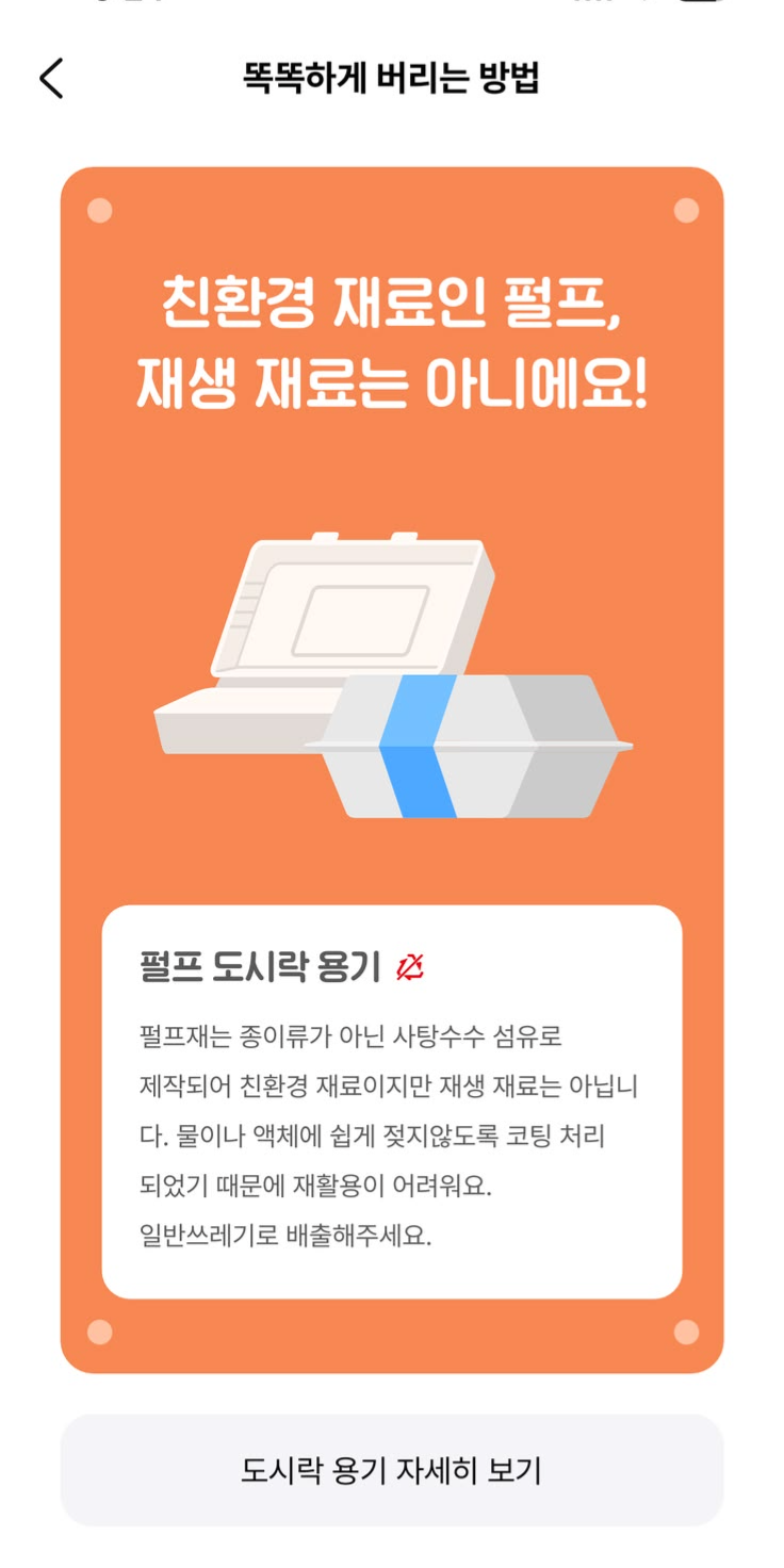
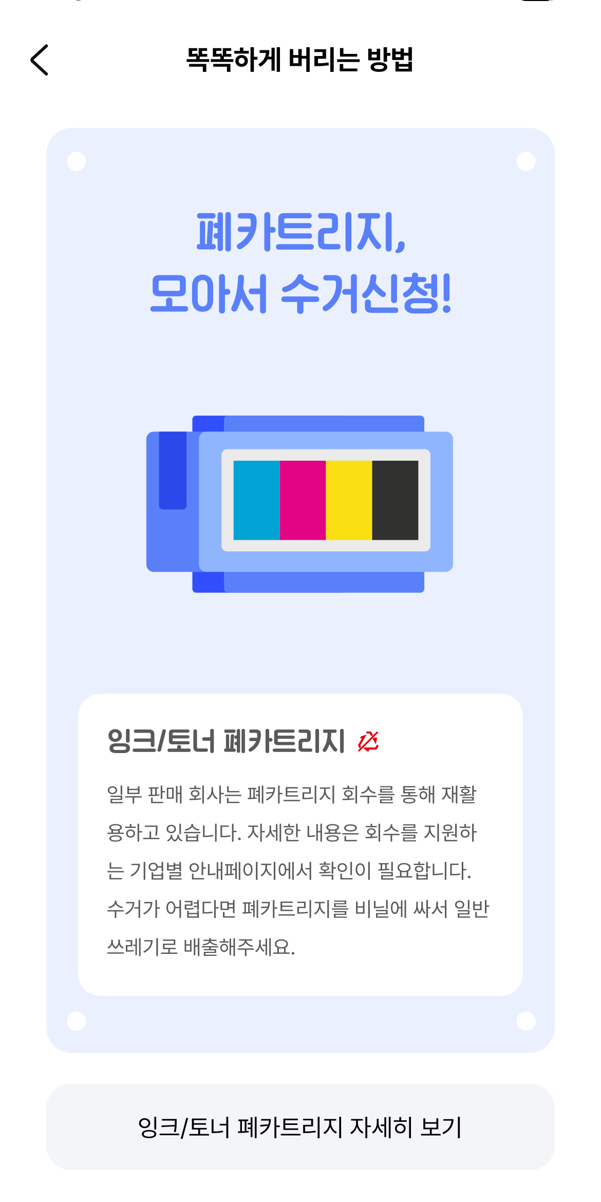
This is a clean, modern user interface design used to convey an important environmental warning regarding plastic recycling. The design uses a warm orange background paired with crisp white and blue accents to ensure high contrast and readability for the cautionary message.
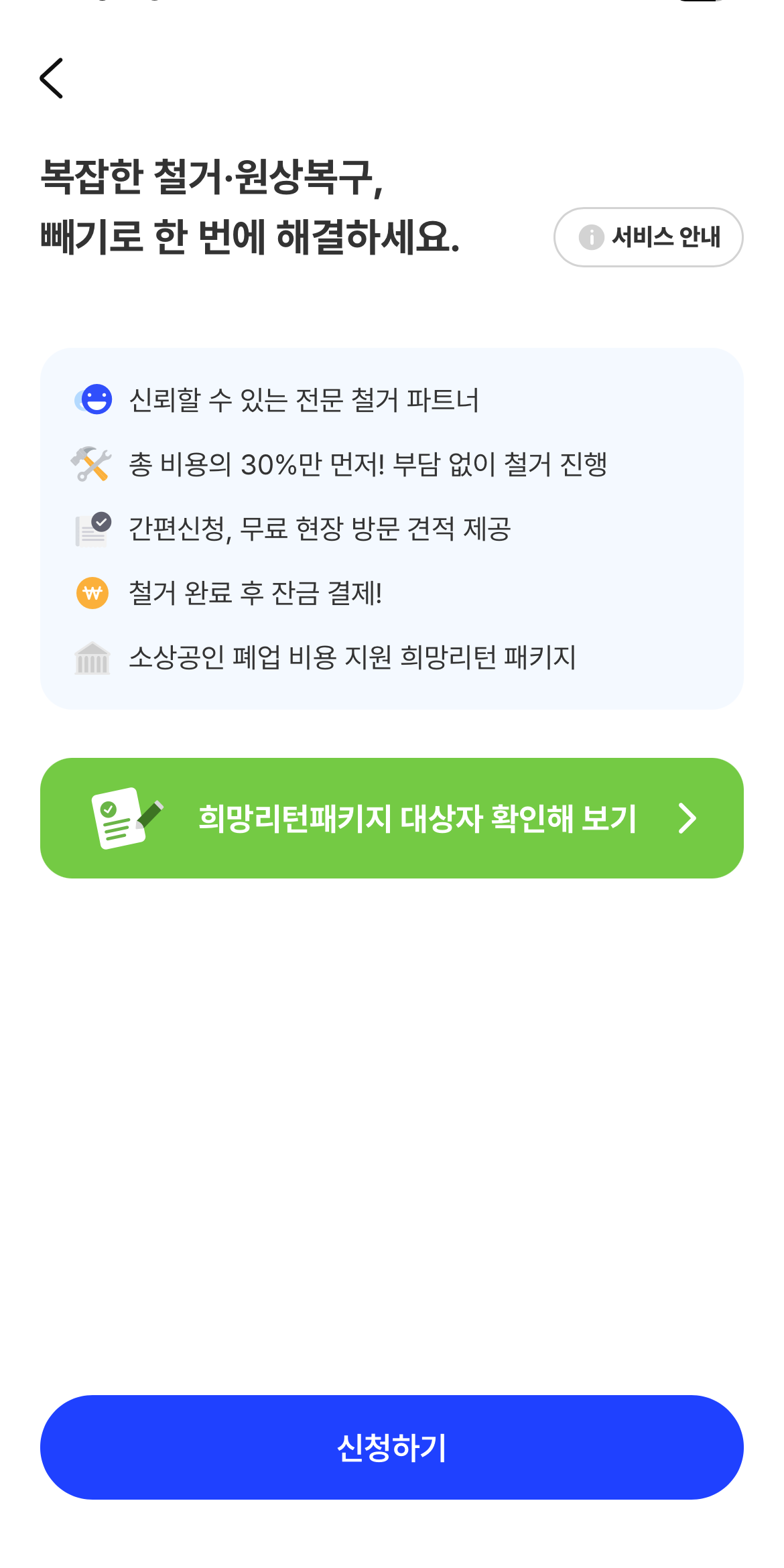
The design features a clean, highly functional mobile interface utilizing ample white space to present service information clearly. The visual language is professional and direct, employing a simple hierarchy with distinct color accents to guide the user toward key actions. The overall feel is trustworthy and efficient, prioritizing ease of understanding for complex services.
This interface features a clean, light blue background with clear white typography, employing a modern flat design aesthetic to convey important informational content. The visual language is highly organized, using simple icons and stacked text to guide the user through a process.
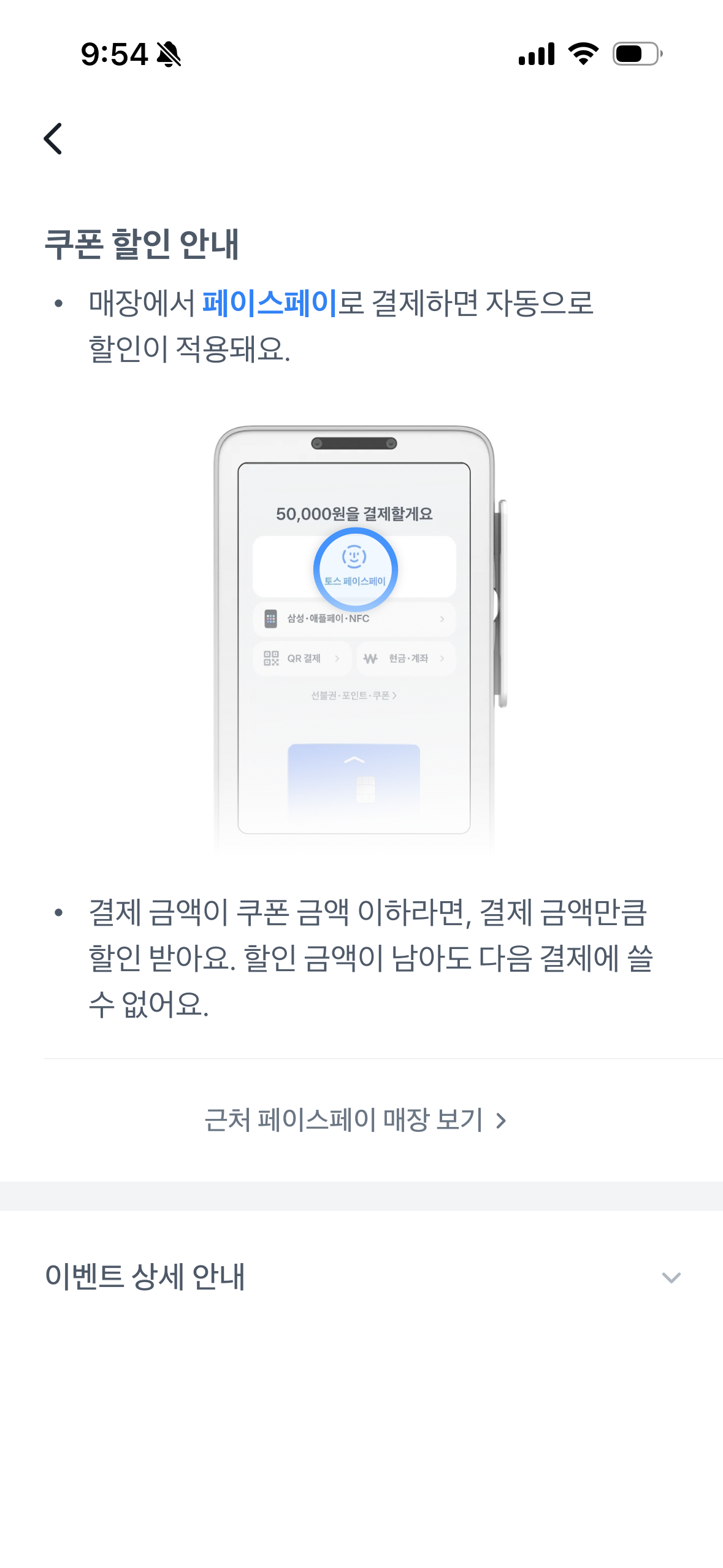
The design employs a clean, minimalist aesthetic typical of mobile application notifications, prioritizing clear communication regarding promotional terms. The visual language is highly functional, using ample white space to ensure the instructional text and key information are easily digestible. The overall feel is professional, trustworthy, and straightforward.
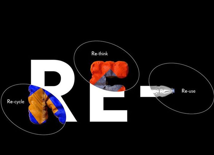
This is a clean, conceptual design piece utilizing bold typography to represent the principles of sustainability (Reduce, Reuse, Recycle). The visual language is minimalist and educational, using distinct color accents to illustrate each concept clearly against a stark black background.
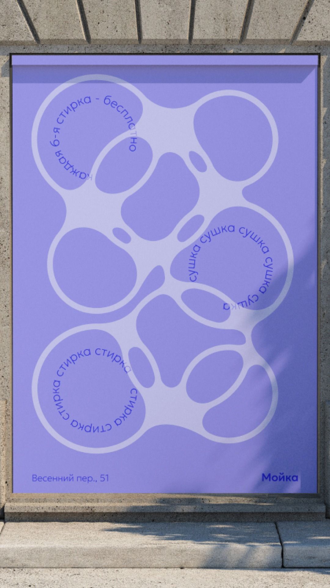
This design utilizes a clean, minimalist approach with soft, organic shapes to convey informational content clearly. The visual language relies heavily on negative space and a limited color palette to create a calm and approachable aesthetic. The composition is balanced, guiding the viewer's eye through the various illustrated elements.
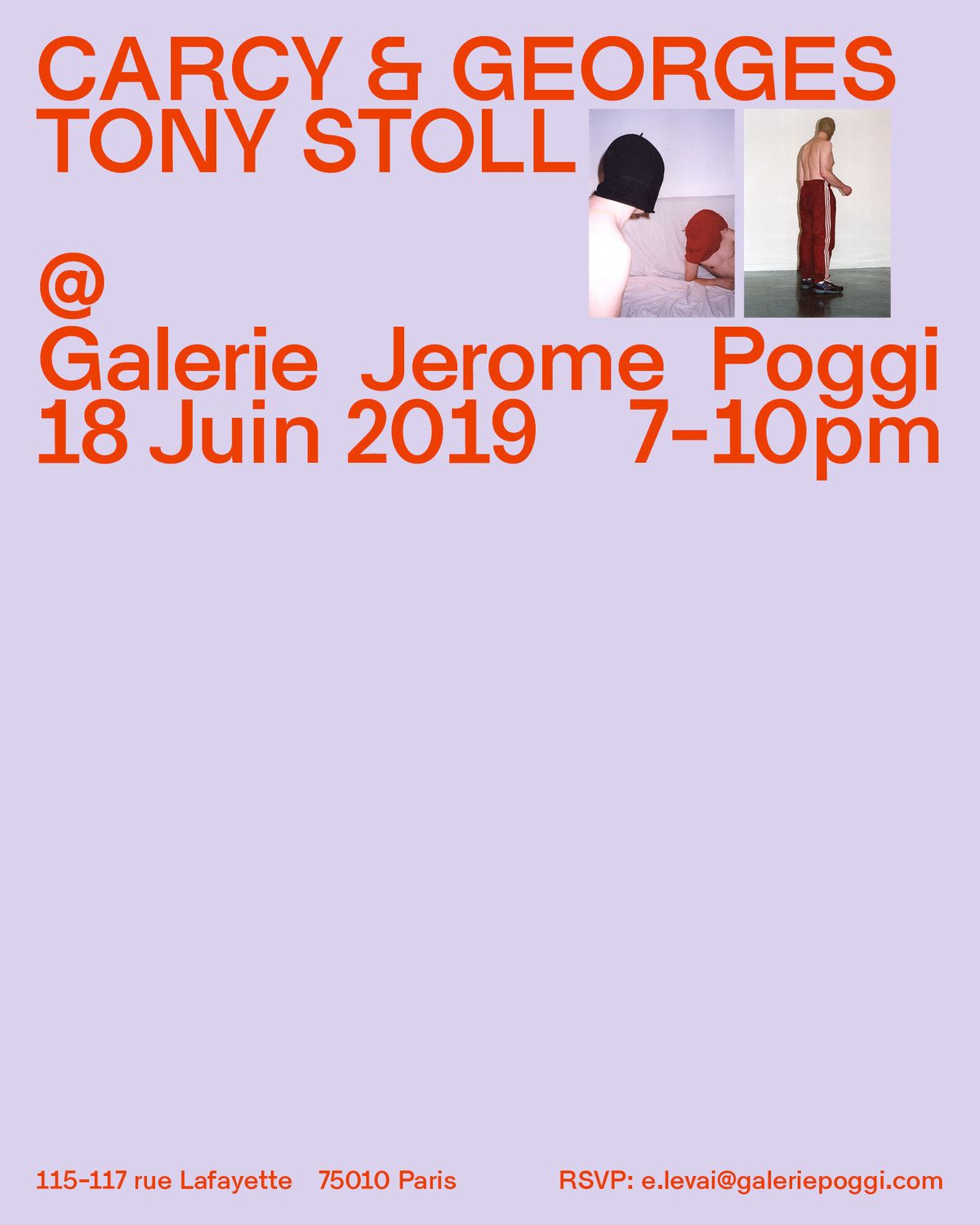
This is a clean, typographic promotional graphic utilizing high contrast between bright orange text and a soft lavender background. The design is highly structured, prioritizing clear hierarchy for artist names, event details, and contact information.