functional ui
10 designs
Showing 10 of 10 (10 total)
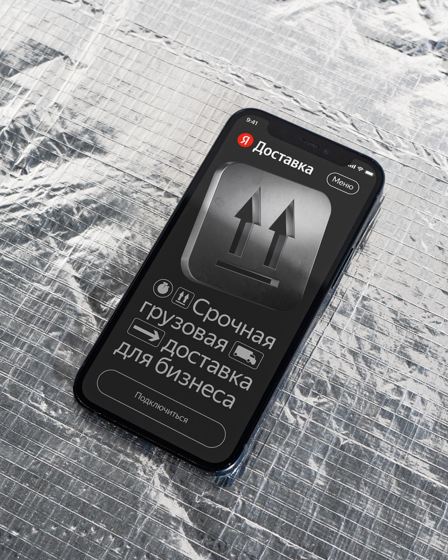
This interface utilizes a clean, high-contrast dark mode design to present a professional service offering. The visual language is direct and functional, prioritizing key actions like urgent cargo delivery through clear iconography and concise text. The overall feel is modern, serious, and focused on immediate business utility.
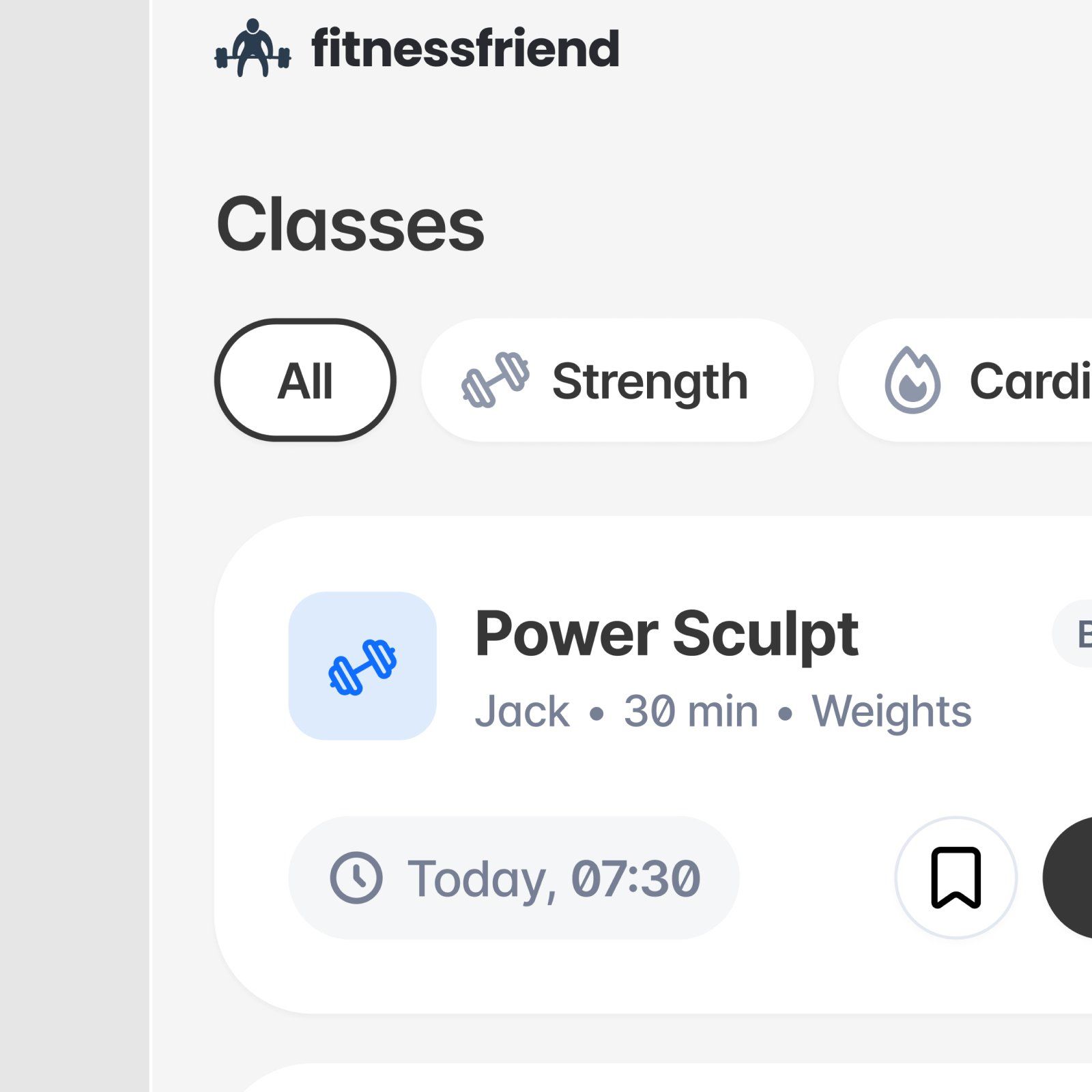
This is a clean, functional user interface design characterized by ample whitespace and clear information hierarchy. The visual language is modern and relies on simple iconography and subtle grays to present fitness class details in an organized manner.
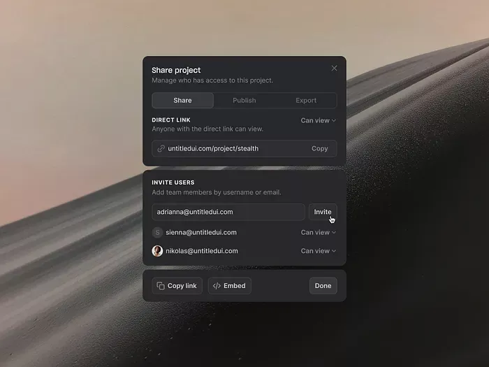
This interface utilizes a clean, functional dark mode design with high contrast to prioritize user actions and clarity. The visual language is minimalist and professional, relying on subtle shading and clear typographic hierarchy to guide the user through project sharing options.
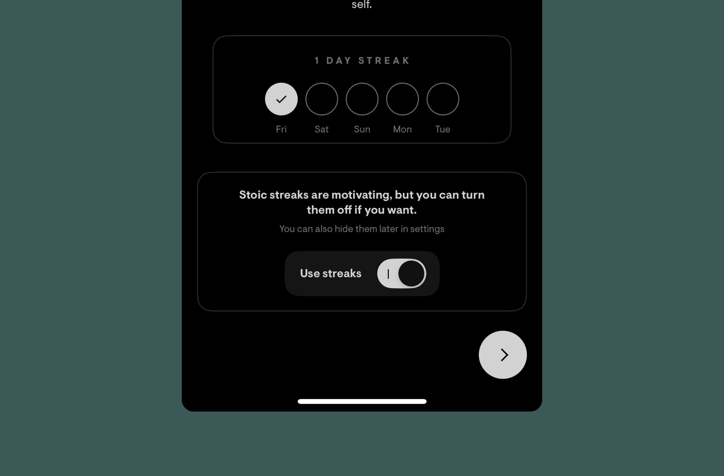
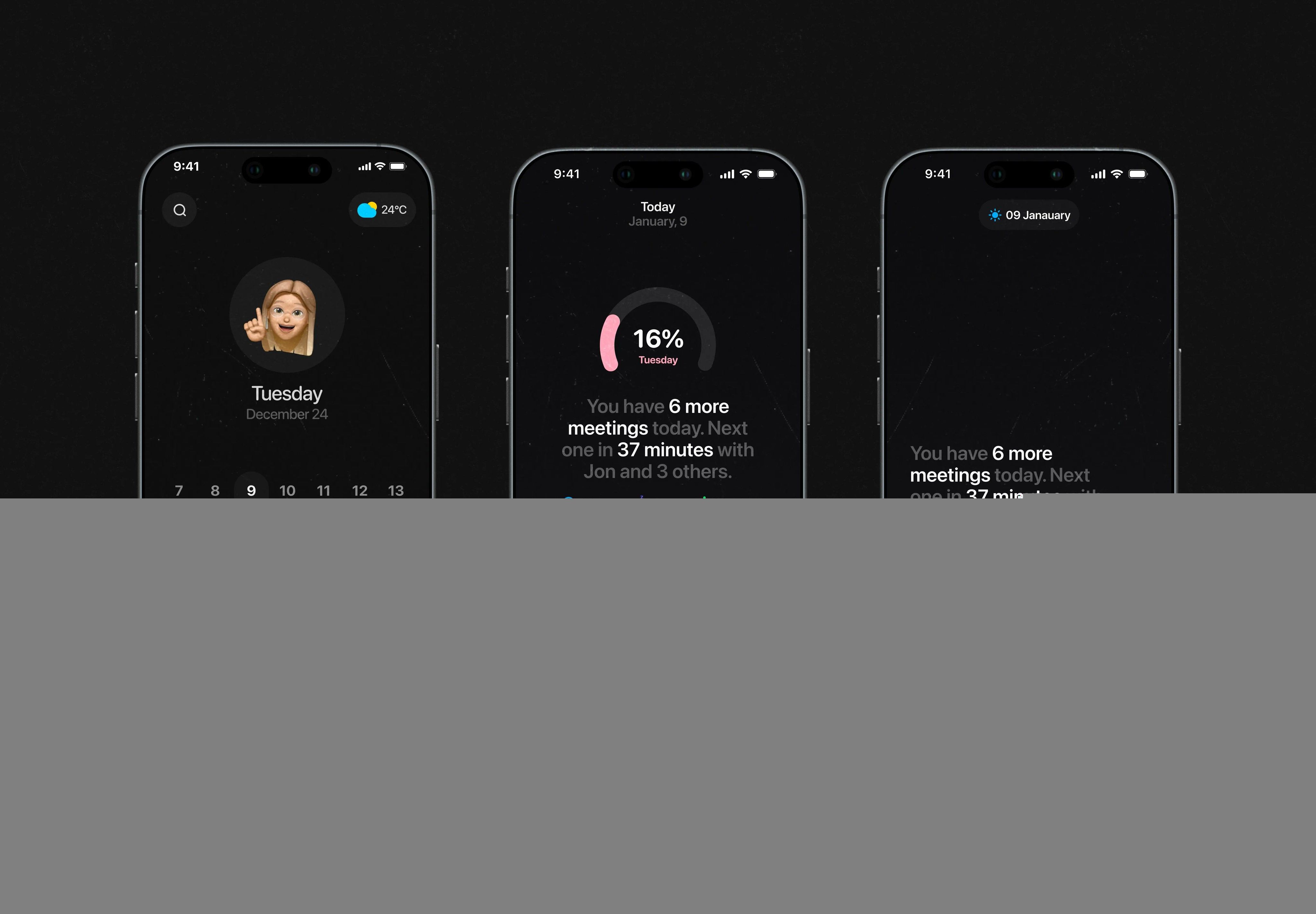
This design utilizes a clean, dark-mode aesthetic to present tracking data and user controls. The visual language is highly functional, employing subtle spatial organization and clear typography to guide the user through streak information and toggles. The overall feel is calm, organized, and focused on productivity metrics.
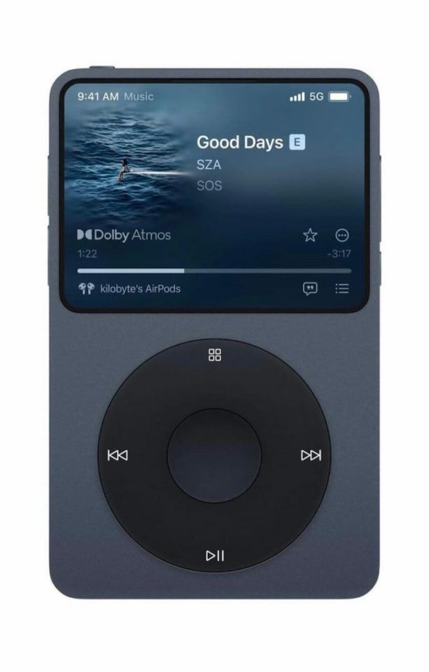
The interface exhibits a modern, dark mode aesthetic characterized by clean lines and sufficient negative space. The design successfully blends functional digital controls with a tactile physical element, suggesting a premium and cohesive user experience.
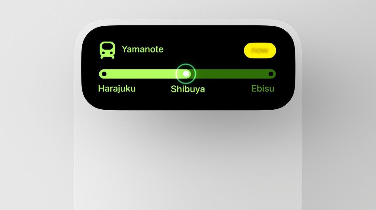
This interface features a clean, modern UI design utilizing high contrast and simple graphic elements to convey route information efficiently. The visual language is minimalist, relying on negative space and clear color coding to guide the user through a selection process.
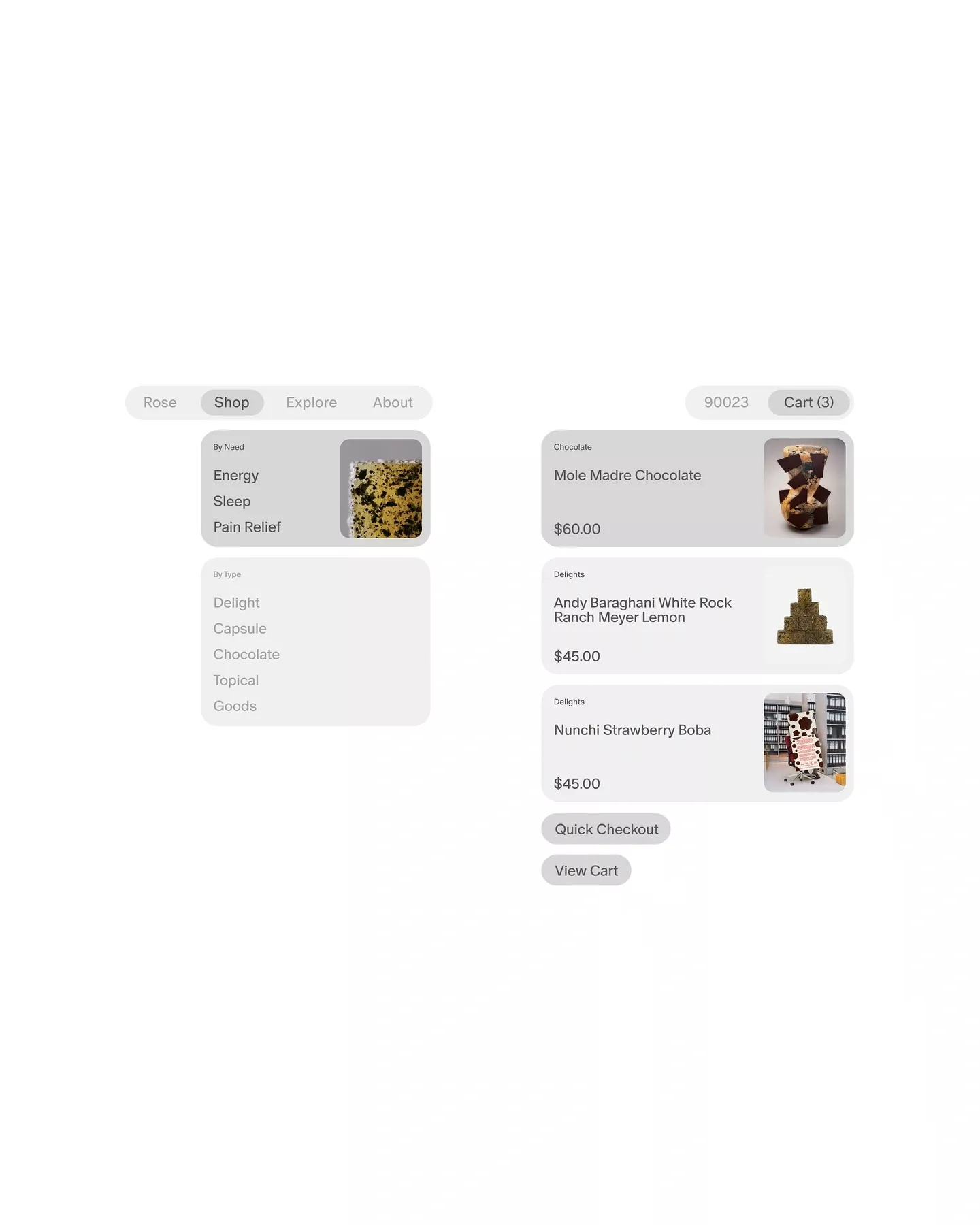
The design employs a clean, minimalist aesthetic utilizing ample white space to ensure clarity and focus on product information. The visual language is modern and functional, using a structured card layout to organize diverse products effectively for easy browsing. The overall feel is professional and inviting, emphasizing ease of navigation.
The design utilizes a clean, dark aesthetic with high contrast to present data clearly. The visual language is minimalist and functional, emphasizing information hierarchy through simple typography and card layouts suitable for a productivity application.
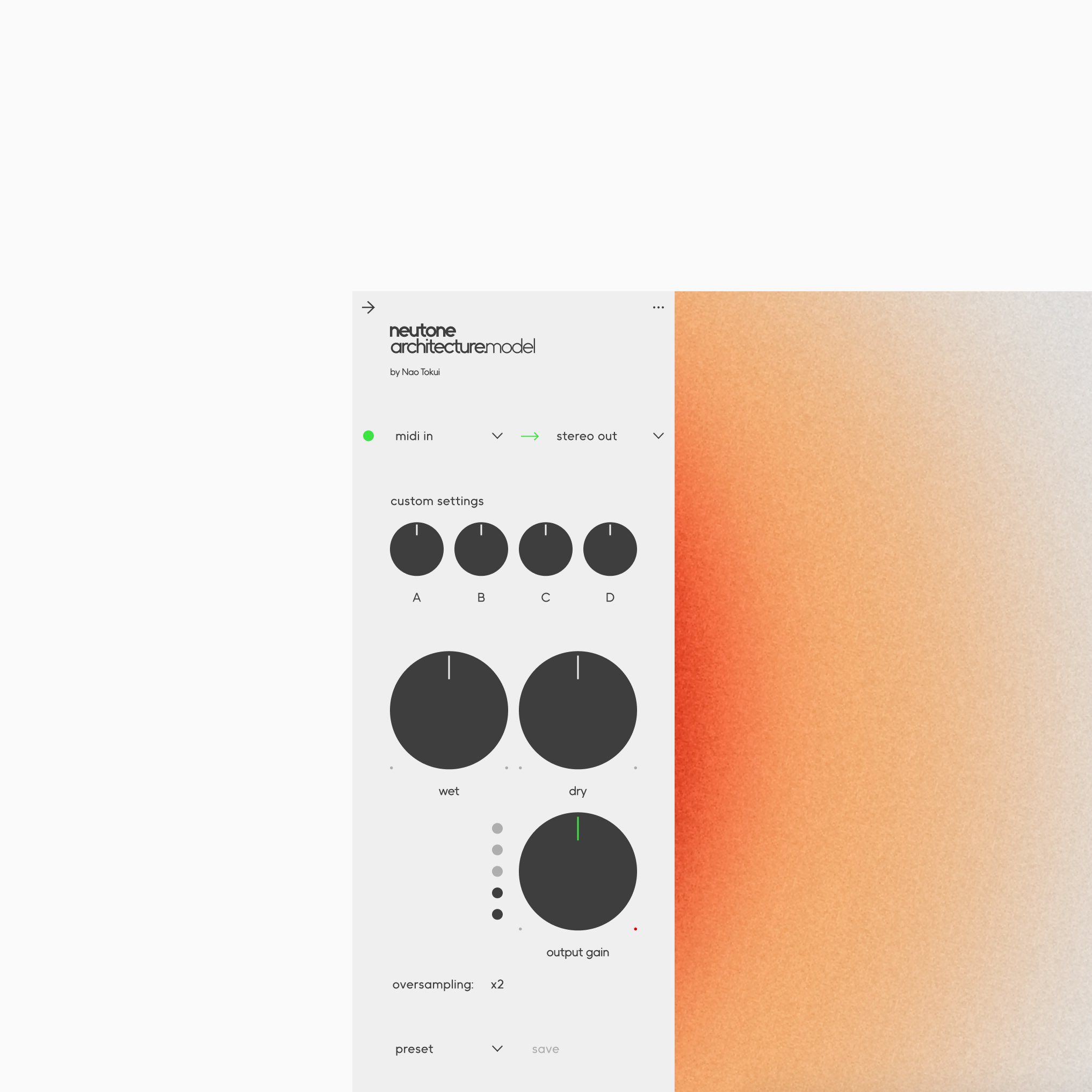
This interface exhibits a clean, functional modern design, utilizing soft gradient colors and clear typography to organize complex technical settings. The visual language prioritizes usability, using simple geometric shapes and strong vertical alignment to create a structured and professional experience.
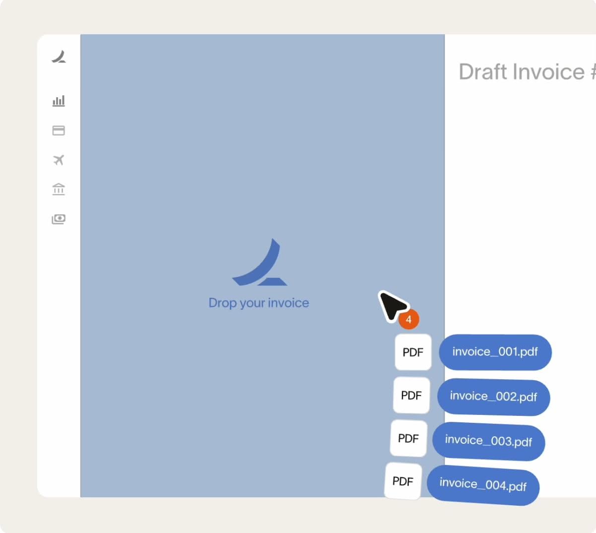
This interface exhibits a clean, minimalist design focused entirely on functional clarity and user workflow. The visual language relies heavily on muted tones and ample whitespace to ensure that the core action—dropping an invoice—is the primary focus. The overall feel is professional, calm, and highly organized.