emblem
12 designs
Showing 12 of 12 (12 total)
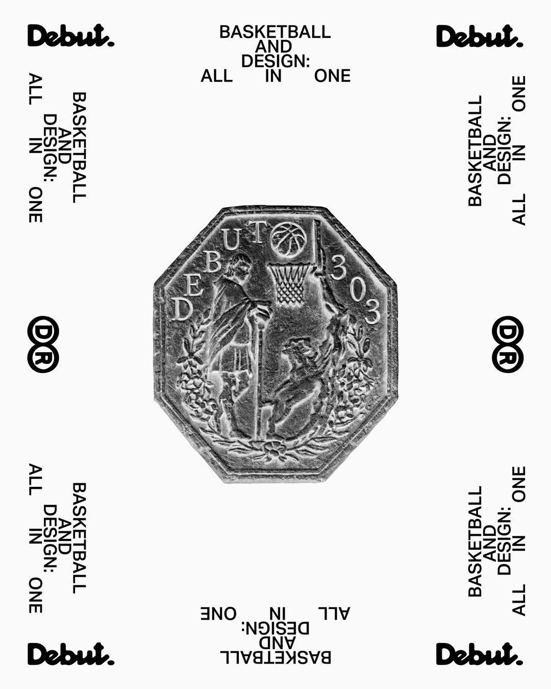
This image presents a highly detailed, monochromatic emblem or seal design, likely intended for a debut or inaugural product/brand. The visual language is classical and heraldic, utilizing intricate engraving to convey a sense of heritage and established quality. The overall feel is formal, traditional, and authoritative.
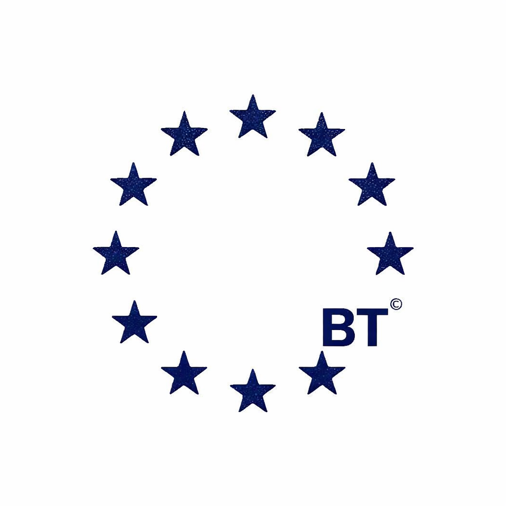
The image features a minimalist, circular arrangement of dark blue stars forming a wreath or border around the initials 'BT'. The design is clean, symmetrical, and uses negative space effectively to create a balanced emblem.
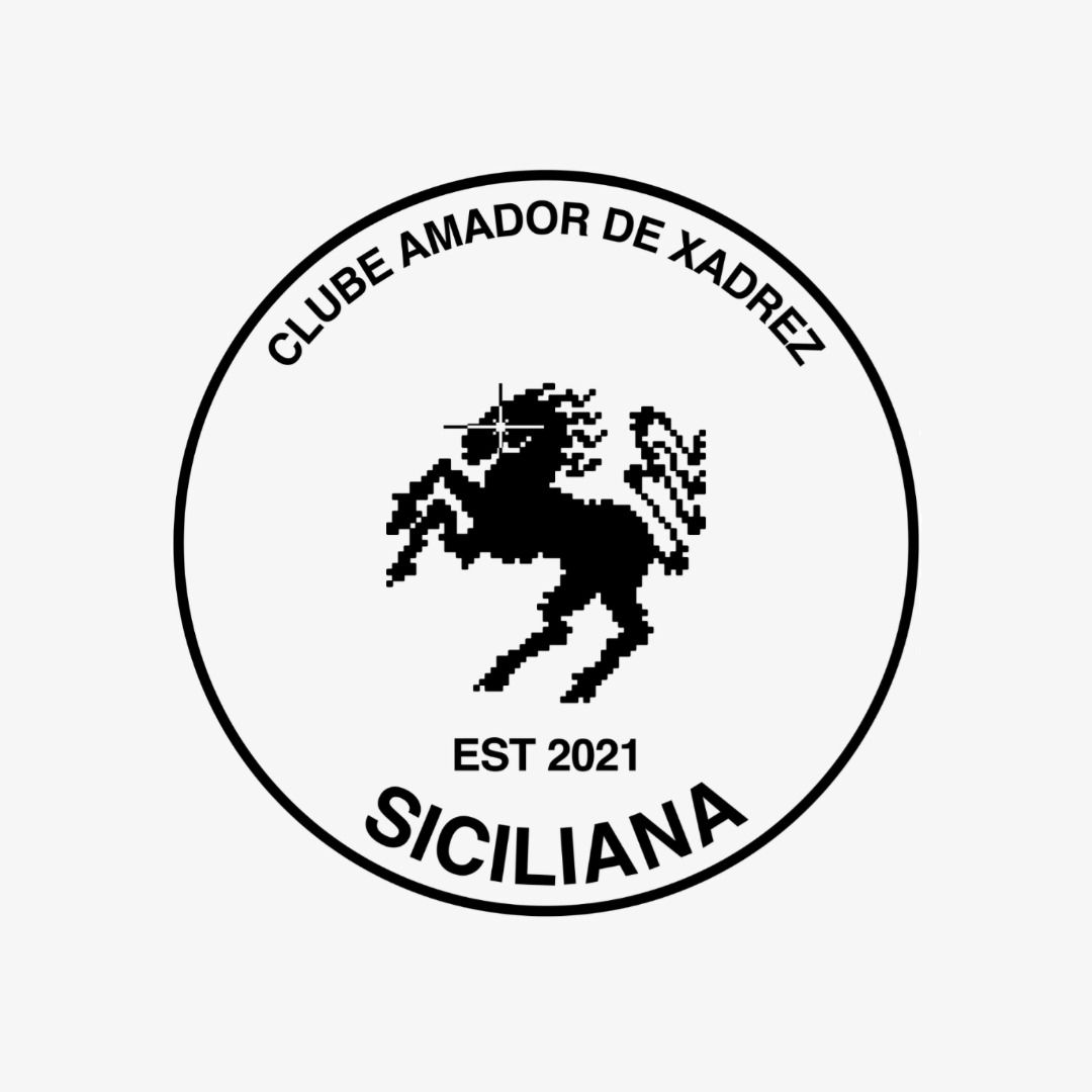
This is a circular emblem featuring a silhouette of a horse, likely representing a club or organization, set against a stark black and white background. The design is clean, symbolic, and conveys a sense of tradition or heritage through its simple, bold graphic elements.
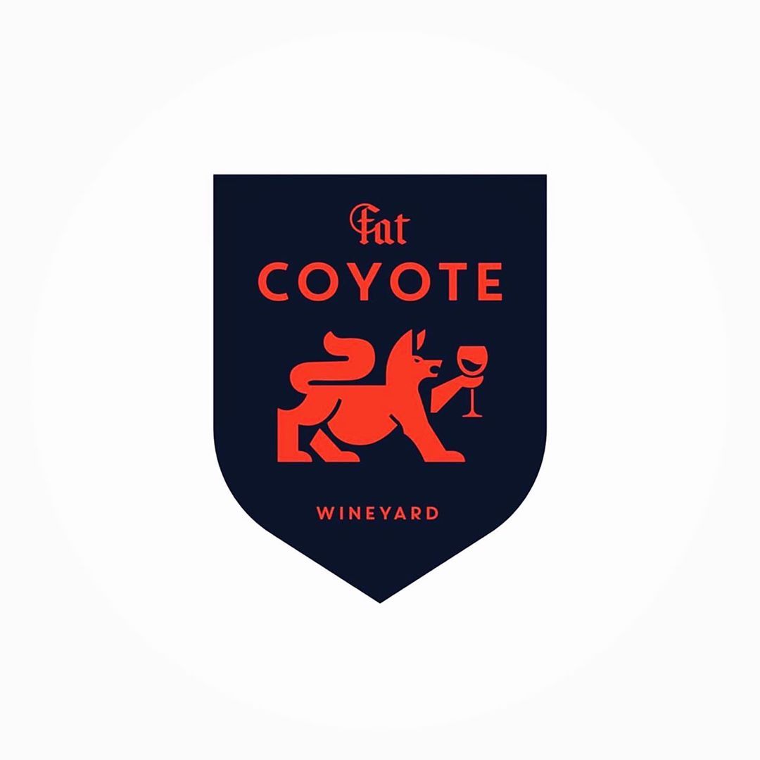
This is a classic, heraldic-inspired logo featuring a stylized silhouette of a coyote within a shield shape. The design uses strong, high-contrast colors to convey a sense of established quality and rustic elegance.
This logo features a classic emblem style, using three overlapping circles to create a monogram for the acronym GRC. The design is clean, balanced, and relies on strong negative space to convey a sense of established tradition and professionalism.
This design utilizes a clean, minimalist aesthetic combined with vintage line art to establish a cohesive brand identity. The visual language is simple and direct, relying on strong silhouettes and geometric framing to create a sense of heritage and craftsmanship.
This is a strong, classic emblem featuring the word 'MAGILL' stylized within an arrowhead shape. The design utilizes a grounded, traditional aesthetic with rich maroon tones set against a muted neutral background, conveying a sense of establishment and collegiate heritage.
This logo utilizes a classic emblem design to convey trust and quality assurance. The clean lines and simple typography create a professional, timeless aesthetic suitable for branding in the food or agricultural sector.
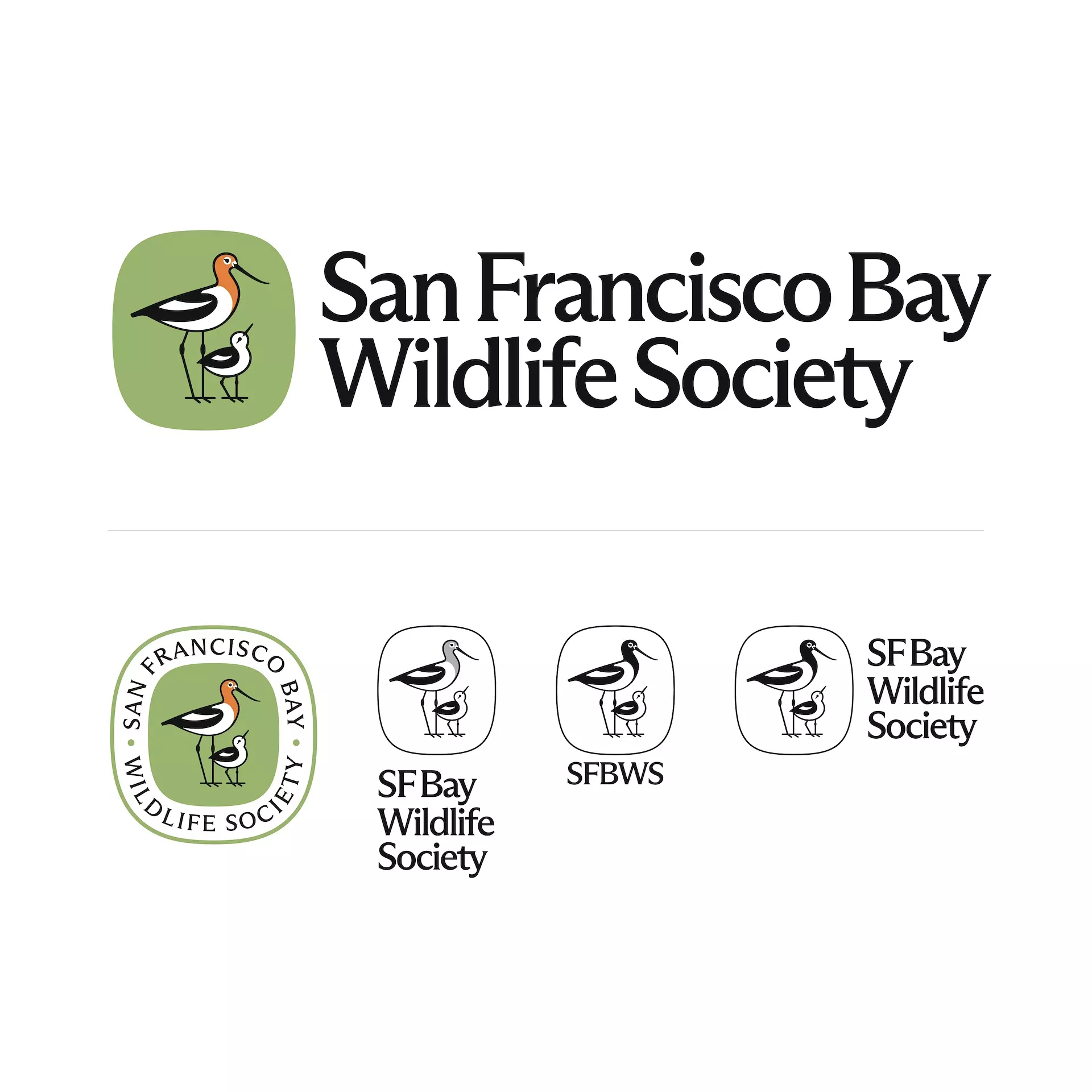
This branding utilizes a clean, minimalist approach combining simple line art illustrations with clear typography to convey a professional and nature-focused message. The visual language is balanced, emphasizing both the organization's name and its core subject matter through distinct icons and seals.

This image presents a minimalist graphic emblem characterized by precise geometric line work, combining a radiating circular motif with a linear element below. The design utilizes high contrast and clean lines to create a sense of elegance and structure.
This is a clean, classic emblem design utilizing a circular badge format to convey official status and tradition. The visual language relies on strong contrasts between deep blue, black, and white to create a robust and established brand identity. The design effectively merges heraldic elements with clear textual information.
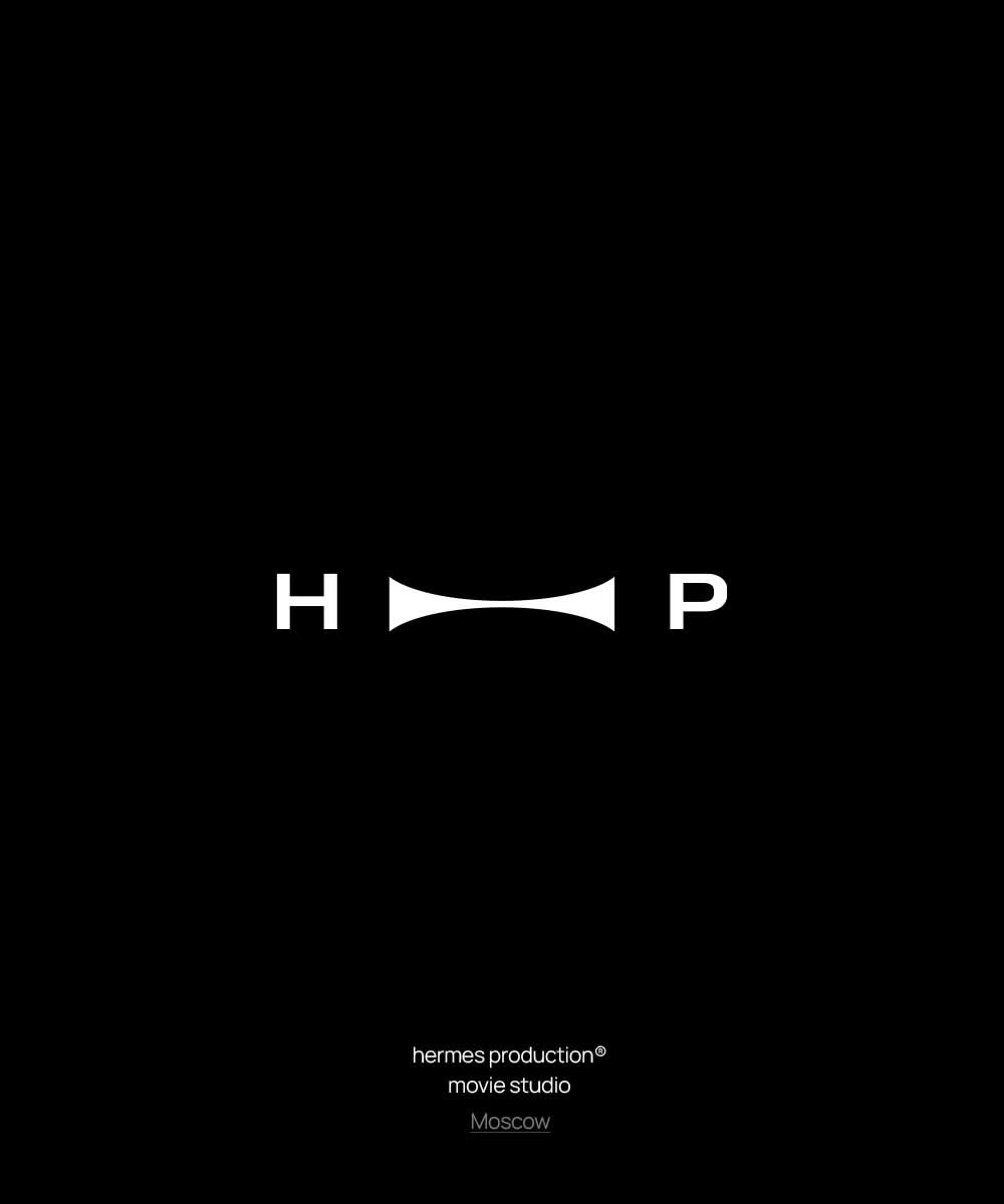
Hermes Production logo and branding materials featuring circular emblem with film reel aesthetic and typography