dashboard ui
5 designs
Showing 5 of 5 (5 total)
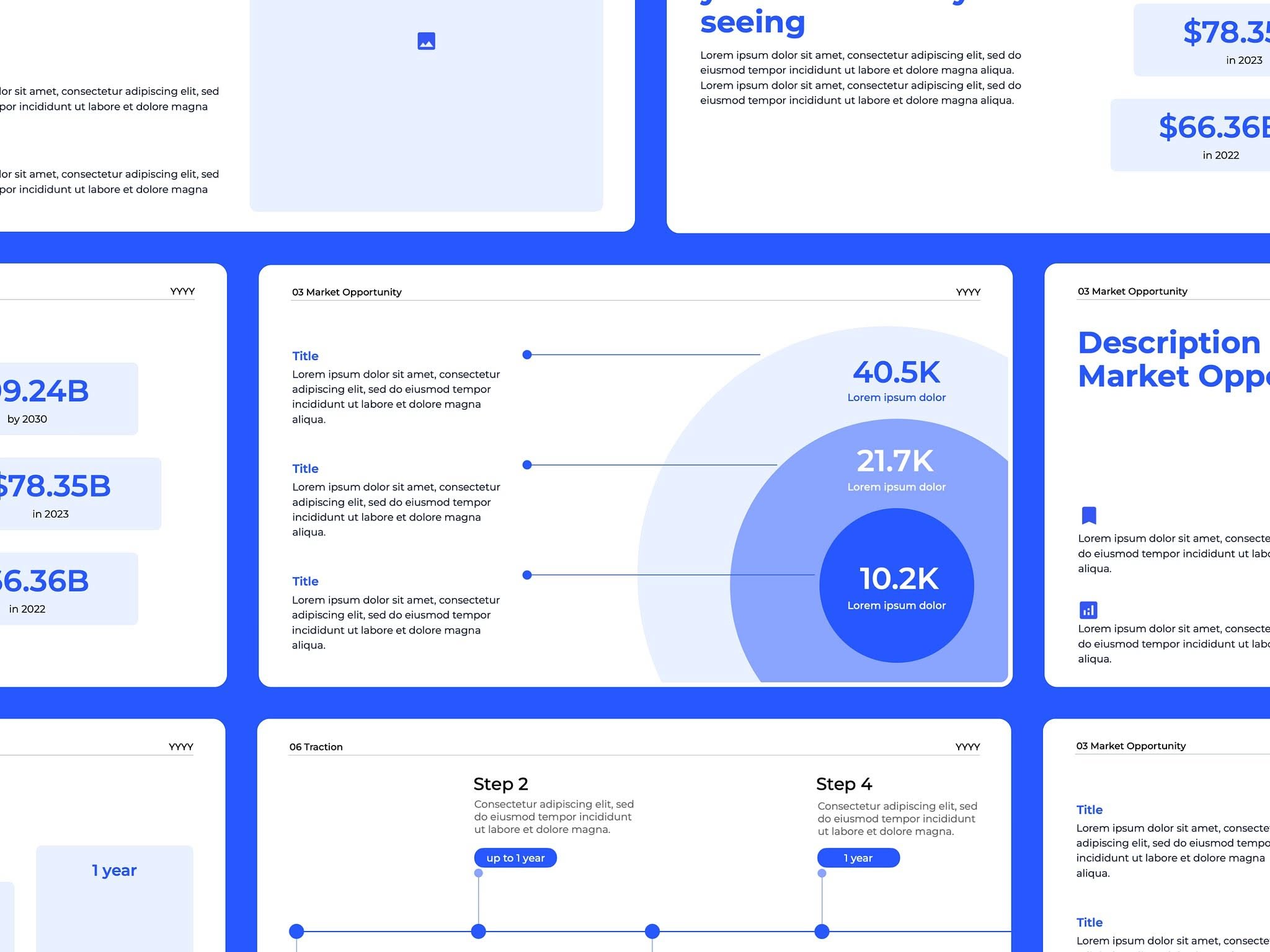
This collection showcases a clean, modern user interface focused heavily on data visualization and metric display. The design utilizes clear segmentation and circular charts to present complex information in an easily digestible format, emphasizing clarity and professionalism.
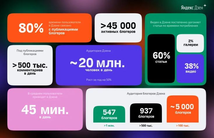
This is a highly structured data visualization dashboard utilizing bold color blocking and clear typography to present statistical information. The design employs a modern flat aesthetic, prioritizing readability and the immediate comprehension of large metrics.
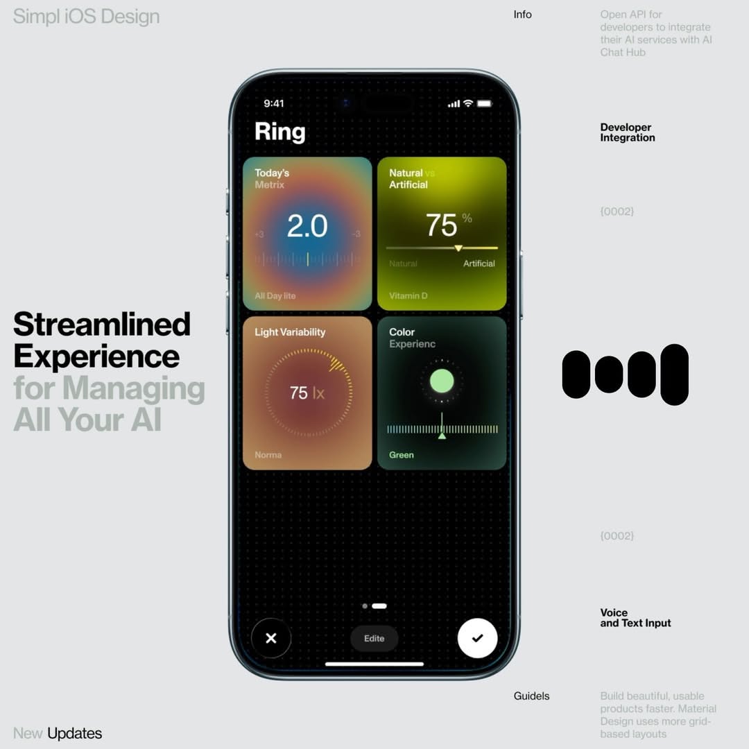
A modern iOS app interface showcasing a minimalist dashboard for AI management with a dark theme and vibrant gradient cards. The design emphasizes clean typography, intuitive navigation, and a sophisticated color-blocked layout that balances visual hierarchy with functional clarity.
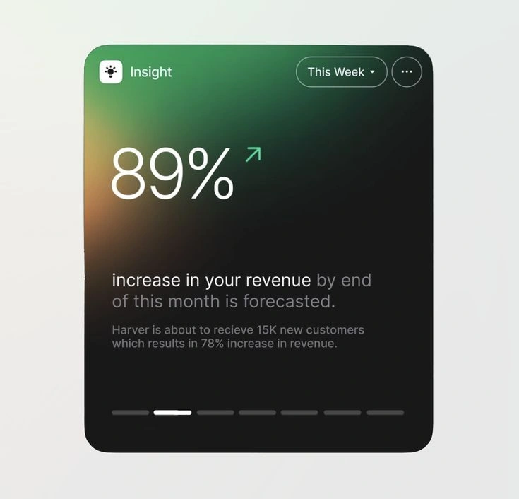
This design employs a modern dark mode aesthetic, utilizing subtle gradients to create depth and focus attention on key performance metrics. The layout is clean and card-based, prioritizing data clarity through high contrast and simple typography.
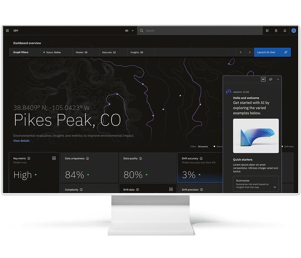
This dashboard features a clean, dark-mode interface optimized for displaying complex geospatial and environmental metrics. The design utilizes clear hierarchy, combining a topographical map with distinct metric cards to provide immediate analytical insights into the selected location. The visual language is professional, sparse, and highly focused on data readability.