dark mode
591 designs
Showing 24 of 591 (591 total)

This image showcases a modern mobile banking interface, emphasizing clean data presentation within a sophisticated dark aesthetic. The visual language successfully blends complex financial information with a sleek, high-contrast digital experience.

This design utilizes a dark mode aesthetic with vibrant green accents to present complex data in a clean, corporate manner. The visual language is highly structured and emphasizes clarity and professionalism through strong typography and organized card layouts.

This interface demonstrates a clean, highly functional mobile design utilizing a dark theme to emphasize content clarity and security. The visual language is minimalist, relying on ample negative space and clear hierarchy to guide the user through saved cards and transaction history. The overall feel is professional, organized, and trustworthy.
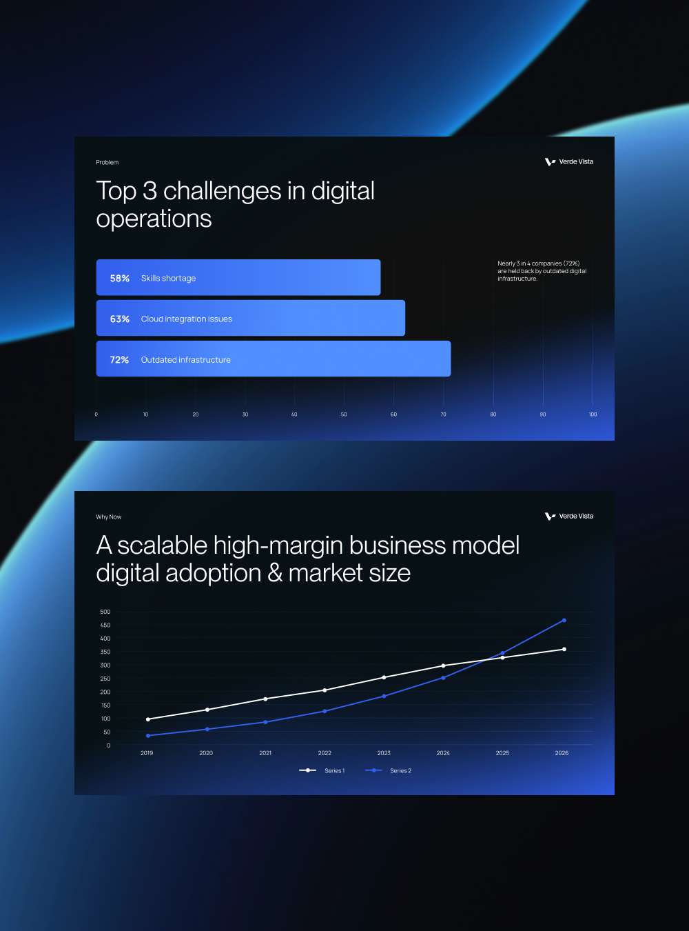
This image presents two distinct data visualizations set against a deep blue background, emphasizing corporate and analytical reporting. The design utilizes clear bar charts and line graphs to communicate complex business challenges and growth trends effectively.
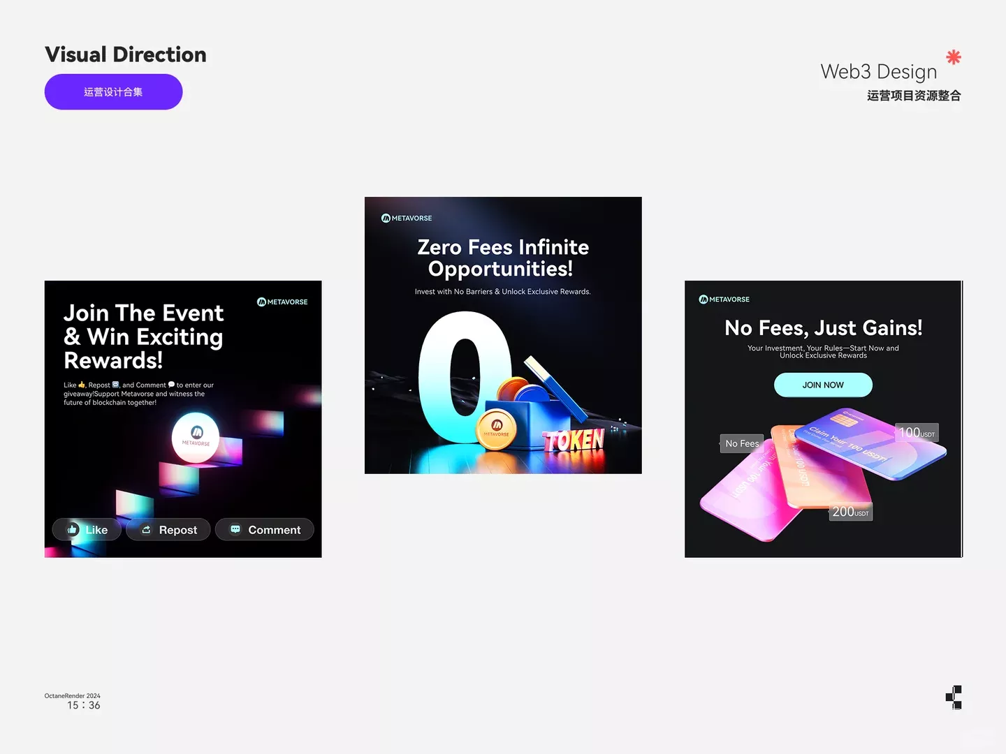
This design utilizes a dark, high-contrast aesthetic typical of Web3 and crypto promotions, employing vibrant neon accents against a deep black background to convey innovation and opportunity. The visual language is modern, sleek, and focused on financial gain and exclusive rewards.
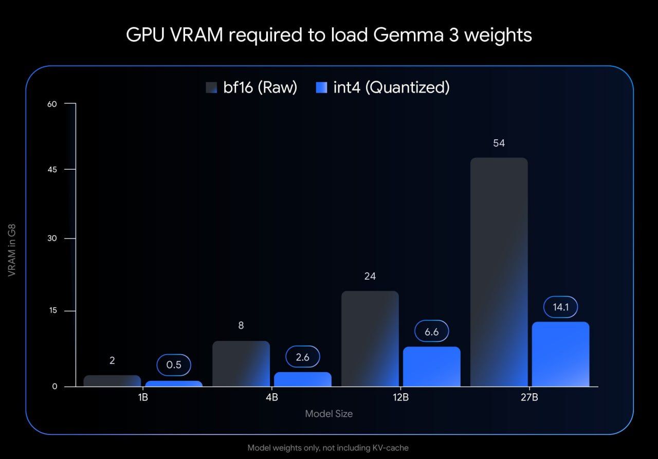
This is a data visualization presenting the required GPU VRAM for loading different sizes of Gemma 3 weights, comparing raw (bf16) and quantized (int4) versions. The design is functional and stark, focusing purely on comparative performance metrics.
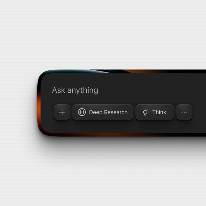
This interface design utilizes a dark, glossy aesthetic to convey sophistication and focus. The visual language is clean and modern, emphasizing functionality through clear icons and minimal text. It successfully creates a premium feel suitable for advanced search or AI applications.
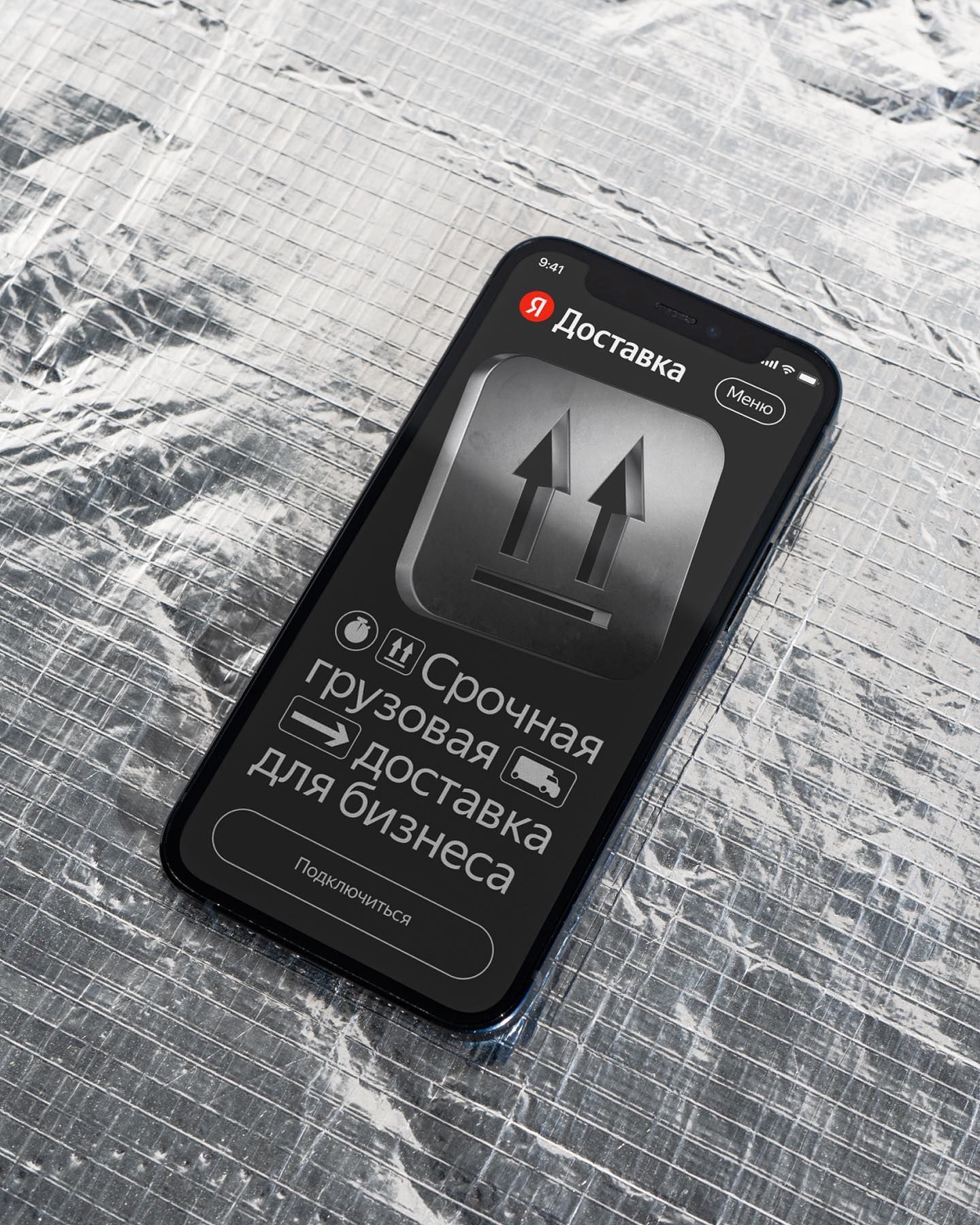
This interface utilizes a clean, high-contrast dark mode design to present a professional service offering. The visual language is direct and functional, prioritizing key actions like urgent cargo delivery through clear iconography and concise text. The overall feel is modern, serious, and focused on immediate business utility.
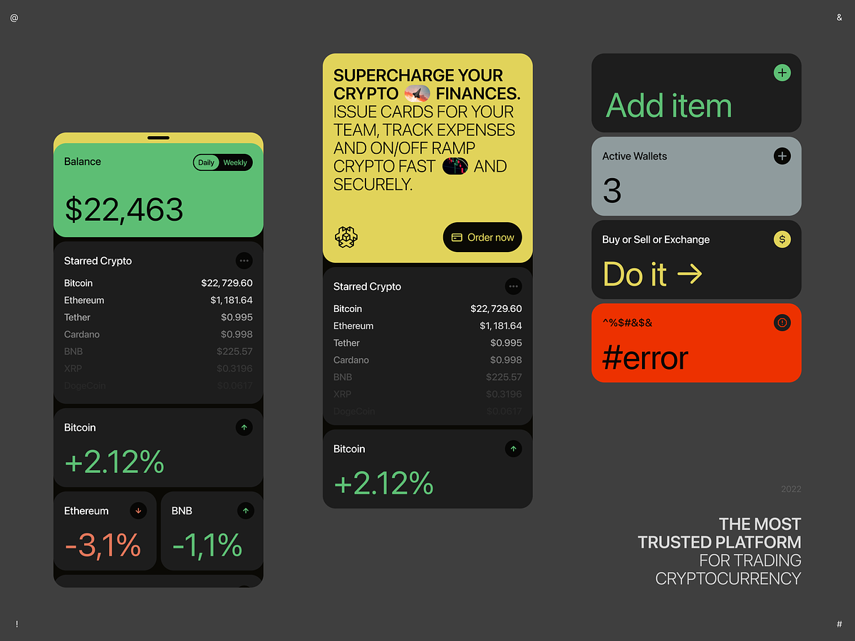
This interface presents a dense, data-rich view typical of a cryptocurrency trading platform, utilizing a dark mode aesthetic with high-contrast accent colors. The design prioritizes readability and immediate presentation of financial metrics.
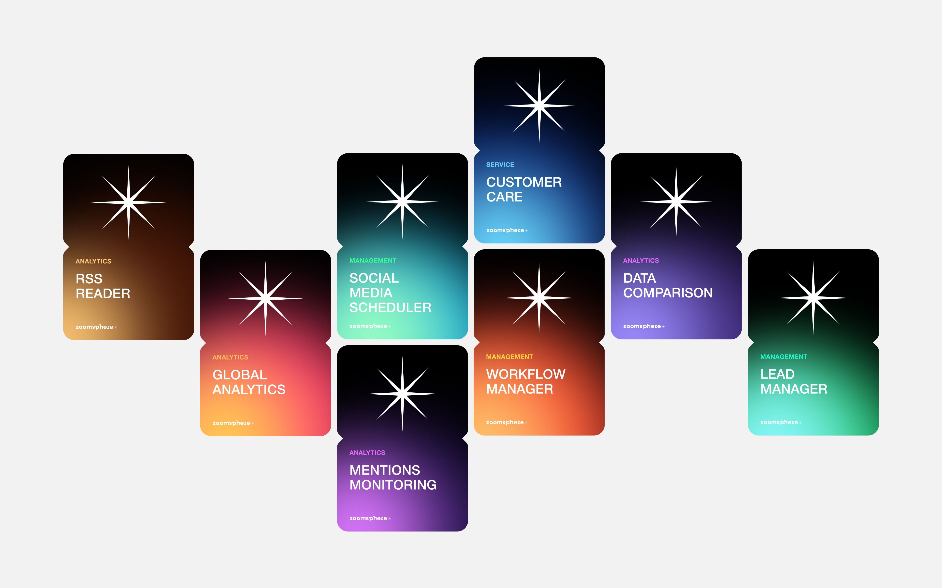
This design utilizes a dark, modular aesthetic to present various analytical tools or services. The visual language is clean and modern, relying on distinct blocks of color to differentiate functional modules while maintaining a consistent starburst icon motif.
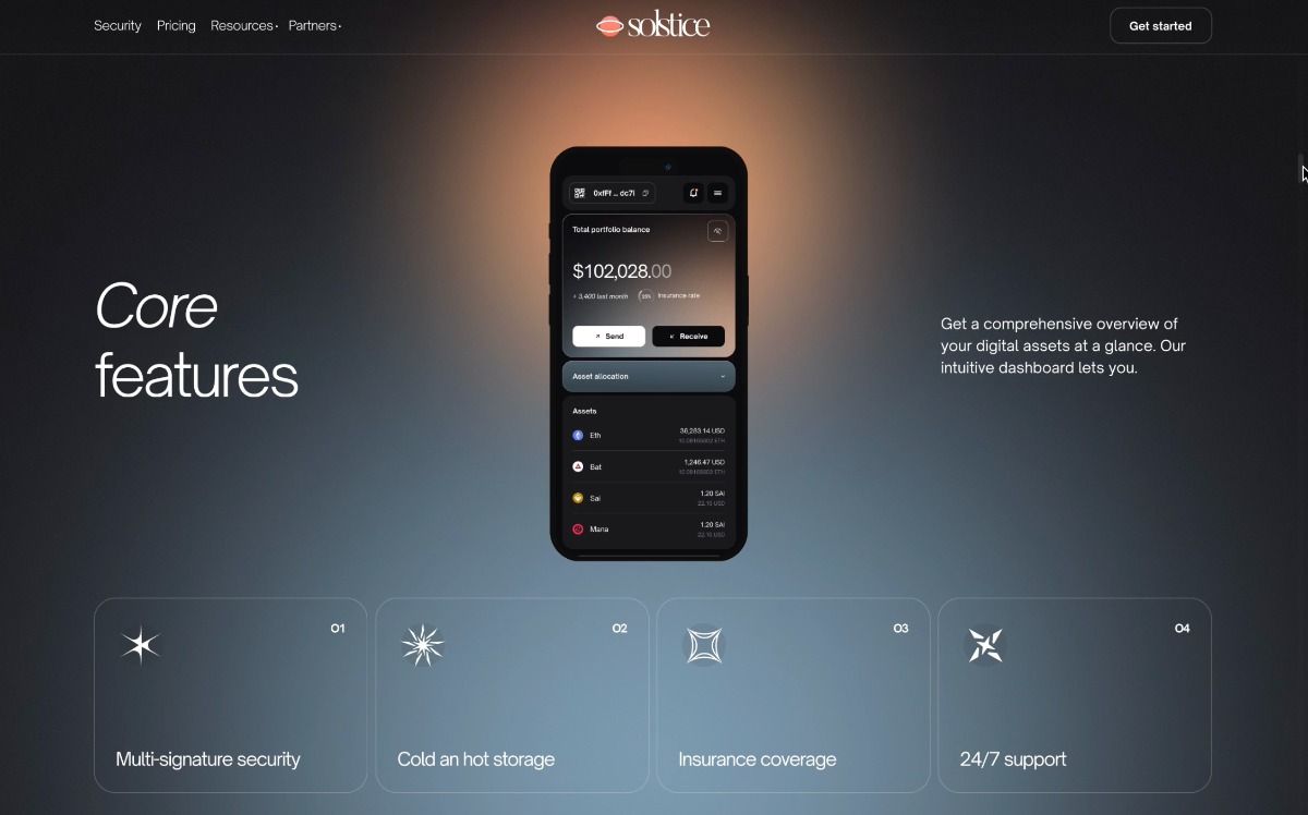
This design utilizes a sophisticated dark mode aesthetic, employing subtle gradients and high contrast to create a professional and secure feel. The visual language is clean and minimalist, focusing attention on key data points and feature cards through balanced spatial arrangement.
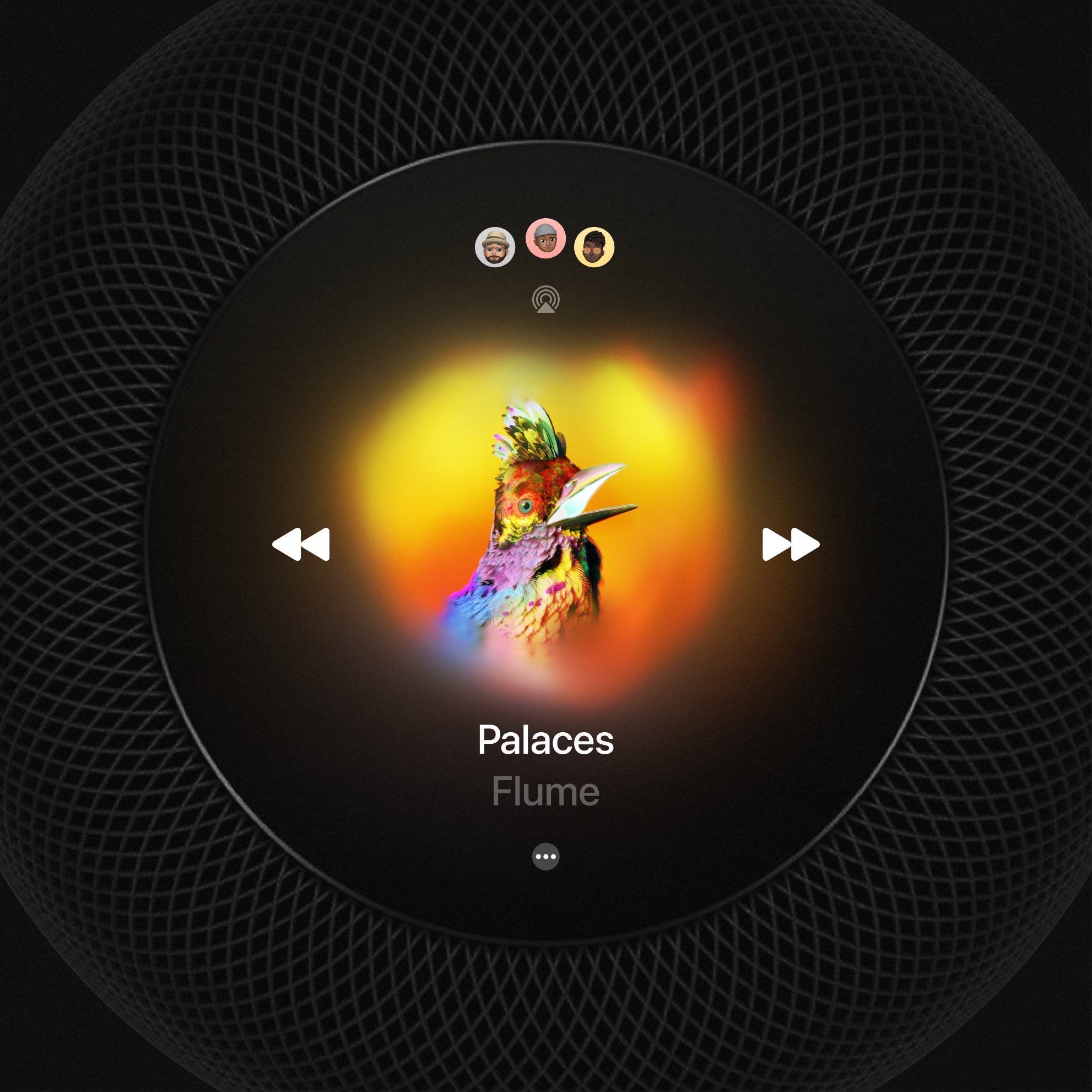
This design utilizes a high-contrast dark mode aesthetic, centering a richly textured, brightly lit bird against a deep void. The visual language is organic and immersive, using radial gradients to draw the viewer's eye directly to the focal point. The overall feel is vibrant, artistic, and deeply focused.
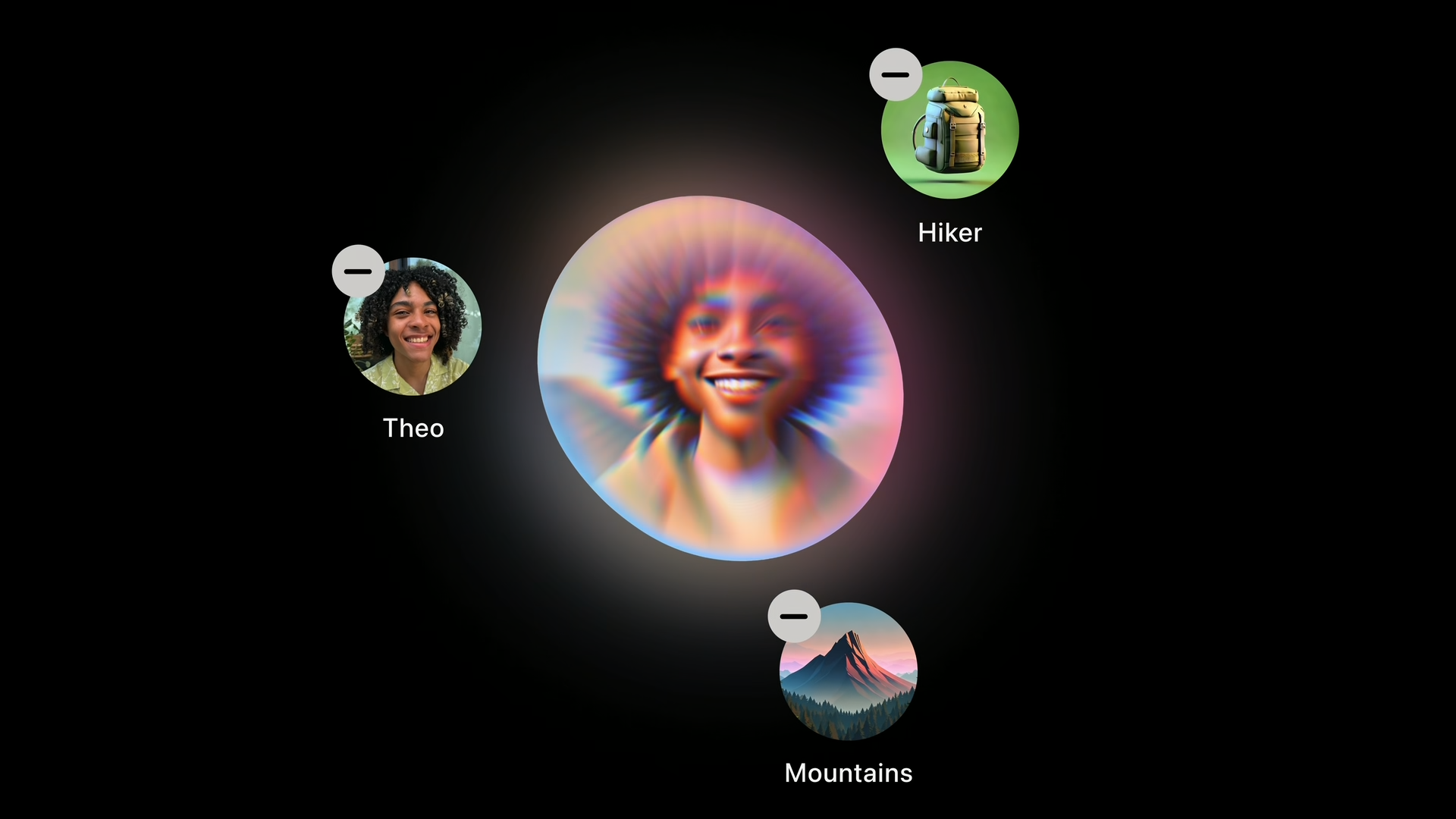
This design utilizes a dark, minimalist background to showcase various thematic icons and portraits contained within glowing circular frames. The visual language is clean and focused, using light effects to draw attention to the subjects against the deep void.

This design utilizes a stark, high-contrast approach, pairing deep indigo tones with crisp white typography to create immediate visual impact. The minimalist composition focuses entirely on the powerful, declarative text, establishing a serious and determined tone.
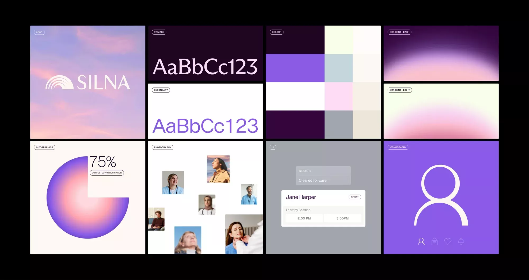
This collection showcases a modern and sophisticated UI design language characterized by soft gradients, deep purples, and clean white accents. The visual style balances abstract geometric shapes with clear functional elements like data visualization and user profiles, resulting in a polished and professional aesthetic.
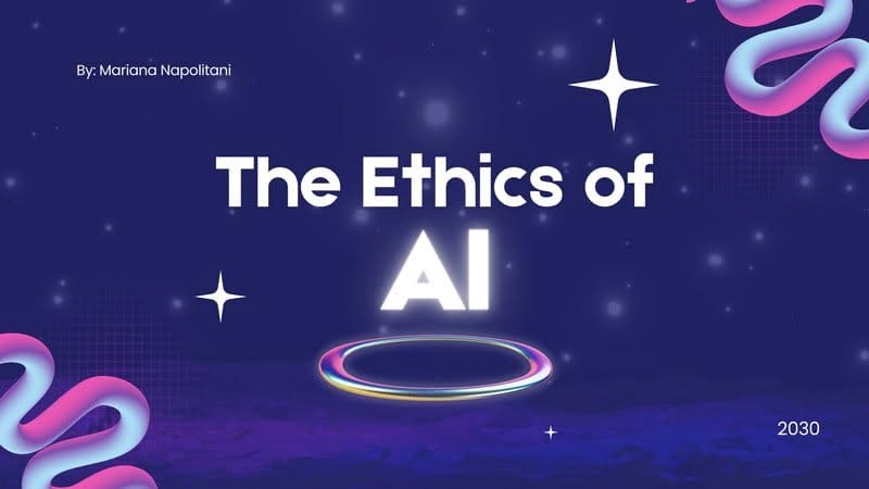
This graphic employs a deep, cosmic color palette to create a futuristic and serious tone suitable for academic or technological topics. The design balances dark backgrounds with bright, glowing typography and abstract swirling lines to suggest complexity and innovation.
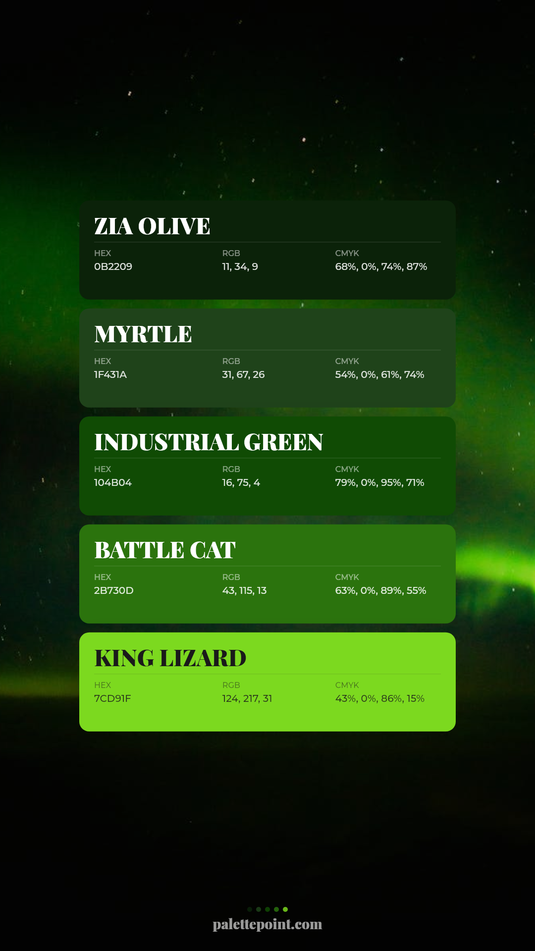
This design utilizes a dark, atmospheric background contrasted by vibrant, neon-like green blocks to present structured data. The visual language is clean and modern, relying heavily on high contrast and a monochromatic color scheme to create a technical yet striking aesthetic.
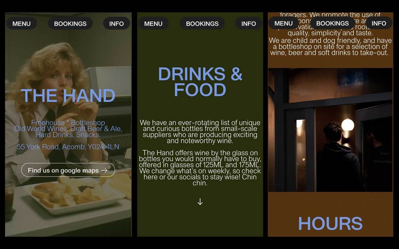
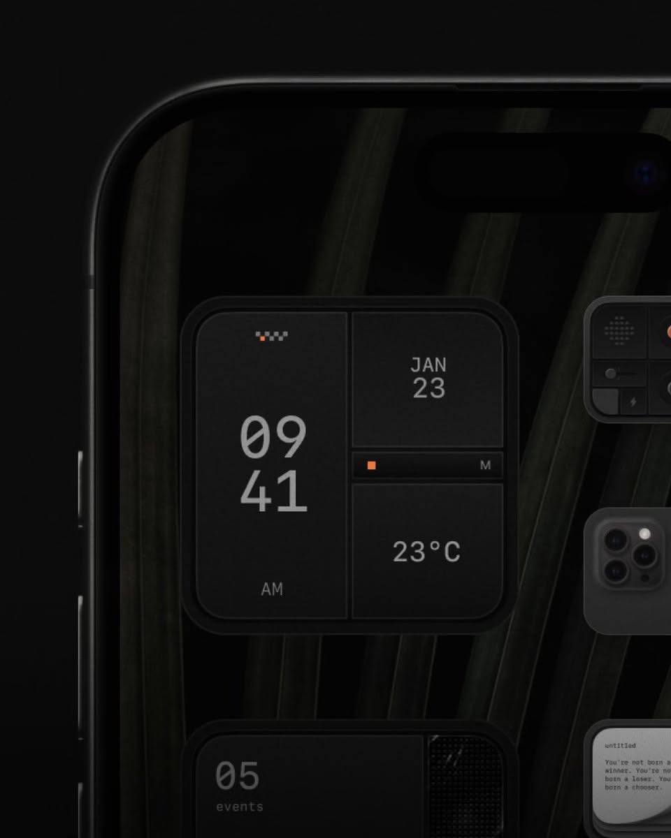
This design utilizes a dark, earthy color palette combined with clean typography to create an intimate and sophisticated atmosphere. The layout is highly segmented, using distinct panels for different information categories to ensure clear navigation and readability.
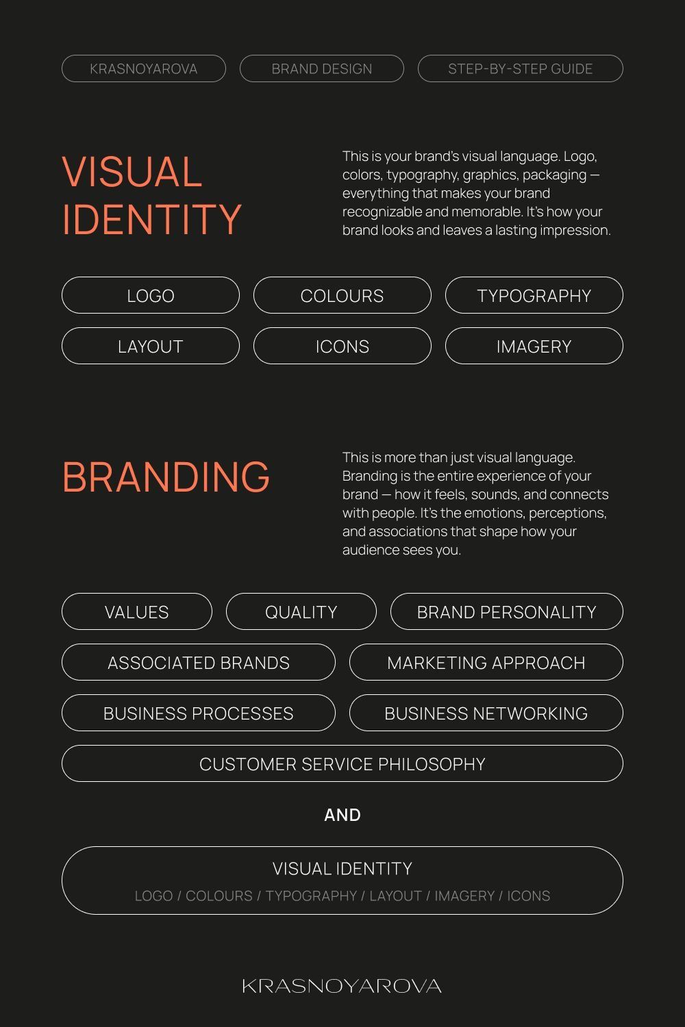
This design utilizes a stark, minimalist aesthetic with high contrast to present complex information in a highly organized manner. The visual language is clean and professional, relying heavily on negative space and clear hierarchy to guide the user through the branding concepts. The overall feel is sophisticated, authoritative, and focused on structured learning.
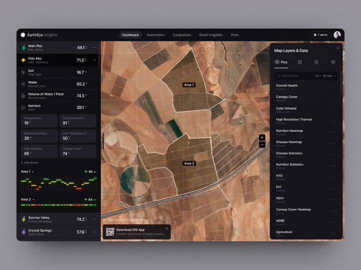
This dashboard features a professional, data-intensive design utilizing a dark theme to emphasize the geospatial imagery. The visual language is clean and functional, prioritizing clear data presentation over decorative elements to create an analytical and immersive user experience.
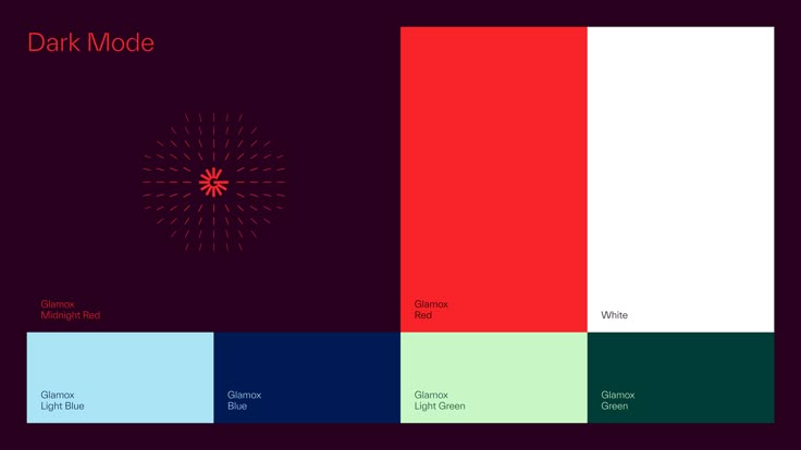
This image showcases a dark mode theme, utilizing high contrast between deep background tones and vibrant color blocks. The design is clean and structured, effectively demonstrating a range of complementary colors for potential use in digital interfaces or branding materials.
The design features a stark, high-contrast digital interface set against a dark background, emphasizing clarity and functionality. The visual language is minimalist, relying heavily on typography and simple numerical data to convey essential information effectively. The overall feel is modern, functional, and sophisticated.
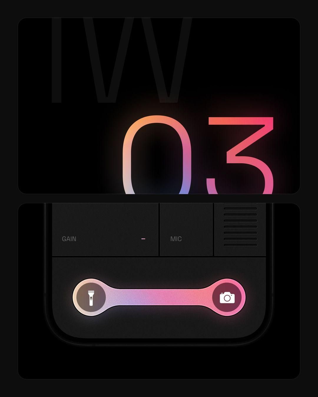
This design utilizes a dark mode aesthetic with vibrant neon accents to create a high-tech, focused interface. The visual language relies heavily on subtle glow effects against a deep black background to draw attention to key functional elements. The composition is clean and structured, emphasizing clarity and modern digital functionality.
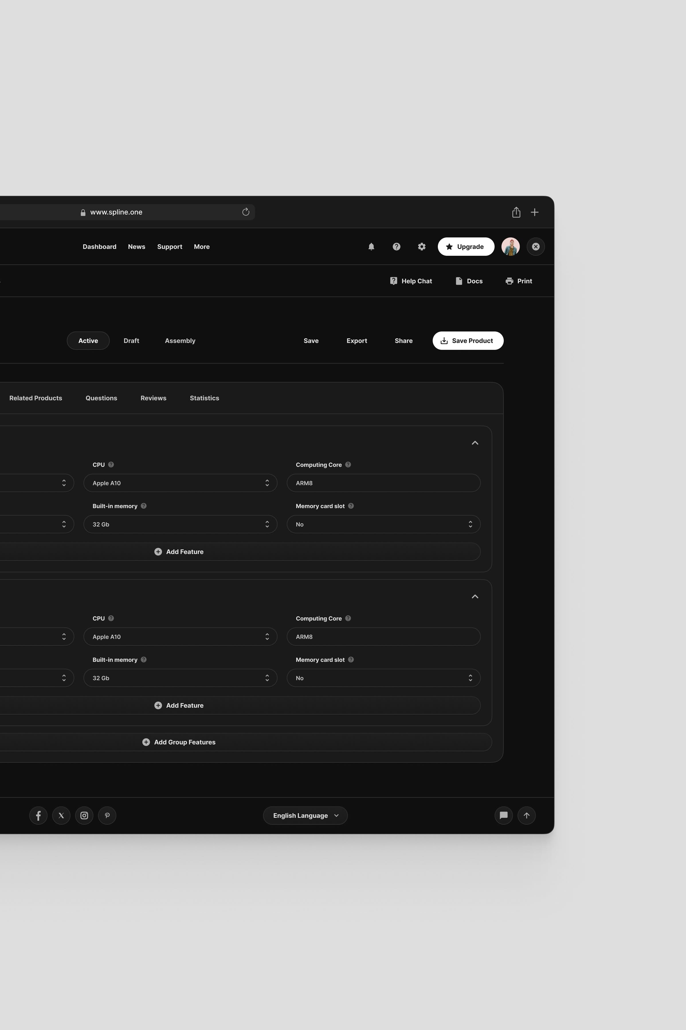
The image displays a dark-mode user interface characterized by a clean, minimalist aesthetic and high contrast. The design prioritizes functionality through structured lists and clear segmentation, creating a professional and focused experience.