clean ui
92 designs
Showing 24 of 92 (92 total)
The design presents a highly functional and clean interface typical of personal finance applications, prioritizing clear navigation and data organization. The visual language is minimalist, relying on ample white space to ensure readability and focus on the financial data.
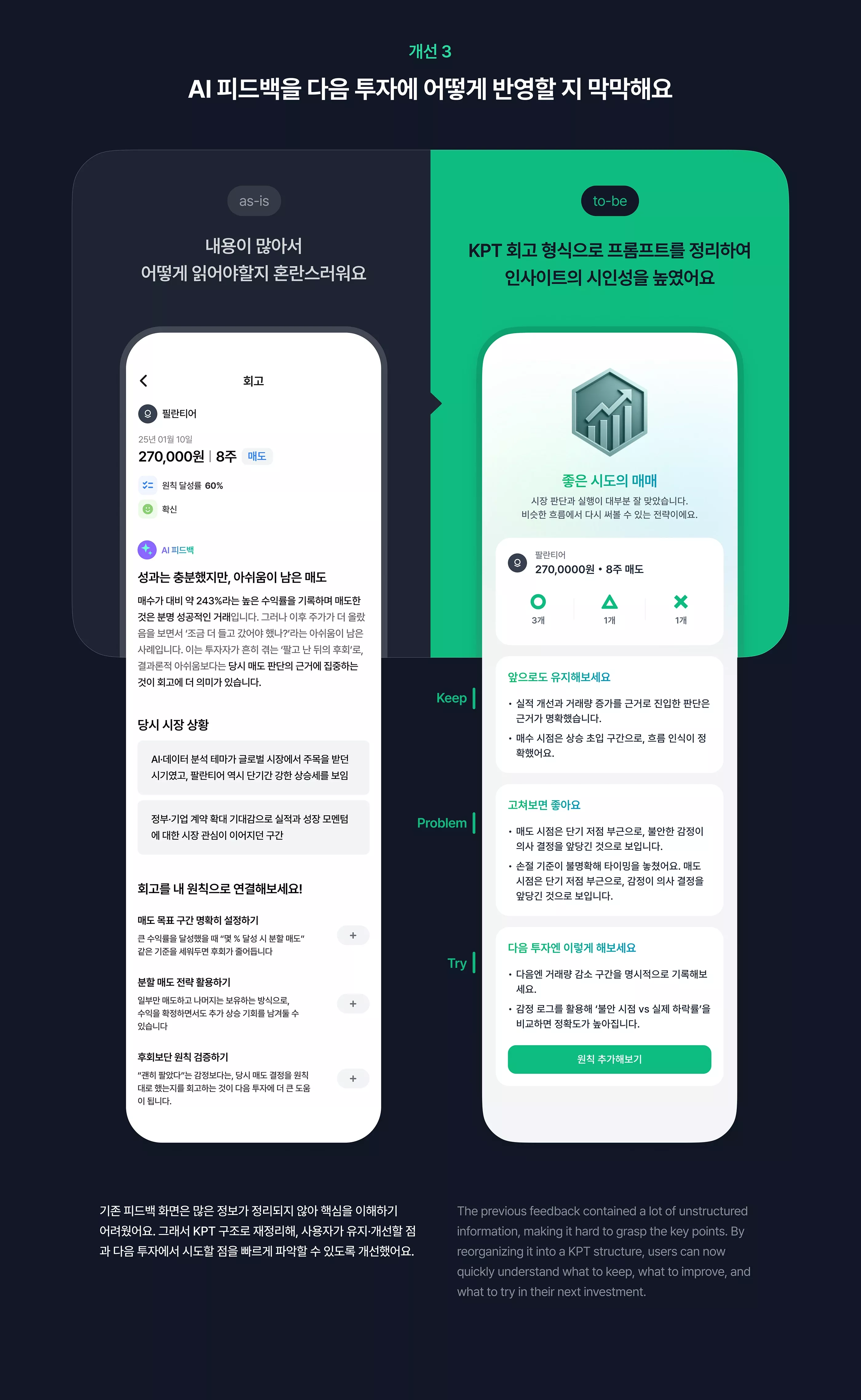
The design features a clean, card-based layout utilizing ample white space to separate distinct sections of feedback or information. The visual language is modern and functional, relying on clear segmentation and a vibrant accent color for emphasis.
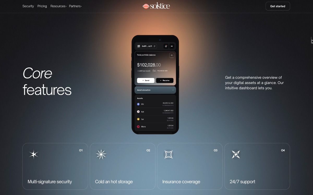
This design utilizes a sophisticated dark mode aesthetic, employing subtle gradients and high contrast to create a professional and secure feel. The visual language is clean and minimalist, focusing attention on key data points and feature cards through balanced spatial arrangement.
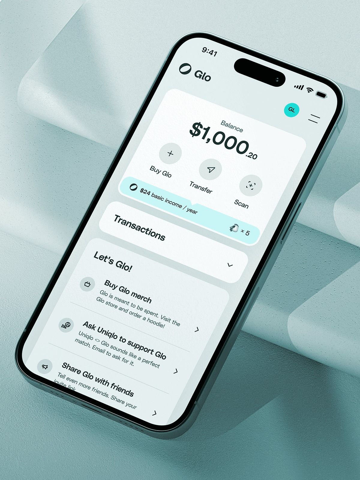
This interface showcases a clean, modern mobile application design characterized by ample white space and clear visual hierarchy. The layout is highly organized, using subtle color accents to guide the user through key financial actions and information.
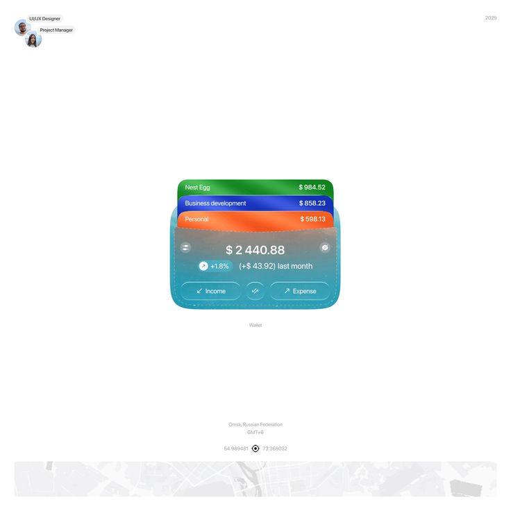
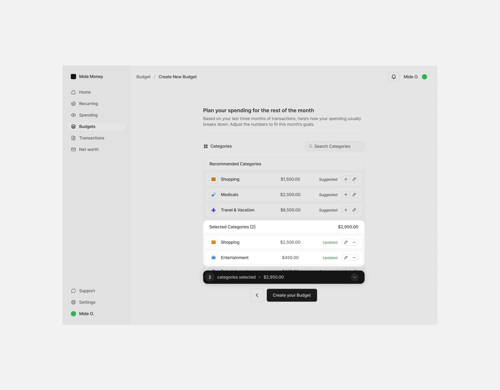
This interface presents a clean, modern data visualization style focused on financial tracking and budgeting. The design utilizes distinct color coding across segmented cards to clearly differentiate between various financial categories, resulting in a highly organized and accessible user experience.
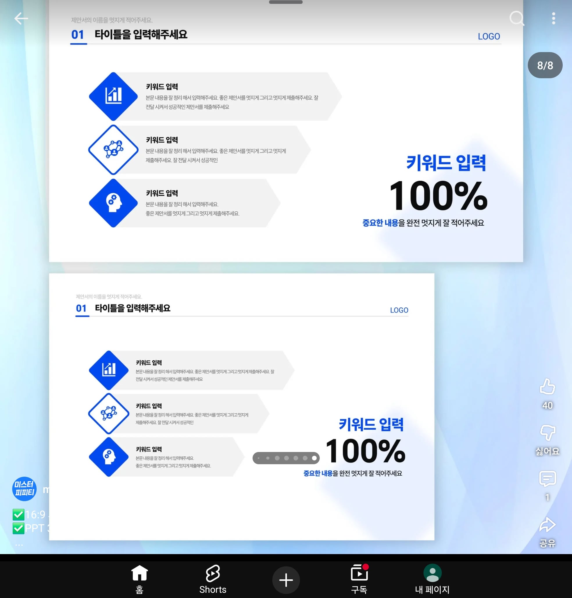
This interface features a clean, modern user interface designed for sequential input or selection tasks. The design emphasizes clarity through ample white space and uses distinct blue iconography to guide the user through the process. The overall feel is professional, organized, and highly functional.
This interface features a clean, professional dark mode design emphasizing clarity and data presentation. The visual language is minimalist, relying on high contrast between the dark background and light text to create a sleek and organized user experience.
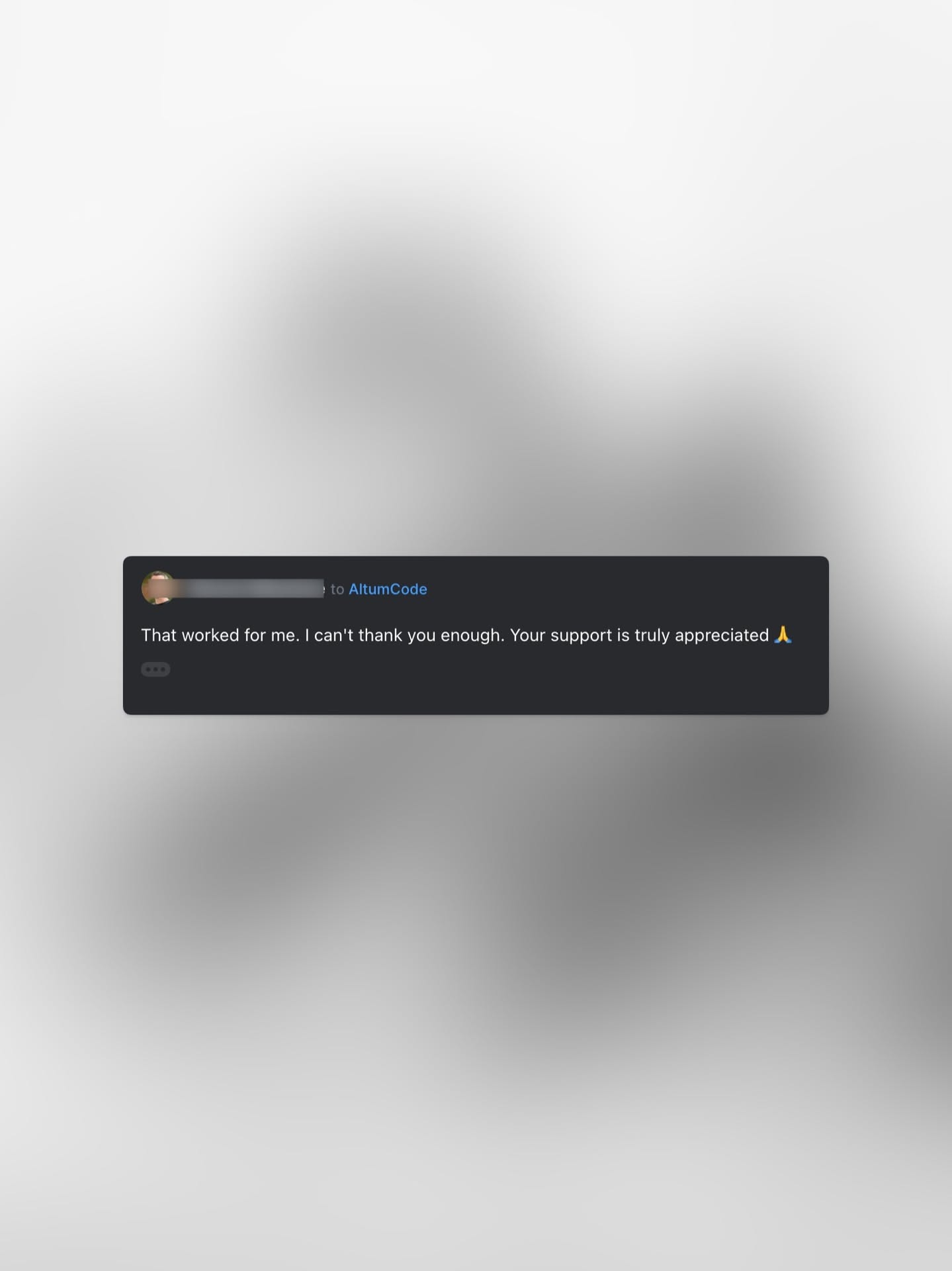
This design utilizes a minimalist approach, employing soft focus and blurred gradients to create a serene backdrop for a focused user interface element. The visual language is clean and subdued, emphasizing the text within the dark box against the expansive, hazy background.
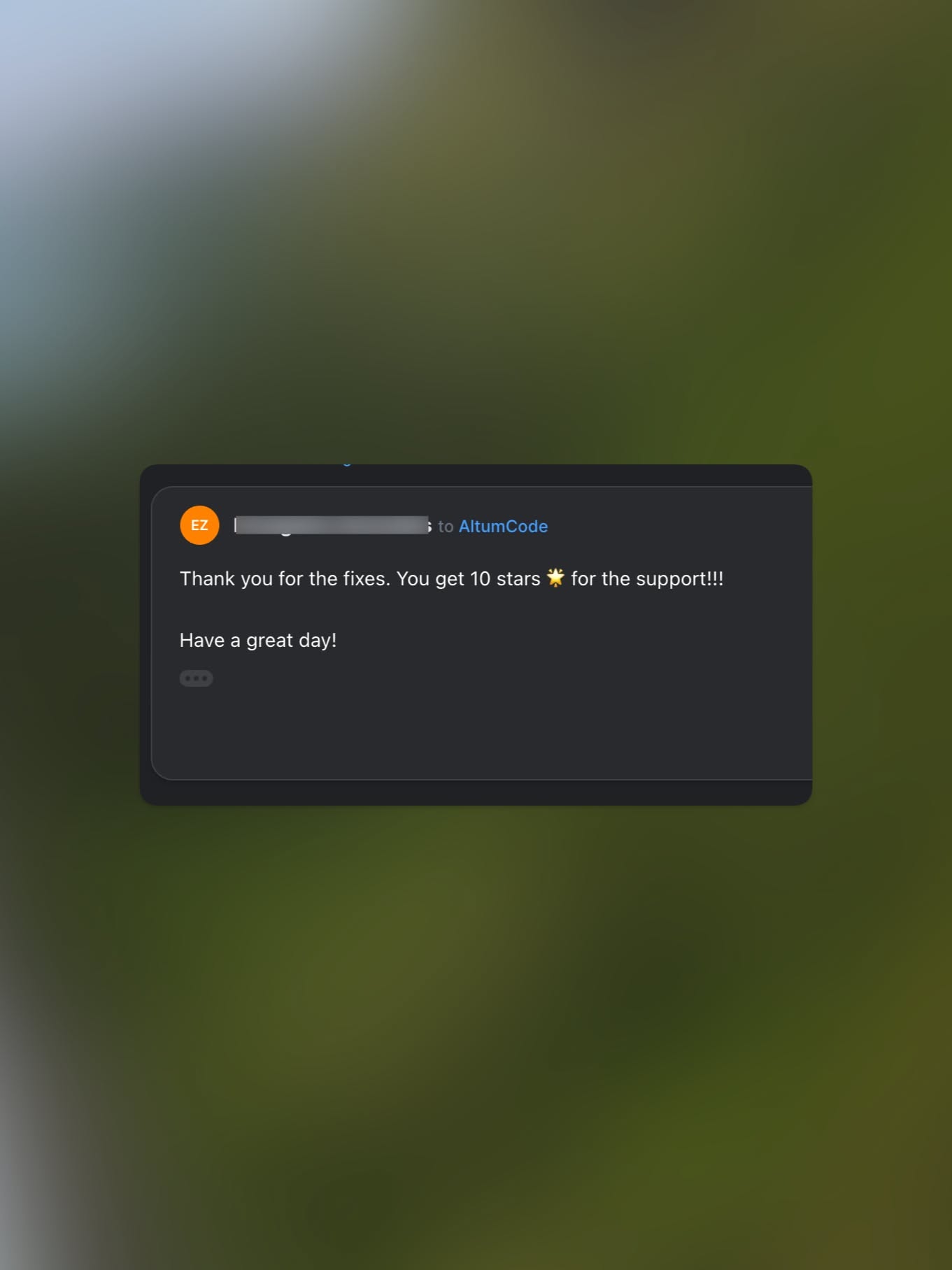
This design features a clean, dark-themed interface presenting positive user feedback and a thank you message. The visual language is minimalist, relying on high contrast between the dark UI elements and a soft, blurred background.
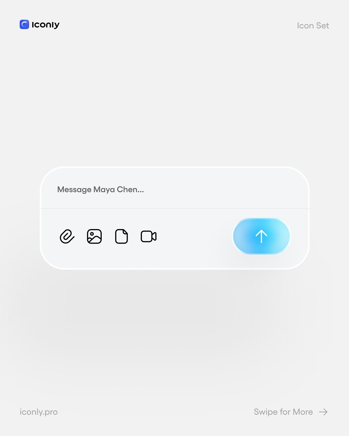
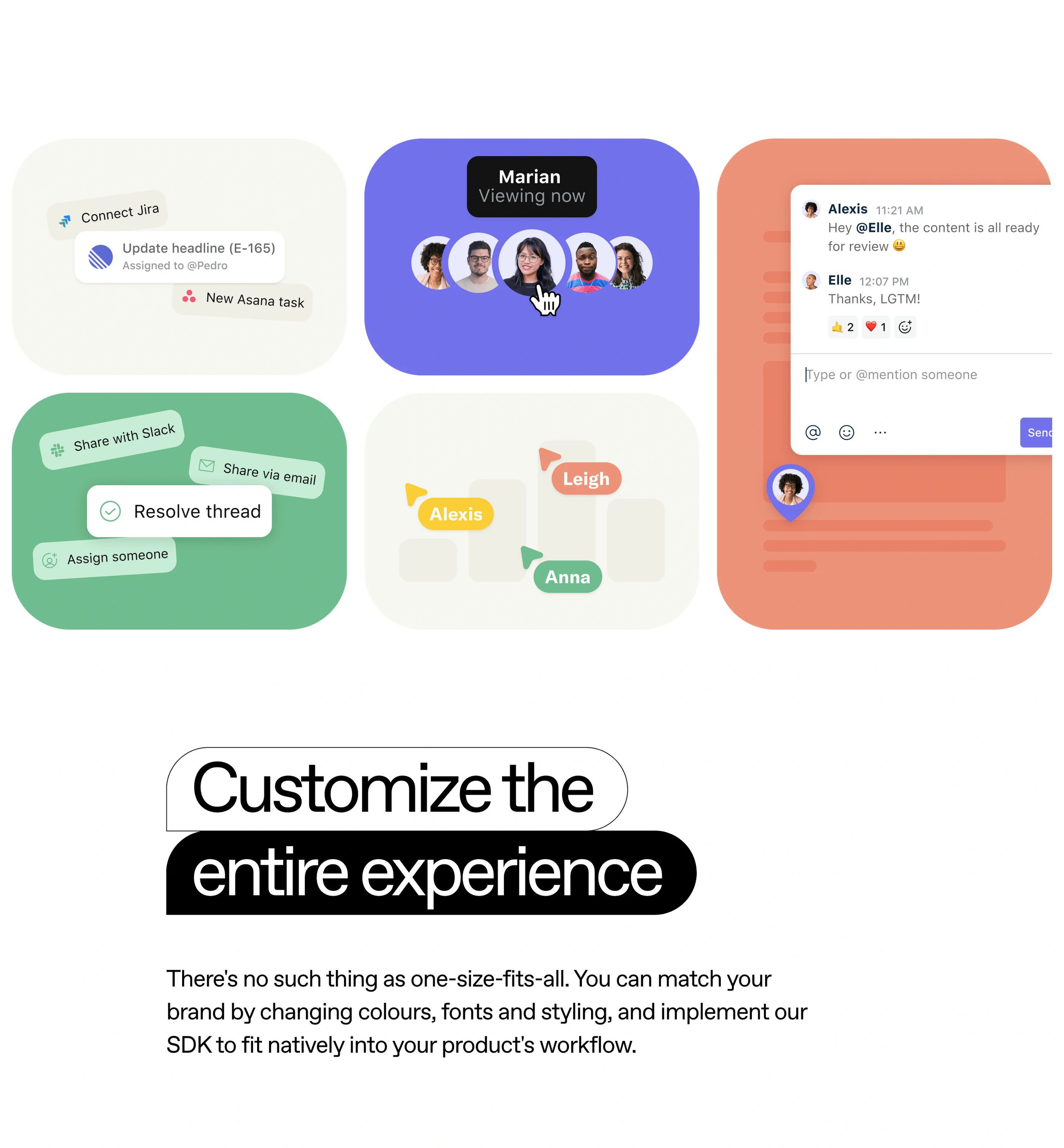
This image showcases a clean, modern user interface design emphasizing clarity and functionality through minimalist iconography. The visual language relies heavily on negative space and subtle gradients to guide the user's attention toward key actions.
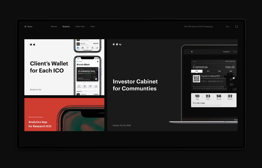
This interface utilizes a sophisticated dark mode design, emphasizing clarity and professionalism through high contrast. The visual language is clean and modern, relying on ample negative space to ensure that key information, such as wallet details and investor access points, is immediately legible.
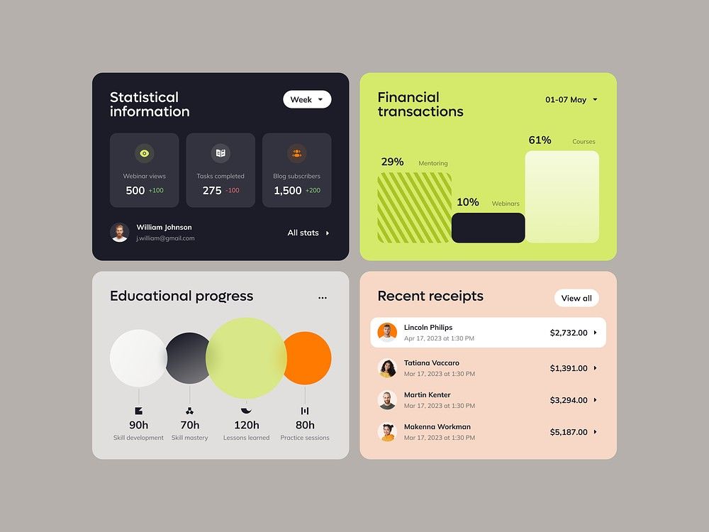
This image showcases a clean, modern dashboard design utilizing card-based layouts to present statistical and financial data. The visual language is minimalist, relying on clear typography and subtle color accents to ensure high readability and data hierarchy. The overall feel is professional, organized, and highly functional.
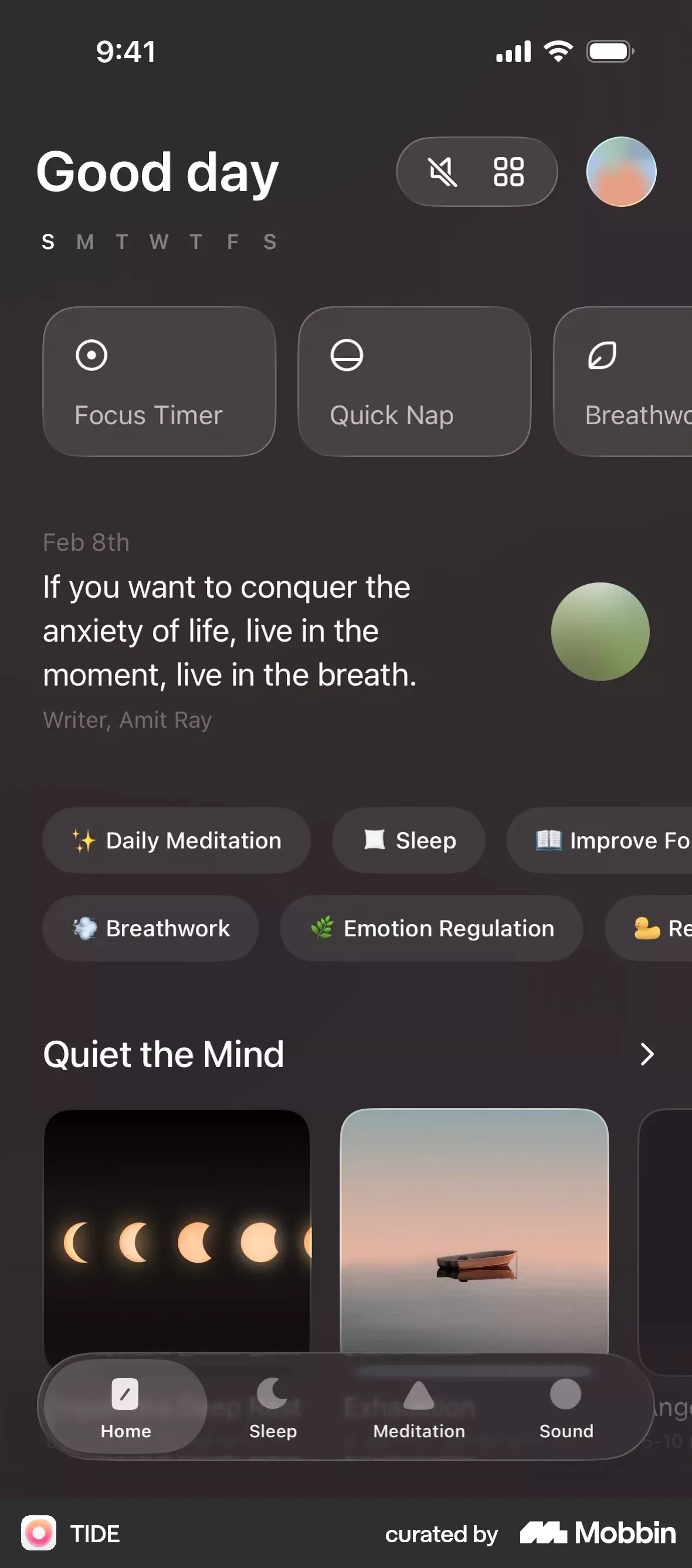
This screen showcases a highly functional and serene user interface designed for mental wellness, utilizing a dark mode aesthetic to promote calm. The visual language relies on soft gradients and clear iconography to guide the user through various meditation and focus tools. The overall feel is modern, therapeutic, and deeply focused on mindfulness.
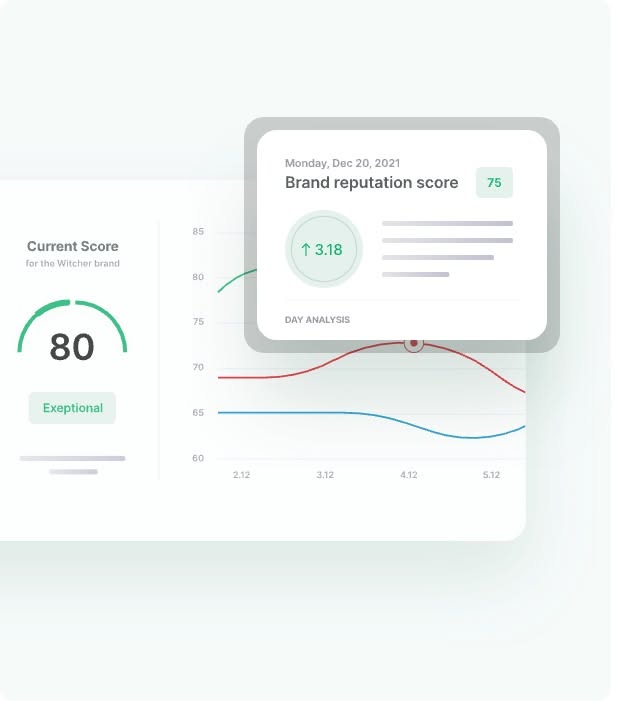
This design features a clean, modern dashboard style focused on presenting quantitative data through clear visualizations like gauges and line graphs. The visual language is minimalist, relying heavily on whitespace and subtle color accents to ensure the data remains the primary focus.
This interface features a clean, modern design utilizing soft pastel tones and ample white space to present complex data clearly. The visual language is professional and highly organized, emphasizing readability and intuitive navigation through card-based layouts.
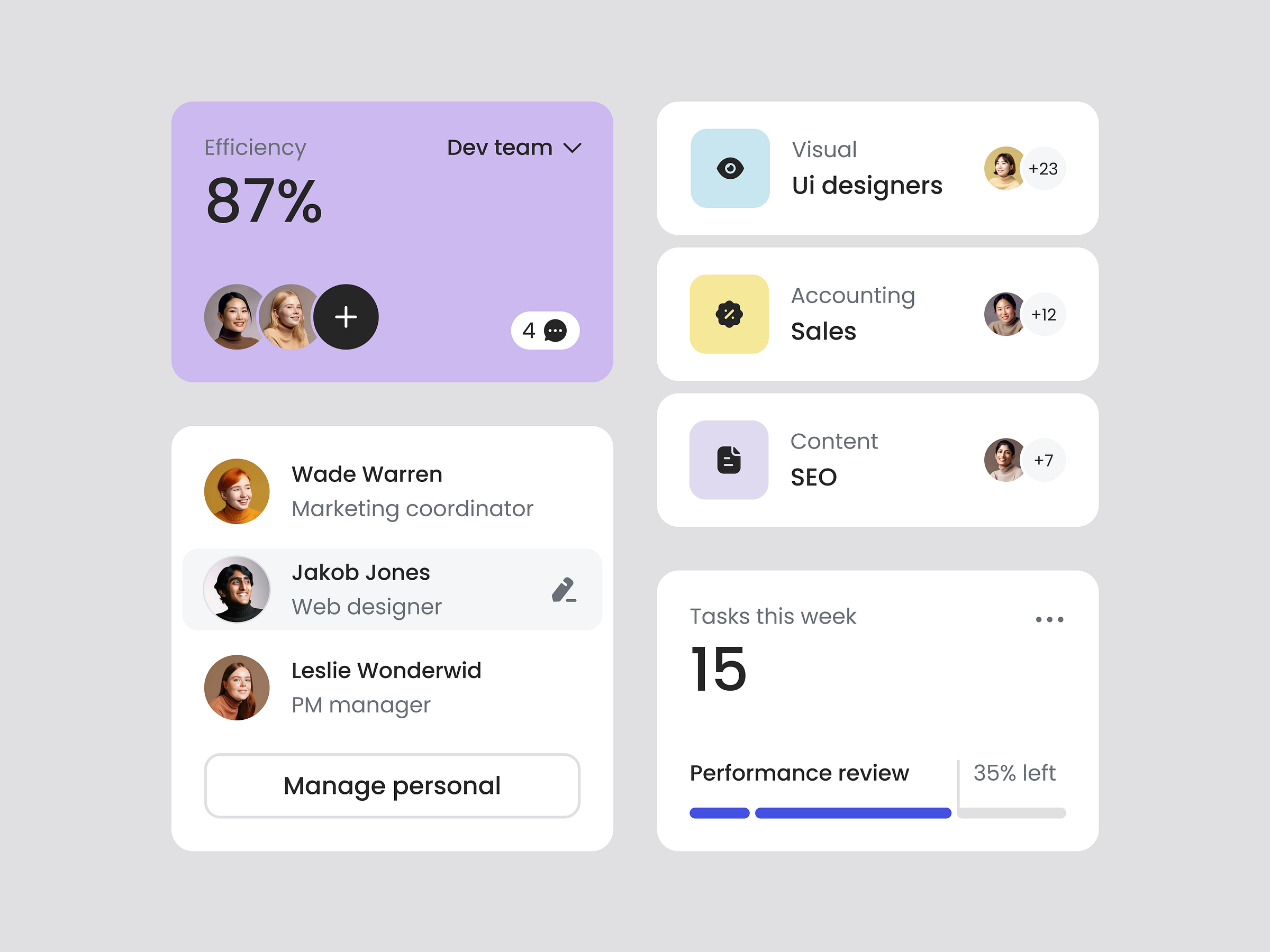
This design showcases a clean, modern card-based user interface emphasizing clarity and functionality. The visual language relies on soft gradients, rounded corners, and subtle shadows to create depth while maintaining a professional and approachable feel. The layout is organized, presenting various features in an easily digestible grid format.
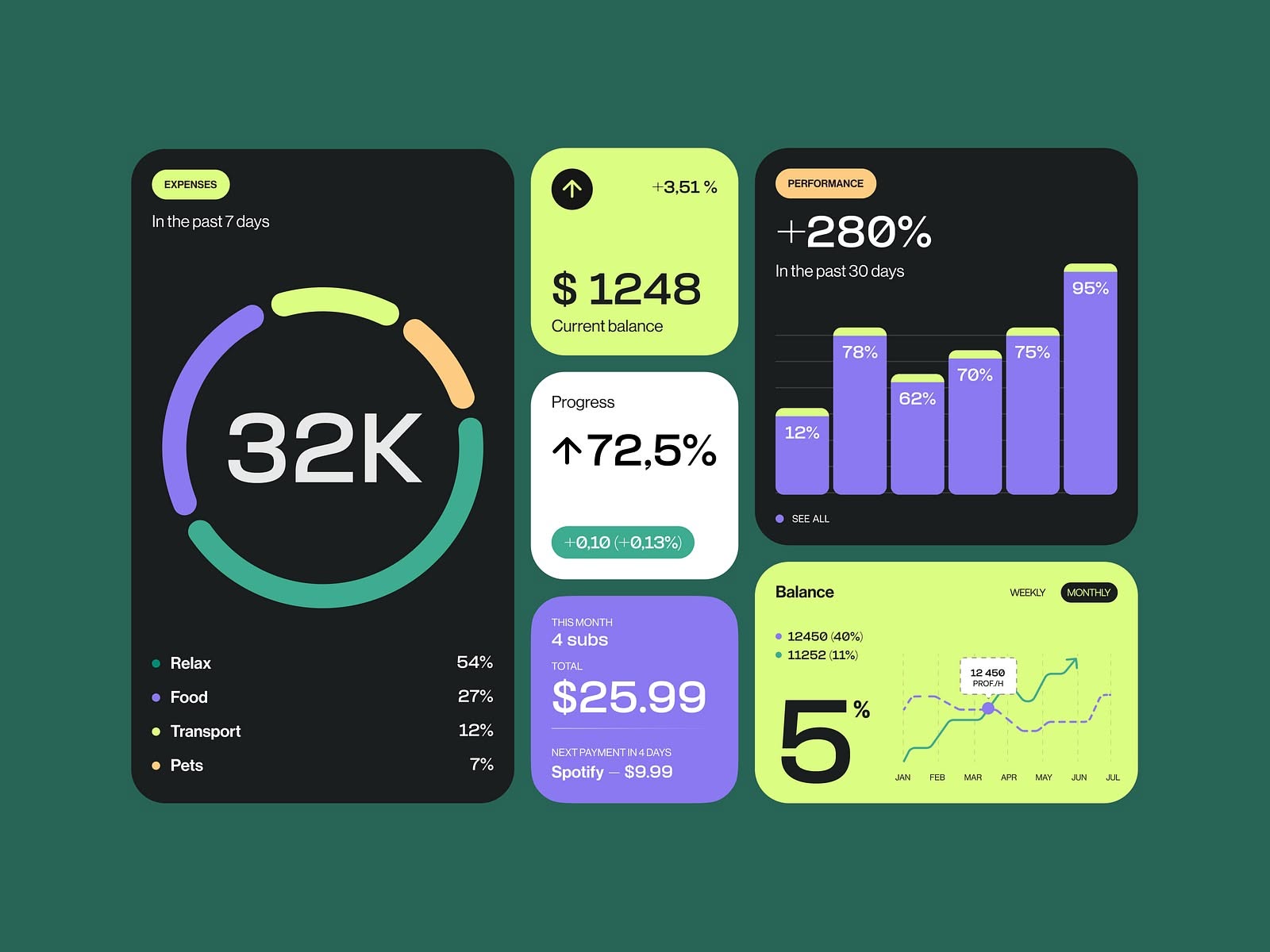
This interface utilizes a dark mode aesthetic with vibrant accent colors to present complex financial data clearly. The design is highly functional, employing distinct cards and charts to visualize spending trends and balances effectively. The overall feel is modern, analytical, and highly organized.
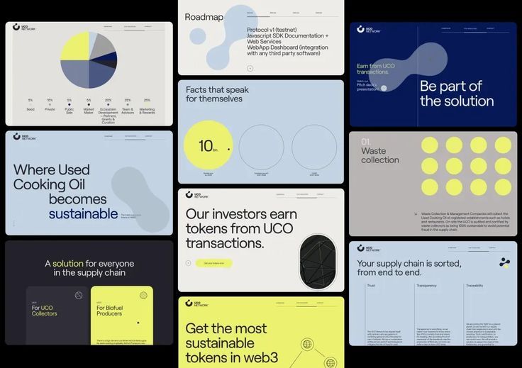
The design employs a clean, modern, and professional aesthetic typical of SaaS or Web3 platforms, utilizing ample white space and clear data visualizations. The visual language is highly structured, relying on simple geometric shapes and a limited color palette to convey trust and innovation. The overall feel is organized, transparent, and focused on presenting complex information in an accessible manner.
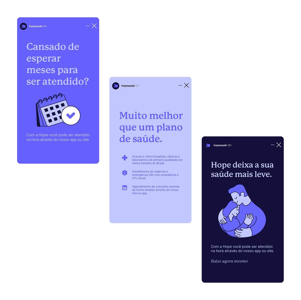
The design utilizes a clean, modern aesthetic with a focus on user trust and clarity, employing soft blues and purples to convey a sense of calm and professionalism. The visual language is minimalist, relying on ample white space and clear typography to present complex service benefits in an easily digestible format.
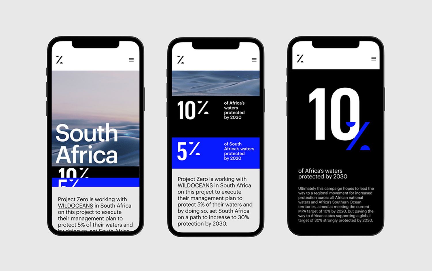
This design utilizes a clean, dark mode aesthetic to present complex environmental data in an accessible and professional manner. The visual language is minimalist, relying on strong typography and clear percentage callouts to convey important statistics effectively. The overall feel is serious, informative, and trustworthy.
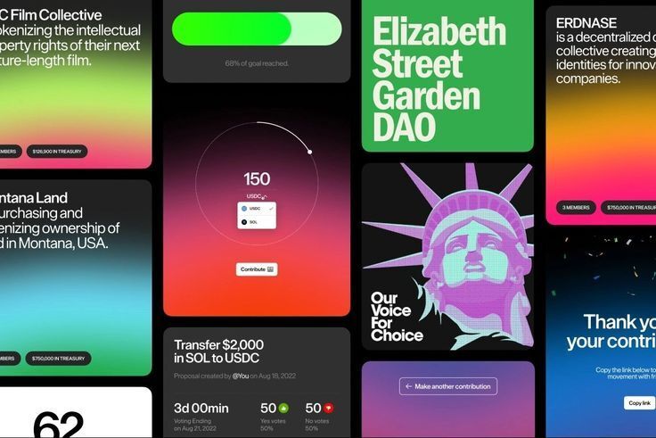
This design utilizes a dark mode aesthetic with high-contrast, vibrant accent colors to create a modern and professional user interface. The layout is highly modular, employing distinct cards to present various metrics and contributions clearly. The visual language is clean, digital, and emphasizes transparency through clear data presentation.
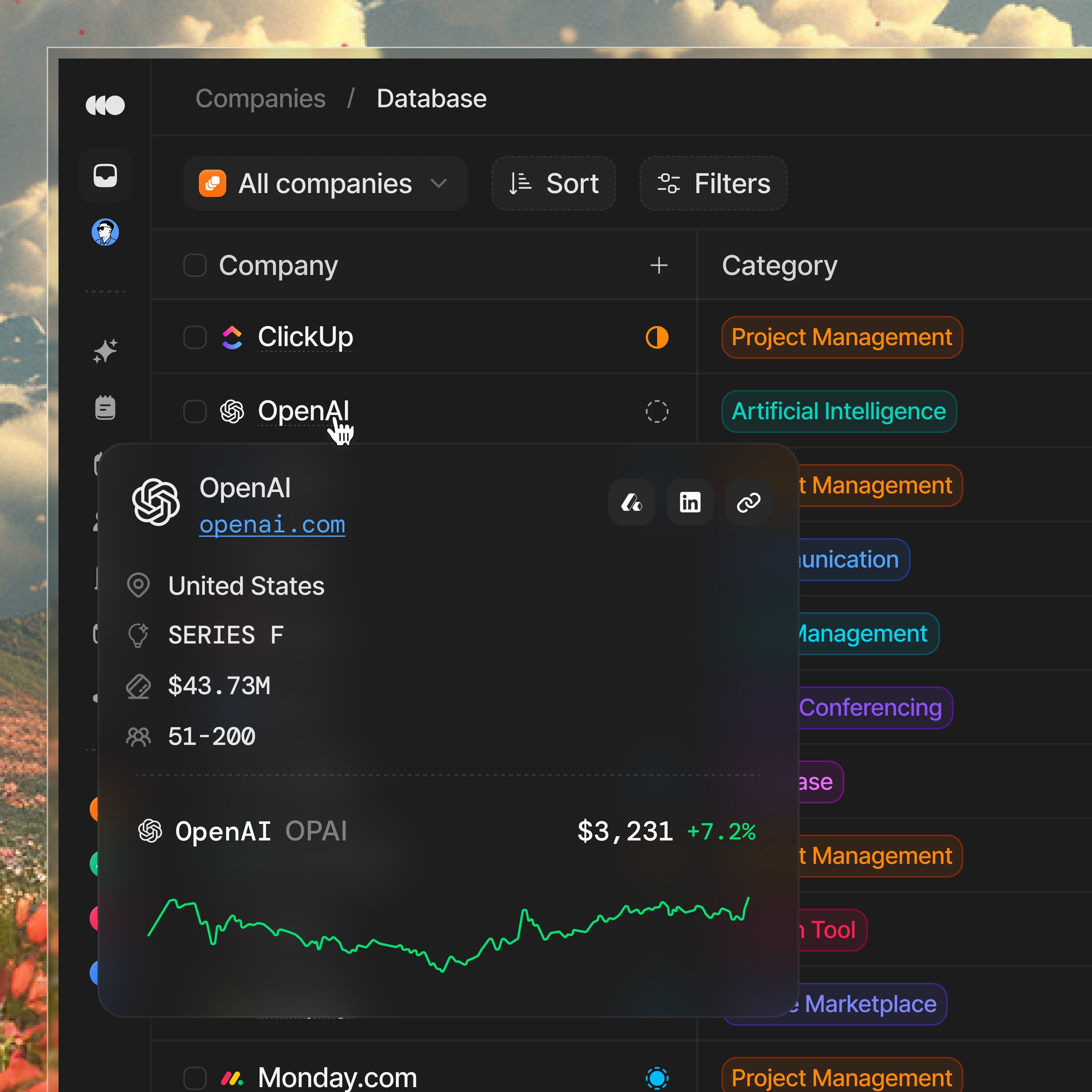
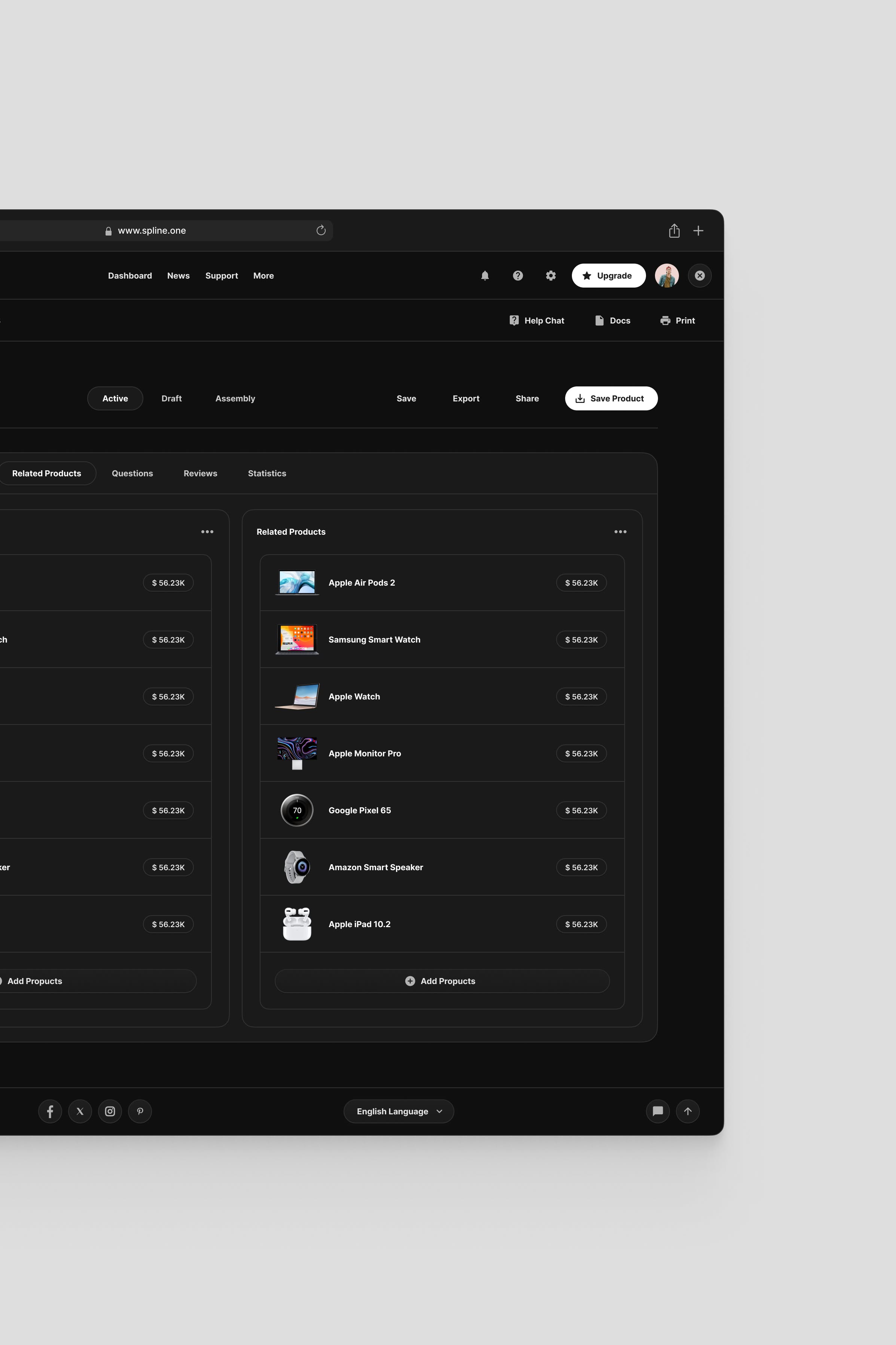
The interface presents a clean, data-driven dashboard layout with a dark mode aesthetic, emphasizing clear categorization and hierarchical information through list views. The design is functional and professional, utilizing subtle color cues to differentiate entities within a structured environment.
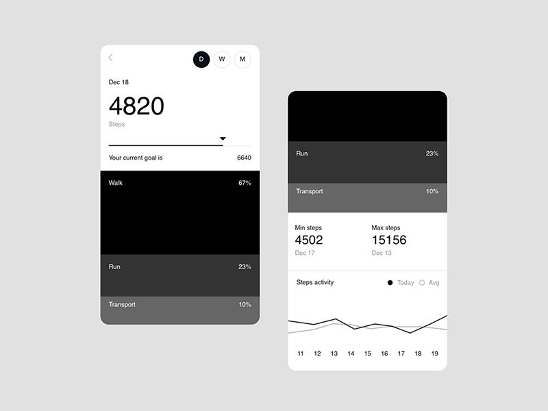
The image displays a clean, dark-mode user interface for tracking fitness or steps, characterized by high contrast and clear data presentation. The design is minimalist, focusing on readability and functional organization of metrics.
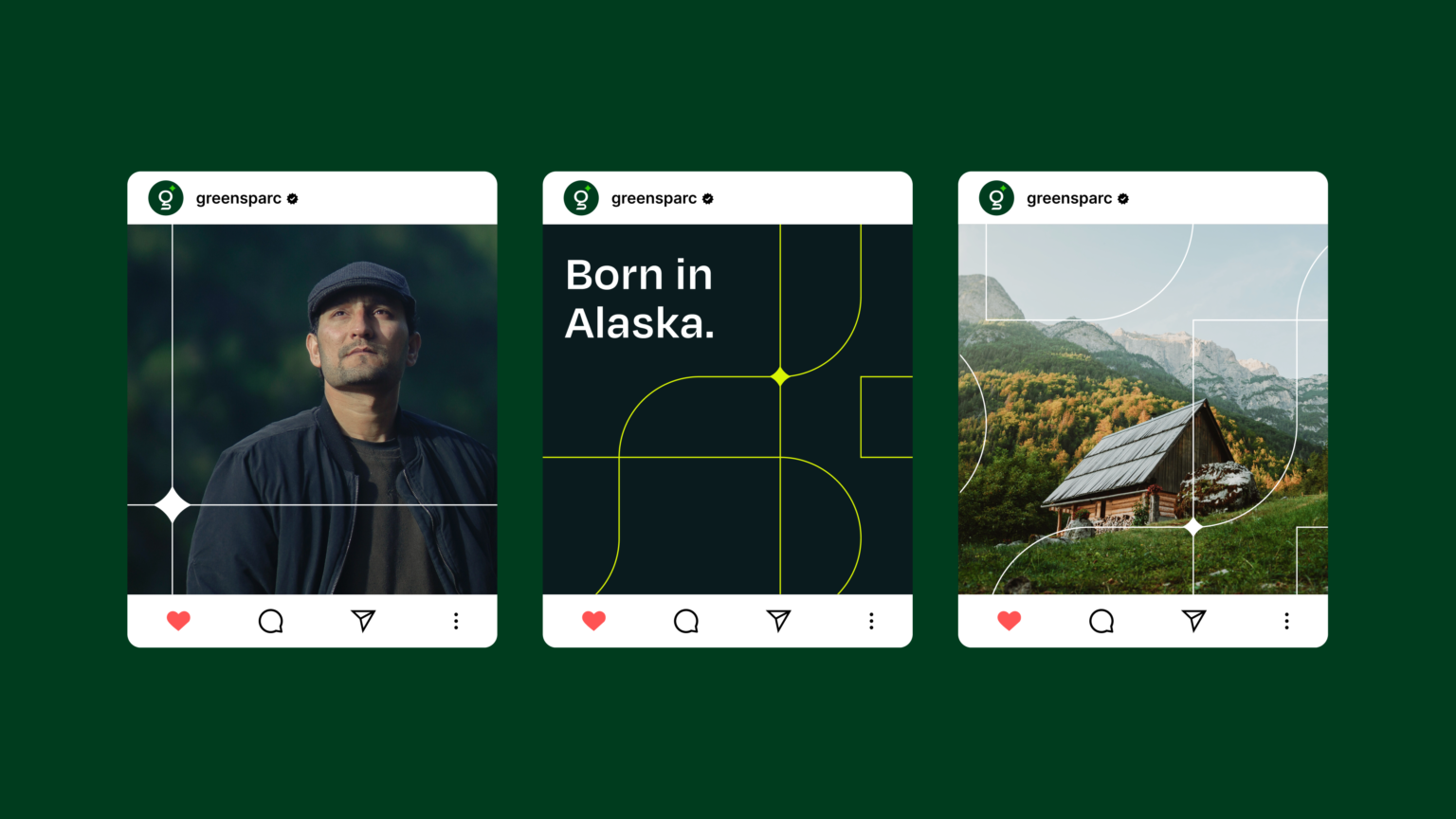
The image displays three distinct profile cards within a dark green interface, suggesting a clean, modern, and nature-inspired digital presentation. The design uses strong geometric lines and high contrast between the dark background and the light elements, creating a sophisticated yet grounded feel.