clean layout
31 designs
Showing 24 of 31 (31 total)
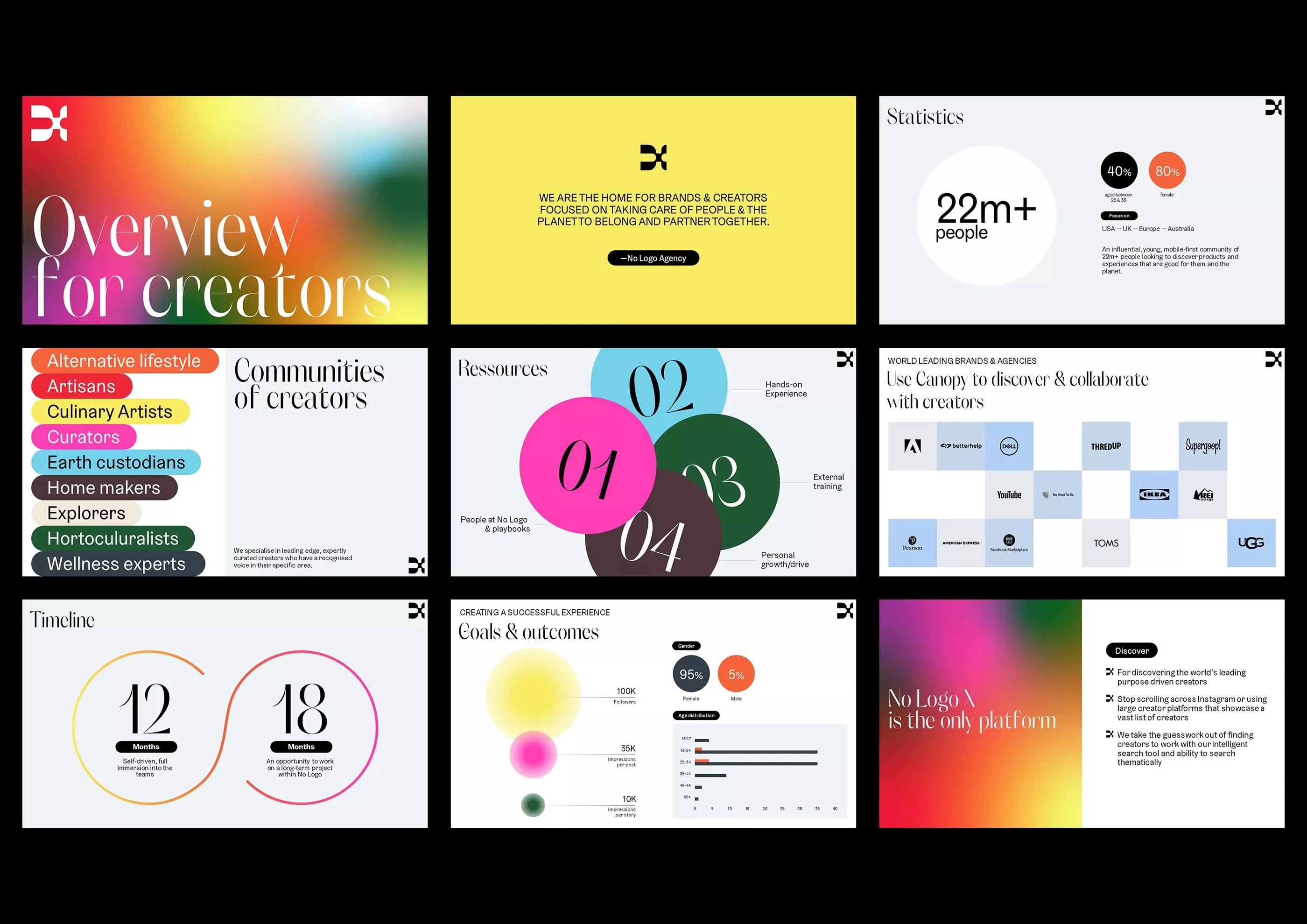
This collection of screens showcases a modern, clean user interface design characterized by vibrant yet balanced color accents and clear data visualization. The visual language is professional and organized, utilizing ample whitespace to ensure readability across various content types. The overall feel is energetic, trustworthy, and focused on creator-centric metrics.
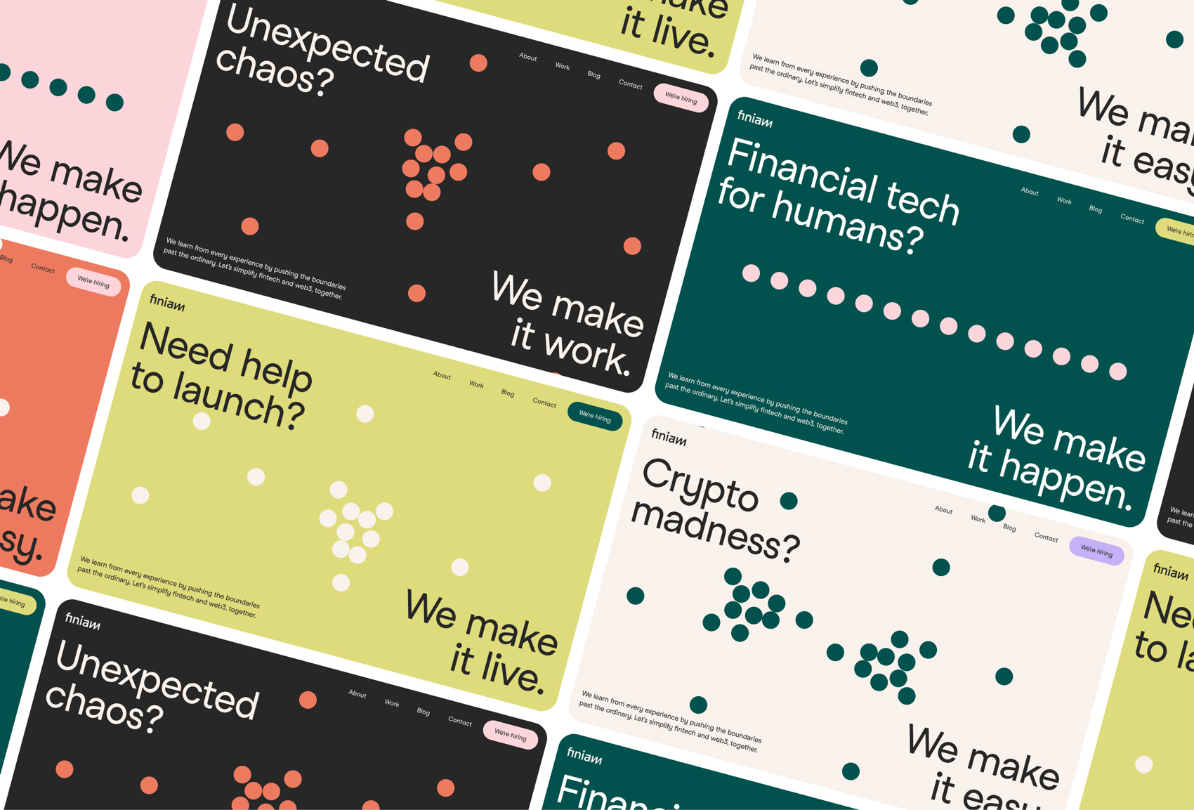
This collection showcases a modern, clean aesthetic utilizing bold typography and simple geometric accents to convey confidence and capability. The design relies on high contrast between dark backgrounds and vibrant accent colors to create a professional yet approachable visual language. The overall feel is polished, innovative, and focused on solving complex problems.
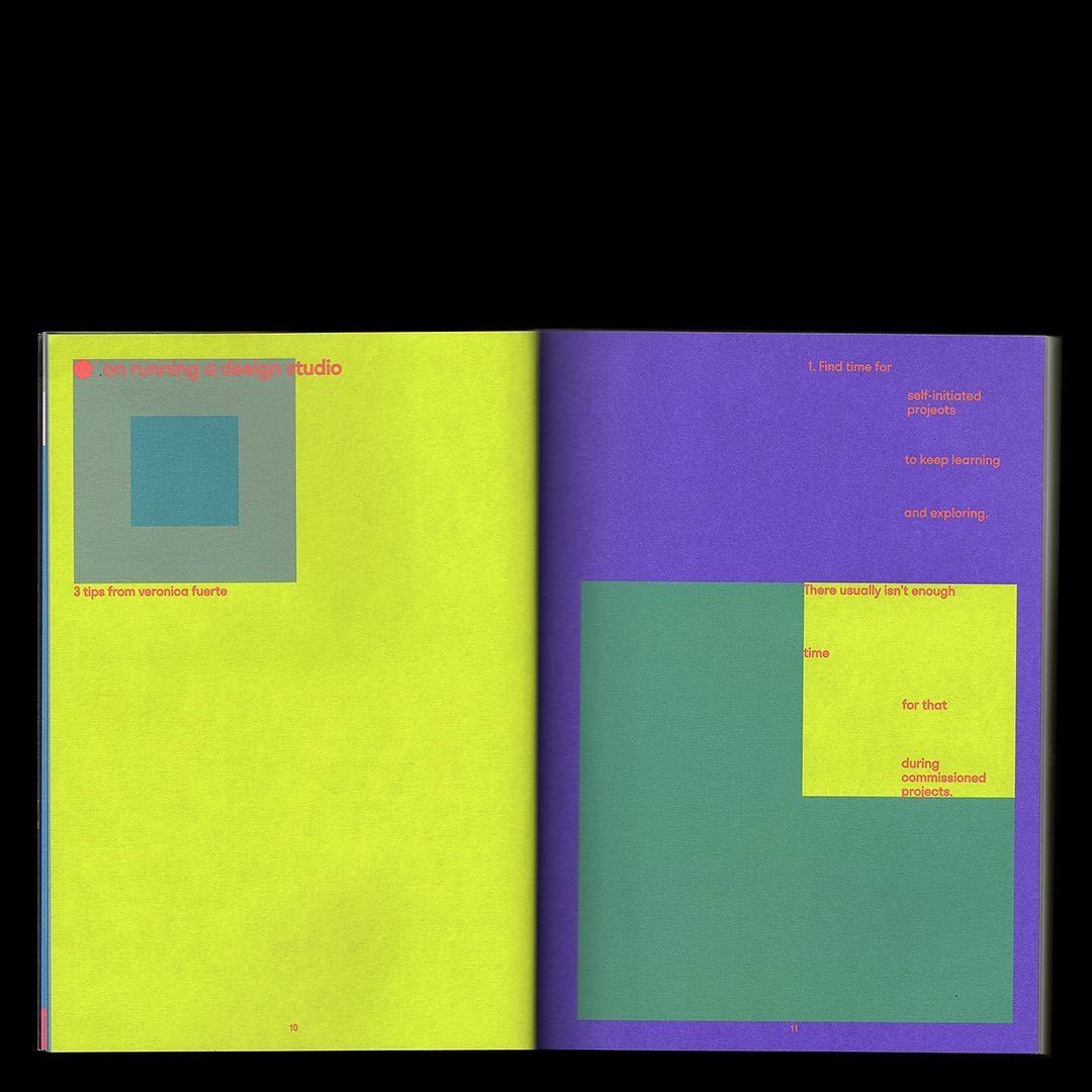
This spread utilizes a clean, high-contrast design employing bold color blocking to separate content. The visual language is modern and structured, balancing solid blocks of color with clear textual hierarchy to guide the reader. The overall feel is professional and focused, suggesting an educational or self-help publication.
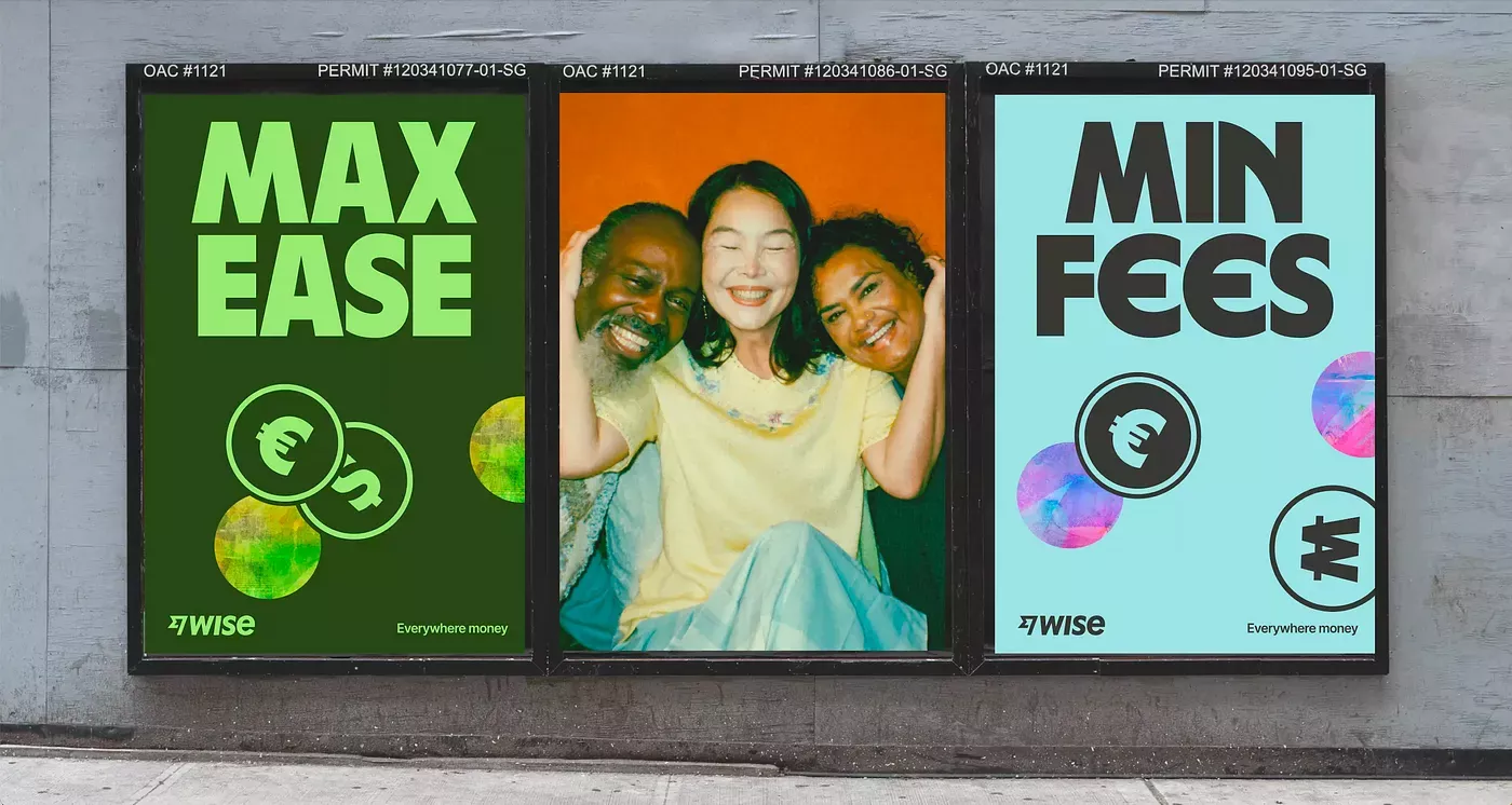
This visual presentation uses a clean, high-contrast graphic style to market financial services by directly comparing two options. The design effectively uses color blocking and large typography to create immediate differentiation between 'Max Ease' and 'Min Fees,' aiming for clarity and consumer choice.
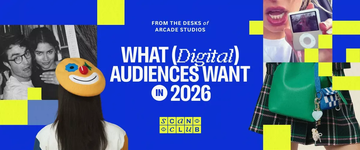
This graphic employs a bold, high-contrast design using strong blocks of blue and vibrant yellow to create visual hierarchy. It blends professional text with playful, candid photography and stylized elements to engage the viewer regarding a digital industry topic.
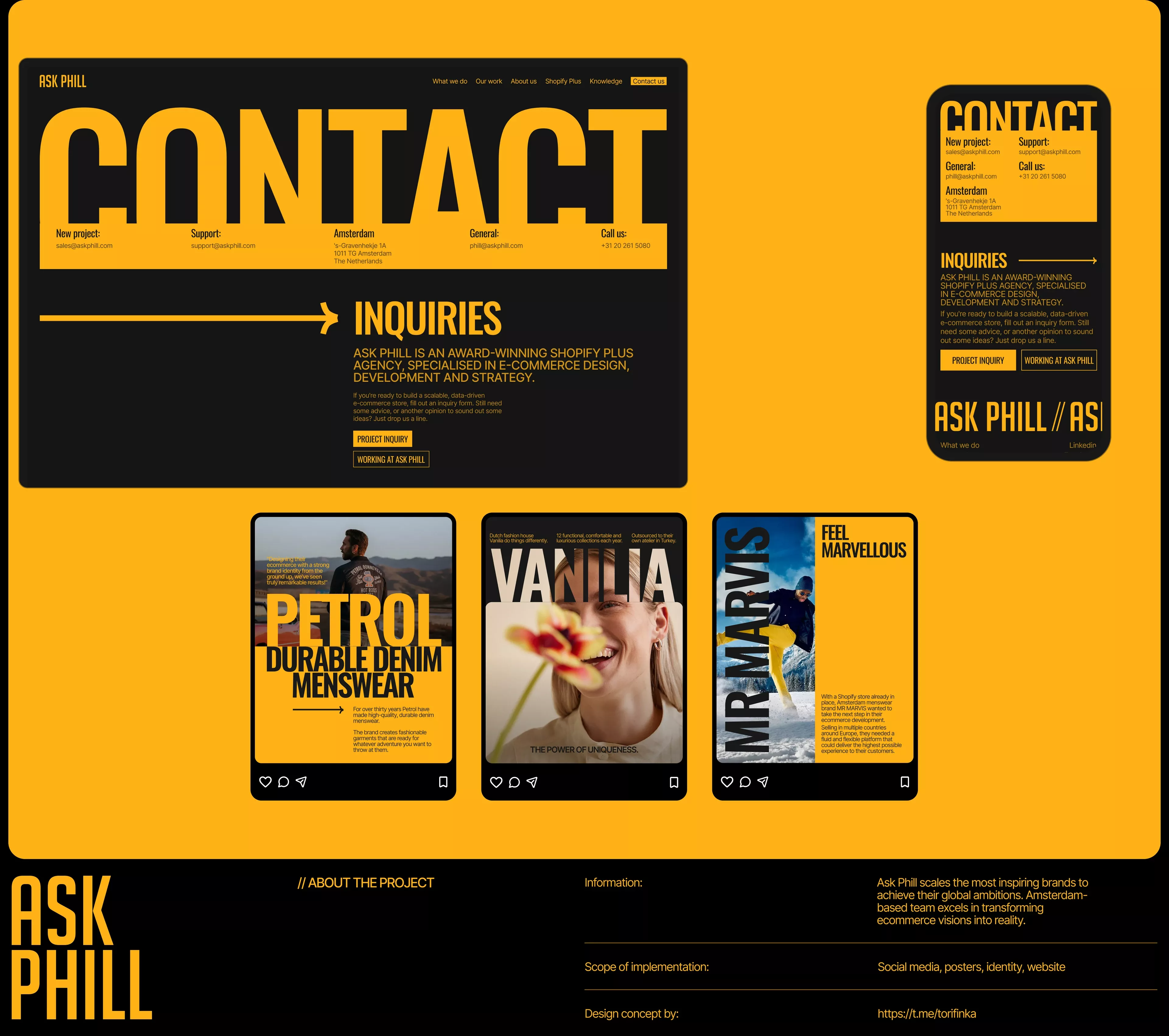
This design utilizes a striking, high-contrast visual language dominated by warm yellow and deep black to convey professionalism and confidence. The layout is clean and structured, employing ample negative space to ensure clear visual hierarchy between sections and calls to action. The overall feel is modern, bold, and highly focused.

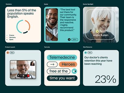
This design utilizes a clean, modular card-based layout to present various community and knowledge resources. The visual language is modern and organized, relying heavily on distinct color blocks to segment information clearly. The overall feel is professional, trustworthy, and inviting for community engagement.
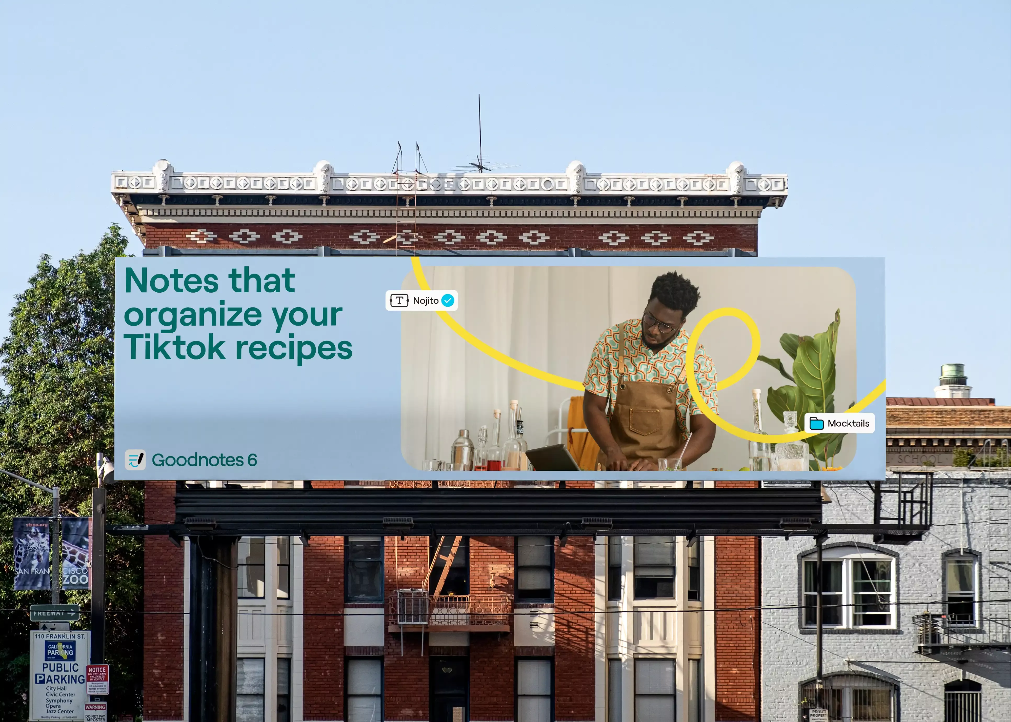
This visual is a commercial graphic designed to promote digital note-taking tools by juxtaposing modern productivity concepts with a traditional urban architectural backdrop. The design uses clean typography and a bright layout to clearly communicate a solution for organizing digital content.
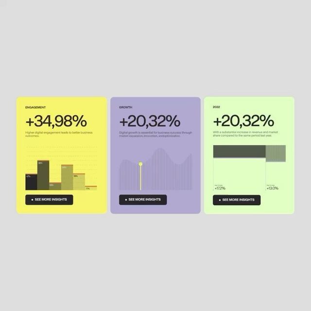
The image presents three distinct, card-like data visualizations using a clean, modern aesthetic. The design relies heavily on color blocking and simple bar/line charts to convey growth metrics effectively. The overall feel is professional, data-driven, and optimistic.
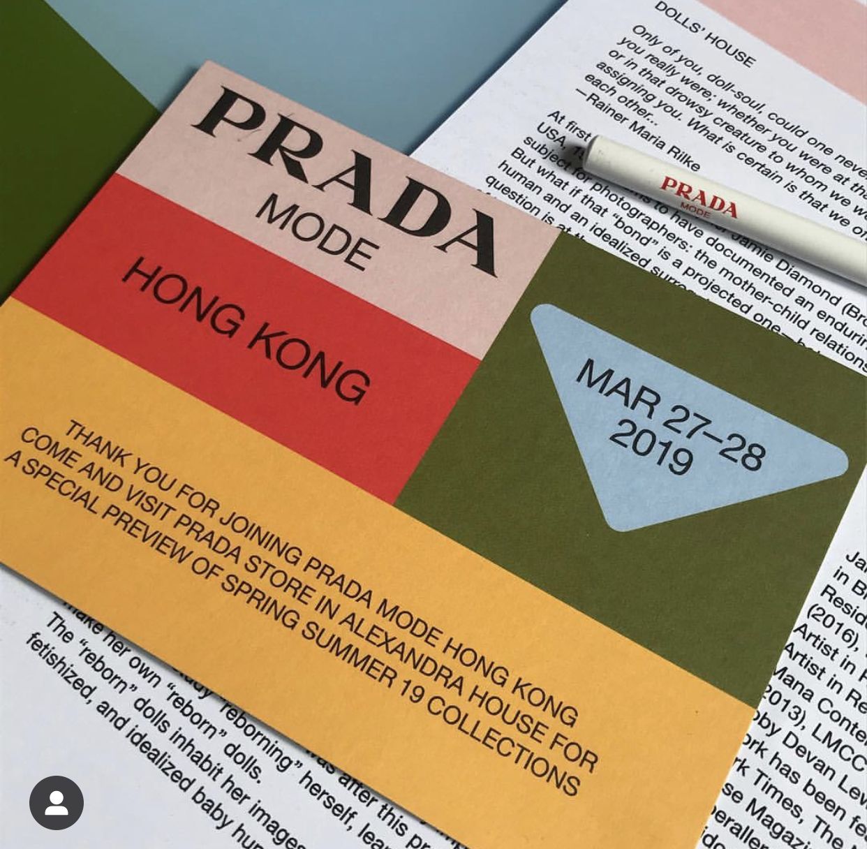
The design features a bold, graphic layout using large blocks of color and contrasting typography to present a brand or event promotion. It employs a clean, modern aesthetic with strong geometric shapes and clear hierarchy.
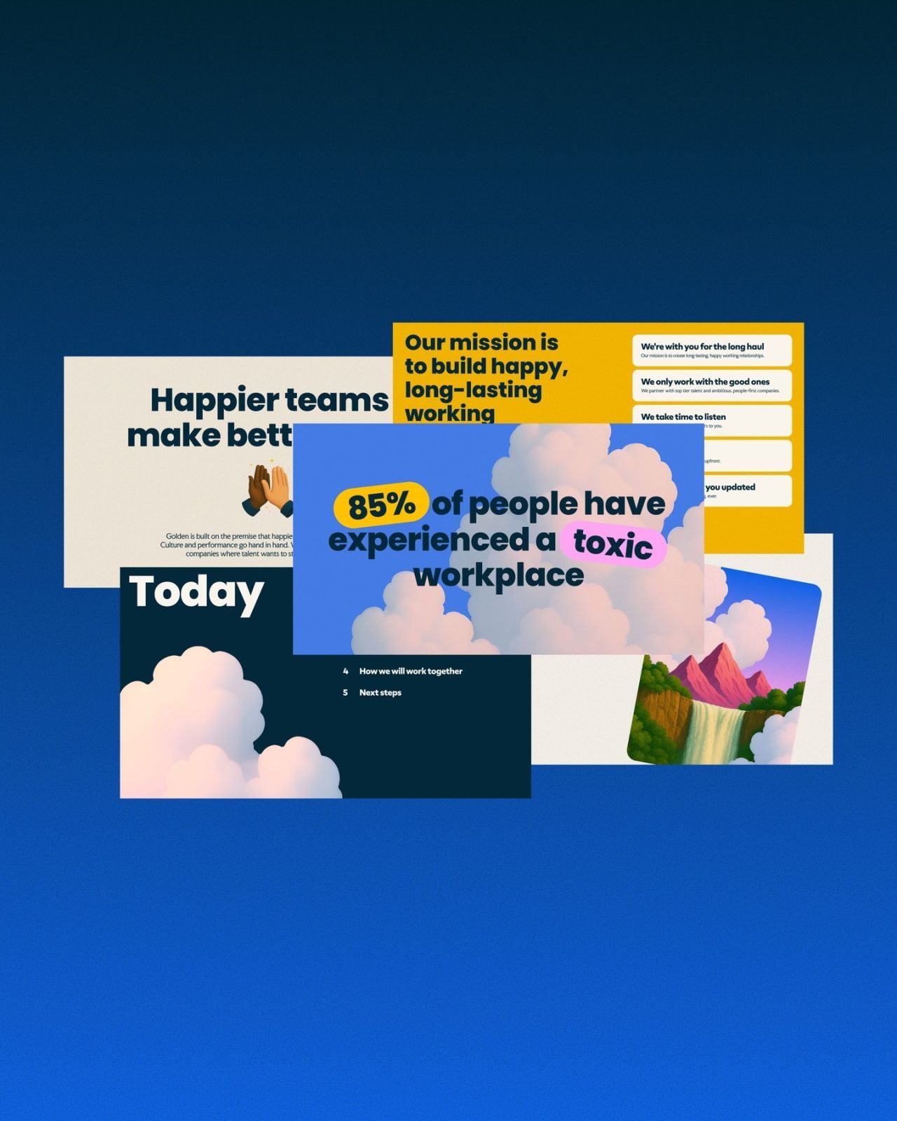
This slide employs a soft, illustrative modern design characterized by pastel elements and clean typography set against a deep blue background. The visual language is friendly yet professional, using nature motifs and layered boxes to present corporate mission and key statistics.
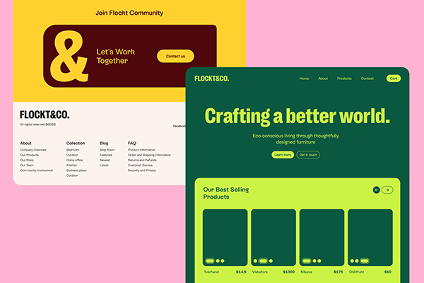
This design utilizes a clean, modern aesthetic with bold color blocking and strong contrast to establish a professional yet eco-conscious brand identity. The visual language is uncluttered, focusing on clear hierarchy between informational sections and impactful calls to action.
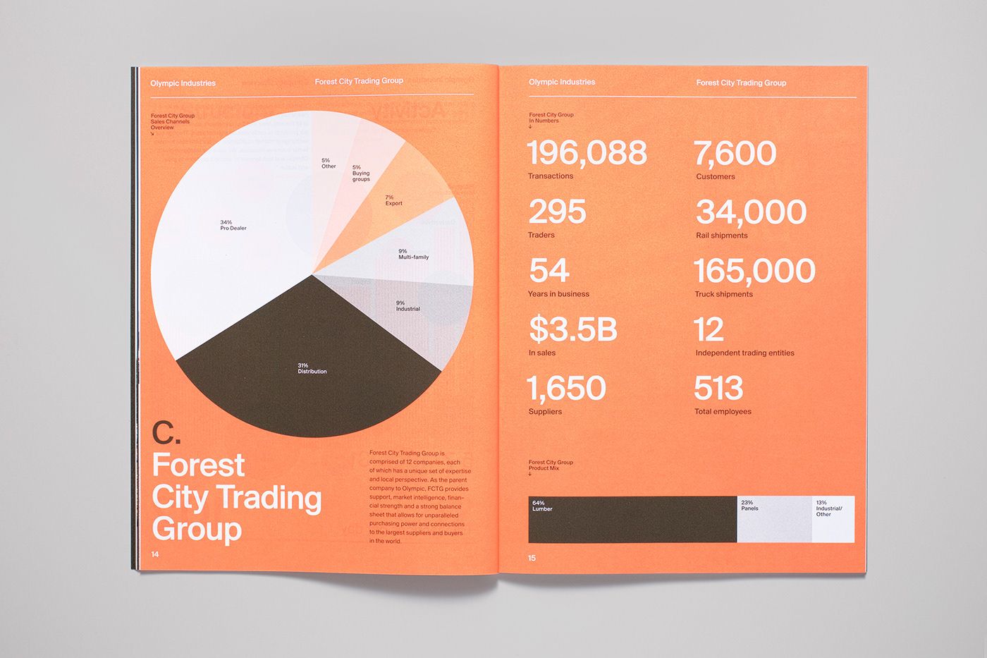
This infographic utilizes a clean, modern aesthetic to present complex business metrics through segmented circular charts and clear typography. The visual language is professional and analytical, effectively segmenting data points for easy comparison across different industries.
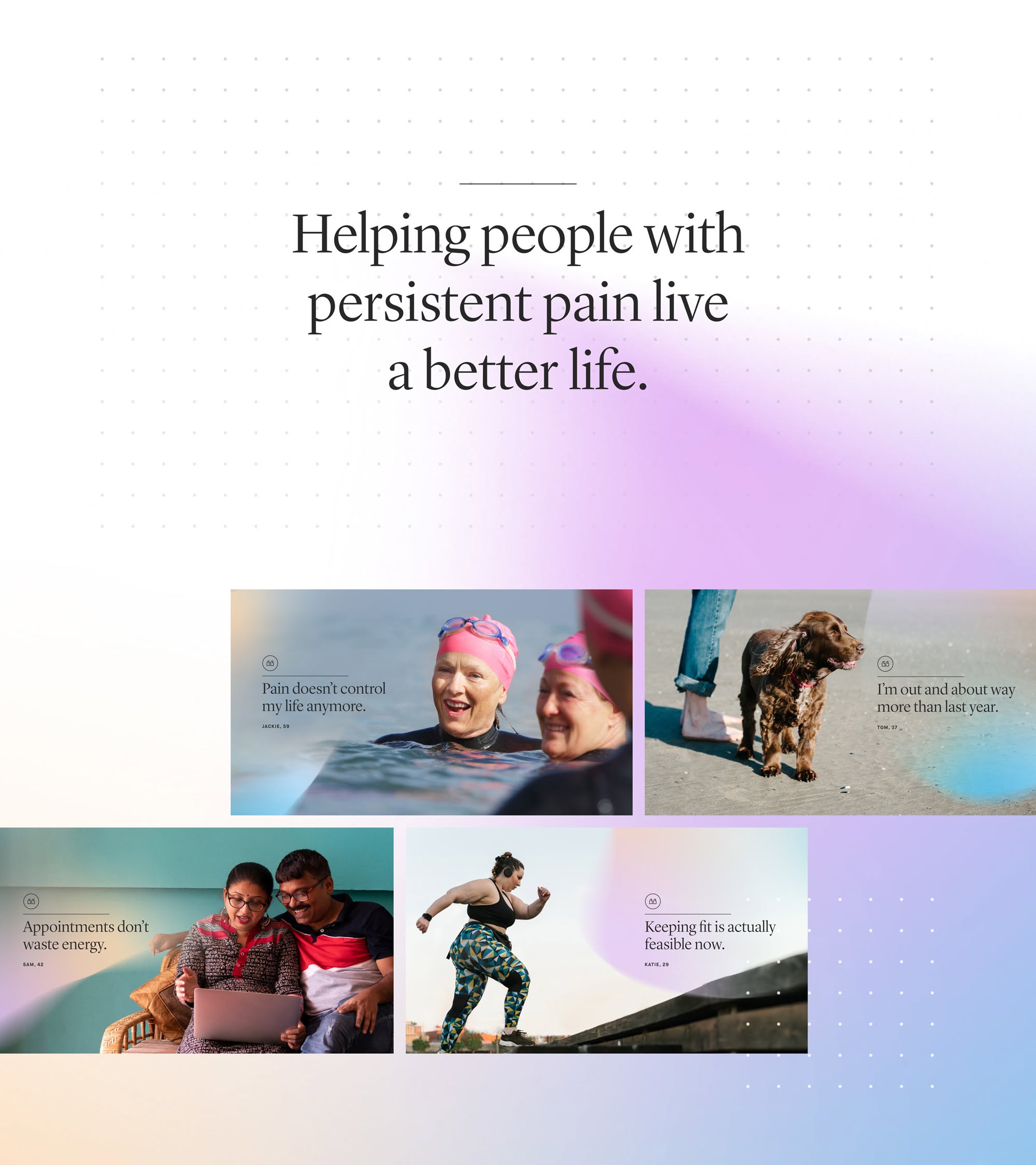
This design utilizes a clean, minimalist aesthetic with soft purple gradients to convey empathy and professionalism. The layout is balanced, using clear visual blocks of photographic evidence to illustrate the benefits of pain management. The overall feel is calm, hopeful, and supportive.
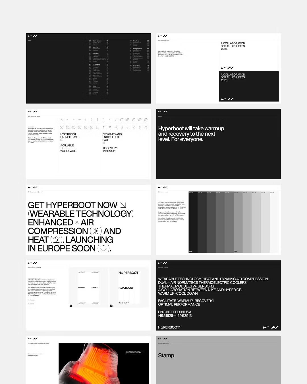
The design employs a sophisticated dark mode aesthetic characterized by high contrast and clean lines, effectively communicating a sense of advanced technology and professional collaboration. The visual language is sparse yet impactful, focusing attention directly on key features and calls to action.
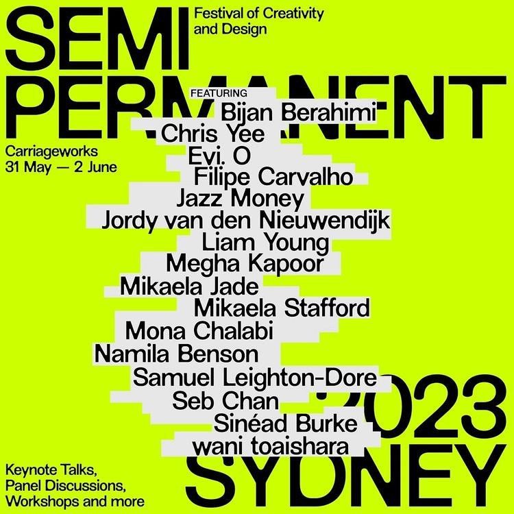
This design utilizes a high-contrast, graphic approach dominated by vibrant lime green and stark black text to create immediate visual impact. The layout is extremely organized, employing clear hierarchy through varying font sizes and weights to guide the viewer through the event details. The resulting feel is modern, energetic, and professional.
This design utilizes a clean, card-based layout with rounded corners and ample negative space to present segmented information clearly. The visual language is modern and professional, relying on a limited color palette and high contrast for readability.
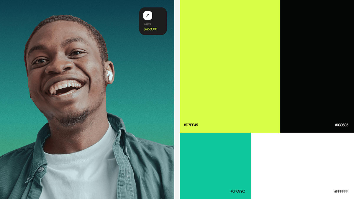
This design utilizes a clean, modern aesthetic, contrasting a warm portrait against vibrant, flat color blocks. The visual language is professional and graphic, employing strong color blocking and high contrast to create a dynamic yet organized composition.
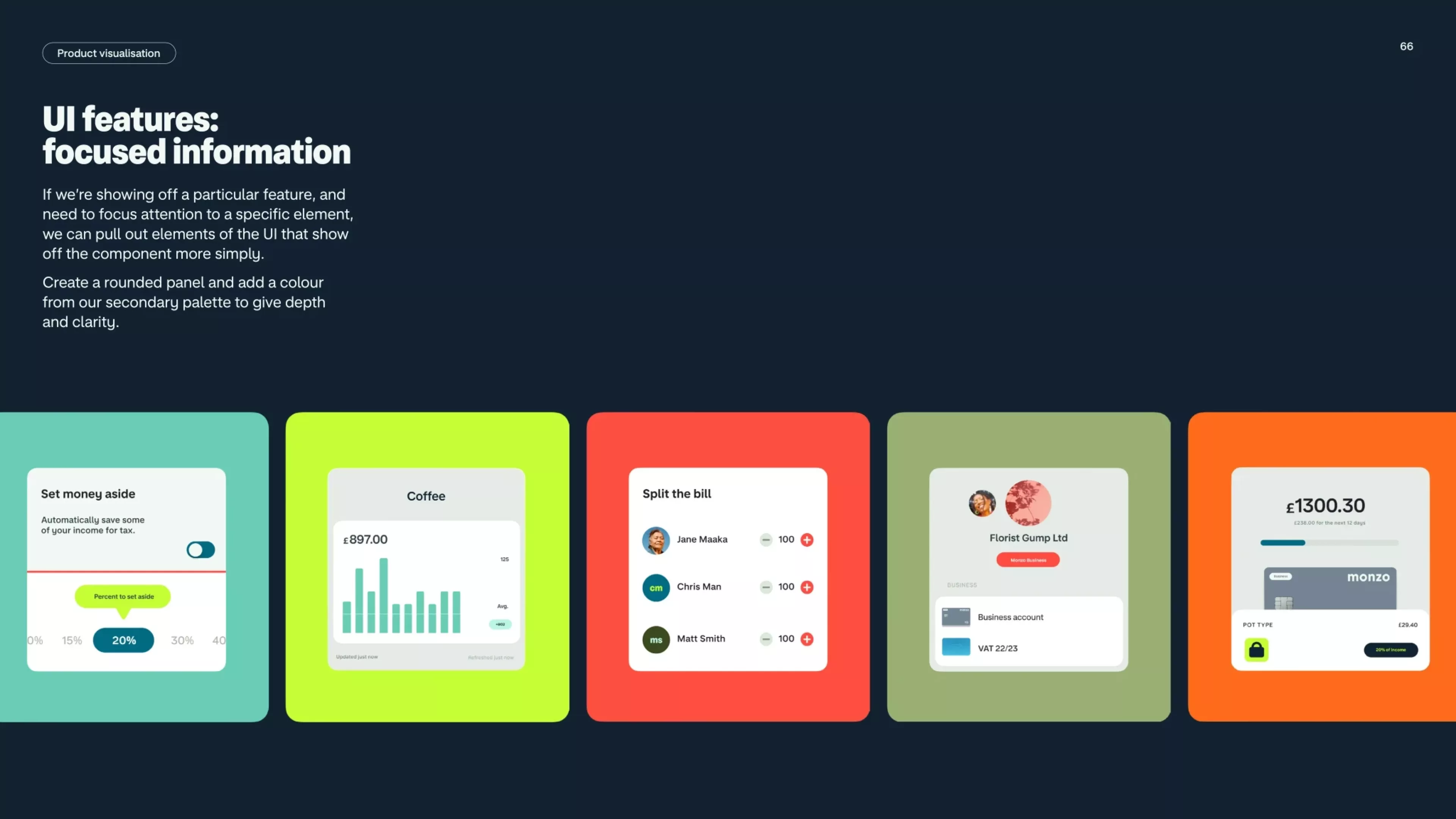
This set of visuals demonstrates clean, modern user interface elements designed for focused data presentation. The design uses a strong contrast between vibrant accent colors and dark backgrounds to ensure information hierarchy is clear and immediately digestible.
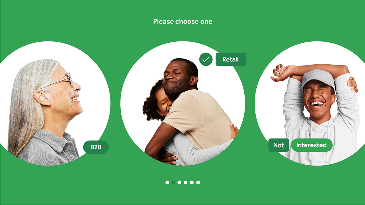
This design uses a clean, flat visual language to present segmented audience choices through illustrative vignettes. The composition is balanced and clear, utilizing circular framing to highlight distinct user profiles for market targeting purposes.
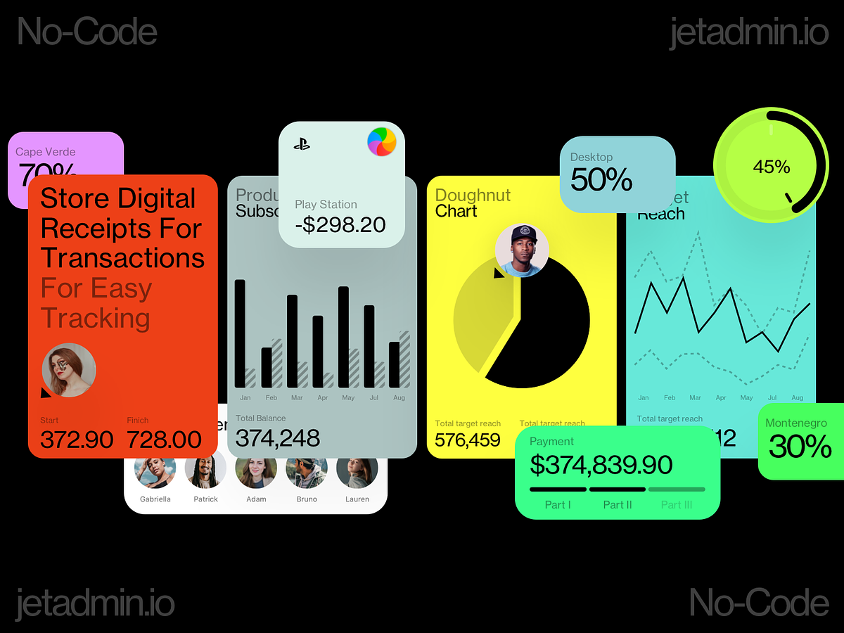
This dashboard employs a modern, clean flat design aesthetic focused heavily on data visualization. The visual language is professional and analytical, using vibrant colors and clear segmentation to present complex numerical data effectively. The overall feel is organized, dynamic, and tech-focused.
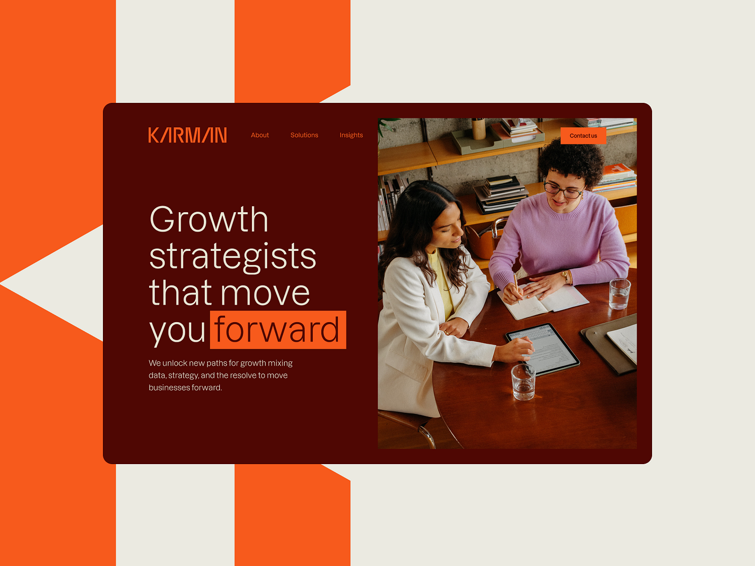
The design utilizes a bold, warm color palette combined with clean typography and professional photography to convey trust and expertise. It employs strong geometric blocks and warm tones to create a visually engaging yet professional atmosphere for a consulting service.
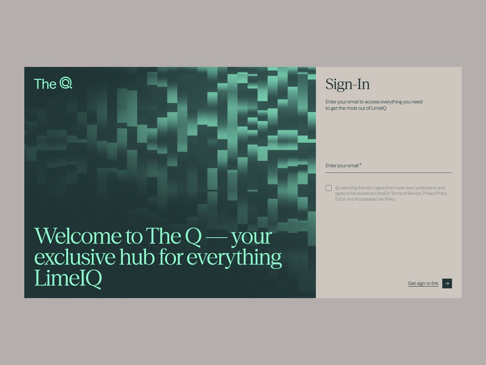
This interface uses a dark, textured background and vibrant teal accents to create a modern and sophisticated digital feel. The design is clean and focused, clearly directing the user toward a sign-in action with minimal clutter. The overall aesthetic is professional and tech-oriented.
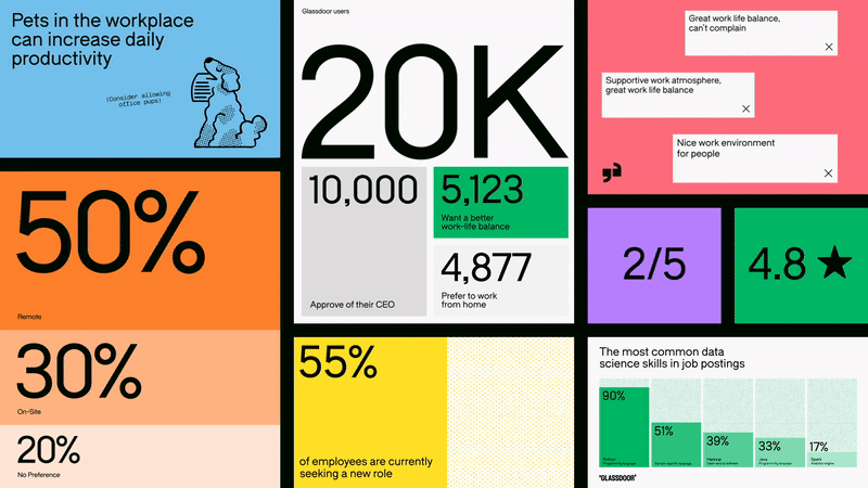
This is a dense, modular data infographic that utilizes bold typography and vibrant color blocking to present statistics and qualitative feedback. The design is clean and analytical, effectively breaking down complex information into digestible visual chunks suitable for corporate or HR reports.