suspenseful
6 designs
Showing 6 of 6 (6 total)
This design employs a clean, high-contrast minimalist approach typical of literary or genre fiction publishing. The layout uses strong typographic hierarchy and generous negative space to draw immediate attention to the author's name and the core concept. The overall feel is sophisticated, serious, and intriguing.
This design utilizes extreme minimalism, relying on high contrast between pure black and stark white typography to convey a sense of progress or exclusivity. The visual language is clean, direct, and highly focused on communicating a specific status (9% complete) while maintaining a sophisticated, premium feel.
This design utilizes a stark, high-contrast monochrome palette typical of early digital interfaces or text-based games. The visual language is purely functional, relying on clear typography and negative space to present necessary game information efficiently.
This image functions as a promotional grid or poster for a film, utilizing a dark, moody aesthetic with high-contrast photographic stills. The design is structured in a clean, modular grid layout, emphasizing individual character portraits or scenes against a dark background.
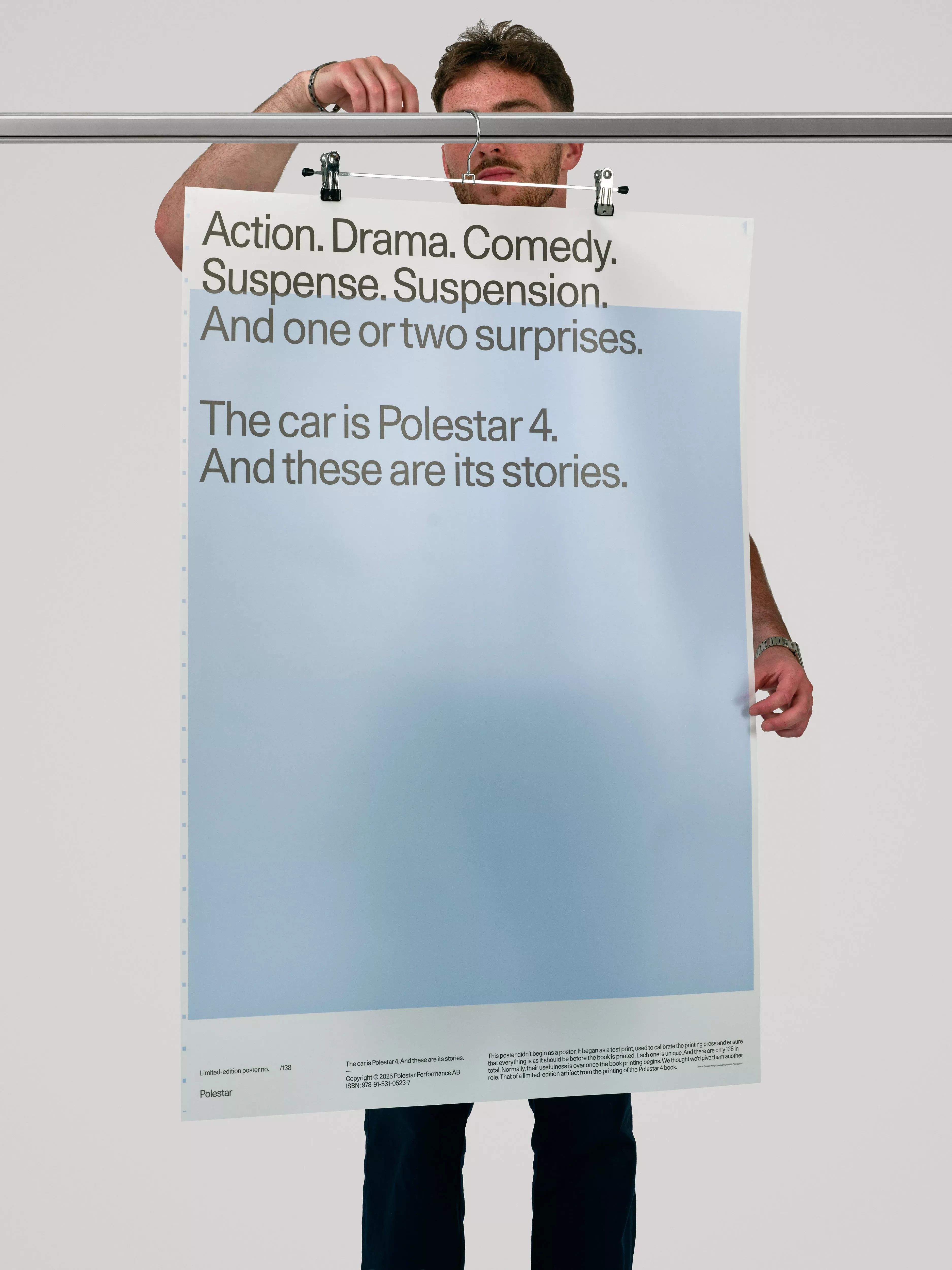
This design utilizes a stark, minimalist approach, employing strong capitalization and clear, punchy text to establish a dramatic tone. The visual language is direct and confident, relying heavily on typography and negative space to convey excitement about the subject matter.
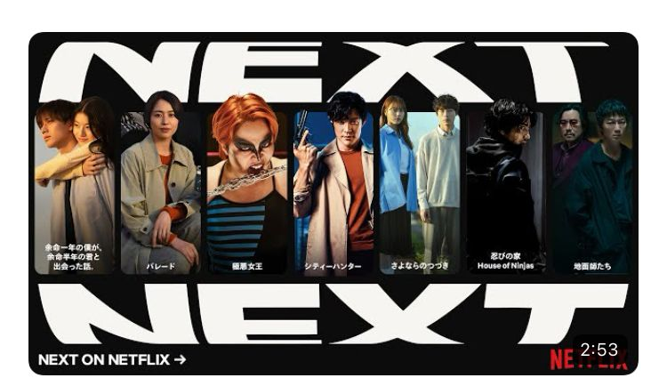
This design utilizes a stark, high-contrast aesthetic characterized by black and white typography set against intense character portraits. The visual language is cinematic and dramatic, effectively drawing attention to the featured cast while maintaining a serious and suspenseful tone.