serious
1,644 designs
Showing 24 of 1644 (1644 total)
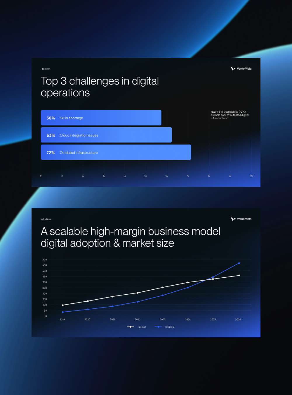
This image presents two distinct data visualizations set against a deep blue background, emphasizing corporate and analytical reporting. The design utilizes clear bar charts and line graphs to communicate complex business challenges and growth trends effectively.
The design employs a clean, minimalist aesthetic dominated by strong typography and muted photography to convey professionalism. The visual language is modern and direct, focusing on clear hierarchy between branding, navigation, and team imagery. The overall feel is sophisticated, authentic, and highly professional.
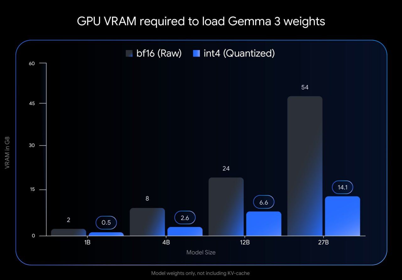
This is a data visualization presenting the required GPU VRAM for loading different sizes of Gemma 3 weights, comparing raw (bf16) and quantized (int4) versions. The design is functional and stark, focusing purely on comparative performance metrics.
This design employs a high-contrast, graphic approach, juxtaposing stark black and white architectural lines against an intense, saturated red field. The visual language is bold and conceptual, focusing on the interplay between urban form and emotional expression.
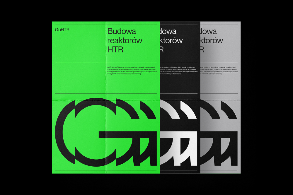
This design utilizes a stark, high-contrast visual language to present technical information clearly. The layout is modern and modular, employing distinct color blocks and grayscale tones to segment different pieces of content effectively. The overall feel is clinical, precise, and highly professional.
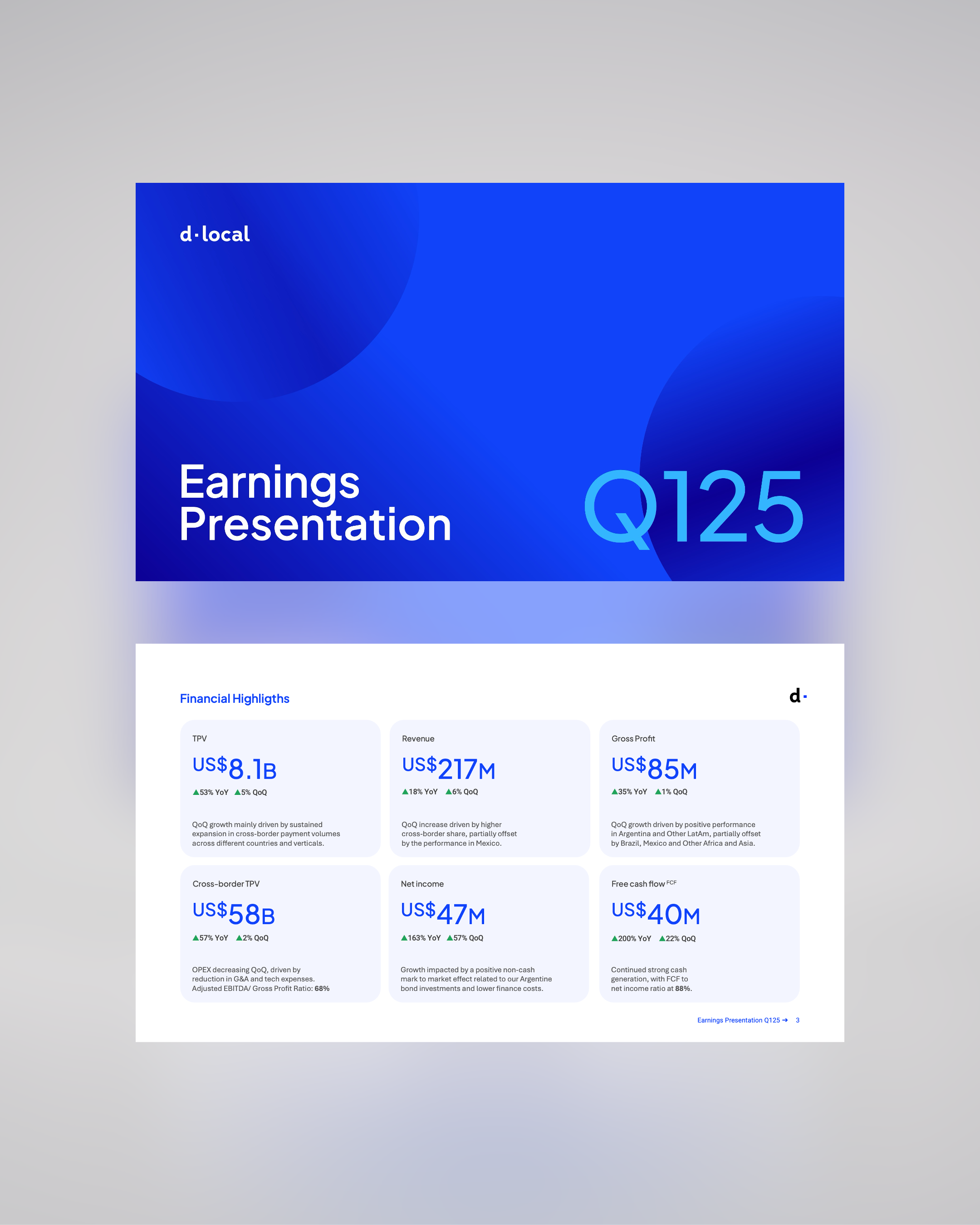
This is a highly structured and data-focused slide employing a strong, cool color palette to present financial earnings. The design prioritizes clarity and the immediate impact of large numerical figures.
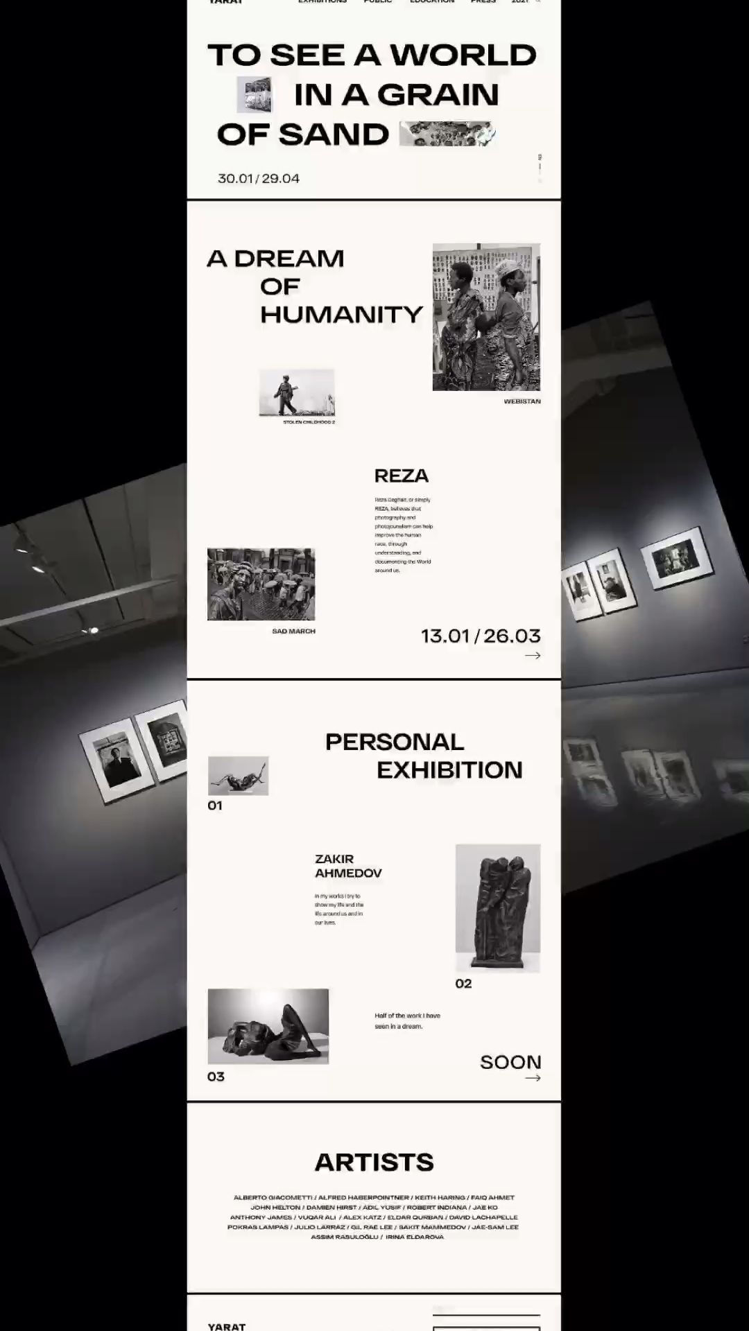
This design employs a stark, high-contrast minimalist approach, utilizing ample negative space and precise typography to create a serious and contemplative atmosphere. The visual language relies heavily on black, white, and grayscale tones to emphasize the textual content and the implied gravity of the artistic subject matter.
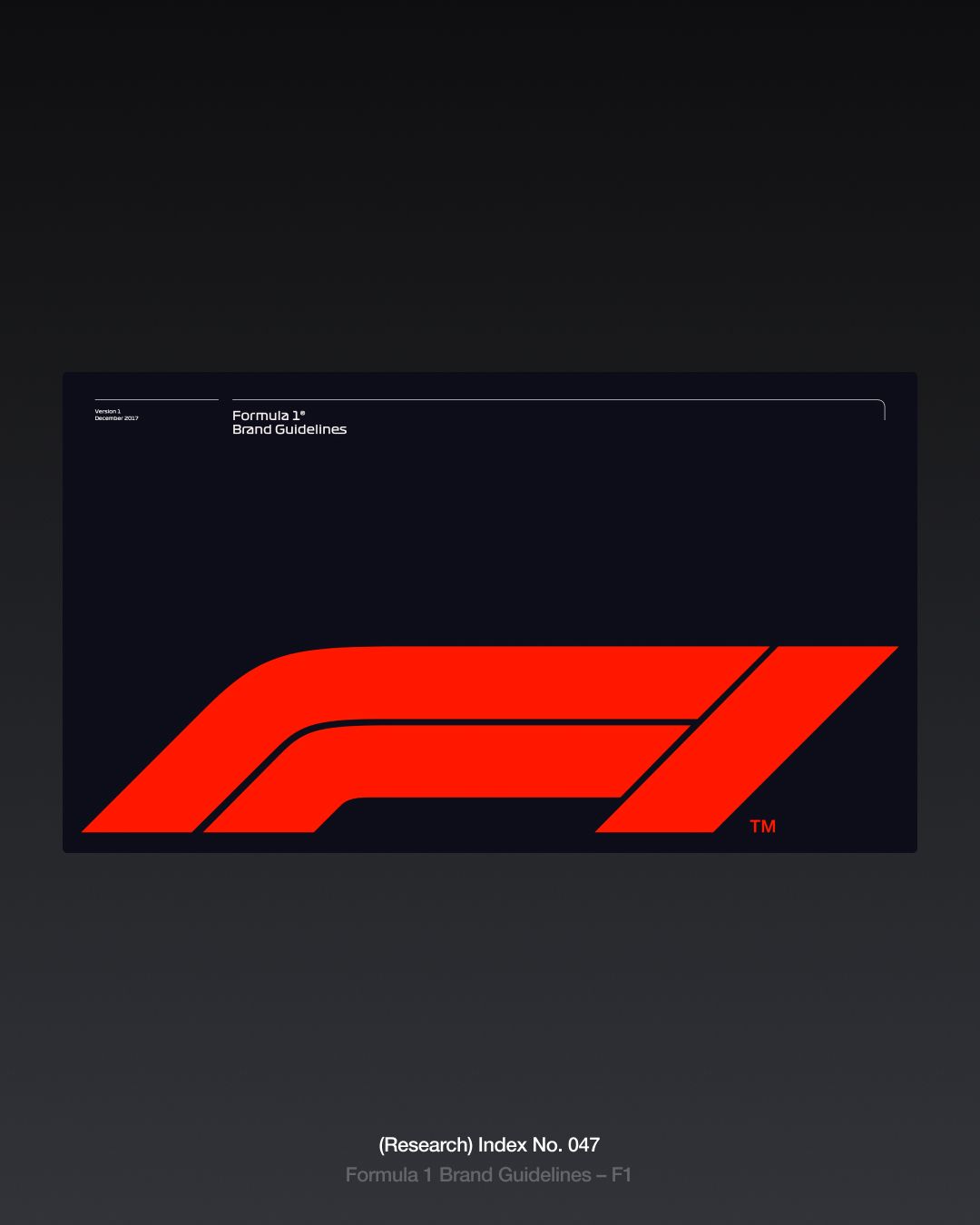
This design employs a high-contrast, minimalist aesthetic dominated by stark black and vibrant red to convey power and speed. The visual language relies on bold geometric shapes and strong negative space to focus attention entirely on the core branding element. The overall feel is aggressive, technical, and highly focused.
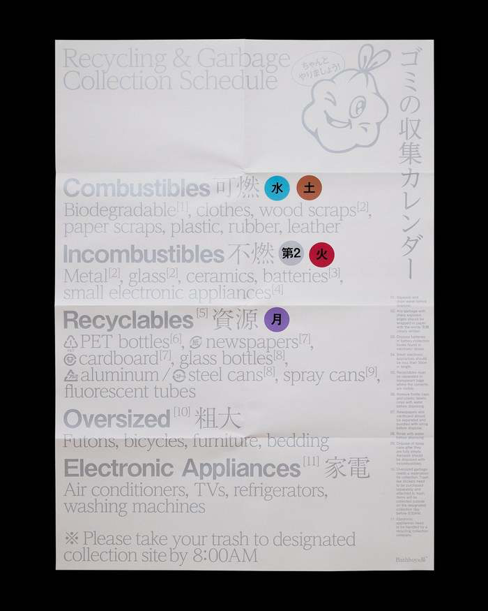
This image is a dense, highly functional informational document, likely a public guide or sorting instruction. The design prioritizes clear categorization and textual density over aesthetic appeal, resulting in a purely utilitarian visual language.
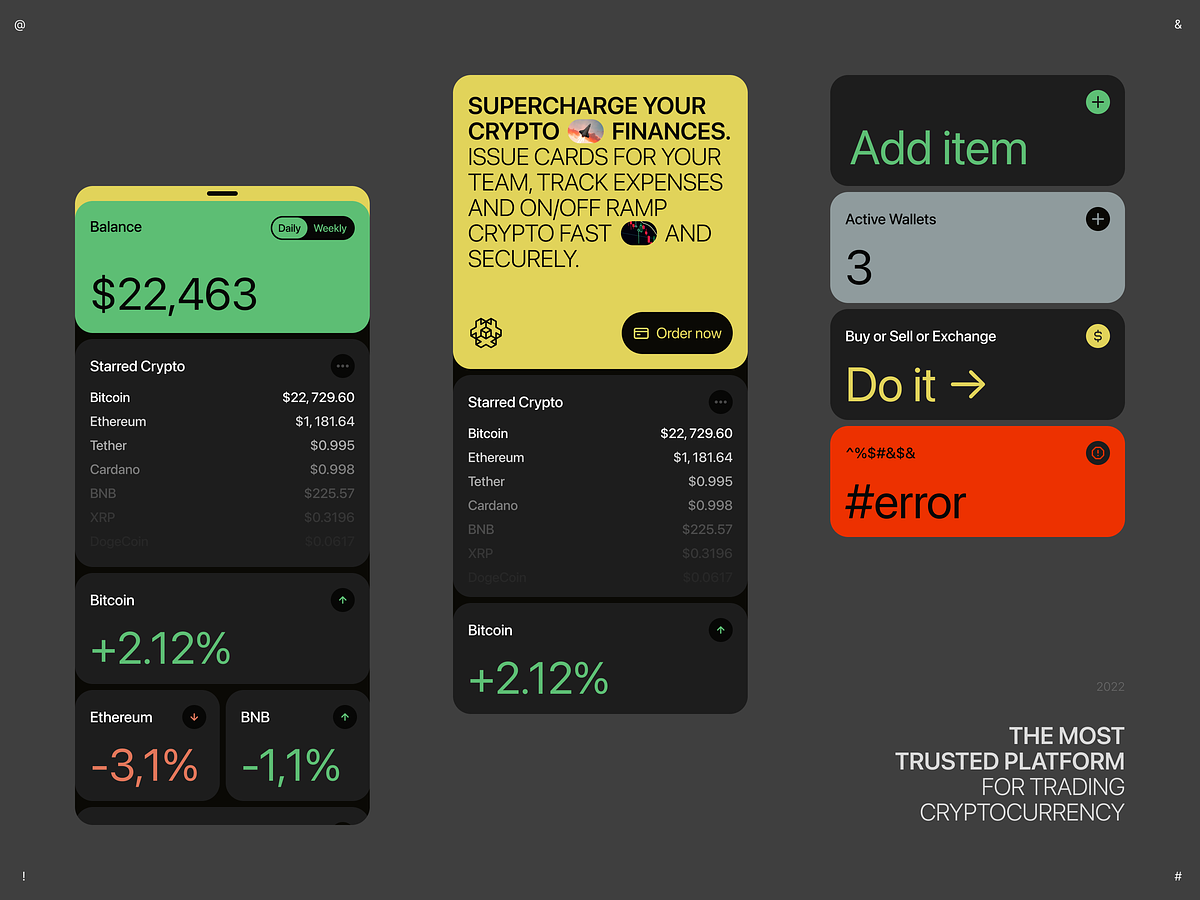
This interface presents a dense, data-rich view typical of a cryptocurrency trading platform, utilizing a dark mode aesthetic with high-contrast accent colors. The design prioritizes readability and immediate presentation of financial metrics.
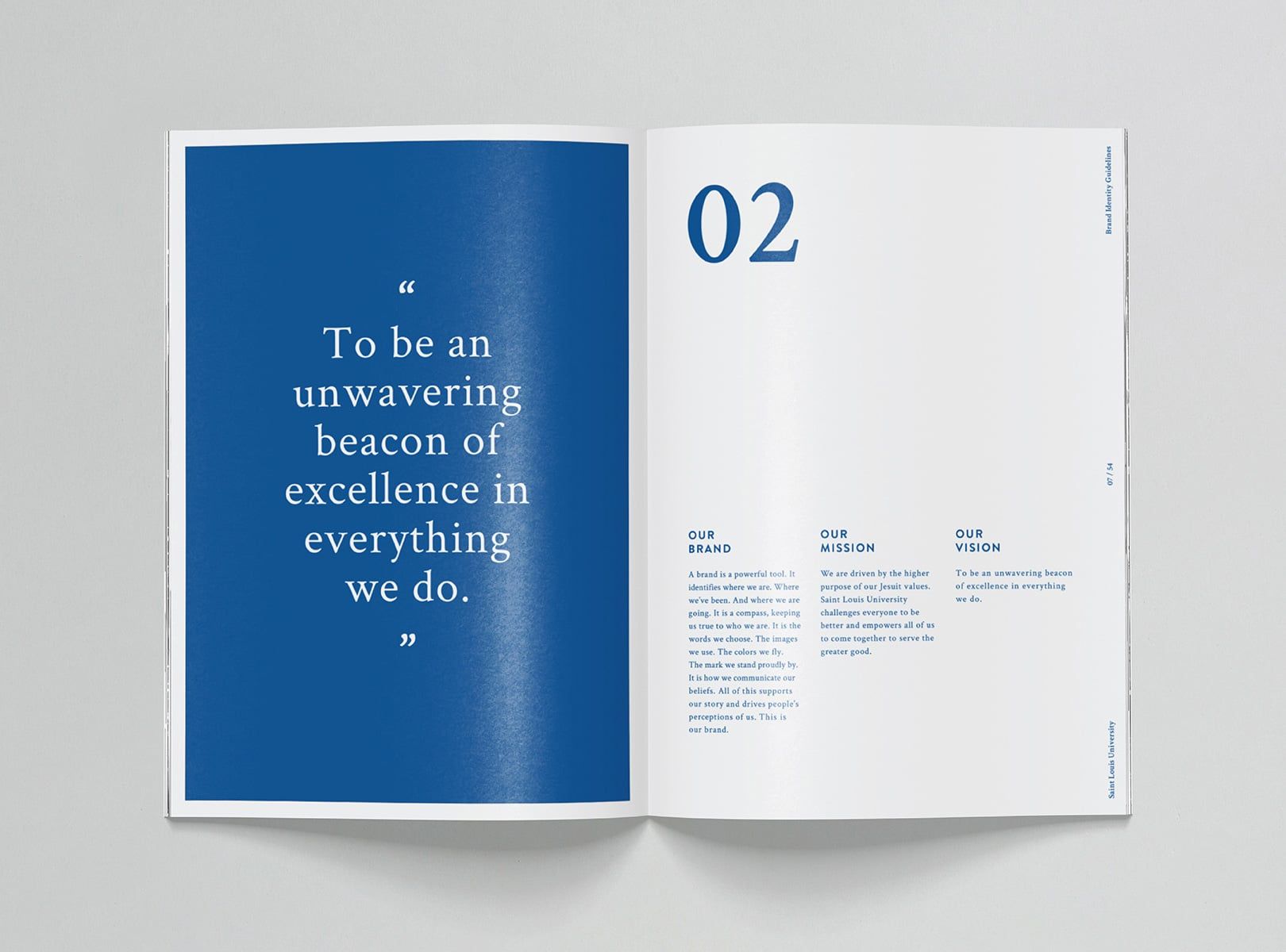
This design utilizes a strong contrast between deep blue and stark white to convey professionalism and trust. The layout is clean and balanced, employing ample negative space on the right page to ensure readability and emphasize key textual information.
This visual presentation utilizes a stark, high-contrast monochrome palette to establish a serious and authoritative corporate identity. The design relies heavily on negative space, bold typography, and minimalist photographic elements to convey strength and professionalism.
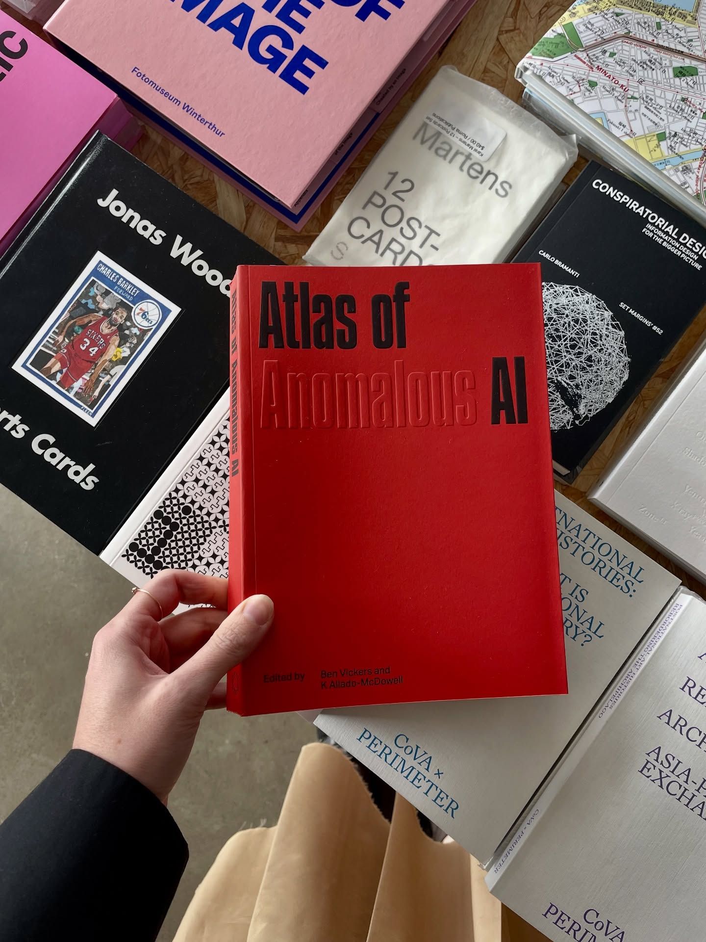
This image showcases a curated collection of academic or specialized publications, utilizing strong color blocking and varied textures. The composition emphasizes the bold red spine of the central book against a backdrop of muted tones, creating a sense of intellectual depth and organized chaos.
This collection showcases a highly professional and minimalist design language characterized by strong grid systems, ample negative space, and high contrast. The visual identity is clean, structured, and conveys a sense of academic authority and corporate sophistication.
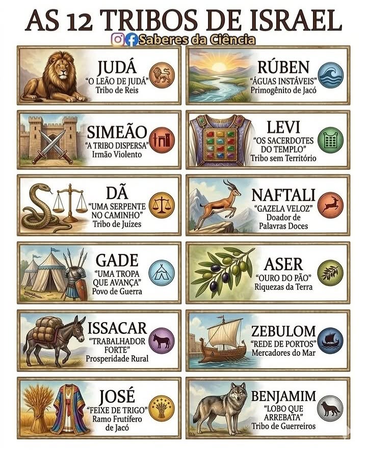
This is a highly structured infographic design utilizing detailed illustrative icons paired with textual information to present historical or religious data. The visual language is rich in earthy tones and detailed engravings, creating a sense of ancient authority and educational depth. The composition is clean and modular, making the twelve entries easily digestible.
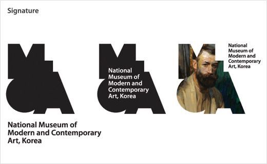
This design utilizes a stark, high-contrast visual language combining abstract geometric forms with photographic portraiture to establish an institutional and artistic identity. The overall feel is serious, modern, and deeply rooted in cultural heritage, relying on strong silhouettes and monochromatic elements.
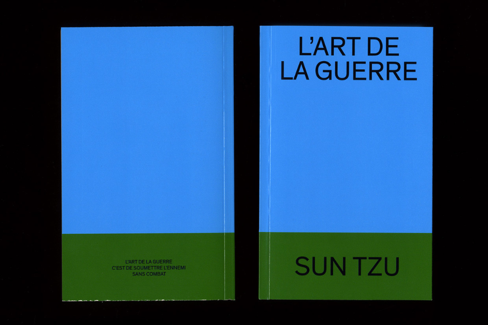
This design utilizes a stark, minimalist approach, relying on a strong vertical division between a bright blue field and a contrasting olive green text block. The visual language is clean, academic, and direct, emphasizing clarity over ornamentation.
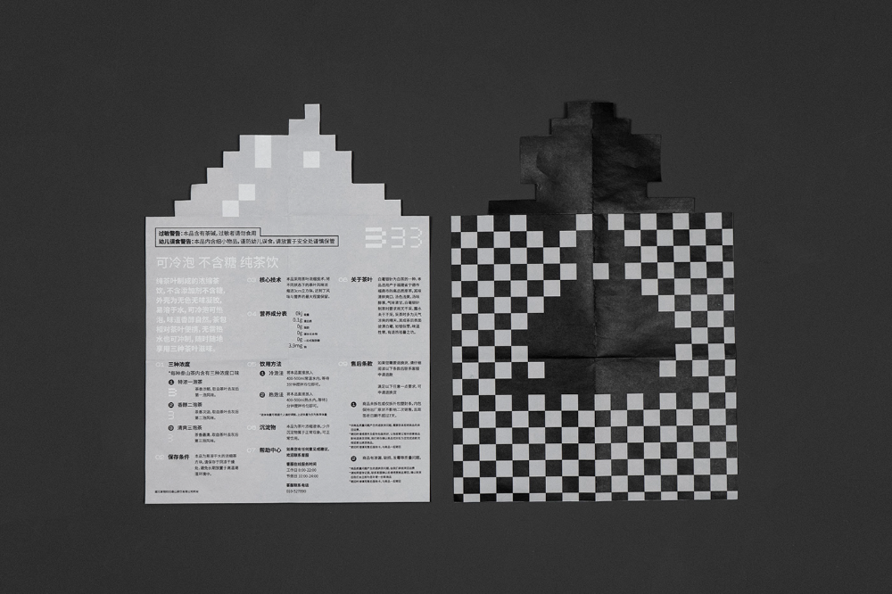
This design utilizes high contrast and stark monochrome elements, juxtaposing abstract geometric shapes with dense blocks of fine print overlaid by a checkerboard texture. The visual language is formal and emphasizes structure and information density.
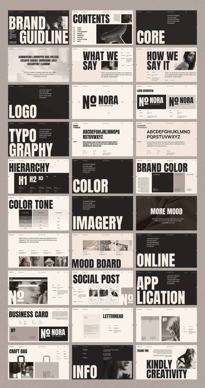
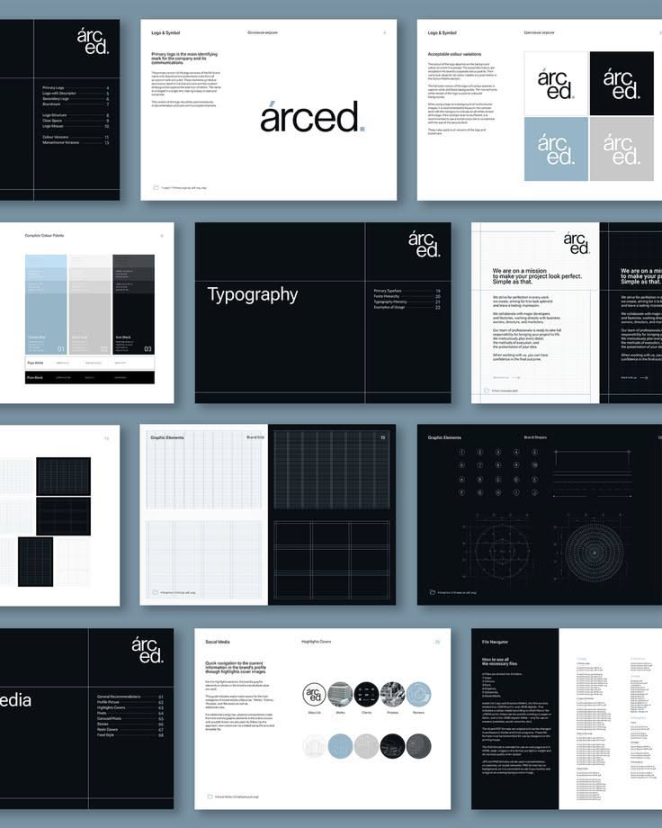
This collection showcases a highly organized and minimalist design system, emphasizing clean lines, high contrast, and strong typographic hierarchy. The visual language is modern and professional, relying heavily on negative space to ensure clarity and sophistication.
This design utilizes a stark, minimalist aesthetic characterized by high contrast between white typography and deep charcoal backgrounds. The visual language relies heavily on clean lines, geometric shapes, and ample negative space to create a sophisticated and structured display.
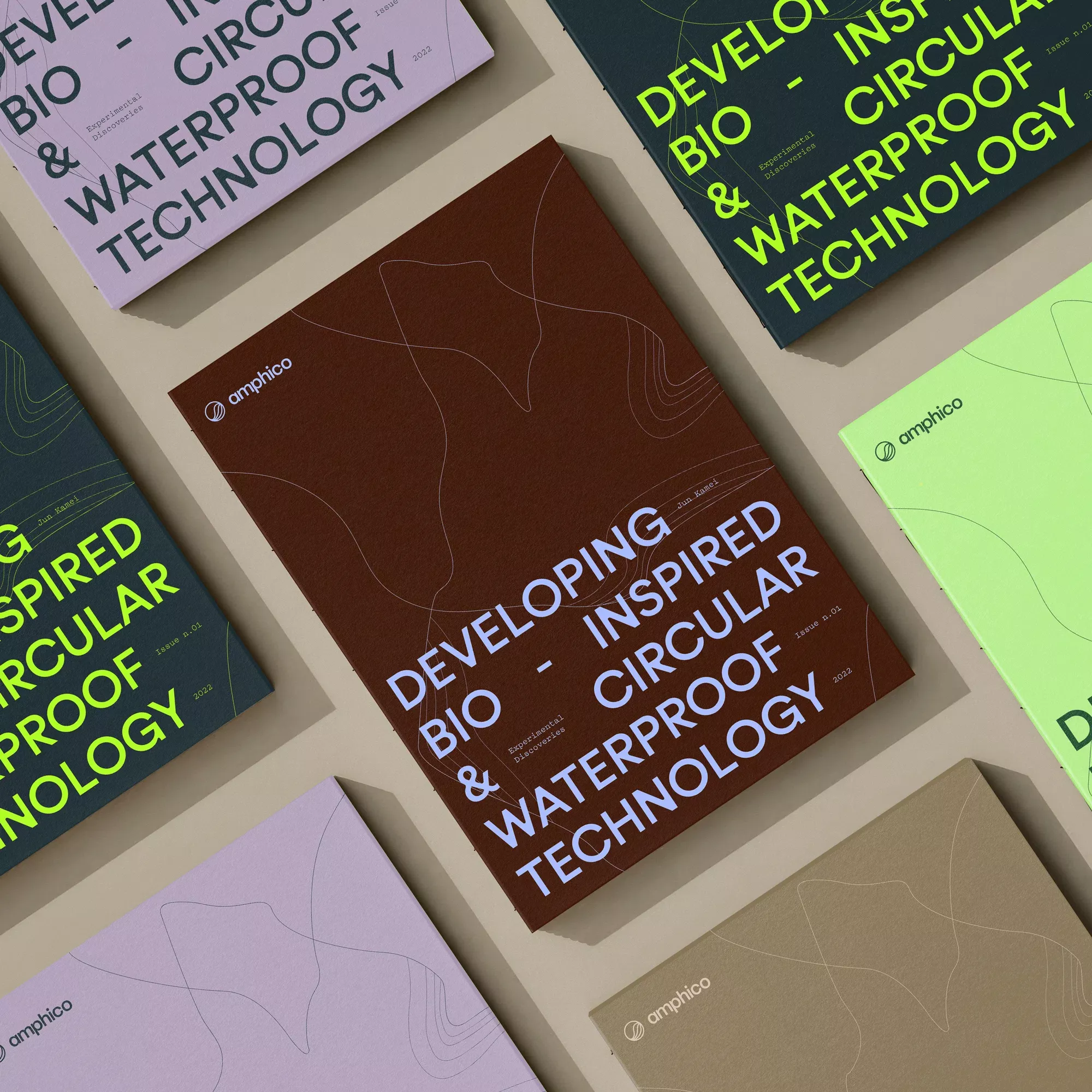
This is a sophisticated, minimalist flat lay showcasing technical reports or publications. The design relies heavily on muted earth tones and clean typography to convey a sense of academic rigor and modern sustainability. The composition is carefully arranged to emphasize texture, depth, and the cohesive branding of the materials.
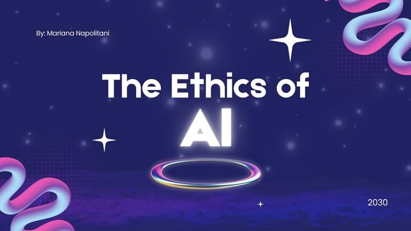
This graphic employs a deep, cosmic color palette to create a futuristic and serious tone suitable for academic or technological topics. The design balances dark backgrounds with bright, glowing typography and abstract swirling lines to suggest complexity and innovation.
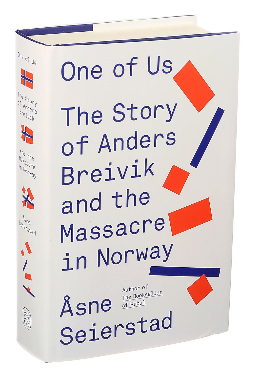
This book cover employs a clean, minimalist design utilizing strong geometric accents against a stark white background. The visual language is structured and journalistic, using color blocking to draw attention to the title while maintaining a serious, investigative tone.
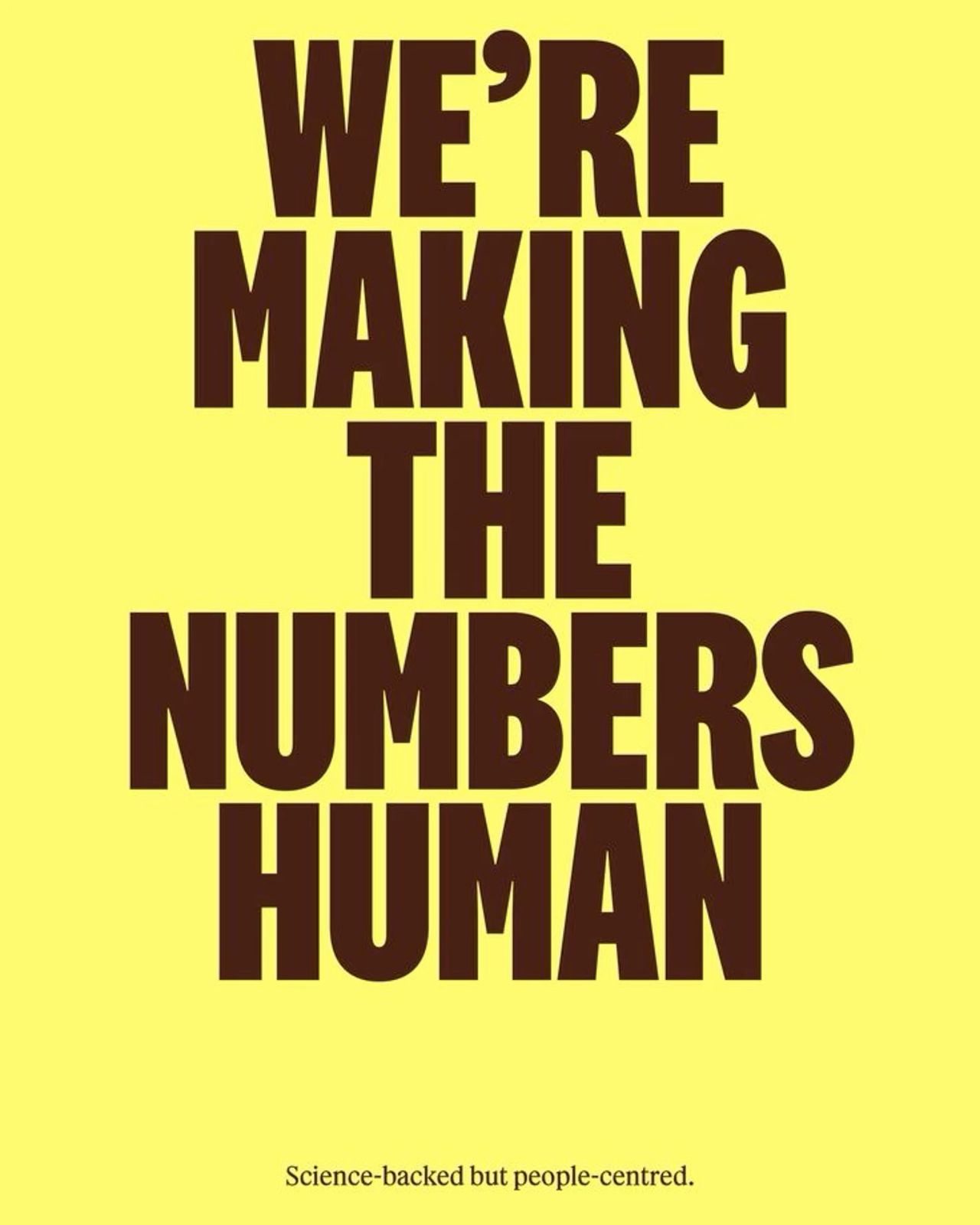
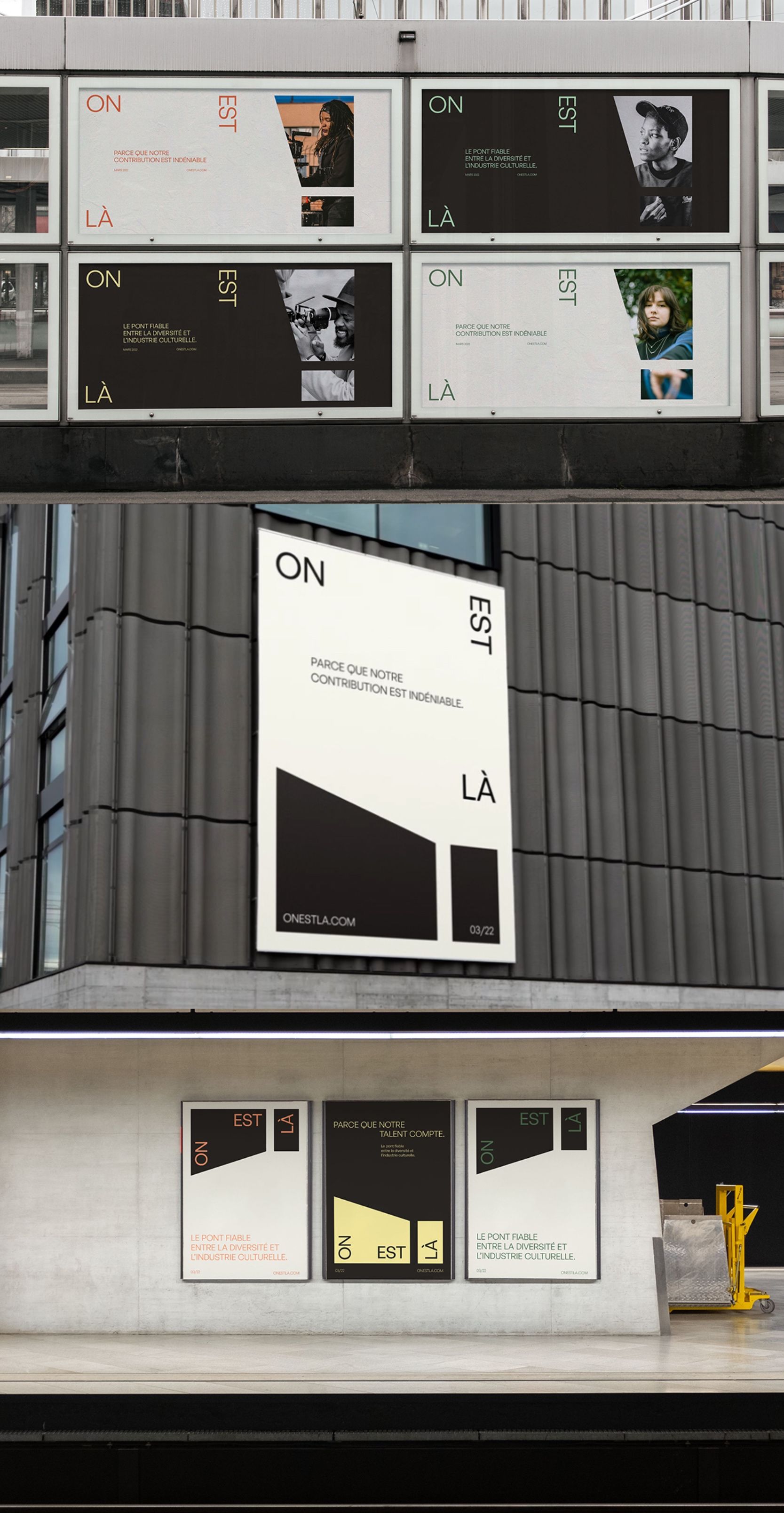
This design utilizes high contrast and bold, stacked typography to deliver a clear, authoritative message. The visual language is minimalist yet impactful, relying on strong typographic hierarchy to emphasize the core concept. The overall feel is professional, trustworthy, and academic.