historical
72 designs
Showing 24 of 72 (72 total)
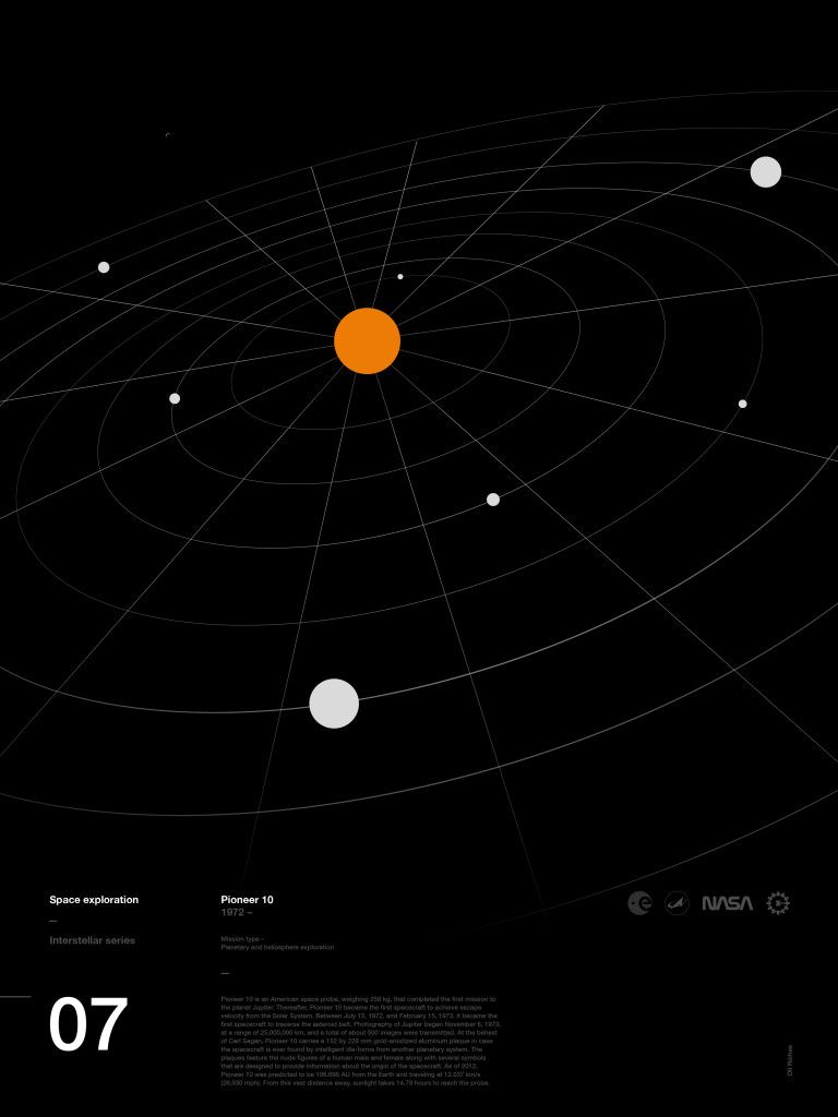
This is a minimalist, high-contrast radial graphic evoking the structure of a star map or planetary orbit, strongly referencing themes of space exploration. The design uses stark geometry and negative space to create a sense of depth and historical significance.
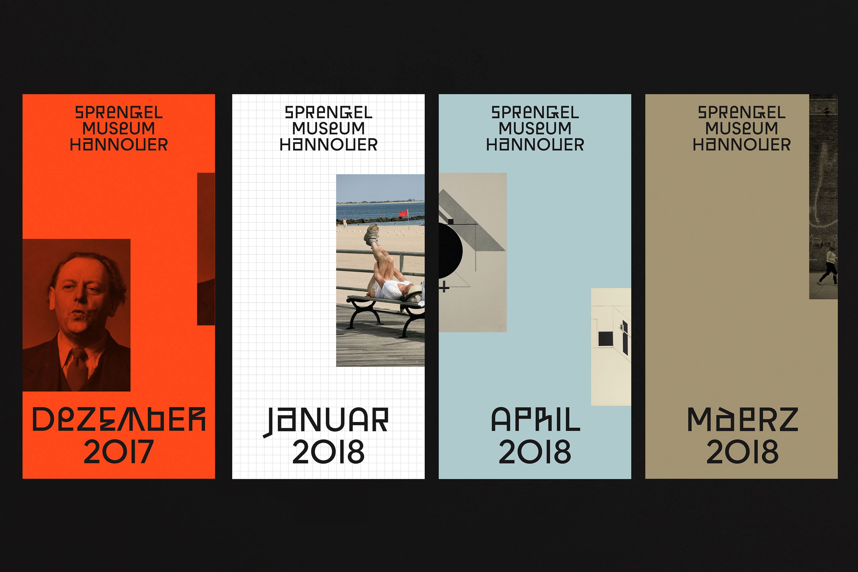
This design utilizes a stark, modular grid structure to present archival information in a minimalist and highly structured manner. The visual language relies on contrasting solid color blocks and photographic elements to create a sense of temporal layering.
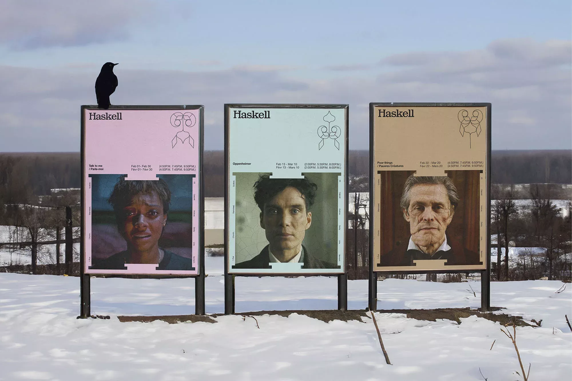
This is an outdoor exhibition featuring three vertical panels displaying photographic portraits and minimalist text, suggesting a historical or artistic retrospective. The design relies on stark contrast and simple composition to present the subjects in a raw, documentary manner.
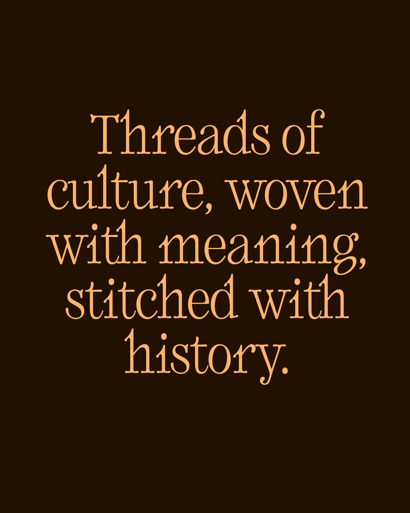
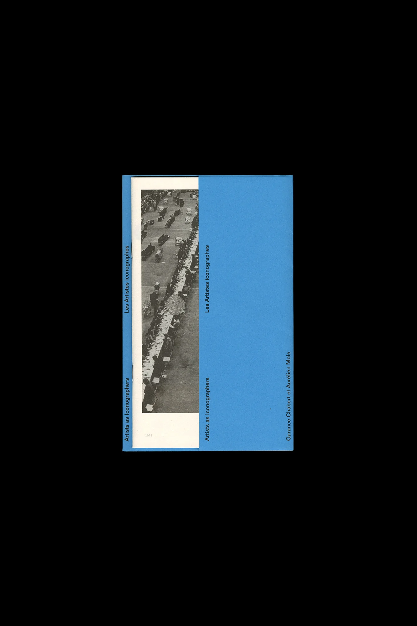
This design utilizes a rich, earthy color palette to convey a sense of depth and history. The elegant serif typography is used effectively against the dark background, creating a sophisticated and literary feel that emphasizes themes of heritage and cultural depth.

This visualization uses concentric elliptical lines against a dark background to represent orbital paths or trajectories, creating a sense of precision and movement. The design employs a limited, warm-to-cool color gradient to emphasize the progression of these paths. The overall feel is highly technical, analytical, and evokes themes of space exploration and scientific tracking.
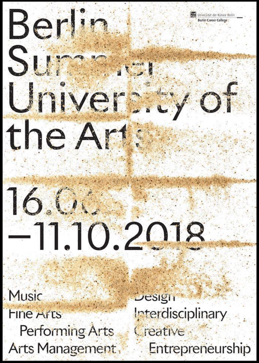
The design is stark, text-heavy, and utilizes a distressed texture to convey a raw, academic, or artistic atmosphere. The layout is straightforward, relying on strong typographic hierarchy to present an event announcement.
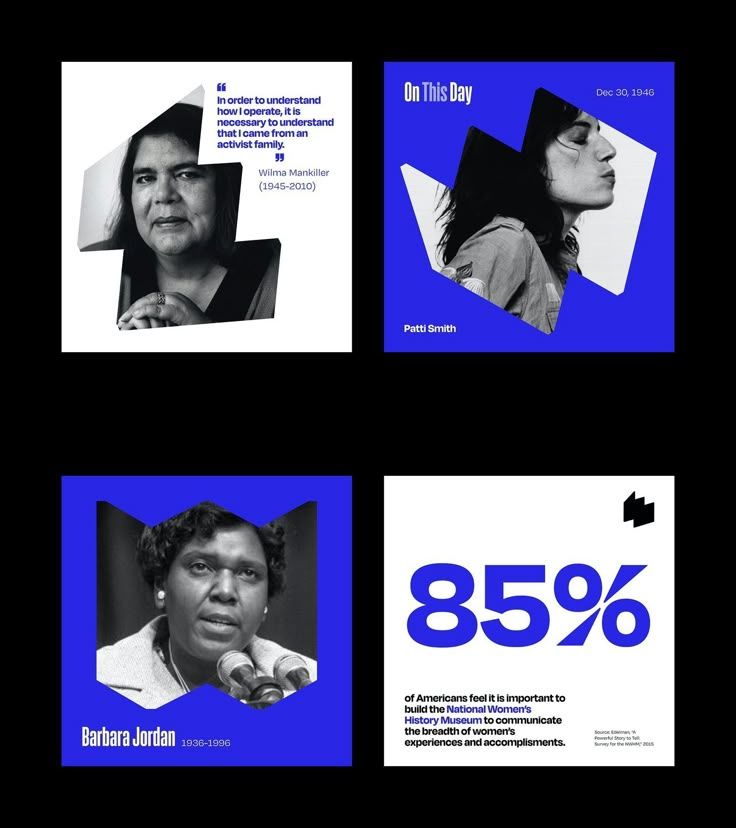
This is a modular, journalistic design featuring four distinct portrait and statistic elements arranged in a grid format. The visual language relies heavily on high contrast between monochrome photography and solid color blocks to create a serious, commemorative tone.
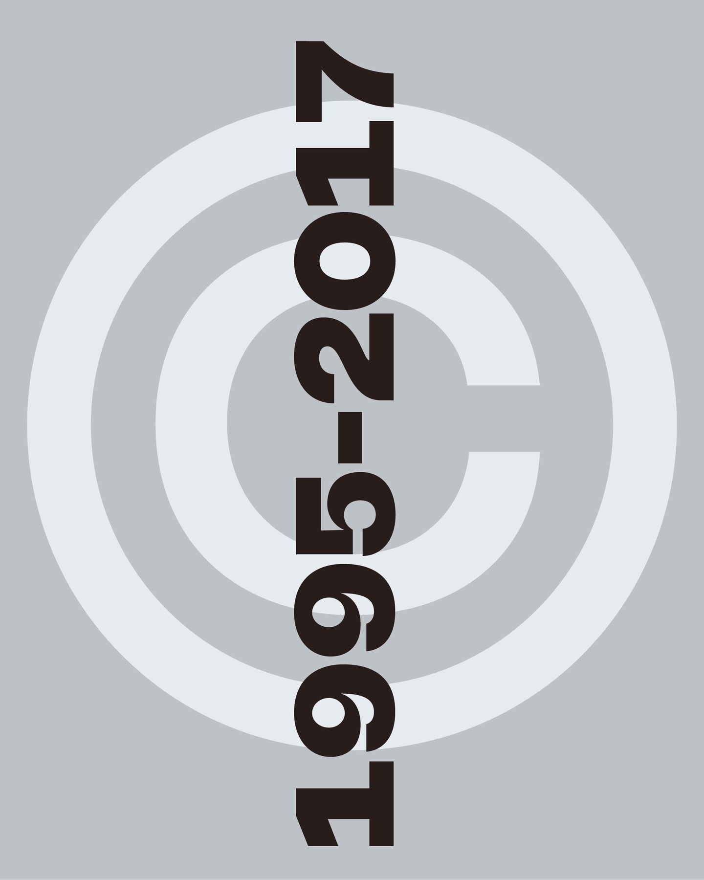
This design utilizes a minimalist and geometric approach, employing concentric circles to create depth and structure around a vertical timeline. The visual language is clean and archival, relying heavily on negative space and subtle tonal variations to convey a sense of history or progression.
This design blends rich historical imagery with a clean, modern editorial layout, creating a sophisticated and academic feel. The composition uses strong visual hierarchy, pairing detailed artwork with minimalist typography to highlight scholarly content.
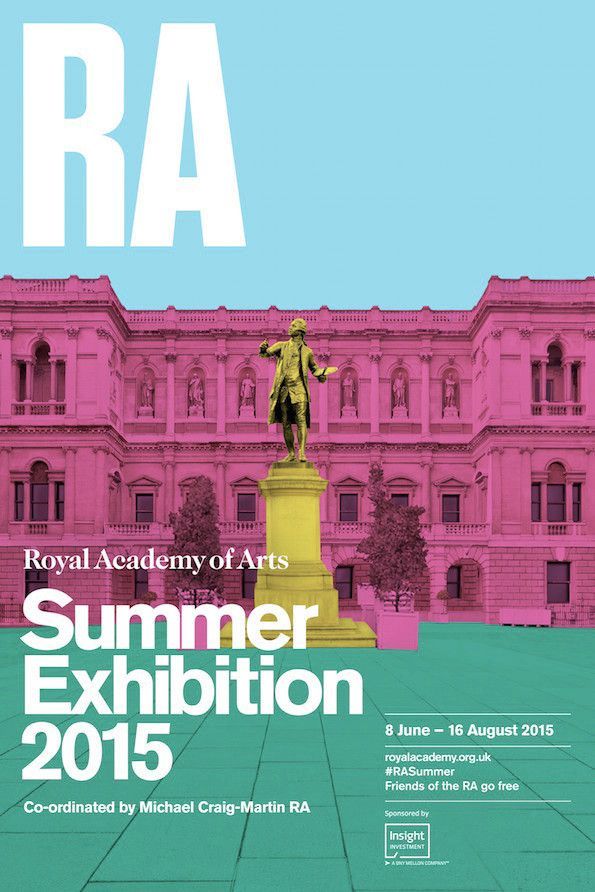
This design employs a classic, academic visual language by juxtaposing the grandeur of historical architecture with clean, modern typography. The composition is balanced and layered, using a muted yet striking color palette to convey a sense of tradition and refined elegance.
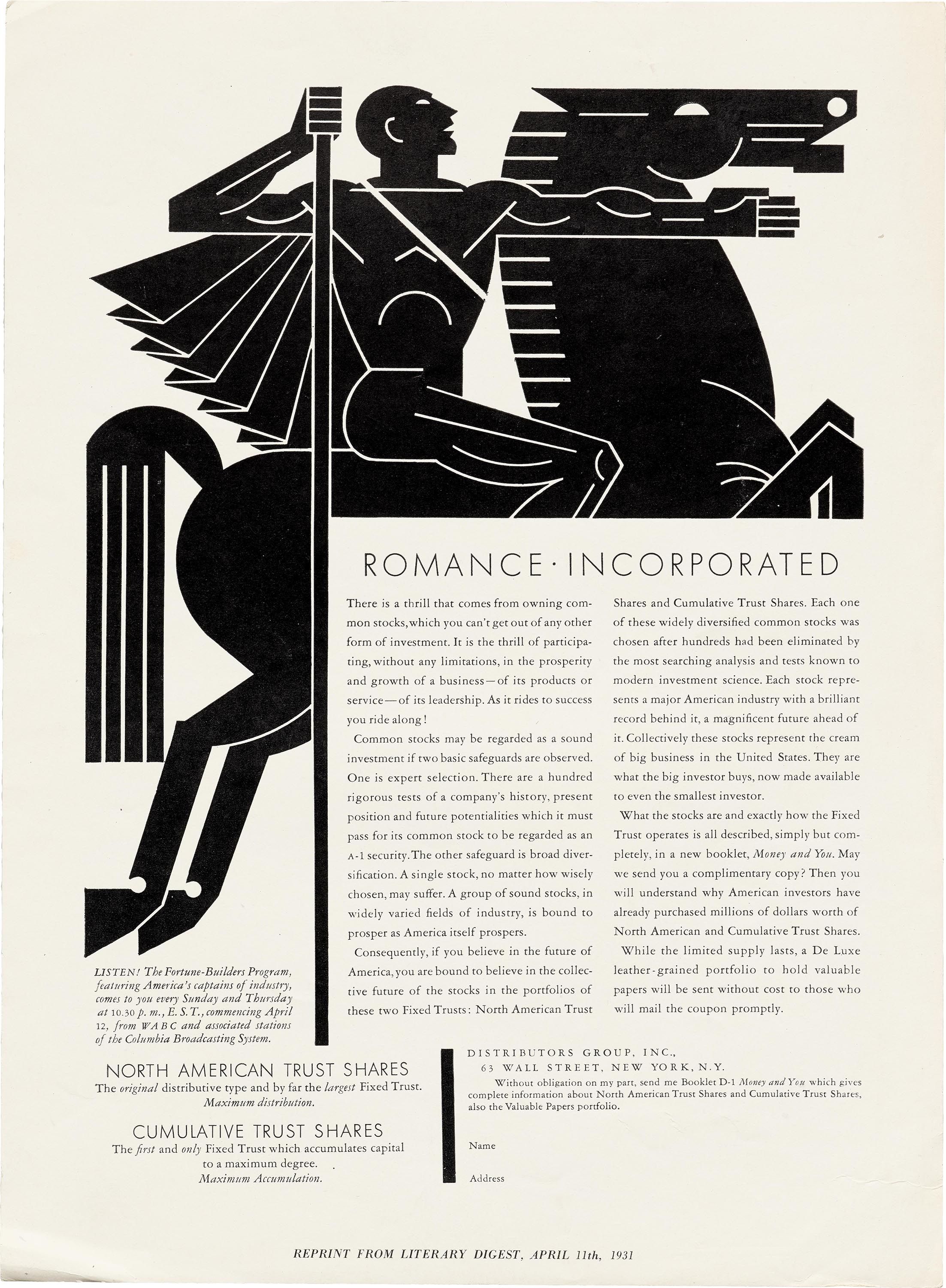
This is a high-contrast, vintage graphic design featuring strong silhouettes and bold typography typical of early 20th-century promotional material. The visual language relies heavily on stark black and white contrast to create dramatic, symbolic figures and convey a sense of established financial solidity.
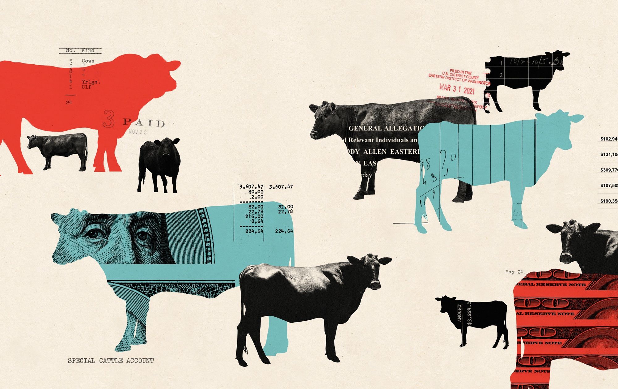
This design utilizes a stark, graphic silhouette style to juxtapose themes of agriculture and finance. The visual language relies on strong, dark shapes against a muted background, creating a serious, documentary feel reminiscent of old ledger prints or legal documents.
The design utilizes a modular, high-contrast layout featuring distinct color blocks and evocative historical imagery. The visual language is clean and editorial, effectively pairing rich textures and portraits with bold typography to create a sense of curated discovery.
This design successfully blends classical illustrative elements with clean, modern typography to create a sophisticated and academic feel. The composition uses strong vertical divisions and high contrast between muted earth tones and stark white space to guide the viewer's eye through the information. The overall aesthetic is thoughtful, serious, and rooted in historical artistic tradition.
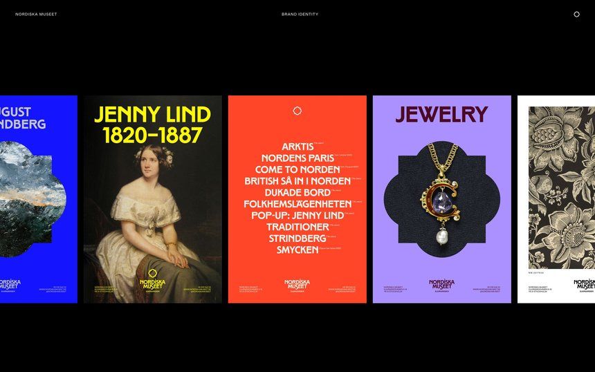
This is a highly structured vertical collage or editorial layout, utilizing strong typographic hierarchy and contrasting color blocks to present cultural and art history information. The design employs a clean, academic aesthetic typical of museum publications or high-end art journalism.
This is a stark, collage-based graphic design piece juxtaposing an iconic architectural element (the US Capitol dome) with fragmented text and a silhouette, creating a sense of historical commentary or critique. The visual language is raw, high-contrast, and deliberately fragmented.
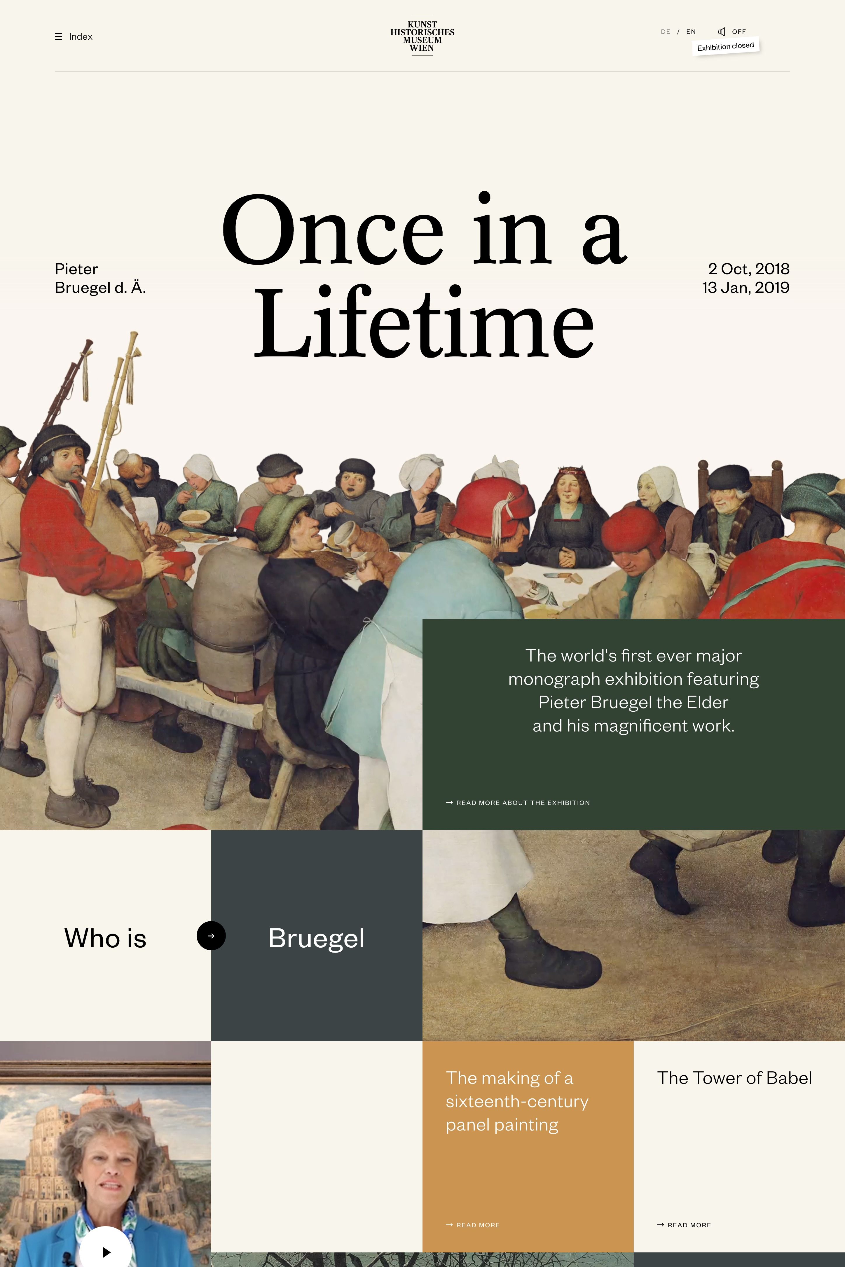
The design is clean, academic, and minimalist, utilizing a muted color palette with strong photographic elements to convey a serious or reflective tone. The layout is balanced, placing clear textual information against a background that suggests institutional history or memory.
The image presents a collection of diverse design artifacts, ranging from formal academic documentation to artistic branding and architectural elements. The visual language is a mix of clean, minimalist text layouts alongside more textured photographic elements, suggesting a portfolio or exhibition context.
The design is minimalist and academic, utilizing a stark contrast between a photographic element and a solid block of color. It employs a clean, vertical layout typical of archival or exhibition material, conveying a sense of seriousness and historical documentation.
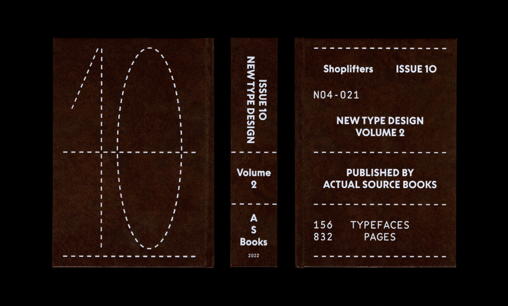
The image presents a stark, minimalist design reminiscent of an archival or academic publication cover. It utilizes strong negative space and a monochromatic, earthy tone to convey a sense of seriousness and established knowledge.
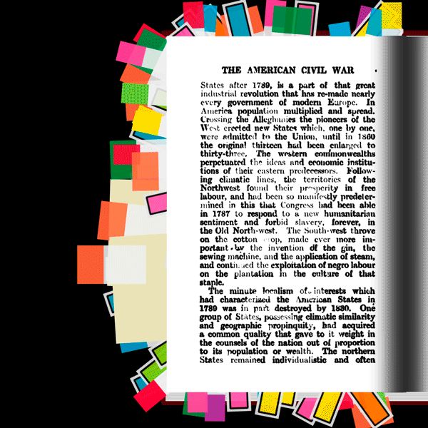
The image presents a historical text layout with a stark, academic feel, characterized by a simple black and white structure overlaid on a colorful, abstract border. The design balances dense text with vibrant graphic elements, suggesting an educational or archival presentation.
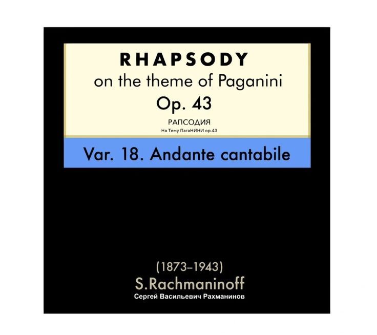
The design is formal and academic, utilizing a high-contrast, minimalist layout typical of sheet music or published musical works. It employs a classic serif typeface against a stark black background, conveying a sense of tradition and scholarly presentation.
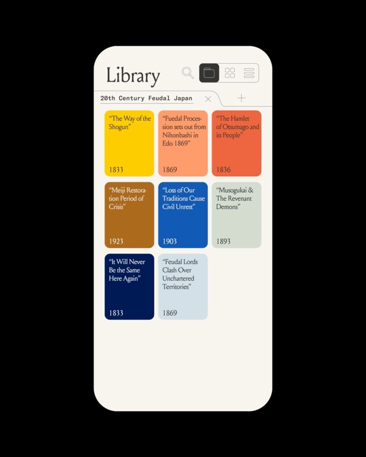
The image presents a clean, minimalist interface design, likely from a mobile application or digital library. It uses a card-based layout with distinct, warm colors to categorize historical data, conveying an organized and academic feel.
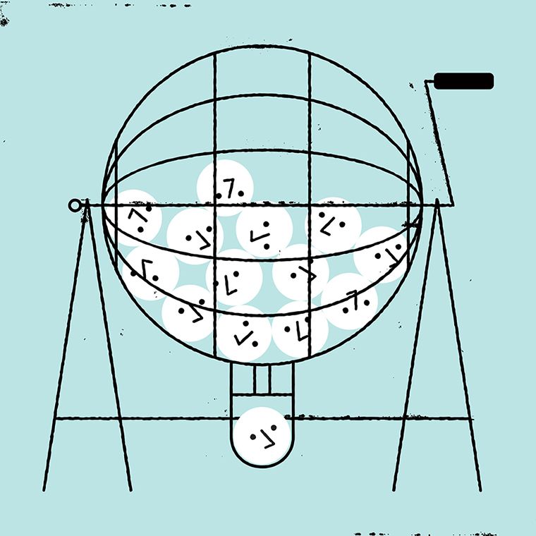
This is a line drawing or schematic representation of a spherical object, possibly a globe or a model, mounted on a tripod-like structure. The visual language is minimalist and technical, relying heavily on thin black lines to define form and structure.