wind power
6 designs
Showing 6 of 6 (6 total)
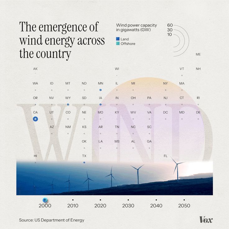
This is an infographic-style visualization tracking the projected wind power capacity across various US regions over time. It uses a clean, minimalist design with subtle gradients and clear data points to convey complex environmental and energy statistics effectively.
The image presents a clean, modern, and professional visual pairing, likely for a report or publication. It uses a split design with contrasting greens to separate two distinct pieces of information, maintaining a sophisticated and corporate aesthetic.
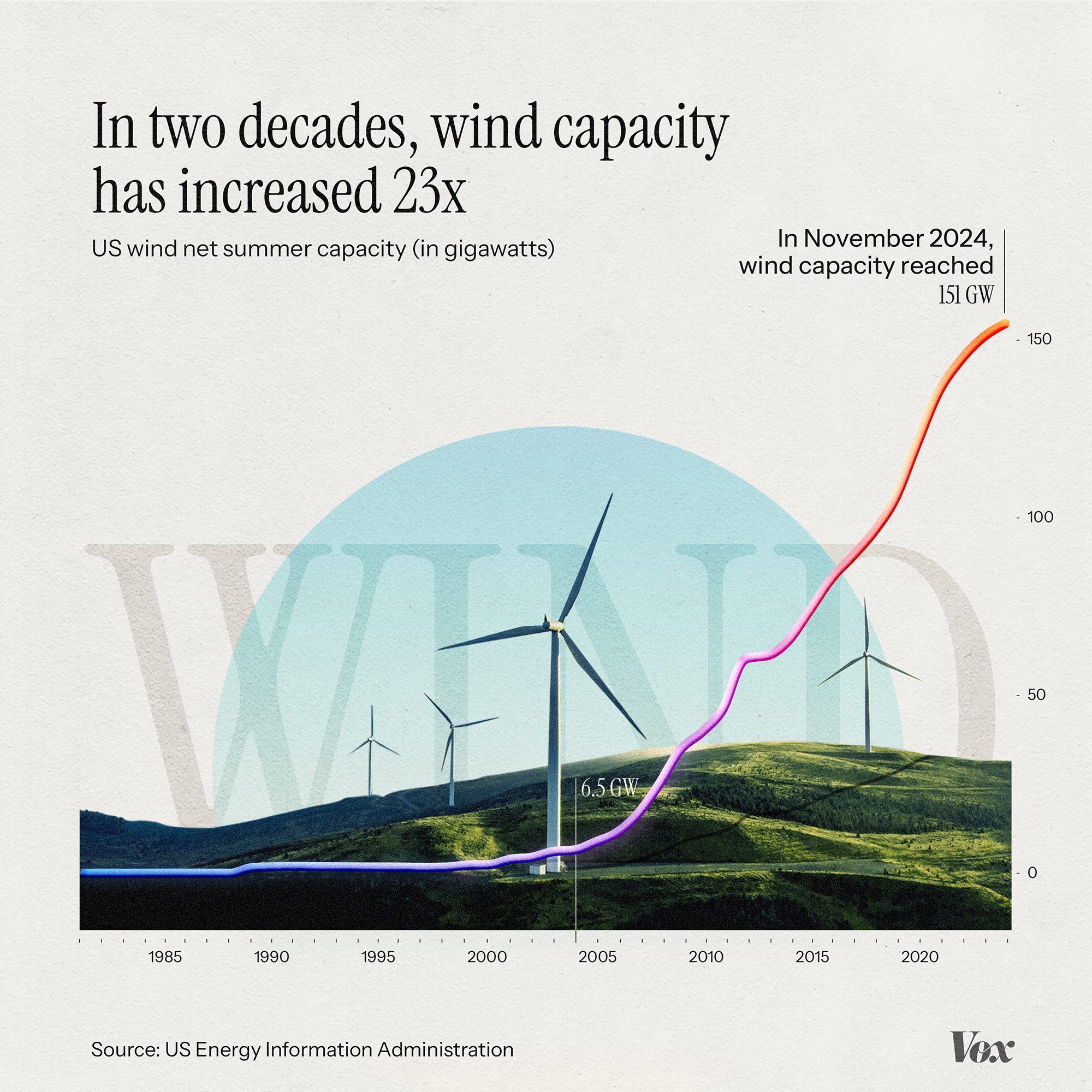
This is an infographic visualizing the exponential growth of US wind energy capacity over two decades, using a clean, modern line graph overlaid on a subtle landscape silhouette. The design effectively communicates a significant trend using clear data visualization principles.
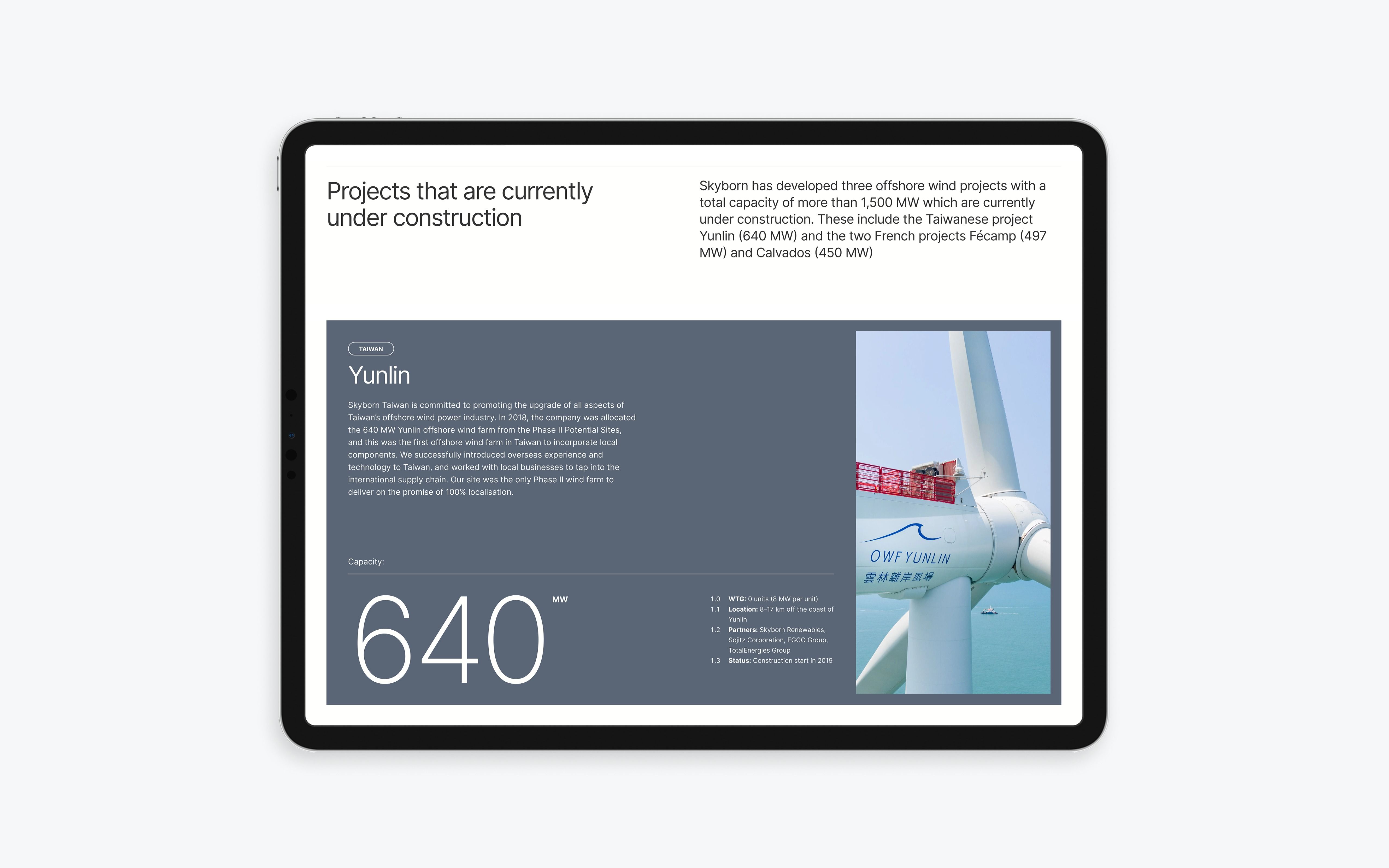
The image presents a clean, professional interface design, likely from a corporate or project development website. It utilizes ample white space and a restrained color palette to convey a sense of modern, technical competence.
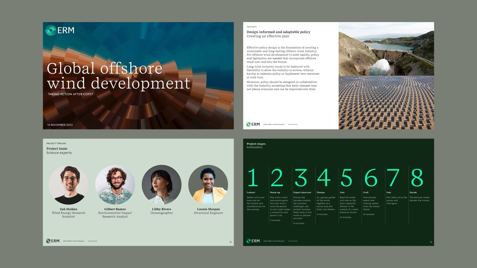
The image presents a clean, professional, and modern presentation style typical of corporate or industry reports. It uses strong imagery paired with clear typography to convey serious, technical information effectively.

This is a clean, data-driven infographic that visually tracks the growth of wind energy capacity across various US regions over time. The design effectively blends geographical mapping, time series data points, and a thematic visual of renewable energy to convey complex information clearly.