web analytics
2 designs
Showing 2 of 2 (2 total)
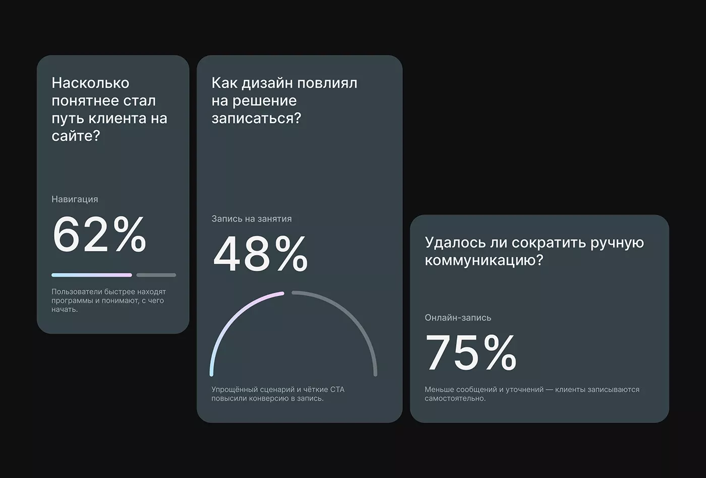
The image presents a data visualization dashboard with a clean, modern, and somewhat corporate aesthetic, utilizing large percentage callouts against a dark background. The design relies heavily on distinct color blocking to segment different data points effectively.
data visualizationdashboardmodern ui
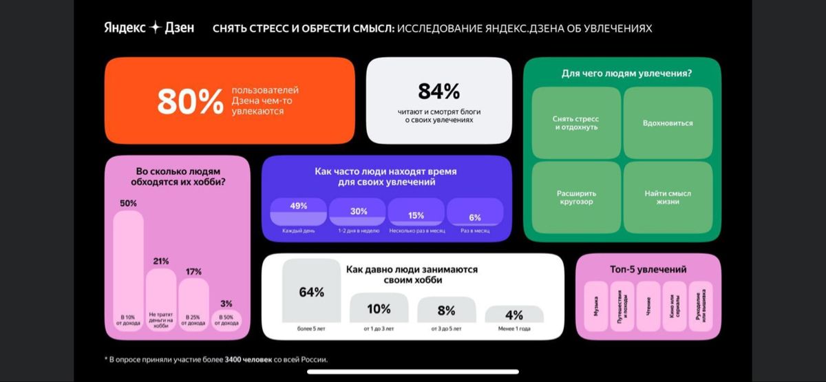
This is a clean, professional infographic design utilizing a dark mode aesthetic to present statistical data. The visual language is minimalist, relying heavily on clear typography and stark contrast to make the percentages immediately accessible. The layout effectively segments complex information into digestible, card-based units.
data visualizationdark modeminimalist