1 designs
Showing 1 of 1 (1 total)
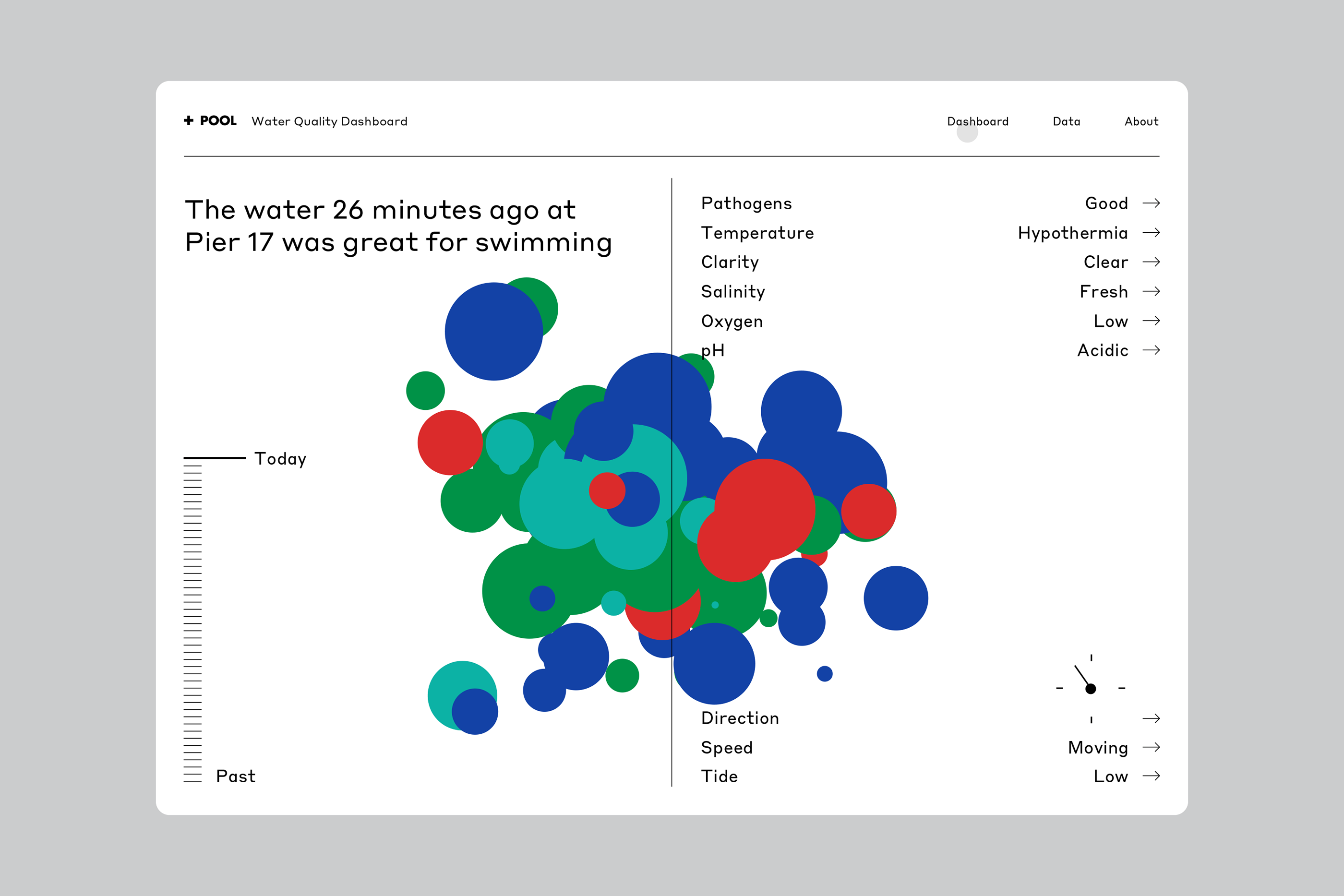
This is a data visualization dashboard presenting water quality metrics using a scatter plot or bubble chart format. The design is clean, functional, and uses color coding effectively to represent different parameters for a specific event (water quality).