technical documentation
42 designs
Showing 24 of 42 (42 total)
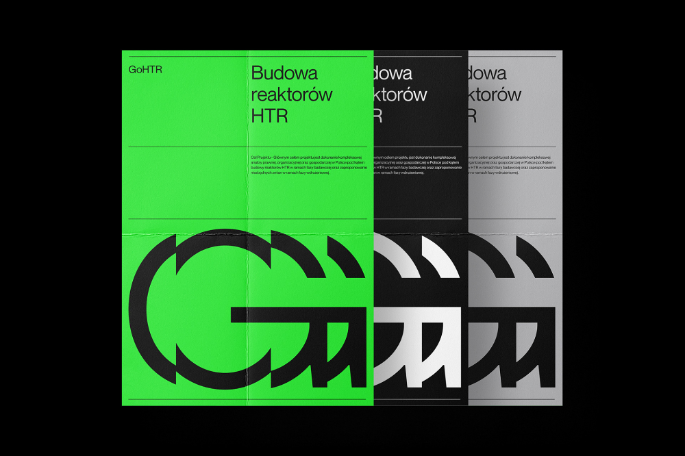
This design utilizes a stark, high-contrast visual language to present technical information clearly. The layout is modern and modular, employing distinct color blocks and grayscale tones to segment different pieces of content effectively. The overall feel is clinical, precise, and highly professional.
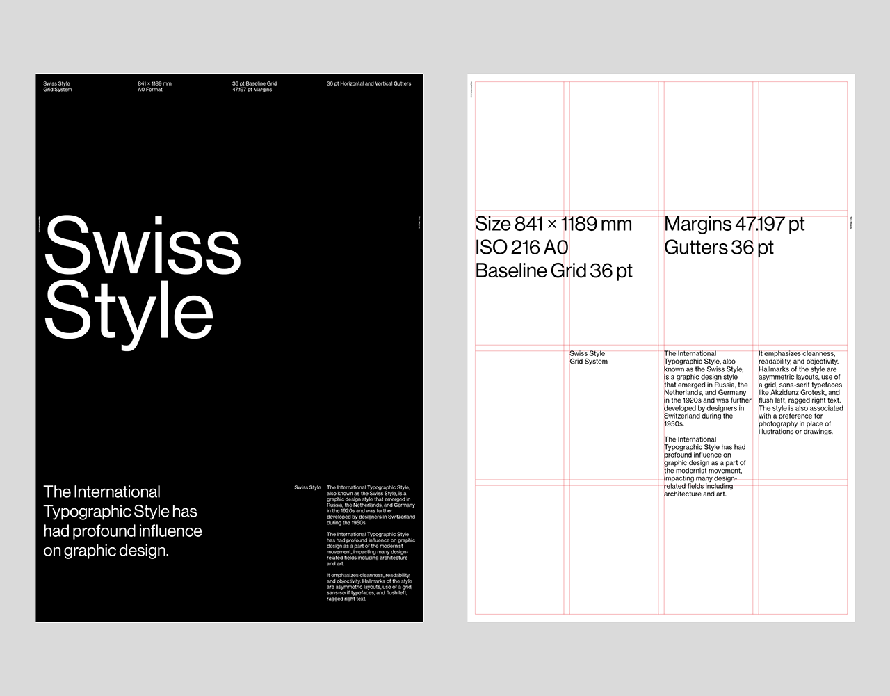
This visual presents a highly structured and minimalist approach, characteristic of Swiss design principles. The layout emphasizes precision through the use of strict grid systems and clear typographic hierarchy, conveying a sense of objective professionalism.
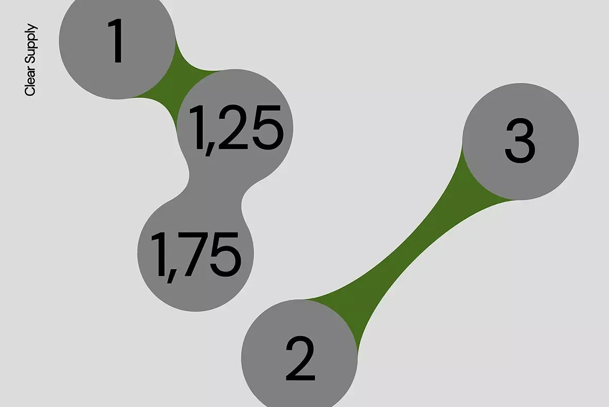
This is a clean, minimalist infographic design utilizing organic, irregular shapes to represent interconnected data points or steps. The visual language relies on subtle tonal variations between gray and olive green to establish hierarchy and connection.
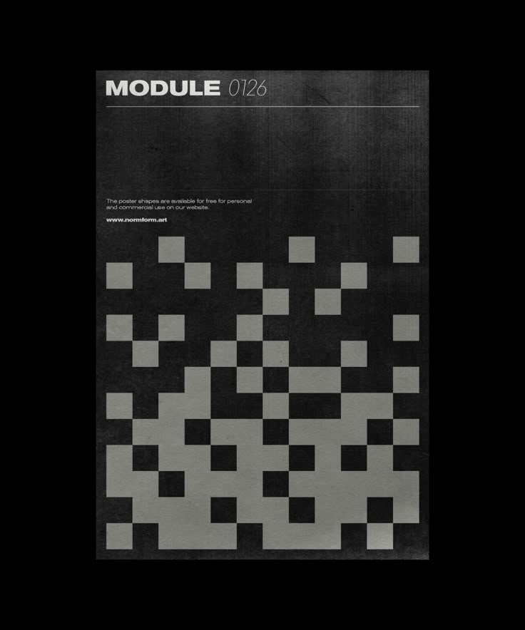
This design utilizes a stark, high-contrast monochrome palette to present an abstract, systematic visual. The composition relies heavily on geometric repetition and texture derived from varying shades of grey to convey a sense of technical precision and density.
This design utilizes a clean, minimalist approach centered around simple line art iconography to represent a tool or family. The visual language is highly functional and professional, relying on negative space and muted tones to convey reliability and simplicity.
This design utilizes a stark, minimalist approach, pairing a deep green background with light purple typography to create a clean yet academic visual. The vertical stacking of terms emphasizes structure and list-based information, resulting in a highly organized and somewhat clinical aesthetic.
This design utilizes a stark, high-contrast typographic approach featuring bold, clean sans-serif lettering. The visual language is minimalist and authoritative, relying purely on the weight and form of the letters to convey impact. The overall feel is academic, strong, and modern.
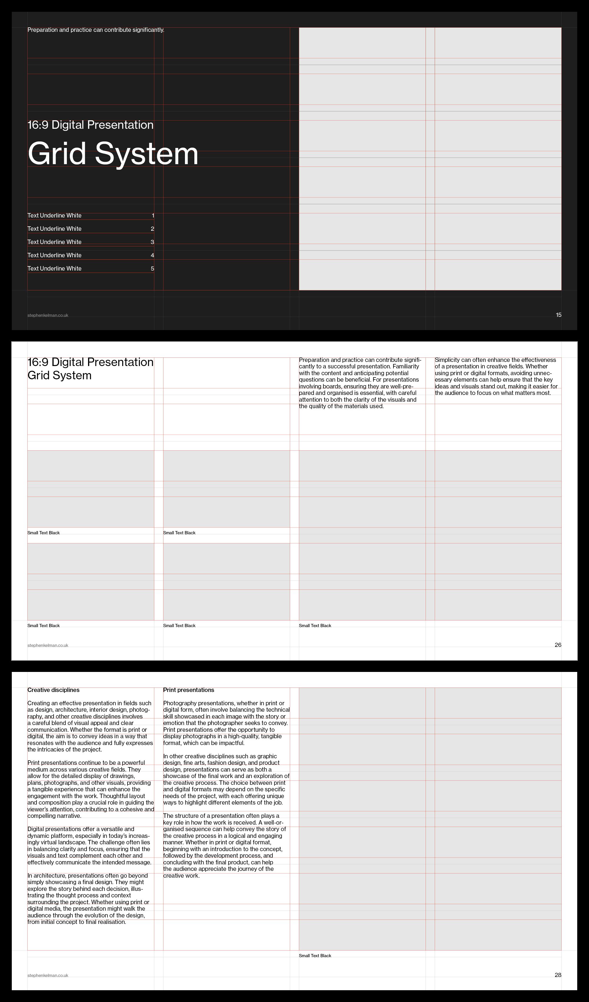
The design employs a stark, minimalist aesthetic centered around a precise grid system to organize technical information. The visual language is highly structured and functional, prioritizing clarity and data presentation over decorative elements.
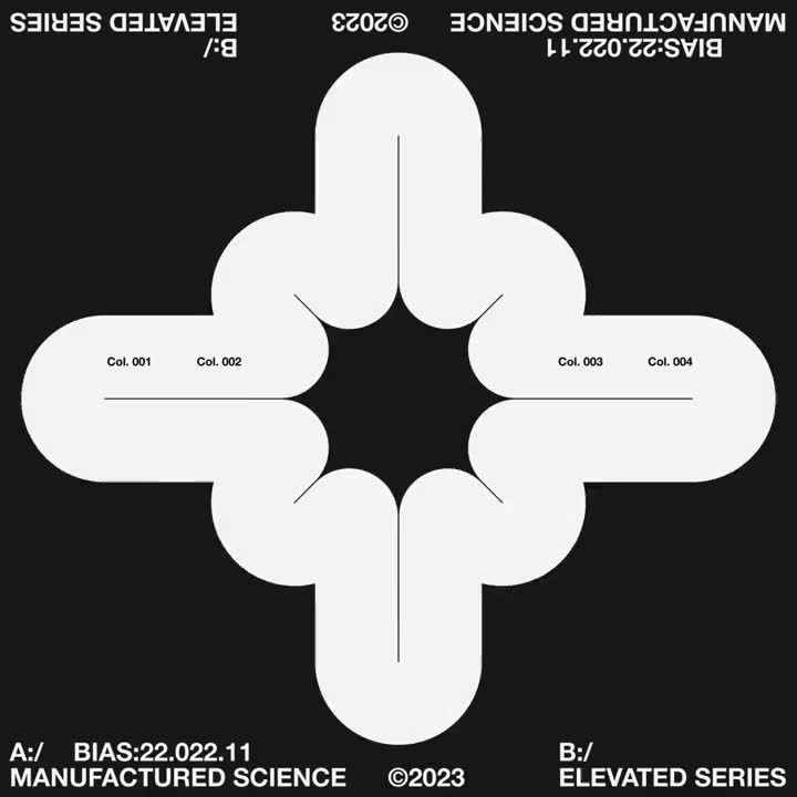
This design features a highly symmetrical, abstract geometric motif formed by interlocking loops, presented in a stark high-contrast black and white palette. The visual language is clean, precise, and technical, relying on negative space to define the structure. It conveys a sense of order, complexity, and modern scientific documentation.
This design showcases a clean, modern approach to data visualization, utilizing modular layouts and radial charts to present complex information clearly. The visual language is precise and professional, relying on subtle color variations within a muted palette to create depth and interest.
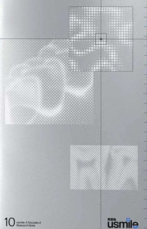
This image utilizes a stark, monochromatic visual language characterized by fine dot patterns and precise grid structures. The design conveys a sense of technical documentation, academic rigor, and systematic observation through its minimalist composition.
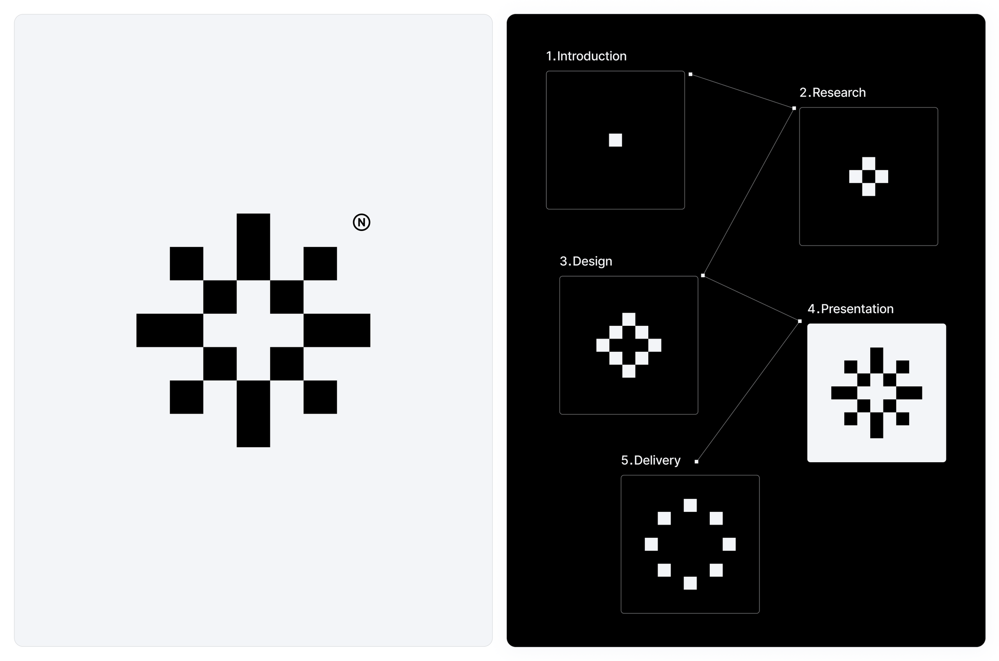
This image presents a clean, minimalist diagrammatic representation of a five-step process flow. The visual language relies heavily on geometric patterns (grids and dots) to symbolize stages, suggesting a structured, analytical approach.
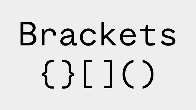
This image presents a clean, minimalist display of various programming brackets and parentheses. The design relies on stark black typography against a light gray background, emphasizing clarity, structure, and technical precision.
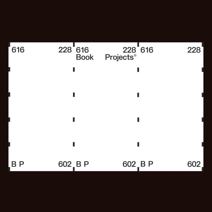
The image presents a stark, minimalist grid structure dominated by black and white, suggesting a technical or archival layout. The design relies heavily on precise alignment and numerical labeling to convey organized data or indexing.
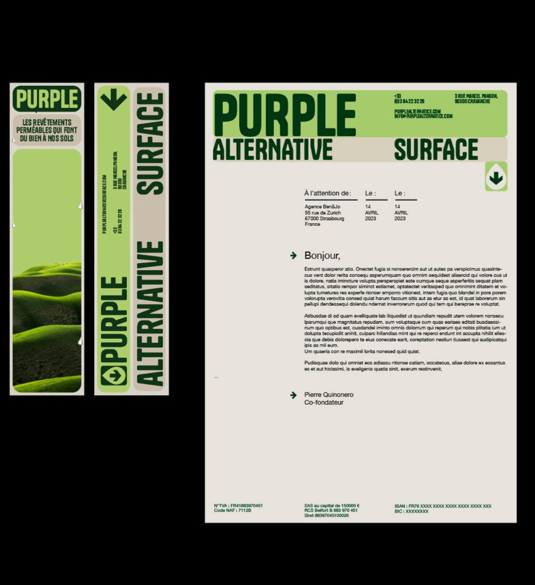
The image presents a clean, minimalist design focused on branding and surface alternatives, utilizing strong vertical alignment and high contrast between dark green/black and white space. The overall feel is professional, technical, and modern.
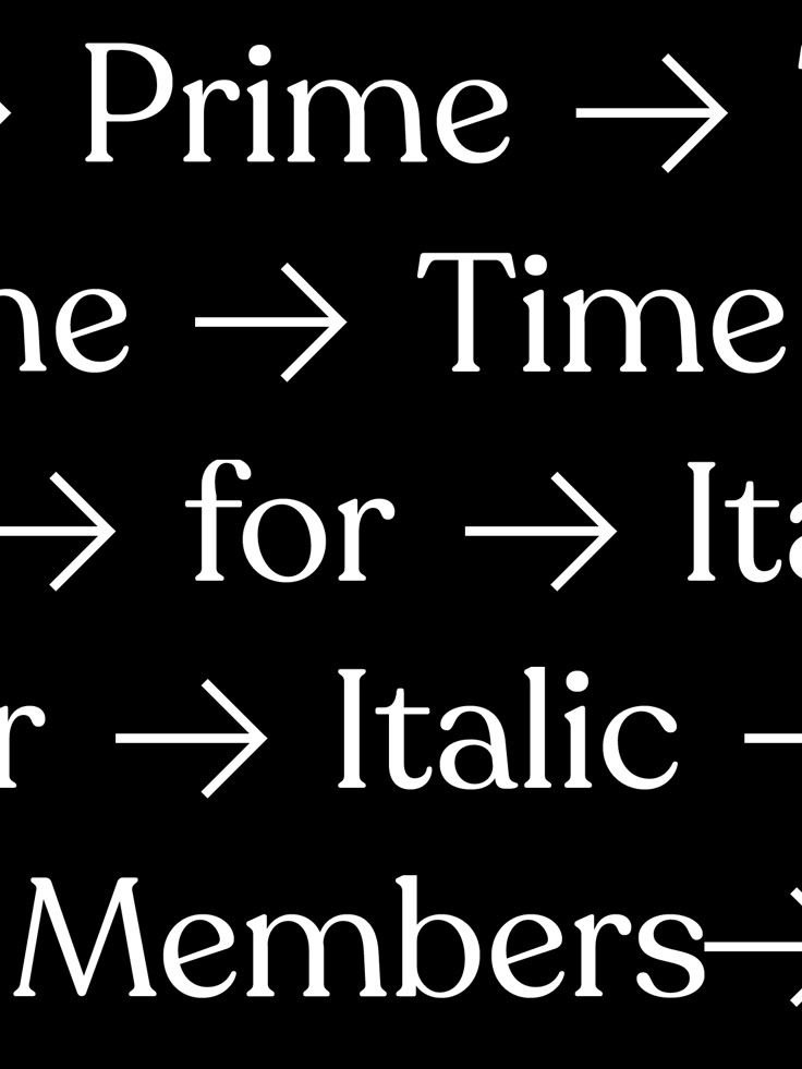
The image displays a series of text fragments, likely representing a sequence or transformation (Prime -> Time for Italic Members), rendered in a clean, sans-serif typeface against a stark black background. The design is minimalist and functional, relying purely on typography to convey information.
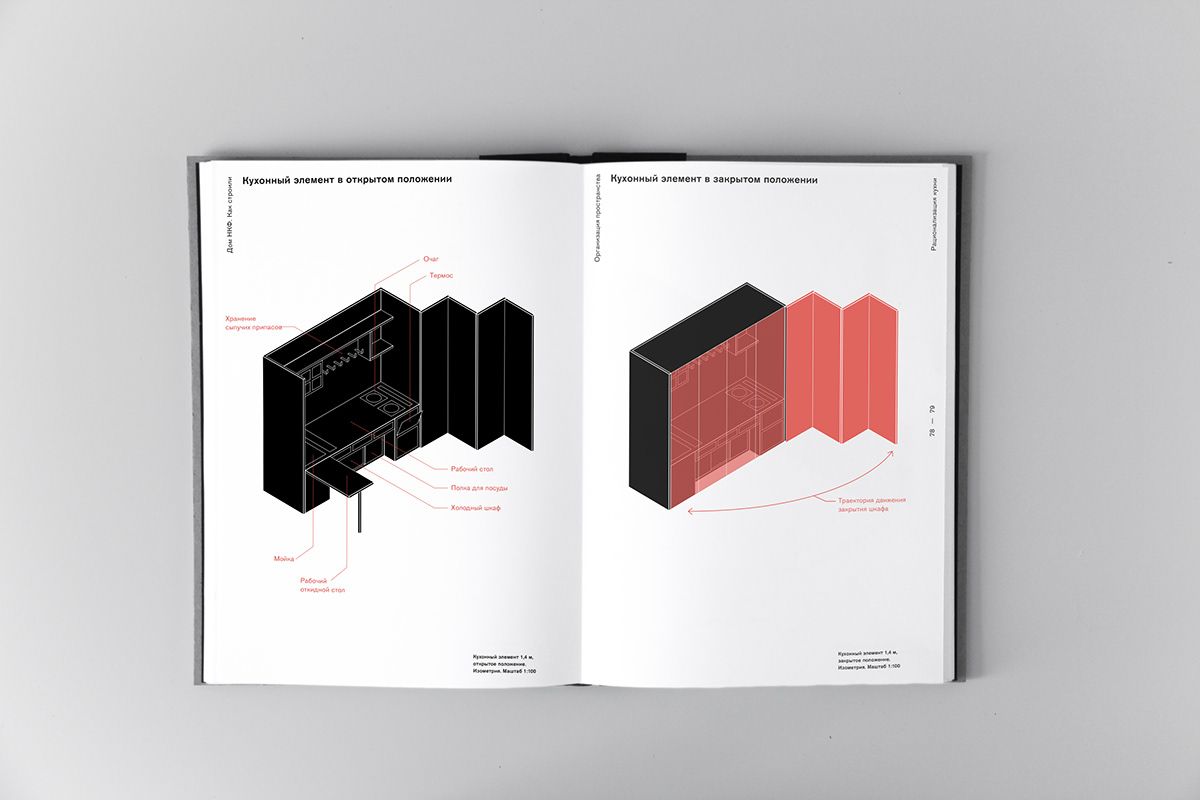
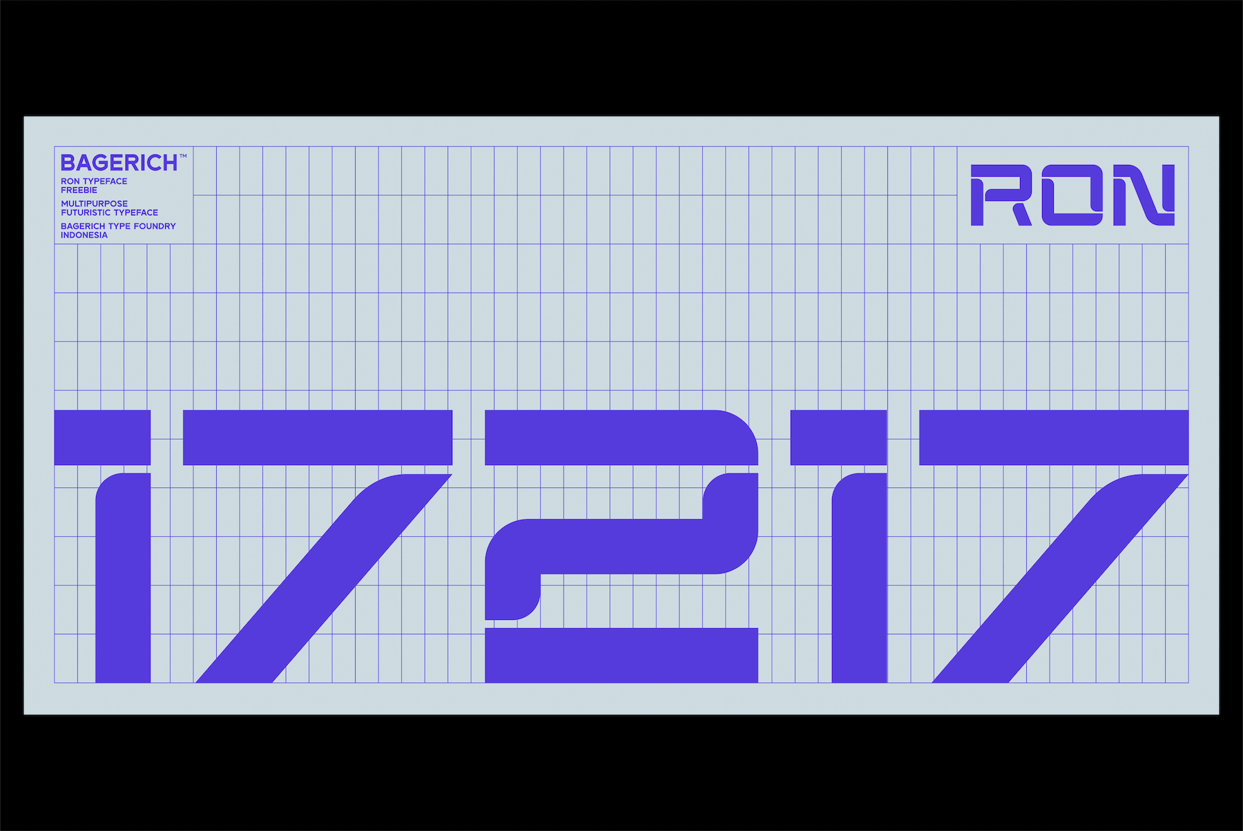
The image displays a technical or architectural diagram, likely illustrating a component or system. The visual language is clean, precise, and schematic, using solid blocks and line work to convey structure. It feels professional, informative, and focused on technical detail.
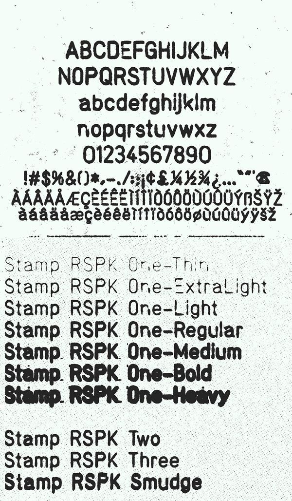
This image presents a stark, utilitarian display of alphanumeric characters and various stamp variations, suggesting a technical or archival context. The design relies heavily on simple, high-contrast text to convey specific designations and weights.
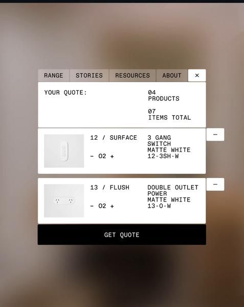
The image displays a clean, functional interface for requesting product quotes, characterized by a minimalist and structured layout. The design emphasizes clear categorization of items (like 'SURFACE' or 'FLUSH') and precise item codes, suggesting a focus on technical or B2B interaction.
This image presents a clean, technical design characterized by a grid structure and bold, monochromatic typography. The visual language is minimalist and functional, relying on precise lines and a cool color palette to convey professionalism and data-driven information.
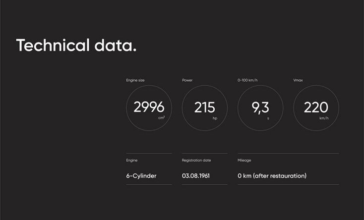
The design is minimalist and functional, employing a dark background with clean white text and circular data points to present technical specifications. The visual language is stark, relying heavily on negative space and precise typography to convey information efficiently.
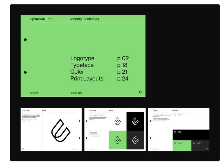
The image presents a clean, professional, and highly structured internal document or guideline page. The design relies heavily on negative space, clear hierarchy through typography, and a monochromatic palette to convey authority and precision.
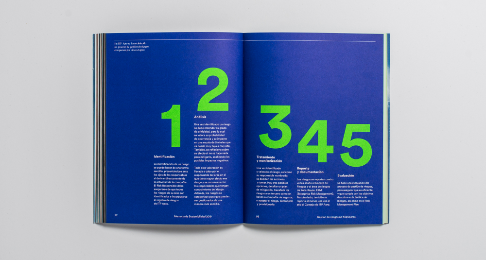
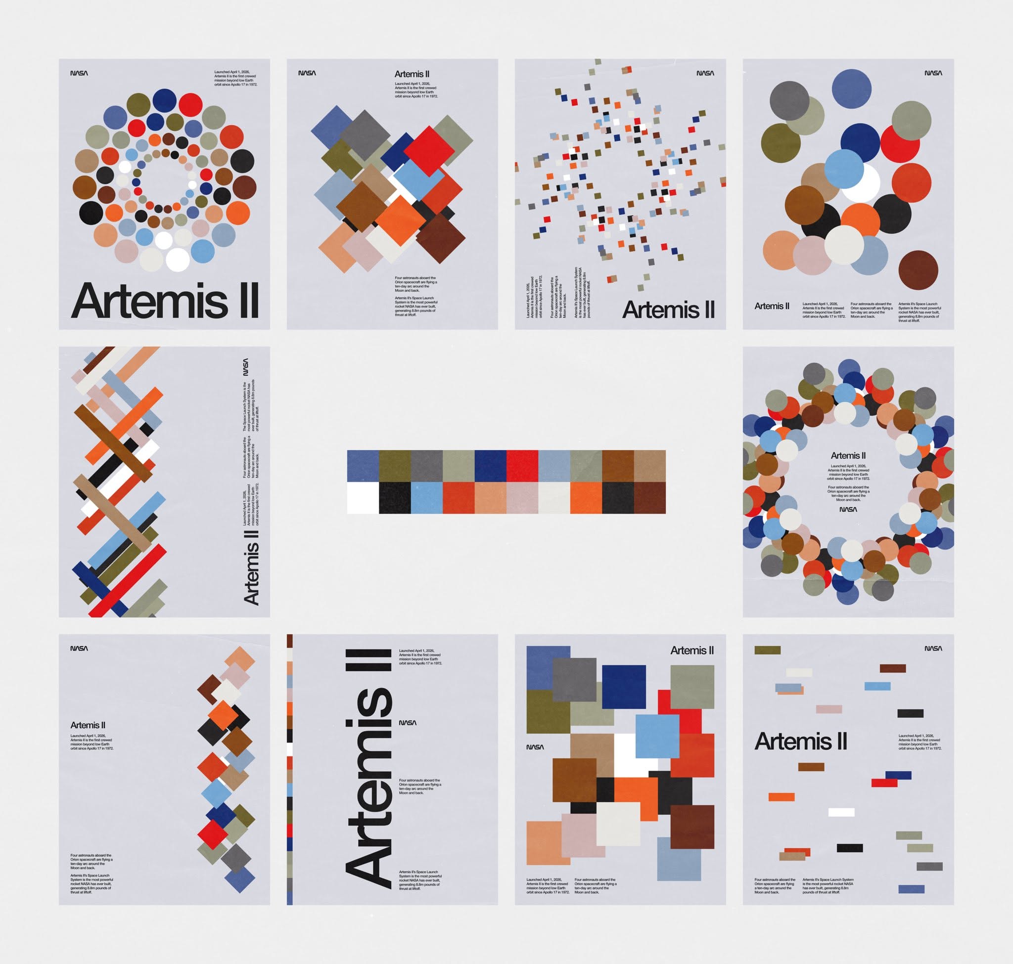
This is a highly structured, corporate infographic design utilizing bold color blocking and high contrast to present detailed information. The visual language emphasizes clarity, organization, and professionalism through the use of large numbers and clean typography.

This design utilizes a clean, minimalist aesthetic with strong negative space and a cool blue palette to convey professionalism. The composition is balanced, featuring large, clear typography against subtle geometric shapes that add visual interest without distraction.