studio branding
10 designs
Showing 10 of 10 (10 total)
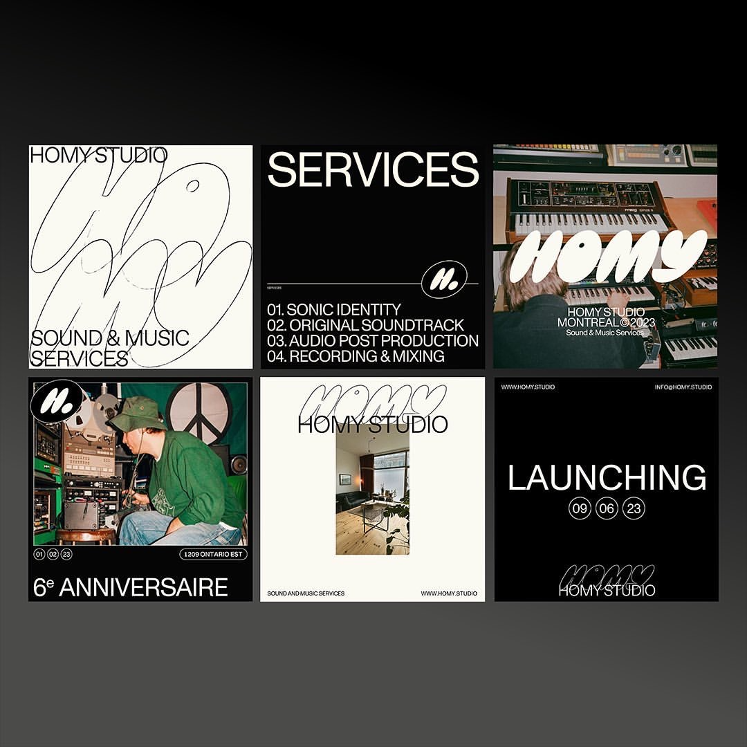
This composite showcases a strong typographic identity rooted in analog aesthetics and creative services. The visual language relies heavily on high contrast, simple geometry, and expressive handwritten scripts to convey a sense of handcrafted authenticity.
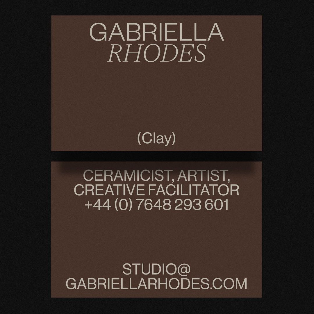
This design employs a rich, earthy color palette and classic typography to establish a sophisticated and artisanal brand identity. The layout is highly structured, using stacked blocks to create a formal and grounded presentation.
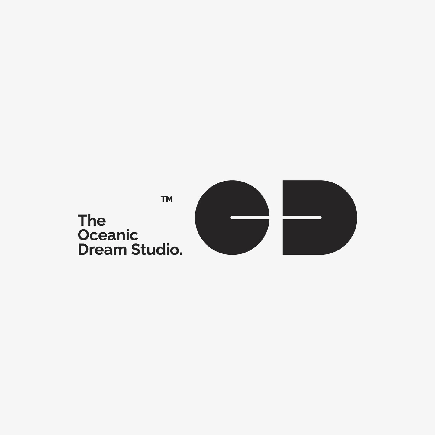
This design features a clean, minimalist logo mark composed of two solid geometric shapes creating negative space. The visual language is modern and sophisticated, relying on simple forms and balanced composition to convey professionalism.
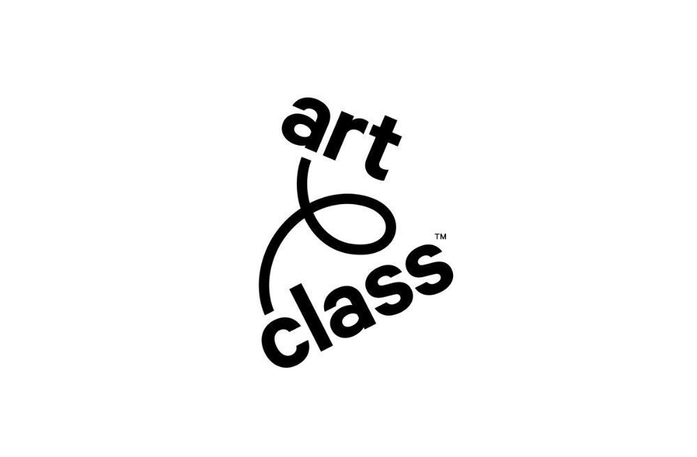
This logo utilizes a fluid, continuous line drawing to form the text, conveying a sense of movement and artistic connection. The design is minimalist and elegant, relying on negative space to emphasize the organic flow of the letters. It successfully merges typography with abstract line art for a sophisticated visual identity.
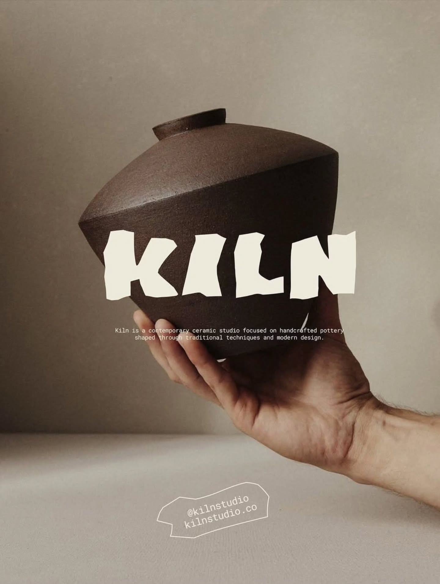
This image showcases a minimalist approach to product photography, focusing on the tactile quality of handcrafted pottery. The visual language is subdued and earthy, emphasizing texture, form, and the connection between the maker's hand and the finished object.
This is a stark, minimalist logo featuring clean, sans-serif typography against a pure black background. The design conveys a sense of modern professionalism and strong, confident branding through its simplicity and high contrast.
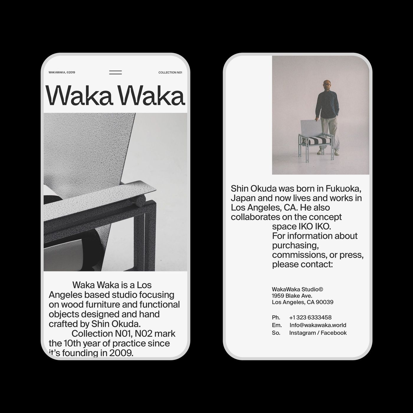
A minimalist portfolio presentation for Waka Waka, a Los Angeles-based furniture design studio. The design employs a clean, contemporary aesthetic with generous whitespace, monochromatic imagery, and sans-serif typography that emphasizes clarity and sophistication.
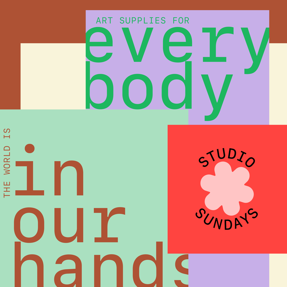
This design features a layered, block-based composition using muted pastel and earthy tones. The visual language is clean and modern, relying on strong color blocking to separate text elements and create visual hierarchy. The overall feel is calm, organized, and artisanal.
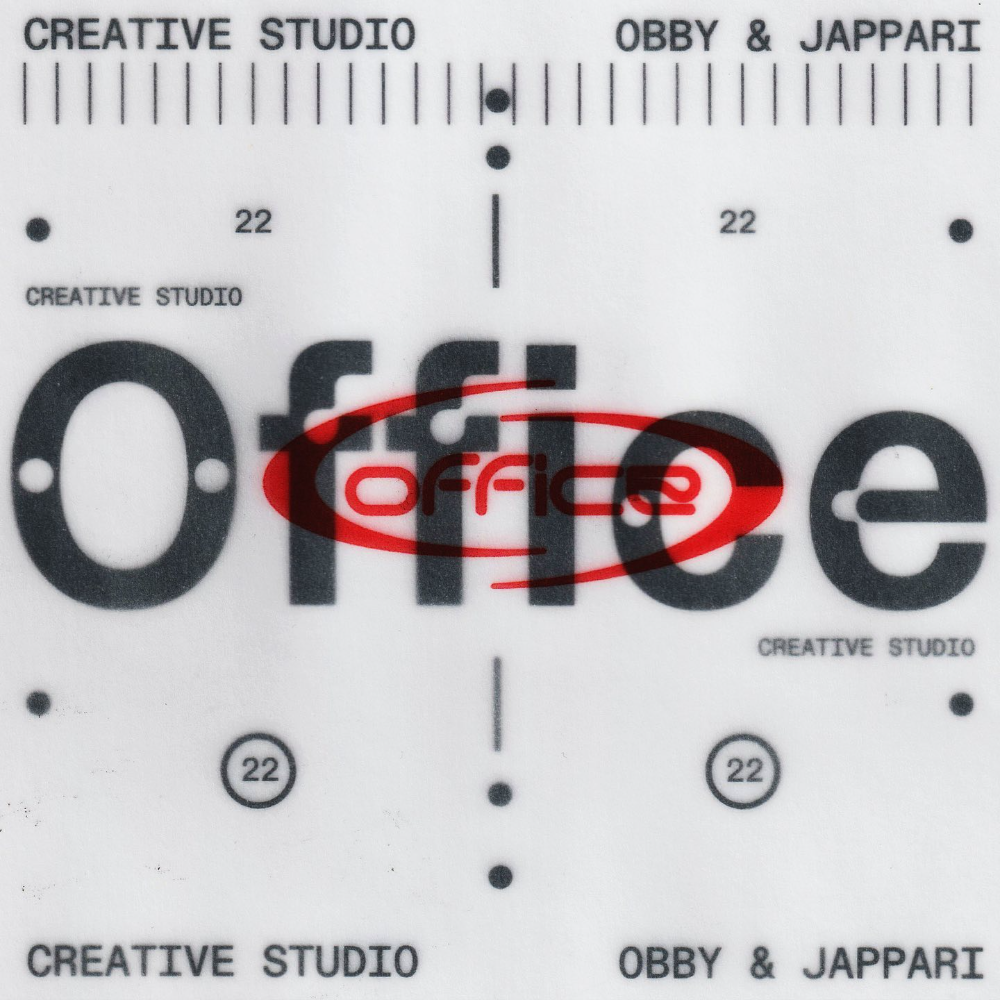
This design employs a highly structured, technical aesthetic, utilizing clean lines and grid elements to create a precise and professional visual hierarchy. The composition relies heavily on negative space and linear elements, suggesting precision and systematic organization.
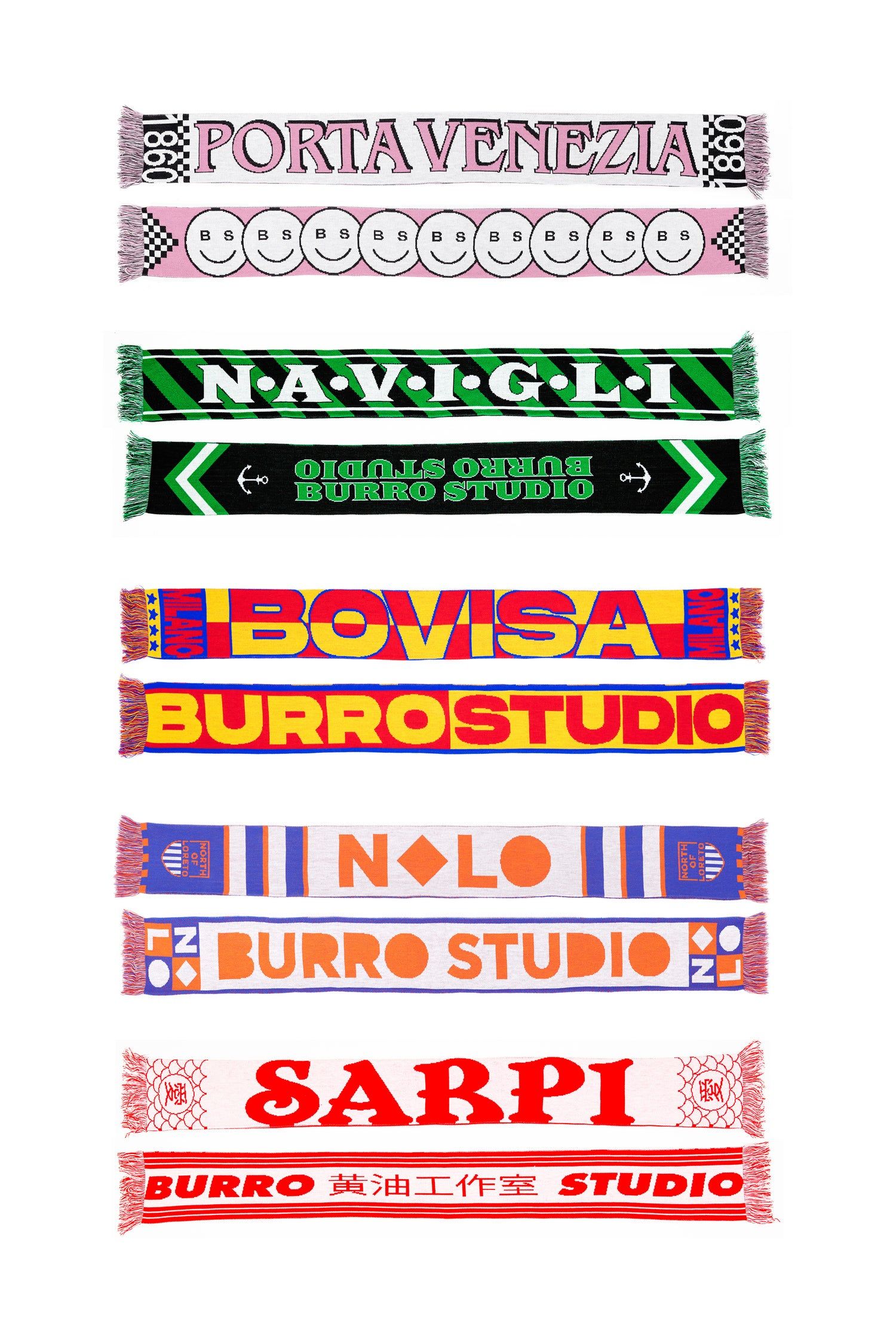
This collection features a series of hand-drawn or digitally rendered banner designs, characterized by bold typography and vibrant, contrasting color blocks. The visual language is assertive and graphic, using striped borders to frame specialized names and terminology in an energetic, slightly vintage style.