research
194 designs
Showing 24 of 194 (194 total)
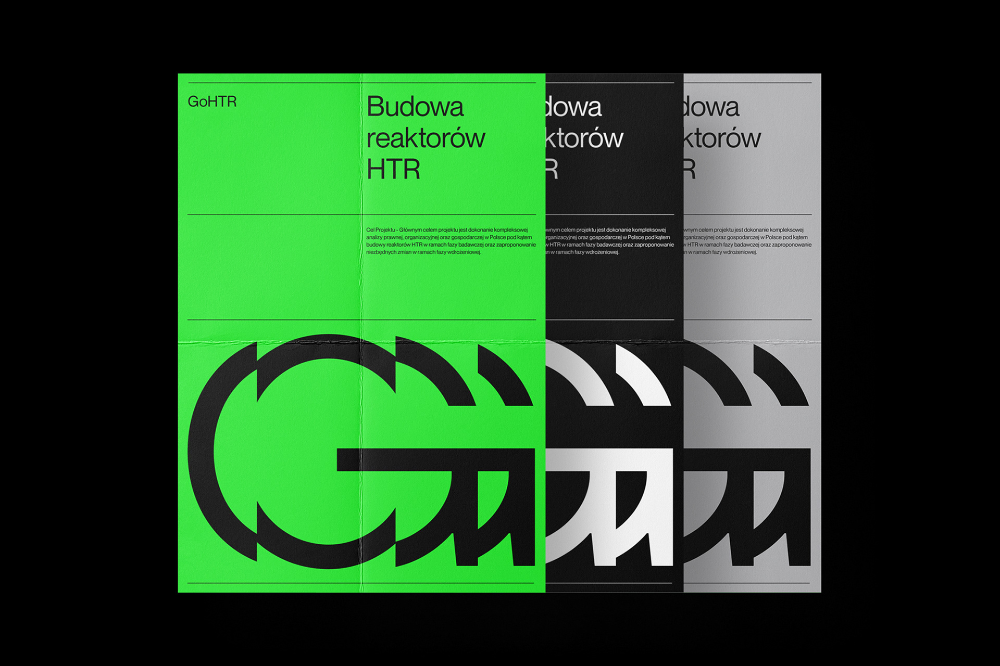
This design utilizes a stark, high-contrast visual language to present technical information clearly. The layout is modern and modular, employing distinct color blocks and grayscale tones to segment different pieces of content effectively. The overall feel is clinical, precise, and highly professional.
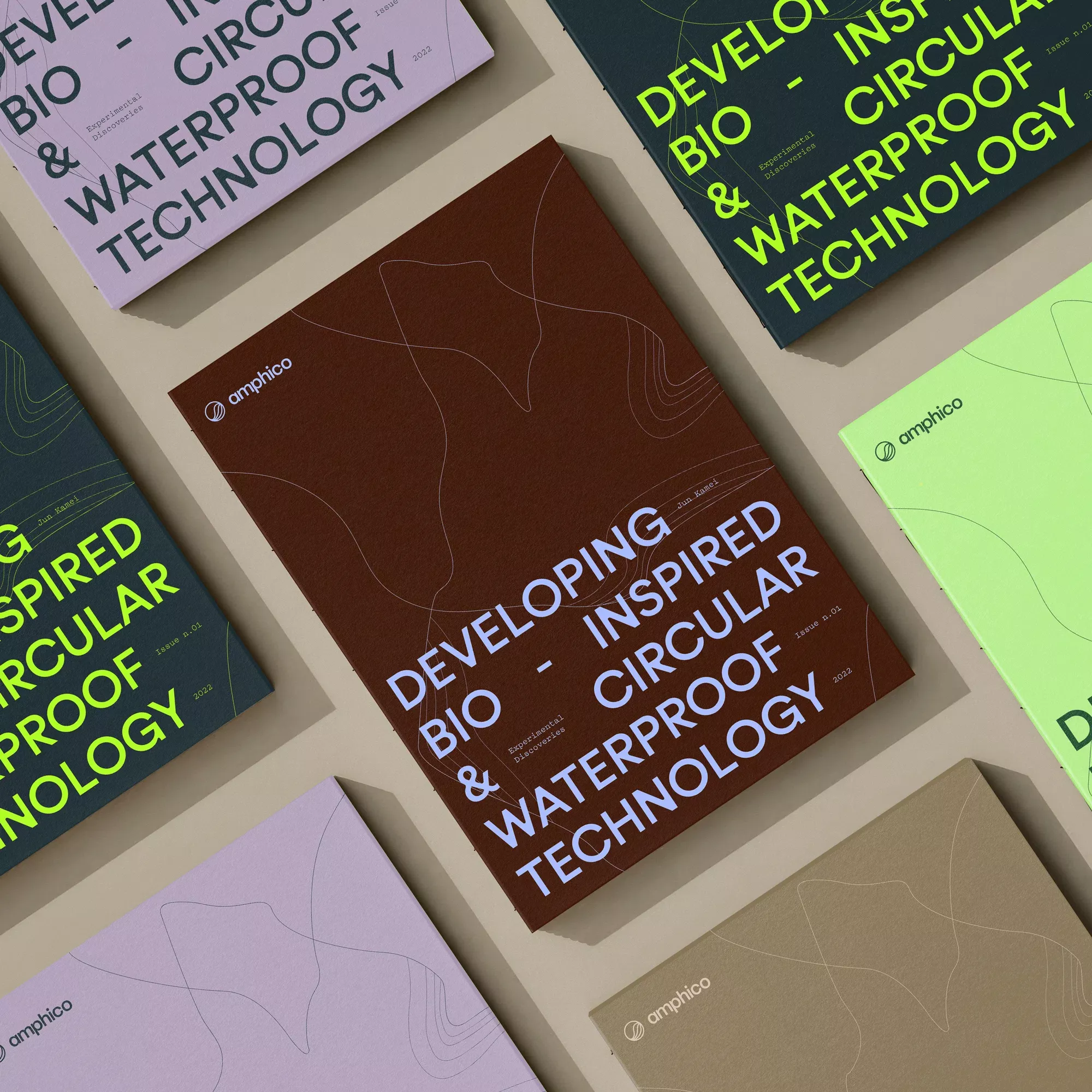
This is a sophisticated, minimalist flat lay showcasing technical reports or publications. The design relies heavily on muted earth tones and clean typography to convey a sense of academic rigor and modern sustainability. The composition is carefully arranged to emphasize texture, depth, and the cohesive branding of the materials.
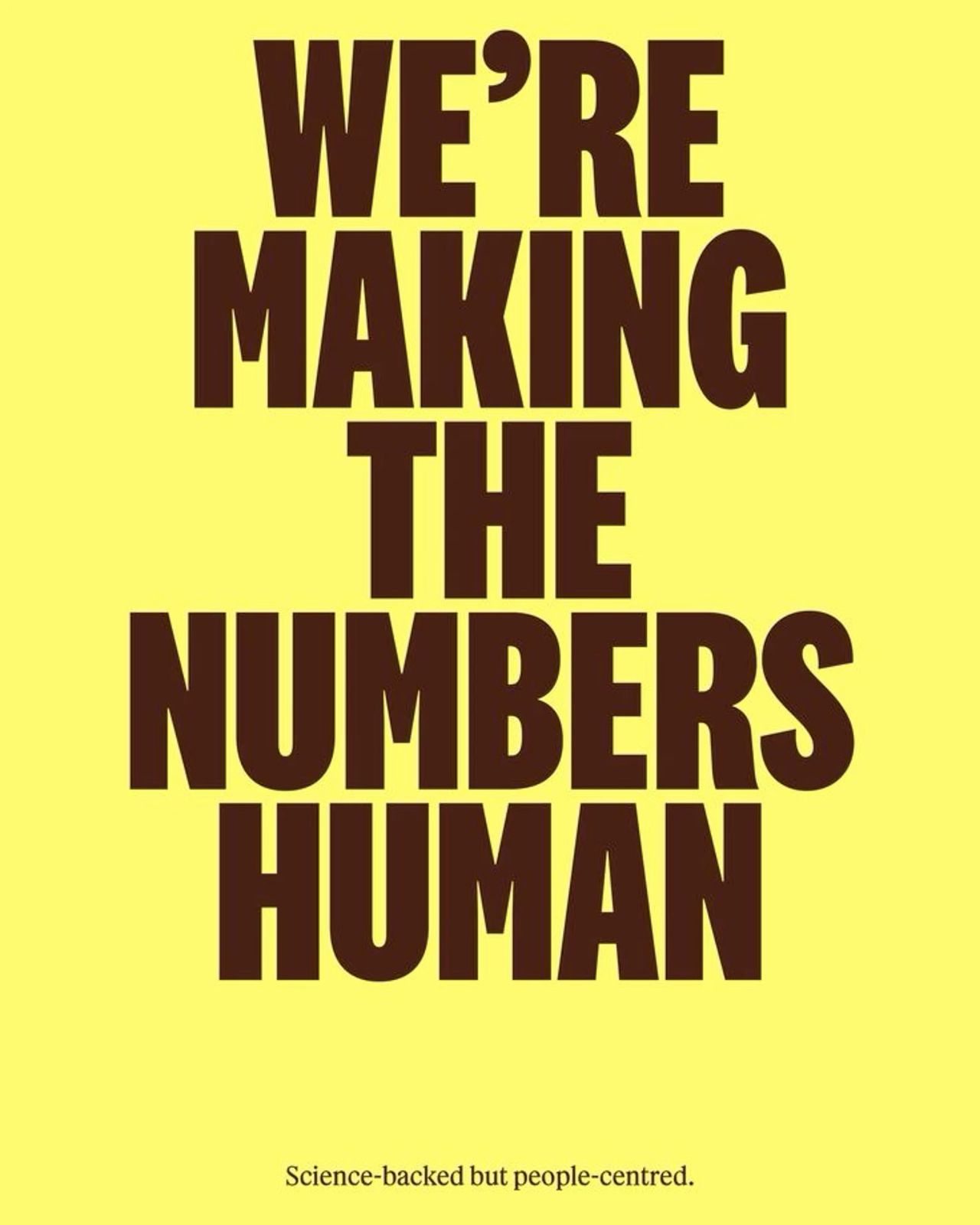
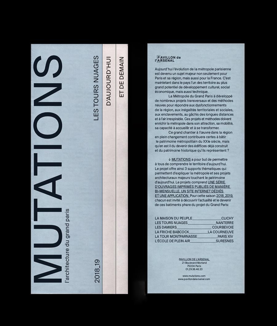
This design utilizes high contrast and bold, stacked typography to deliver a clear, authoritative message. The visual language is minimalist yet impactful, relying on strong typographic hierarchy to emphasize the core concept. The overall feel is professional, trustworthy, and academic.
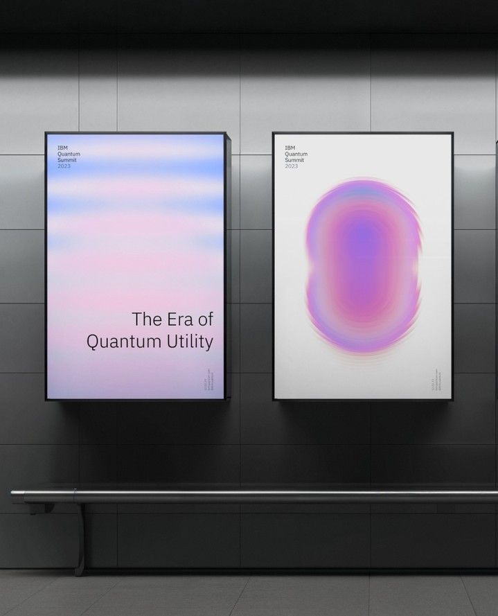
This design utilizes a stark, minimalist aesthetic to present scientific or technological information. The visual language relies on clean lines, high contrast between dark backgrounds and luminous gradients, and abstract forms to evoke a sense of futuristic innovation.
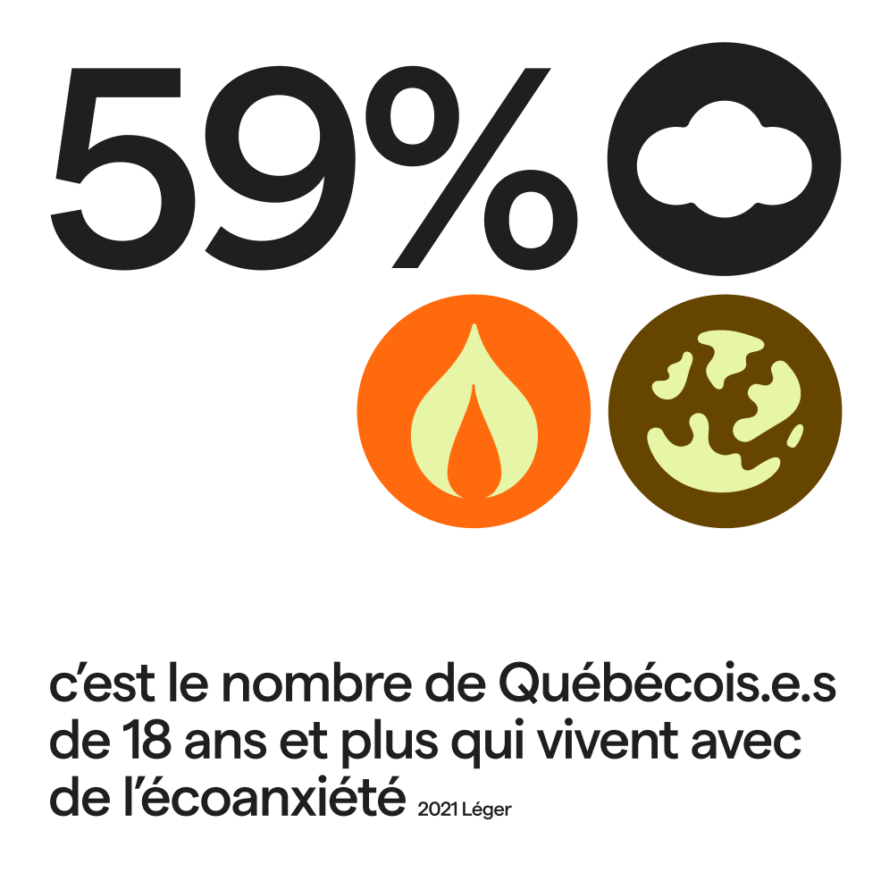
This is a clean, data-driven infographic design utilizing bold typography and symbolic icons to present a statistic. The visual language is stark and modern, relying on high contrast between black elements and warm, earthy tones to convey serious information.
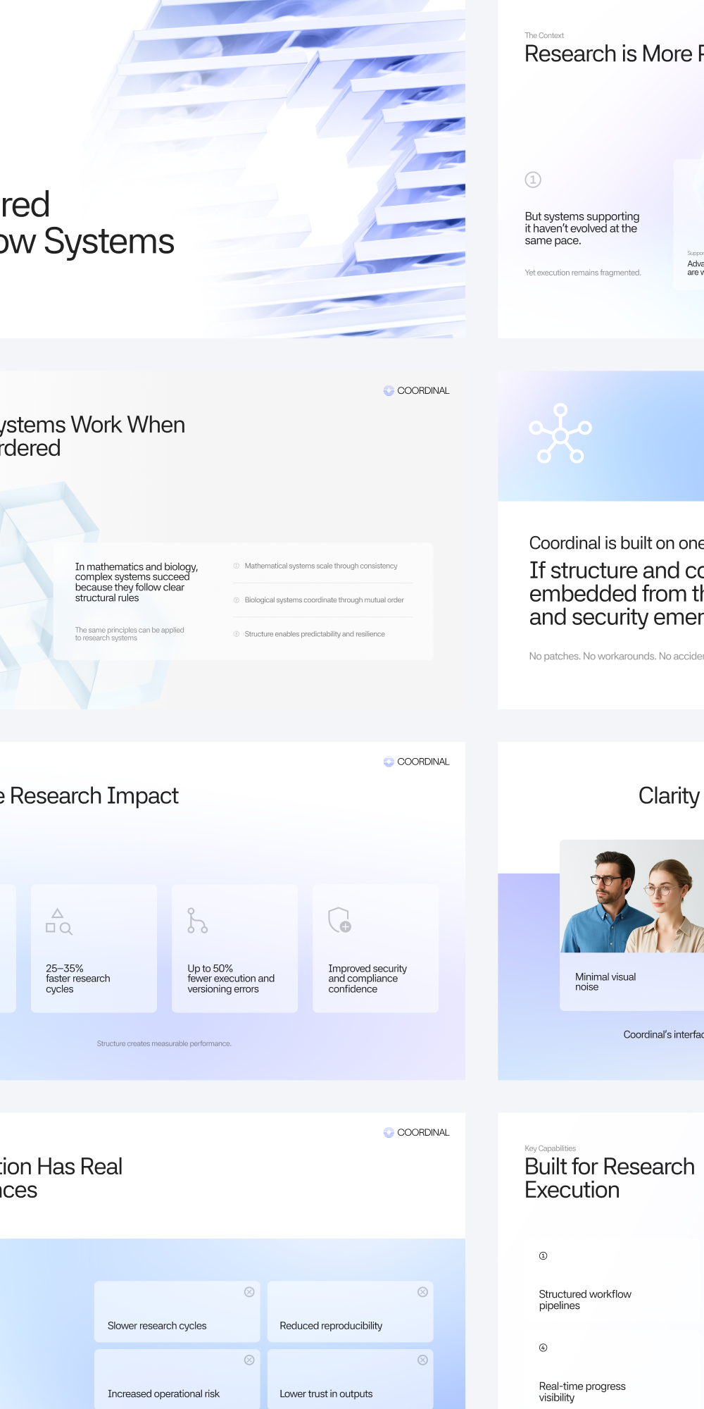
The design employs a clean, minimalist aesthetic characterized by ample white space and subtle blue accents, creating a professional and trustworthy feel. The visual language is highly structured, relying on clear segmentation to present complex information effectively.
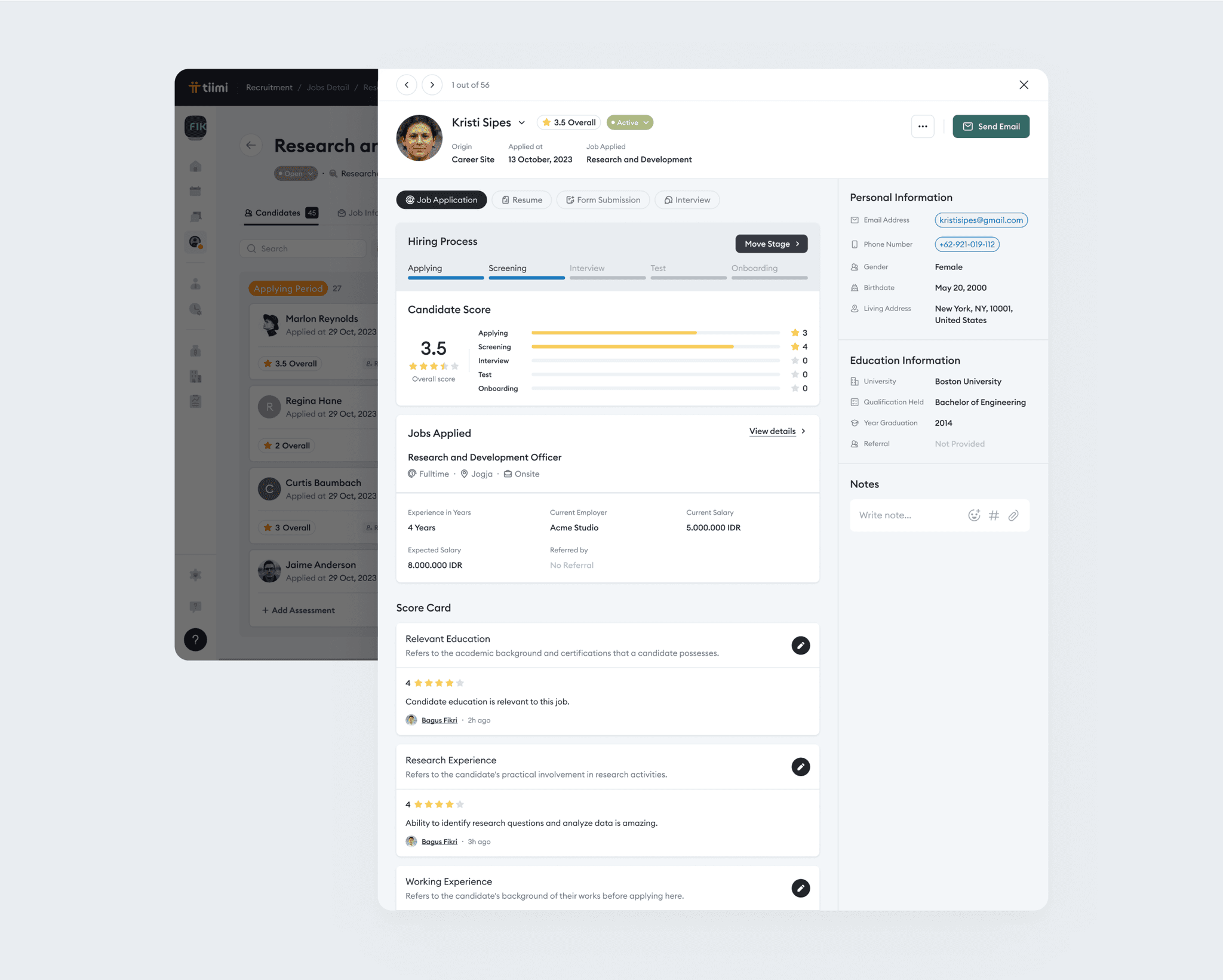
The design presents a highly structured, functional interface typical of an online application or detailed data review system. The visual language relies on clear segmentation and ample white space to manage complex information effectively.
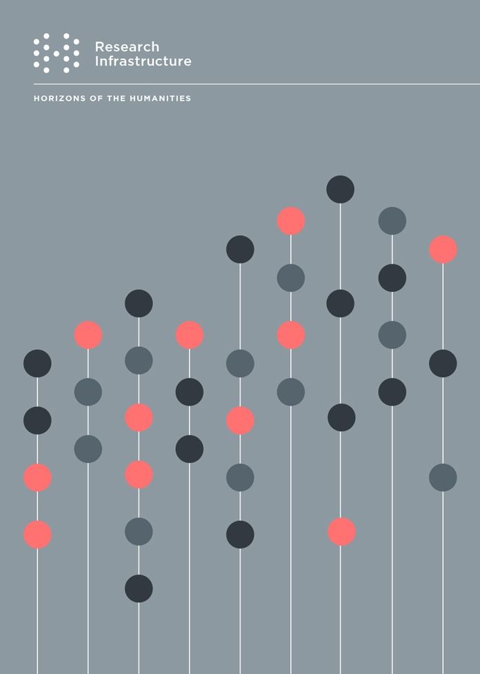
This design utilizes a clean, minimalist aesthetic to visualize abstract concepts, employing vertical lines and colored dots to represent data or progression. The visual language is highly structured and precise, conveying a sense of academic rigor and organized research.
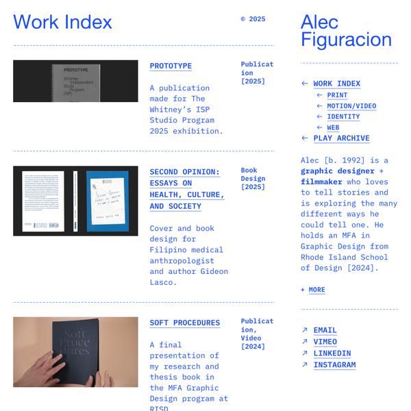
This work index presents a highly organized and professional portfolio structure, utilizing ample white space to ensure readability. The visual language is clean, academic, and functional, prioritizing clear information hierarchy over elaborate decoration. The overall feel is serious, competent, and research-oriented.
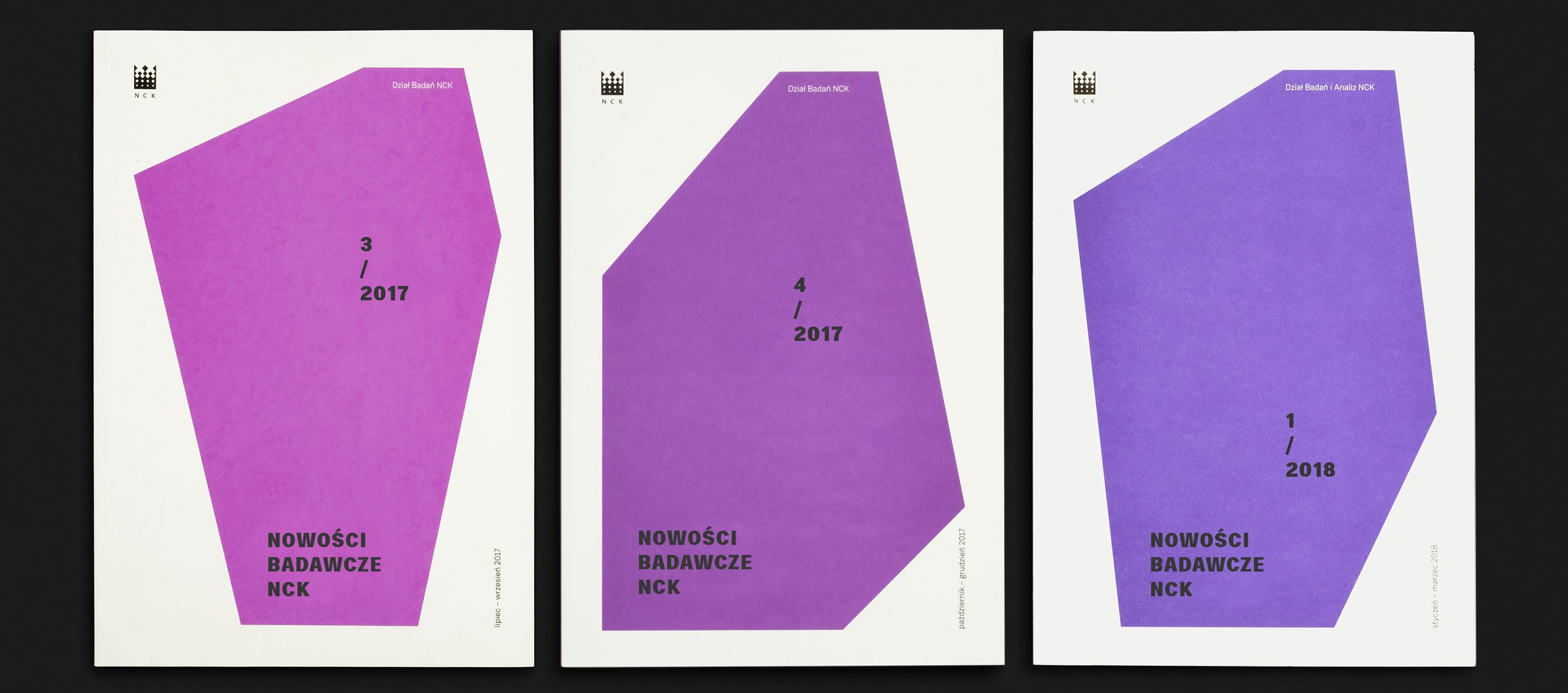
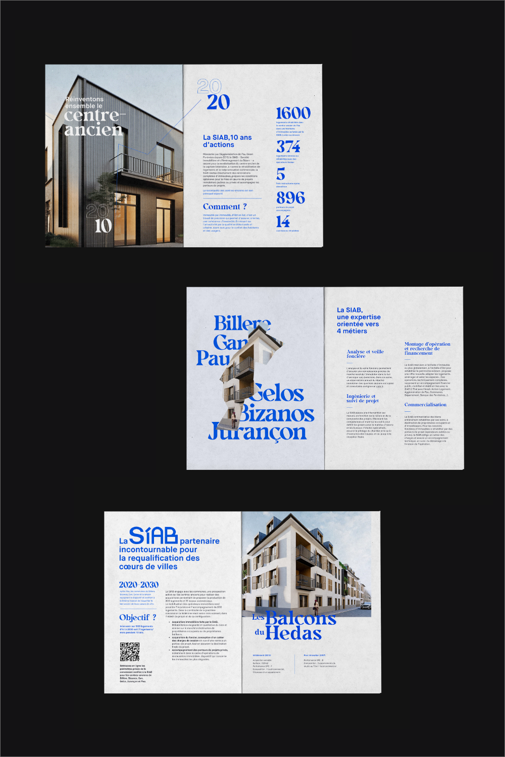
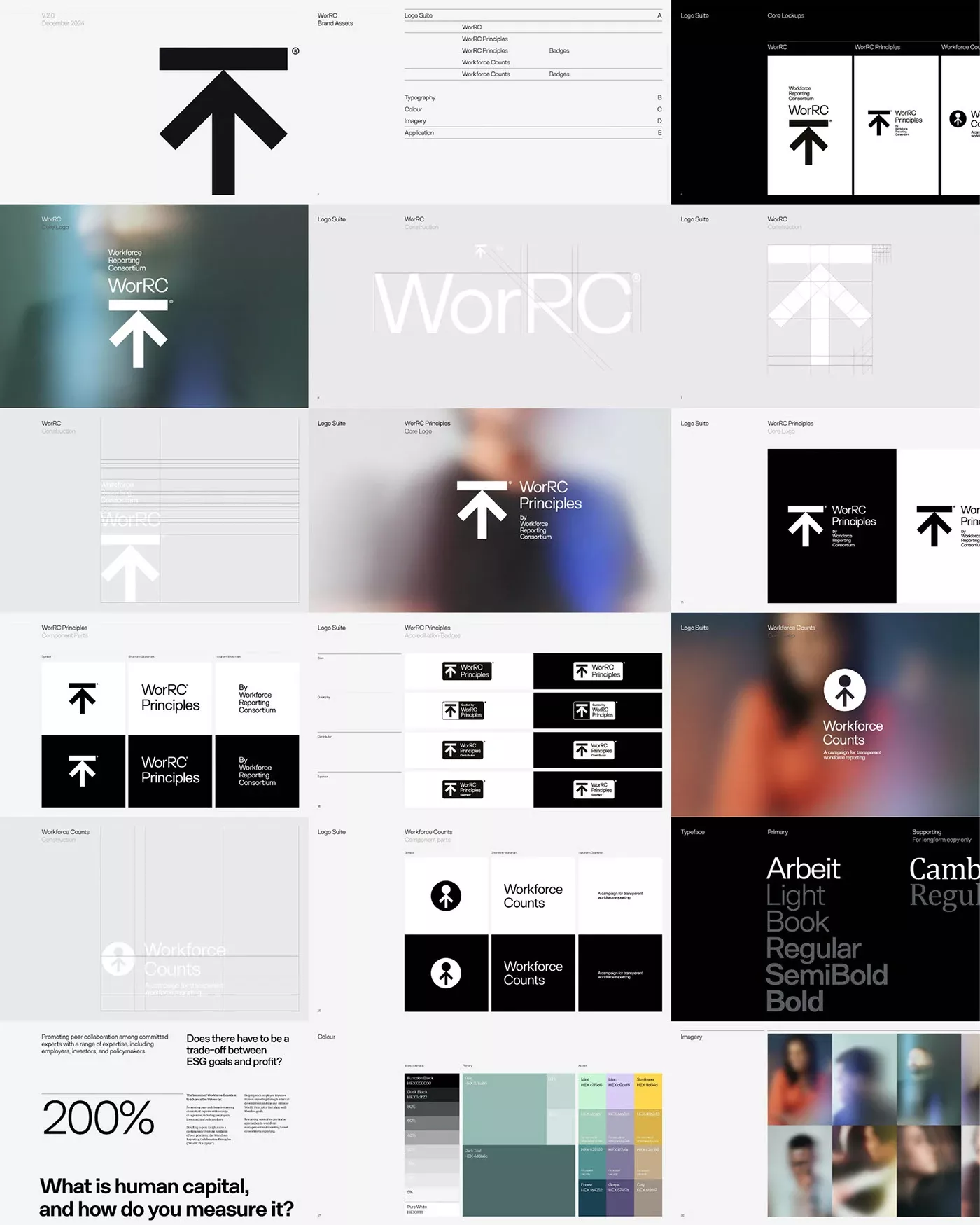
This set of designs demonstrates a clean, modern visual language characterized by strong geometric shapes and a limited, sophisticated color palette. The consistent use of angular forms provides a strong brand identity while maintaining ample negative space for clear information hierarchy.
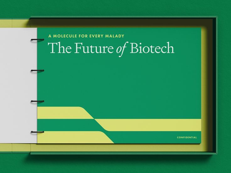
This design utilizes a clean, corporate aesthetic characterized by strong color blocking and clear typography to convey scientific authority. The visual language is modern and professional, relying on a limited palette to focus attention on the title and implied subject matter.
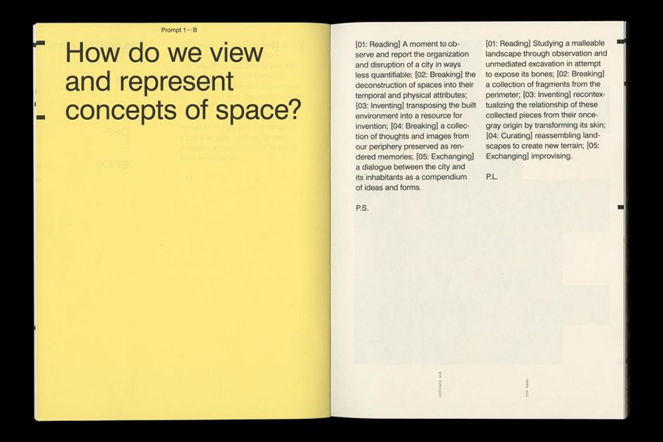
This page exhibits a highly structured and minimalist academic design, utilizing ample white space to emphasize the dense textual content. The visual language is clean and objective, relying on strong typographic hierarchy to organize complex theoretical concepts clearly.
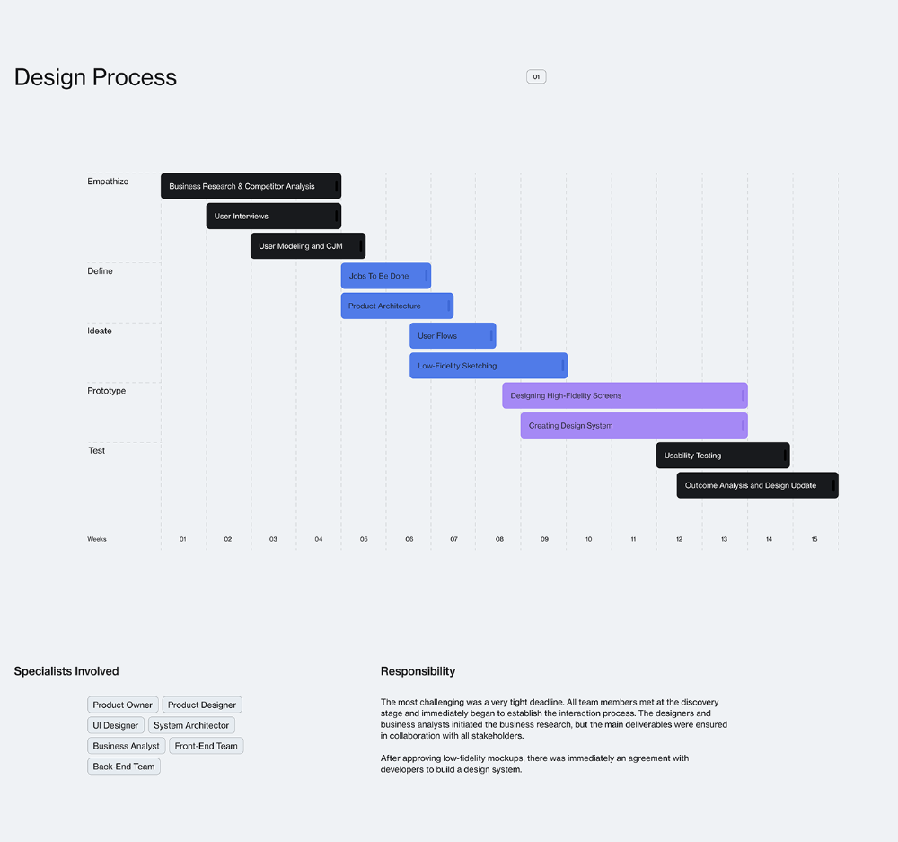
This is a highly structured and clean visual representation of a design process timeline, effectively mapping various stages from research to testing across a twelve-week period. The visual language is minimalist, relying on clear lines and text hierarchy to convey complex methodological information.
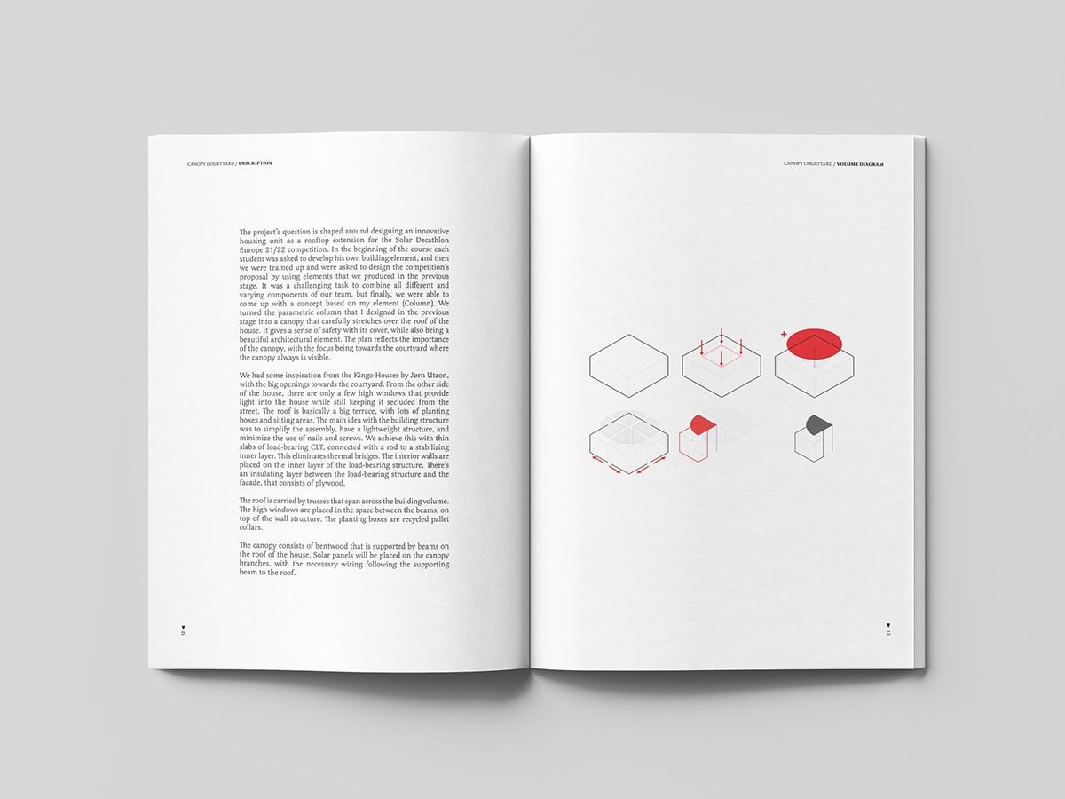
This page presents a highly conceptual design document, blending dense analytical text with minimalist geometric diagrams. The visual language is clean and academic, focusing on structural ideas through simple forms and precise line work.
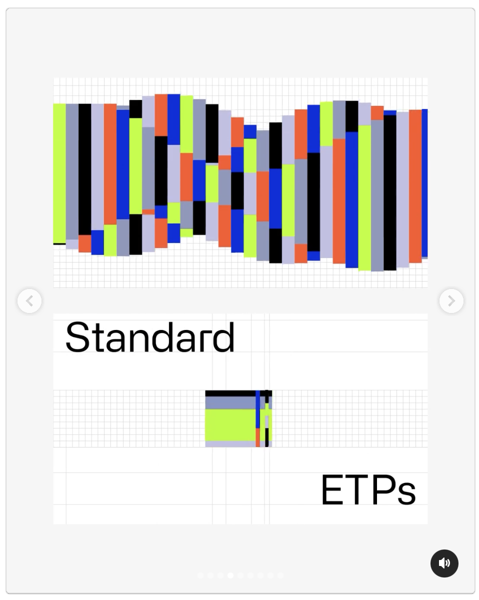
This image presents a clean, technical data visualization comparing two sets of metrics, 'Standard' and 'ETPs,' using a grid-based bar chart format. The design emphasizes clarity and quantitative comparison through distinct color coding and structured layout.
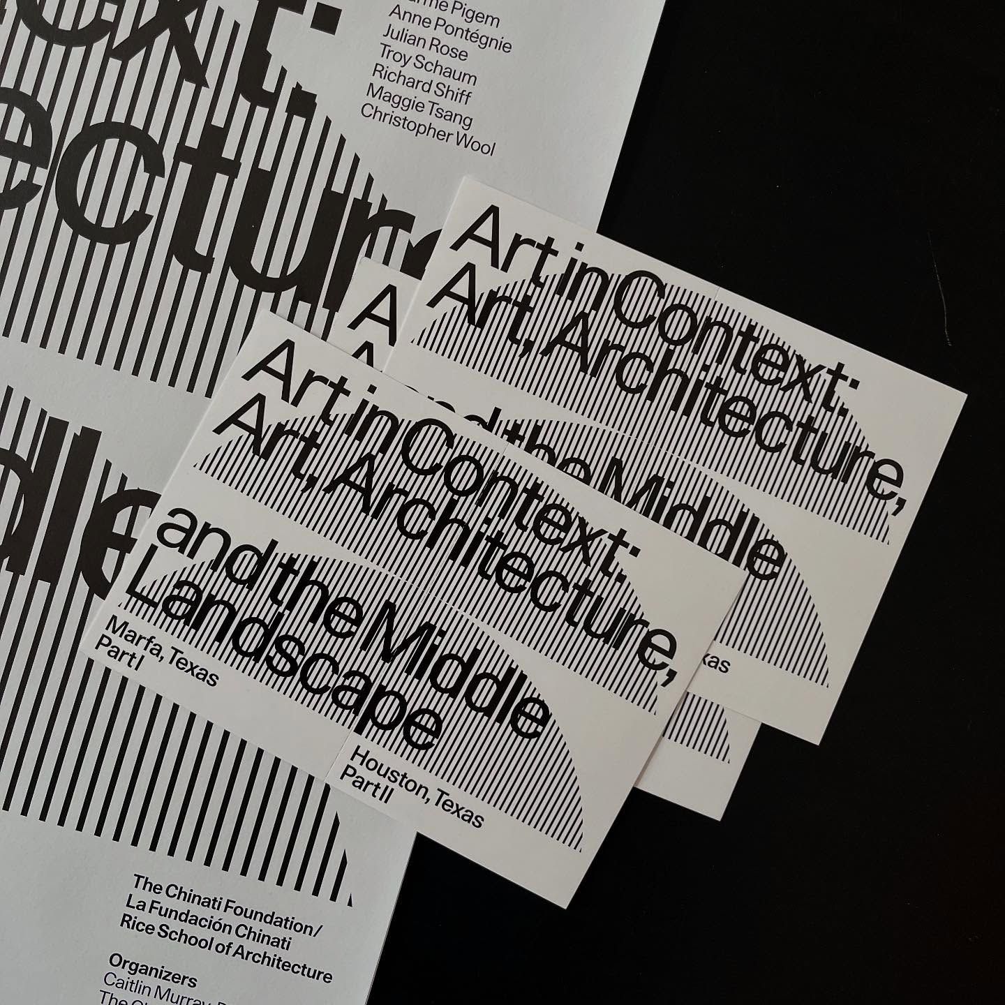
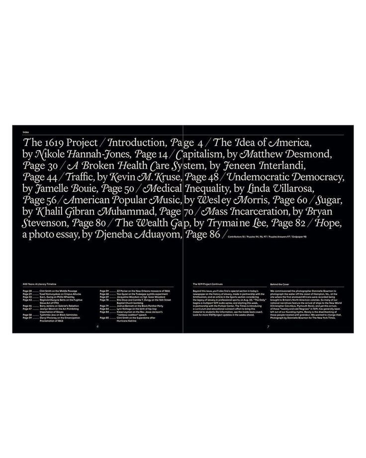
This visual study features a collection of academic or exhibition labels characterized by stark, high-contrast typography against a dark background. The design relies heavily on negative space and precise alignment to create a structured, minimalist aesthetic suitable for scholarly presentation.
This design employs a stark, minimalist aesthetic characterized by strong vertical alignment and high contrast between black text and a light background. The visual language is academic and structured, using typography to emphasize the weight and seriousness of the subject matter.
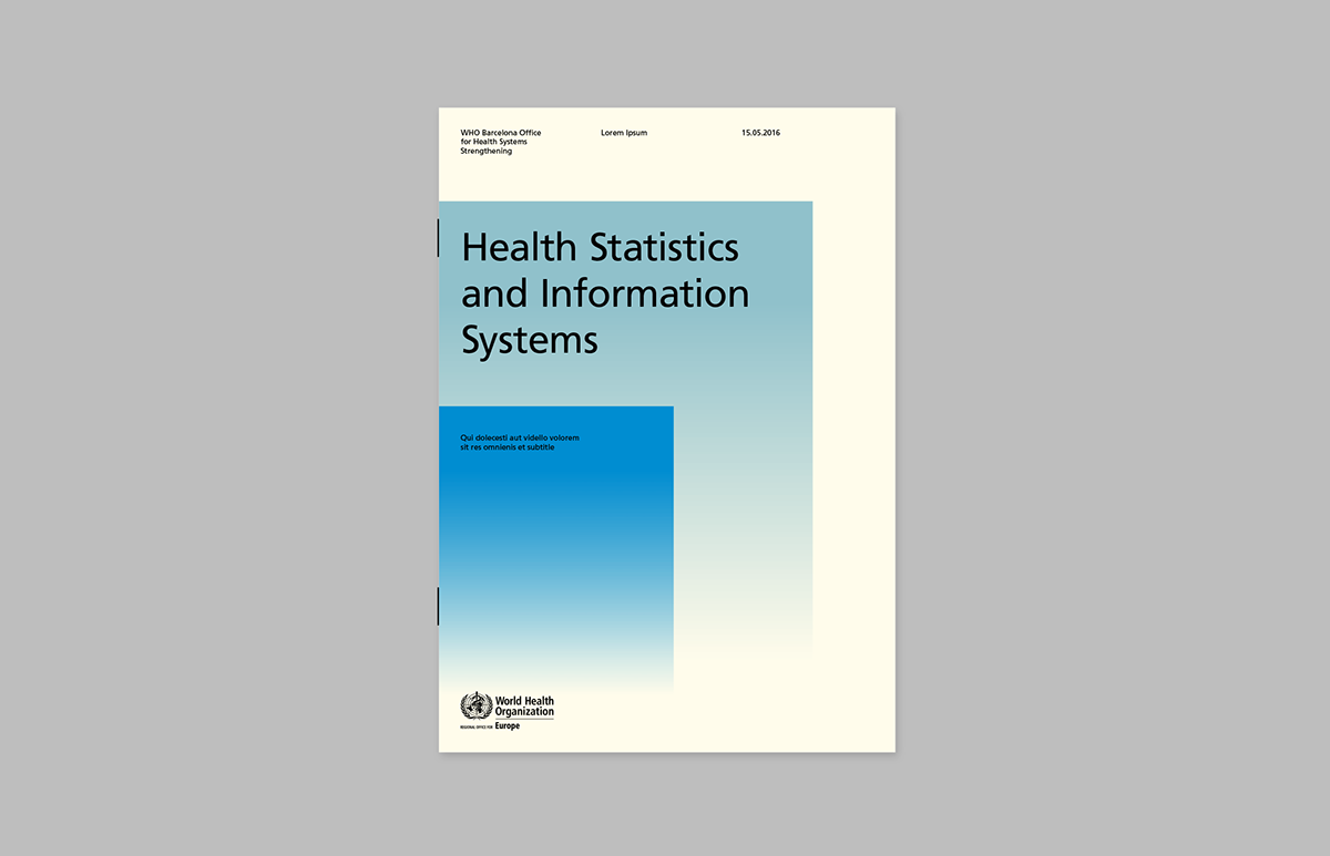
This design employs a clean, minimalist aesthetic typical of institutional reports, using ample white space and a subtle blue gradient to convey clarity and data. The visual language is highly professional, focusing attention directly on the title through balanced composition.
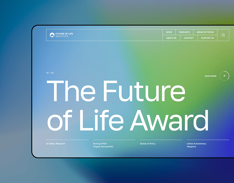
This design utilizes a clean, modern aesthetic with subtle gradients to create a professional and forward-thinking atmosphere. The layout is balanced, using ample negative space to draw focus directly to the main award title and key information.
The design employs a stark, high-contrast visual language dominated by black and white to present complex information in a structured, academic manner. The layout is modular, using clean lines and ample negative space to emphasize data points and architectural imagery.
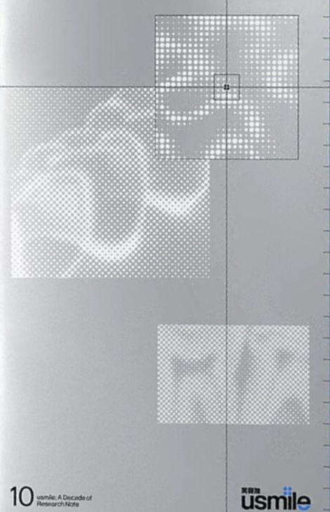
This image utilizes a stark, monochromatic visual language characterized by fine dot patterns and precise grid structures. The design conveys a sense of technical documentation, academic rigor, and systematic observation through its minimalist composition.
This page exhibits a highly structured and academic design characterized by dense, justified text blocks typical of scholarly publications. The visual language is minimalist, relying on high contrast between black text and a white background to prioritize readability and information density. The overall feel is serious, rigorous, and deeply researched.
The design exhibits a highly structured, minimalist aesthetic characterized by ample white space and clear hierarchy. The visual language relies on simple icons and clean typography to convey complex principles in an organized, professional manner.
This design employs a stark, minimalist aesthetic characterized by high contrast and precise typography to convey institutional authority. The visual language is clean and structured, utilizing negative space effectively to organize complex information clearly. The overall feel is professional, serious, and highly technical.