public signage
13 designs
Showing 13 of 13 (13 total)
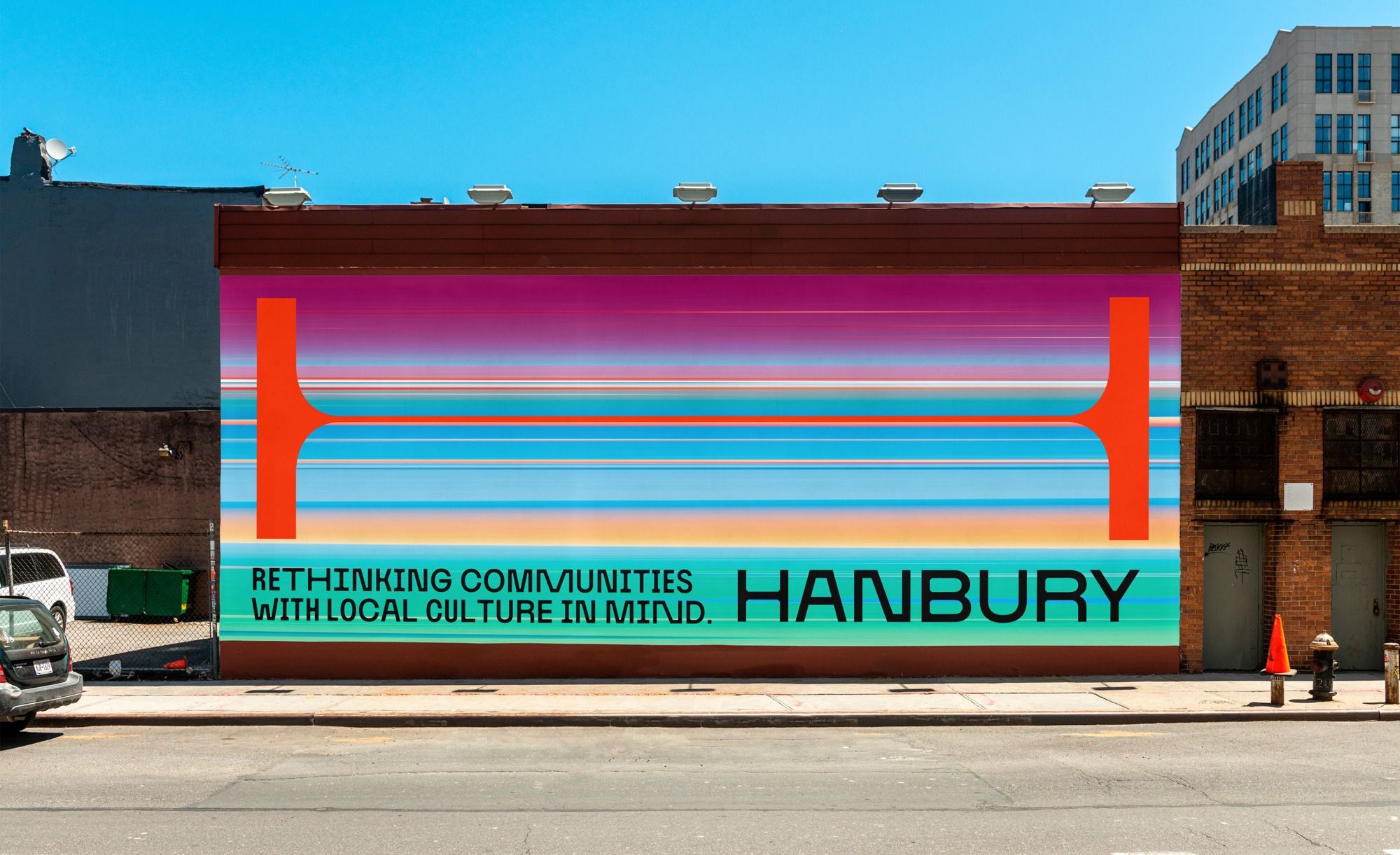
This is a vibrant, large-scale mural utilizing bold geometric shapes and layered horizontal bands to create an energetic urban aesthetic. The design employs high contrast and saturated colors to communicate a message about community culture in a dynamic visual language.
This design utilizes a clean, minimalist approach characterized by strong geometric shapes and high contrast typography to convey institutional information. The visual language is highly structured, relying on negative space and precise alignment to create a modern and authoritative feel.
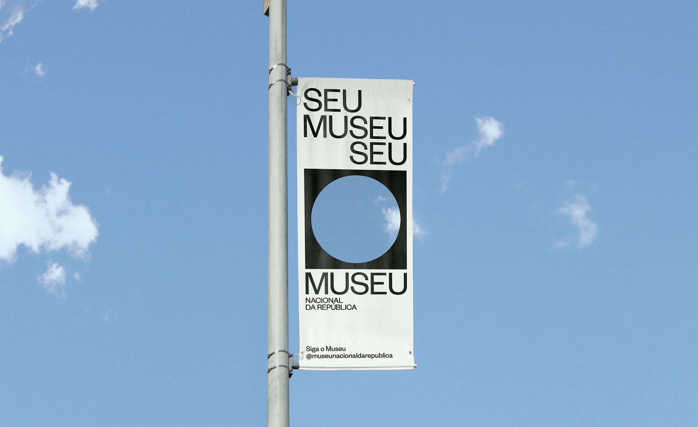
This design utilizes a stark, minimalist approach, relying on high contrast between black text and white space against a bright blue sky. The visual language is clean, institutional, and direct, emphasizing clarity and official branding through simple geometric forms.

The image features a clean, modern informational sign mounted on a textured stone wall, conveying a sense of institutional formality and clear communication. The design relies heavily on negative space and high contrast between the white sign and the dark background elements.
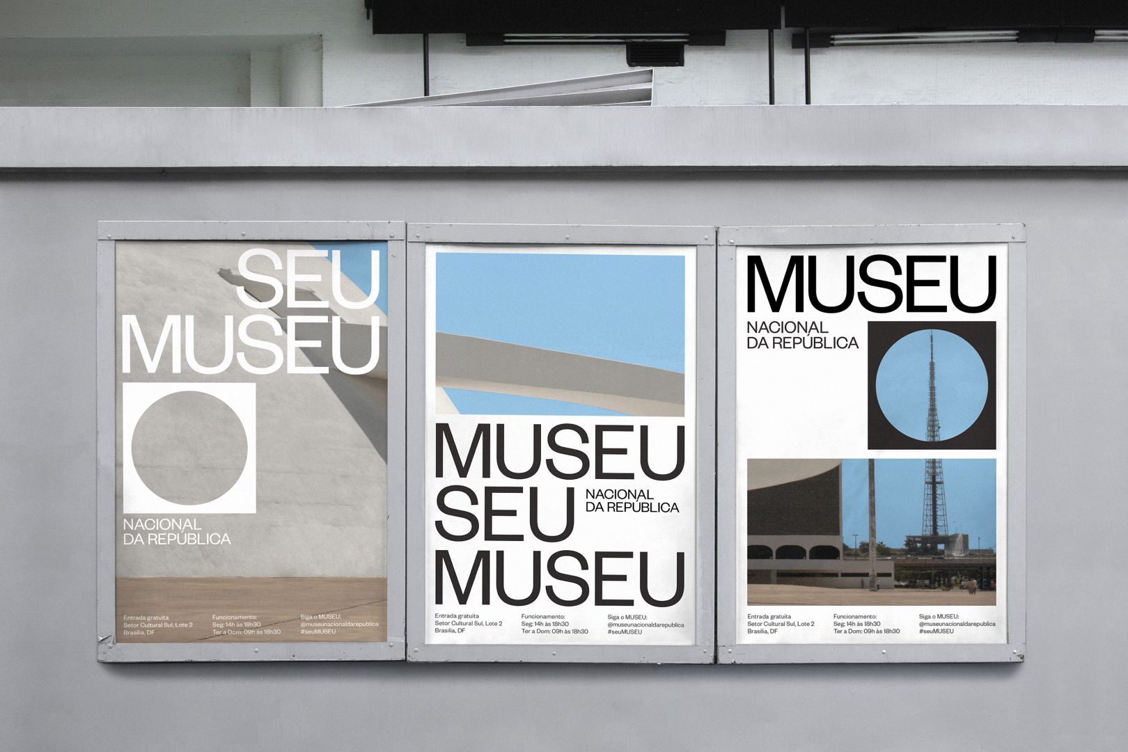
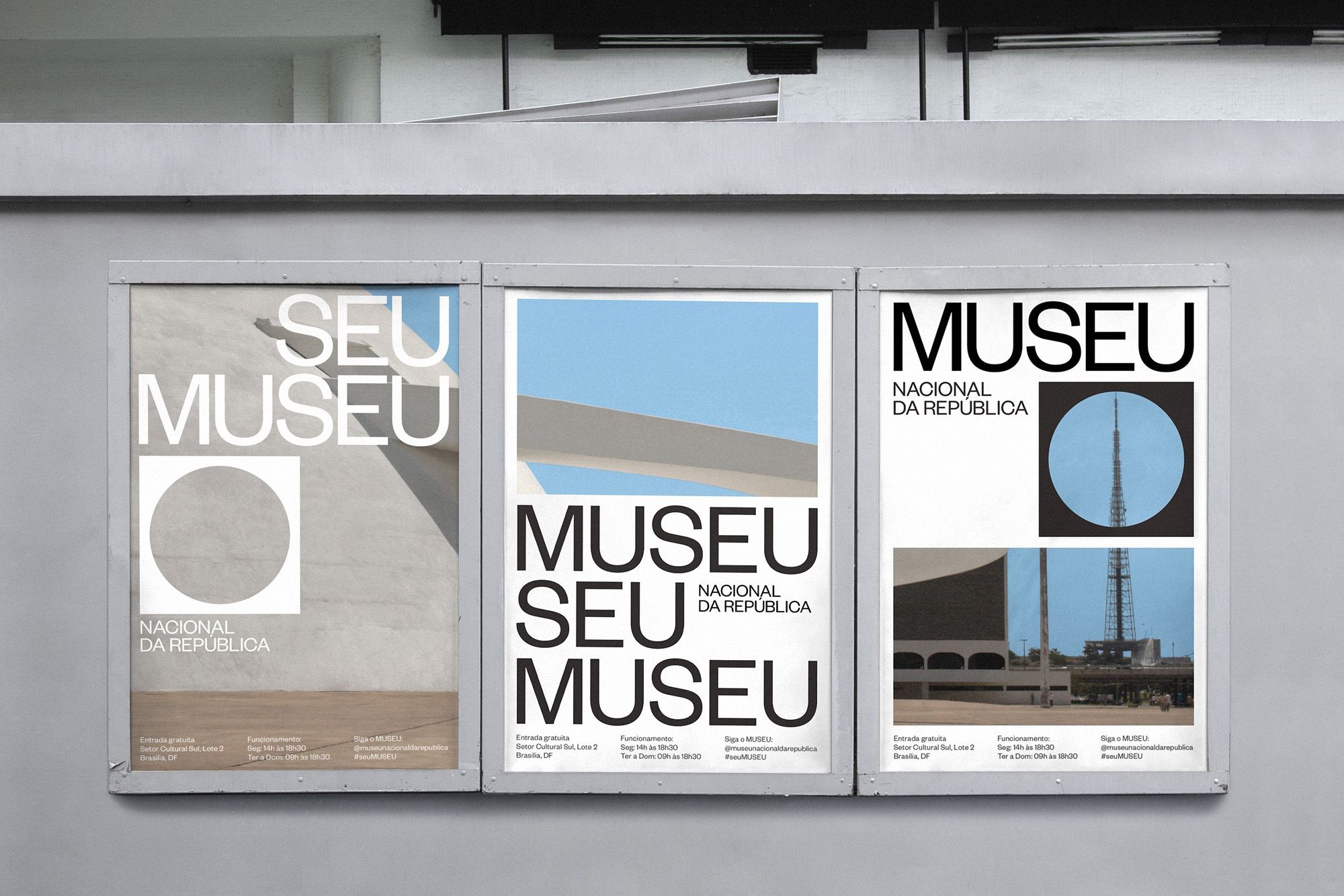
This is a clean, minimalist display featuring three panels promoting a museum. The design relies heavily on negative space, geometric shapes (circles and rectangles), and a restrained color palette to convey a sense of institutional seriousness and modern clarity.
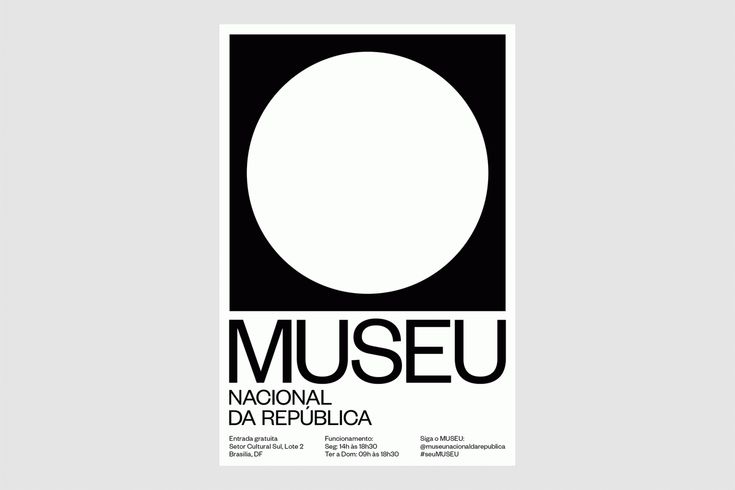
The design is stark, minimalist, and high-contrast, relying on a strong black and white dichotomy to create a clean and authoritative visual identity. It uses ample negative space, focusing attention directly on the institution's name.
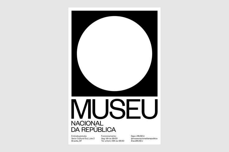
The design is minimalist and stark, relying on high contrast between black and white to create a strong, modern presence. It uses simple geometric shapes—a large circle within a black rectangle—to focus attention on the institution's name.
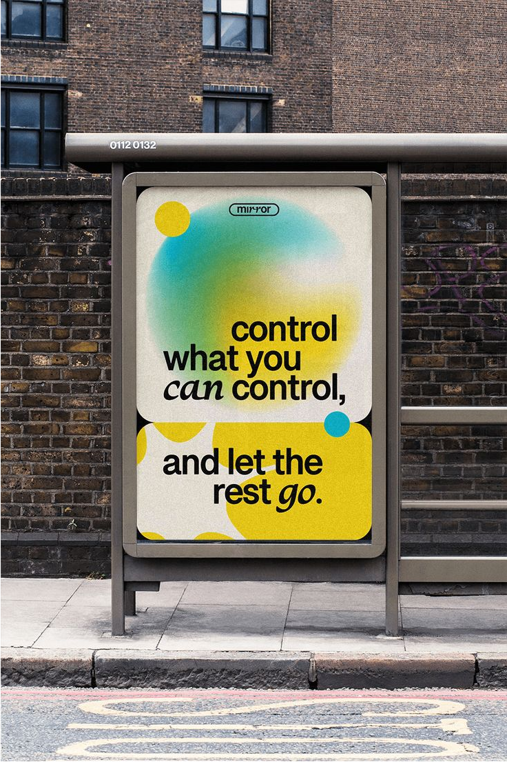
This is a piece of public transit or informational signage featuring a minimalist, modern design that uses vibrant, soft gradients to convey a message about control and letting go. The design balances clean lines with organic, fluid shapes to create an inviting yet thoughtful visual experience.
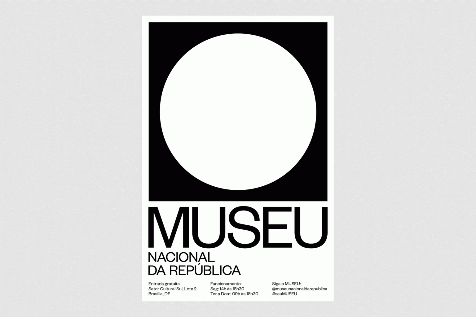
The design is stark, minimalist, and high-contrast, relying on a strong black and white dichotomy to create a clean and authoritative presence. It uses ample negative space, focusing all attention on the central circular element and the institution's name.
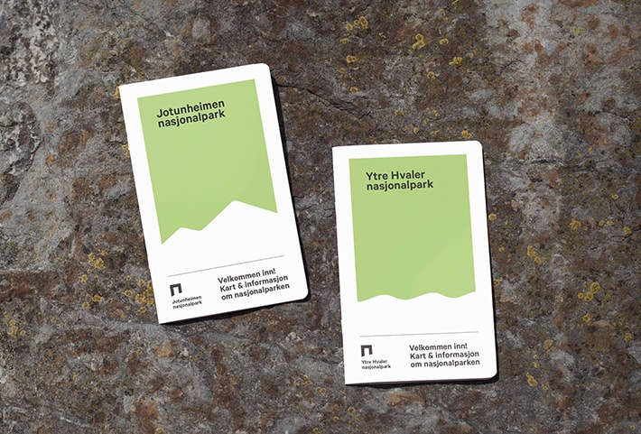
The image displays two vertical informational cards, likely entrance or introductory signs for nature parks, characterized by a clean, minimalist design. The use of a soft, muted green against a white background conveys a sense of nature, clarity, and official guidance.
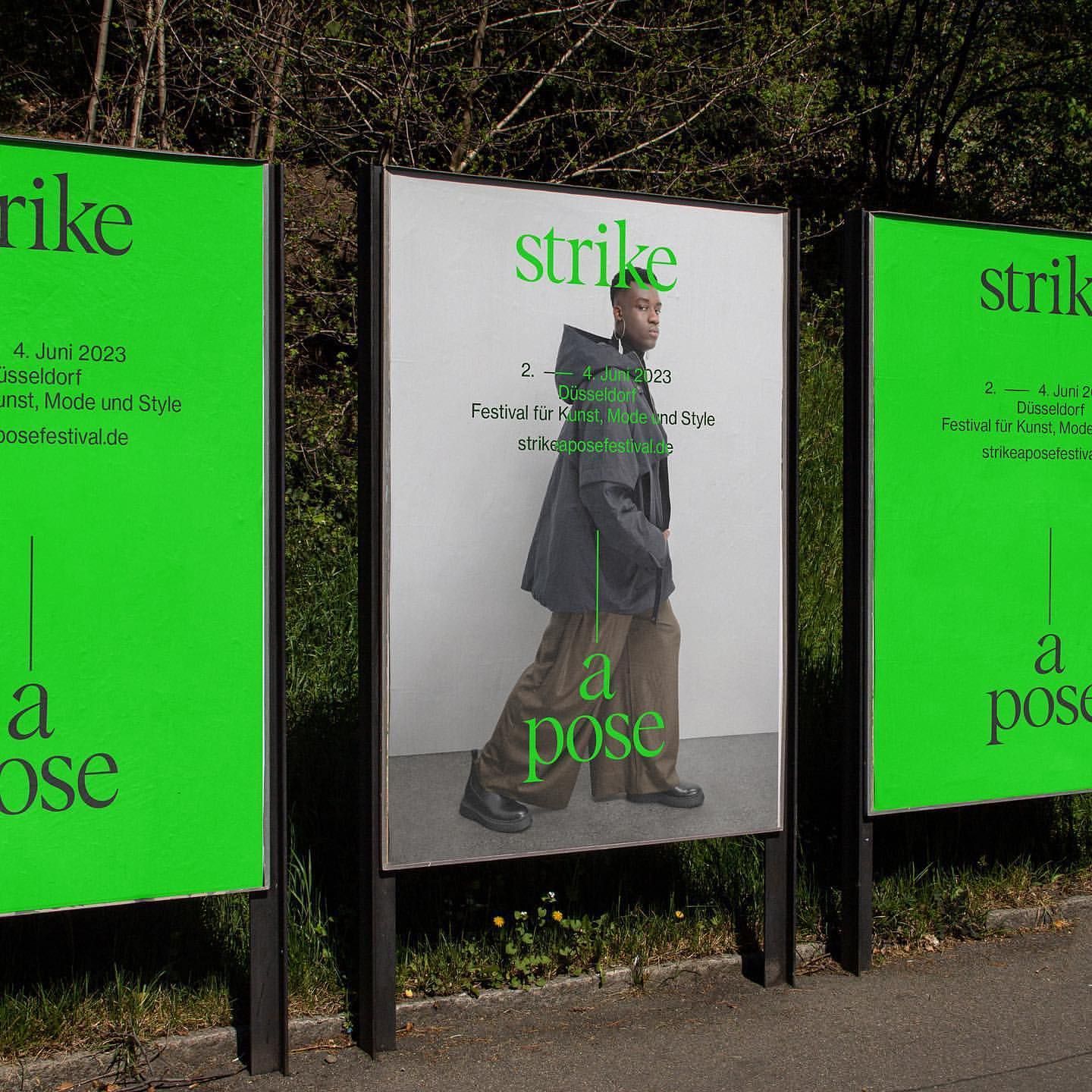
This is a series of large, vertical exhibition panels featuring minimalist photography and bold, contrasting typography. The design employs a stark, high-contrast aesthetic to present artistic or promotional content clearly and with a modern, gallery-like feel.
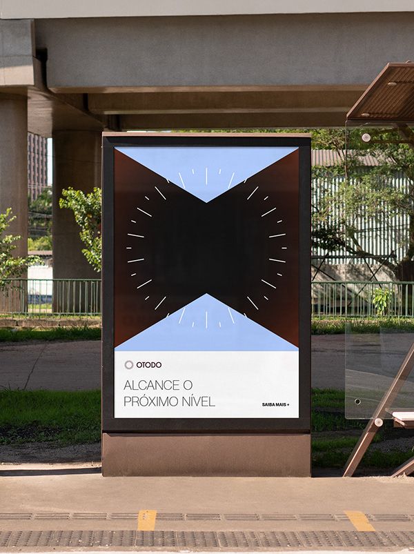
This is a modern, minimalist architectural or informational sign featuring a striking geometric pattern. The design uses negative space and strong contrast between dark brown/black elements and a light blue background to create a sophisticated and contemporary visual statement.
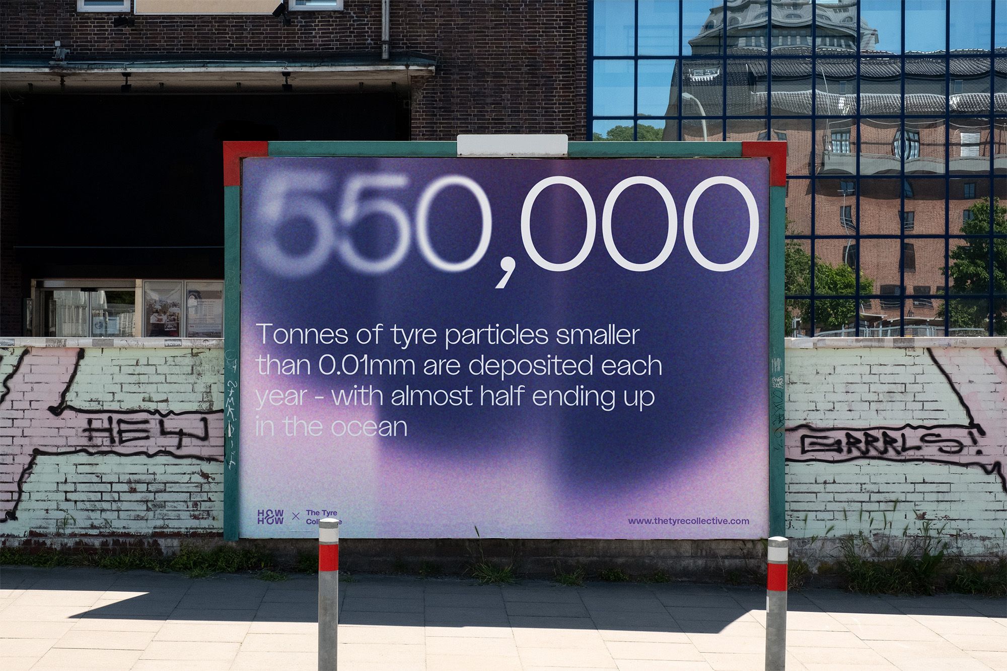
The design is a clear, highly legible informational sign utilizing strong color contrast to highlight statistical data. It employs a clean, modern visual language suitable for public education or scientific reporting, balancing precise numbers with accessible text.