public policy
4 designs
Showing 4 of 4 (4 total)
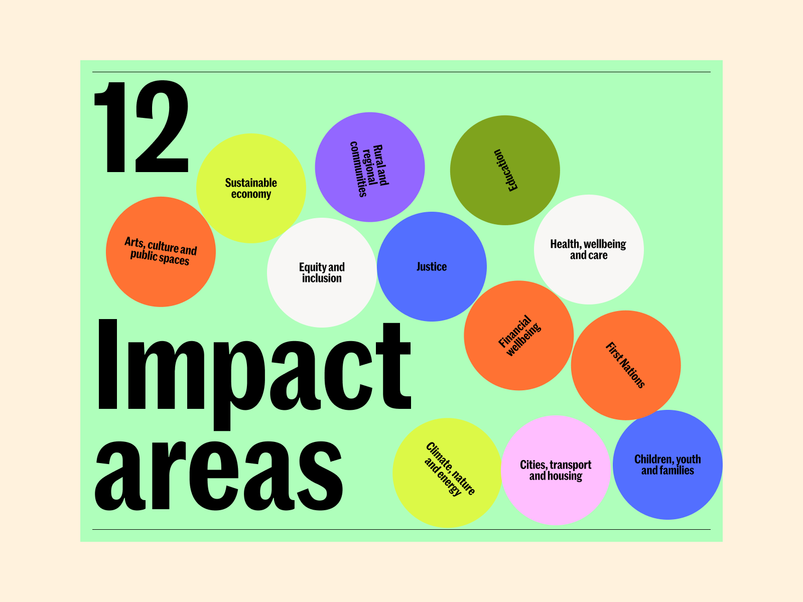
This infographic uses a clean, modern, and organized approach to categorize impact areas using a vibrant yet harmonious color palette. The design relies heavily on circular nodes against a light green background, creating a sense of clarity and accessibility for complex information.
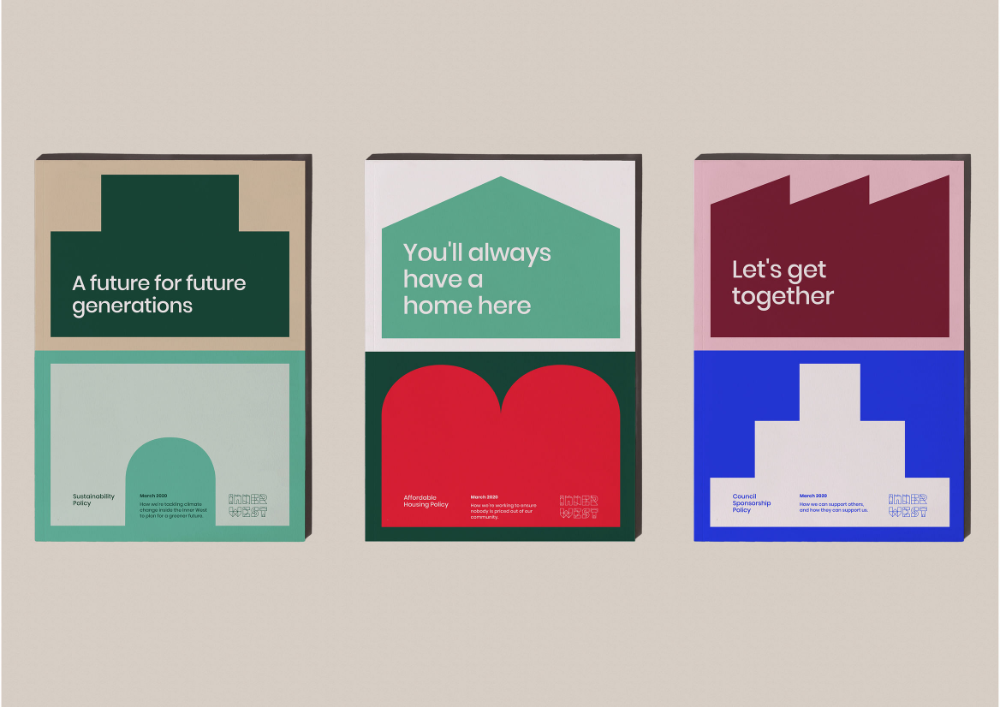
The image displays three distinct, vertically oriented informational cards or panels with a clean, modern, and institutional aesthetic. The design uses solid blocks of color and simple geometric shapes to convey clear, positive messages related to future planning and community.
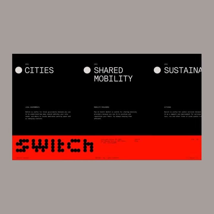
The design is stark, minimalist, and modern, utilizing a high-contrast black background with white text for a clean, institutional feel. The inclusion of the 'SWITCH' logo in bright red adds a deliberate, urgent call to action against the subdued backdrop.
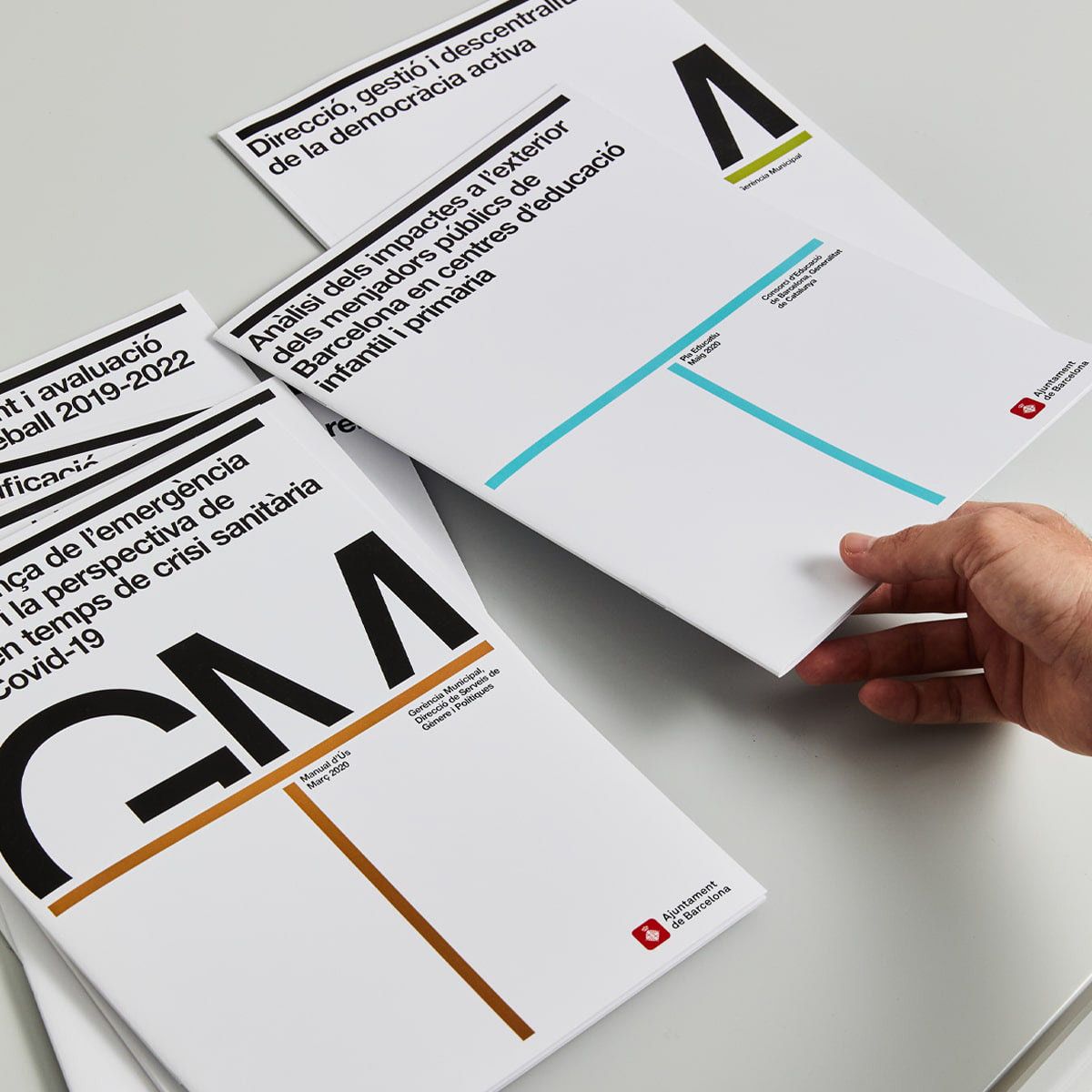
The design features a highly organized and minimalist layout characteristic of professional reports, emphasizing clarity and structure. The visual language relies on clean lines, ample white space, and precise typography to convey authoritative information effectively.