public health
11 designs
Showing 11 of 11 (11 total)
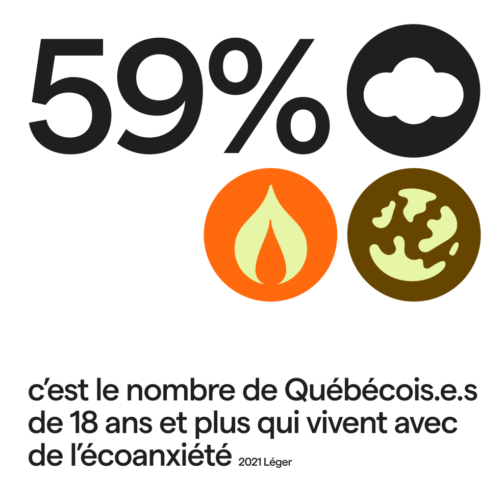
This is a clean, data-driven infographic design utilizing bold typography and symbolic icons to present a statistic. The visual language is stark and modern, relying on high contrast between black elements and warm, earthy tones to convey serious information.
This design employs a clean, minimalist aesthetic typical of institutional reports, using ample white space and a subtle blue gradient to convey clarity and data. The visual language is highly professional, focusing attention directly on the title through balanced composition.
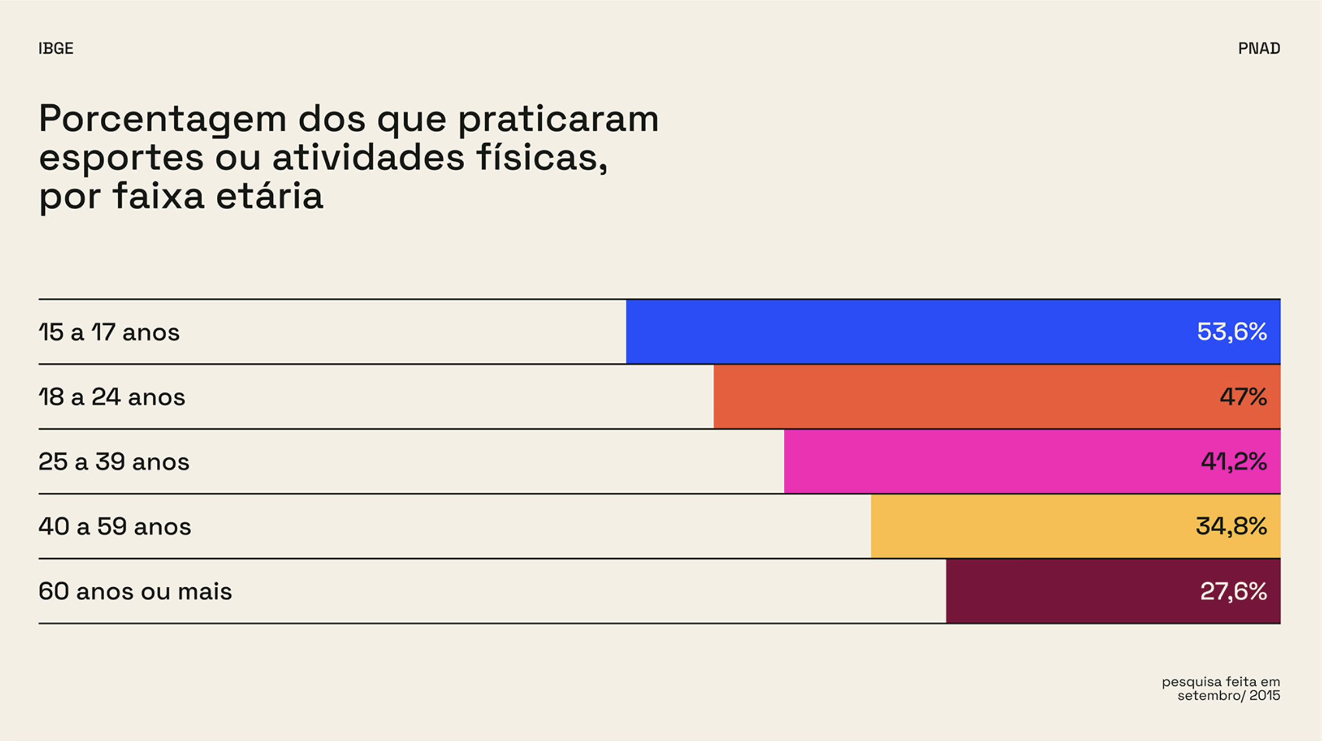
The image is a clear, data-driven bar chart visualization presenting the percentage of people who practice sports or physical activities categorized by age group. The design is clean, minimalist, and highly functional, prioritizing readability of the statistical information.
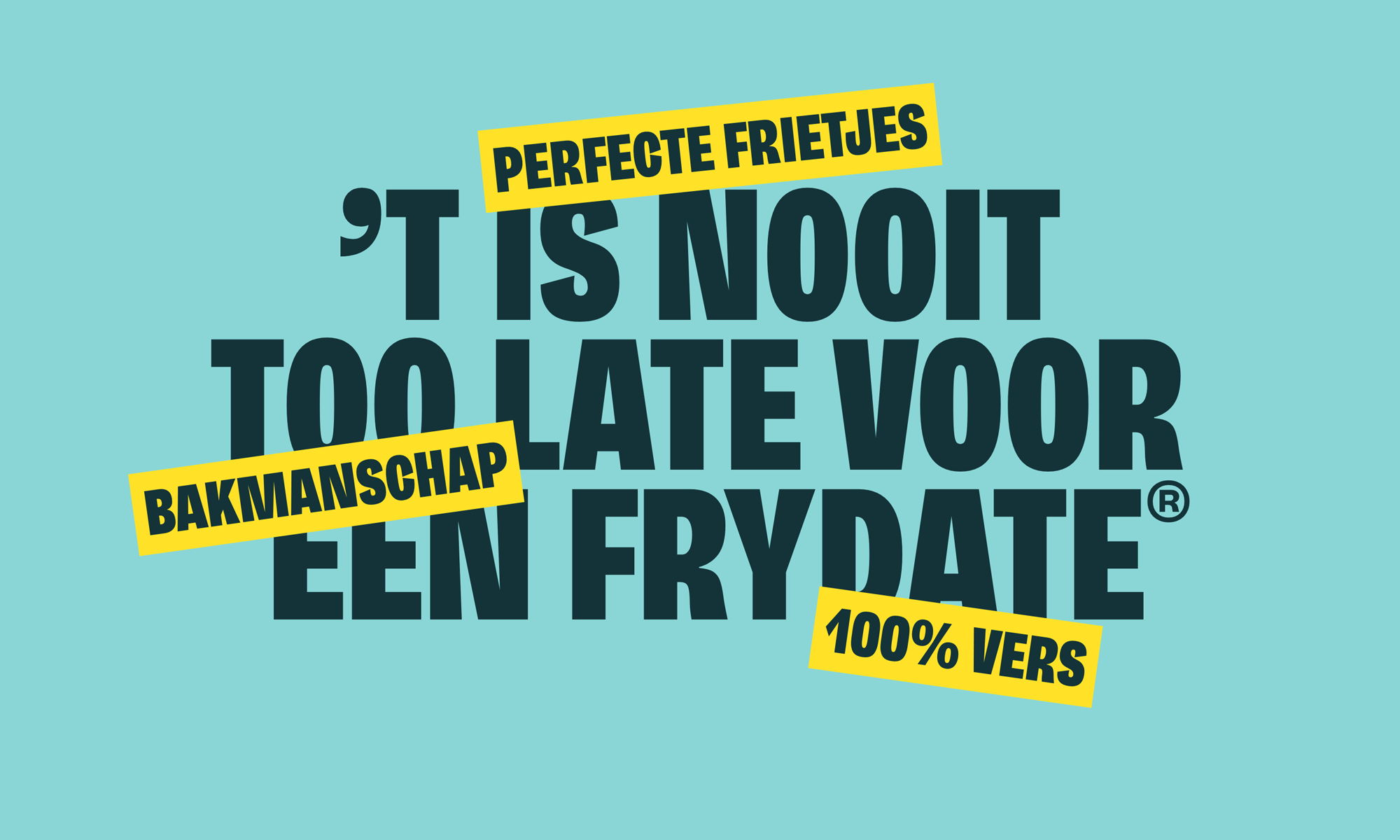
A bold, Dutch-language public health or safety campaign featuring large, heavy sans-serif typography in dark teal against a bright turquoise background. The design uses contrasting yellow accent bars with white text to emphasize key messages, creating an urgent and attention-grabbing visual hierarchy.
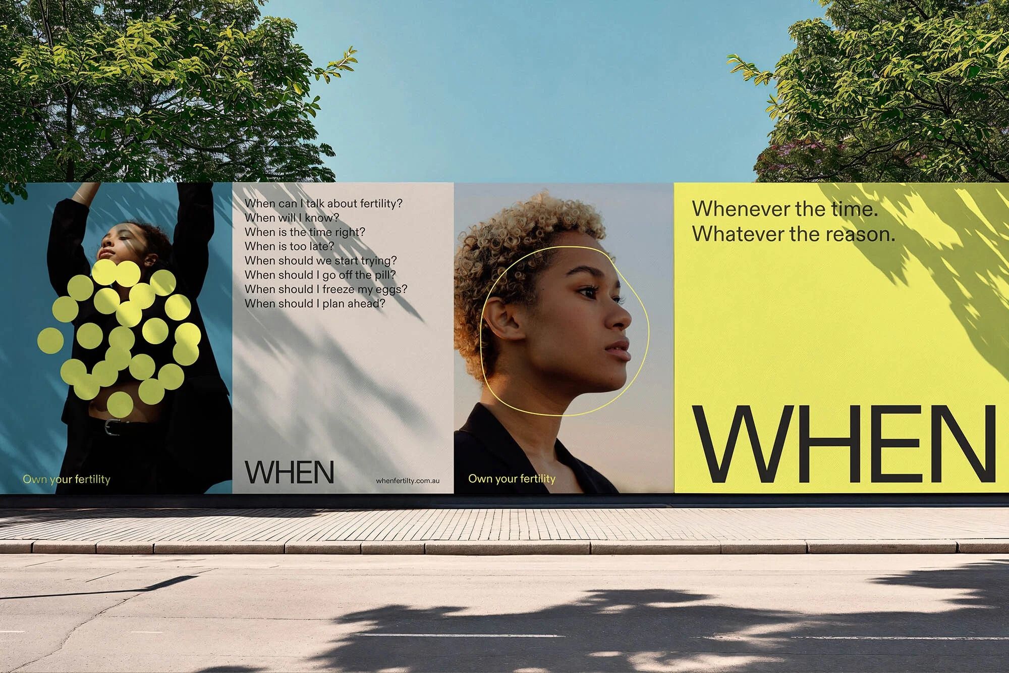
A contemporary public billboard campaign featuring a modular grid layout with striking typography and candid portrait photography. The design employs bold color blocking, minimalist text hierarchy, and natural imagery to create an engaging, thought-provoking visual narrative about timing and decision-making.
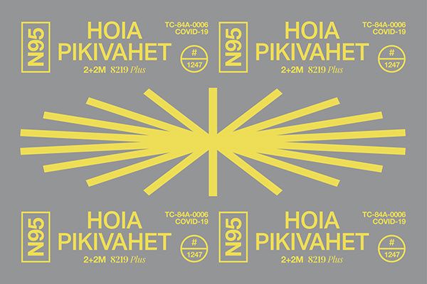
A minimalist institutional design featuring bold geometric sunburst patterns in bright yellow against a neutral gray background. The layout employs symmetrical repetition of text and badge elements, creating a structured, official aesthetic with strong visual hierarchy and balanced composition.
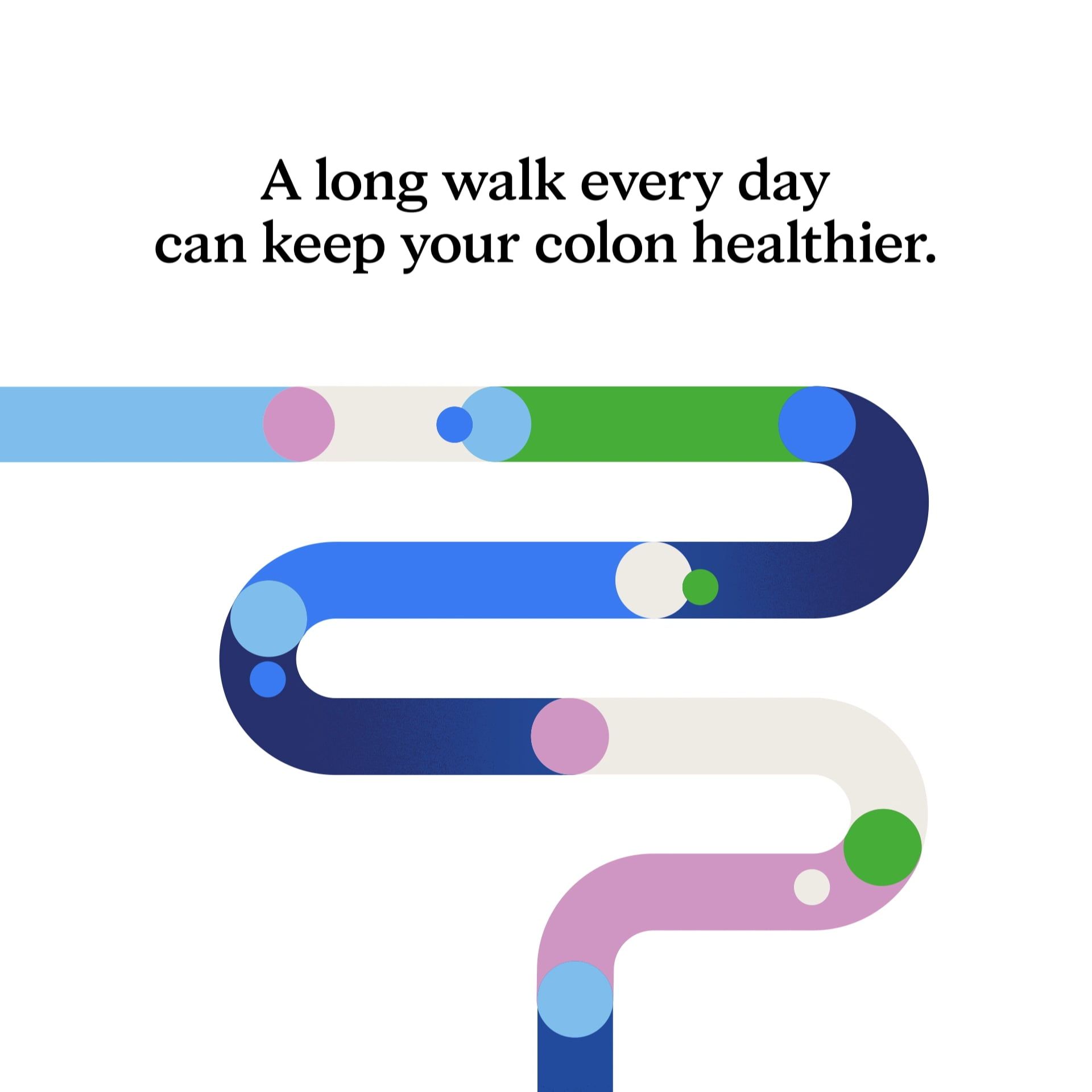
A modern health infographic using an abstract intestinal pathway design to communicate digestive wellness. The composition combines flowing organic shapes with colorful accent dots, creating an approachable and educational visual narrative about daily walking and colon health.
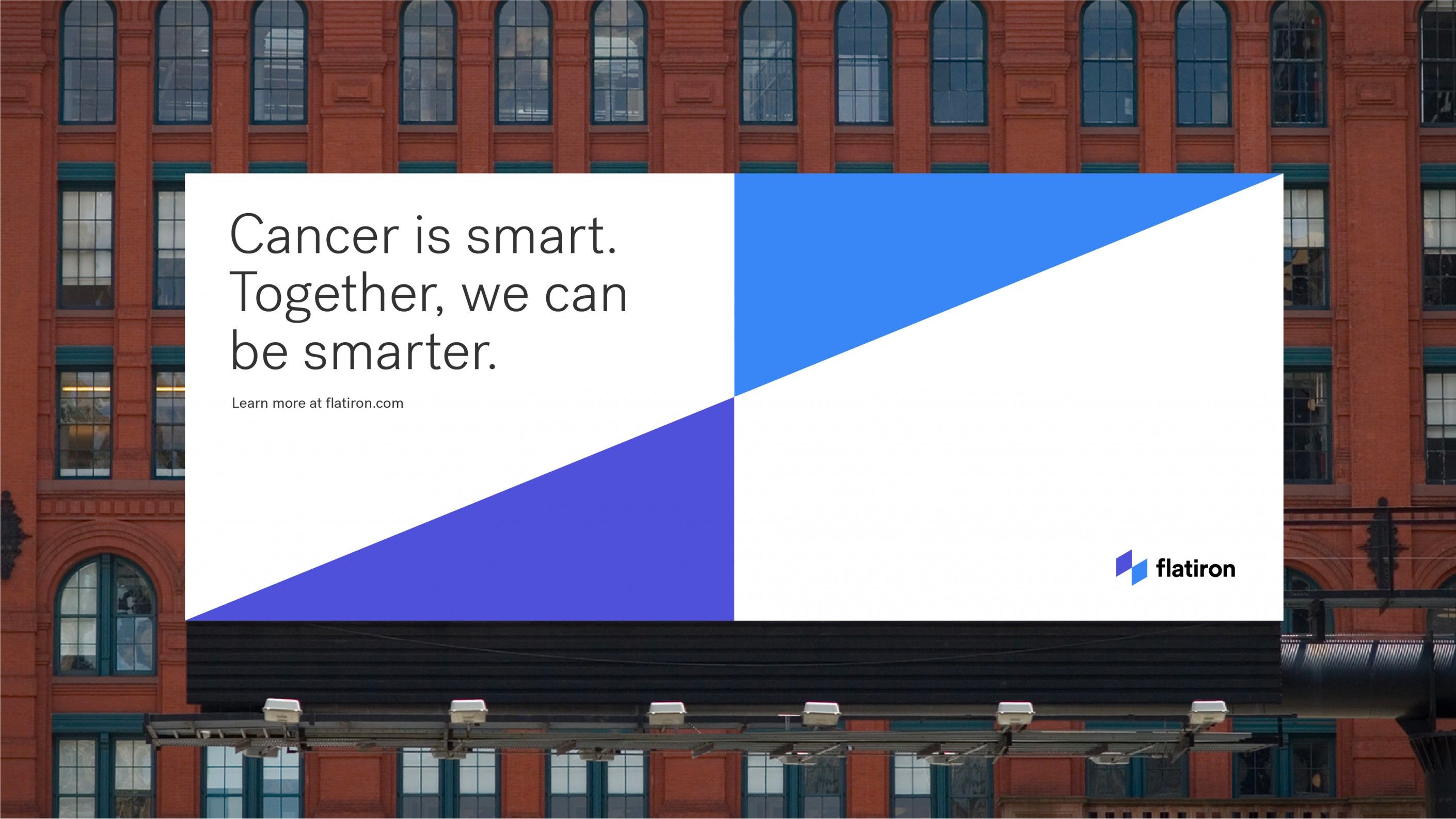
A bold, minimalist public health billboard campaign featuring geometric abstraction and confident messaging. The design uses stark contrast between white space and vibrant blue shapes to create visual impact against an urban brick backdrop. The typography is clean and direct, emphasizing clarity and accessibility for a mass audience.
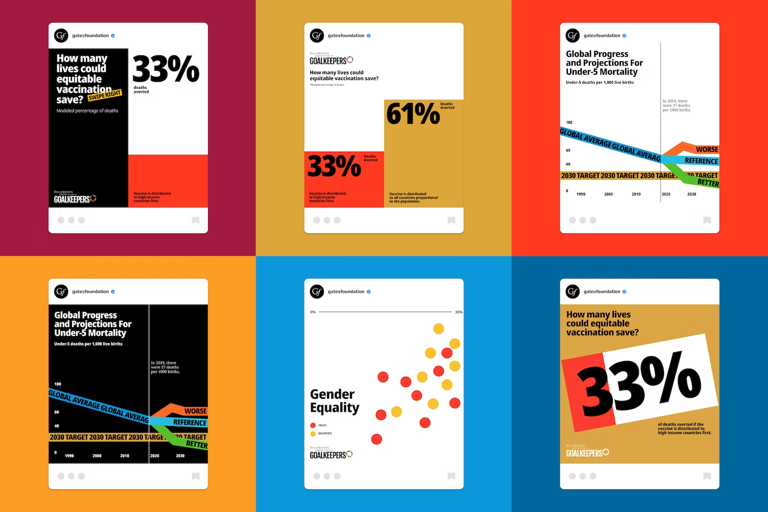
The image displays a set of infographic cards, likely presenting data or progress reports related to global health or vaccination efforts. The design is clean, modern, and utilizes strong color blocking to highlight key statistics.
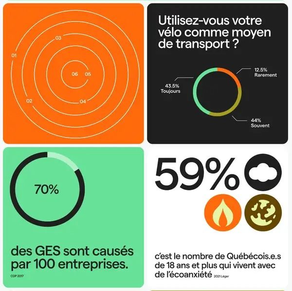
The image is a collage of four distinct infographic panels, utilizing a clean, modern design with strong use of circular and radial charts to present statistical data. The visual language is direct and informational, employing a limited but contrasting color palette to segment different pieces of information effectively.
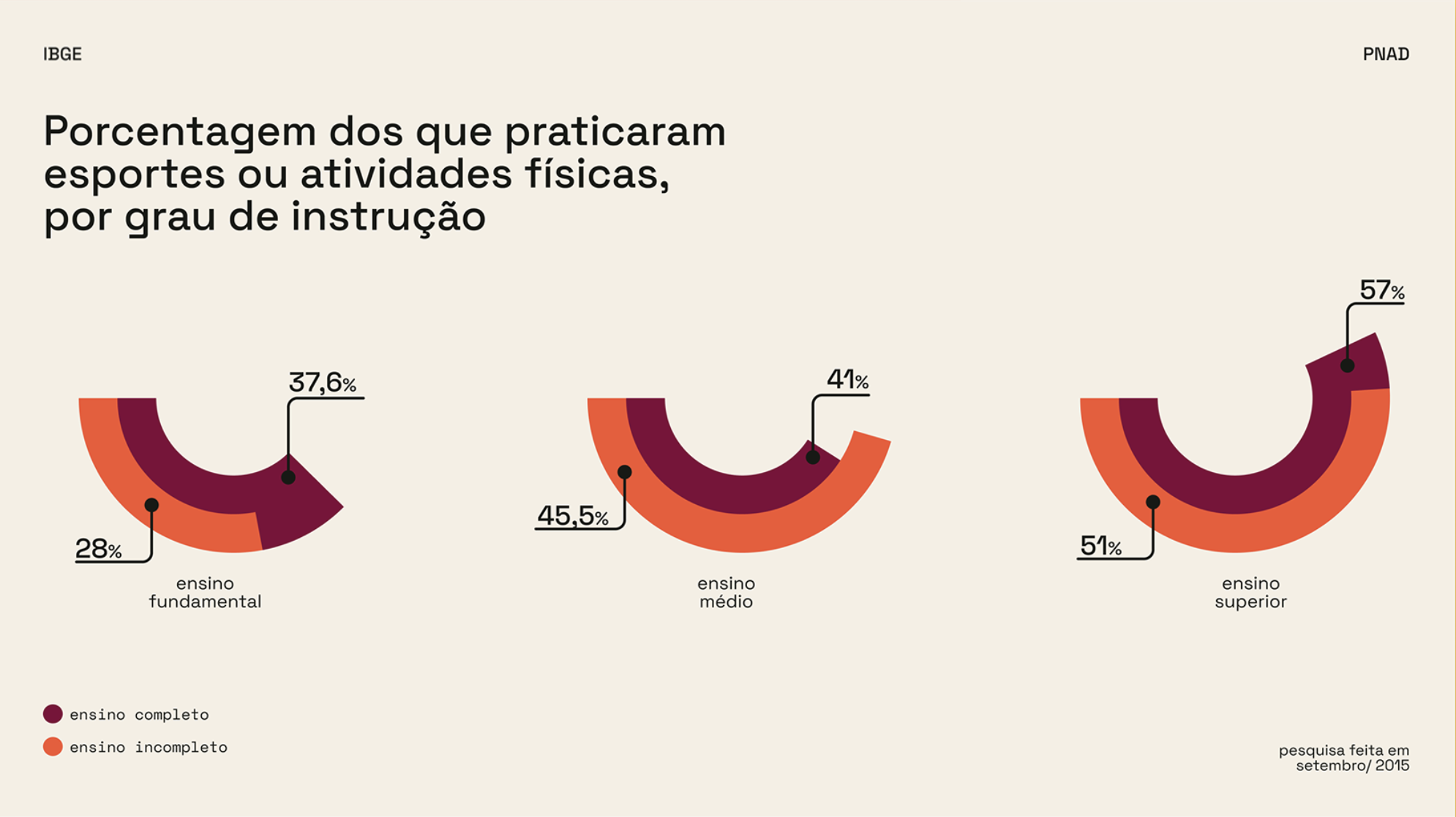
The infographic uses a clean, minimalist design with a muted, earthy color palette to present statistical data clearly. The use of curved bar charts effectively visualizes the percentage distribution across different levels of physical activity instruction.