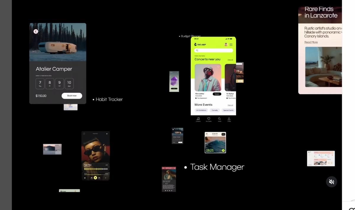
productivity apps
6 designs
Showing 6 of 6 (6 total)
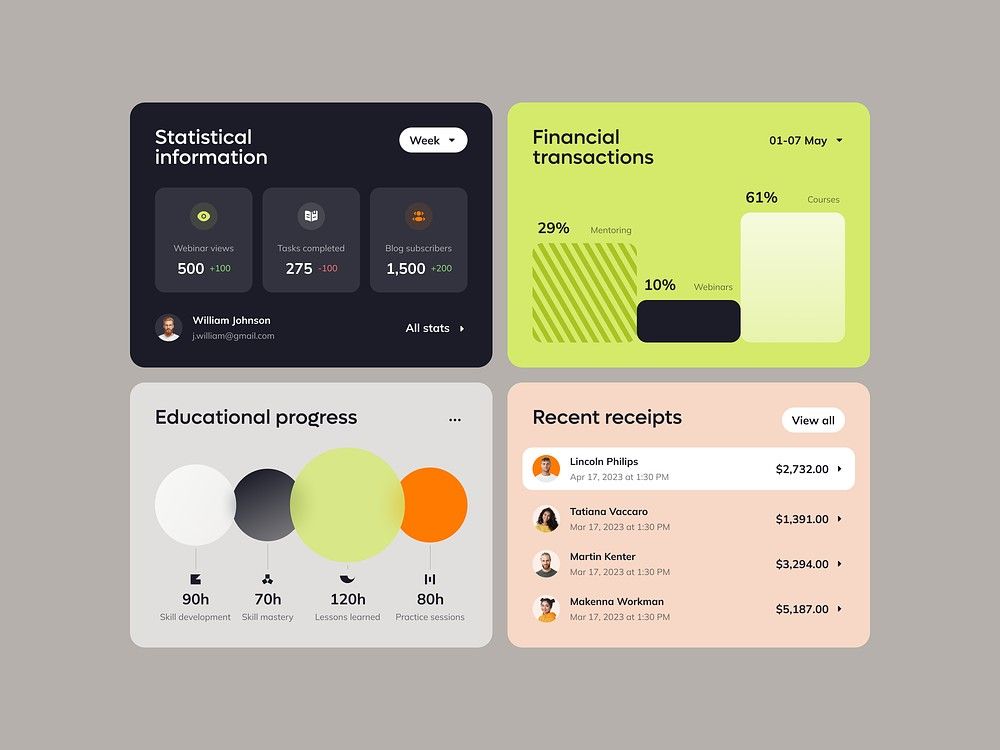
This image showcases a clean, modern dashboard design utilizing card-based layouts to present statistical and financial data. The visual language is minimalist, relying on clear typography and subtle color accents to ensure high readability and data hierarchy. The overall feel is professional, organized, and highly functional.
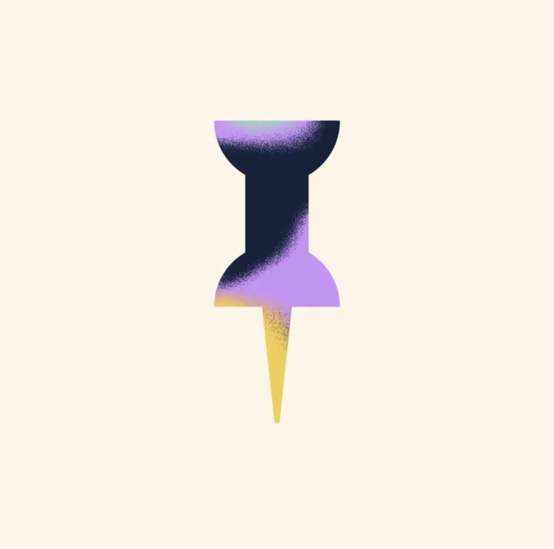
A minimalist illustration of a pushpin rendered with a modern gradient aesthetic, featuring bold color blocking and soft grainy textures. The design combines geometric simplicity with contemporary digital art techniques, set against a warm neutral background.
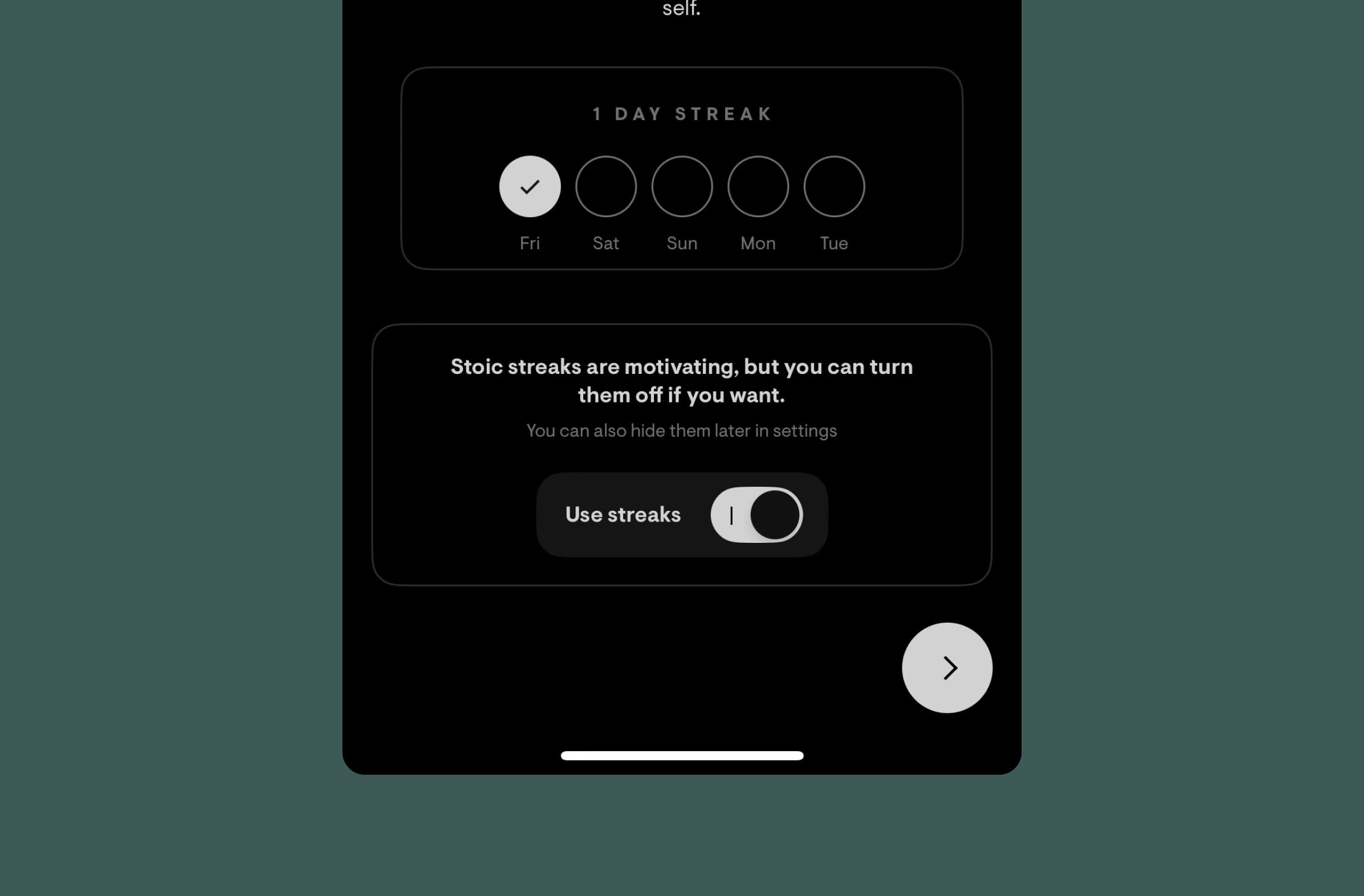
This design utilizes a clean, dark-mode aesthetic to present tracking data and user controls. The visual language is highly functional, employing subtle spatial organization and clear typography to guide the user through streak information and toggles. The overall feel is calm, organized, and focused on productivity metrics.
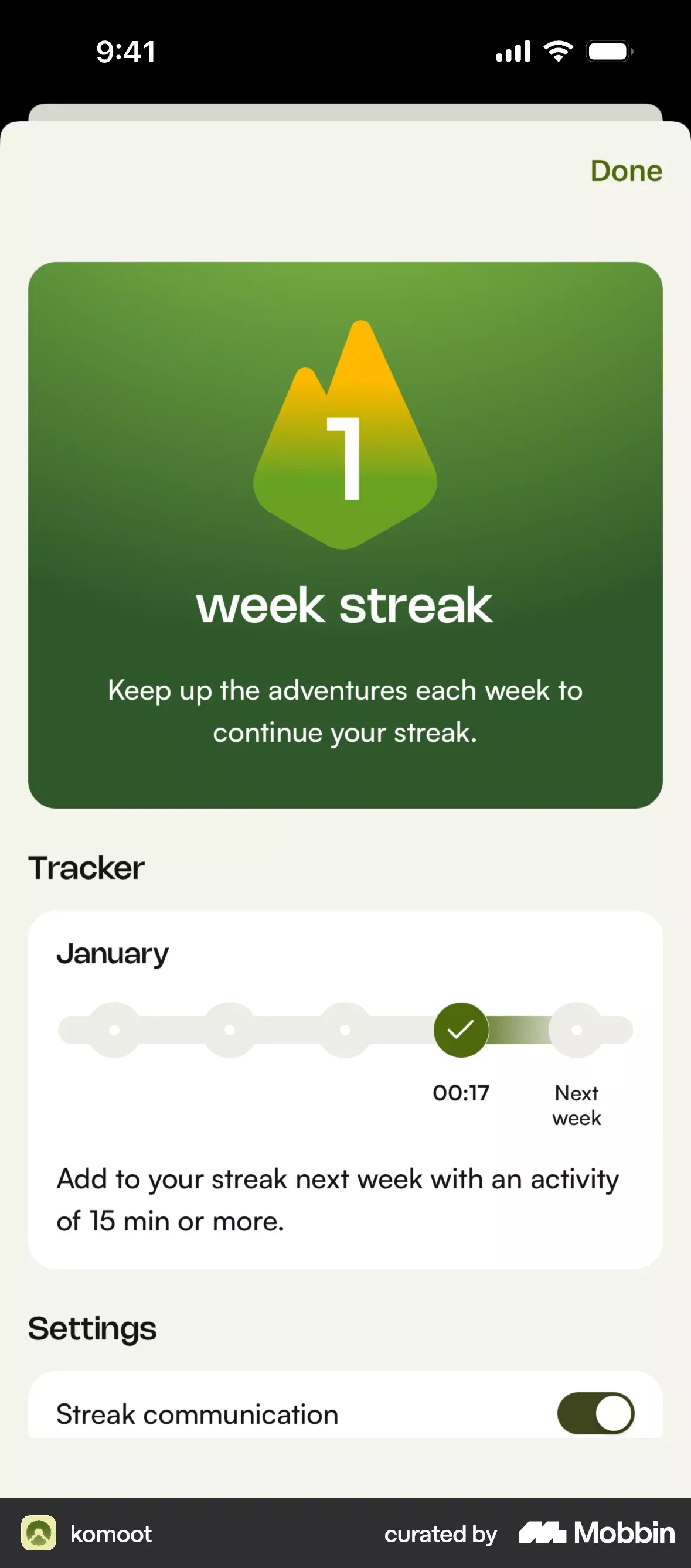
This interface employs a clean, modern flat design with high contrast, utilizing vibrant greens and subtle yellow accents to guide the user's attention. The visual language is highly structured, organizing key metrics like streaks and settings into distinct, easily digestible cards. The overall feel is encouraging and focused on positive progress tracking.
This design utilizes a clean, modern dark mode aesthetic focused on functional information display. The visual language is modular and structured, relying heavily on card layouts and clear typography to organize disparate services or events effectively.
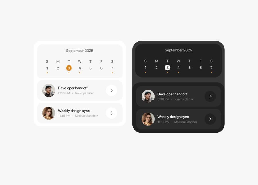
Calendar application UI design with light and dark theme variations. Shows calendar grid, event management, and navigation with consistent visual system.