performance arts
2 designs
Showing 2 of 2 (2 total)
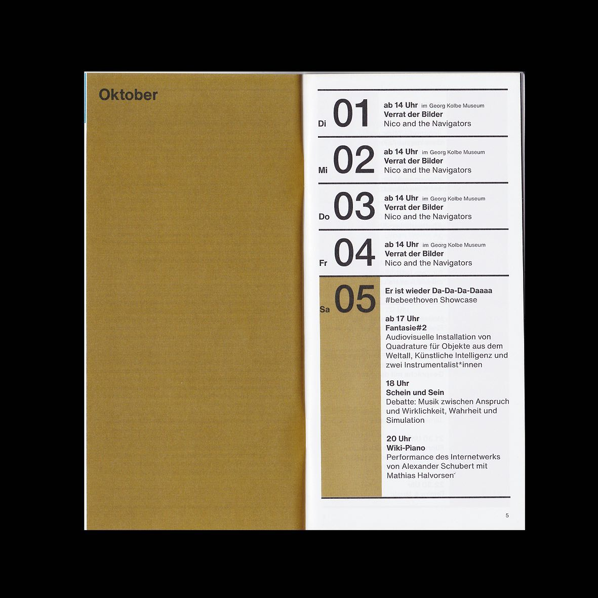
This design utilizes a minimalist and structured approach, relying on clean typography and ample negative space to present dense information clearly. The visual language is reserved and academic, emphasizing organization and legibility above all else through a monochromatic palette.
minimalistinformationalclean lines
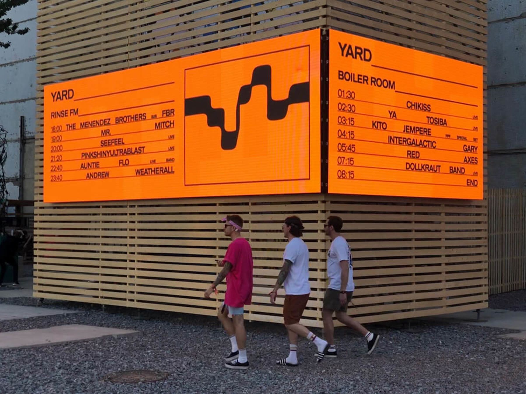
This design utilizes strong material contrast, juxtaposing a vibrant orange schedule against a neutral wooden slat background. The visual language is straightforward and functional, emphasizing legibility and organizational clarity for public display.
functionalminimalistindustrial