performance tracking
13 designs
Showing 13 of 13 (13 total)
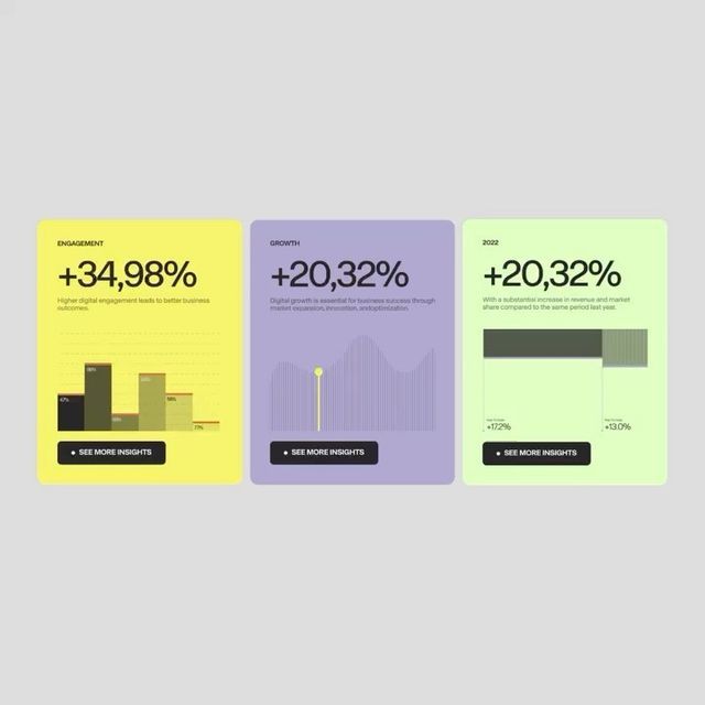
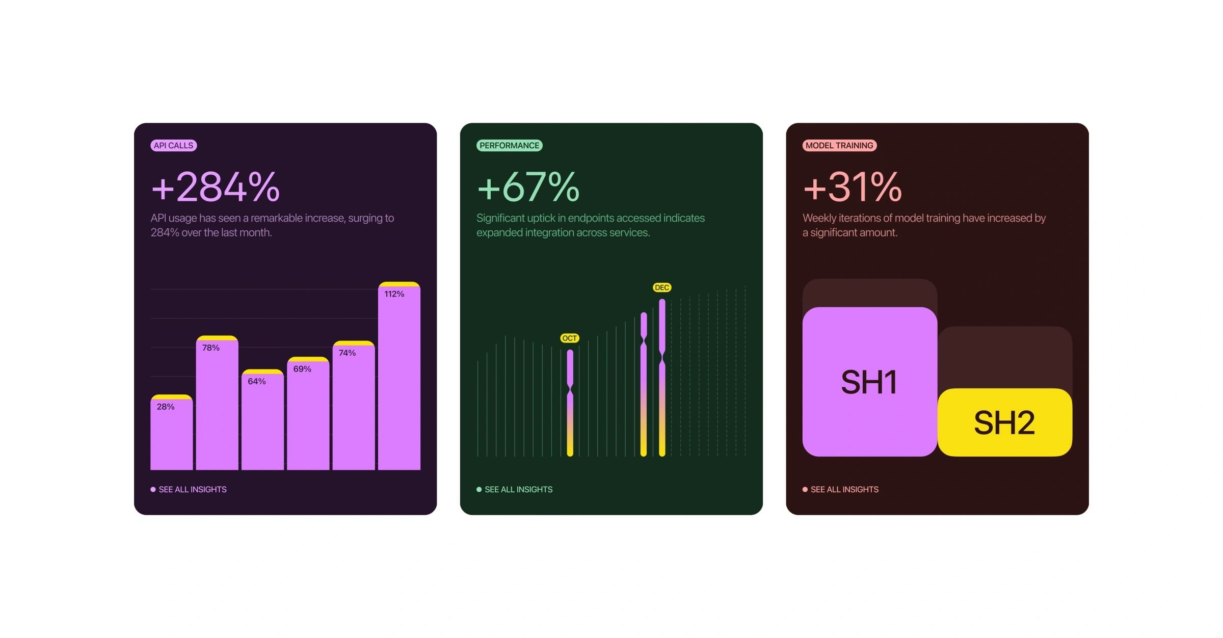
The image presents three distinct, card-like data visualizations using a clean, modern aesthetic. The design relies heavily on color blocking and simple bar/line charts to convey growth metrics effectively. The overall feel is professional, data-driven, and optimistic.

The image displays a mobile application interface with a clean, modern, and minimalist design focused on presenting performance statistics. It uses ample white space and subtle use of color to guide the user's attention to key metrics.
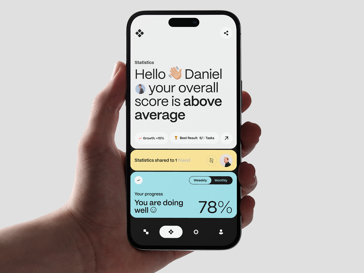
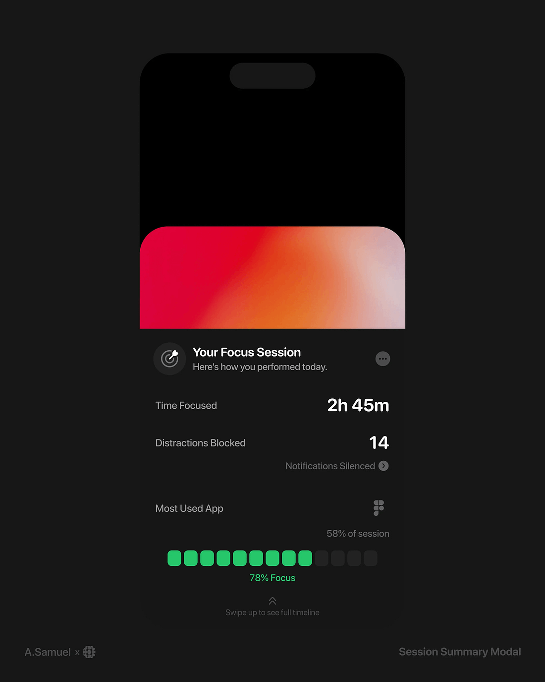
The image displays a clean, modern mobile application interface focused on presenting positive performance statistics. The design utilizes ample white space and subtle use of color to create a professional and encouraging user experience.
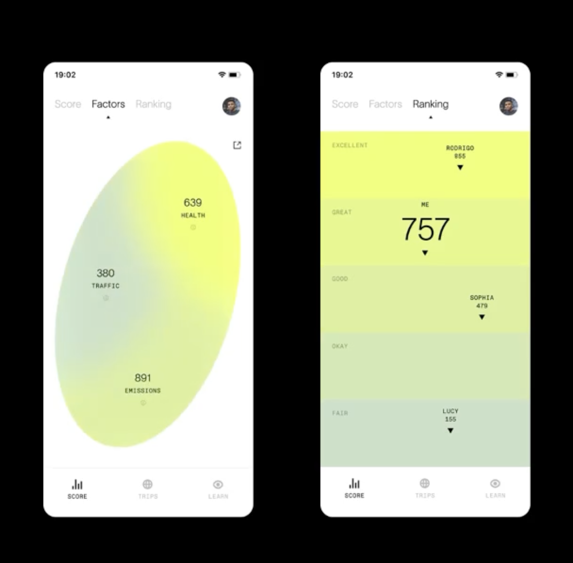
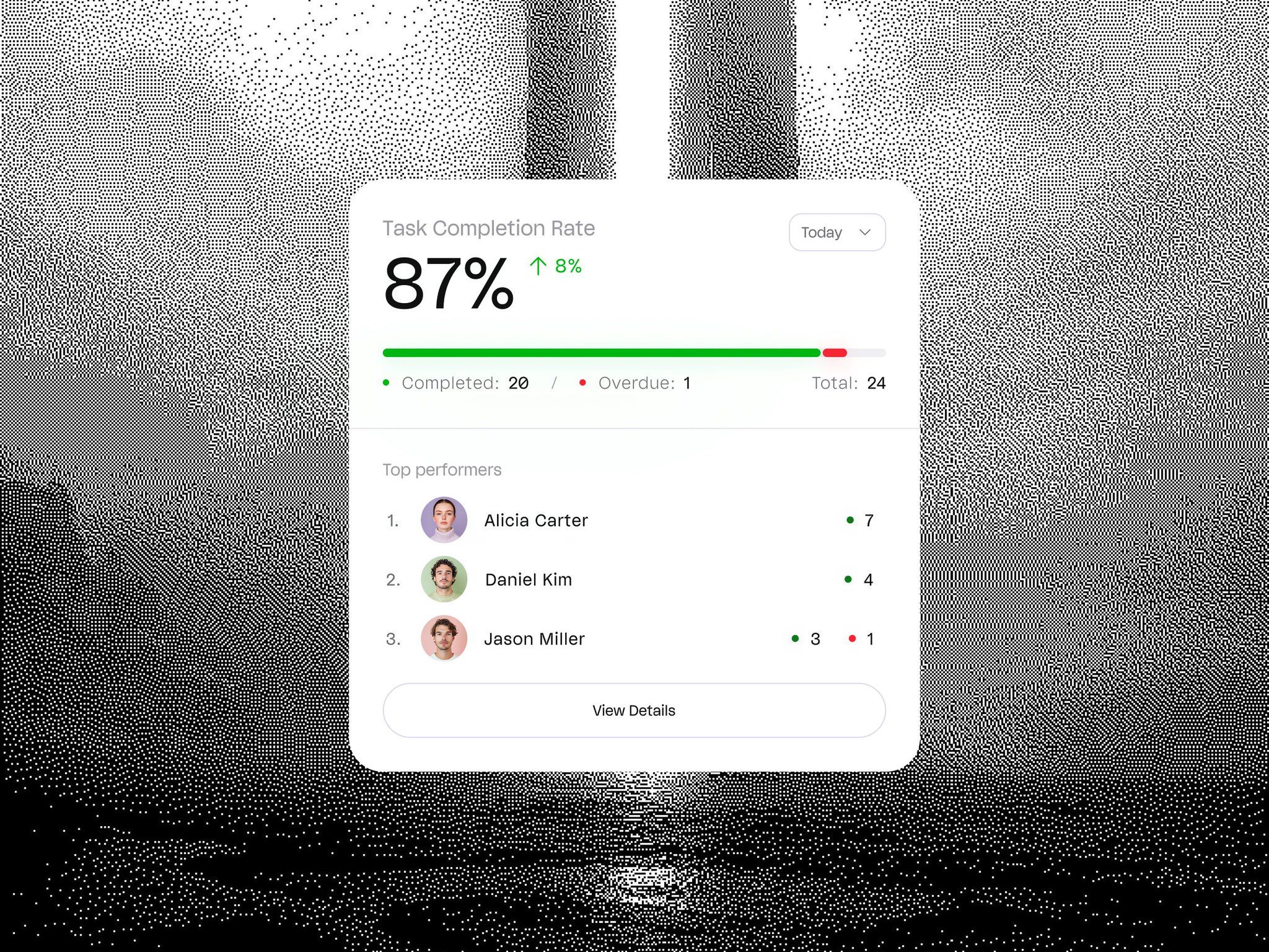
The interface presents a clean, modern, and data-driven dashboard design utilizing a light, pastel color palette. The layout is organized vertically with distinct sections for scores and rankings, emphasizing clarity and easy comparison of metrics.
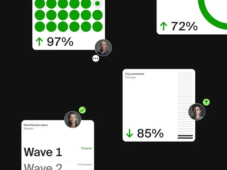
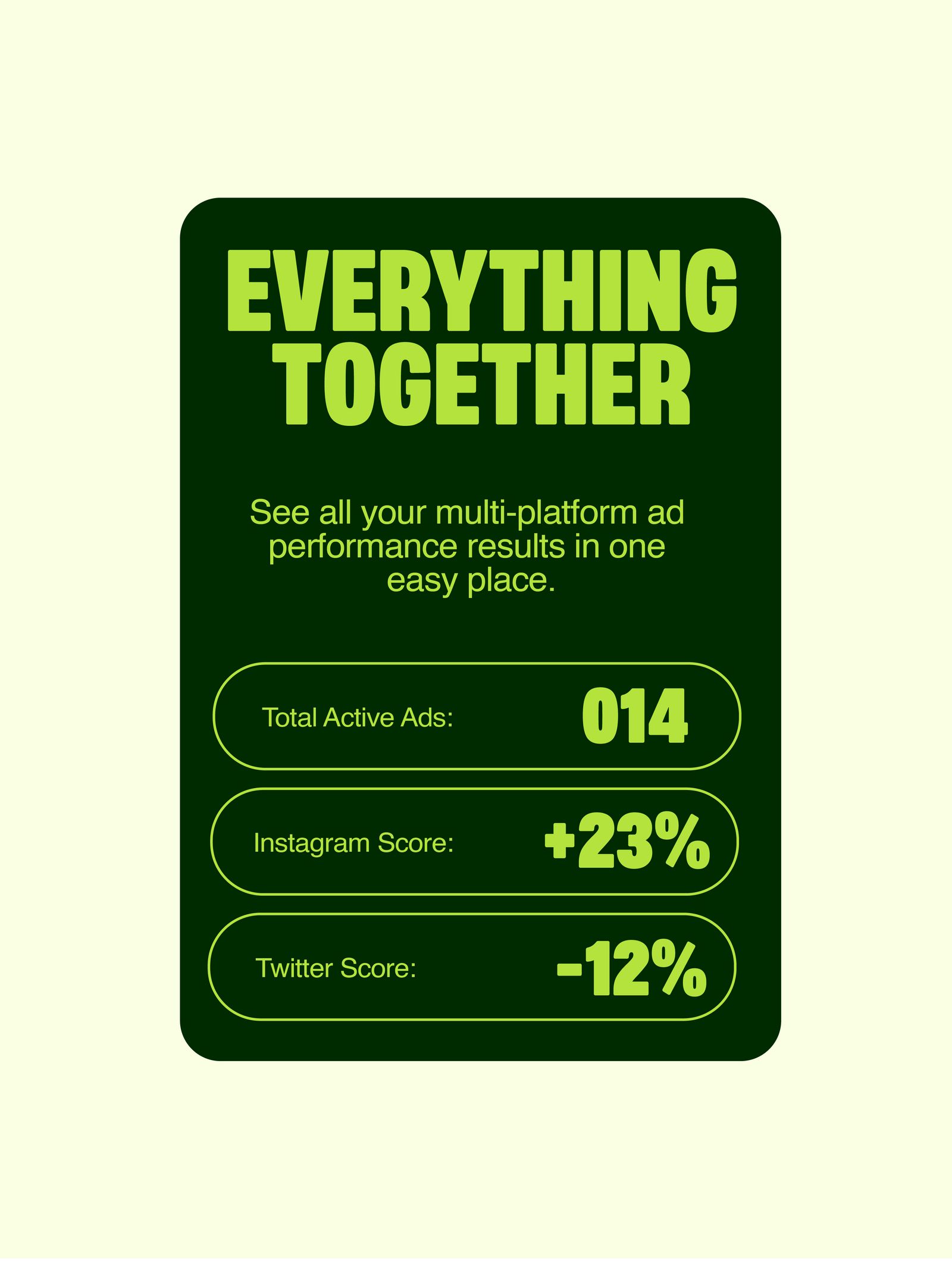
The image presents a dashboard or infographic style layout using a clean, minimalist aesthetic with a dark background and bright green accents. It uses clear percentage indicators and simple icons to convey data effectively, suggesting a focus on progress tracking or performance metrics.
The image displays three distinct, dark-themed data cards presented in a clean, modern dashboard style. The design uses vibrant accent colors (purple/pink and green) against a dark background to highlight positive performance metrics effectively.
The interface presents a clean, dark-mode design with a vibrant gradient as the primary focal point. It uses clear segmentation and subtle use of color to convey performance metrics in a modern, data-driven manner.
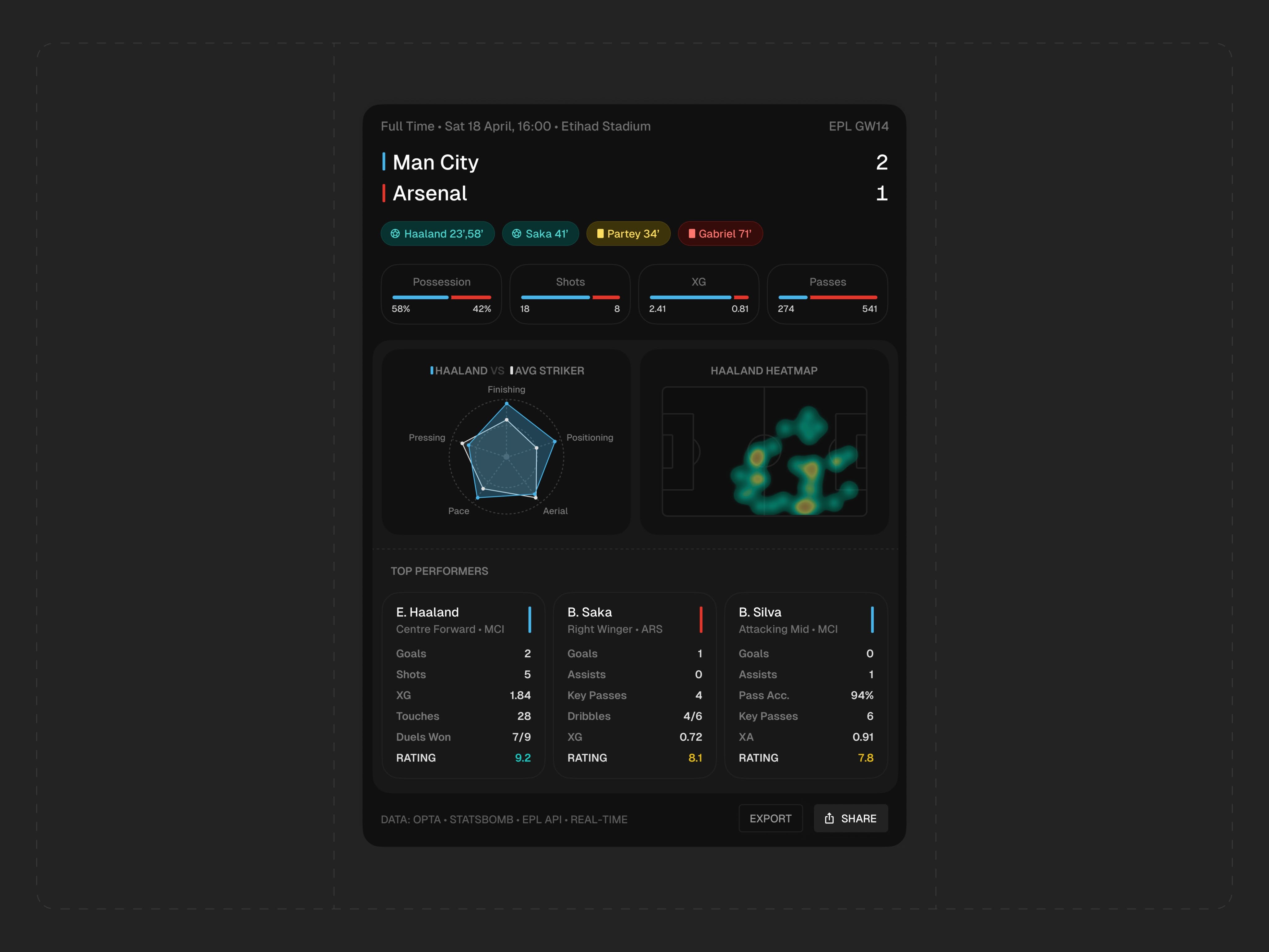
This design utilizes a dark mode aesthetic to present complex sports statistics clearly and professionally. The visual language is clean, utilizing high contrast between dark backgrounds and vibrant accent colors to prioritize data readability. The overall feel is modern, analytical, and focused on performance tracking.
This design features a clean, data-driven dashboard utilizing strong contrast and subtle texture to present performance metrics. The visual language is minimalist, relying on clear typography and proportional spacing to prioritize key statistics. It successfully conveys professionalism and analytical precision.
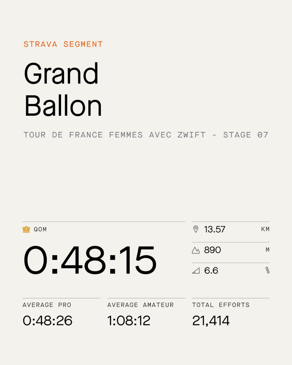
This design utilizes a stark, minimalist aesthetic focused entirely on conveying technical performance data with exceptional clarity. The visual language relies heavily on high contrast between dark text and a light background, ensuring immediate readability and emphasizing precision.
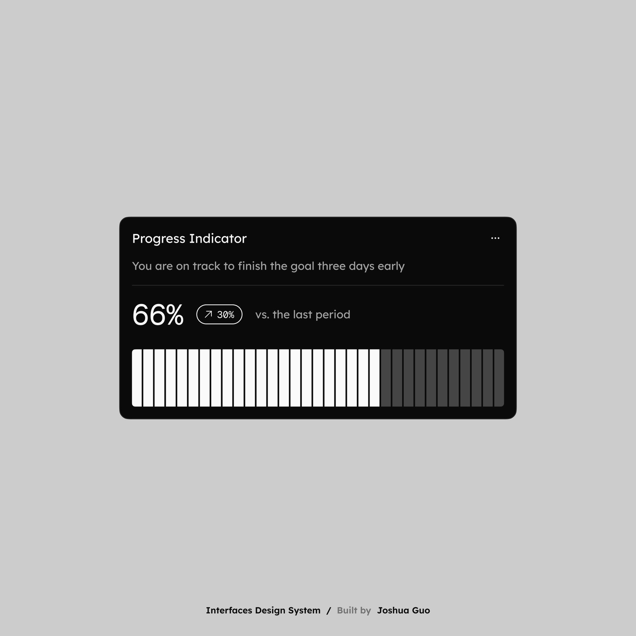
This is a highly functional and minimalist progress indicator design, utilizing stark monochrome elements to present quantitative data clearly. The visual language is clean and objective, prioritizing readability and the immediate understanding of performance metrics.
This graphic employs a clean, modern aesthetic suitable for data visualization, using strong color contrast to highlight key performance metrics. The design is highly functional, prioritizing readability and the clear presentation of statistical information in a modular layout.
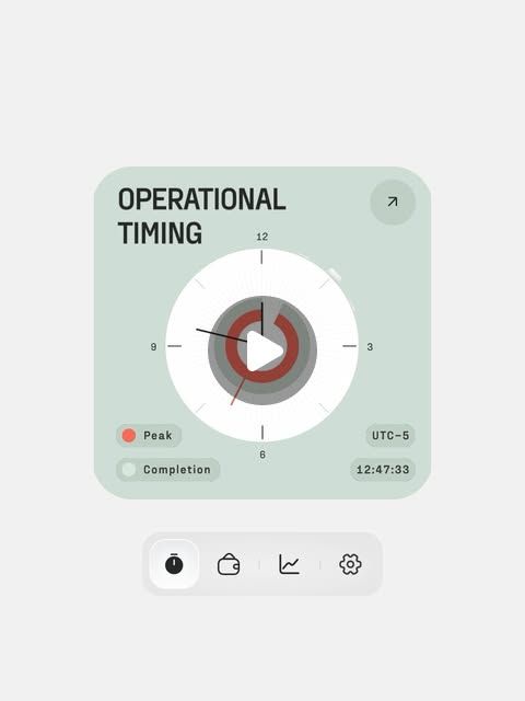
This design utilizes a clean, modern interface to present operational data through a circular gauge visualization. The visual language is minimalist and structured, emphasizing clarity and precision in tracking performance metrics like peak and completion times. The layout effectively uses negative space to draw attention to the central progress indicator.