mobile ui
17 designs
Showing 17 of 17 (17 total)
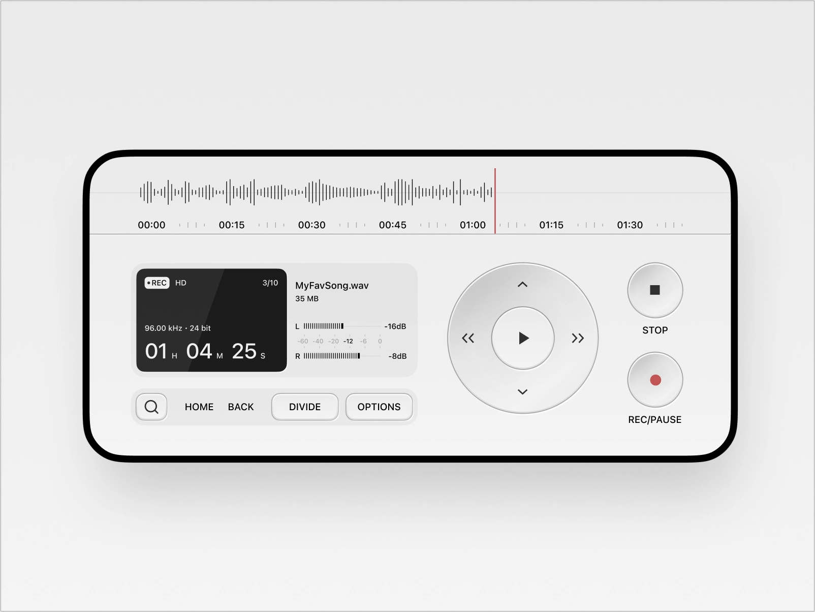
This interface showcases a clean, functional user interface design typical of modern media players. The visual language relies heavily on negative space and clear delineation between controls, emphasizing usability and a minimalist aesthetic. The design is highly organized, making complex playback functions intuitive and easy to navigate.
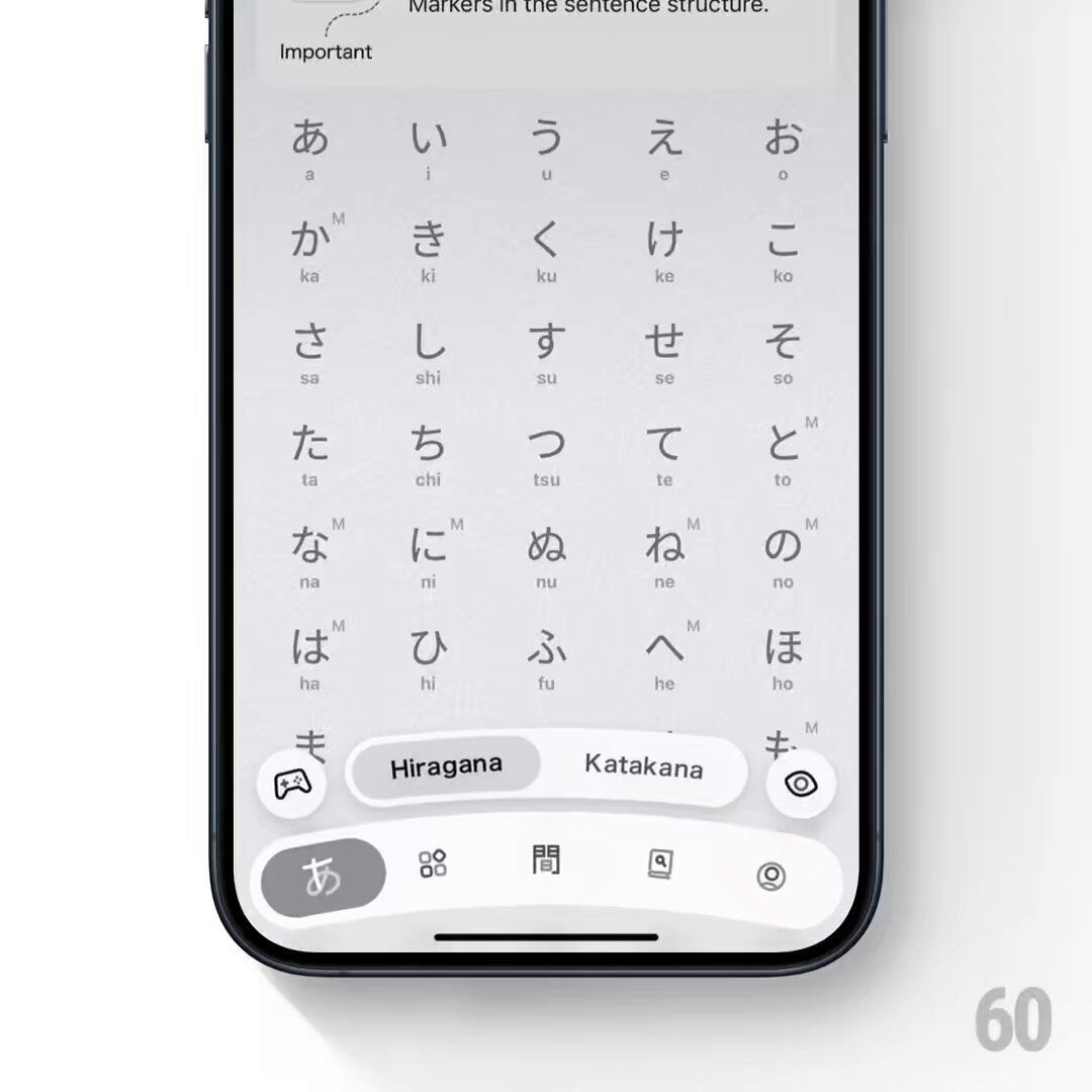
This image showcases a highly functional and minimalist user interface design for a Japanese input method, emphasizing clarity and ease of use. The visual language relies on clean lines, ample negative space, and a monochromatic palette to ensure the focus remains entirely on the text input.
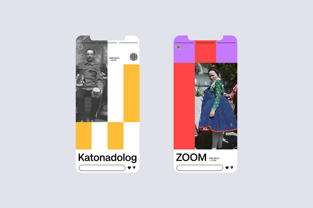
This design showcases a clean, modern aesthetic utilizing strong vertical color blocking and photographic elements. The visual language is minimalist yet bold, relying on sharp geometric divisions to separate content and branding. It successfully balances photographic imagery with clear, legible typography for a contemporary feel.
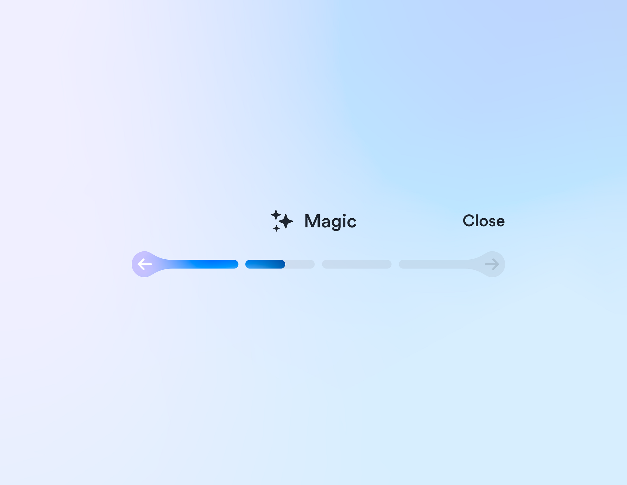
This interface utilizes a clean, minimalist design characterized by ample negative space and subtle use of color gradients. The visual language is modern and functional, prioritizing clear status indication through simple iconography and horizontal progress bars.
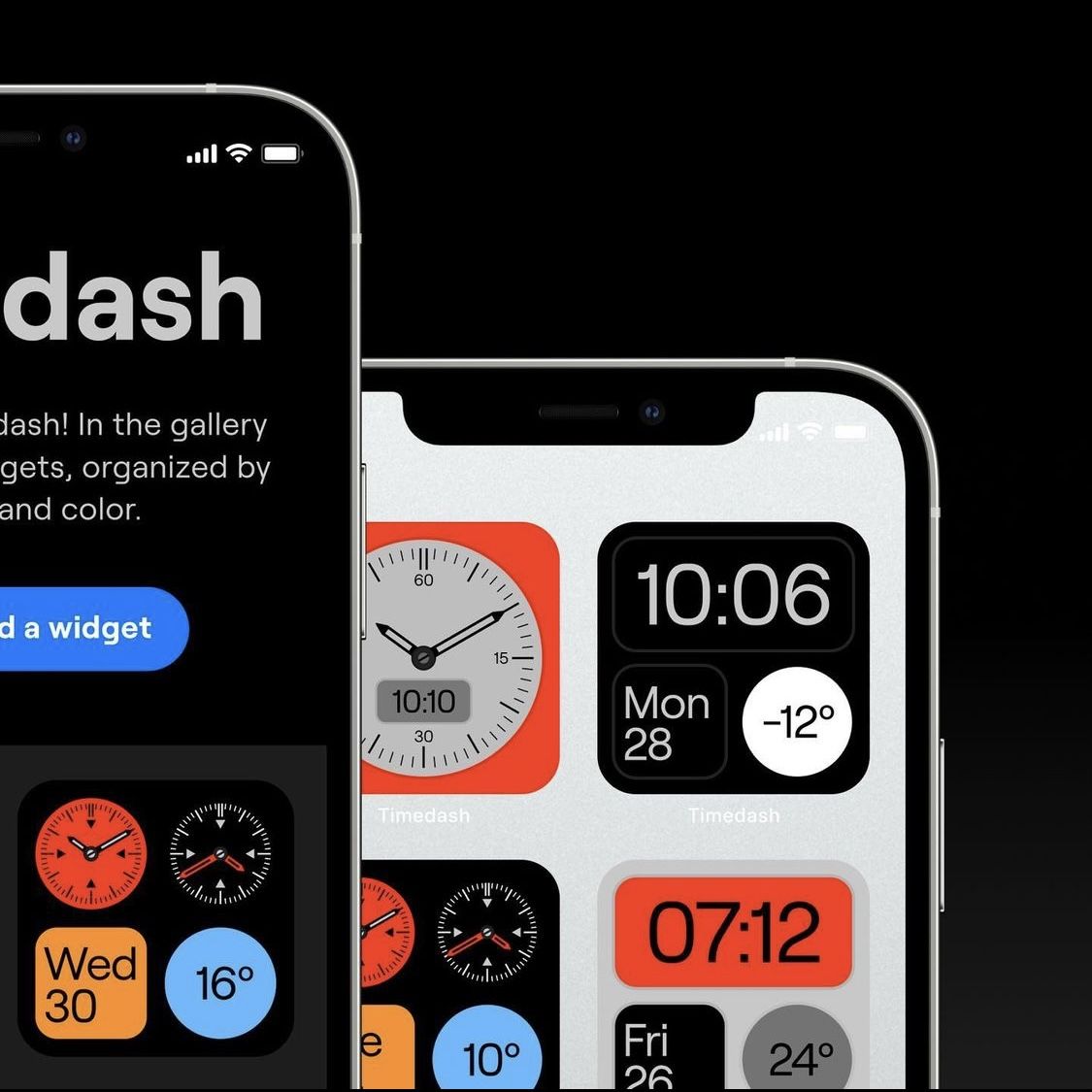
This interface features a clean, modern design focused on displaying time and weather data through circular gauges and clear typography. The visual language is minimalist, relying on high contrast between light elements and a dark background to ensure data readability.
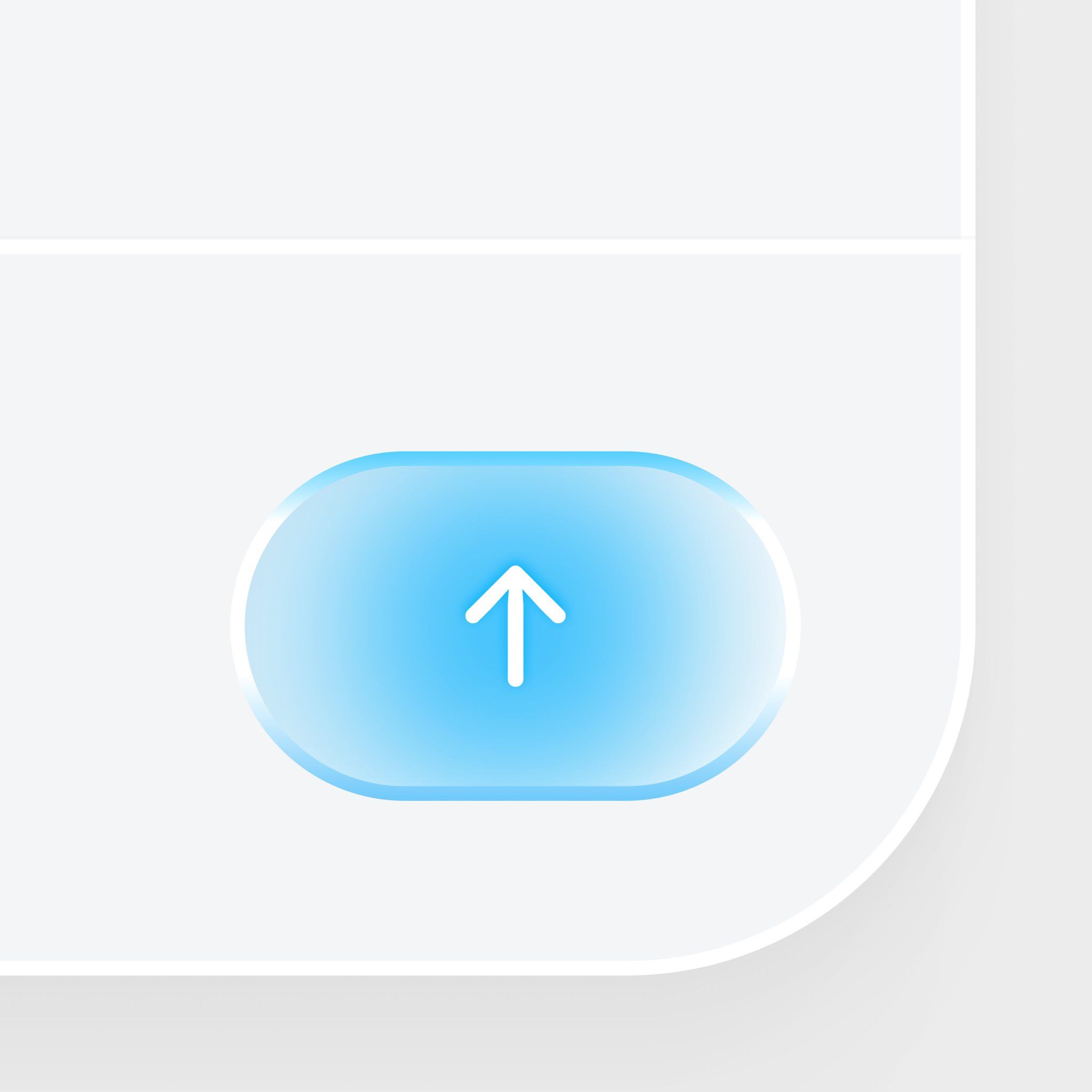
This is a clean, modern user interface element featuring a prominent, softly glowing blue button with an upward-pointing arrow icon. The design emphasizes clarity and positive direction through subtle gradients and smooth, rounded shapes.
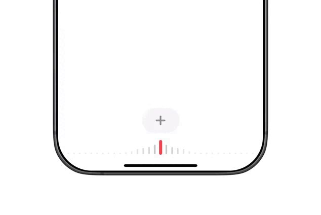
This image displays a minimalist, clean interface element, likely representing a status indicator or progress bar within a digital product. The design emphasizes simplicity and functionality through subtle use of negative space and a clear, linear progression.
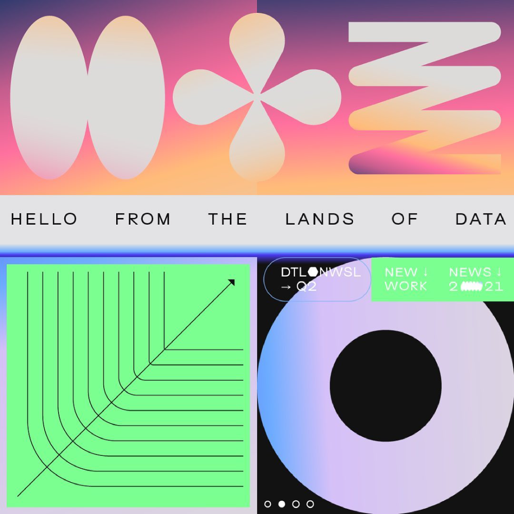
The design features a clean, modern interface with a soft, gradient color palette and simple geometric shapes. It employs a light background with distinct, stylized icons and data visualizations, suggesting a focus on data presentation or a modern application.
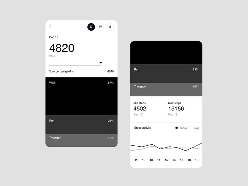
The image displays a clean, dark-mode user interface for tracking fitness or steps, characterized by high contrast and clear data presentation. The design is minimalist, focusing on readability and functional organization of metrics.
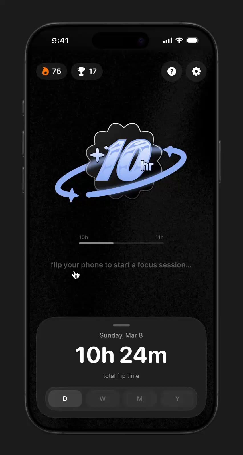
The interface presents a dark mode design with a minimalist and modern aesthetic, focusing on a central visual element related to a focus timer. The layout is clean, utilizing negative space effectively to draw attention to the core function and current status.
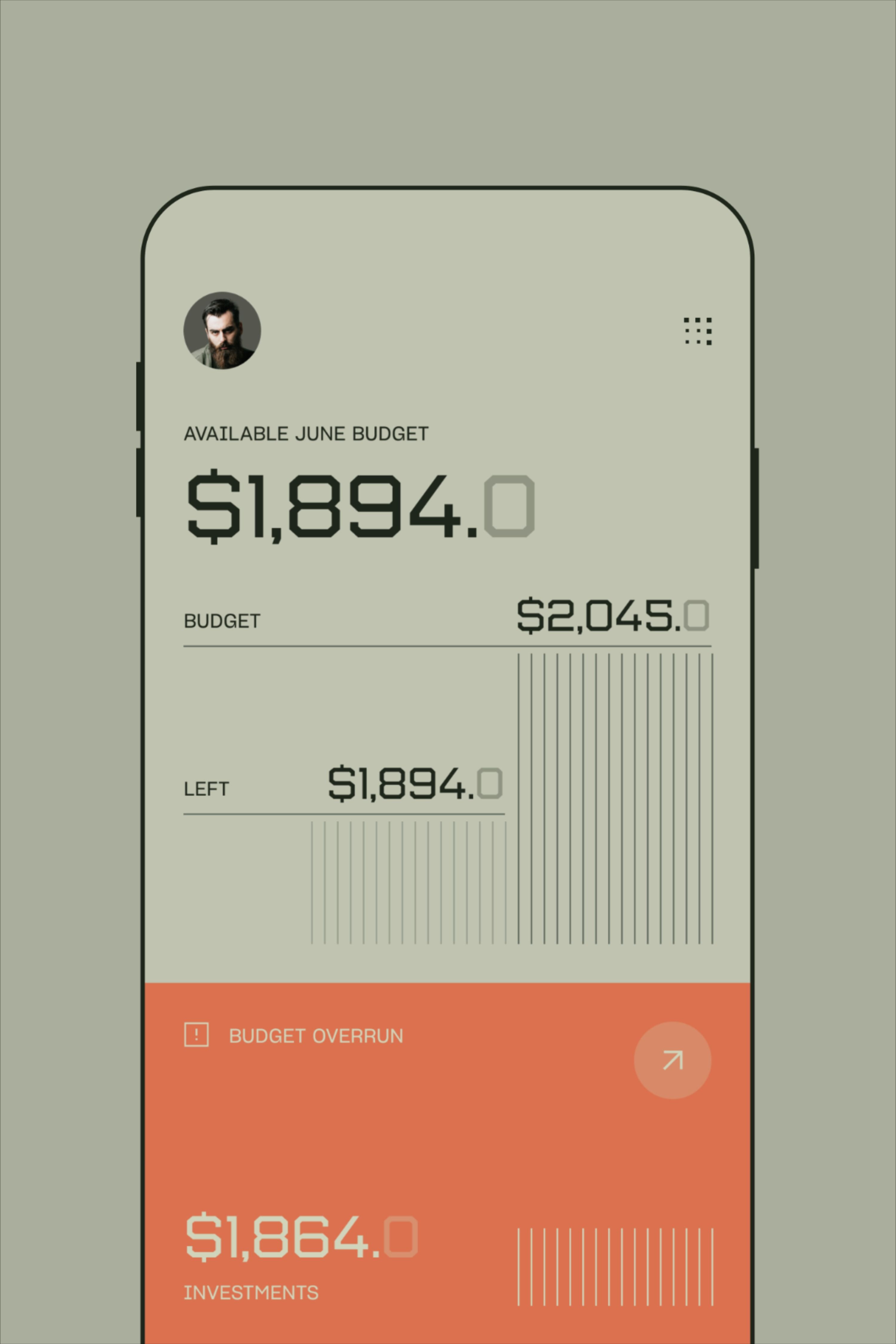
This design features a clean, minimalist mobile user interface dedicated to financial tracking. The visual language relies on muted earth tones and clear typography to present complex budget data in an easily digestible format. The overall feel is professional, organized, and highly functional.
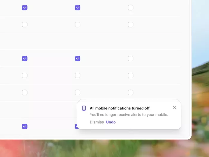
This interface features a clean, minimalist list view designed for managing settings or notifications. The visual language is highly functional and modern, emphasizing clarity through ample negative space and clear checkbox indicators.
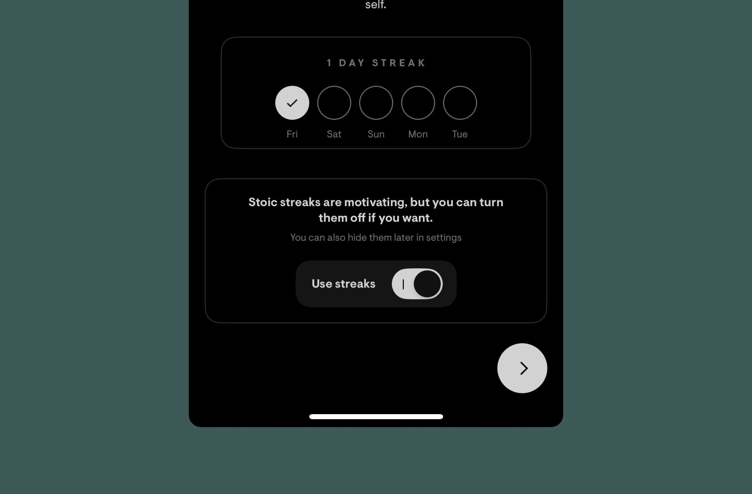
This design utilizes a clean, dark-mode aesthetic to present tracking data and user controls. The visual language is highly functional, employing subtle spatial organization and clear typography to guide the user through streak information and toggles. The overall feel is calm, organized, and focused on productivity metrics.
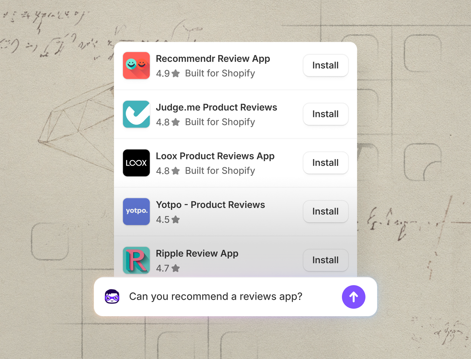
This image presents a clean, modern mobile interface featuring a vertical list of application recommendations set against a rustic, hand-drawn paper background. The design successfully balances crisp digital information delivery with an organic, sketched aesthetic, creating a visually engaging and trustworthy feel.
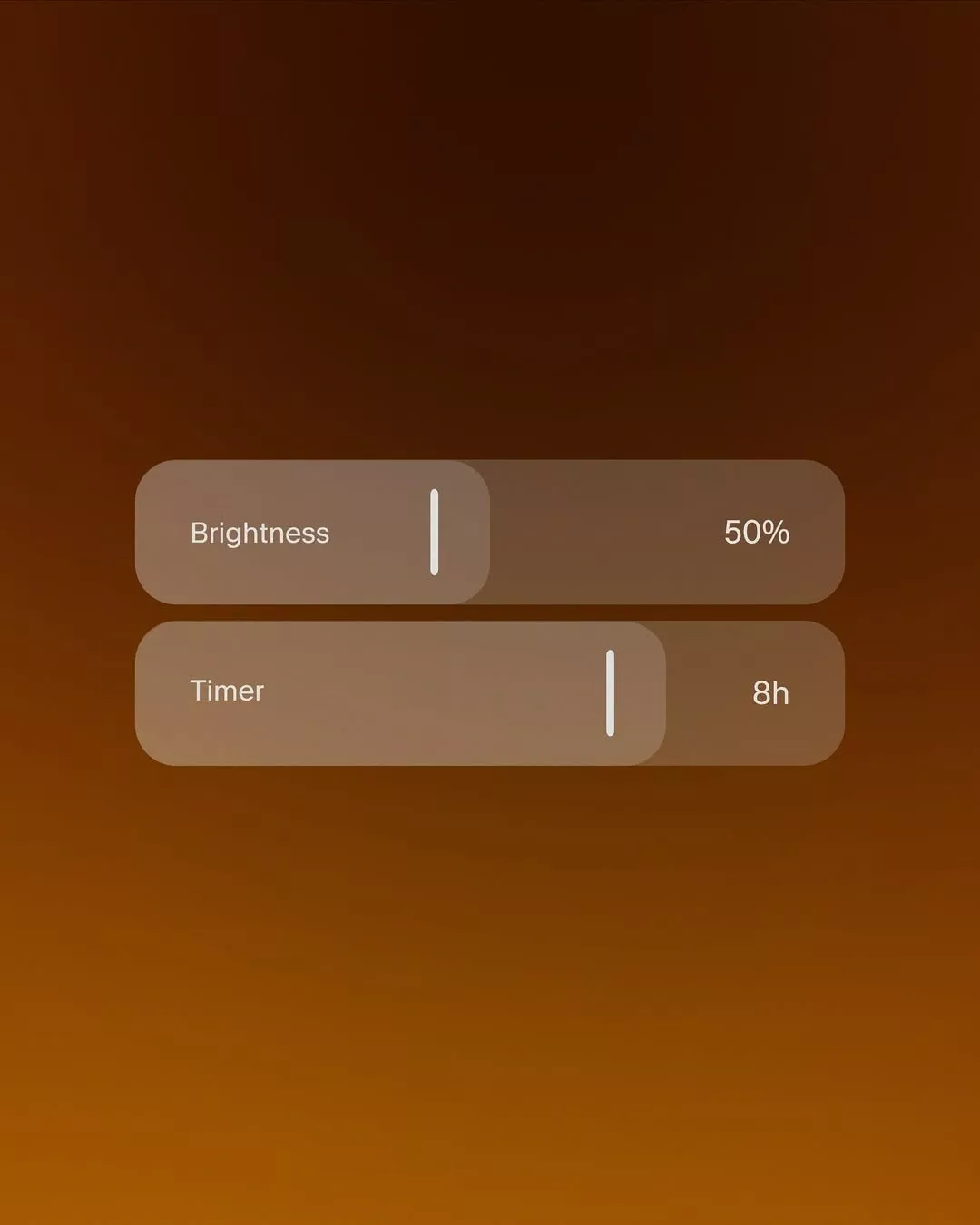
This interface utilizes a warm, deep orange background paired with soft beige cards to create a highly legible and inviting dark mode aesthetic. The design emphasizes clarity and functionality through simple text labels and intuitive slider controls, resulting in a clean and modern user experience.
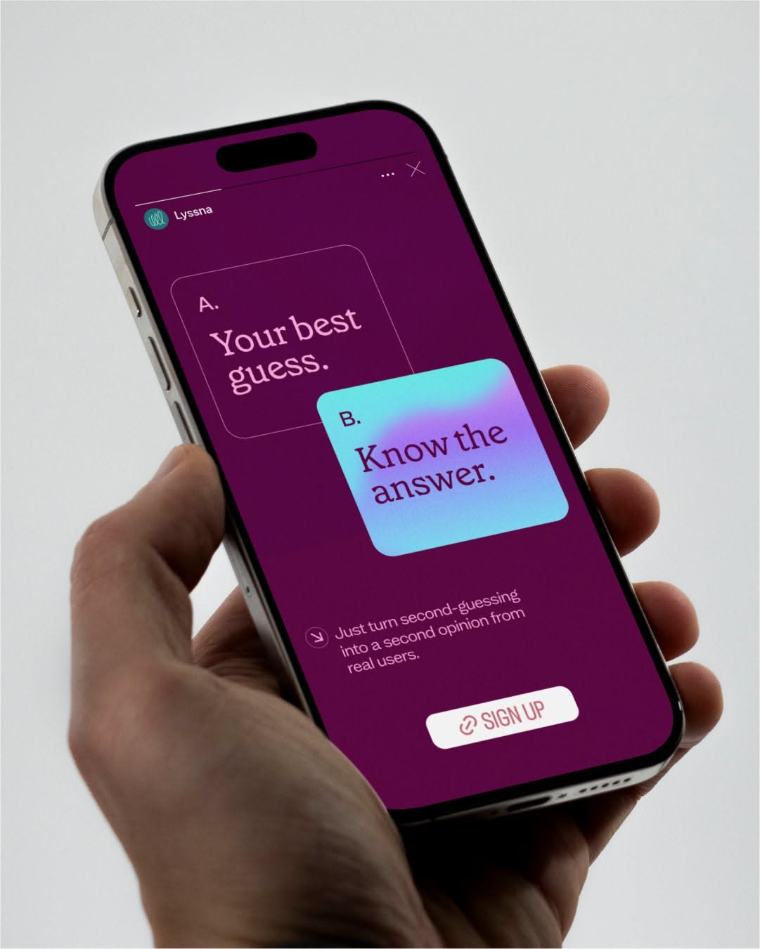
This mobile interface utilizes a vibrant, deep purple color scheme to create an engaging and modern aesthetic. The design employs high contrast between the background and text elements, guiding the user through a simple quiz or guessing mechanic with clear visual hierarchy.
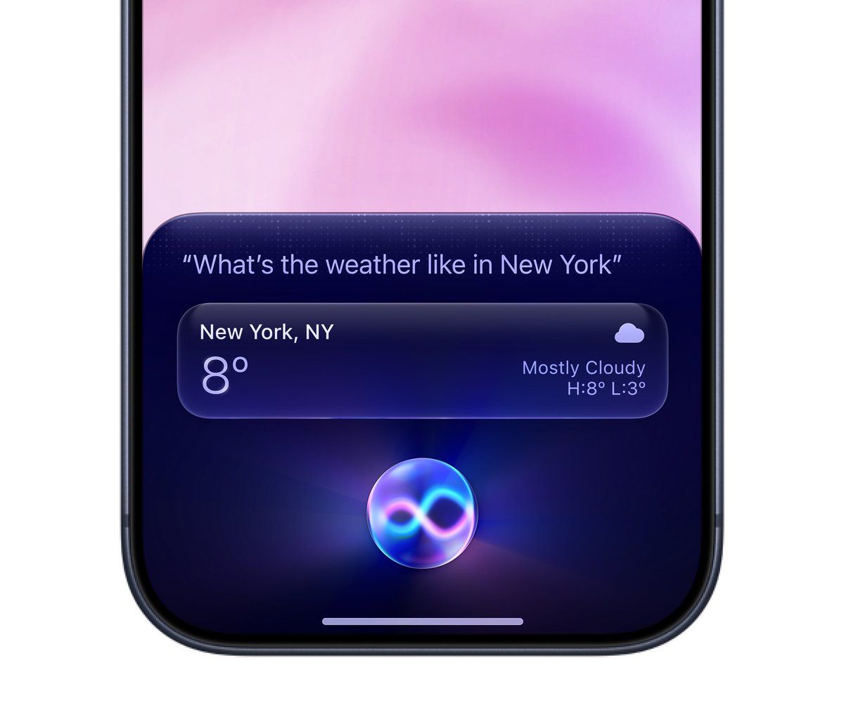
This interface showcases a modern, clean user experience utilizing soft gradients and a dark mode aesthetic. The design employs subtle luminosity to highlight key information, creating a visually soothing yet highly functional digital display.