institutional
19 designs
Showing 19 of 19 (19 total)
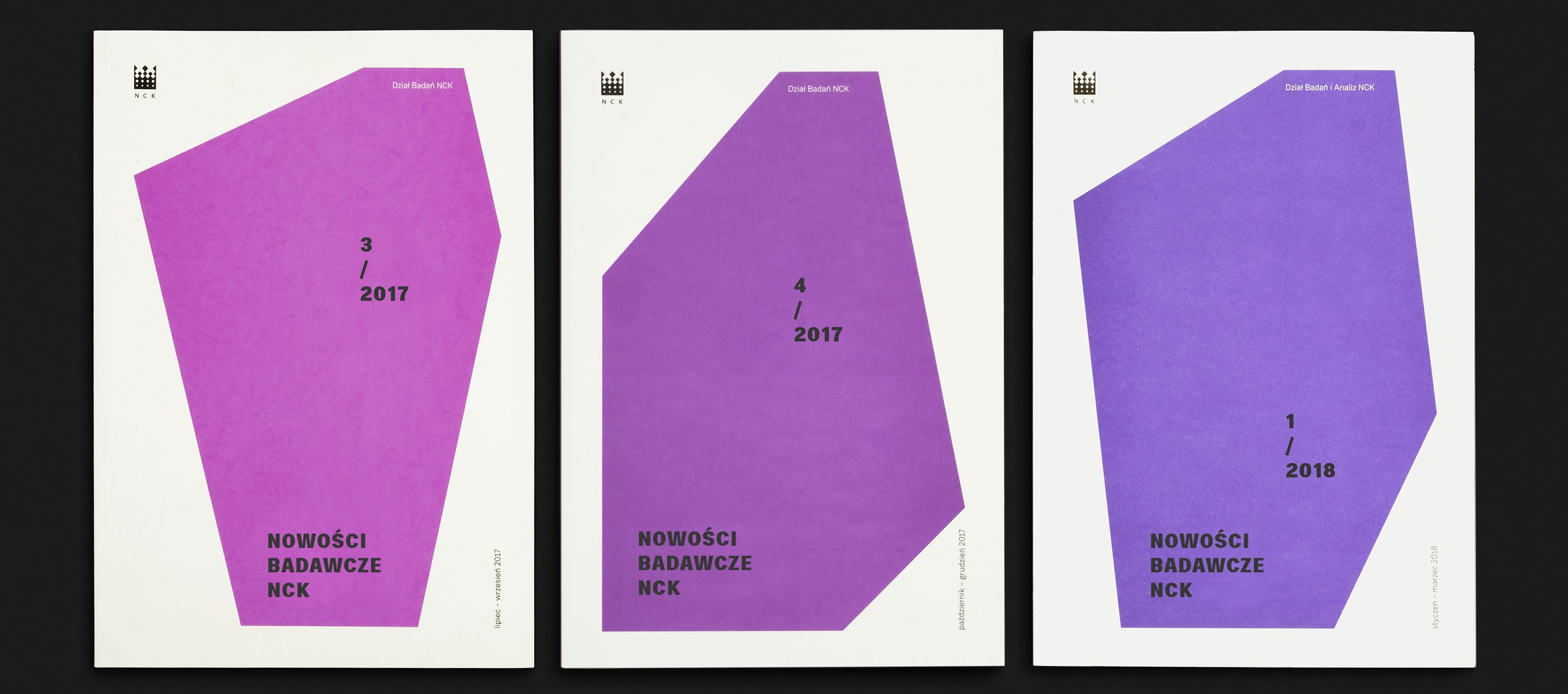
This set of designs demonstrates a clean, modern visual language characterized by strong geometric shapes and a limited, sophisticated color palette. The consistent use of angular forms provides a strong brand identity while maintaining ample negative space for clear information hierarchy.
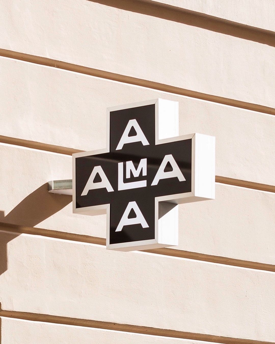
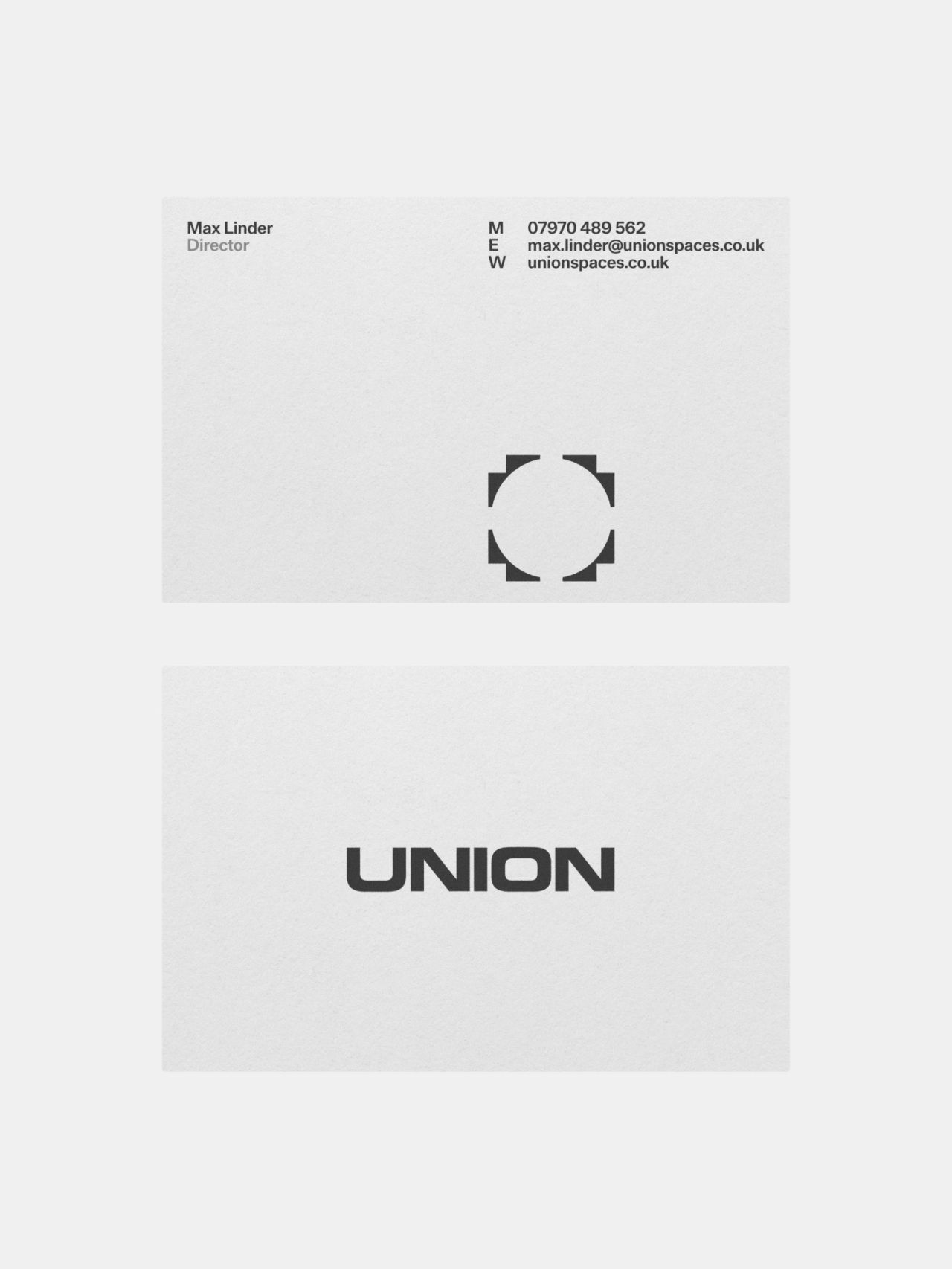
This design utilizes strong geometric forms and high contrast to create a clean, modern visual statement. The interplay between the raised black lettering and the surrounding white frame provides significant depth and tactile interest against the muted background. The overall aesthetic is precise, architectural, and minimalist.
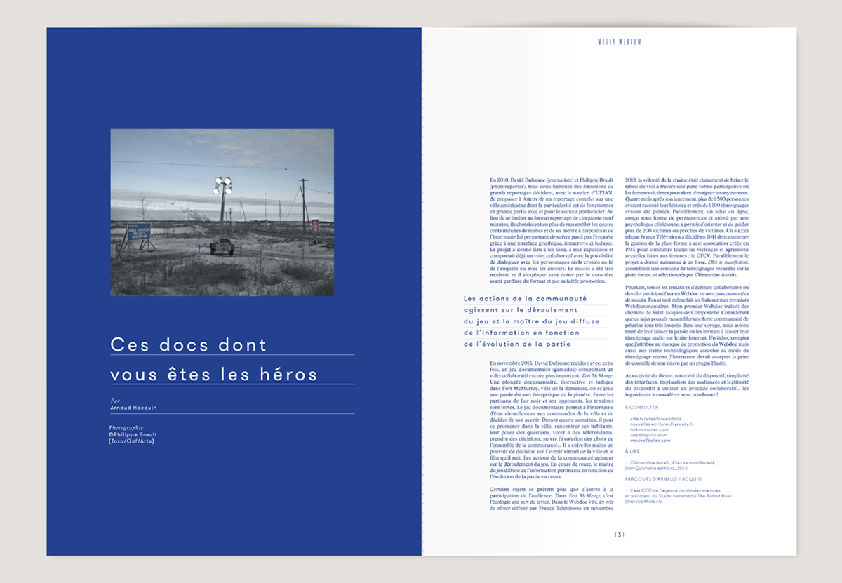
This design employs a clean, minimalist editorial style, utilizing strong color blocking and ample negative space to create a professional and serious tone. The visual language is highly structured, balancing a large photographic element with dense textual information in a sophisticated manner.
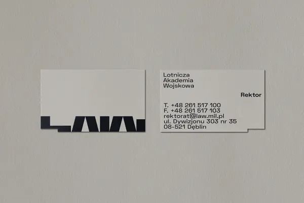
The image presents a minimalist and corporate identity display, featuring stark black typography against a light, neutral background. The design emphasizes clean lines and negative space, conveying a sense of modern professionalism and institutional authority.
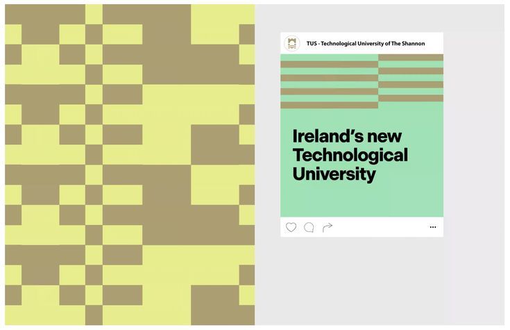
The design features a clean, modern layout contrasting a textured, geometric background with a simple informational card. The visual language is professional and institutional, using muted earth tones alongside a fresh mint green accent.
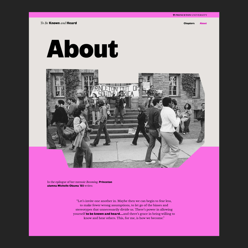
The design is clean, academic, and minimalist, utilizing a muted color palette with strong photographic elements to convey a serious or reflective tone. The layout is balanced, placing clear textual information against a background that suggests institutional history or memory.
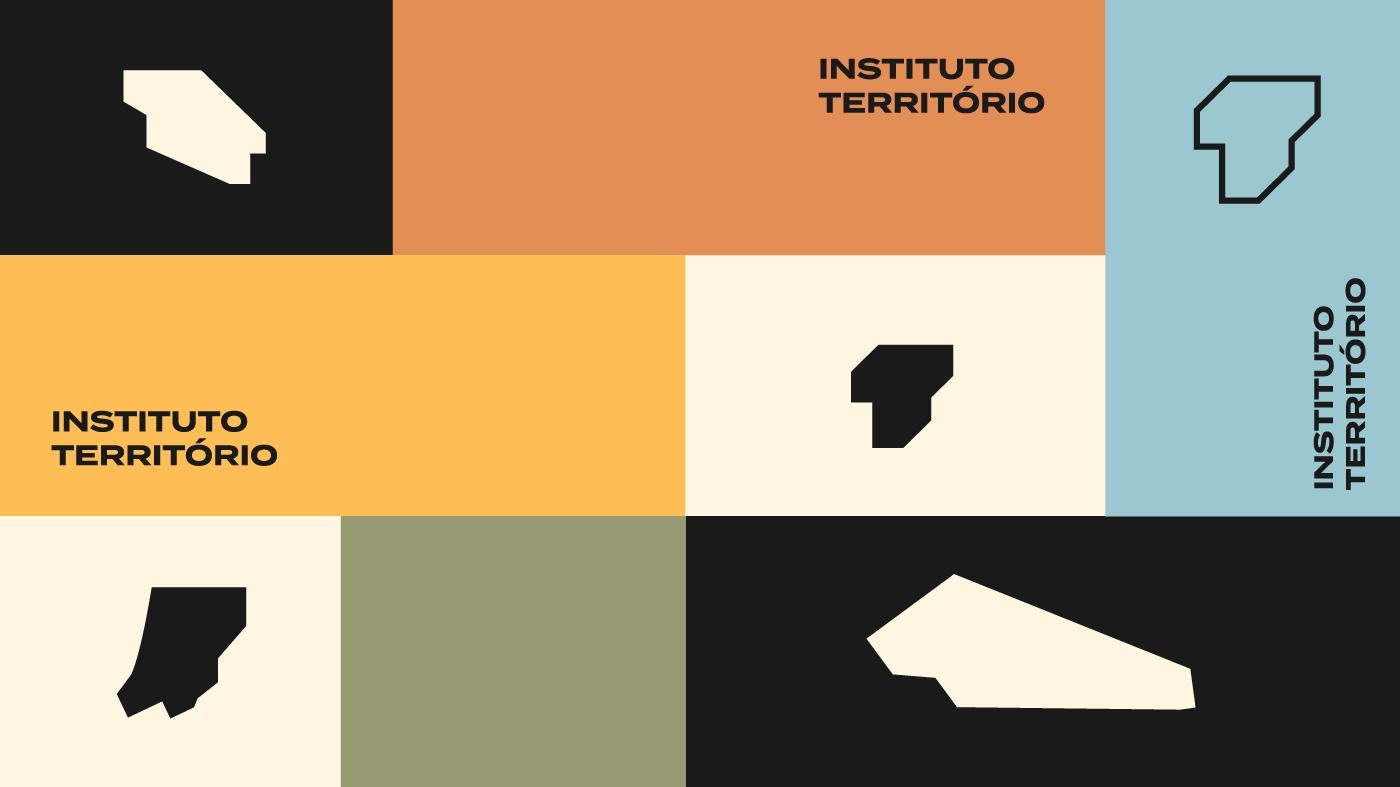
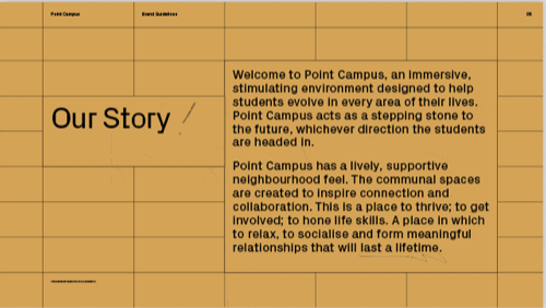
This image presents a clean, modular grid design utilizing muted, earthy tones contrasted with stark black and white. The visual language is minimalist and institutional, relying heavily on geometric shapes to denote different sections.
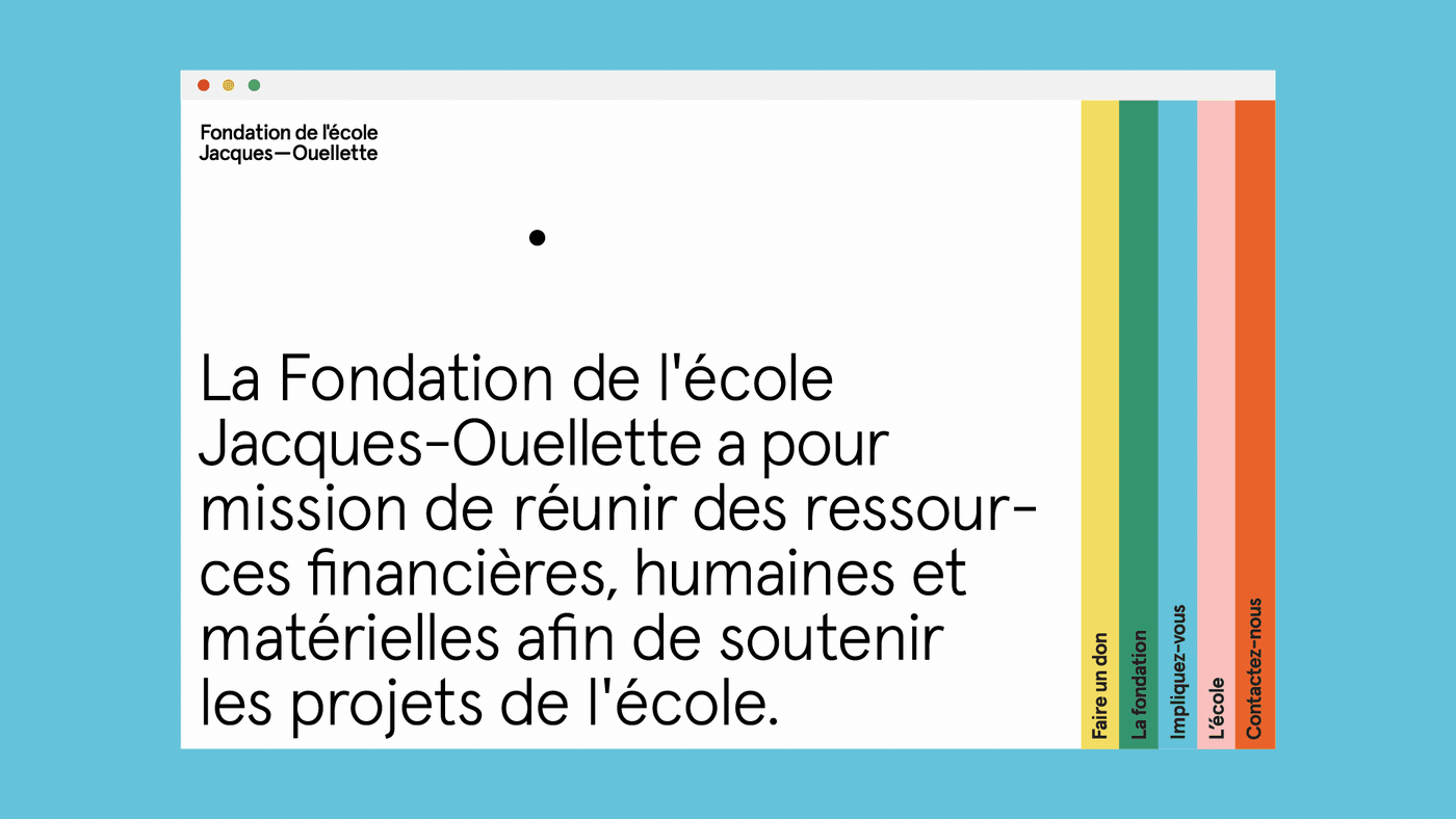
A clean, minimalist institutional website design featuring a French educational foundation. The layout combines bold typography with a structured color-coded vertical bar system, creating a modern and professional aesthetic that emphasizes clarity and organizational purpose.
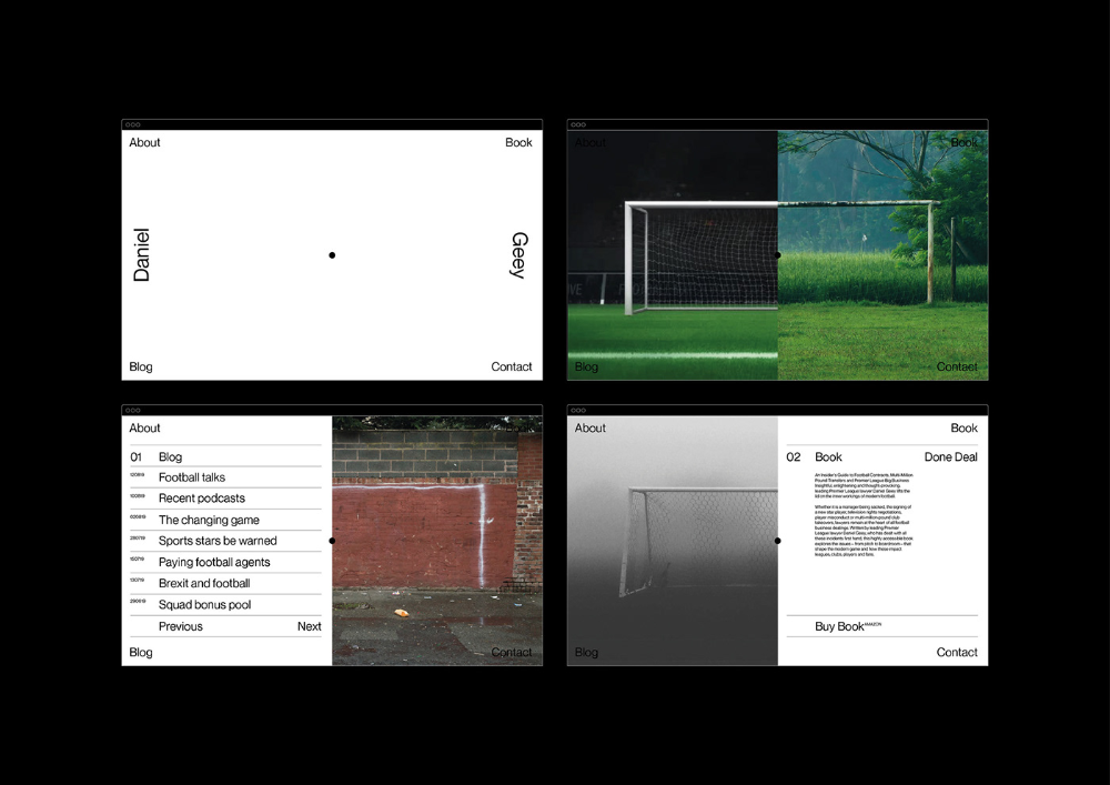
A minimalist design system showcasing a sports/football brand with clean typography and documentary-style photography. The layout demonstrates a modular grid system with high contrast between white space and dark elements, emphasizing content hierarchy and functional elegance.

A minimalist logo design featuring curved text arranged in an arc around a central circle, creating a badge-like emblem. The design uses clean, geometric forms with a modern sans-serif typeface set against a dark teal background, conveying institutional authority and contemporary professionalism.
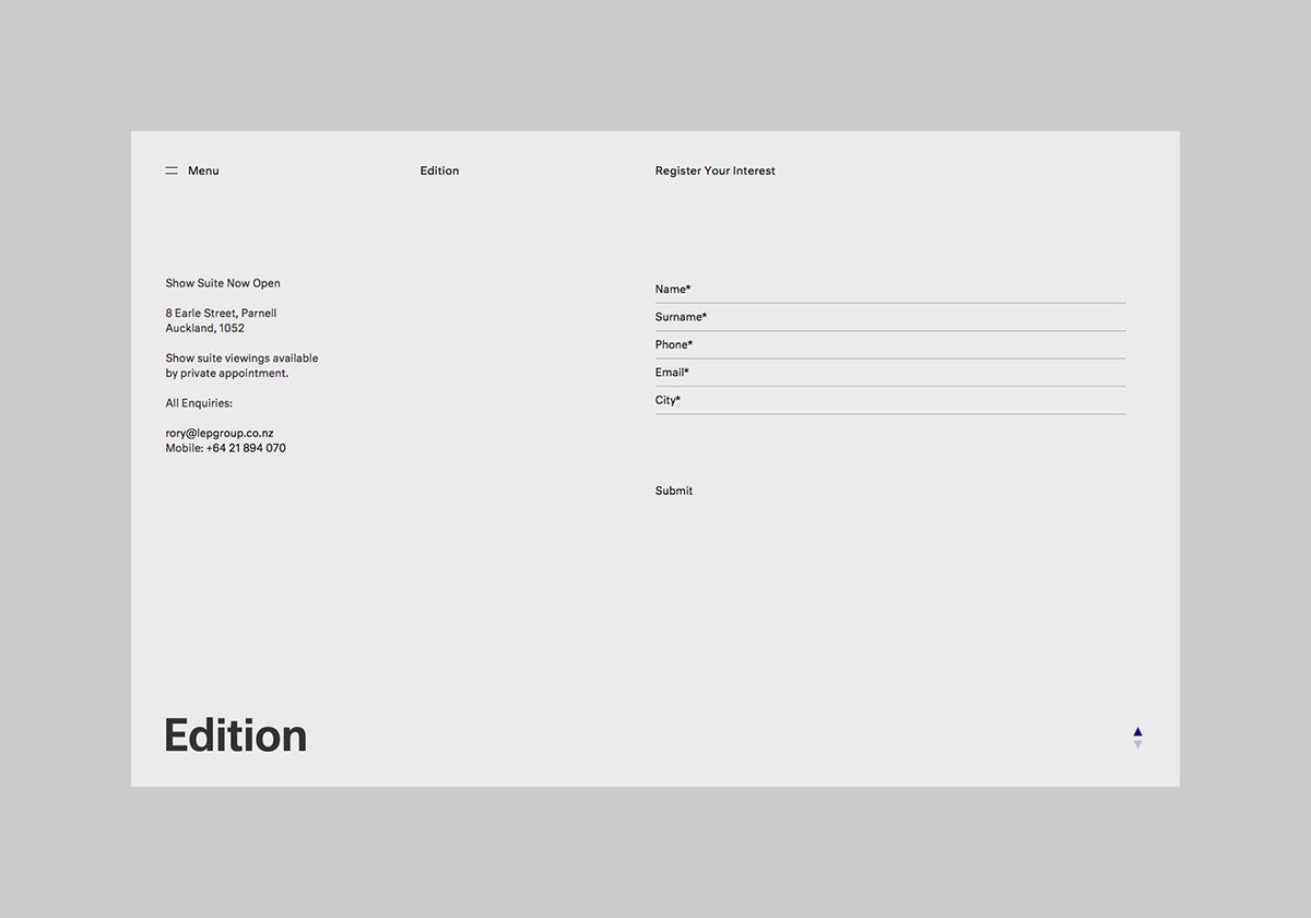
A minimalist, professional form or registration interface with clean typography and ample whitespace. The design employs a grid-based layout with subtle hierarchical elements, presenting information in a structured, accessible manner typical of contemporary web or print design.
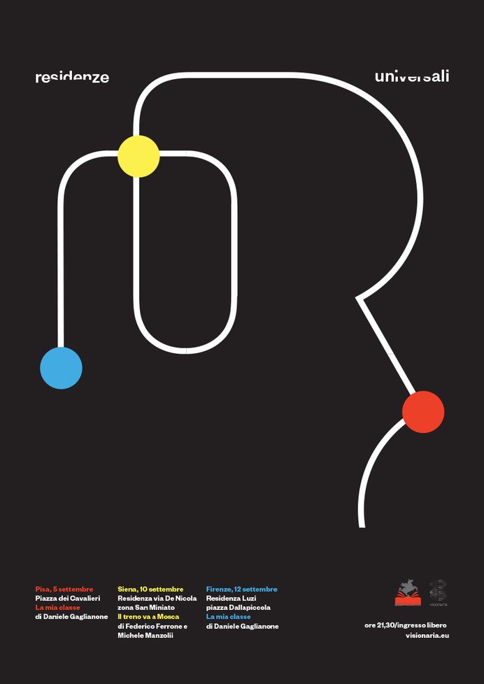
The design is minimalist and abstract, using a continuous line drawing to connect various points, suggesting a flow or network. It employs a clean, modern aesthetic with high contrast between the white lines and the dark background.
The design is clean, minimalist, and uses a muted, earthy color palette with a grid structure to convey a sense of order and groundedness. The visual language is straightforward, focusing on clear typography against a subtle background texture.
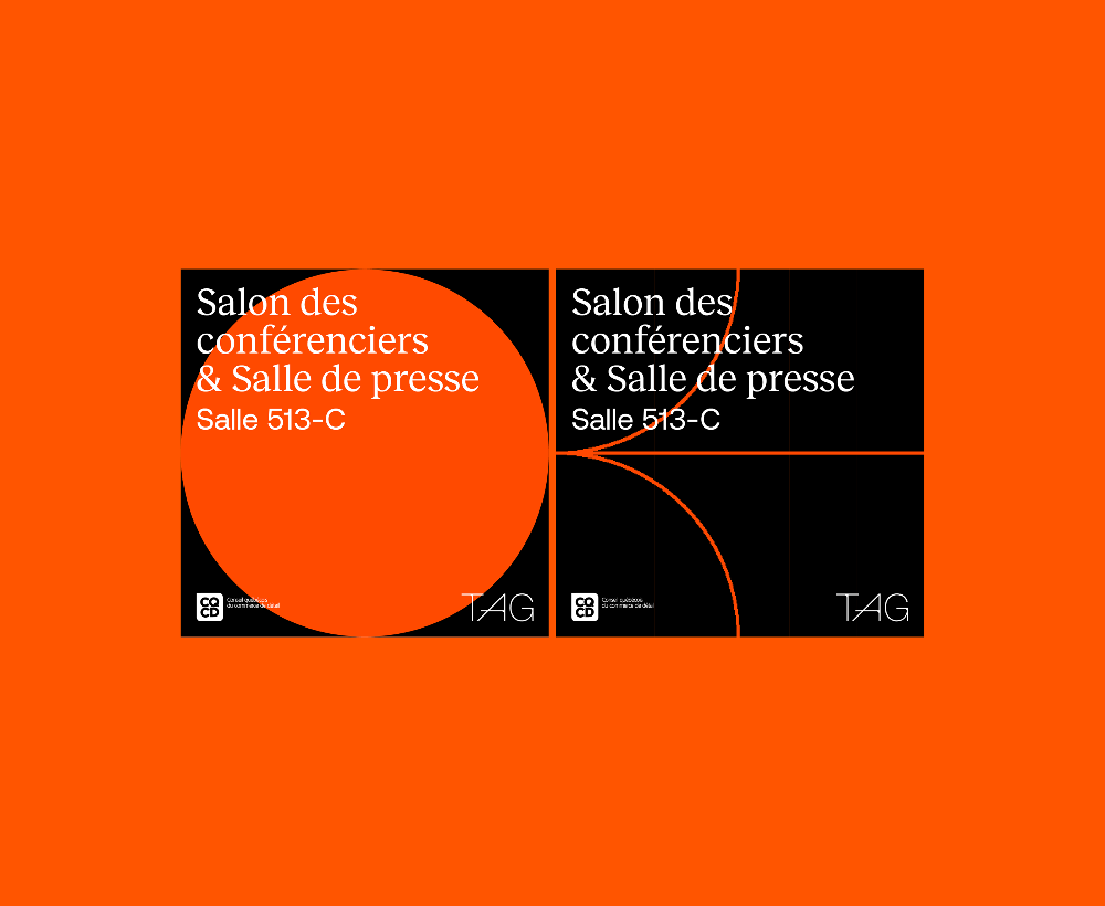
The design employs a stark, high-contrast composition using a vibrant orange background juxtaposed with solid black blocks. It utilizes simple geometric shapes and clear, capitalized text to convey institutional or informational signage.
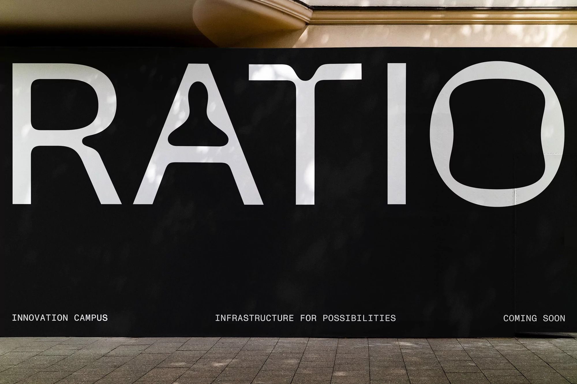
The image features bold, stark white sans-serif typography set against a dark, matte background, conveying a sense of modern professionalism and gravitas. The design relies heavily on negative space and strong contrast to create a clean, impactful statement.
This design utilizes a stark, high-contrast minimalist approach, pairing dark earth tones with crisp white space to create a clean and professional interface. The visual language relies heavily on generous negative space and bold, geometric typography to convey a sense of modern clarity and institutional seriousness.
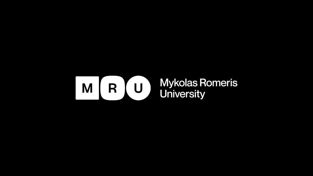
This is a highly minimalist and stark visual identity, utilizing high contrast between black and white to create a strong, clean institutional feel. The design relies purely on typography to convey branding and academic affiliation with precise, modern simplicity.
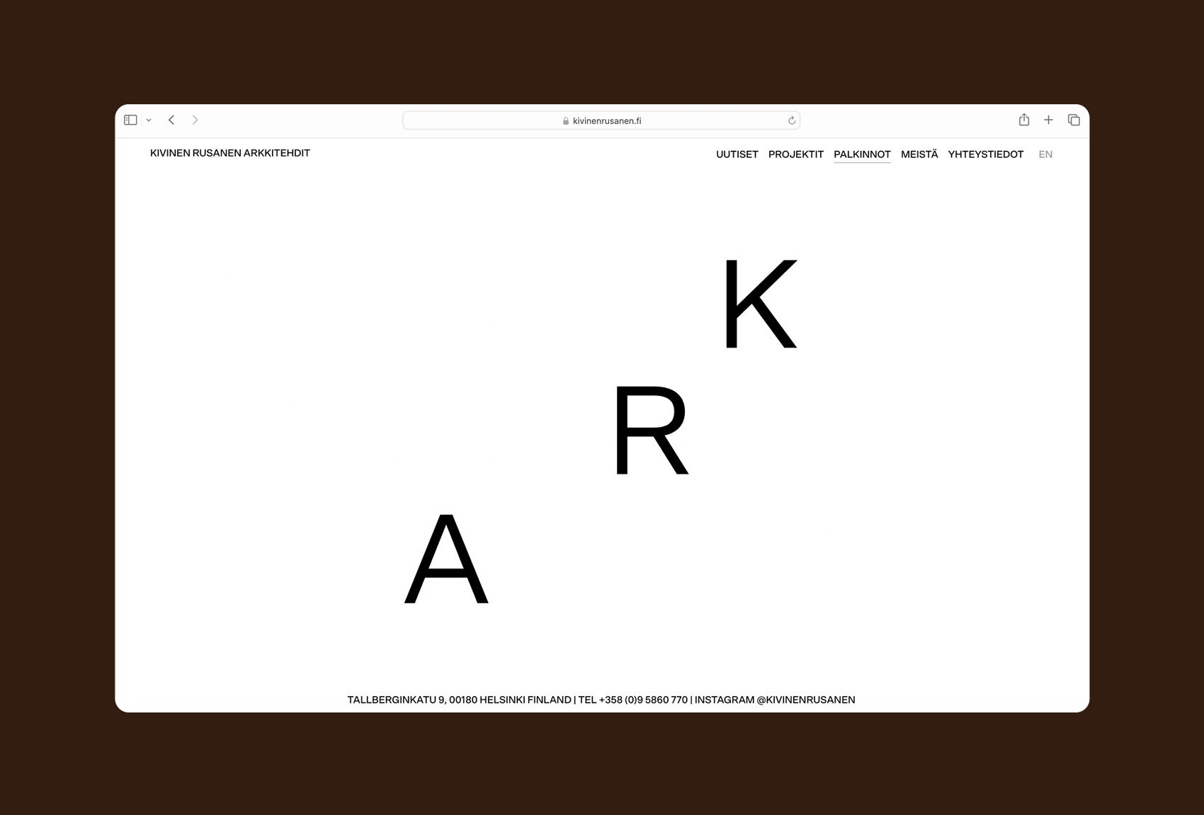
This design utilizes a minimalist and clean aesthetic, relying heavily on negative space and stark typography to convey professionalism. The visual language is restrained and corporate, emphasizing clarity and institutional trust through a monochromatic palette.
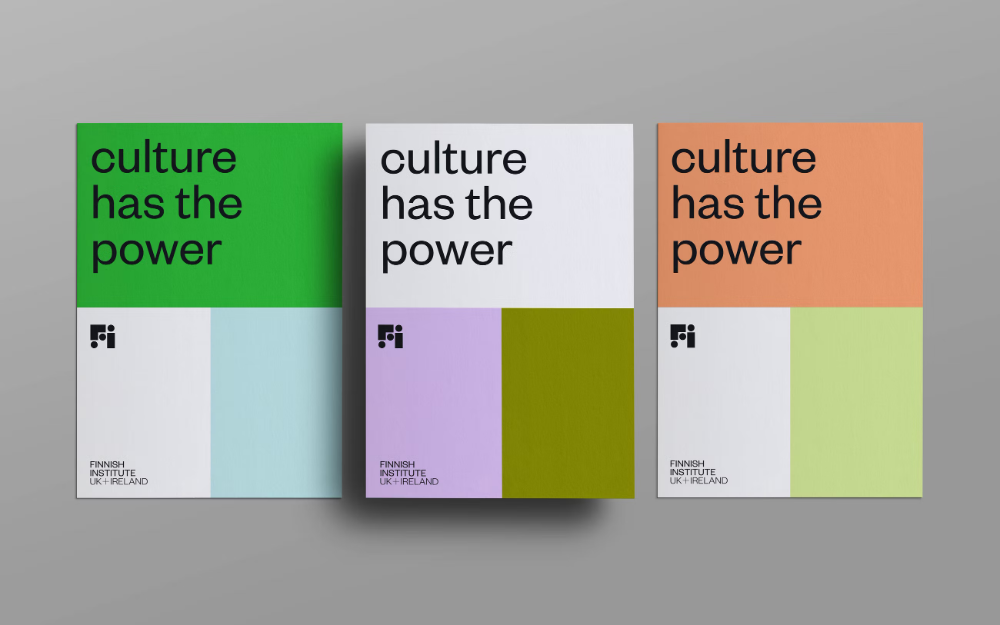
This design utilizes a clean, minimalist aesthetic based on strong color blocking to convey institutional authority and clarity. The visual language relies on negative space and bold typography to deliver a clear, impactful message about cultural power. The overall feel is modern, organized, and professional.