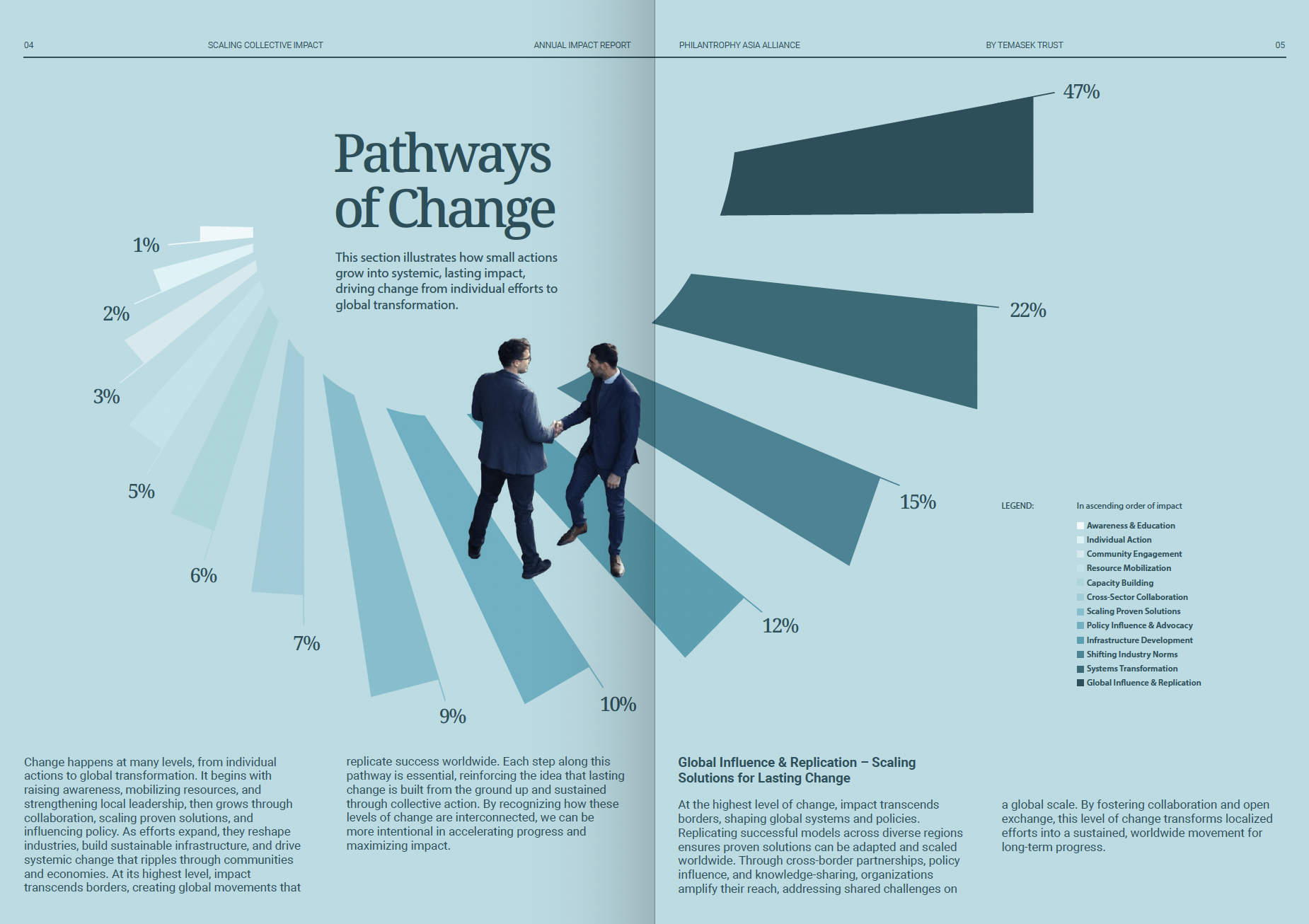
This is a professional, data-driven infographic utilizing clean lines and muted blues to illustrate scaling concepts. The design effectively combines percentage bar charts with stylized human interaction graphics to present complex pathways of change in an accessible, corporate manner.
corporateinfographicdata visualization