gallery
97 designs
Showing 24 of 97 (97 total)
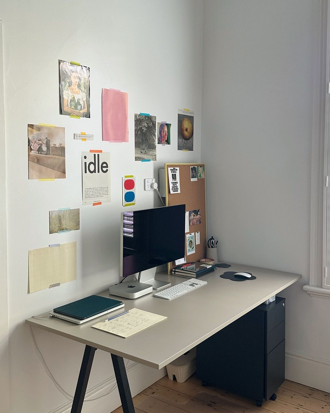
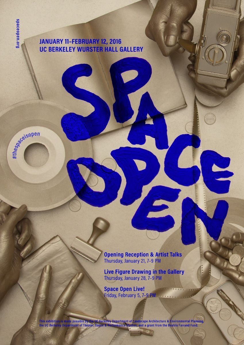
This image presents a bright, eclectic workspace characterized by a layered arrangement of personal artifacts and functional furniture. The visual language blends minimalist structure with bohemian, artistic decoration, creating an inviting yet busy atmosphere.
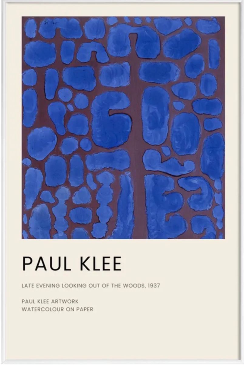
This composition features an abstract pattern rendered in deep blues and earthy browns, characterized by blocky, organic shapes. The overall visual language is grounded and textural, inviting contemplation of the artist's expressive mark-making. The presentation balances the raw quality of the artwork with clean, archival typography.
This design employs a stark, high-contrast minimalist approach, utilizing ample negative space and precise typography to create a serious and contemplative atmosphere. The visual language relies heavily on black, white, and grayscale tones to emphasize the textual content and the implied gravity of the artistic subject matter.

This design utilizes a stark, minimalist approach, featuring the wordmark 'Banksy' rendered in a geometric typeface. The visual language relies heavily on high contrast between black text and a muted, warm background to achieve a sophisticated and modern feel.
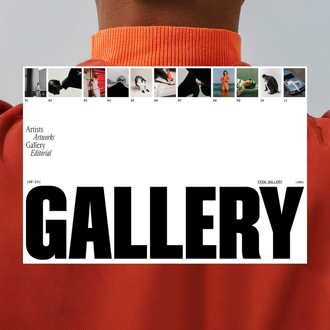
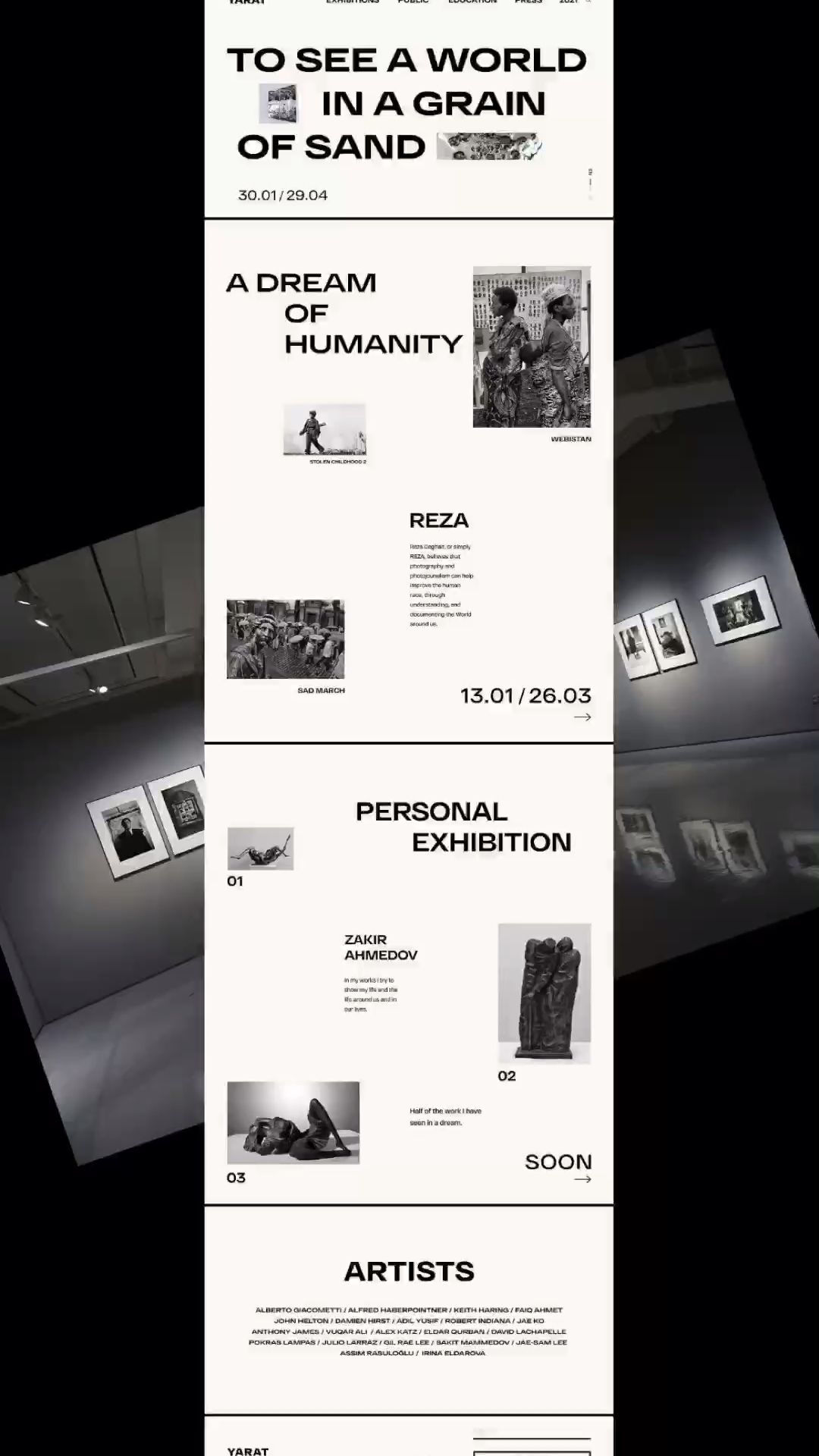
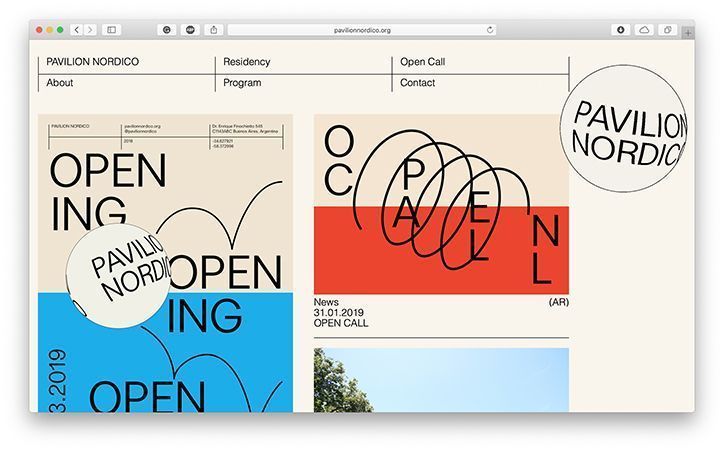
This design employs a clean, minimalist editorial layout to showcase visual content, utilizing strong grid structures and high contrast. The visual language is highly organized, prioritizing clarity and the presentation of curated artwork or portfolio pieces.
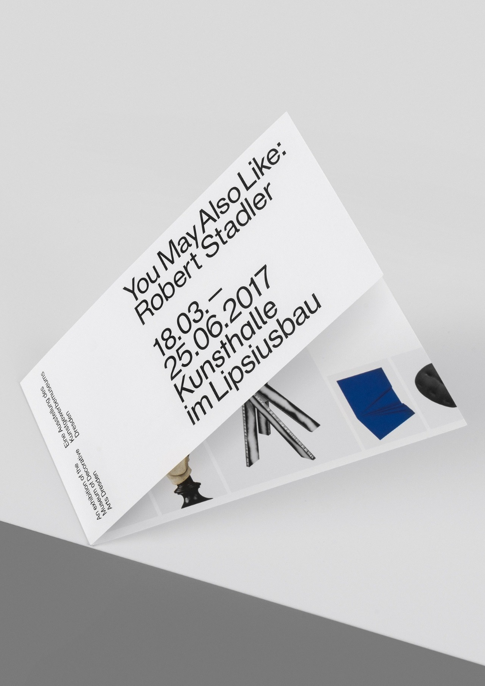
This design employs a clean, minimalist aesthetic relying heavily on negative space and precise typography to convey information. The visual language is highly structured, focusing on clear hierarchy and sophisticated readability suitable for an academic or cultural context.
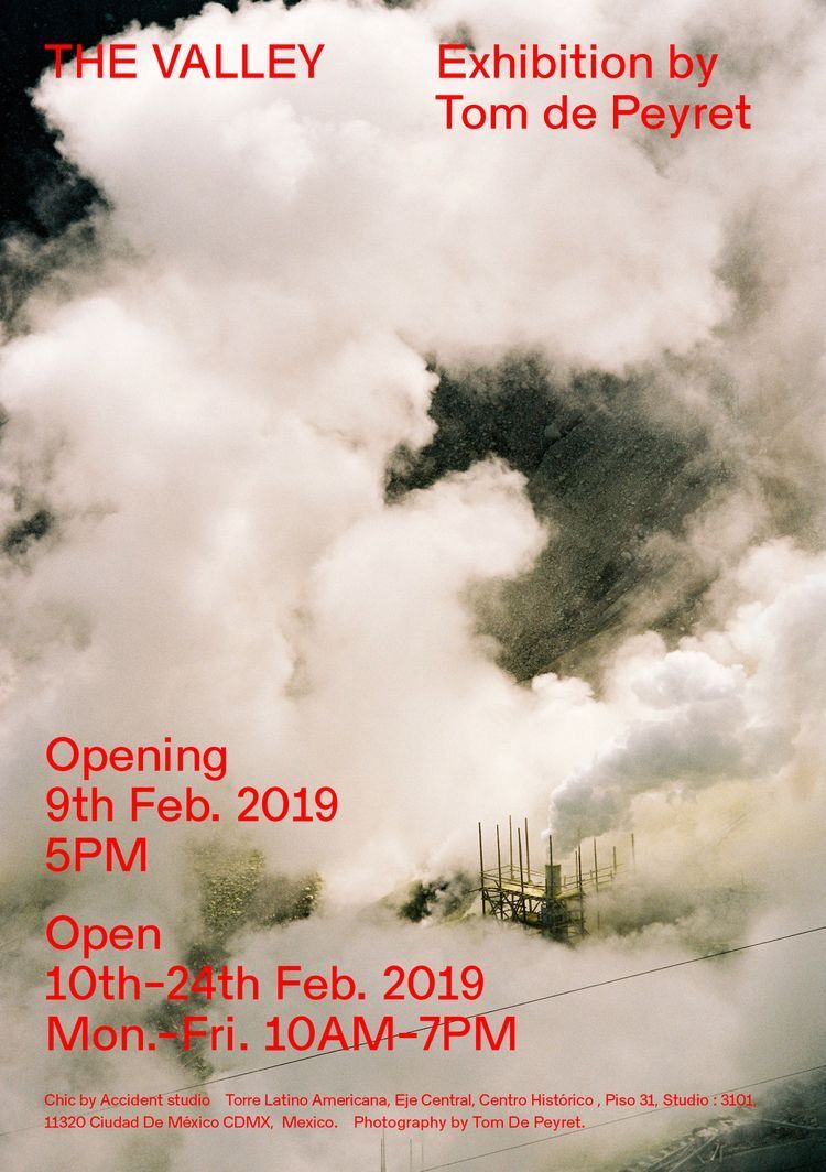
This design utilizes a dramatic, atmospheric photographic style where soft, diffused clouds dominate the composition. The visual language is moody and evocative, using natural light and shadow to create depth and mystery. The layout effectively balances the expansive photographic element with clean, legible text overlays.
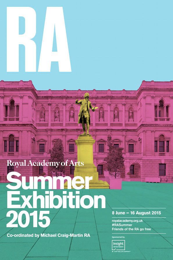
This design employs a classic, academic visual language by juxtaposing the grandeur of historical architecture with clean, modern typography. The composition is balanced and layered, using a muted yet striking color palette to convey a sense of tradition and refined elegance.
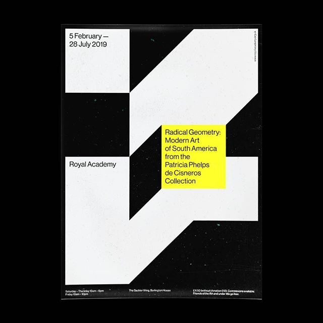
This design utilizes a stark, high-contrast geometric language dominated by black and white quadrants to convey a sense of modern academic rigor. The composition is clean, minimalist, and relies heavily on negative space to draw attention to the textual information and the implied structure of the artwork.
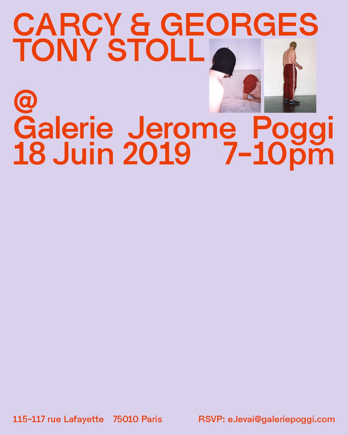
This is a clean, typographic promotional graphic utilizing high contrast between bright orange text and a soft lavender background. The design is highly structured, prioritizing clear hierarchy for artist names, event details, and contact information.
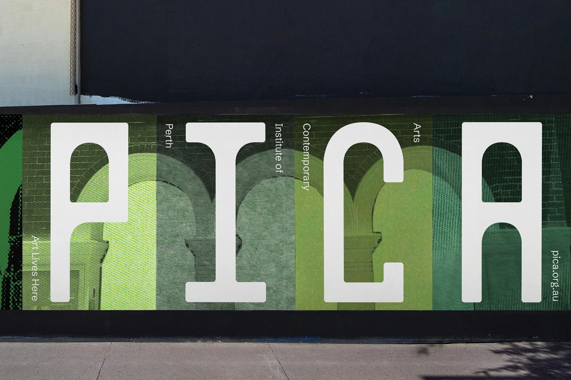
This design utilizes high contrast between stark white typography and a muted, textured olive green background to create a clean and institutional aesthetic. The visual language is minimalist and relies on strong, clear typography to establish a sense of academic authority and contemporary relevance.
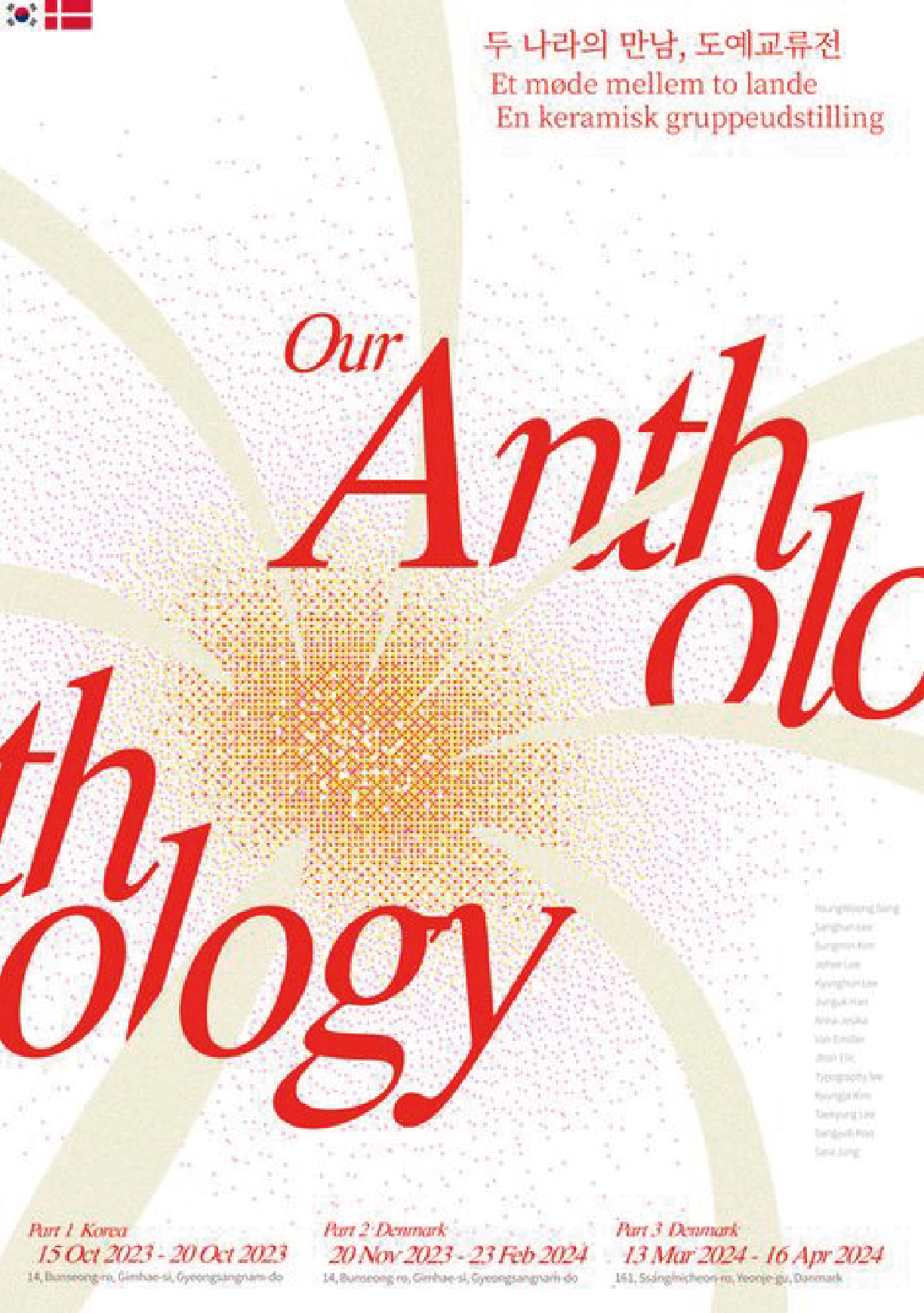
This design employs a sophisticated minimalist approach, utilizing a warm, radial burst graphic to highlight the main title. The visual language is clean and academic, relying on subtle texture and high contrast between the typography and the soft background tones to create an elegant feel.
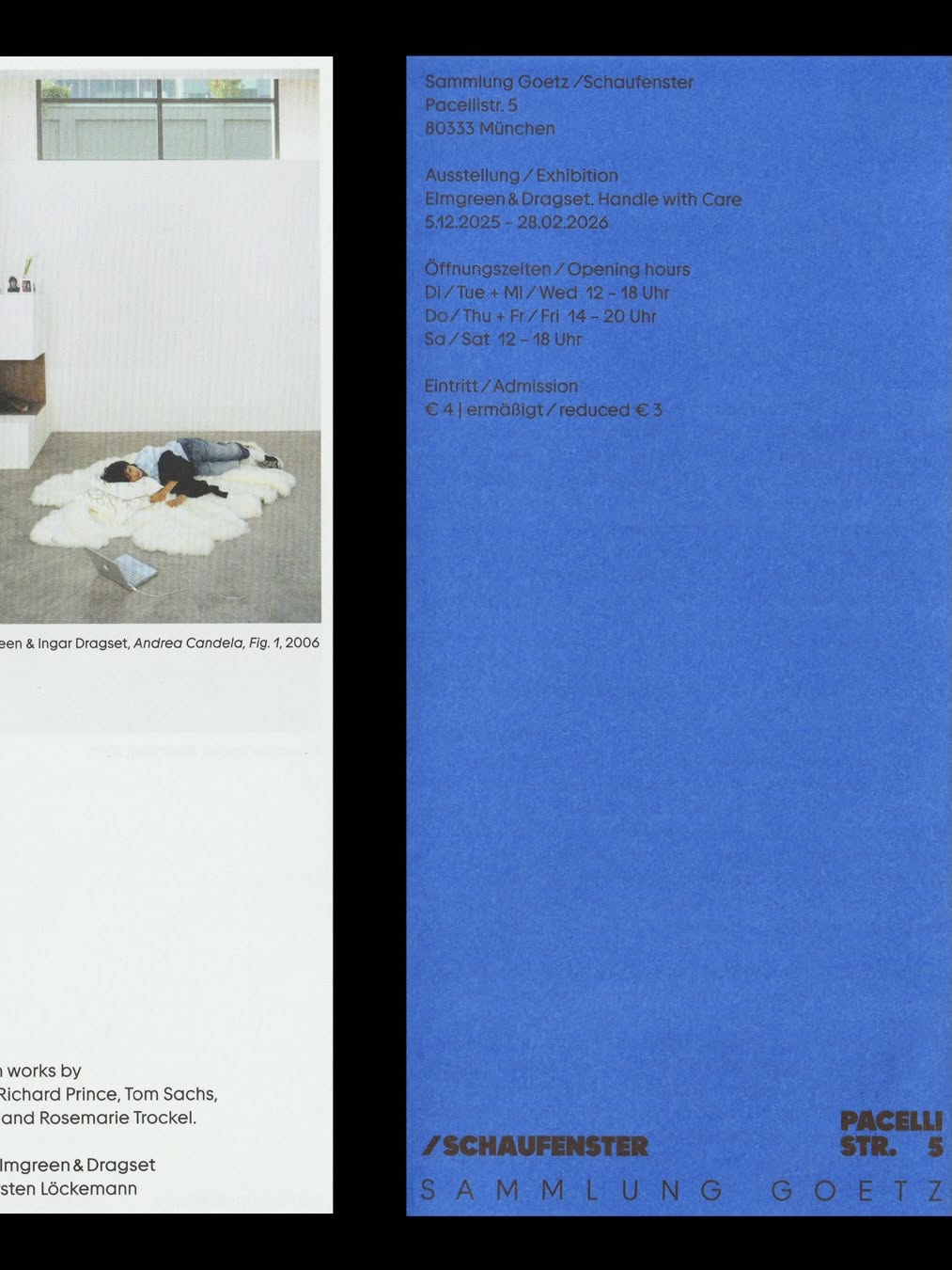
The design employs a clean, minimalist layout that juxtaposes a photographic element with formal, institutional text. The visual language is reserved and academic, relying on strong typography and ample negative space to convey information clearly. The overall feel is curated, serious, and highly informational.
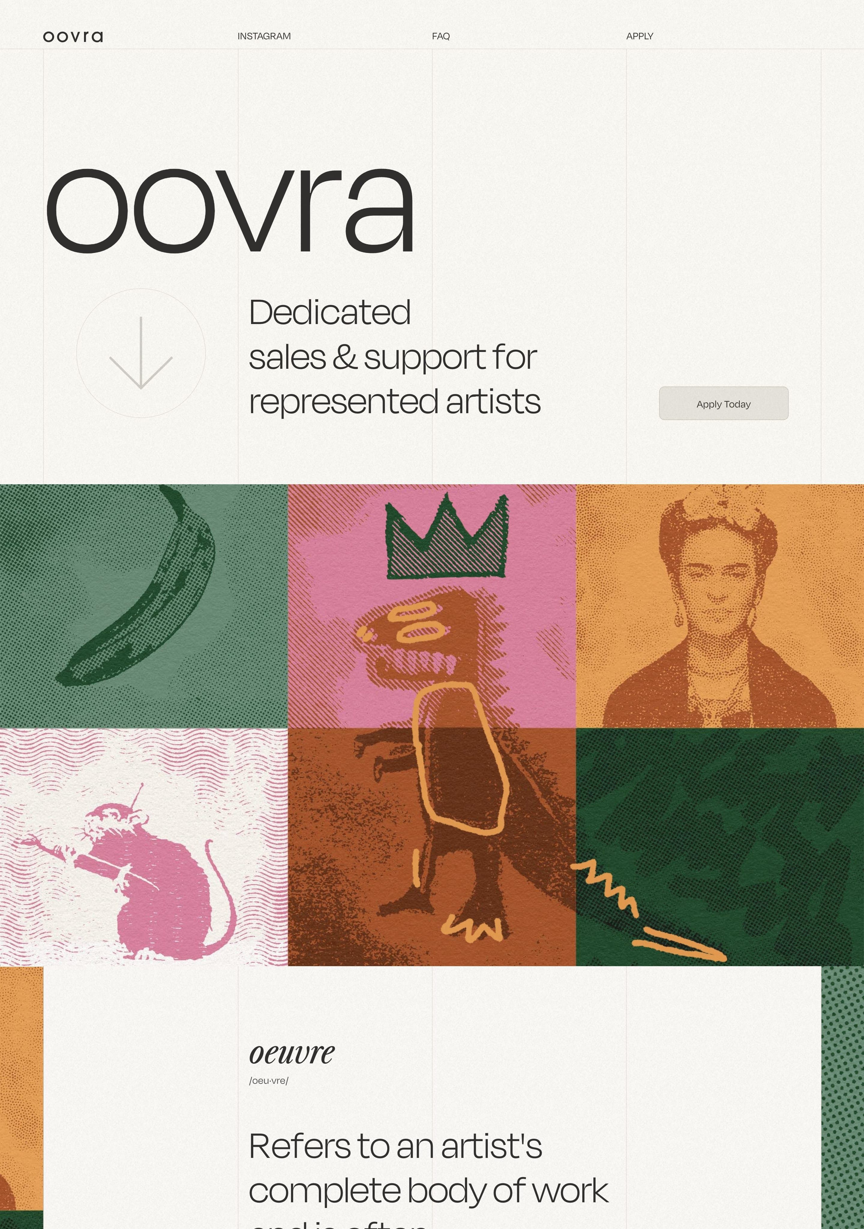
This design balances clean, modern typography with richly textured, organic illustrations to convey a sense of artistic authenticity and professional support. The visual language is grounded and warm, using muted earth tones to create an inviting yet sophisticated atmosphere.
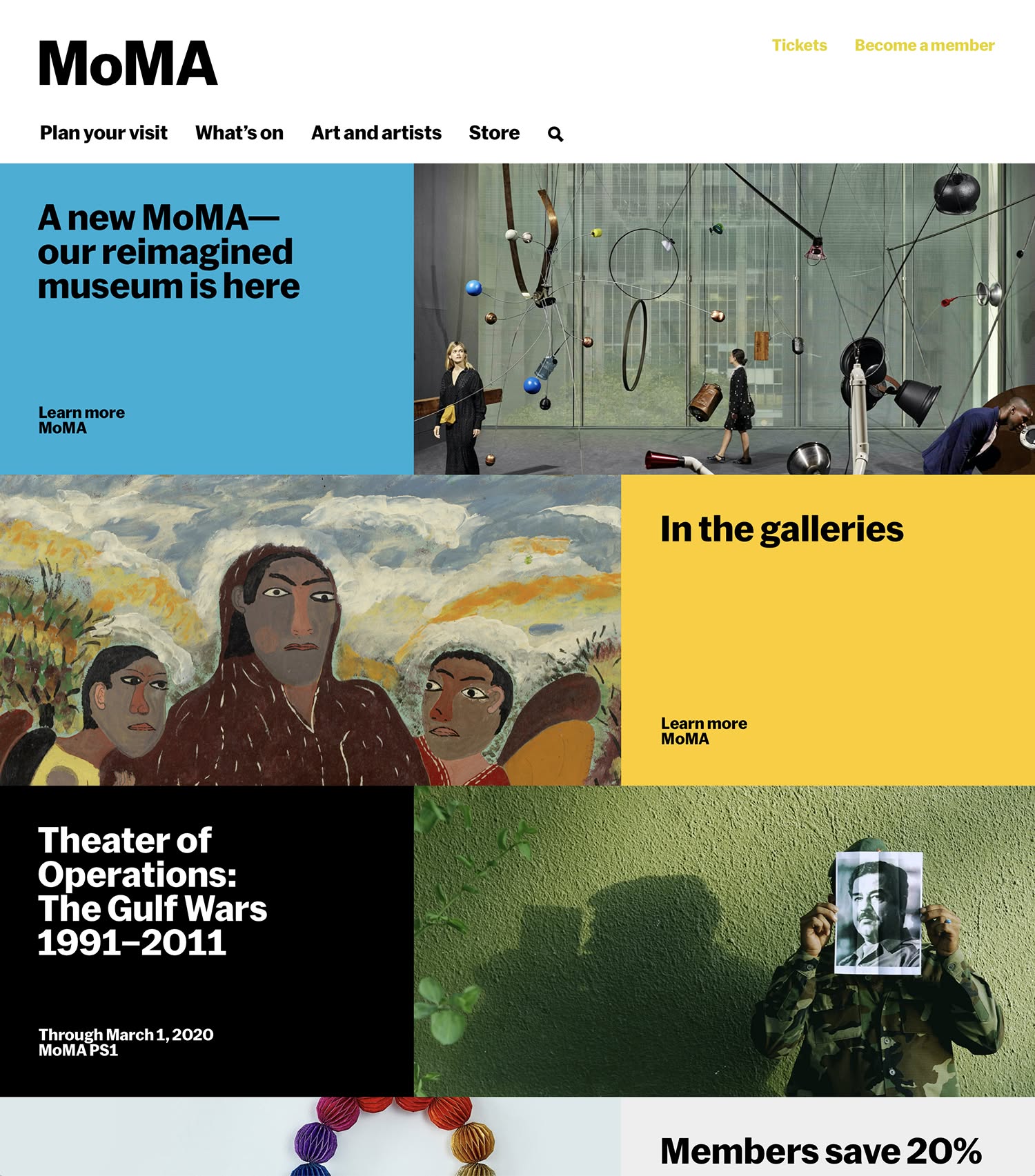
The design is clean, modern, and professional, utilizing a strong grid structure with high-contrast imagery to promote cultural institutions and exhibitions. It balances large photographic elements with clear, minimalist text blocks.
This is a promotional graphic for an event, characterized by a clean, minimalist design that uses bold, saturated blue typography against a muted, light background. The composition is balanced, focusing attention on the main title while providing necessary event details.
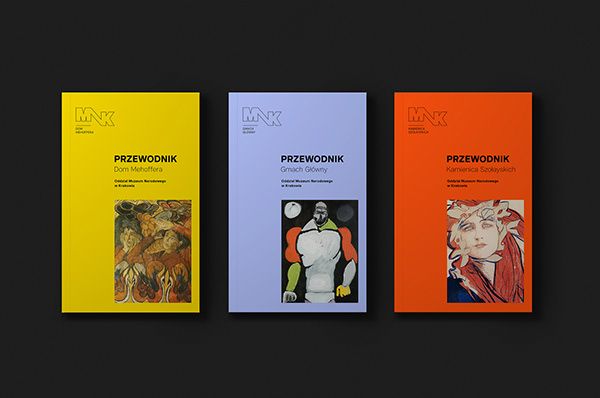
This is a set of three visually distinct book covers or publications, unified by a minimalist yet evocative design language. The covers use strong color blocking and striking, somewhat abstract or stylized figurative imagery to convey a sense of depth and artistic seriousness.
The design is minimalist and stark, relying on high contrast between white text and a black background. It conveys a sense of modern, clean, and sophisticated presentation typical of gallery or exhibition materials.
The image presents a clean, minimalist exhibition or program layout using a muted, earthy color palette contrasted with blocks of solid color. The design relies heavily on negative space and clear typography to present distinct titles and ongoing status.
The design is minimalist and sophisticated, utilizing a stark black background with clean white typography to present an exhibition title. The layout is highly structured, relying on precise alignment and negative space to create a sense of order and gravitas.
This image presents a minimalist, high-contrast visual experience, likely for an exhibition or installation. It uses soft, diffused light effects against a dark background to create an ethereal and contemplative atmosphere.
The design is clean, minimalist, and academic, utilizing a light background with strong typographic hierarchy to present information clearly. It employs a restrained color palette and simple line work to convey a sense of institutional professionalism.
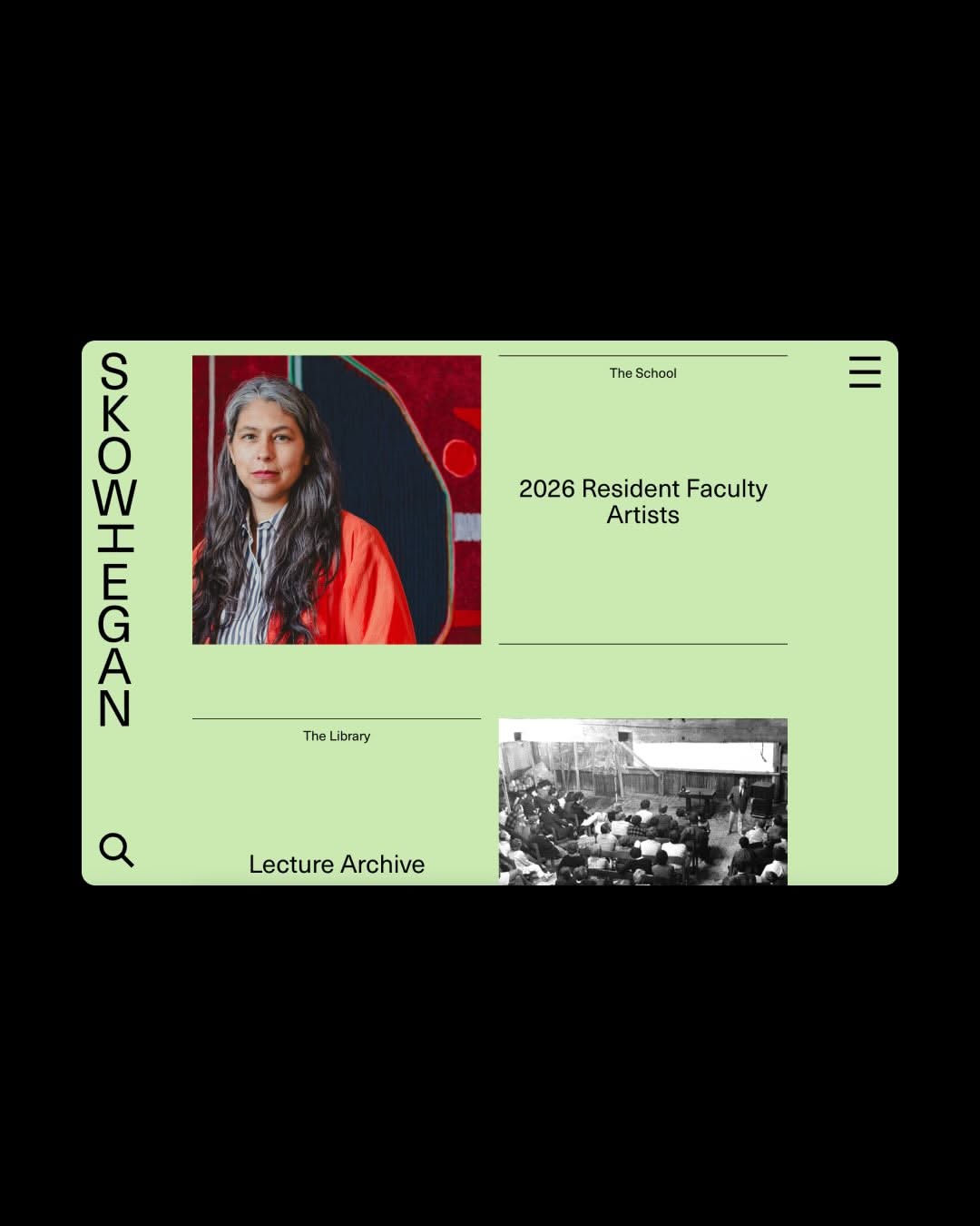
The design is clean, minimalist, and academic, utilizing a muted, earthy color palette with strong visual hierarchy. It employs a card-based or panel layout to present distinct sections of information clearly and professionally.
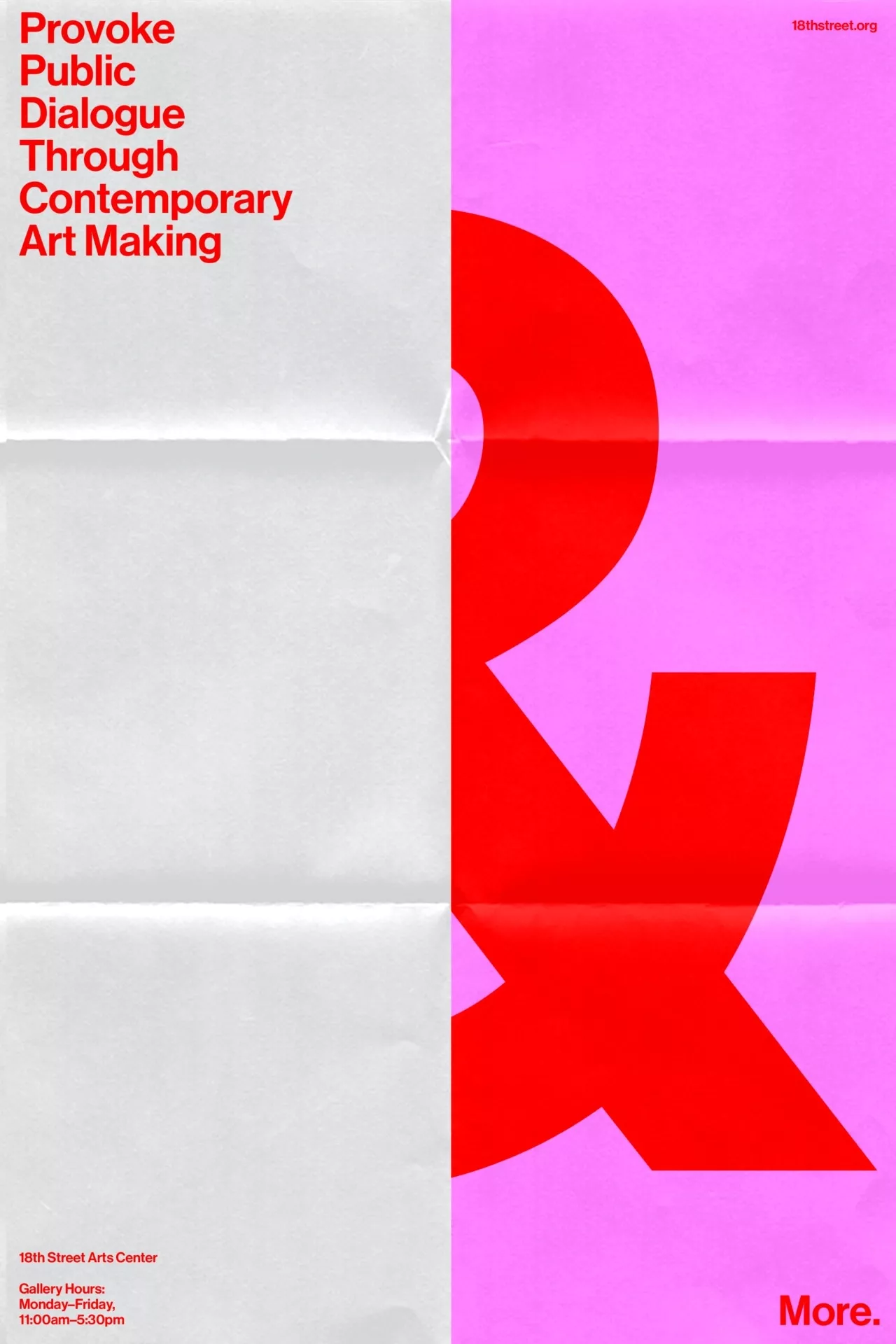
The design is stark and high-contrast, utilizing a bold, graphic element in vibrant red against a soft pink background. It conveys a sense of modern artistic provocation and direct communication through strong visual hierarchy.