fitness tracking
23 designs
Showing 23 of 23 (23 total)
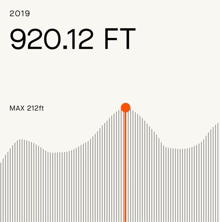
A minimalist data visualization dashboard displaying elevation or altitude metrics for 2019, featuring a clean beige background with a prominent wavy line graph rendered in thin black strokes. The design emphasizes clarity and precision through restrained typography and a single accent color highlighting the peak value.
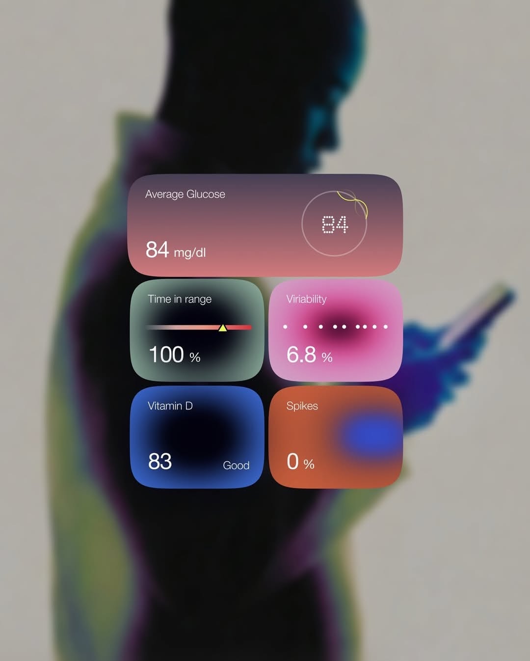
A modern health/wellness dashboard interface overlaid on a blurred, colorful silhouette of a human figure. The design features glassmorphic cards with gradient backgrounds displaying health metrics like glucose levels, vitamin D, and vitality scores. The aesthetic combines contemporary UI design with a soft, approachable visual language suited for health tracking applications.
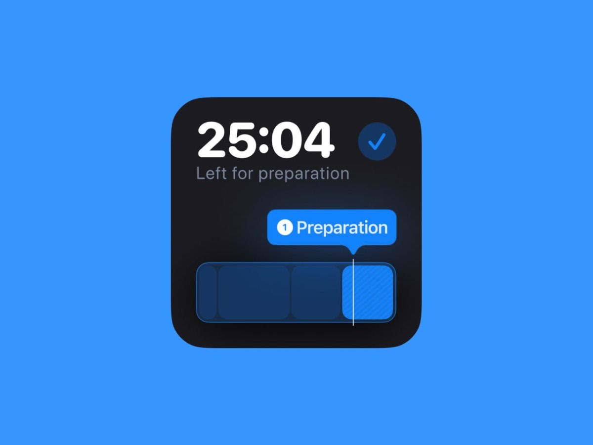
A modern digital timer interface displayed as a dark rounded widget against a vibrant blue background. The design features a countdown display with status information and a progress indicator, exemplifying contemporary app UI design with clear hierarchy and accessibility.
The image displays a clean, dark-themed mobile application interface focused on fitness tracking or workout guidance. The design utilizes high contrast between dark backgrounds and vibrant accent colors to create a modern, functional, and energetic feel.
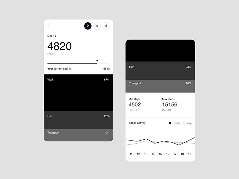
The image displays a clean, dark-mode user interface for tracking fitness or steps, characterized by high contrast and clear data presentation. The design is minimalist, focusing on readability and functional organization of metrics.
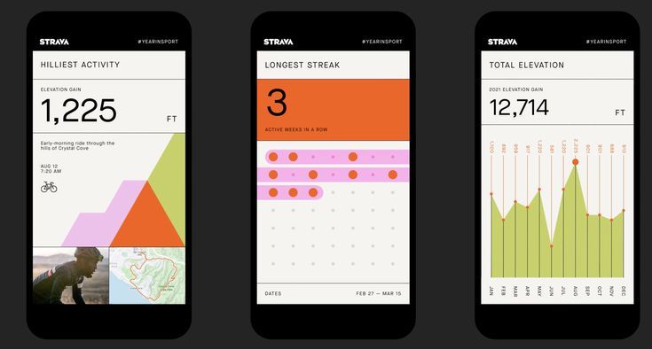
This is a clean, data-driven interface design typical of a sports tracking application. It uses a minimalist approach with clear segmentation to present elevation gain statistics effectively.
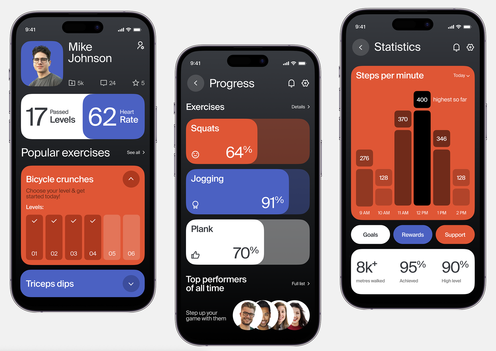
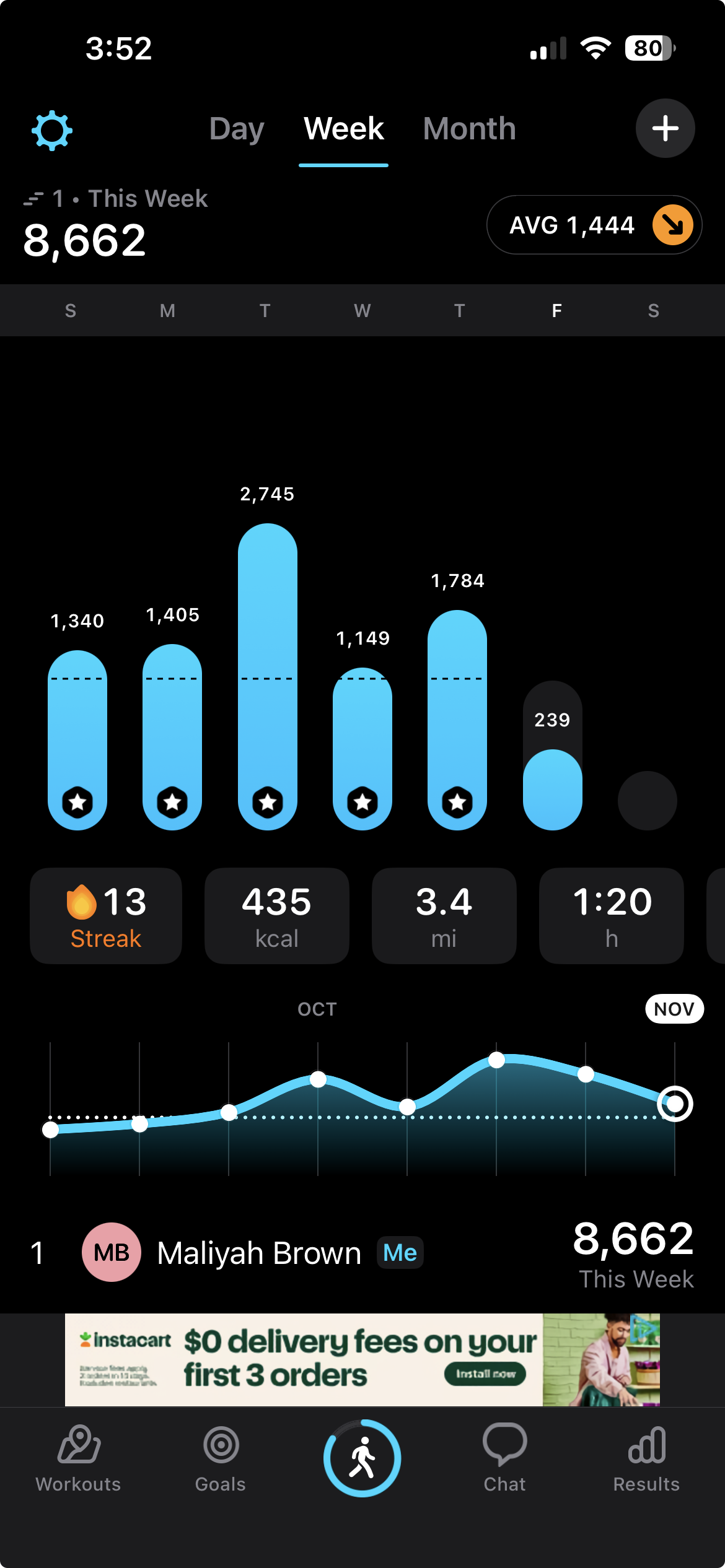
The interface presents a clean, modern, and data-driven design typical of fitness tracking applications. It uses high contrast and clear segmentation to present progress metrics effectively.
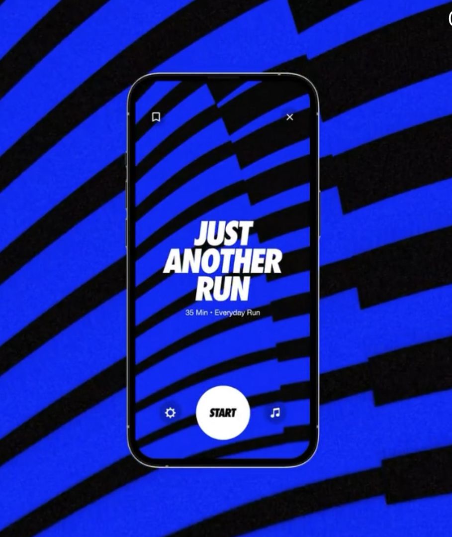
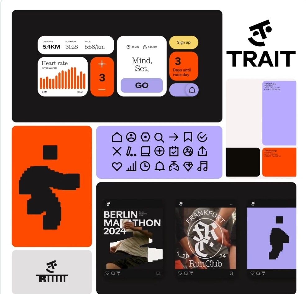
The image features a mobile app interface design characterized by high contrast and bold graphic elements. It uses strong diagonal lines and a limited color palette to create a dynamic, modern, and focused visual experience.
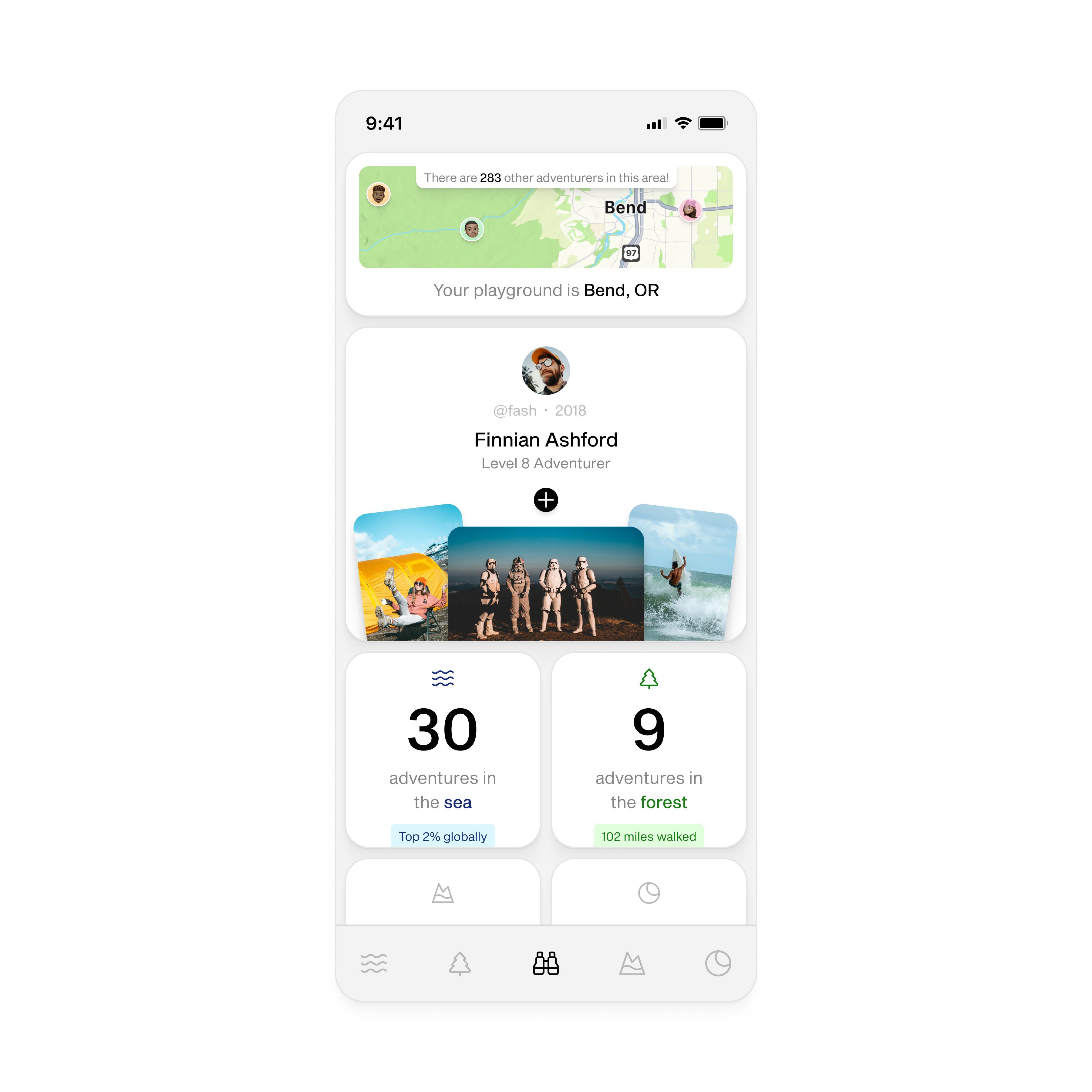
The image displays a clean, minimalist user interface for a gamified activity tracking application. It uses a light background with clear iconography and simple text to present user achievements and location-based challenges. The design emphasizes clarity and straightforward data presentation.
The interface presents a clean, modern, and data-focused design typical of fitness tracking applications. It utilizes ample white space and a limited, high-contrast color palette to ensure readability and emphasize key metrics.
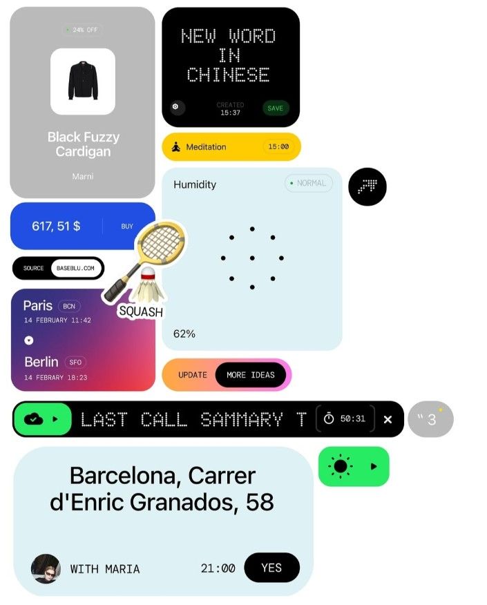
The image presents a clean, modern user interface design, likely from a mobile application or digital service. It utilizes ample white space and clear iconography to present various pieces of information in a structured, card-based layout. The overall feel is professional, functional, and minimalist.
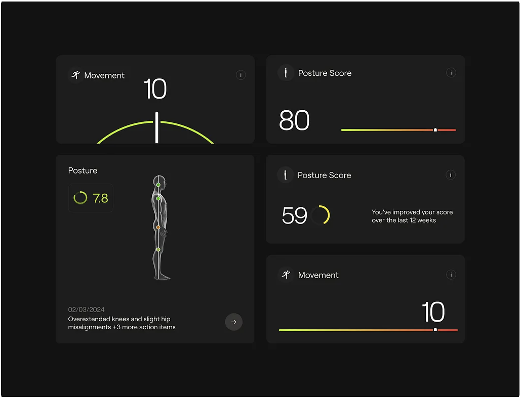
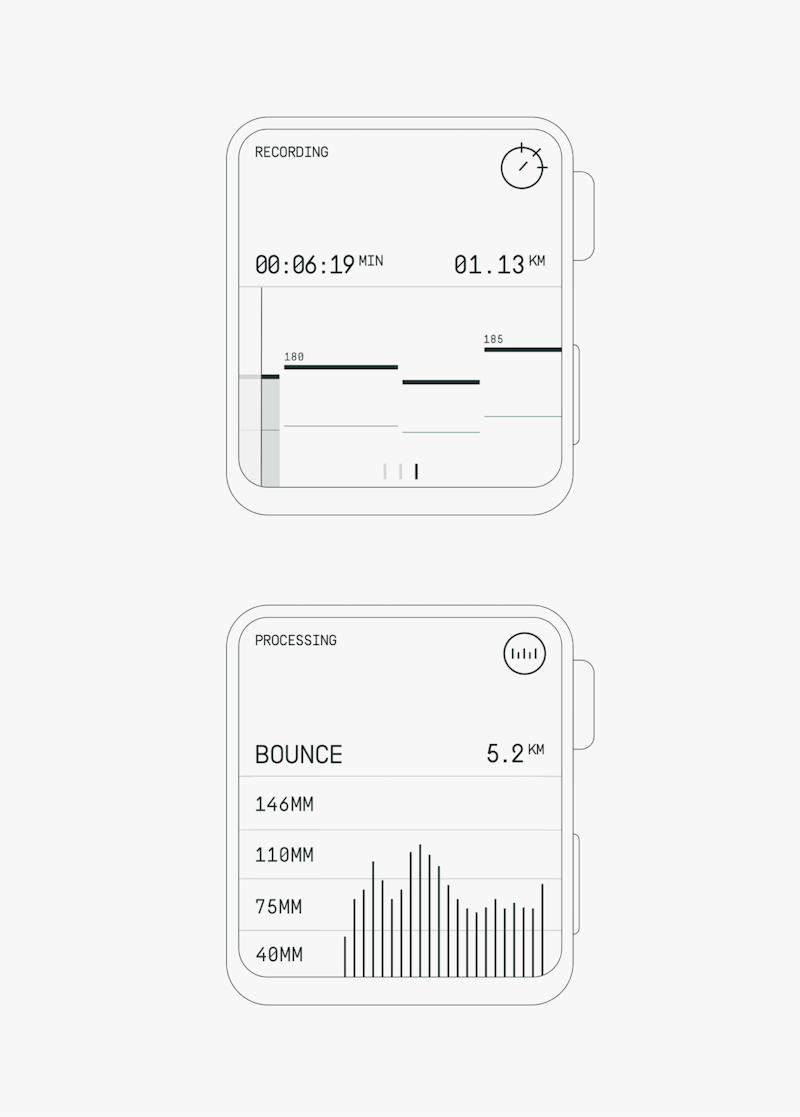
The interface presents a clean, dark-mode design typical of health or fitness tracking applications. It uses simple line graphs and numerical readouts to convey performance metrics in a straightforward, data-driven manner. The overall feel is modern, clinical, and focused on progress tracking.
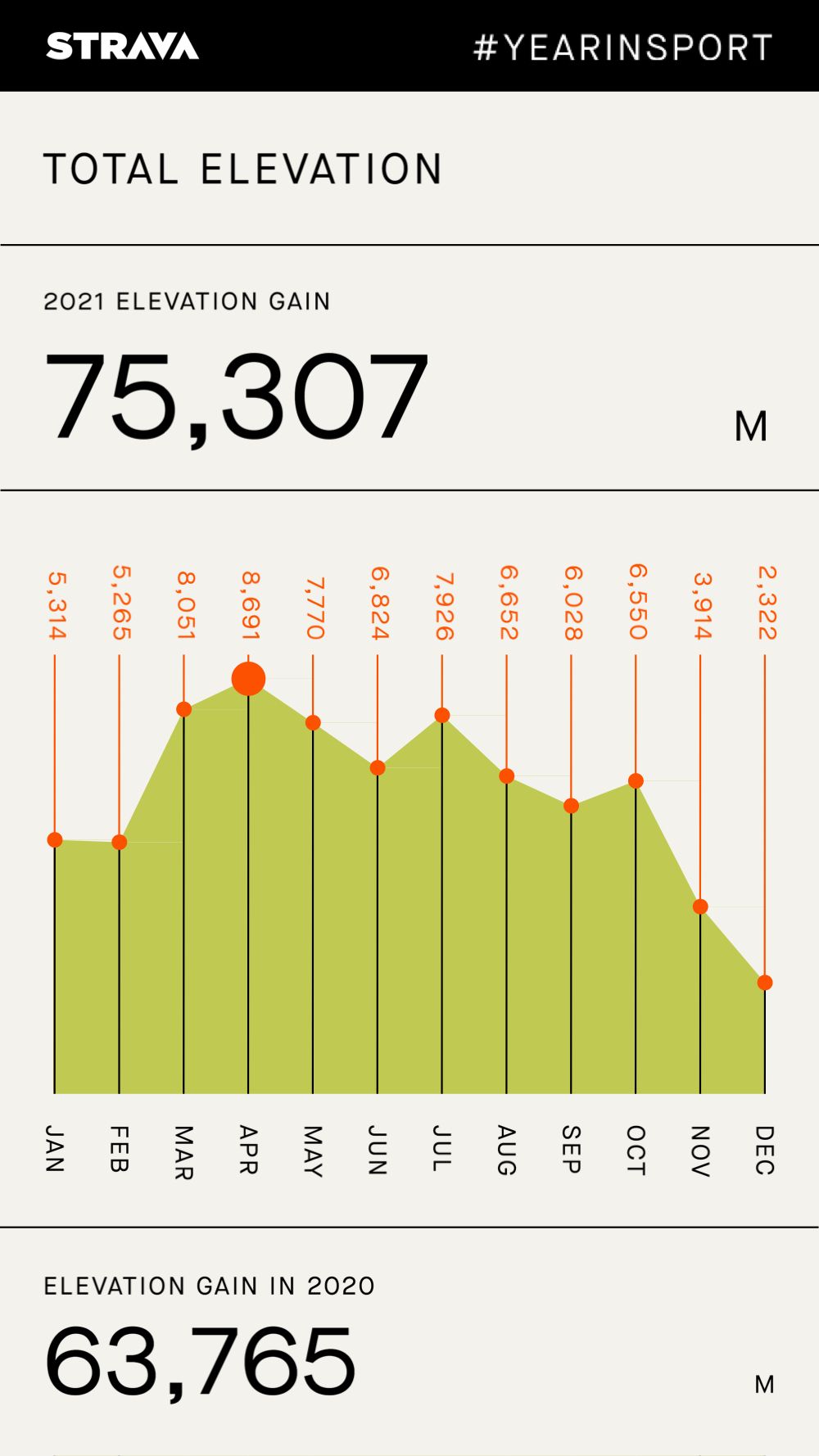
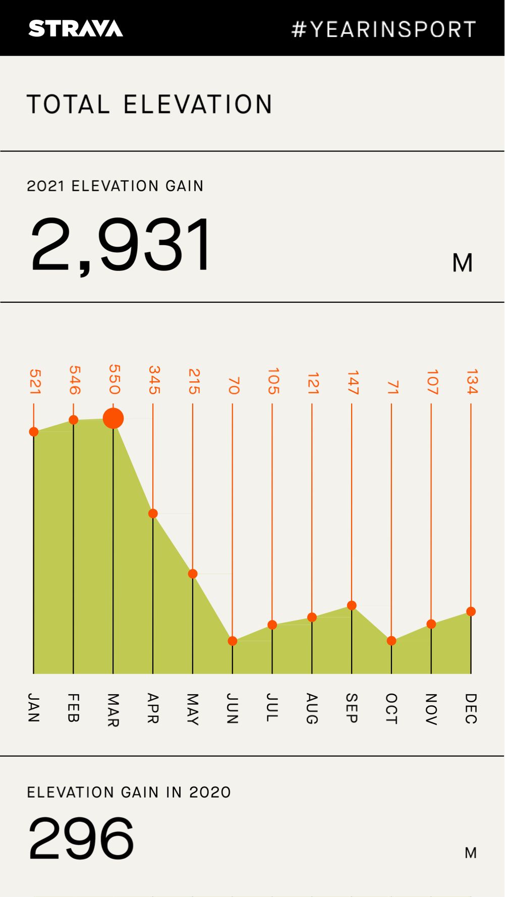
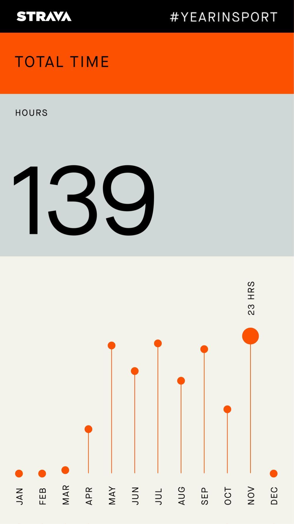
This is a data visualization screen, likely from a fitness tracking app, presenting elevation gain over the course of a year. The design is clean, minimalist, and functional, relying heavily on a simple bar chart to convey performance metrics clearly.
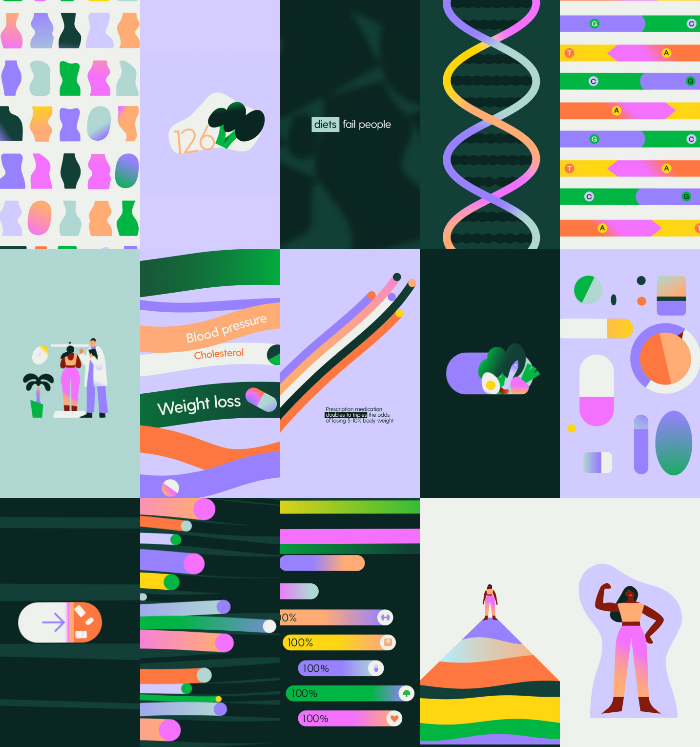
This image is a grid of diverse infographic elements, characterized by a clean, modern, and somewhat clinical visual language. It uses bright, contrasting colors against dark backgrounds to present various health and diet-related statistics in a highly structured manner.
This design exhibits a highly functional and minimalist visual language, relying on clean lines, high contrast, and structured data visualization to convey technical information. The aesthetic is strictly utilitarian, prioritizing legibility and efficient presentation of numerical data.
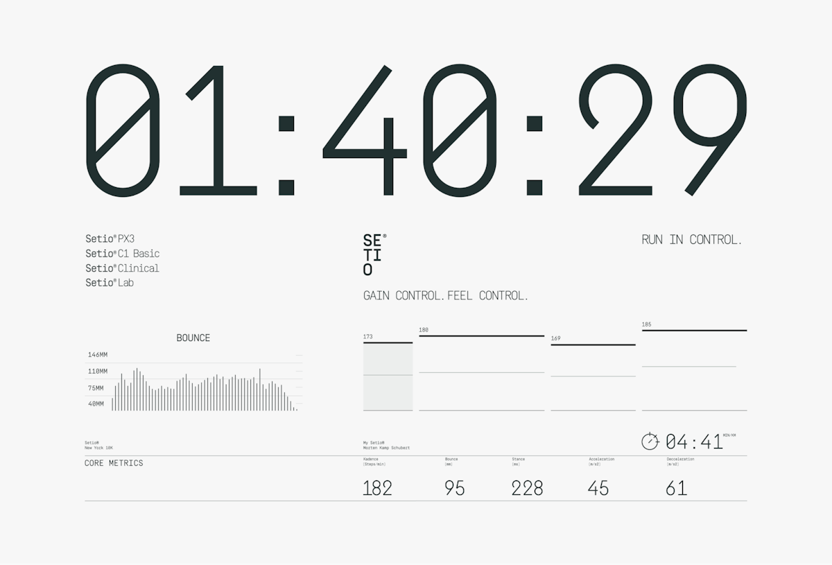
This design utilizes a clean, high-contrast aesthetic typical of technical dashboards, emphasizing data clarity and precision. The visual language is strictly functional, relying on clear typography and minimalist lines to present complex metrics efficiently. The overall feel is highly analytical and performance-focused.
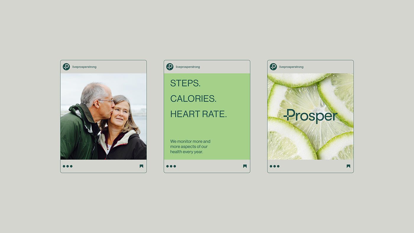
This design features a clean, modern interface utilizing soft pastels and vibrant natural greens to convey a sense of wellness and vitality. The visual language is minimalist, relying on clear typography and evocative imagery to promote health tracking and positive outcomes.
This design employs a clean, modern aesthetic suitable for data presentation, utilizing strong segmentation and high contrast to prioritize key metrics. The visual language is minimalist, ensuring the focus remains entirely on the numerical data and the chronological progression of performance.
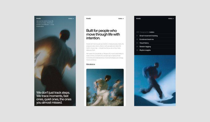
This design utilizes a highly minimalist and clean aesthetic, relying on strong typography and significant negative space to create a calm and focused user experience. The visual language is modern and functional, emphasizing data and intention through subtle photographic elements.
This interface utilizes a clean, dark mode aesthetic to present complex fitness data in an organized and highly functional manner. The visual language relies heavily on simple bar charts and clear numerical displays to convey performance metrics efficiently. It successfully achieves a modern, analytical feel suitable for tracking quantitative health information.
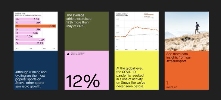
The design utilizes a clean, modular grid layout to present multiple data visualizations in an infographic style. It employs strong color blocking and contrasting accents (orange, green, blue) to clearly differentiate metrics and highlight key findings. The visual language is professional, analytical, and highly focused on conveying statistical information.
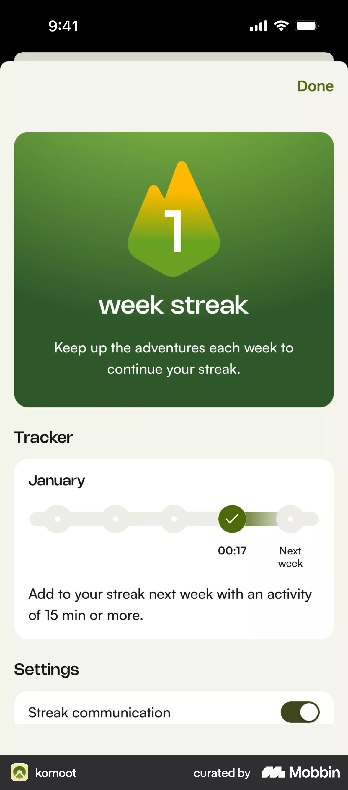
This interface employs a clean, modern flat design with high contrast, utilizing vibrant greens and subtle yellow accents to guide the user's attention. The visual language is highly structured, organizing key metrics like streaks and settings into distinct, easily digestible cards. The overall feel is encouraging and focused on positive progress tracking.
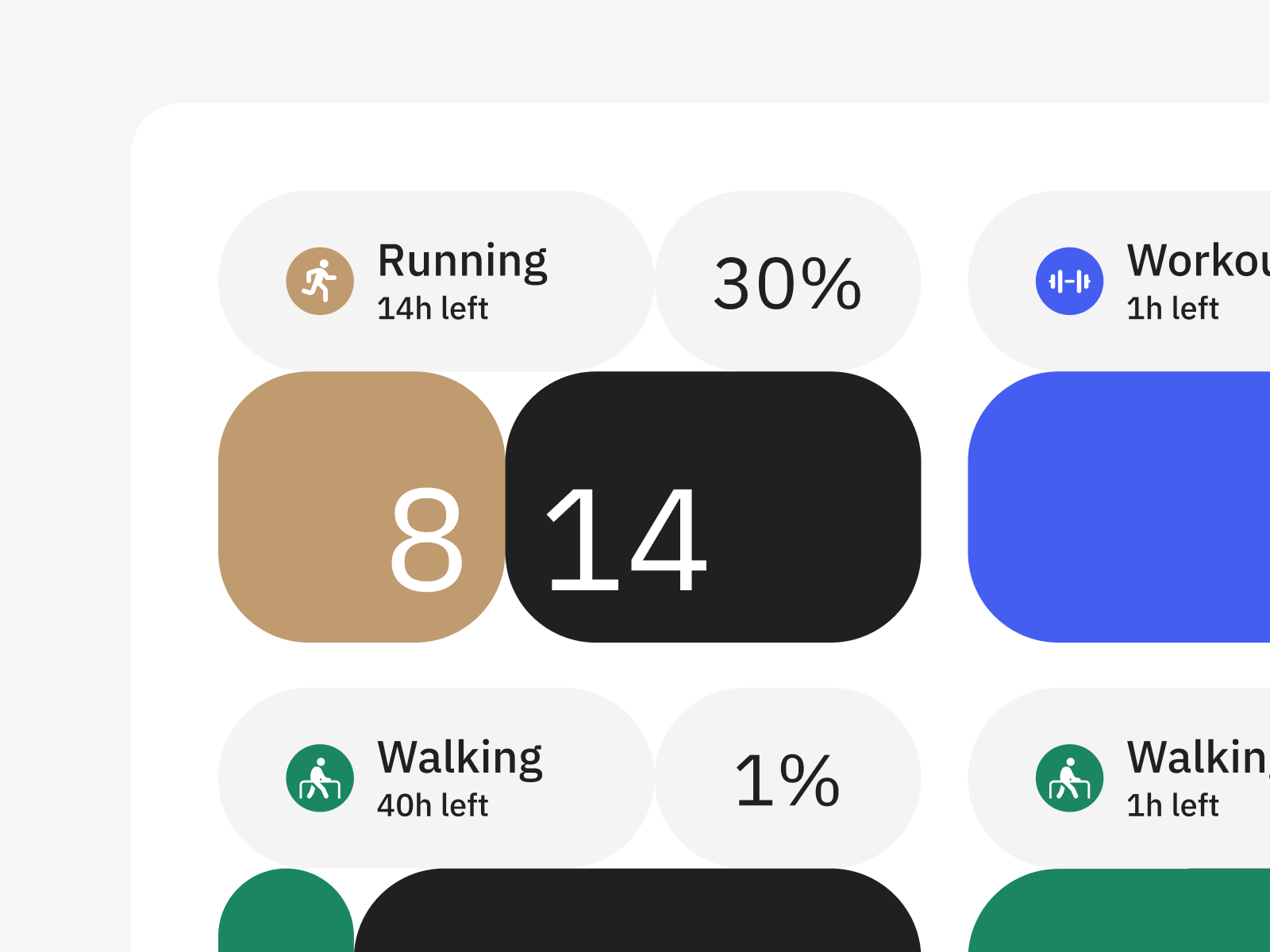
This interface demonstrates a clean, modern design approach using segmented circular tiles to present quantitative fitness data. The visual language relies heavily on clear typography and high contrast to ensure readability and quick comprehension of workout status and progress.