financial reporting
10 designs
Showing 10 of 10 (10 total)
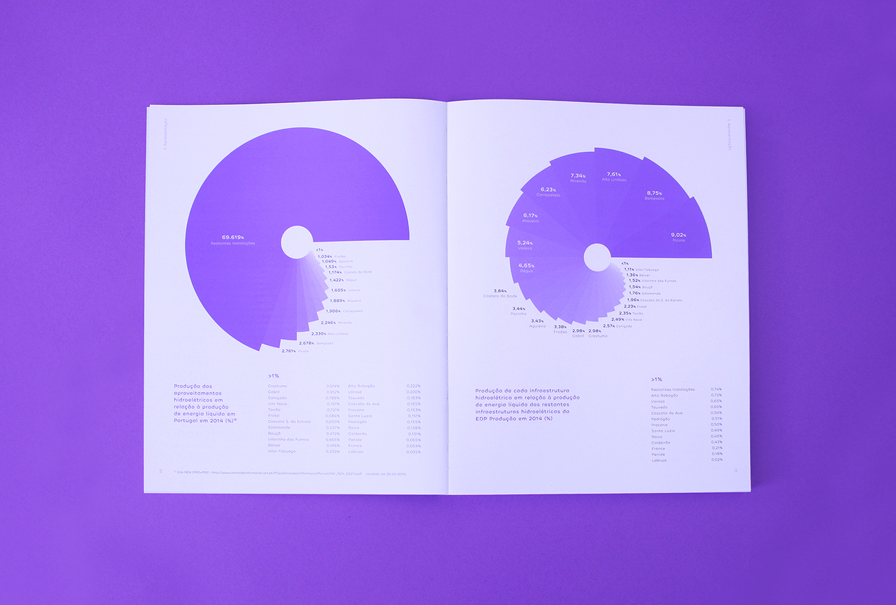
This spread features a clean, professional presentation of quantitative data using large circular charts against a stark white background. The design emphasizes clarity and readability, utilizing a monochromatic palette of purples and whites to create a modern and analytical feel.
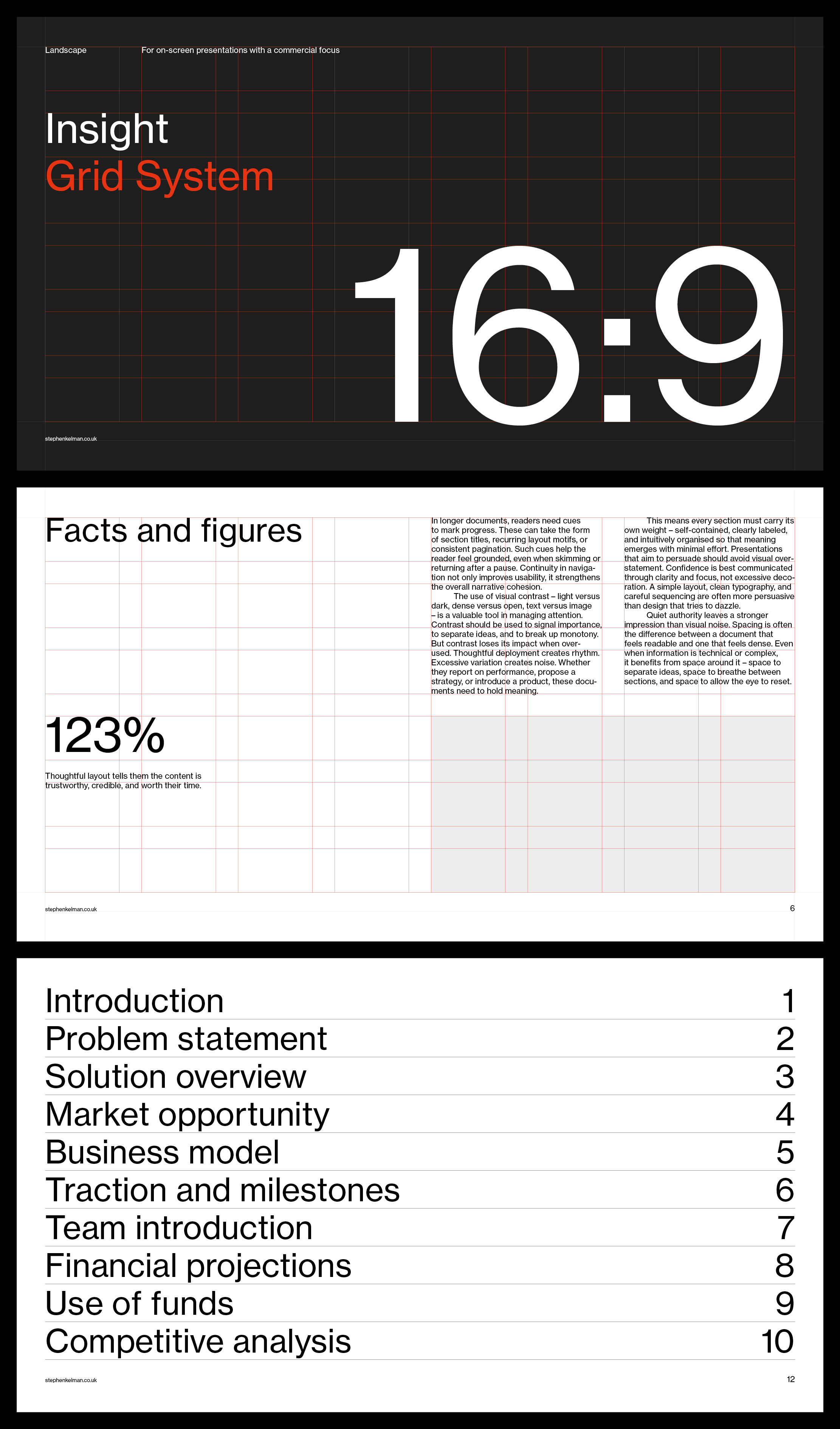
A professional grid-based design system showcasing a corporate presentation template with clean typography and structured layout. The design employs a minimalist aesthetic with strategic use of white space, dark backgrounds, and bold numerical hierarchy to communicate data-driven insights.
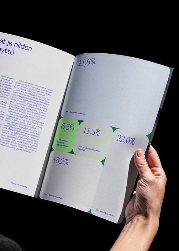
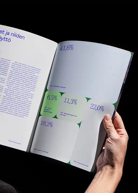
A minimalist data visualization publication featuring statistical infographics with percentage metrics displayed across an open spread. The design employs a clean, modern aesthetic with strategic use of color-coded data points and geometric shapes to communicate quantitative information. The composition balances dense text on the left with visual data representation on the right, creating an accessible editorial layout.
A modern data visualization publication spread featuring statistical infographics with percentage metrics and directional indicators. The design employs a clean, minimalist aesthetic with strategic use of color to highlight key data points against a predominantly white background. The composition demonstrates professional editorial design with emphasis on readability and visual hierarchy.
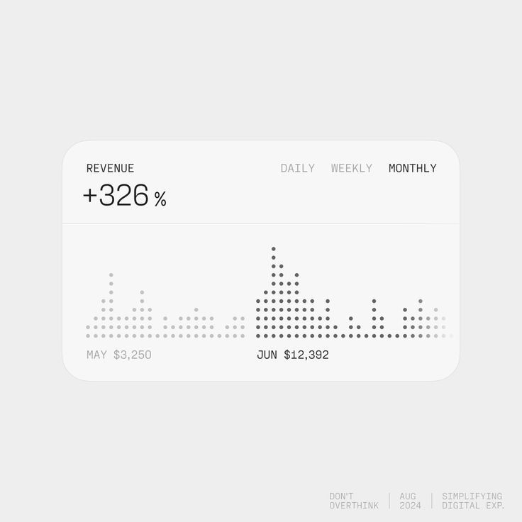
A minimalist data visualization dashboard displaying revenue metrics with a clean, modern aesthetic. The design uses a dot-matrix chart to represent temporal data trends, emphasizing simplicity and clarity through restrained typography and neutral color palette.
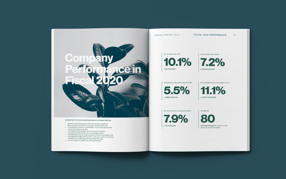
This design utilizes a clean, corporate aesthetic, pairing strong data visualization with an organic motif to convey trust and growth. The visual language is professional and minimalist, effectively organizing complex financial metrics into an accessible format.
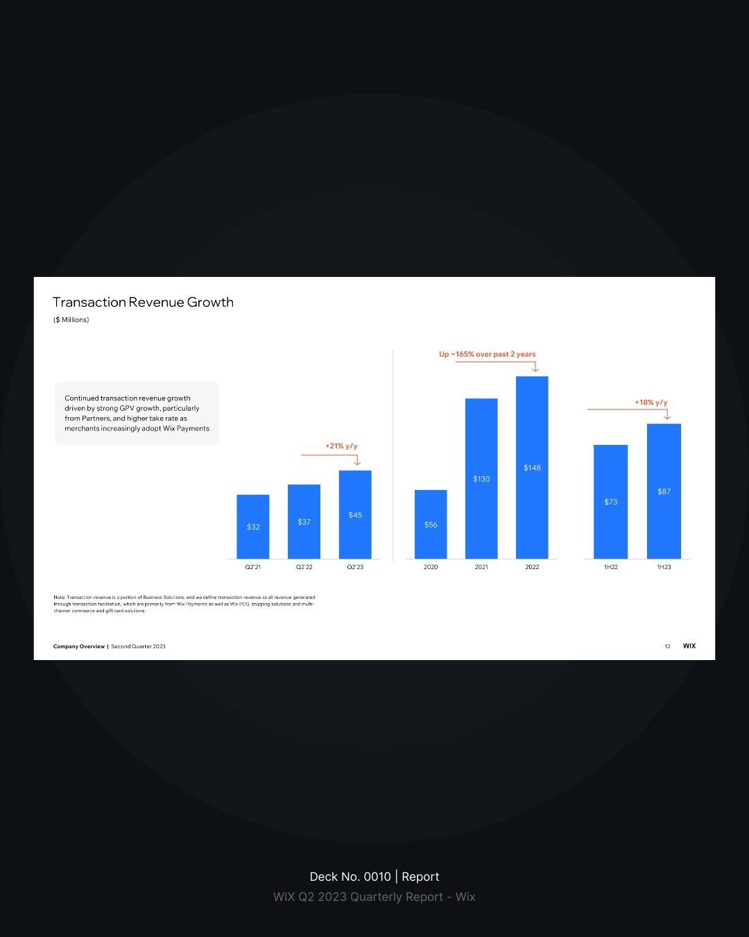
This slide features a clean, professional data visualization using a dark theme to clearly present transaction revenue growth. The design prioritizes readability and emphasizes key metrics through simple bar charts and explicit percentage notations.
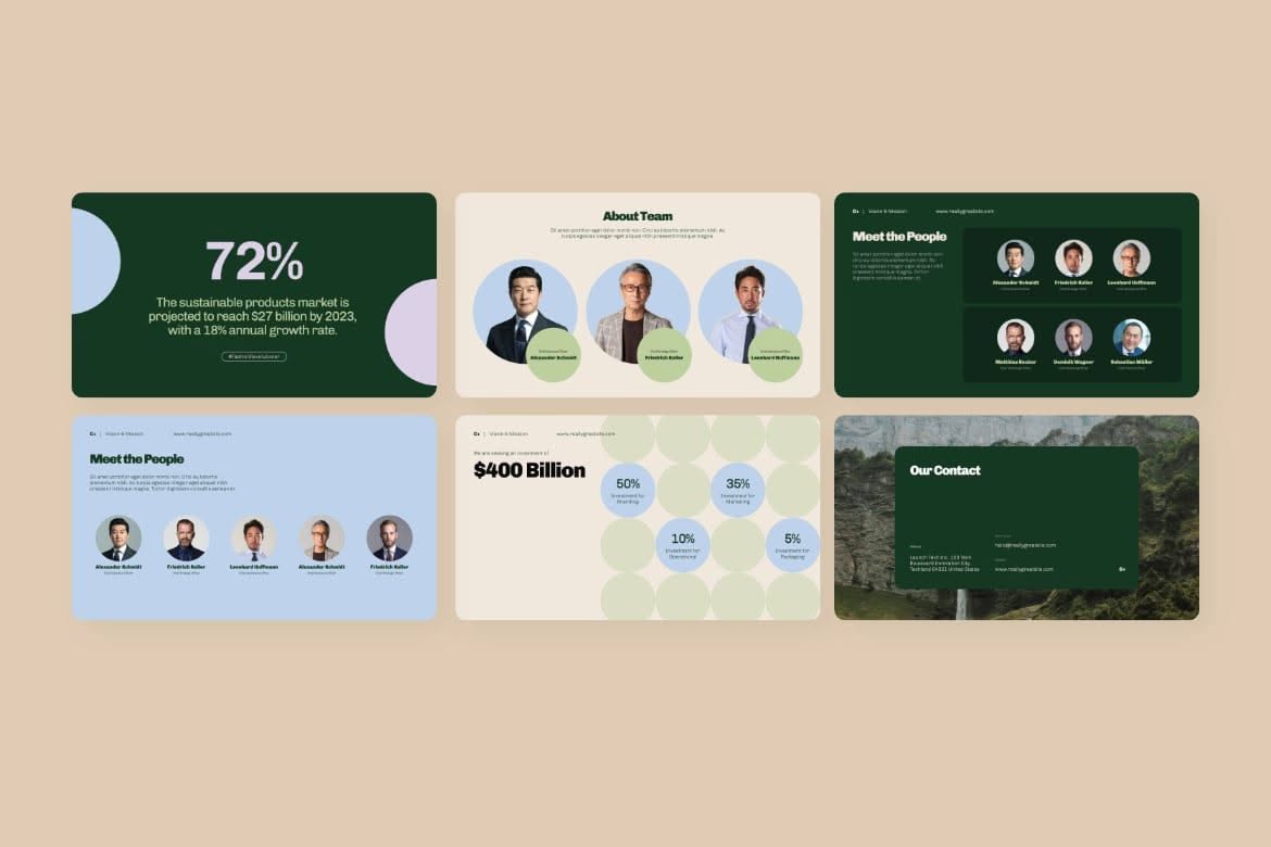
This is a clean, corporate presentation style characterized by a modular grid layout, utilizing muted greens and beige tones to present data clearly. The design emphasizes readability and hierarchy, using simple graphics and strong typography to communicate business information effectively.
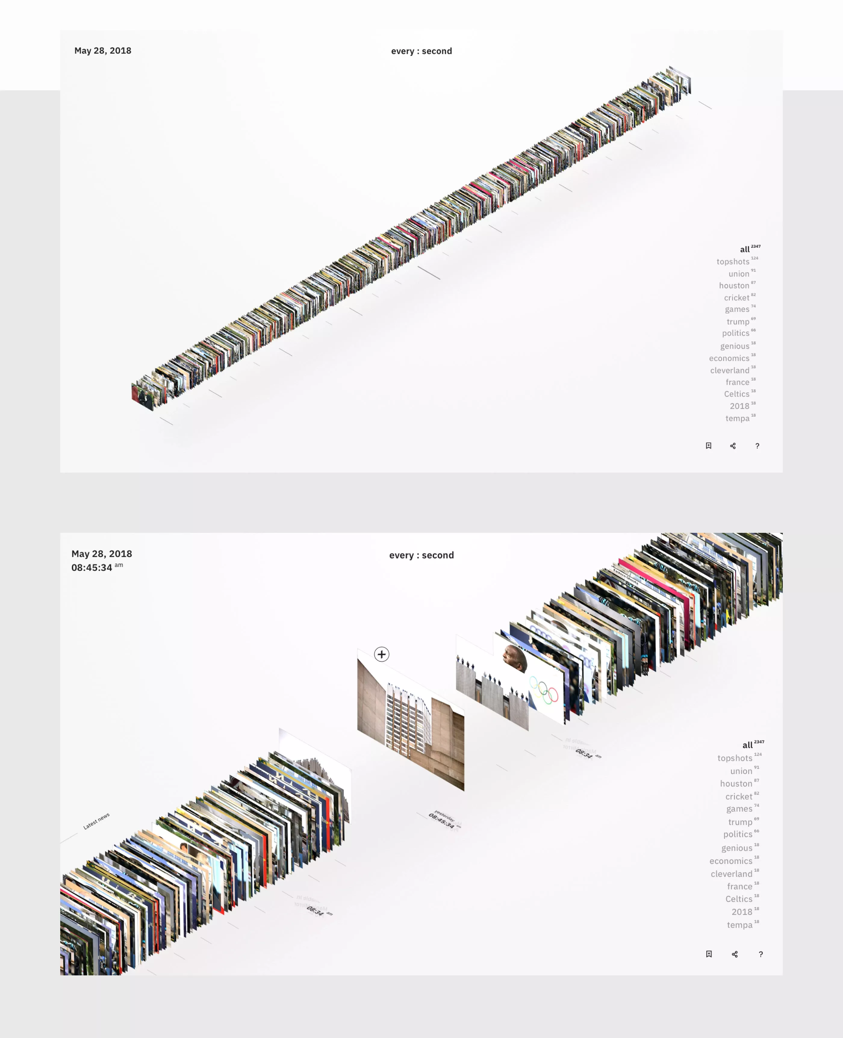
This design utilizes a clean, modern aesthetic centered around horizontal data display, emphasizing precision and temporal tracking. The visual language is minimalist, relying heavily on negative space and clear typography to present complex information in an organized manner.
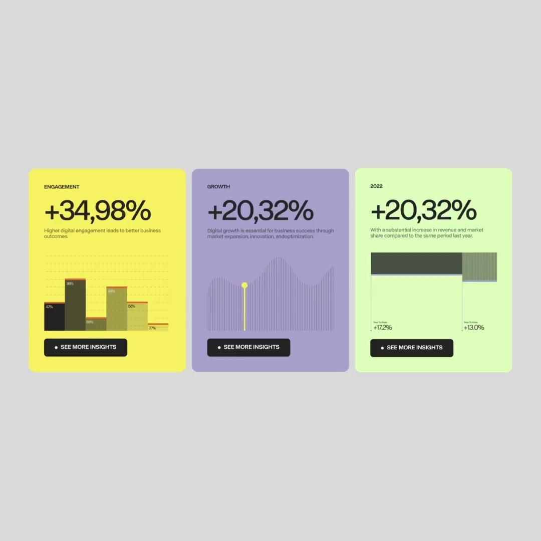
This design utilizes a clean, modern aesthetic focused on presenting quantifiable business metrics through distinct card layouts. The visual language is corporate and analytical, relying on strong contrast between dark backgrounds and bright text to ensure data readability.