financial technology
4 designs
Showing 4 of 4 (4 total)
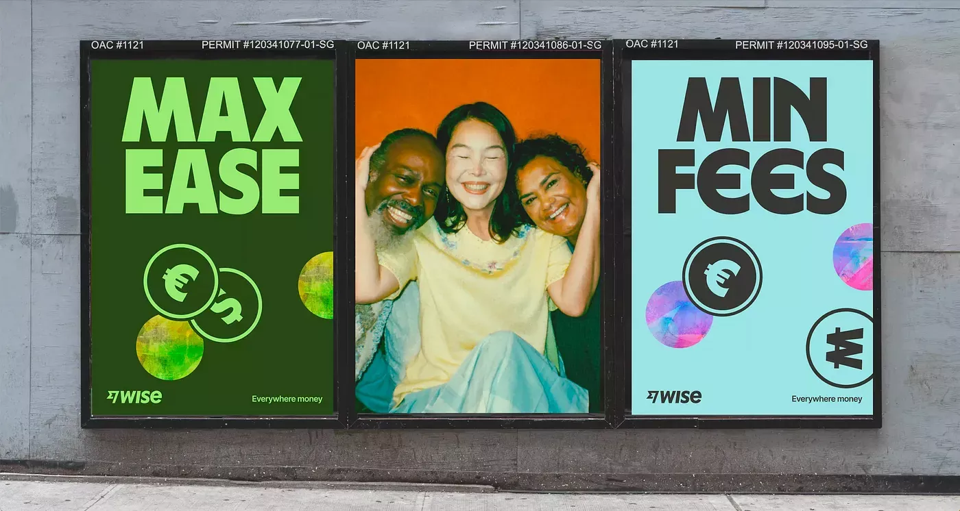
This visual presentation uses a clean, high-contrast graphic style to market financial services by directly comparing two options. The design effectively uses color blocking and large typography to create immediate differentiation between 'Max Ease' and 'Min Fees,' aiming for clarity and consumer choice.
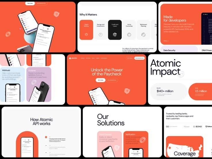
This collection showcases a modern, clean interface design utilizing a strong color accent against a neutral background to convey professionalism and clarity. The visual language is highly structured, relying on card layouts and ample negative space to ensure key information is easily digestible. The overall feel is trustworthy, innovative, and highly functional.
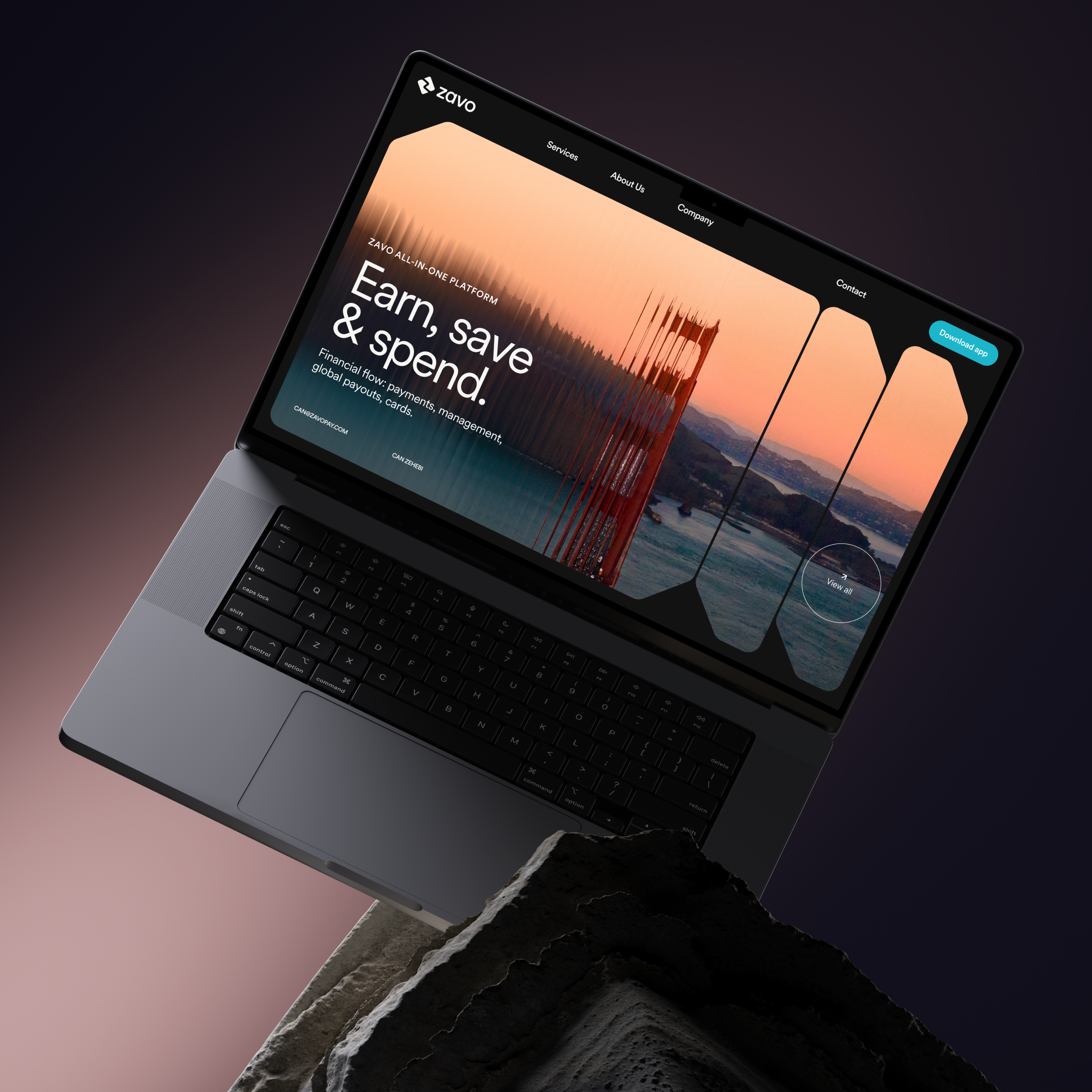
This image showcases a clean, modern user interface displayed on a laptop, emphasizing clarity and data visualization. The design successfully blends professional hardware with an engaging, warm color gradient to convey a sense of financial opportunity and innovation.

A vibrant data visualization dashboard featuring an upward trending graph with flowing organic curves and geometric elements. The design combines modern infographic aesthetics with a dynamic, energetic visual language that communicates growth and progress through layered visual metaphors.