event scheduling
3 designs
Showing 3 of 3 (3 total)
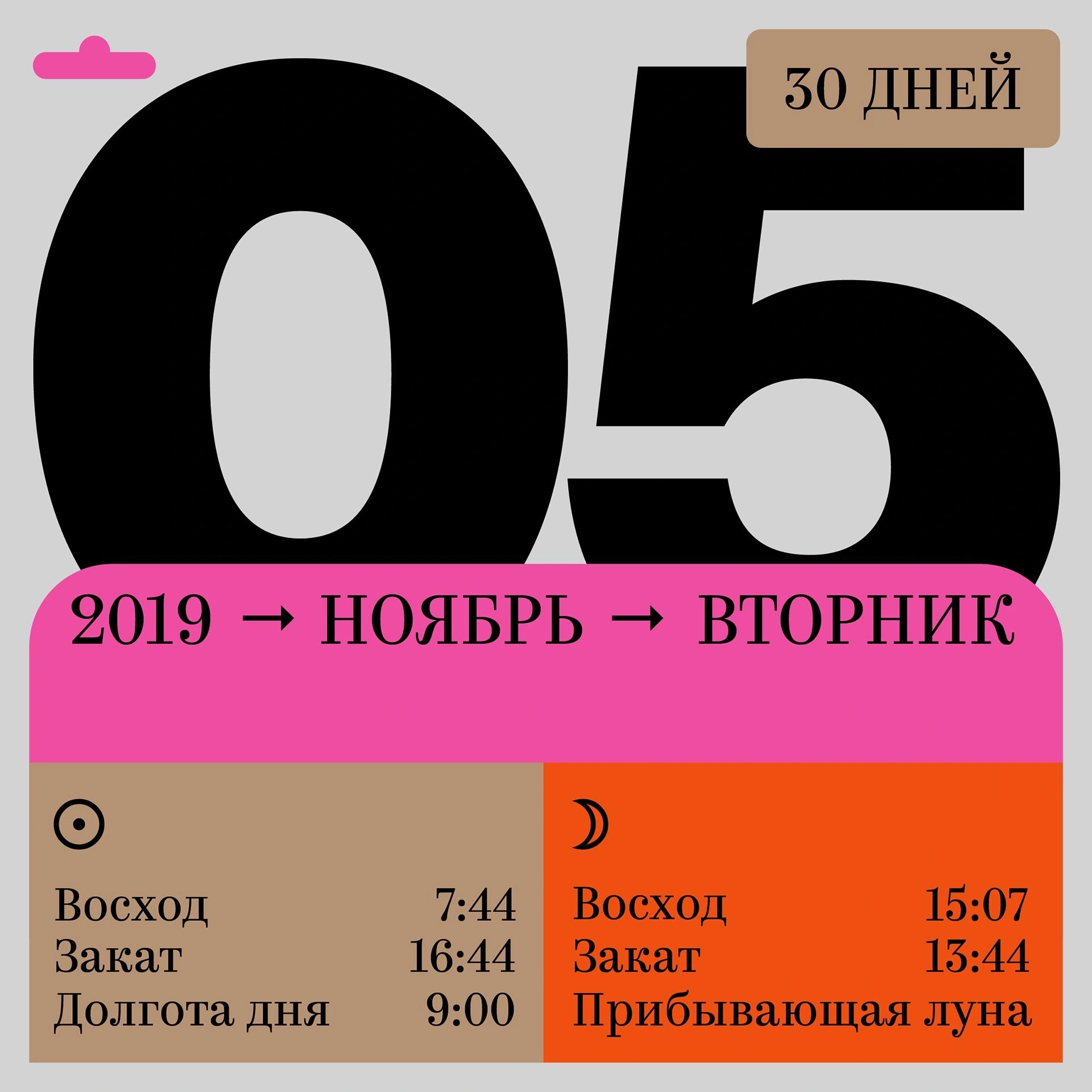
The design is clean, modern, and functional, utilizing a high-contrast palette of black, muted gray, and vibrant pink/orange accents. It effectively uses large, bold numbers to convey a specific date or time context, suggesting an informational or calendrical purpose.
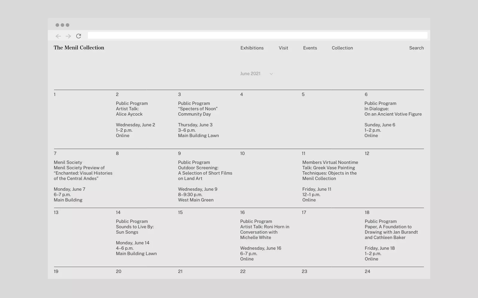
The design is highly functional and minimalist, employing a clear tabular grid structure to present extensive chronological and logistical data. The visual language emphasizes organization, precision, and archival clarity through strong lines and ample white space.
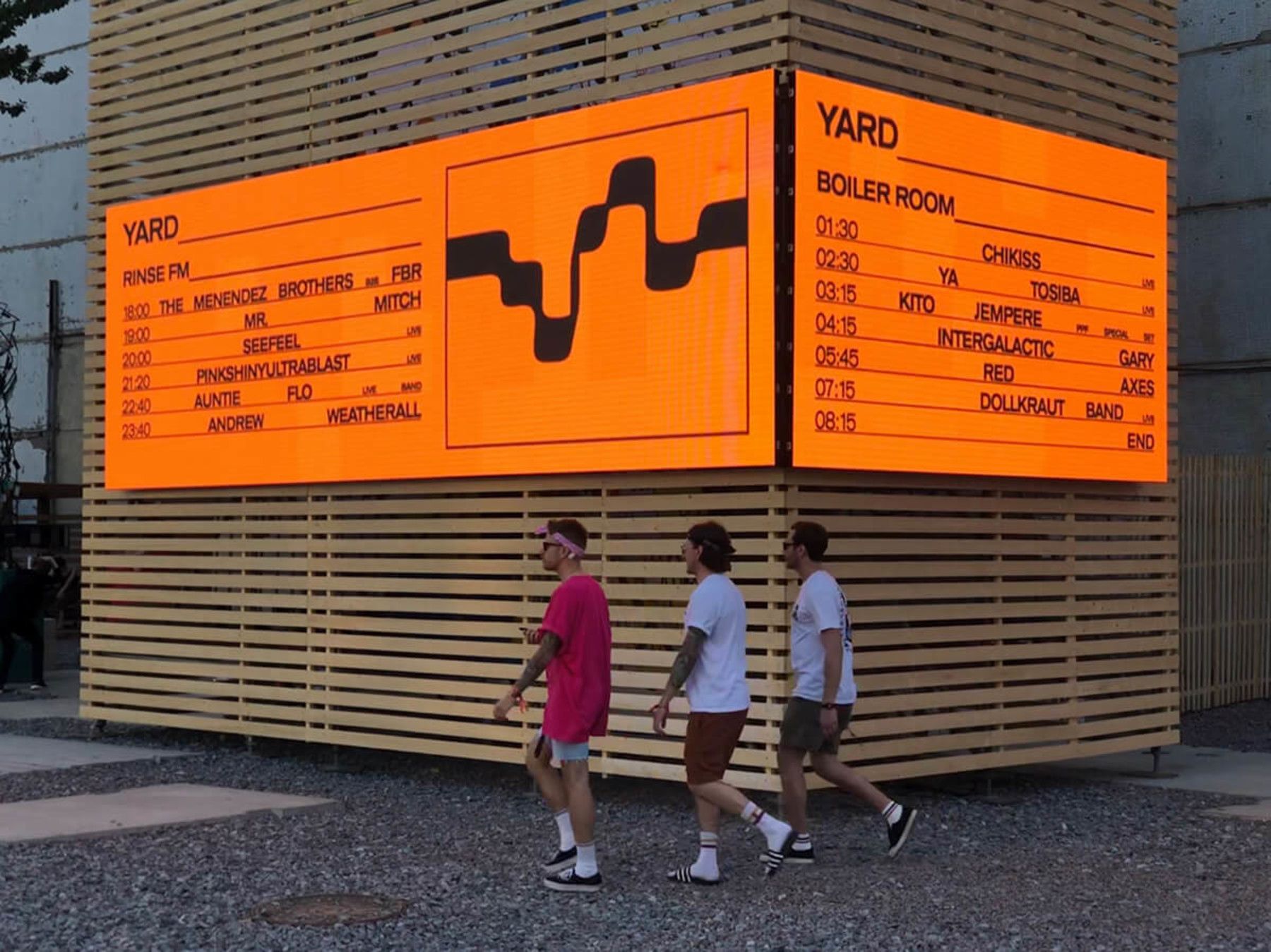
This design utilizes strong material contrast, juxtaposing a vibrant orange schedule against a neutral wooden slat background. The visual language is straightforward and functional, emphasizing legibility and organizational clarity for public display.