environmental reporting
15 designs
Showing 15 of 15 (15 total)

This is a highly structured data visualization designed to present comparative projections related to emissions and planning periods. The visual language is minimalist, relying on clear geometric shapes and distinct color blocks to guide the viewer through complex quantitative information.
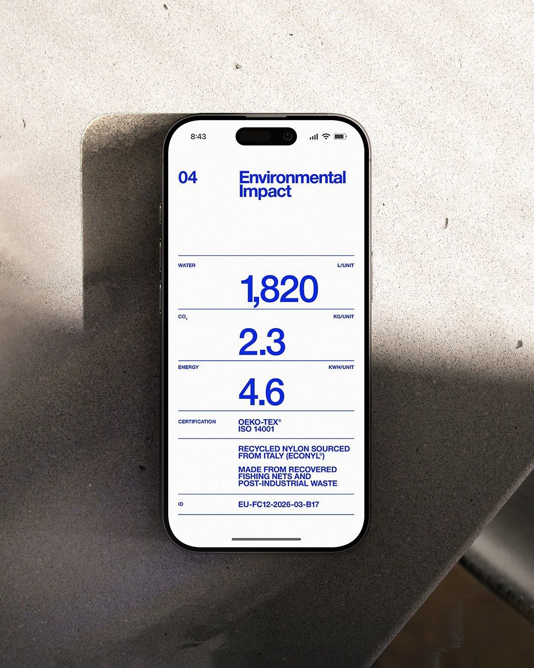
This design utilizes a clean, minimalist aesthetic to present complex environmental data in an easily digestible format. The visual language is highly functional and relies on clear typography and ample negative space to ensure data hierarchy is immediately apparent. The overall feel is professional, transparent, and trustworthy.
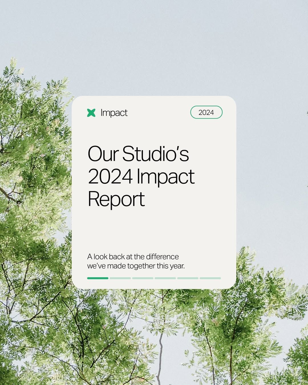
The image features a clean, minimalist digital interface design for a report cover or title screen. It uses ample white space and subtle greenery in the background to convey a natural, professional, and modern aesthetic. The overall feel is light, transparent, and focused on presenting important data.
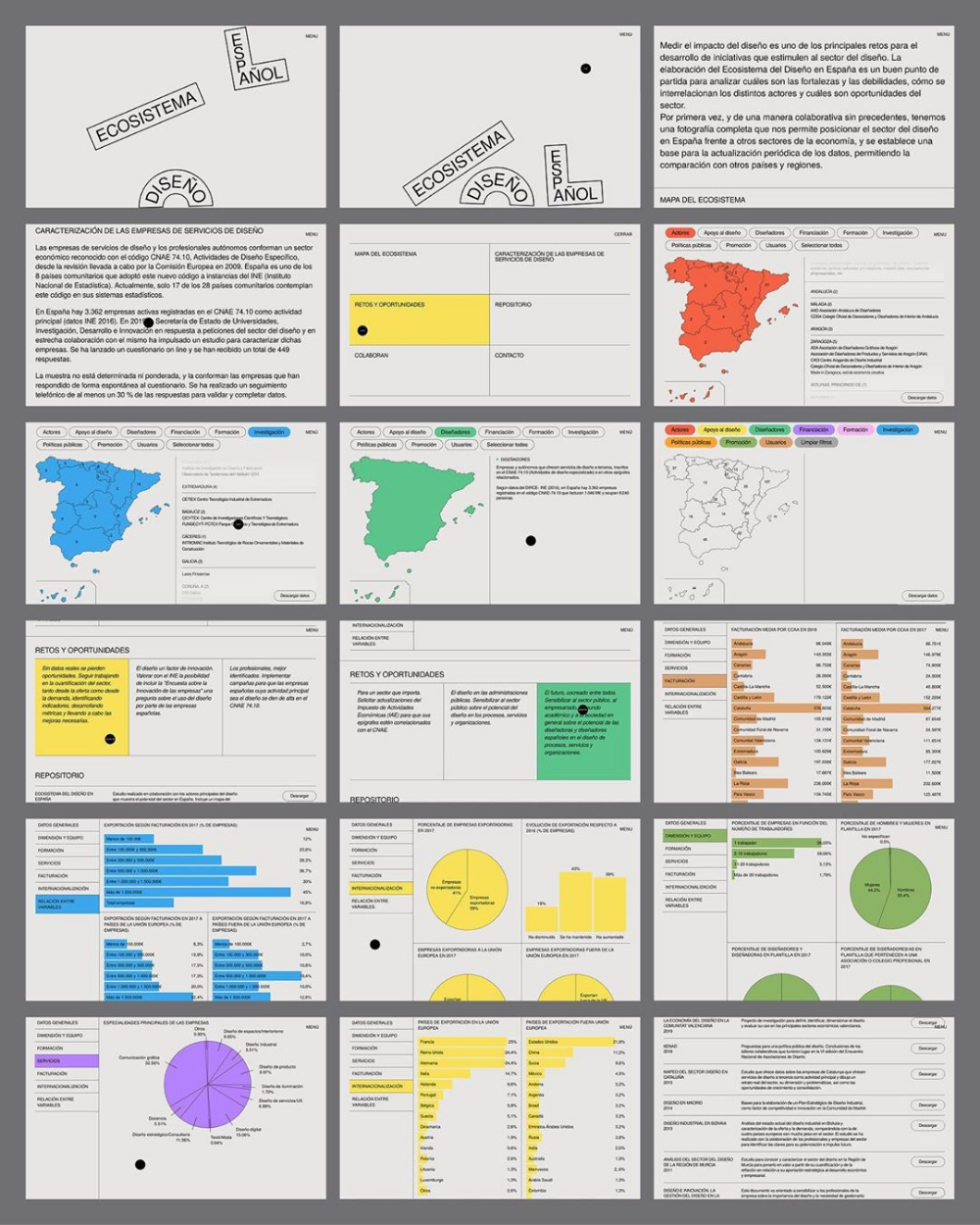
The image presents a dense, academic, and highly structured layout typical of a report or detailed informational website. It uses a muted, professional color scheme with clear segmentation through boxes and charts, conveying a sense of thoroughness and data-driven analysis.
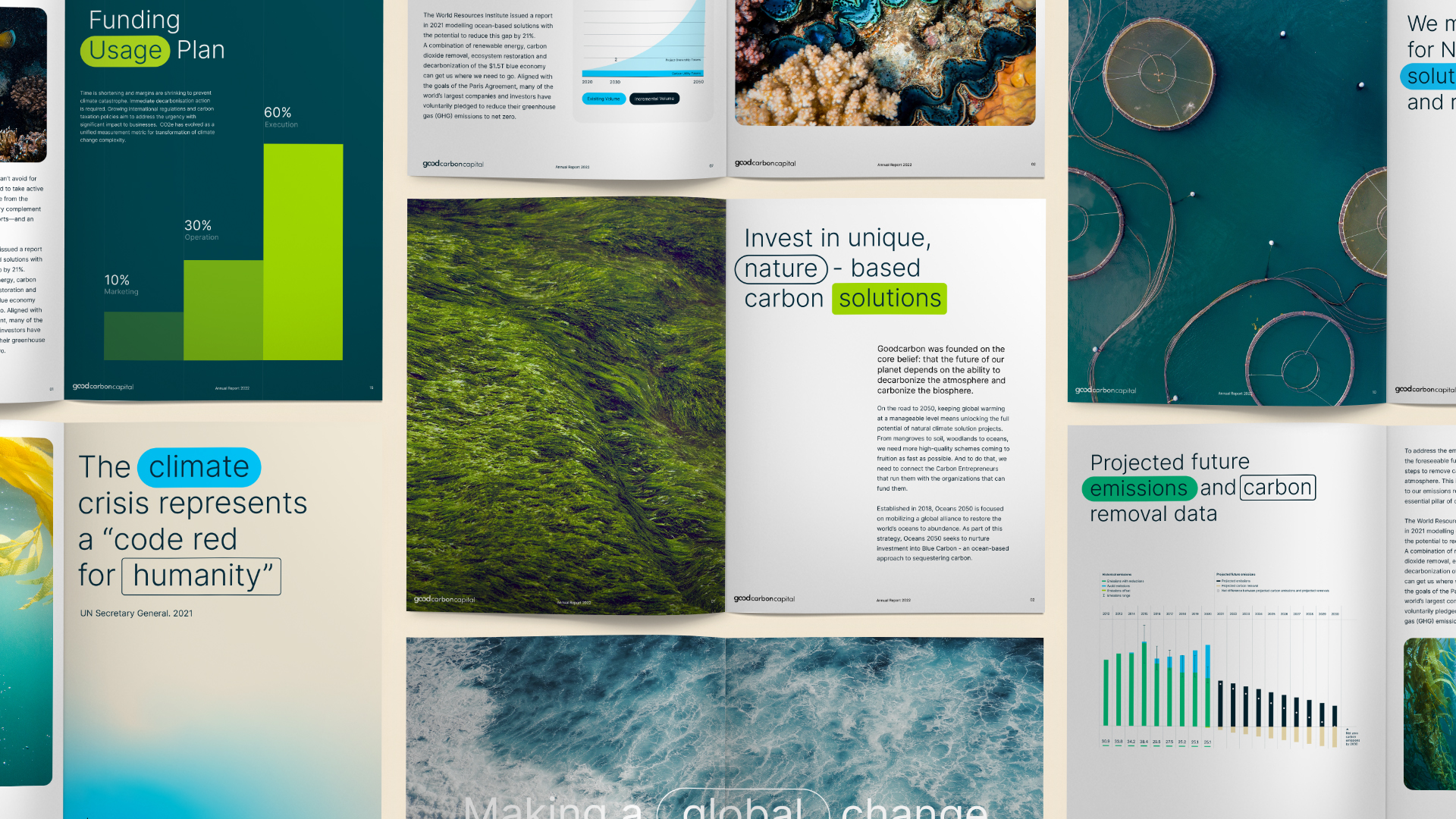
The image displays a series of clean, modern infographic-style pages, characterized by a professional and data-driven aesthetic. The design heavily utilizes white space, strong color blocking for emphasis, and clear visual hierarchy to present complex information in an accessible manner.
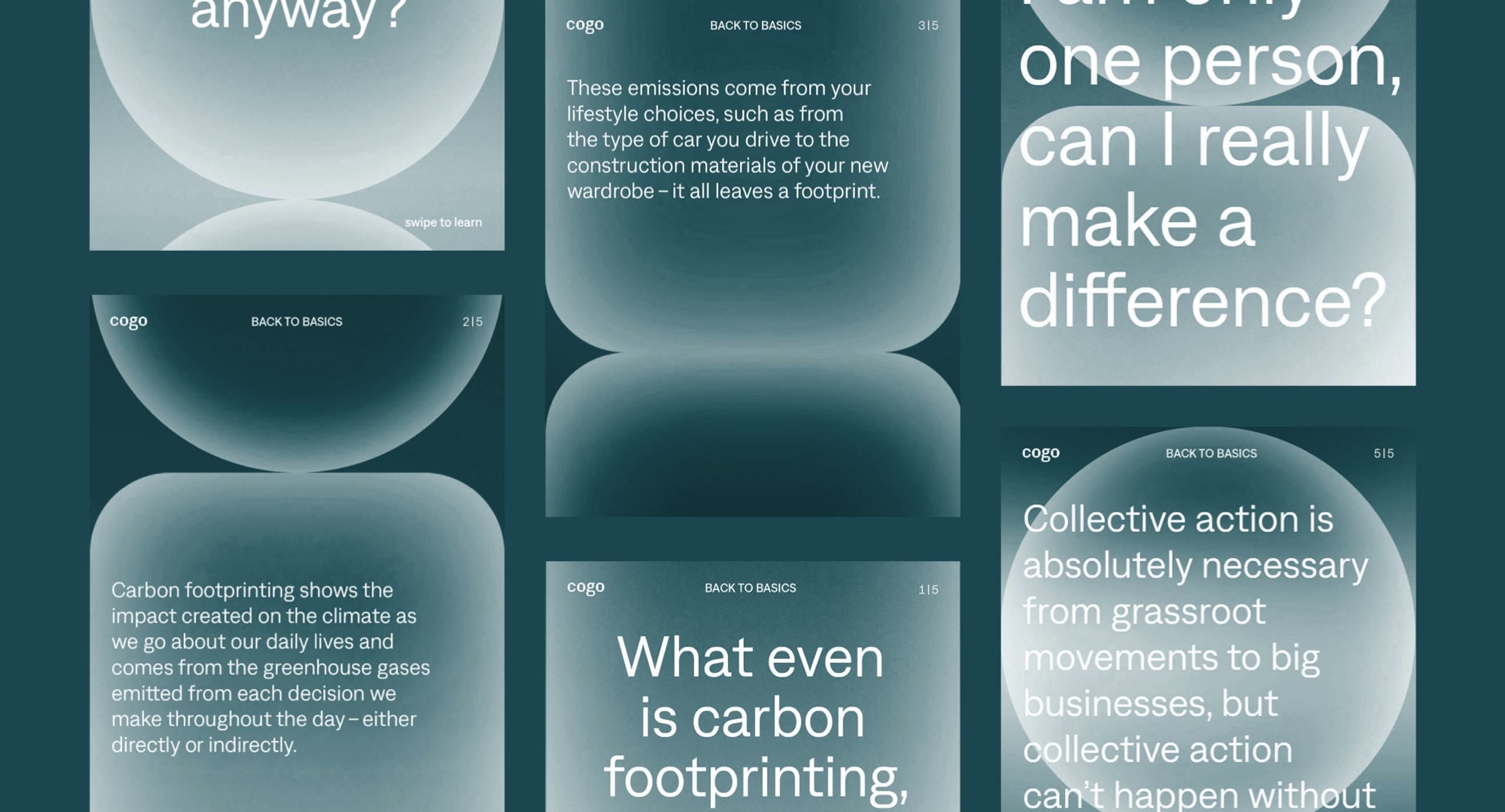
The image presents a clean, minimalist design characterized by large, soft-edged geometric shapes set against a muted, cool color palette. The layout is modular and text-heavy, suggesting an informational or editorial style focused on environmental topics.
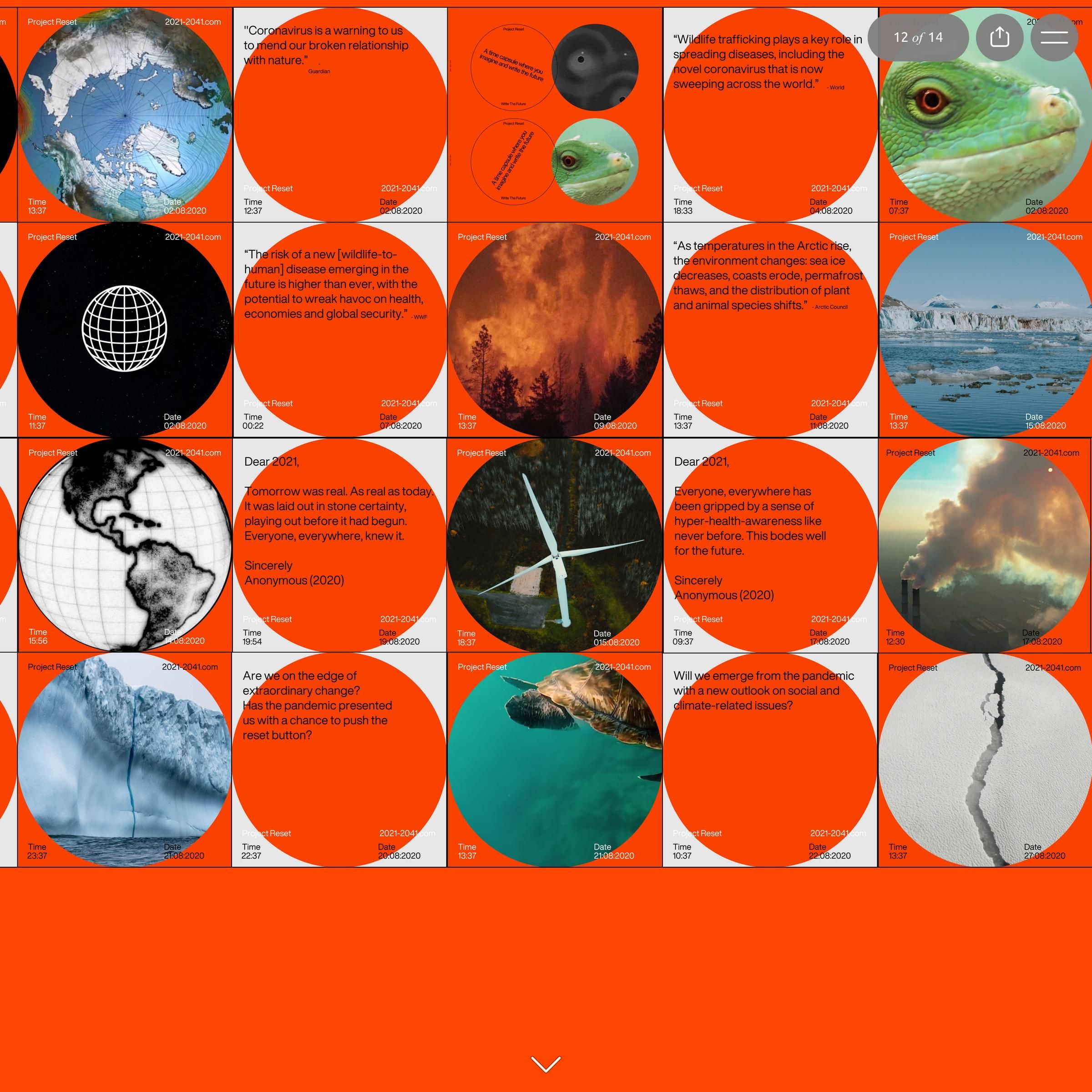
The image presents a highly structured, modular infographic style using a dominant orange background and circular/spherical imagery. The design relies on stark contrast between the vibrant orange and the photographic or graphic elements, suggesting a serious, data-driven, or perhaps scientific/news reporting context.
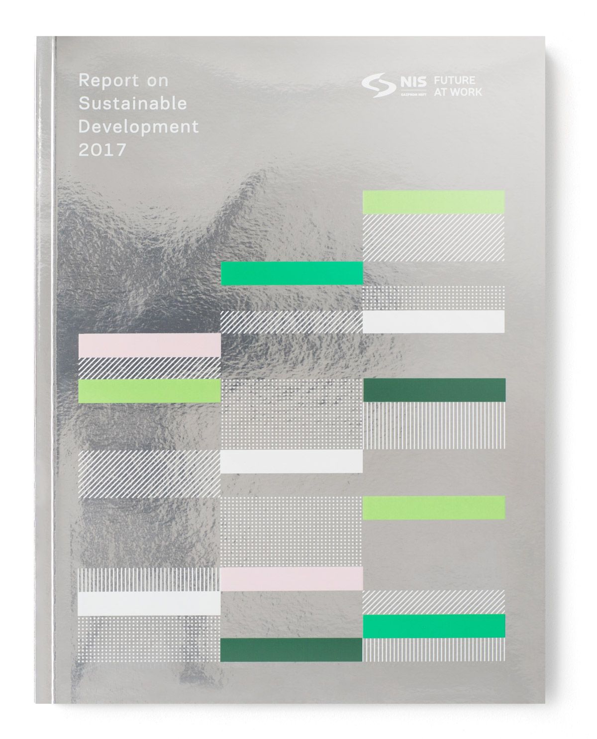
The design is clean, modern, and data-driven, utilizing a monochromatic gray background contrasted by vibrant, segmented color bars to represent quantitative information. The layout is highly structured, resembling a complex infographic or report summary.
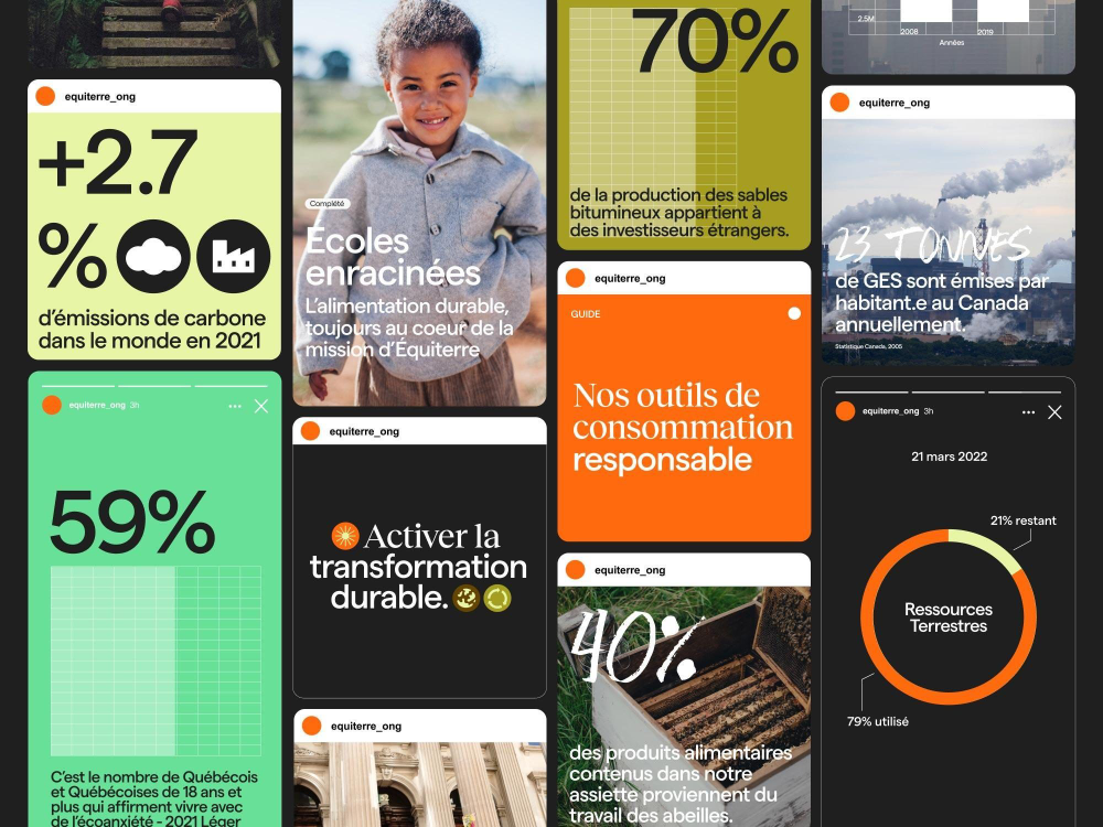
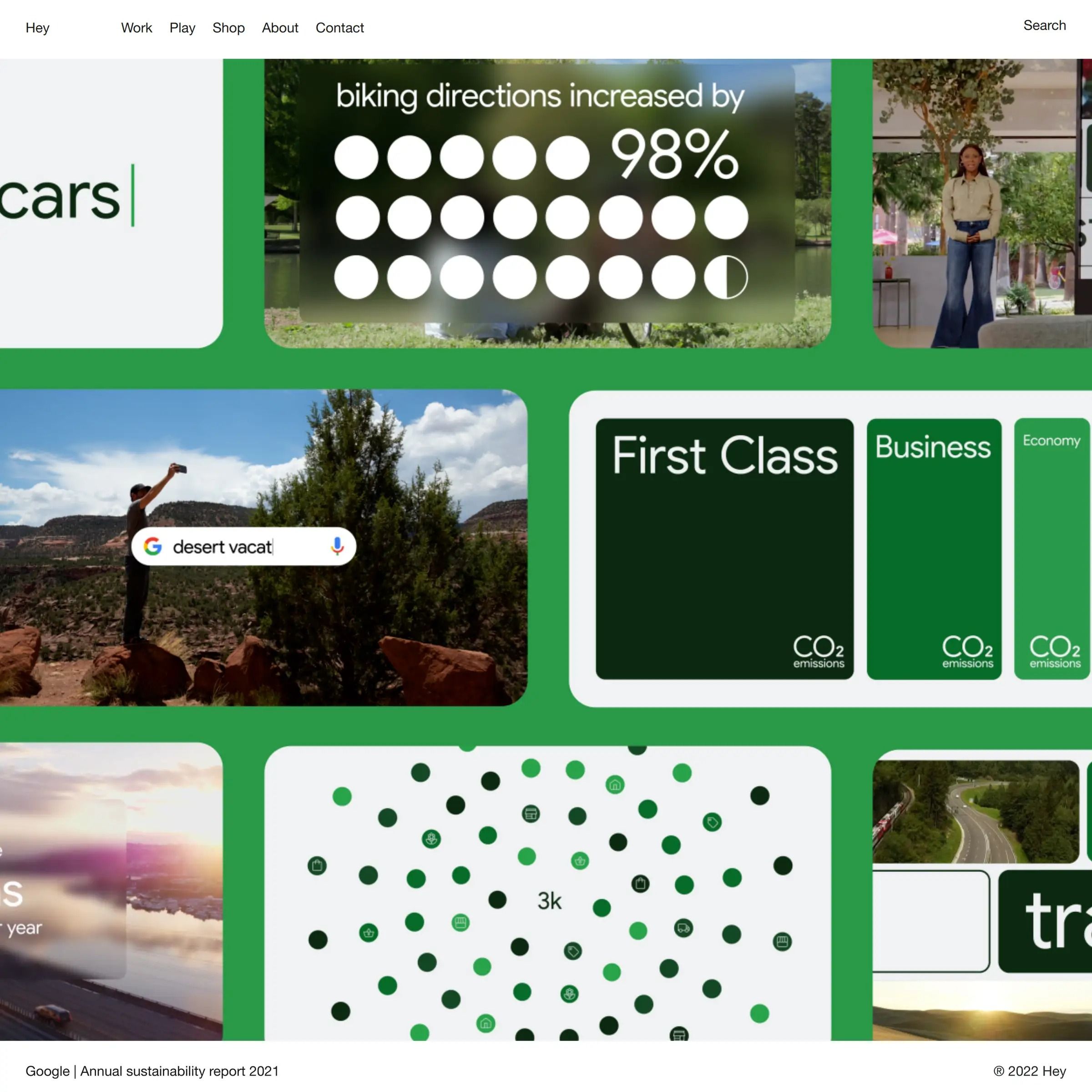
The image is a collage of various infographic-style tiles, likely from a mobile application or website, presenting data related to environmental or sustainability topics. The design is clean, modern, and utilizes strong visual hierarchy through large percentages and clear iconography.
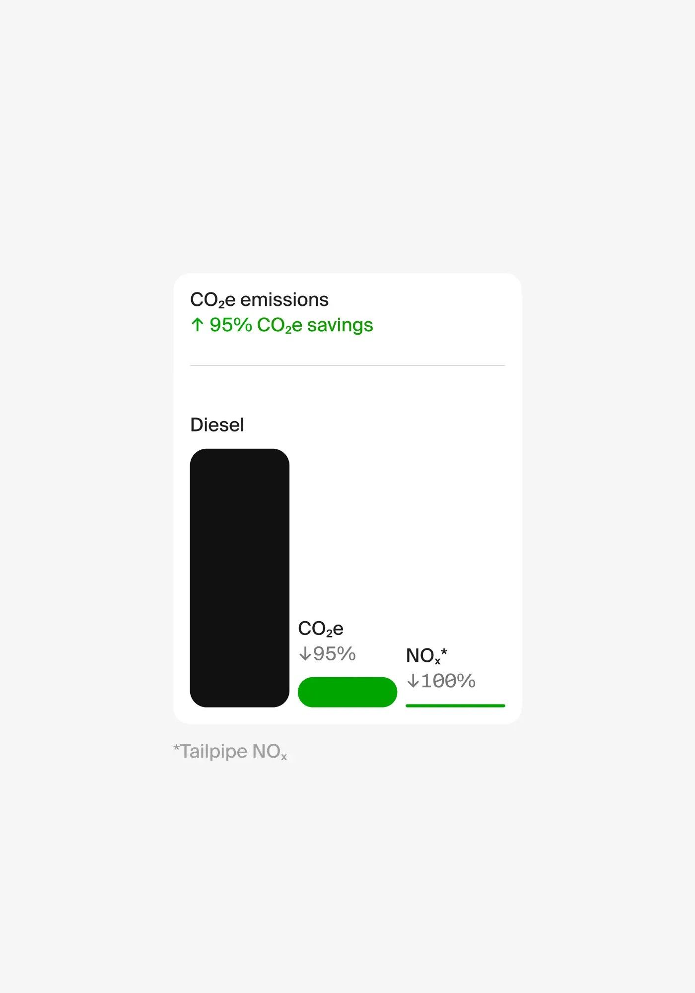
The image presents a minimalist, data-driven infographic style focusing on environmental savings. It uses stark contrast between black and green to visually represent positive outcomes, creating a clean and direct communication of performance metrics.
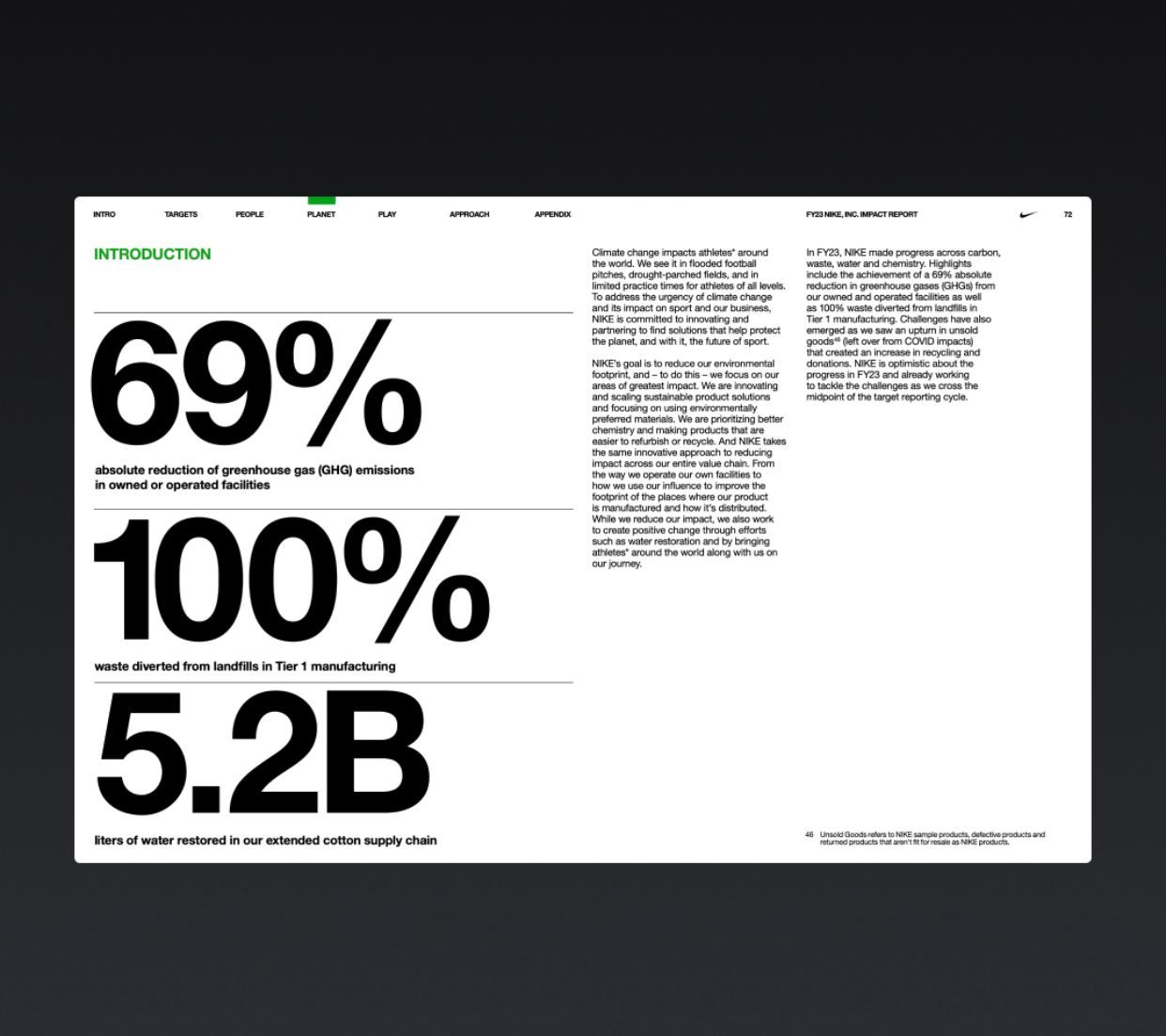
This is a clean, high-impact data visualization slide utilizing large typography and strong contrast to present critical environmental statistics. The design is highly professional, prioritizing clarity and the immediate impact of the metrics.
This design employs a clean, modular layout characterized by strong color blocking and clear segmentation of data. The visual language is modern and informative, using environmental green tones to convey themes of sustainability and natural resources. The overall feel is professional, organized, and data-driven.
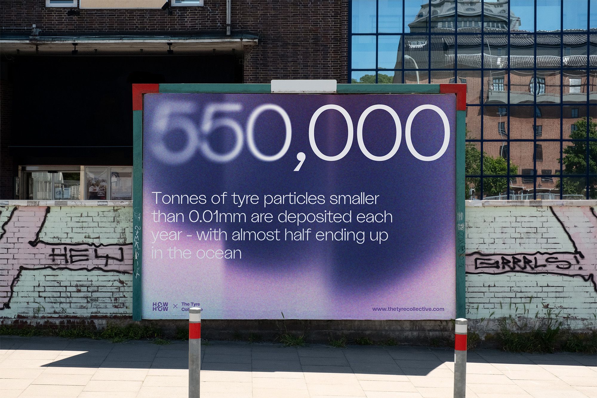
The design is a clear, highly legible informational sign utilizing strong color contrast to highlight statistical data. It employs a clean, modern visual language suitable for public education or scientific reporting, balancing precise numbers with accessible text.
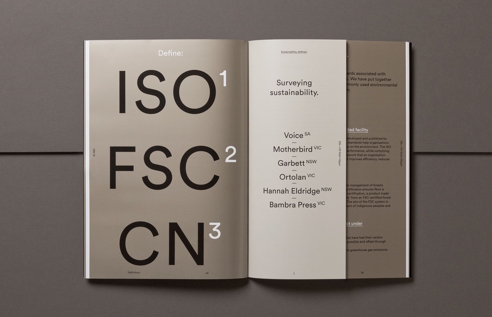
This design exemplifies high-level corporate minimalism, using strong typographic hierarchy and substantial negative space to present complex technical standards clearly. The visual language is clean, structured, and authoritative, emphasizing clarity over decorative elements.
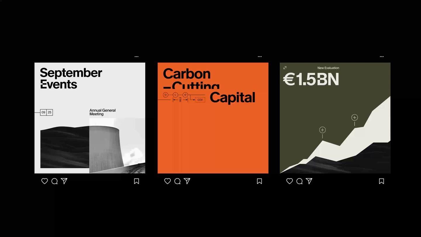
This design employs a modern, corporate visual language utilizing bold color blocking and minimalist data visualization to present key information. The layout is highly structured, dividing complex financial and event data into distinct, digestible panels against a dark background.