environmental monitoring
6 designs
Showing 6 of 6 (6 total)
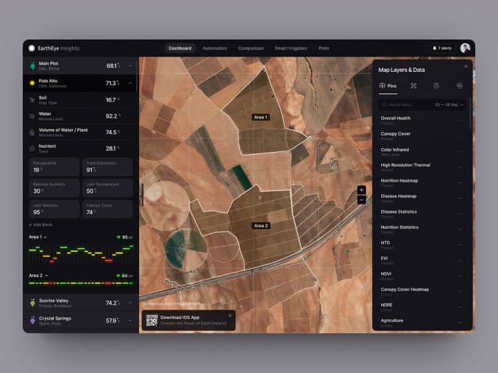
This dashboard features a professional, data-intensive design utilizing a dark theme to emphasize the geospatial imagery. The visual language is clean and functional, prioritizing clear data presentation over decorative elements to create an analytical and immersive user experience.
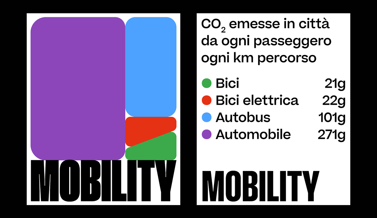
This graphic employs a clean, blocky design to present quantitative data related to urban mobility and CO2 emissions. The visual language is minimalist and relies on strong color blocking and clear typography to organize complex information effectively.
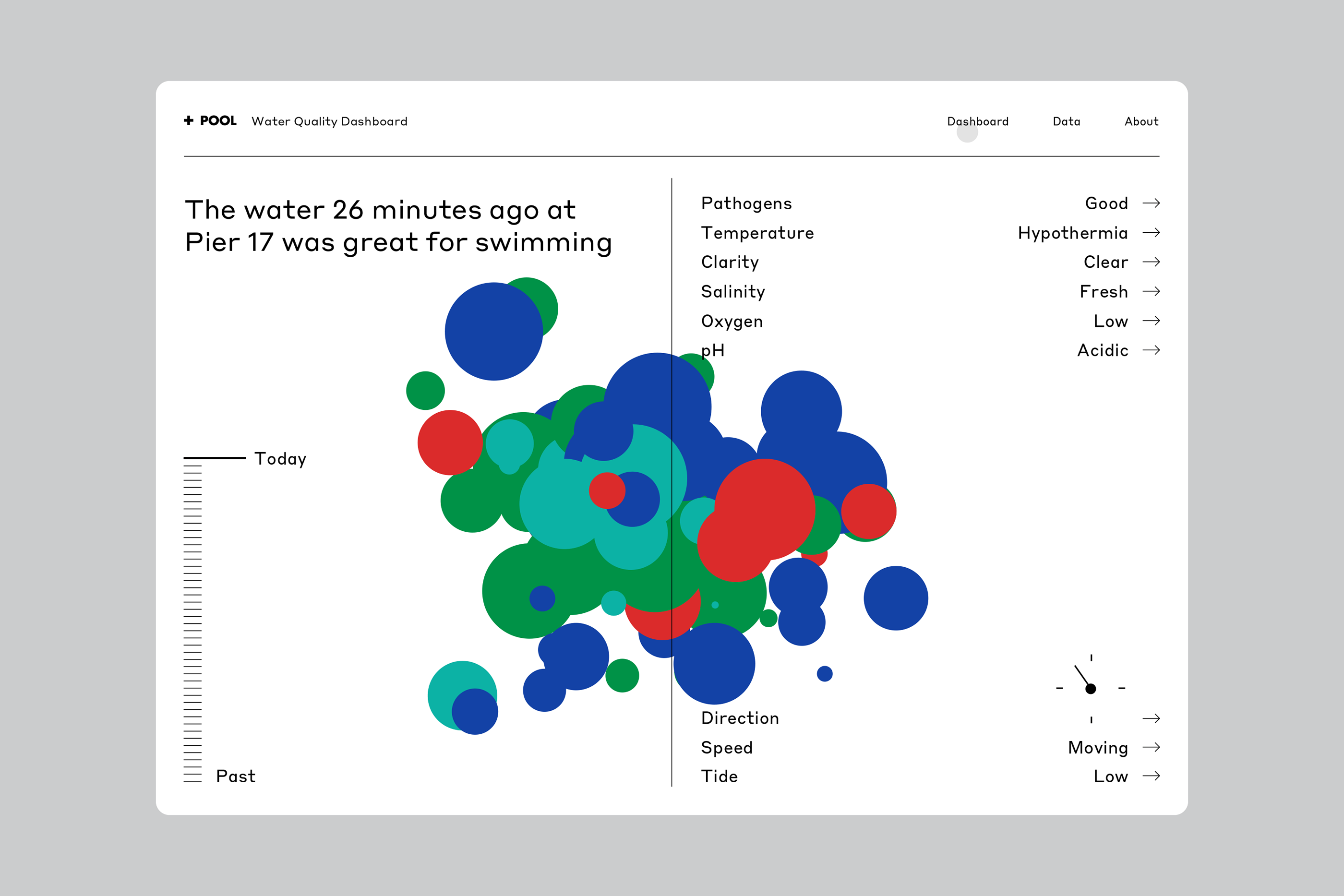
This is a data visualization dashboard presenting water quality metrics using a scatter plot or bubble chart format. The design is clean, functional, and uses color coding effectively to represent different parameters for a specific event (water quality).

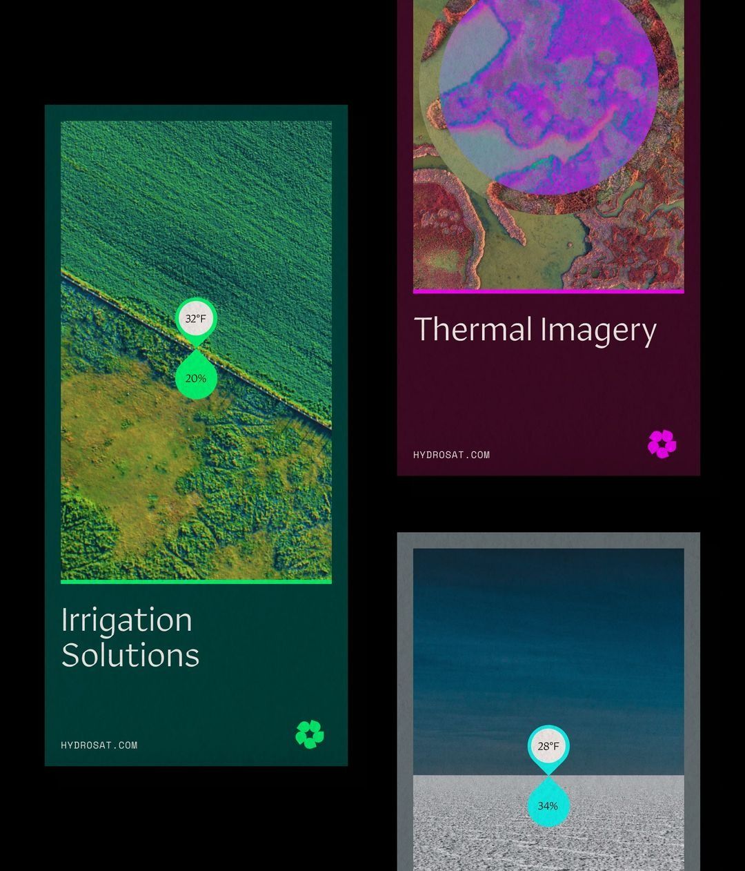
This is a modular, data-driven presentation showcasing environmental and thermal imagery. The design utilizes a dark background with vibrant, specific color accents to clearly separate different types of scientific data visualizations.
This design utilizes a dark, high-contrast aesthetic to present technical data visualizations related to agricultural and environmental monitoring. The visual language is clean, precise, and highly informational, effectively using color and spatial division to differentiate between thermal imagery and other metrics.
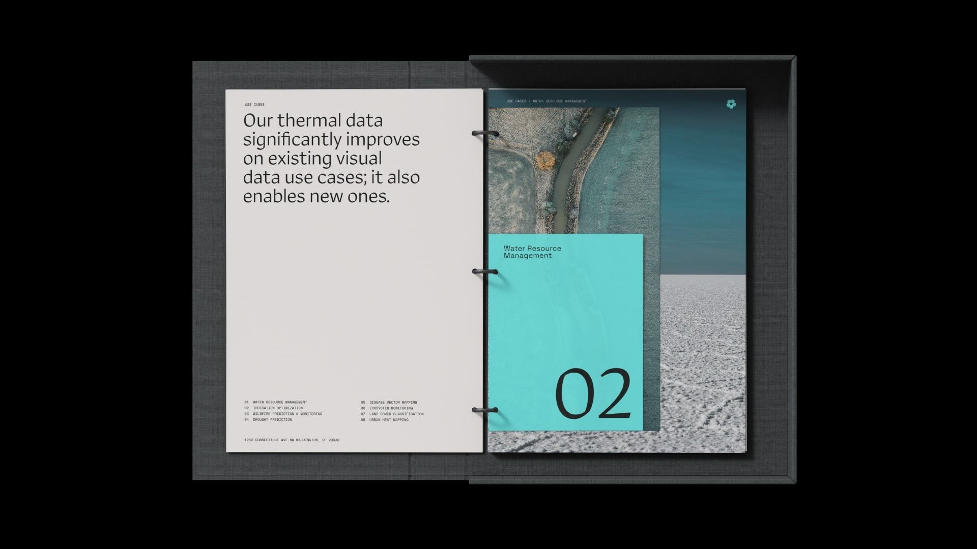
This presentation design employs a clean, minimalist aesthetic suitable for technical or corporate contexts, using strong typography and clear visual hierarchy to present complex data concepts. The split layout effectively balances explanatory text with impactful visual examples, creating a professional and trustworthy feel.