energy statistics
2 designs
Showing 2 of 2 (2 total)
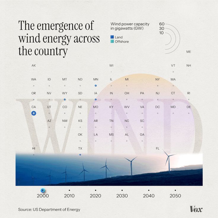
This is an infographic-style visualization tracking the projected wind power capacity across various US regions over time. It uses a clean, minimalist design with subtle gradients and clear data points to convey complex environmental and energy statistics effectively.
infographicdata visualizationminimalist
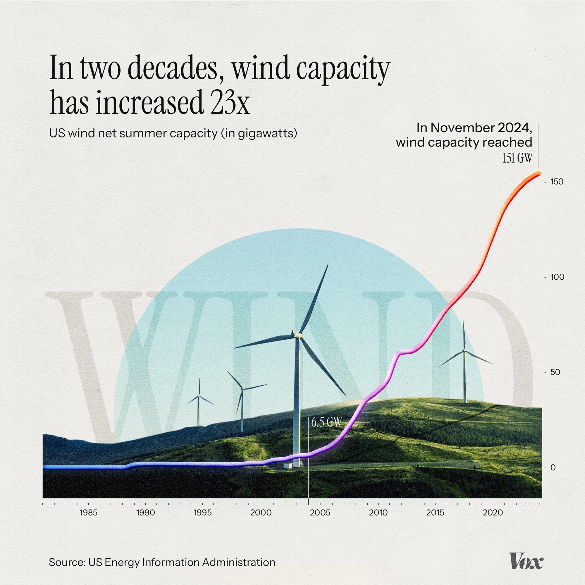
This is an infographic visualizing the exponential growth of US wind energy capacity over two decades, using a clean, modern line graph overlaid on a subtle landscape silhouette. The design effectively communicates a significant trend using clear data visualization principles.
infographicline graphdata visualization