directory
14 designs
Showing 14 of 14 (14 total)
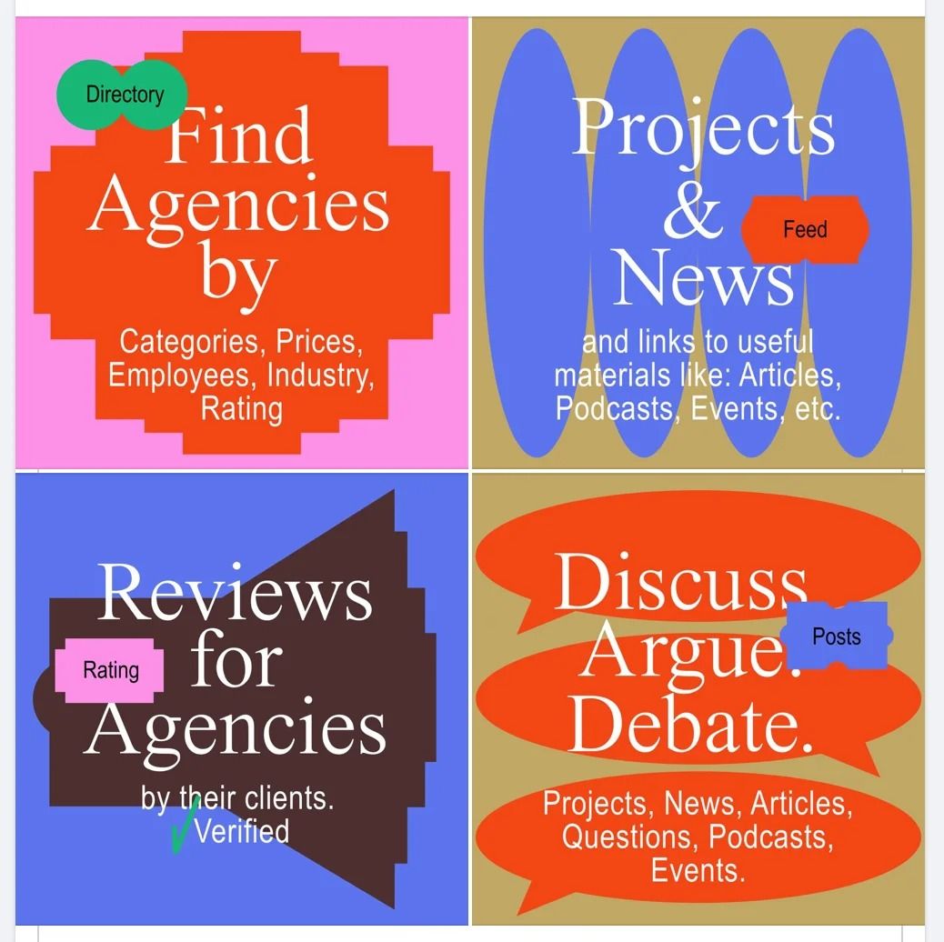
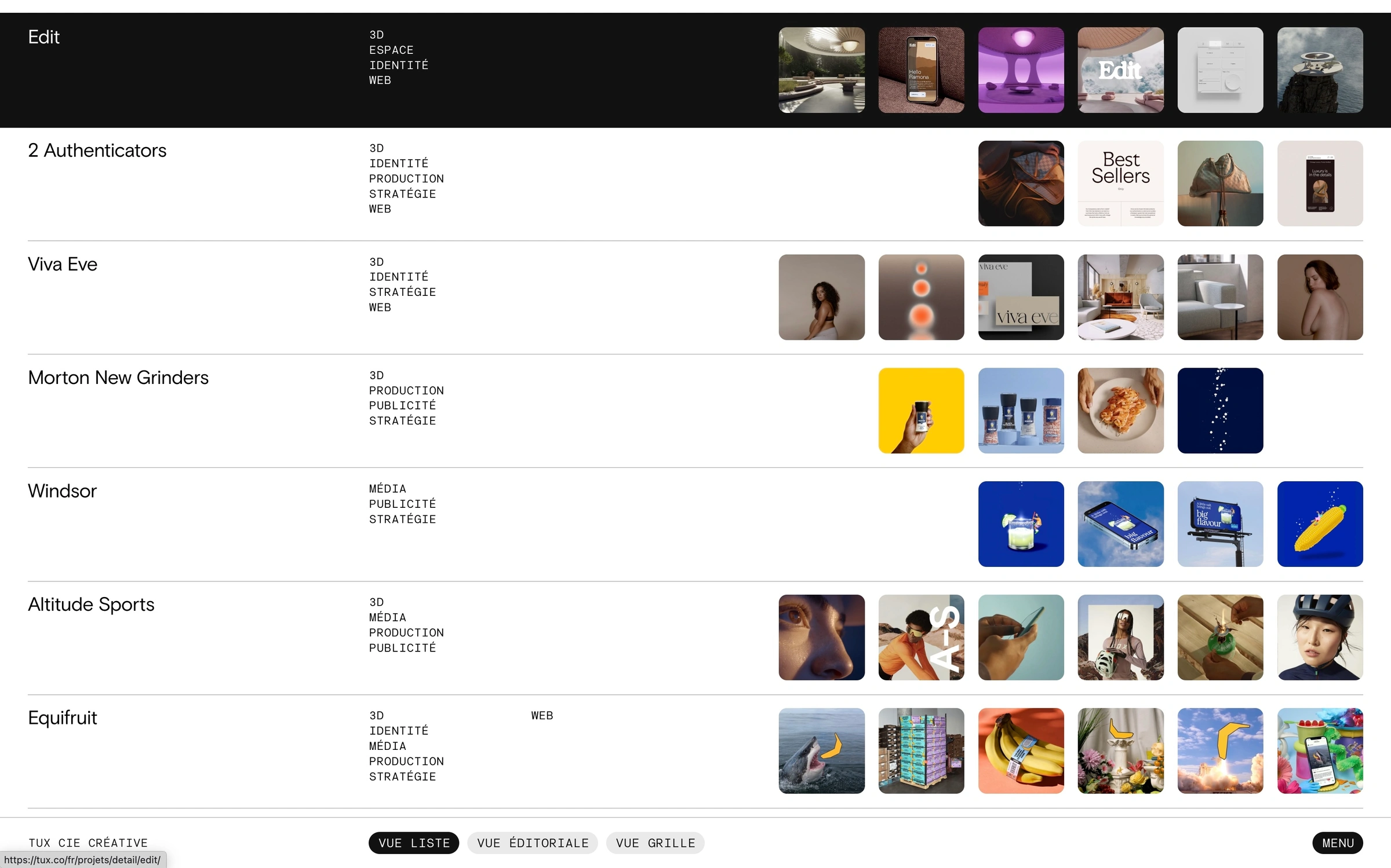
This design utilizes a vibrant, segmented grid layout to present distinct functional categories clearly. The visual language is bold and direct, relying on strong color blocking to separate information silos effectively. It conveys a sense of organized utility and professional transparency.
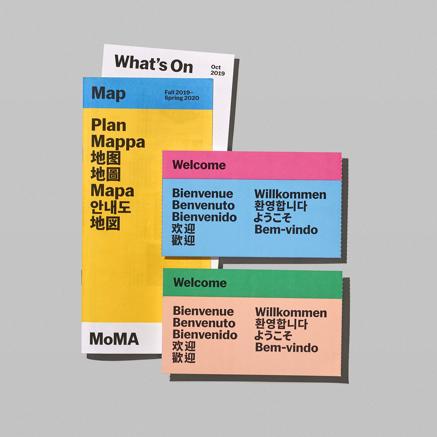
This design utilizes a clean, block-based visual language to organize information hierarchically. The layout is highly segmented using distinct blocks of color, creating a modern and structured feel while incorporating multilingual text for accessibility.
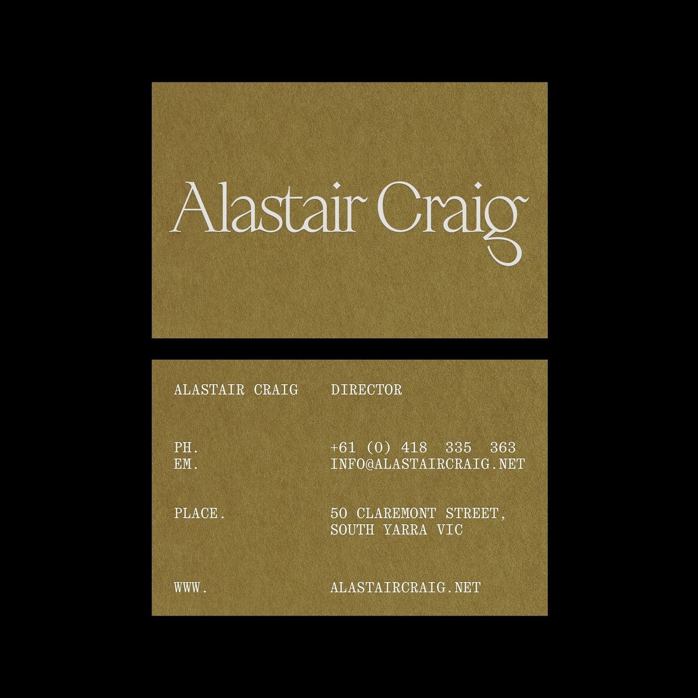
This design employs a sophisticated minimalist approach, relying on high contrast between the earthy background and clean serif typography to convey professionalism. The visual language is grounded and classic, utilizing texture and negative space effectively to ensure all contact information is clearly legible.
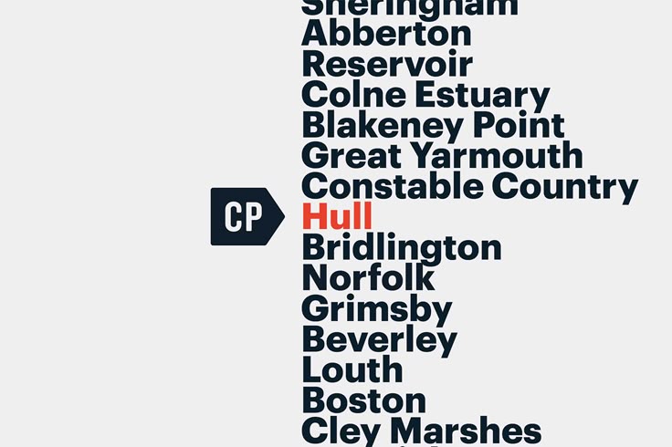
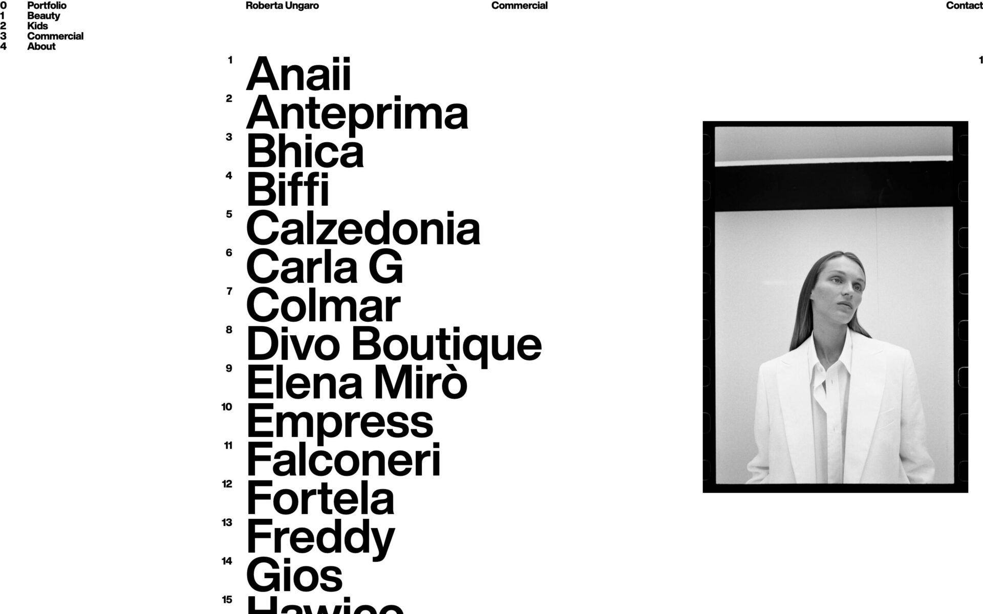
The image presents a stark, text-heavy list format, suggesting an index, directory, or perhaps a historical record. The design is minimalist and functional, relying entirely on typography and negative space to convey information.
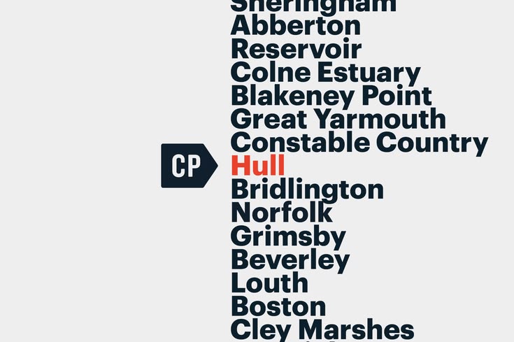
The image presents a stark, text-heavy list format, suggesting an index, directory, or perhaps a historical record. The design is minimalist and functional, relying entirely on typography and negative space to convey information.
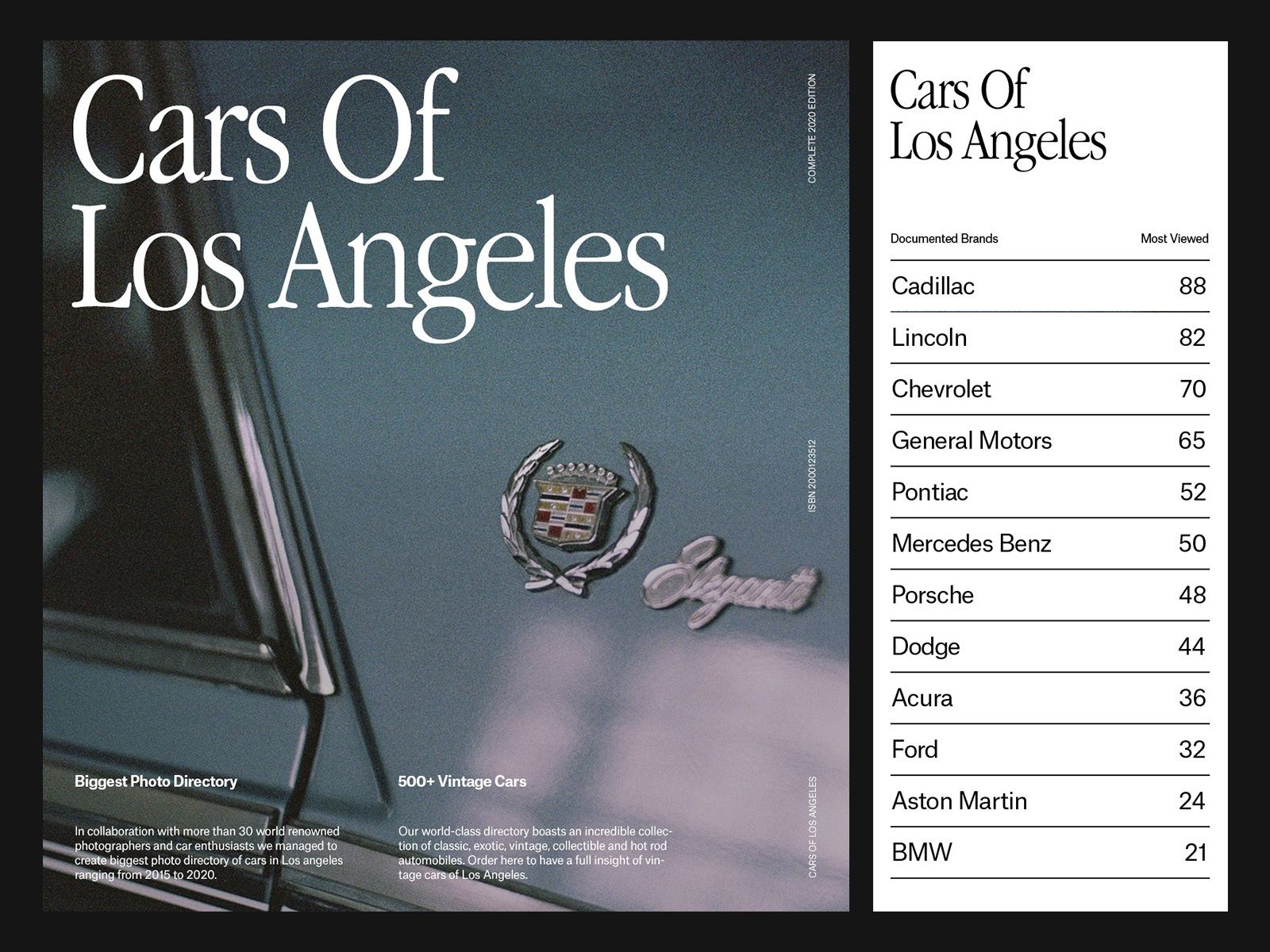
This image functions as a directory or ranking list for cars, employing a clean, professional, and somewhat classic aesthetic. The design balances large, bold typography with subtle graphical elements like emblems to convey authority and automotive focus.
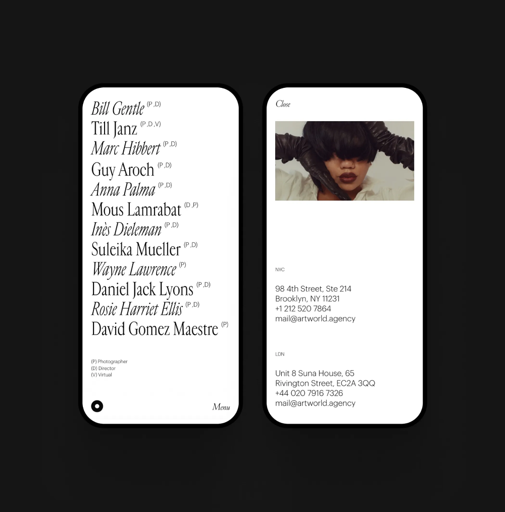
The image displays a clean, minimalist interface design, likely for a contact list or directory, characterized by high contrast and ample white space. The layout is structured vertically with clear separation between names and contact details, conveying a professional and organized feel.
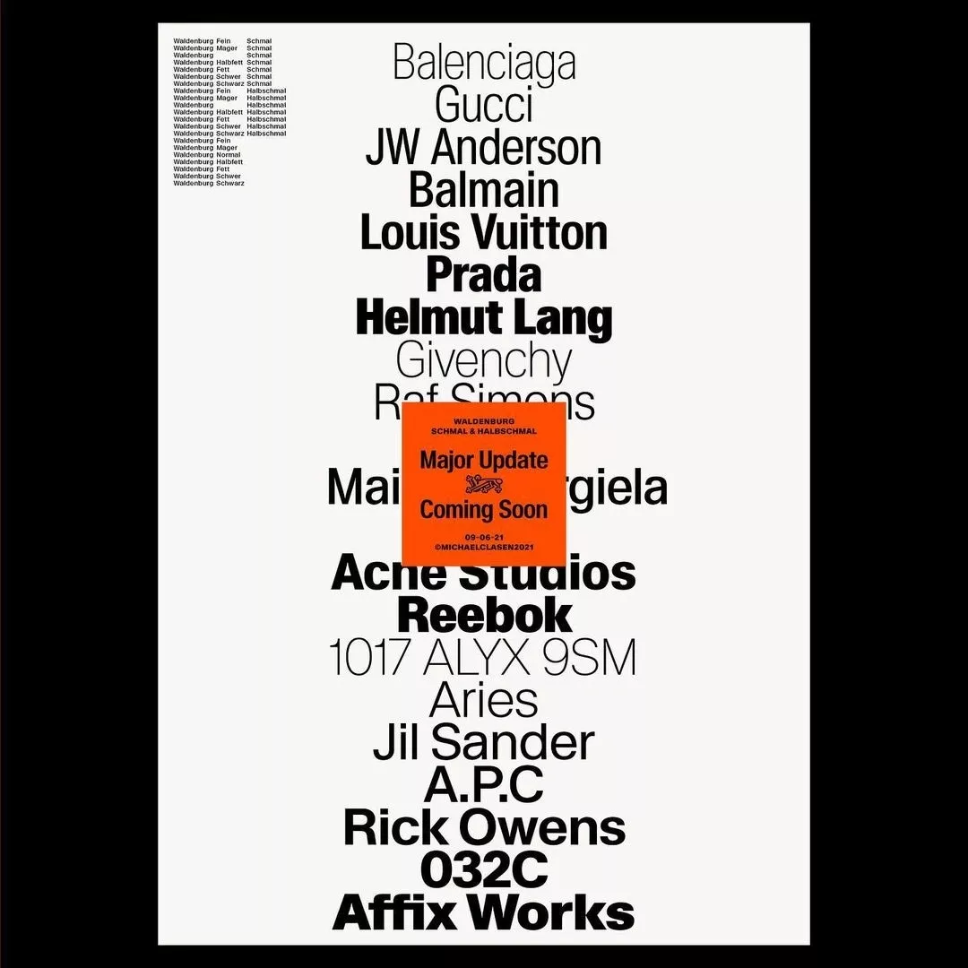
This image presents a stark, text-heavy list or directory format, characterized by a minimalist and utilitarian design. The layout relies entirely on stacked typography to convey information, resulting in a dense yet clean visual hierarchy.
The image presents a clean, professional interface, likely for a directory or portfolio platform, characterized by a grid-like structure of profiles. The design employs a muted, sophisticated color palette with high contrast elements to separate information clearly.
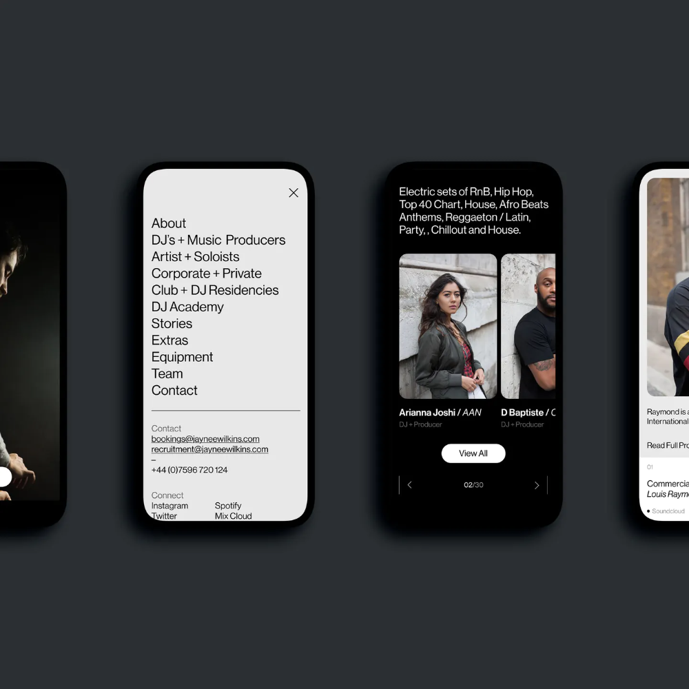
The image displays a dark-themed mobile application interface, likely for a music or entertainment industry service. The design is clean, modern, and professional, utilizing high contrast between dark backgrounds and bright white text to create a sophisticated and focused user experience.
The image presents a stark, minimalist list of names set against a clean white background, suggesting a formal directory or catalog. The design relies heavily on simple black typography and ample negative space to create a sense of order and sobriety.

The image presents a clean, modern, and organized layout featuring circular profile icons against a light background. The design uses a limited color palette dominated by shades of blue and green to create a professional and trustworthy aesthetic.
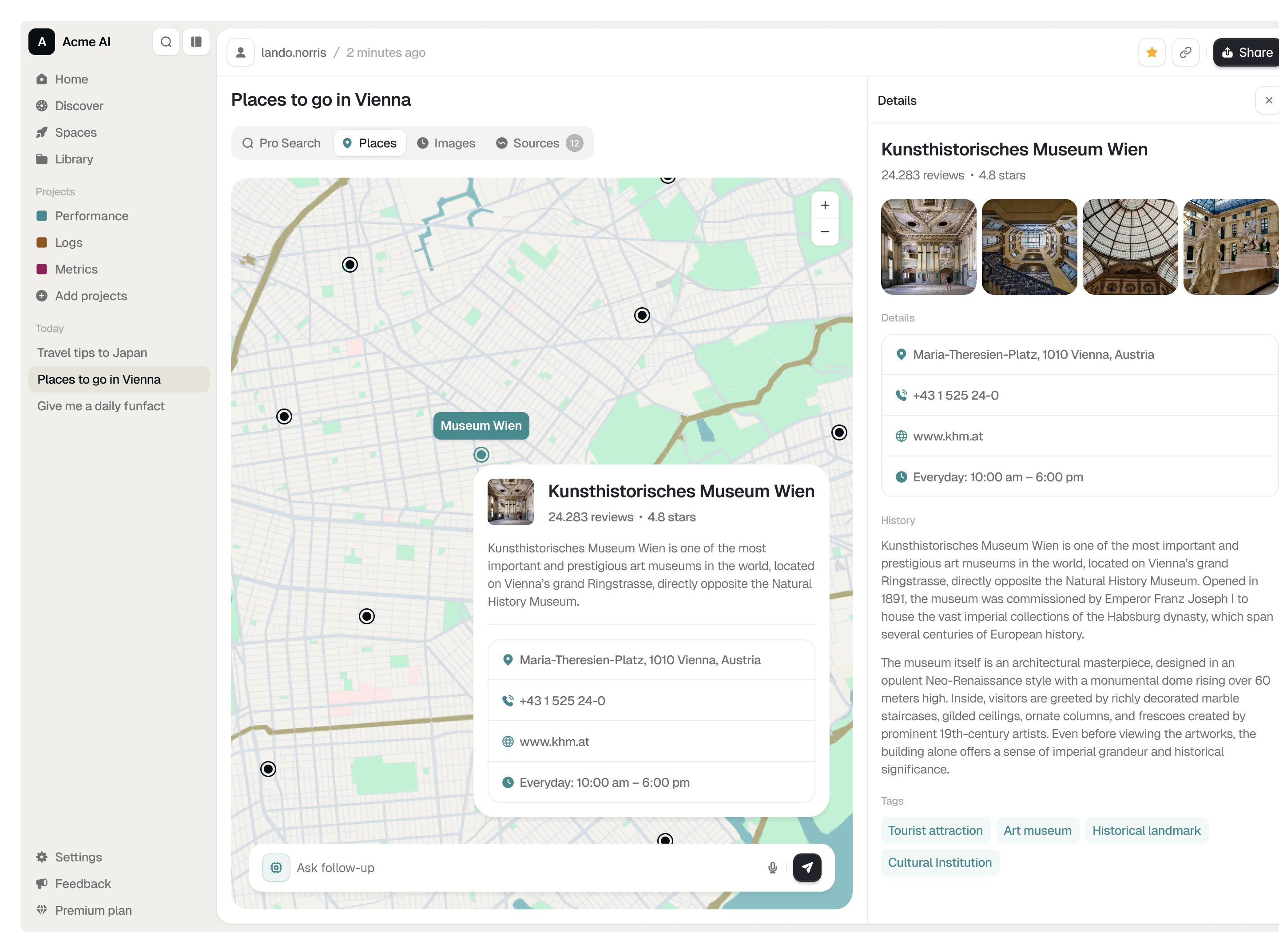
The interface employs a clean, modern design characterized by ample white space and clear visual hierarchy, making complex geographical and historical information easily accessible. The language is highly functional, prioritizing navigation and data presentation over decorative elements.
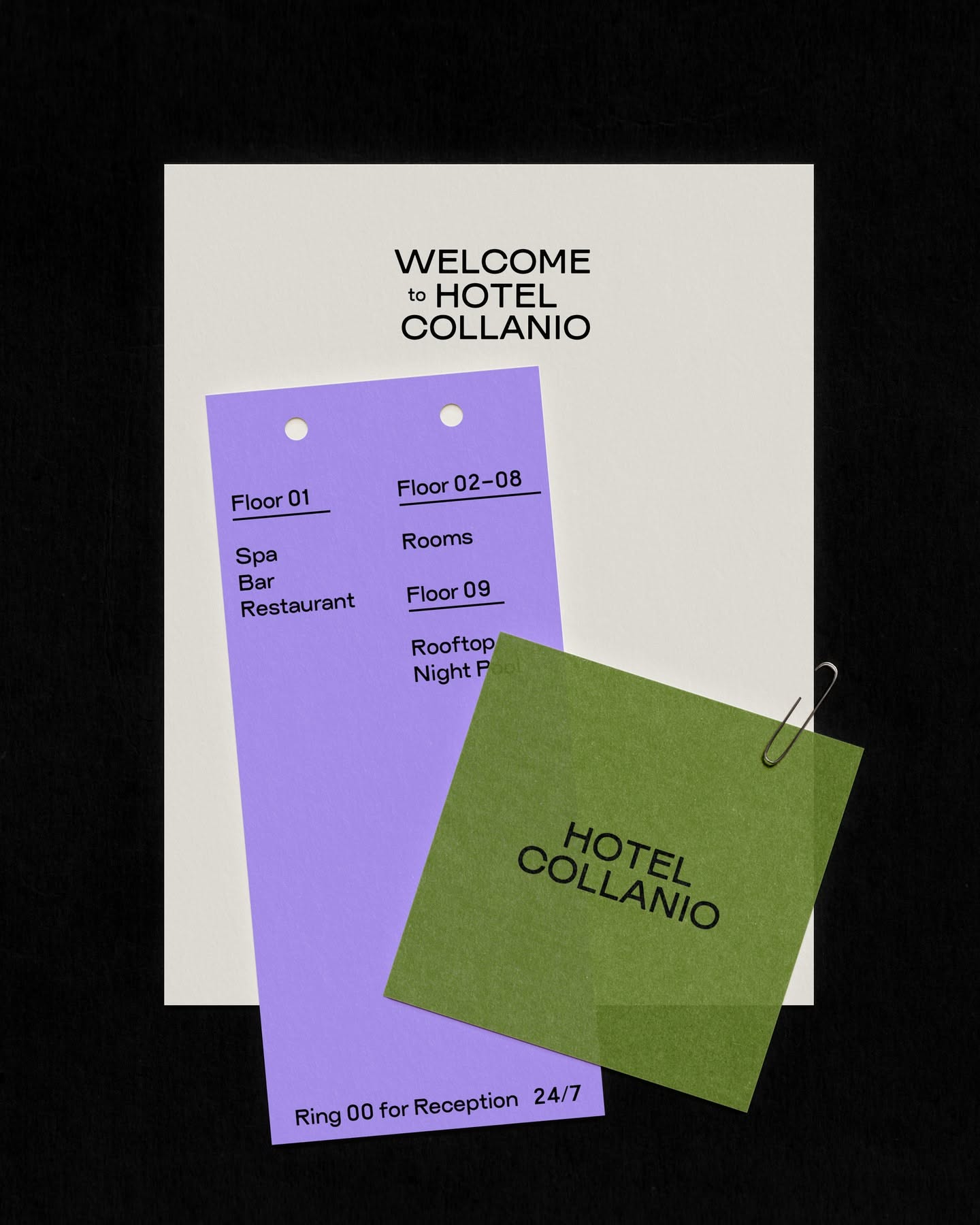
This design utilizes a clean, layered graphic approach with distinct color blocking to organize navigational information. The visual language is modern and structured, employing soft pastel tones contrasted with a deep accent green to create clear hierarchy.