creative technology
9 designs
Showing 9 of 9 (9 total)
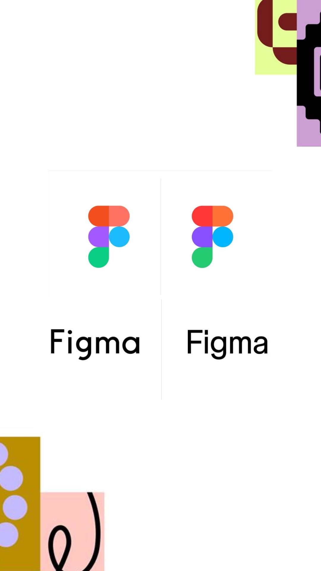
This visual presents a clean, modern layout emphasizing branding and clarity through simple geometric icons and typography. The design utilizes a vibrant yet controlled color palette to create a professional and engaging aesthetic suitable for software or creative industries.
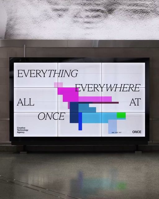
This display utilizes a stark, high-contrast visual language combining clean typography with abstract, colorful data visualization elements. The design is highly minimalist and geometric, suggesting a modern approach to conveying complex concepts or branding messages.
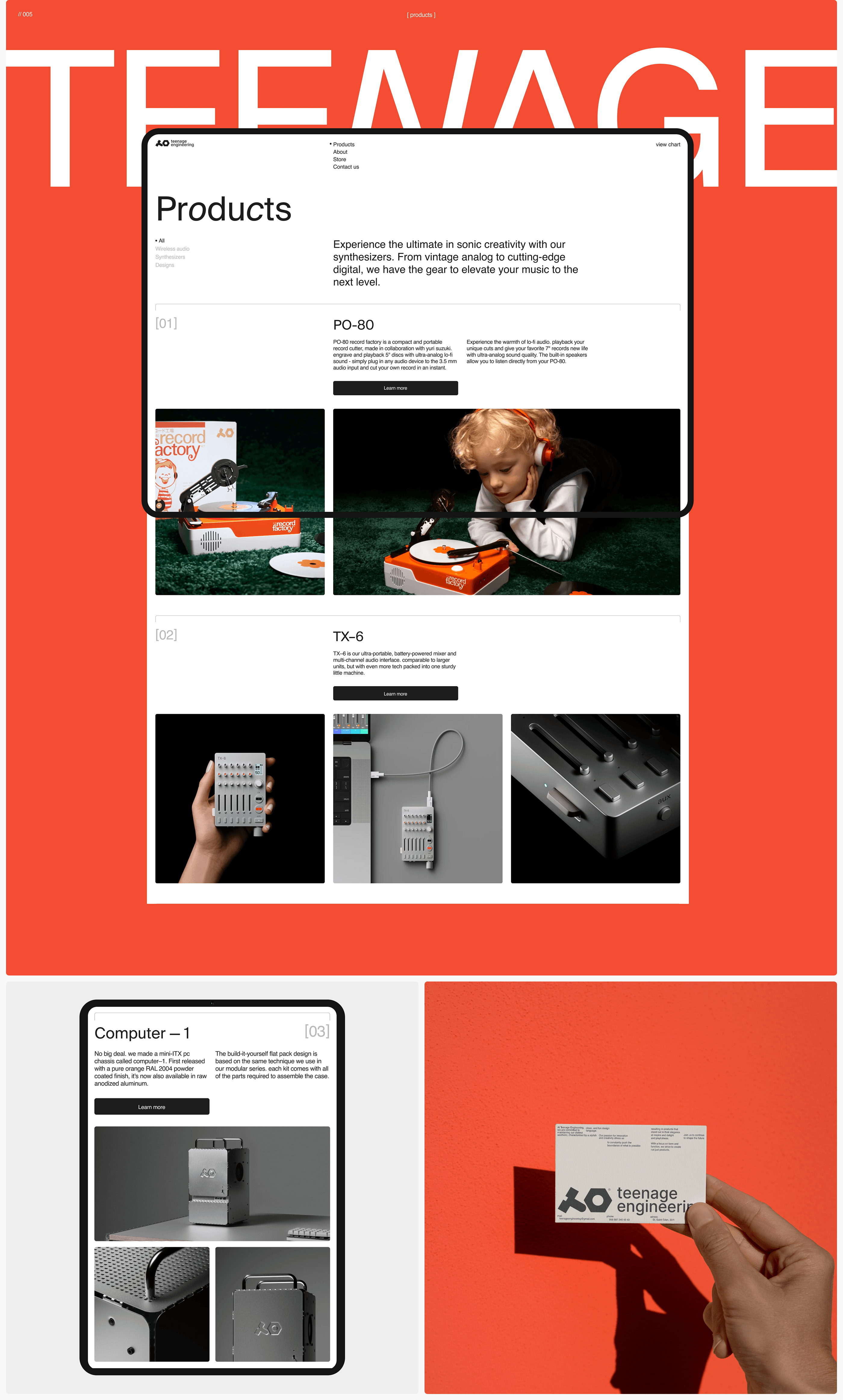
This design utilizes a bold, high-contrast visual language dominated by warm orange tones against stark white text and product imagery. The layout is clean and structured, effectively guiding the viewer through a clear hierarchy of products and information.
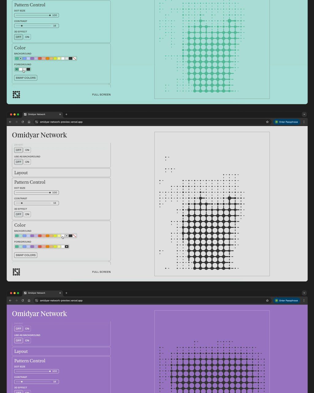
A multi-panel design tool interface showcasing pattern control and visualization across three color schemes: mint green, neutral beige, and vibrant purple. The layout demonstrates a systematic approach to generative design with real-time preview panels displaying halftone dot patterns that transition across the color variations.
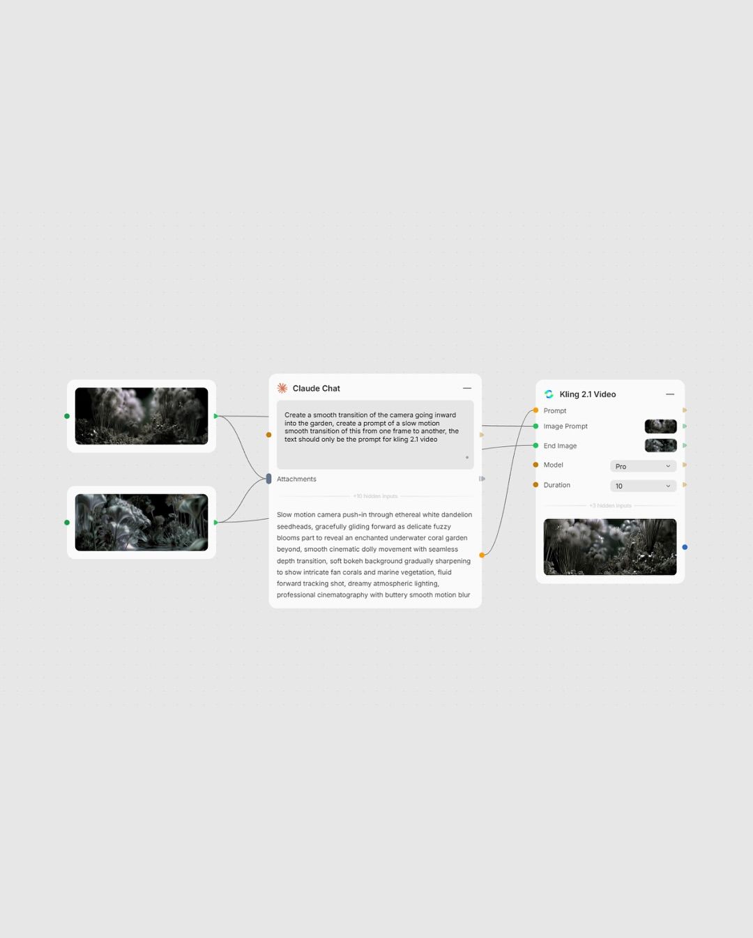
The image displays a clean, minimalist interface mockup featuring several distinct components related to AI or creative tools. The design emphasizes clarity and functionality with a light gray background and dark text, suggesting a modern software or application aesthetic.
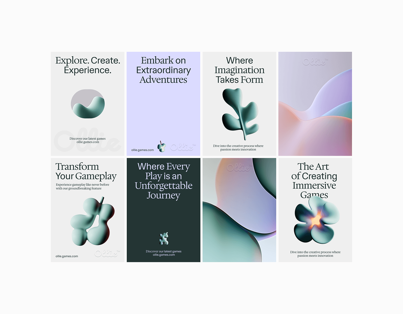
This image presents a clean, modern, and sophisticated grid layout featuring soft, organic shapes against muted pastel backgrounds. The design uses negative space effectively to create a sense of calm and premium quality, suggesting innovation in the gaming or creative technology sector.
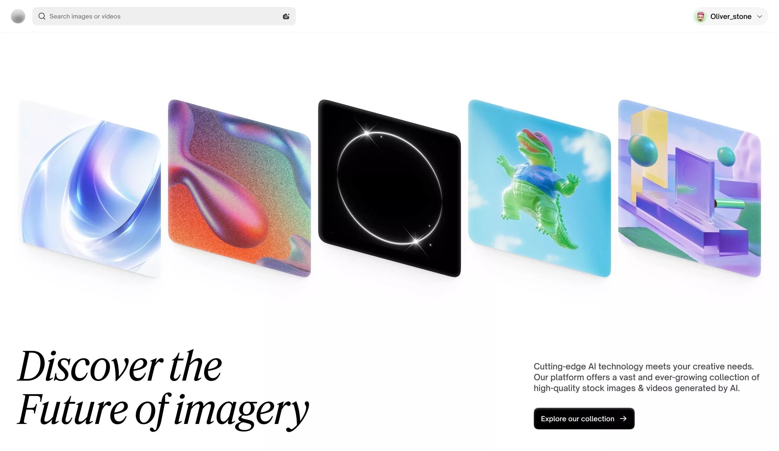
This image showcases a collection of abstract, luminous digital art pieces, suggesting a focus on futuristic or AI-generated imagery. The design is clean and modern, utilizing gradients and glowing effects to create a sense of depth and technological sophistication.
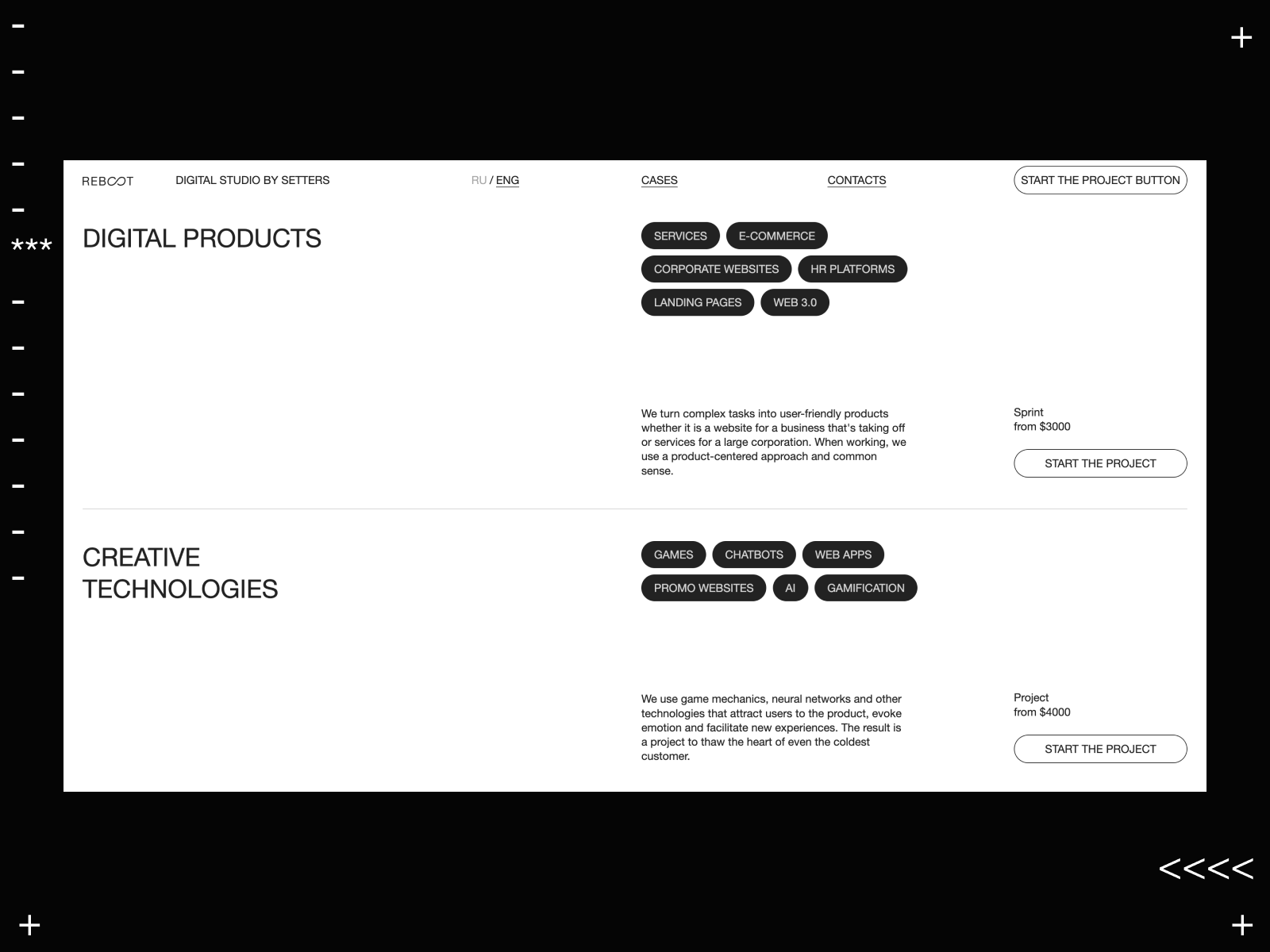
This design utilizes a sophisticated dark mode aesthetic, combining stark contrasts between black and white to emphasize clean structure and professionalism. The visual language is highly organized, relying on clear typography and segmented sections to present complex digital services in an accessible manner.
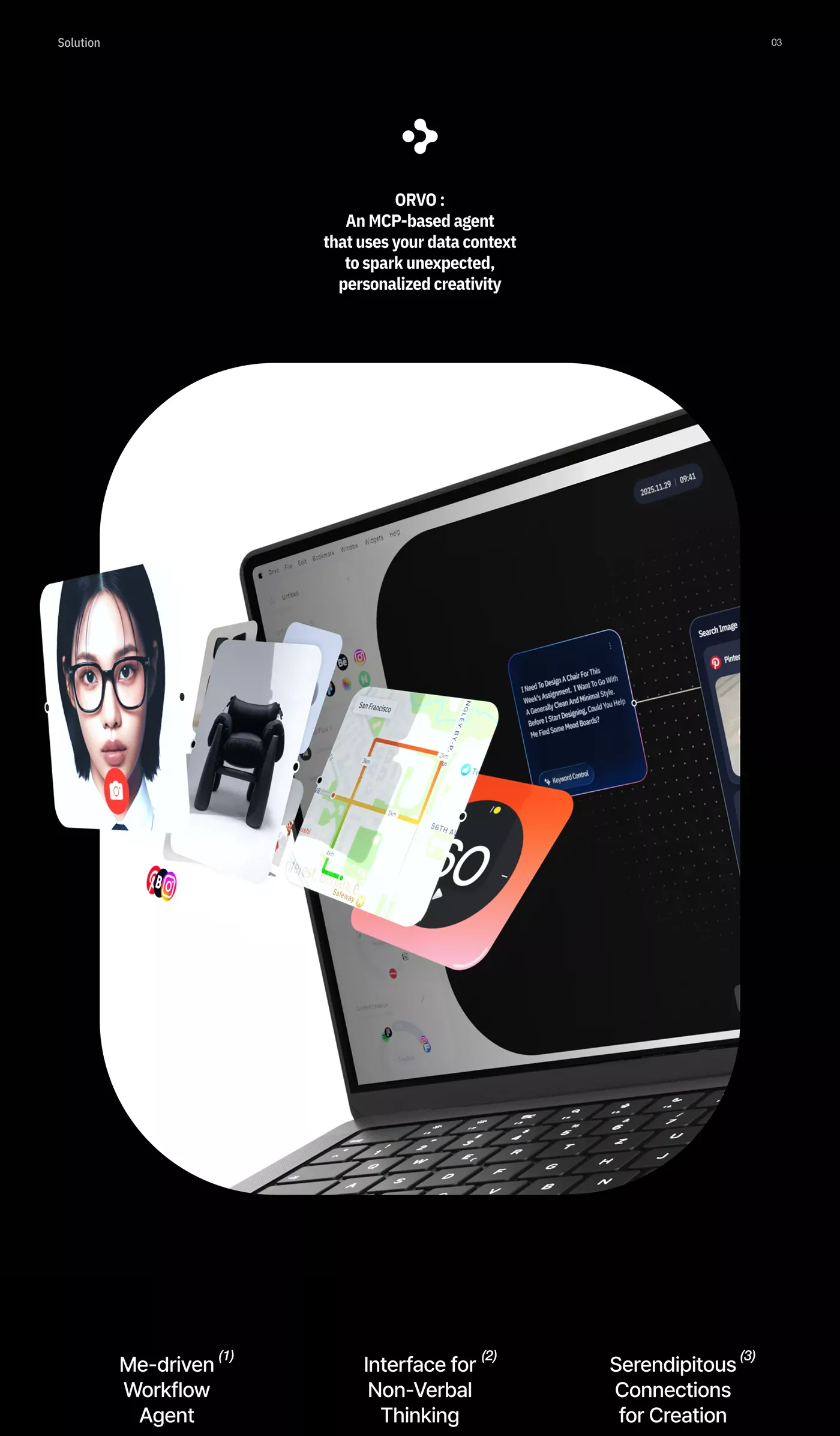
The design employs a sophisticated dark mode palette emphasizing high contrast and technical precision. The visual language is minimalist, using layered elements to illustrate a complex concept involving data, interfaces, and creativity. The overall feel is modern, innovative, and highly focused on the intersection of technology and human insight.