aviation
6 designs
Showing 6 of 6 (6 total)
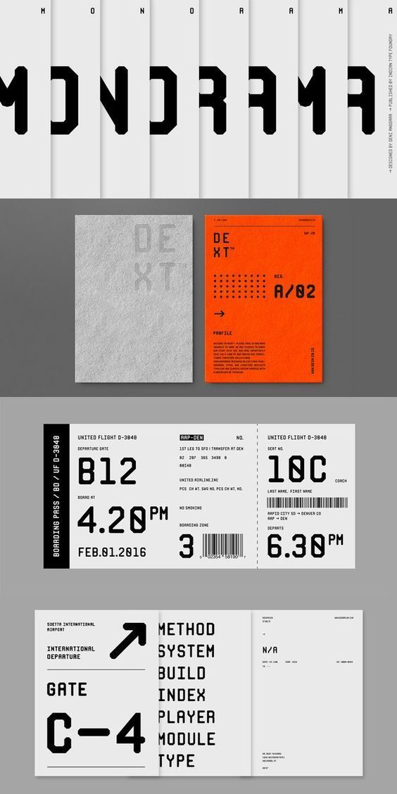
The design exhibits a stark, minimalist aesthetic characterized by strong typographic hierarchy and a limited, high-contrast color palette. It employs a clean, grid-like structure typical of technical documentation or high-end branding, conveying precision and seriousness.
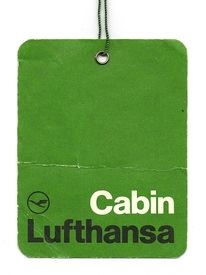
This is a simple, utilitarian identification tag featuring a solid, muted green background with clear white typography. The design relies on high contrast and minimalist elements to convey official branding in a straightforward manner.
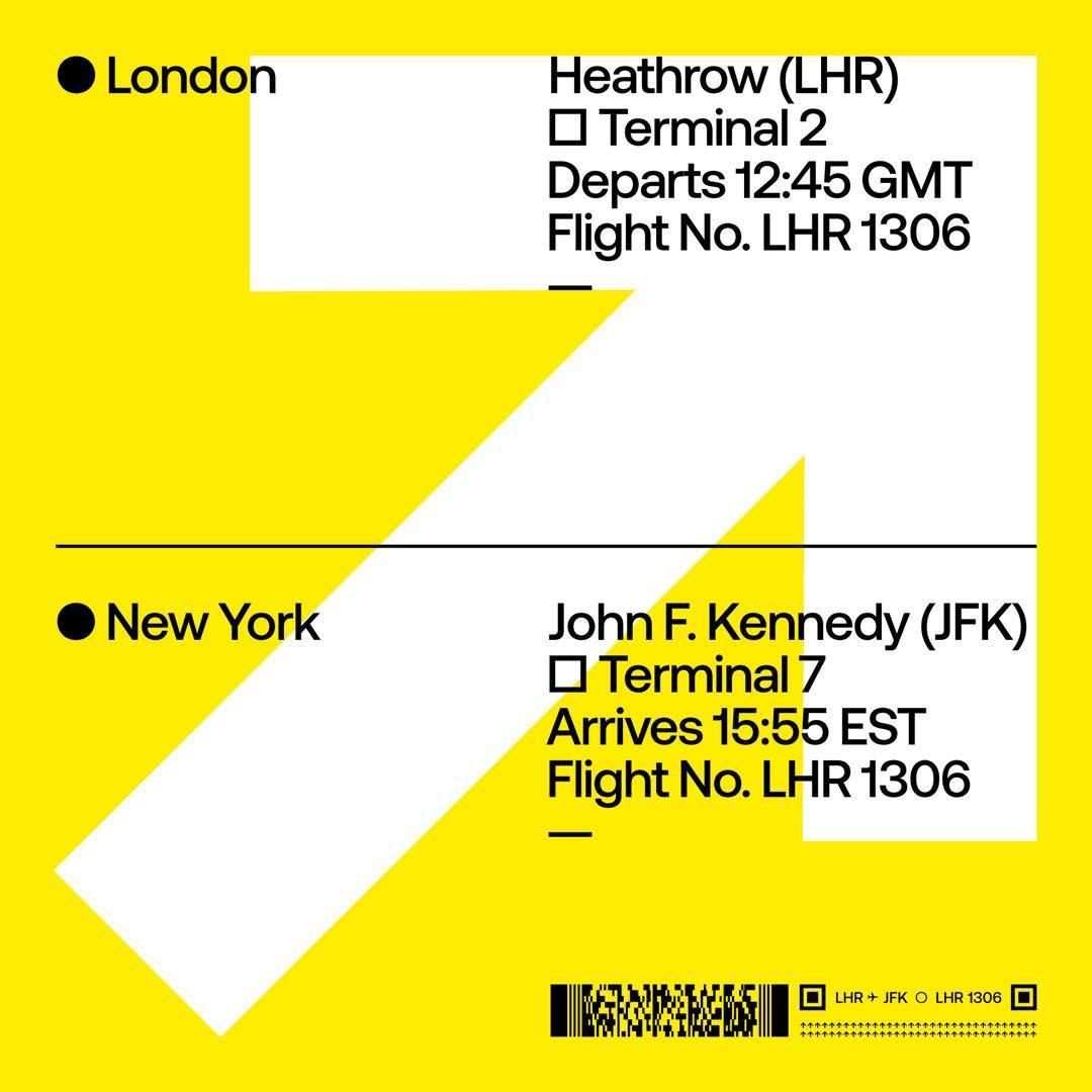
The design is a highly graphic, minimalist infographic using bold yellow and white to direct the viewer's eye across a diagonal path connecting two major locations. It employs strong directional cues and clear textual information to convey flight details efficiently.
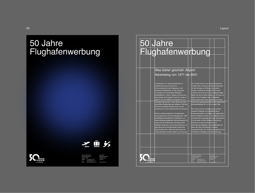
This layout features a clean, professional, and highly structured design typical of corporate or historical commemoration. It uses strong typographic hierarchy and ample negative space to present archival information clearly and with a sense of gravitas.
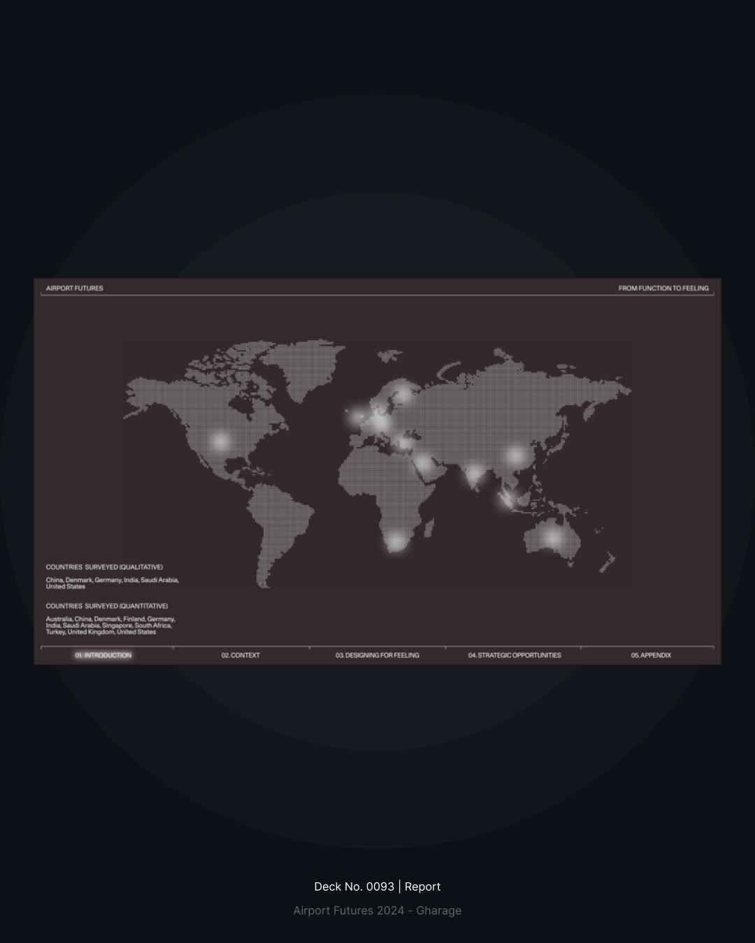
This slide employs a professional and analytical visual language, utilizing a dark muted palette to emphasize data and strategic mapping. The design is clean, minimalist, and clearly structured to present complex geographical information in an accessible format.
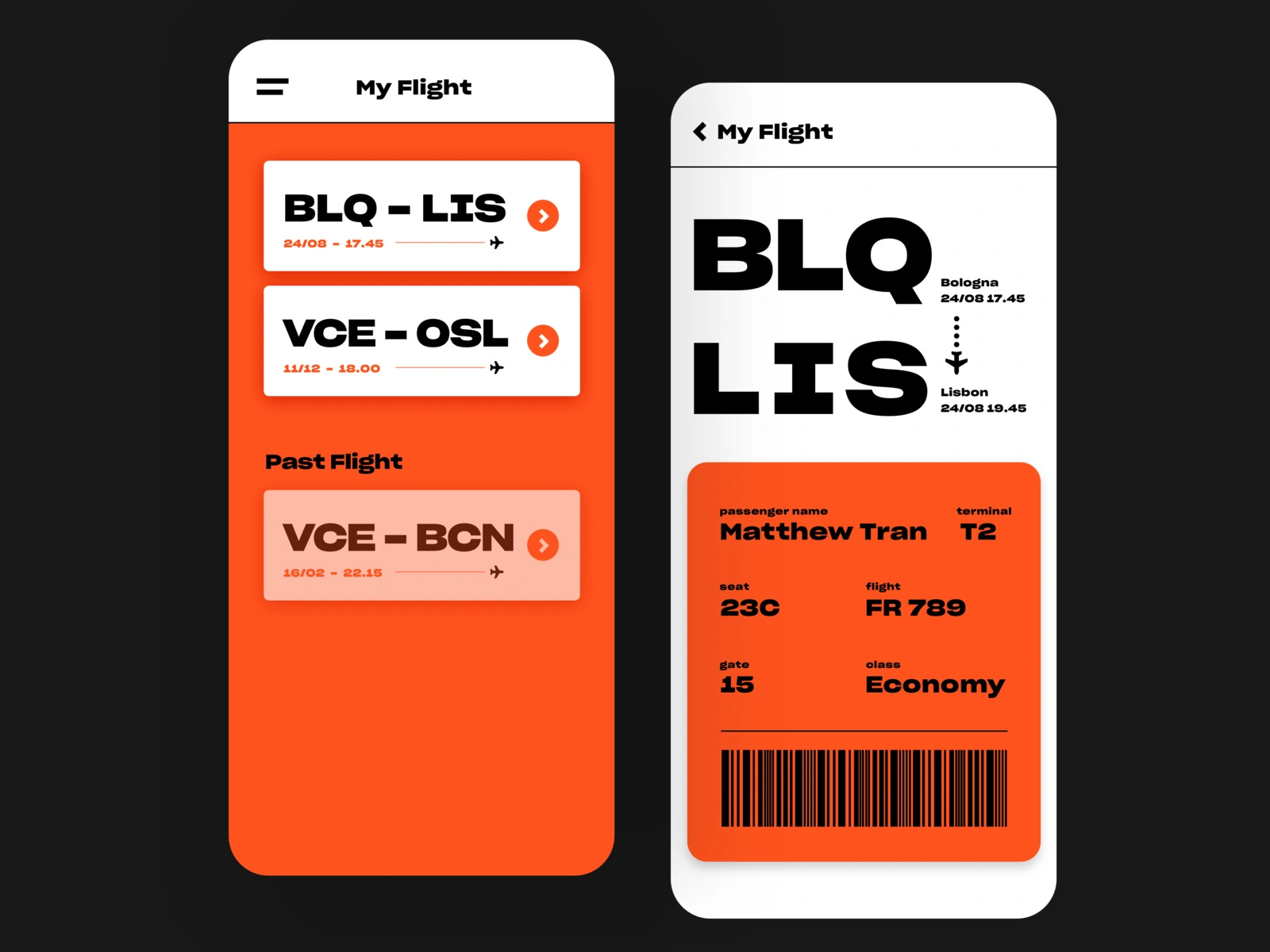
This interface demonstrates a clean, modern mobile design focused on high readability and efficient information hierarchy. The visual language relies heavily on strong contrasts between warm orange accents and stark black text, creating a professional and actionable user experience.