audio production
10 designs
Showing 10 of 10 (10 total)
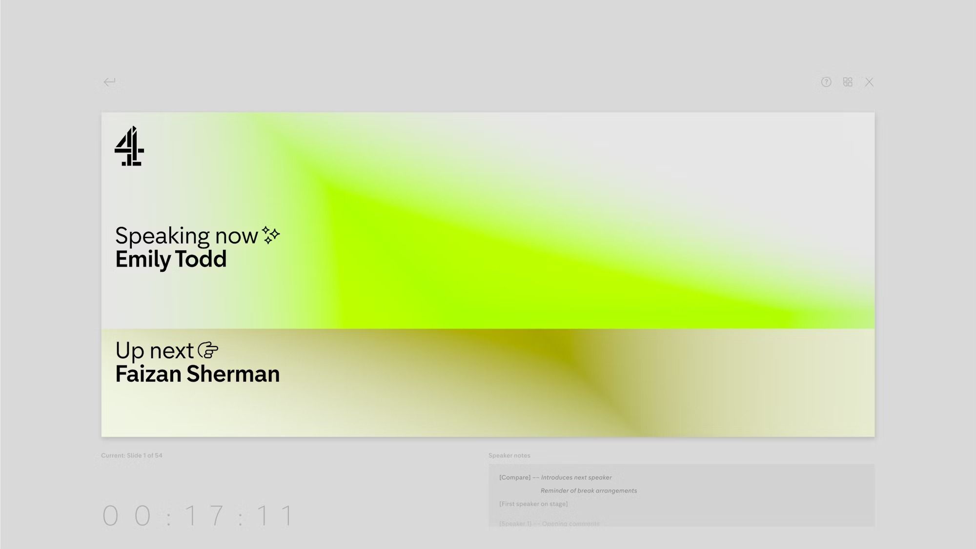
This design utilizes a vibrant, modern color gradient to create visual interest while maintaining a clean, minimalist interface. The layout effectively uses negative space and distinct color blocks to clearly prioritize current content and upcoming segments. The overall feel is bright, professional, and contemporary.
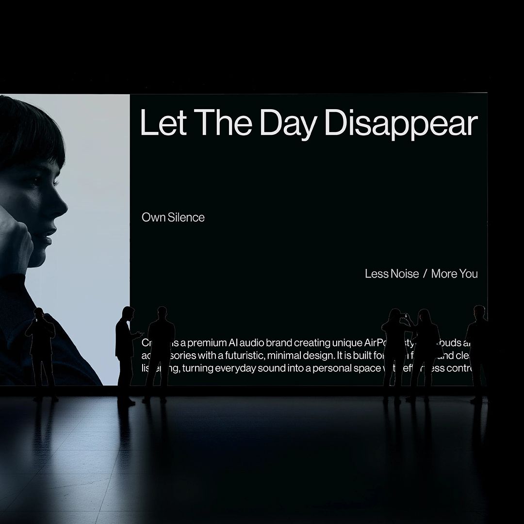
This design employs a stark, high-contrast minimalist aesthetic dominated by deep shadows and clean typography. The visual language is introspective and sophisticated, using negative space effectively to draw focus to the core message.
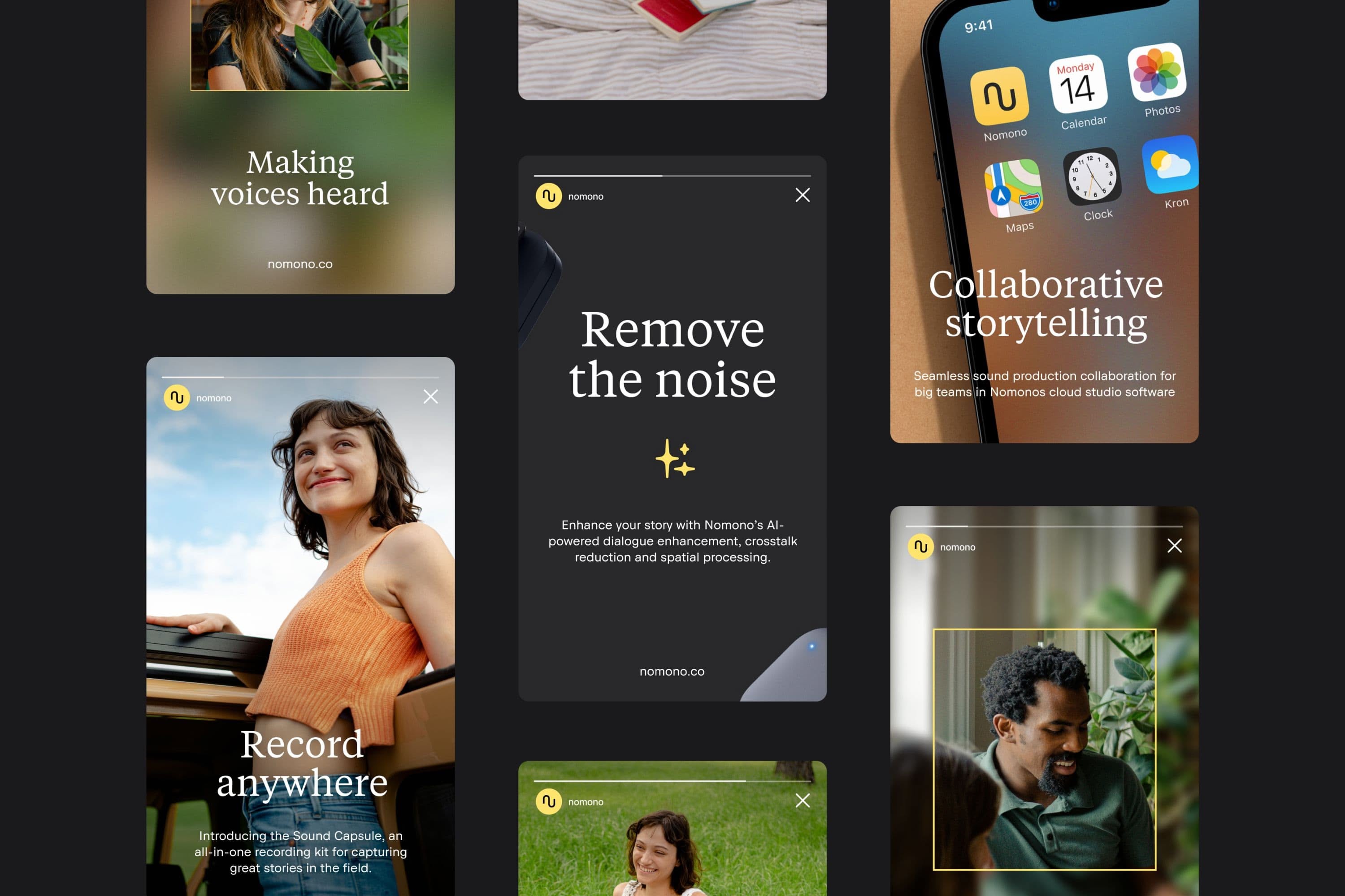
The image displays a series of clean, modern app or software interface mockups characterized by minimalist design, ample white space, and a sophisticated, muted color palette. The visual language is professional and focused, emphasizing functionality through clear typography and subtle use of accent colors.
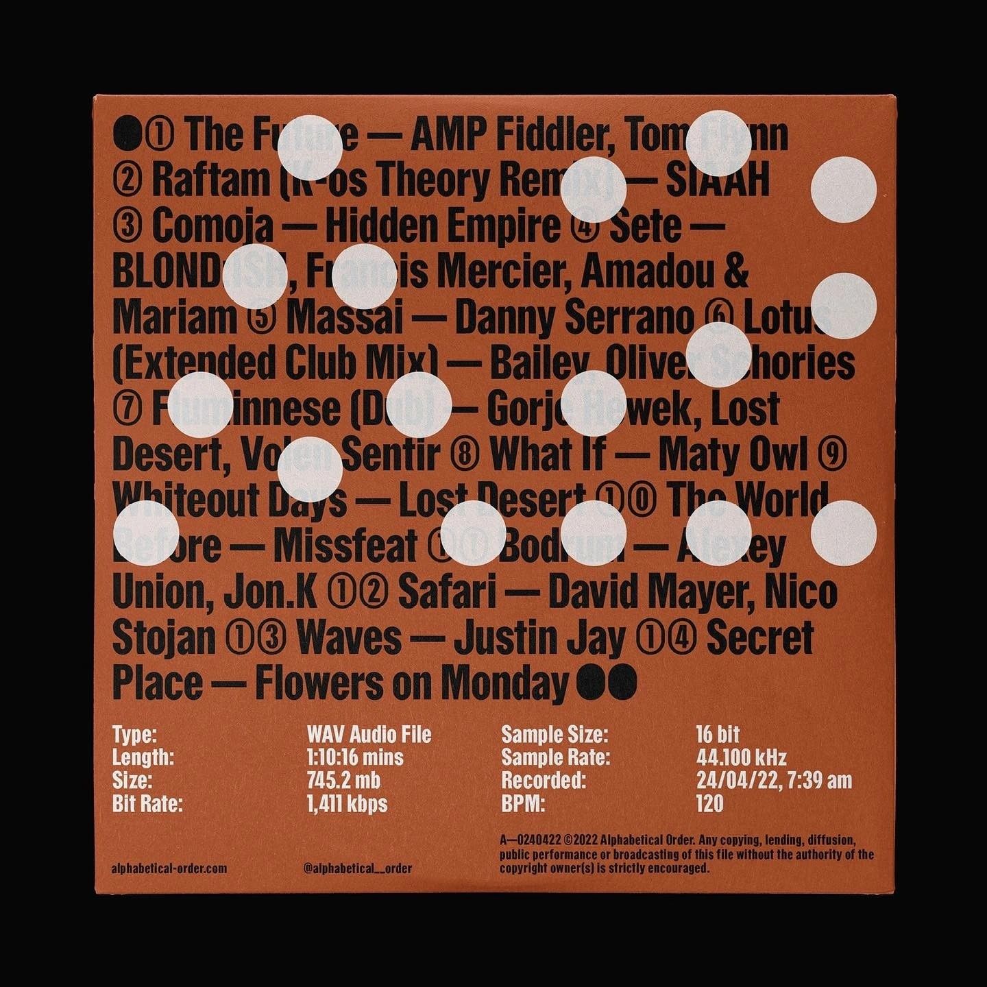
A vibrant orange album or compilation cover featuring a dense, typographic layout with overlaid white circular elements creating an interactive or playful visual rhythm. The design combines bold black sans-serif typography with technical audio specifications, suggesting a music release or podcast compilation with a contemporary, energetic aesthetic.
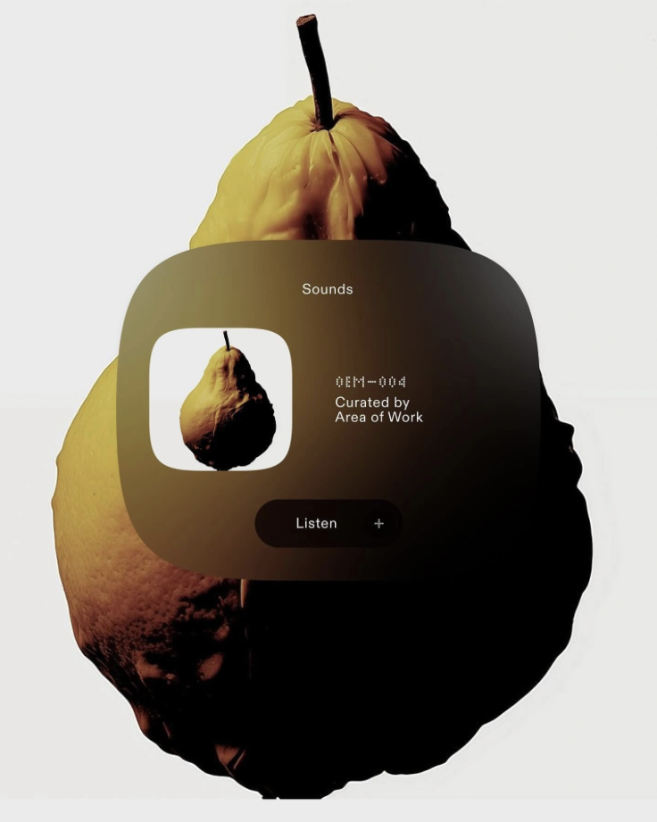
The image presents a dark, moody interface design overlaid onto the organic shape of a pear, suggesting a focus on curated audio or media. The visual language is minimalist and uses high contrast between the dark UI elements and the warm, muted tones of the fruit.
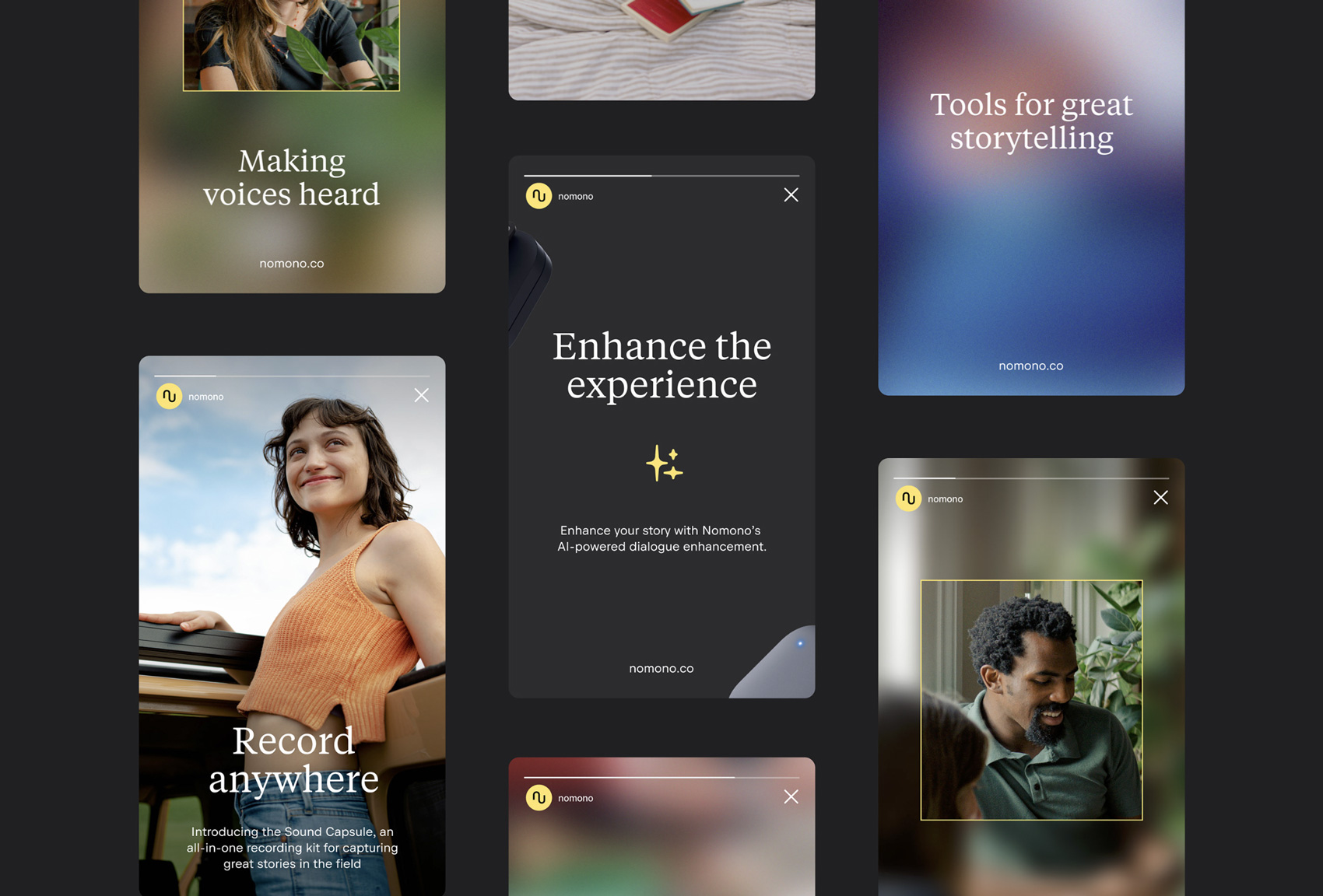
The image displays a grid of dark-themed digital interface mockups, suggesting a modern, professional application or platform. The design relies heavily on clean typography, subtle gradients, and negative space to convey a sophisticated and focused user experience.
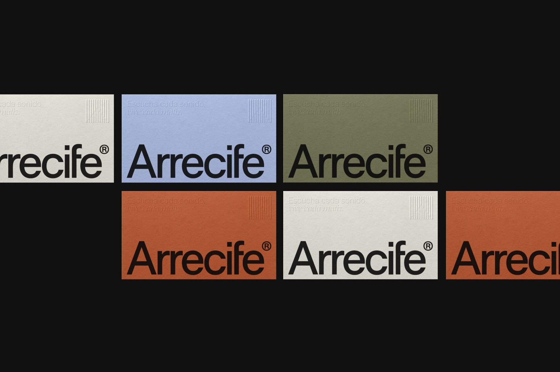
This visual identity employs a clean, layered design utilizing soft, muted color blocks to present the Arrecife brand across three distinct sections. The layout is modern and structured, emphasizing clarity and professionalism through the strategic use of color contrast and consistent typography.
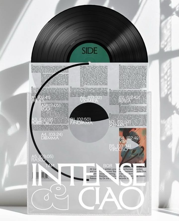
This design utilizes high contrast and negative space to create a rugged yet clean aesthetic, typical of independent music releases. The visual language is dominated by the classic black vinyl format juxtaposed with stark white labels and distressed typography, lending a vintage, raw feeling to the presentation.
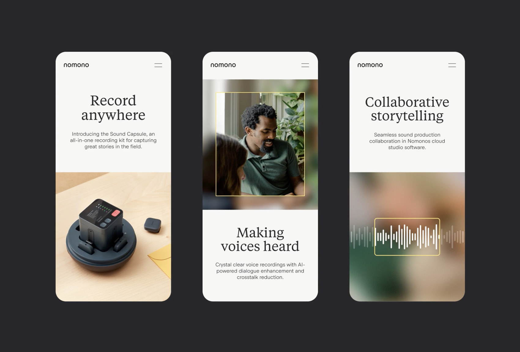
This design employs a clean, minimalist aesthetic characterized by soft, earthy tones and ample white space, effectively conveying professionalism and technical sophistication. The visual language is highly focused on showcasing product benefits related to audio collaboration and recording technology.
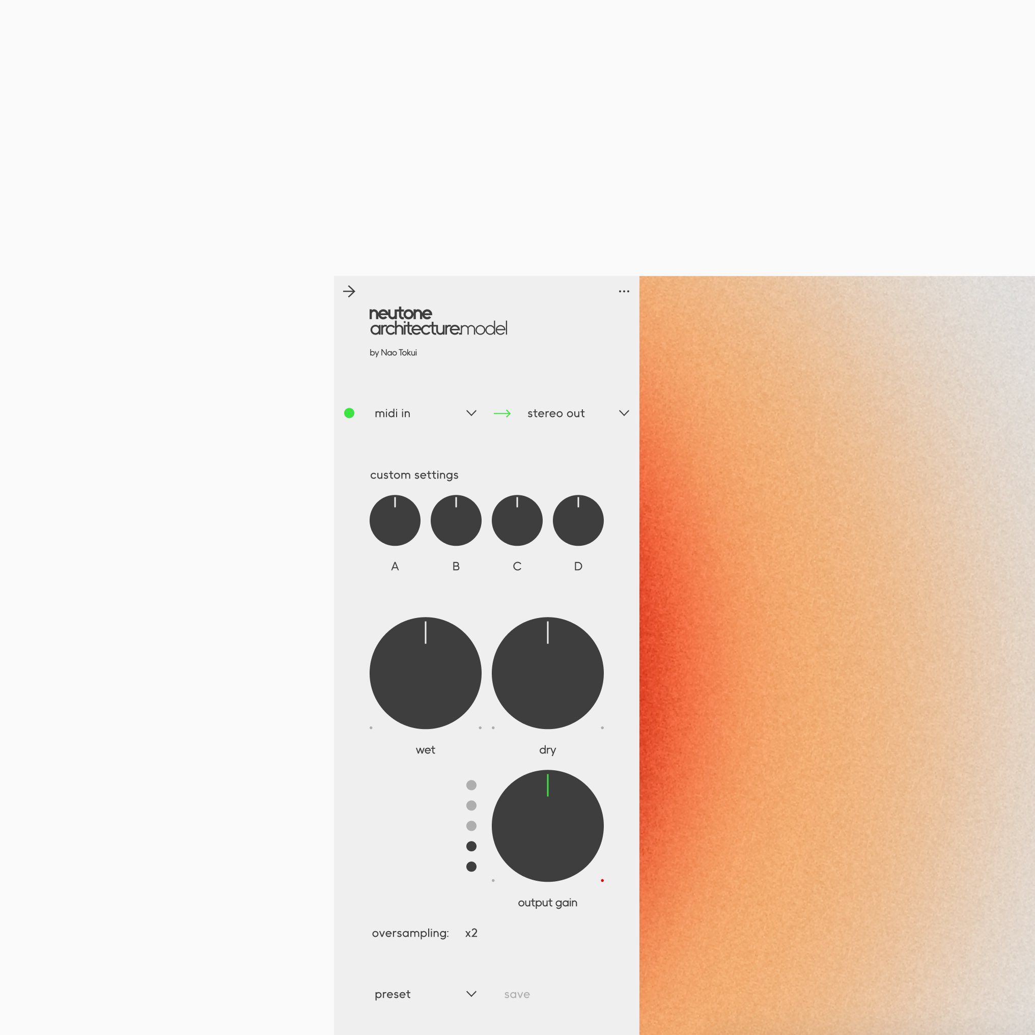
This interface exhibits a clean, functional modern design, utilizing soft gradient colors and clear typography to organize complex technical settings. The visual language prioritizes usability, using simple geometric shapes and strong vertical alignment to create a structured and professional experience.