UX/UI
27 designs
Showing 24 of 27 (27 total)
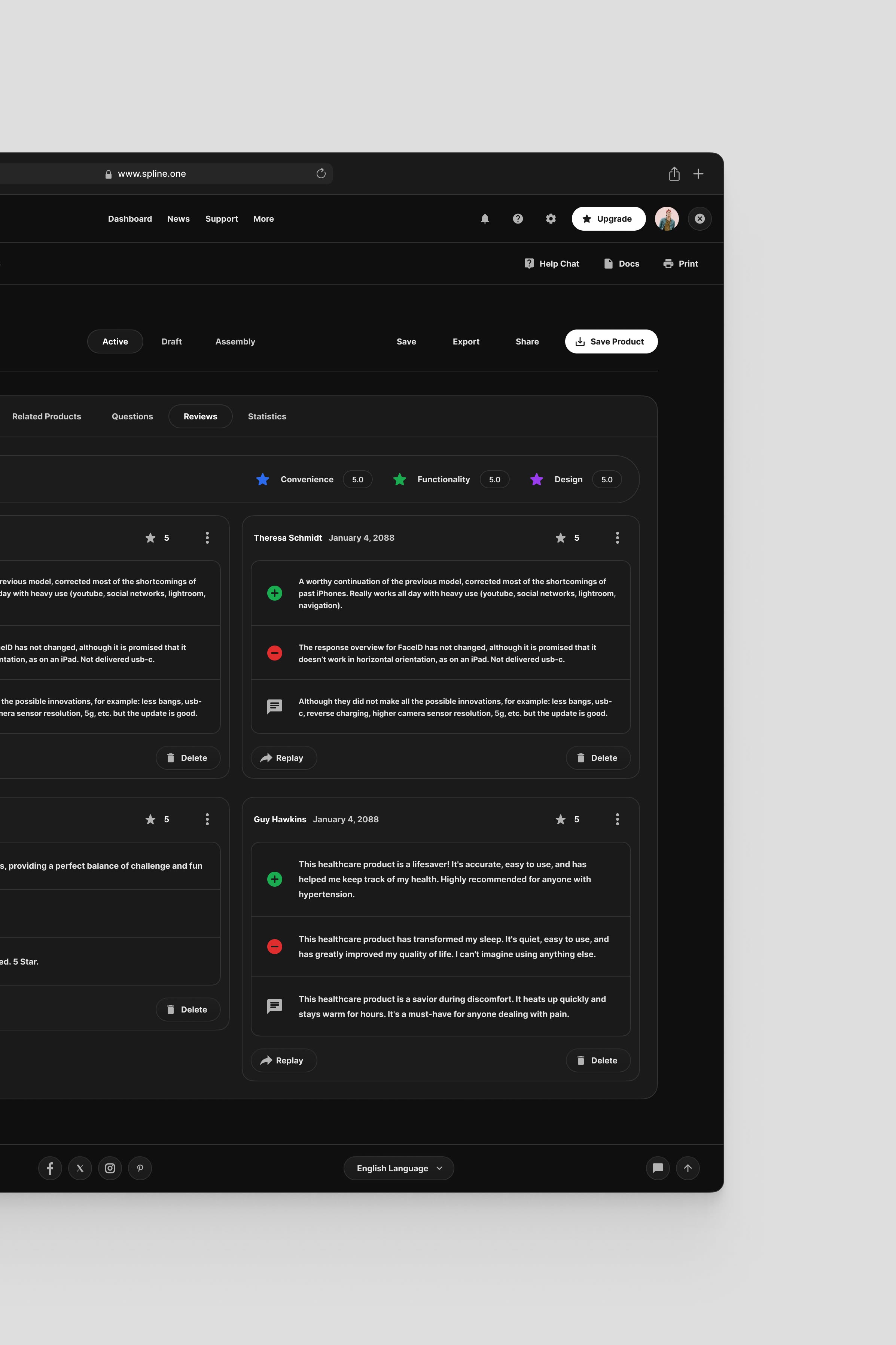
The design exhibits a clean, functional, and highly structured layout dominated by ample white space, which promotes readability. The visual language is straightforward and professional, focusing attention squarely on the textual content and interactive elements.
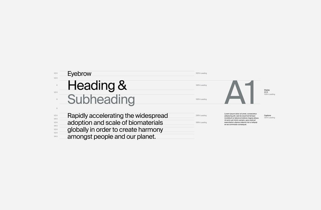
This design exhibits a highly minimalist and structured approach, relying on clean lines and ample negative space to prioritize readability. The visual language is functional and professional, emphasizing clear hierarchy through simple text treatments.
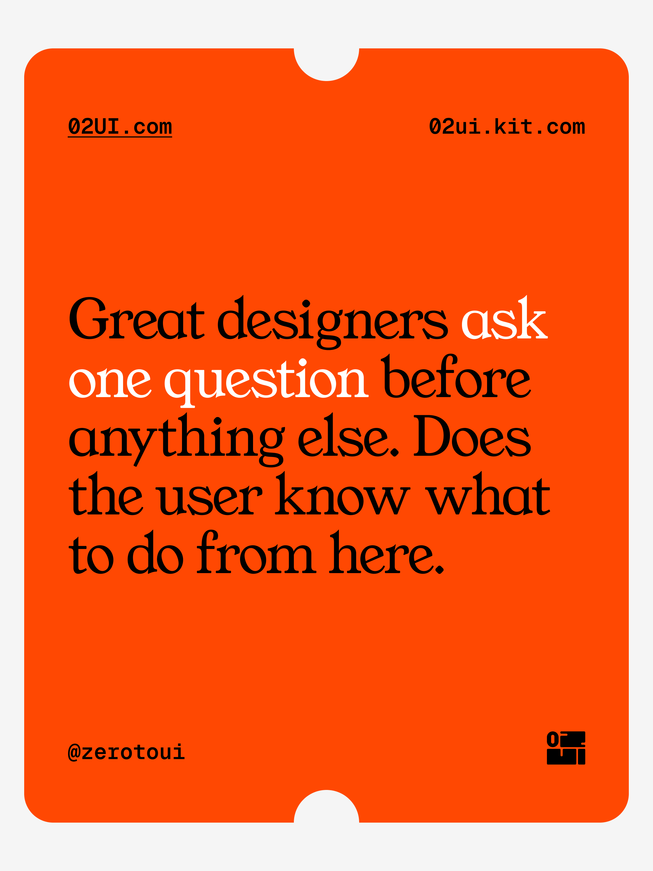
This design uses a high-contrast, energetic approach with a vibrant orange background to deliver a direct and assertive message. The visual language is minimalist, relying heavily on bold typography to emphasize the core statement.

This illustration utilizes a vibrant flat design style to depict collaborative work and creative processes. The visual language is clean, modern, and relies on bold geometric shapes and simplified figures to convey interaction and teamwork effectively.
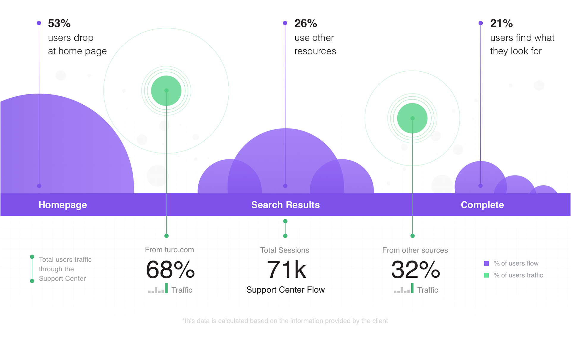
This infographic uses a clean, segmented horizontal layout to visualize user flow and drop-off rates across different stages. The design relies on distinct shades of purple to segment the data, creating a clear and analytical visual narrative. The overall feel is professional, structured, and highly informative.
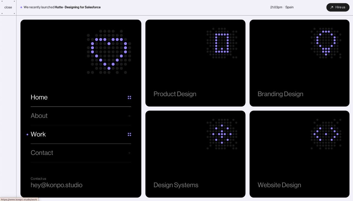
The interface presents a dark, minimalist design utilizing a monochromatic palette of deep black and vibrant purple accents. The layout is clean and grid-based, featuring distinct, equally weighted tiles for navigation, suggesting a modern and professional portfolio or service showcase.
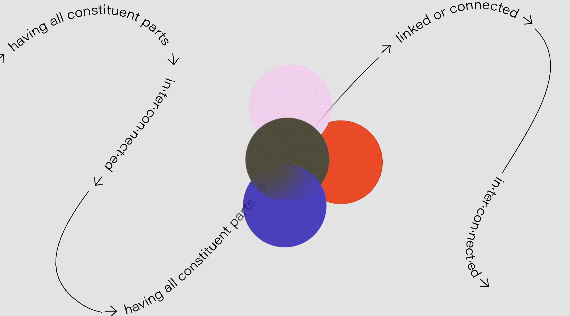
The image presents a conceptual diagram illustrating relationships between constituent parts using overlapping circles to denote connections. The design is clean and abstract, relying heavily on color and spatial overlap to convey complex relational data.

The image captures a close-up of a hand holding a smartphone displaying a colorful mockup interface, suggesting a focus on digital design or prototyping. The visual language is clean and modern, emphasizing vibrant color blocking against a white background.
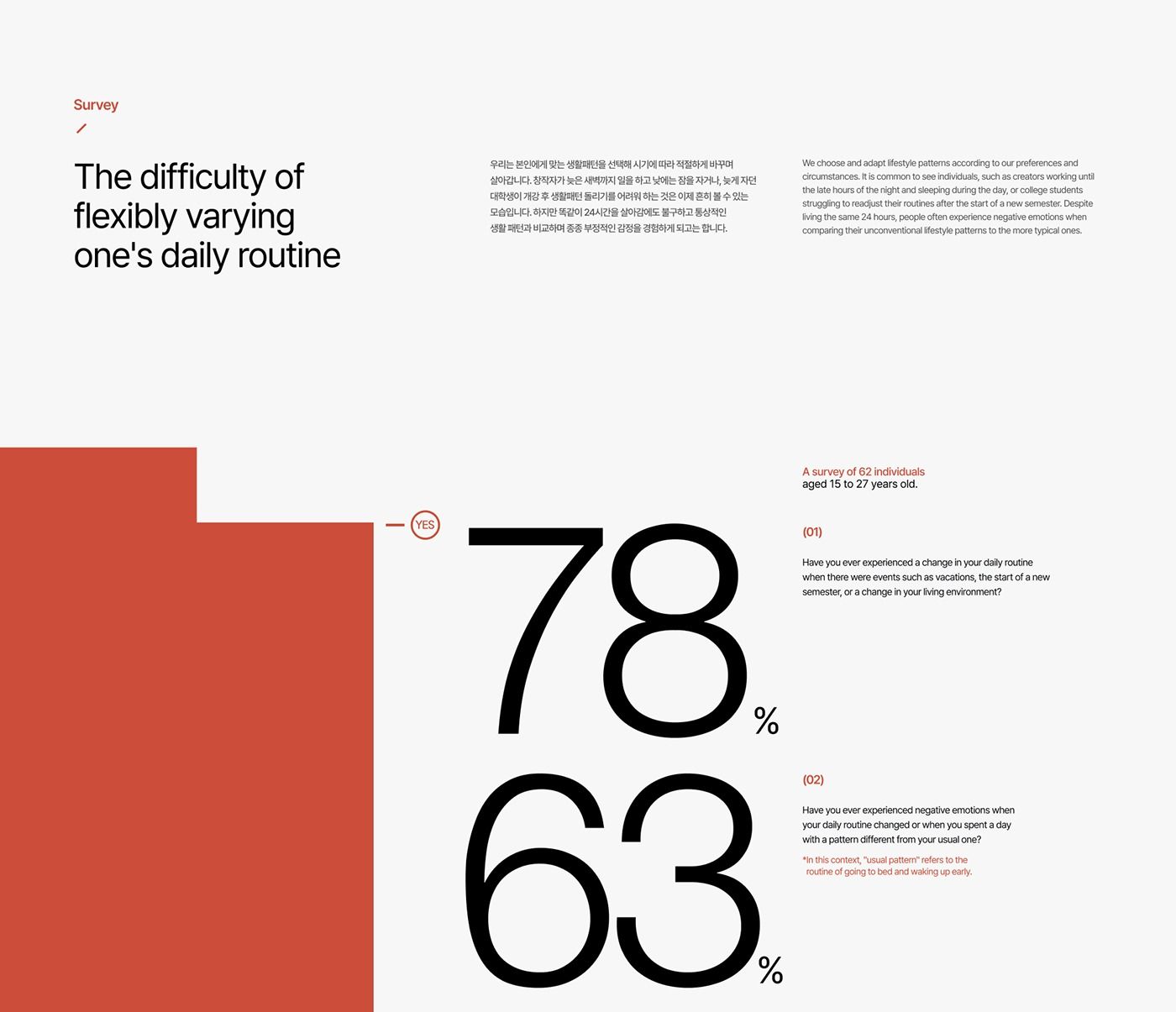
The design is minimalist and clean, utilizing a high-contrast black and white layout with a single accent color (red/terracotta) to present survey results. The visual language is direct and data-focused, prioritizing readability and stark presentation of quantitative information.
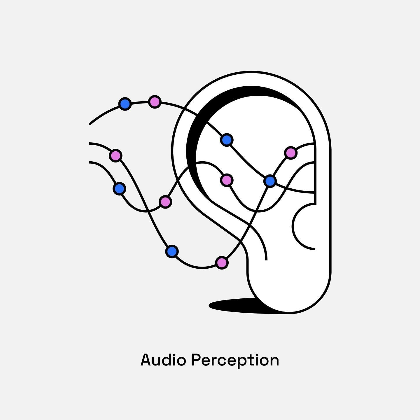
This is a minimalist line art illustration depicting an abstract representation of an ear, focusing on the concept of audio perception. The design uses thin, continuous lines to suggest sound waves or neural pathways within the structure of the ear.
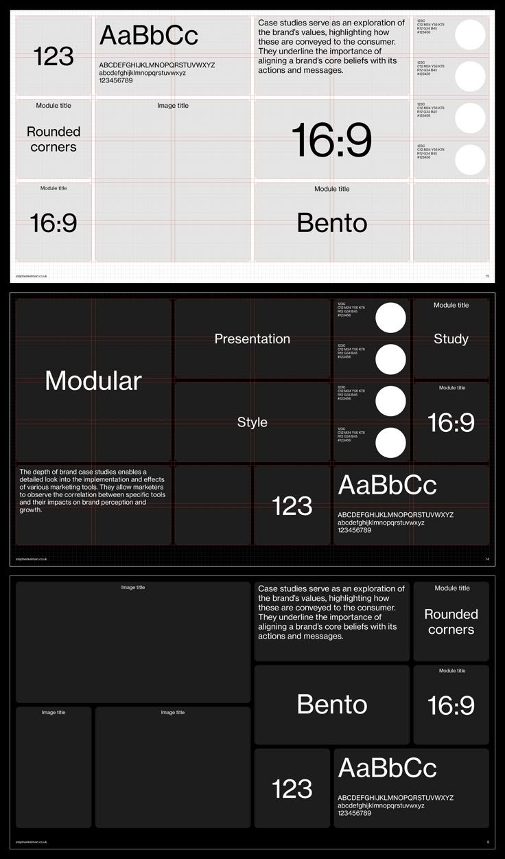
The image presents a clean, grid-based layout typical of a case study or portfolio presentation. It uses high contrast between white/light gray backgrounds and dark text, emphasizing structure and clarity for technical or academic content.
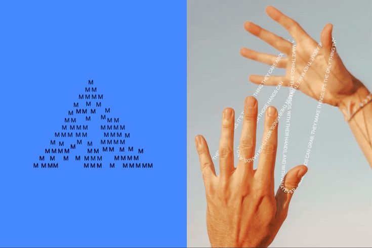
The image presents a stark, minimalist comparison between abstract text representation and a physical gesture. It juxtaposes a dense, uniform pattern of 'M's in a solid color field against the organic lines and form of a human hand, creating a conceptual link between digital/symbolic representation and physical action.

The image is a minimalist screen featuring a solid, vibrant blue background with a subtle white arrow icon centered on the left. The design is clean, modern, and directs the user's attention towards an implied action or navigation point.
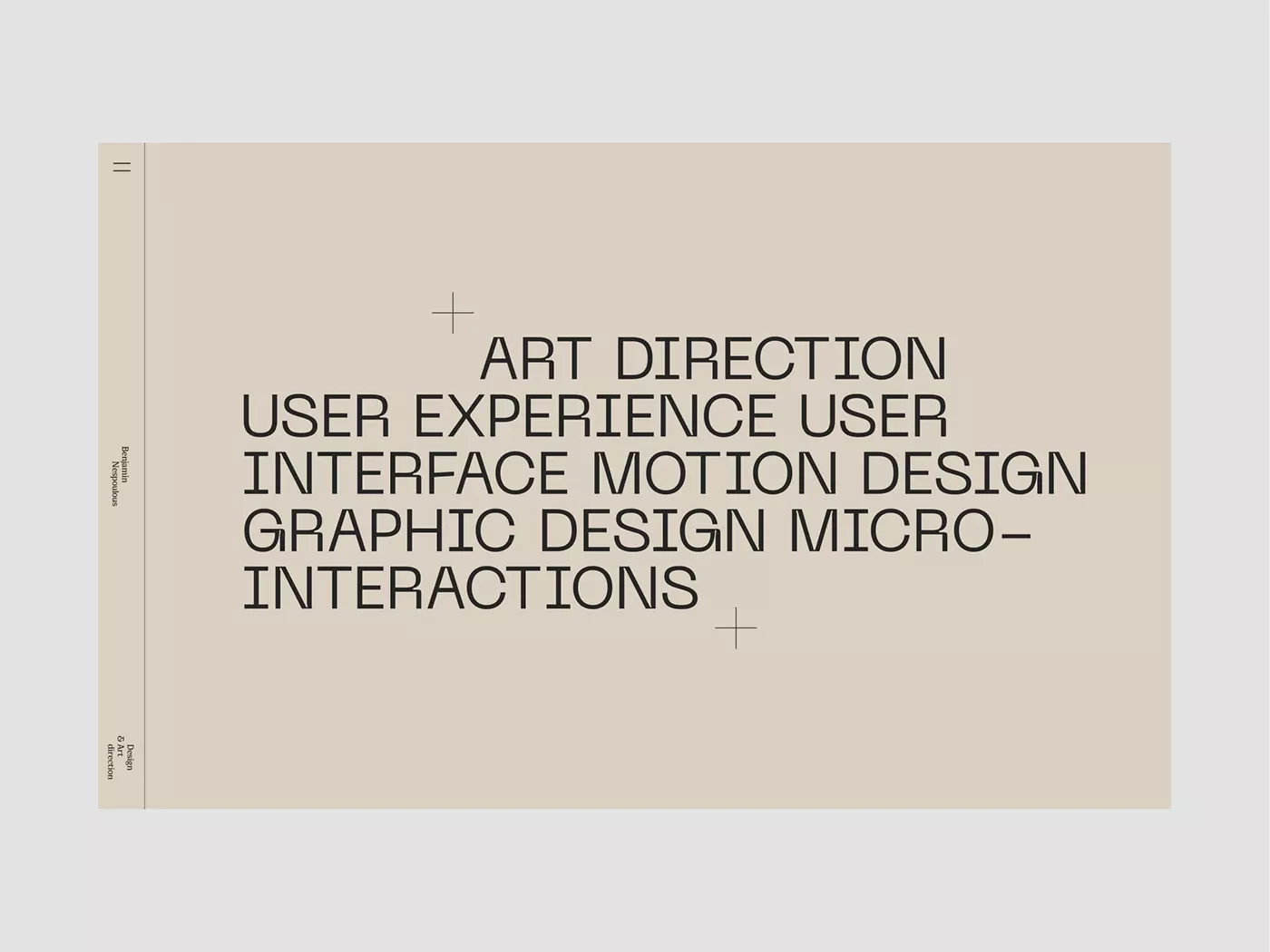
The image presents a minimalist, text-heavy layout with a muted, earthy tone. The design relies on clean typography and subtle use of plus signs to structure the list of design disciplines, conveying a sense of academic or professional documentation.
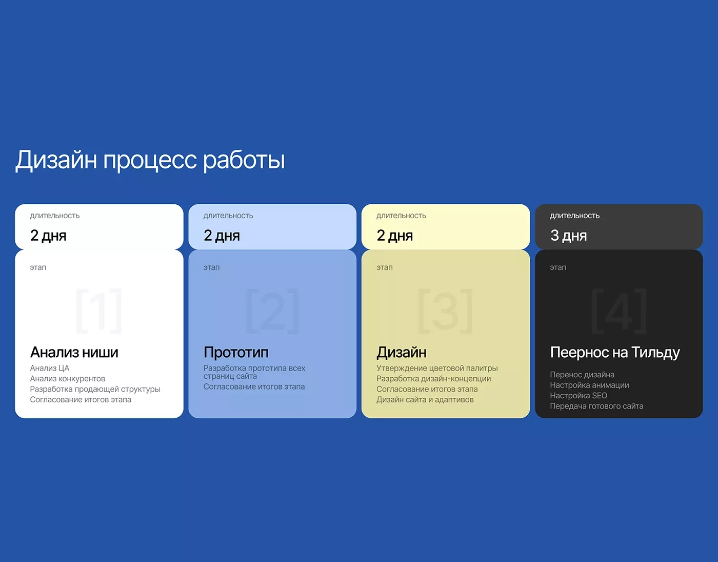
The image presents a clean, structured infographic detailing a design process using a numbered, step-by-step flow. The visual language is minimalist and professional, relying heavily on solid color blocks to delineate distinct phases of work.
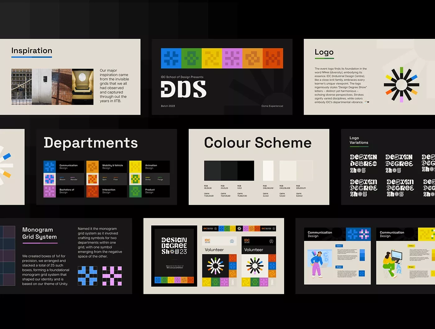
This image presents a clean, structured, and professional presentation of design concepts, likely for an agency or portfolio. The visual language relies heavily on geometric blocks, clear segmentation, and a muted but deliberate color palette to convey competence and order.
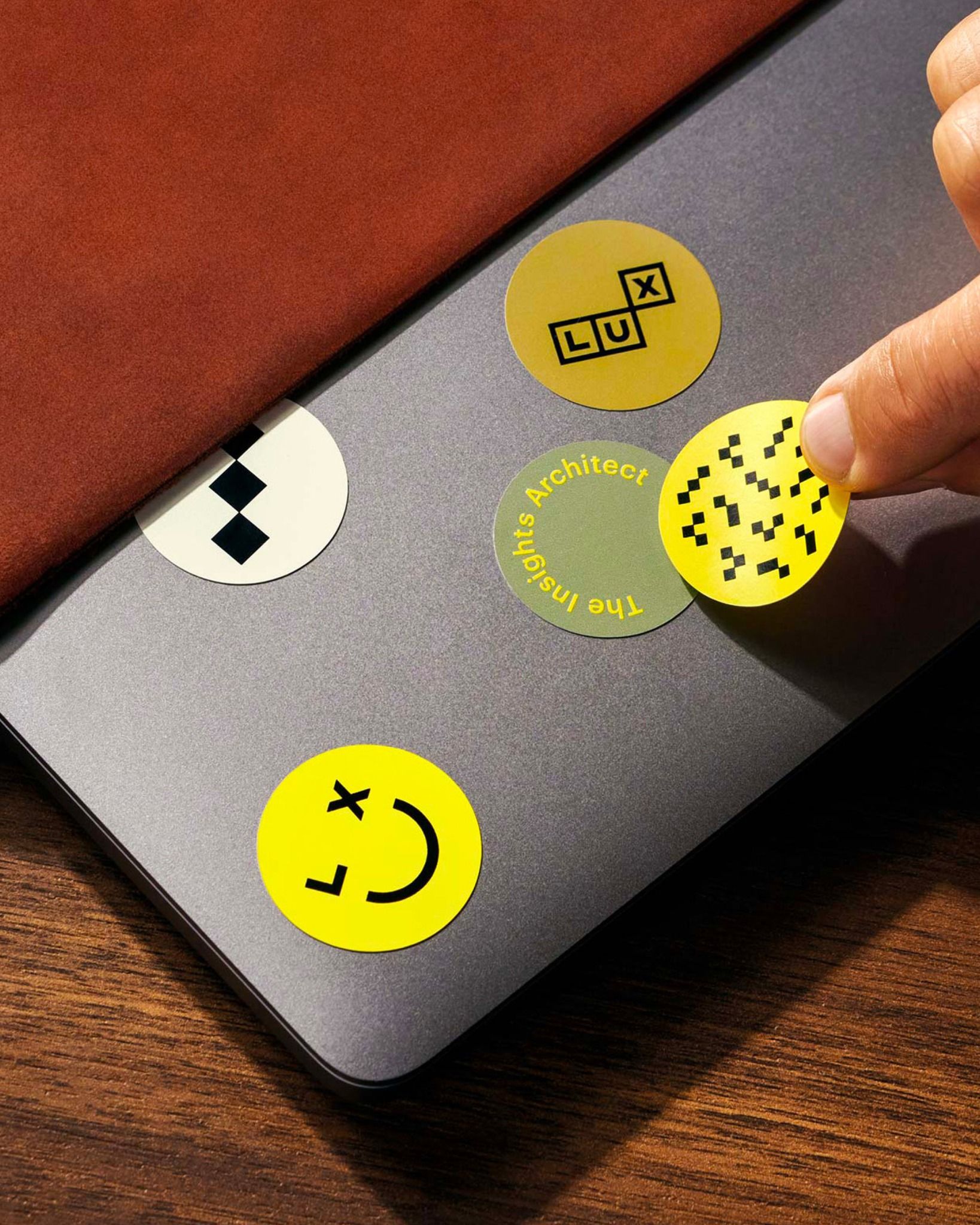
This image showcases a minimalist and tactile design aesthetic, utilizing a muted gray background contrasted with vibrant yellow and olive green circular elements. The visual language is clean, modern, and playful, suggesting an interface or a set of conceptual markers.
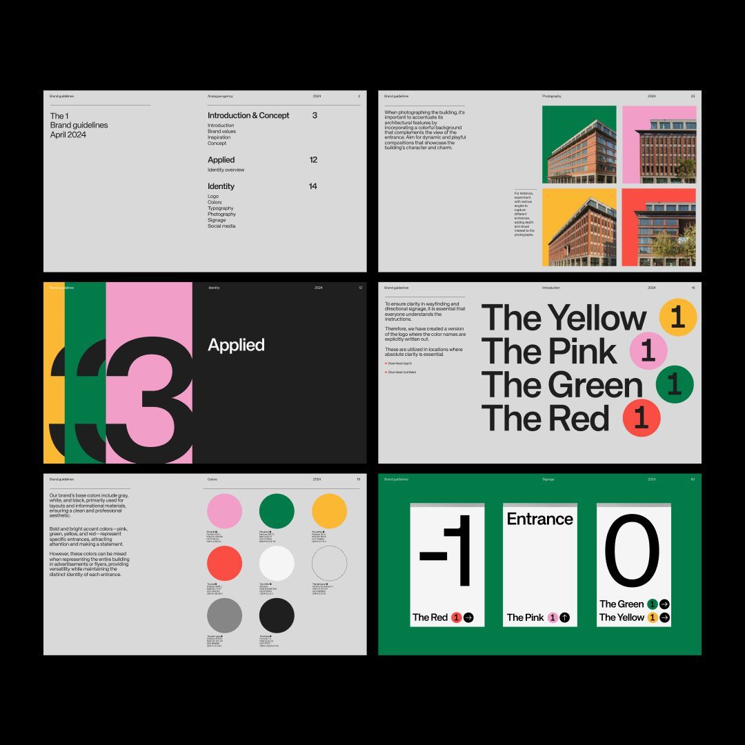
The image displays a series of clean, modern, and highly structured design mockups, likely showcasing branding or identity systems. The visual language relies heavily on bold geometric shapes, strong color blocking, and clear typographic hierarchy to convey a sense of professionalism and precision.
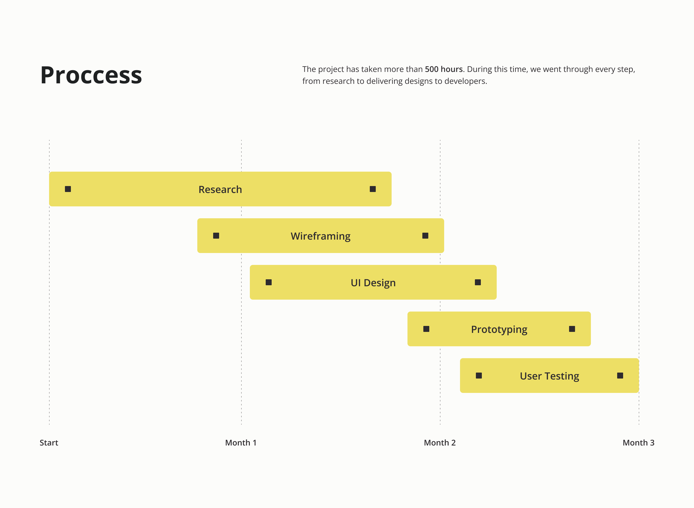
The image presents a linear, process-oriented timeline using simple rectangular blocks to denote sequential project stages. The design is clean, minimalist, and highly functional, relying on clear spatial separation to guide the viewer through the workflow.
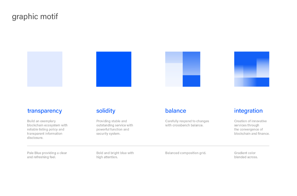
This image presents a clean, minimalist presentation of three distinct concepts—transparency, solidity, and balance—using solid blocks of color to symbolize abstract ideas. The design relies on strong geometric shapes and a limited, high-contrast color palette to convey a sense of modern professionalism and clarity.
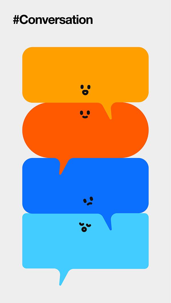
This image features a series of stacked, speech-bubble shapes in warm and cool tones, suggesting a theme of conversation or dialogue. The design is clean, minimalist, and uses color blocking effectively to create visual hierarchy.

The image displays a minimalist, abstract network diagram composed of connected nodes, suggesting concepts like relationships, connections, or data flow. The design is clean and relies purely on geometric arrangement to convey structure.
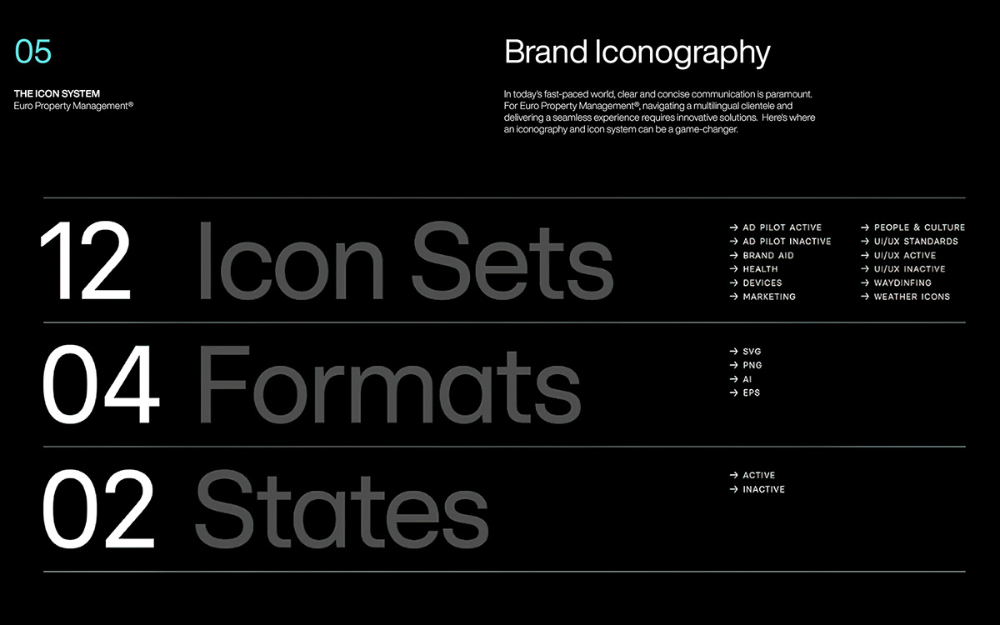
This is a highly structured and professional presentation slide characterized by a strong, monochromatic scheme designed for technical documentation. The visual language emphasizes clear hierarchy through large numbers, bold titles, and consistent use of dividers and directional arrows.
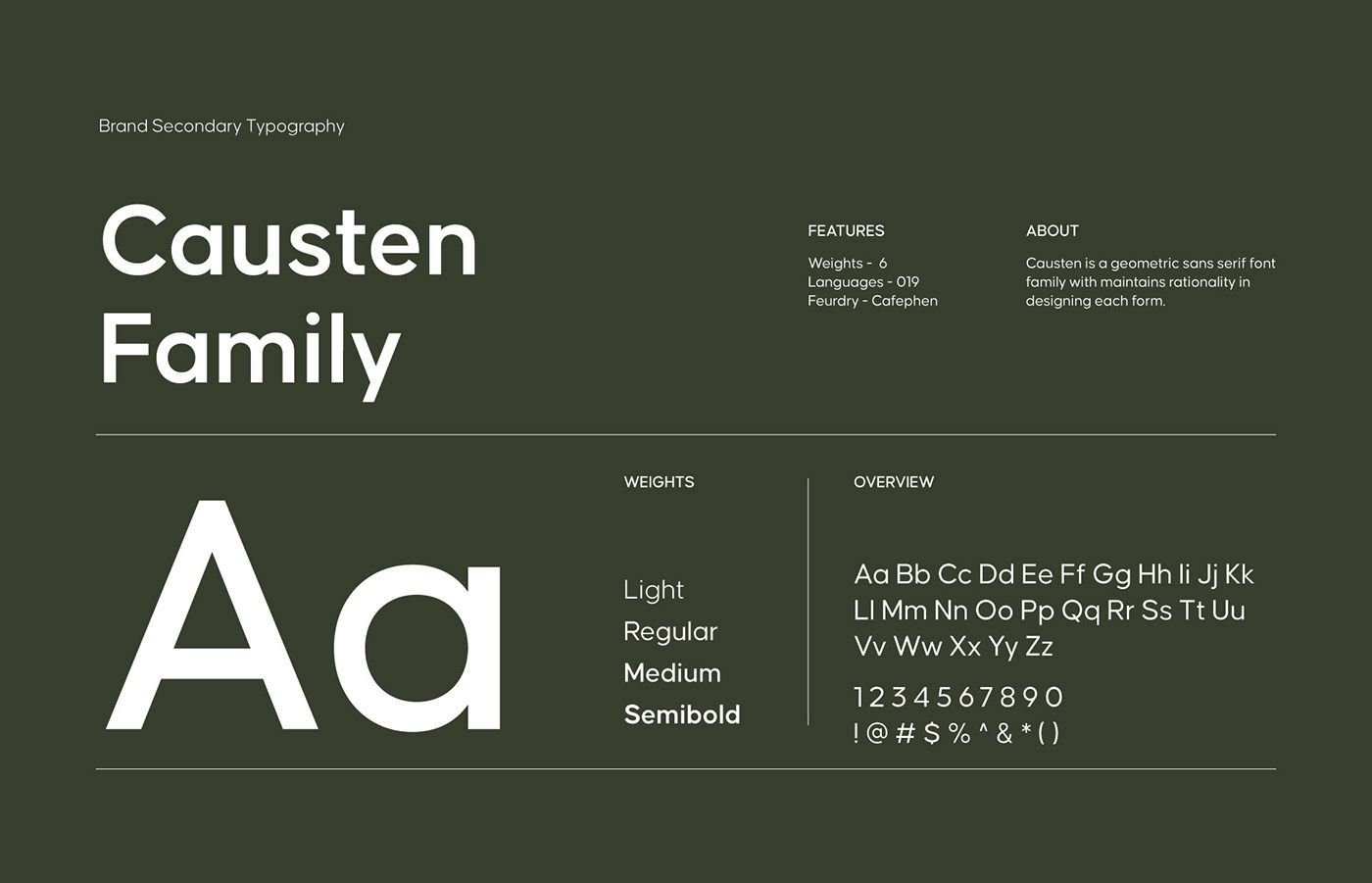
This is a clean, minimalist presentation focused entirely on displaying a typeface family. The design utilizes high contrast between dark gray and white to emphasize the geometric structure and readability of the font weights.