reporting
84 designs
Showing 24 of 84 (84 total)
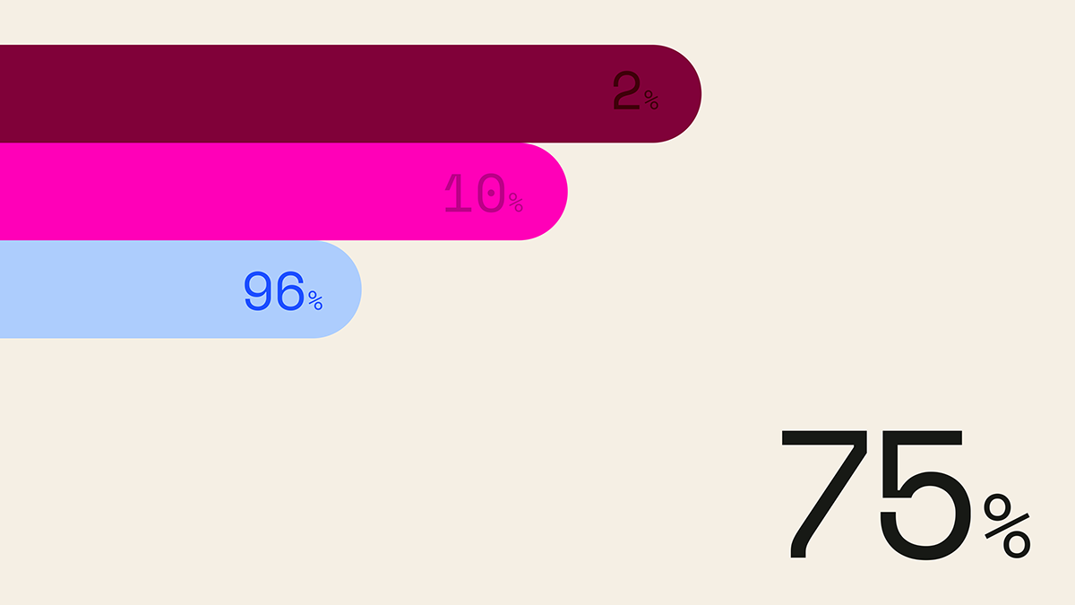
This is a clean, minimalist data visualization utilizing horizontal bars of varying saturation and length to represent percentages. The design relies on strong color contrast against a neutral background to clearly communicate quantitative information.
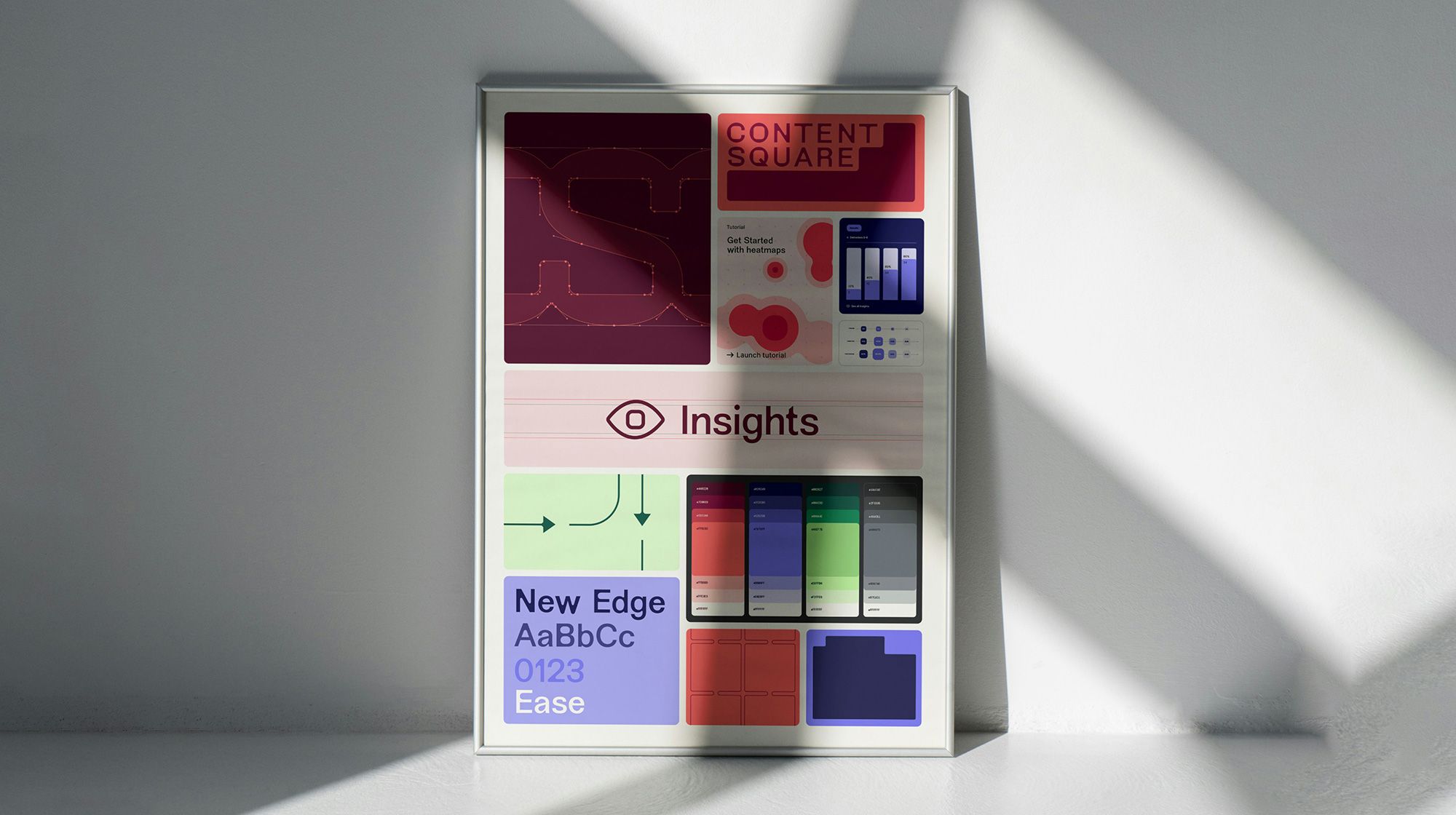
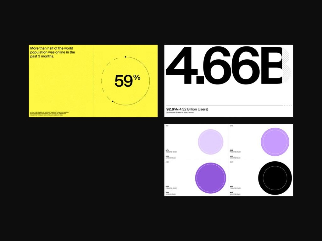
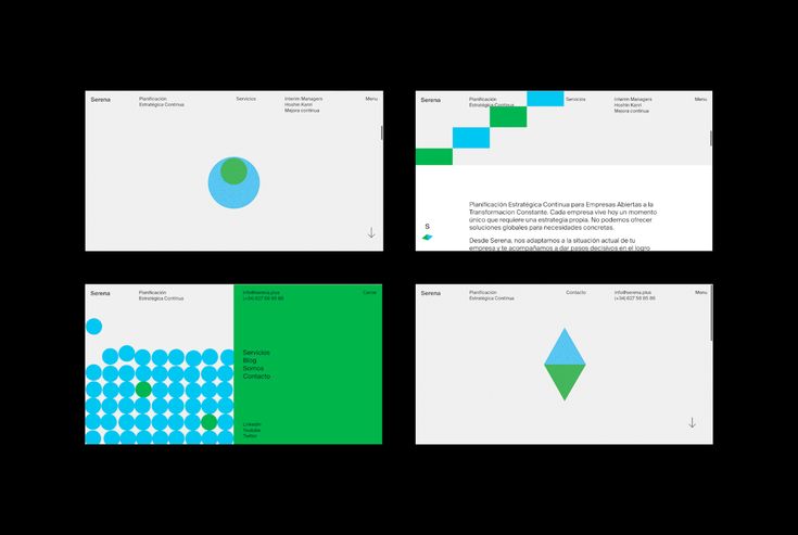
This image displays a series of mockups or screenshots, likely from a web or application interface, characterized by a clean, modern, and professional design aesthetic. The layout uses ample white space and a muted color palette punctuated by soft pastel circles for data visualization.
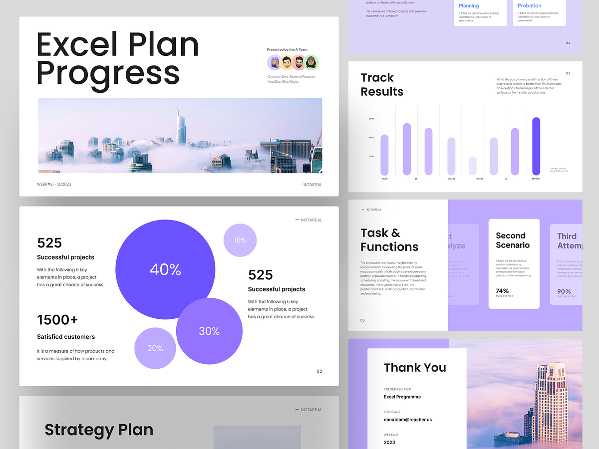
This design features a clean, modern, and professional aesthetic suitable for business reporting. It utilizes a structured grid layout to present complex data and metrics clearly, emphasizing readability and analytical precision.
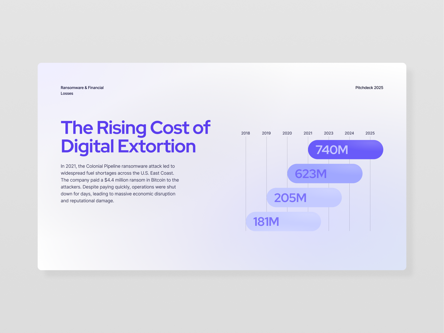
This is a clean, professional infographic slide designed to present statistical data regarding the financial costs of digital extortion. The design utilizes ample white space and a cool color palette to ensure high readability and focus on the numerical trends.
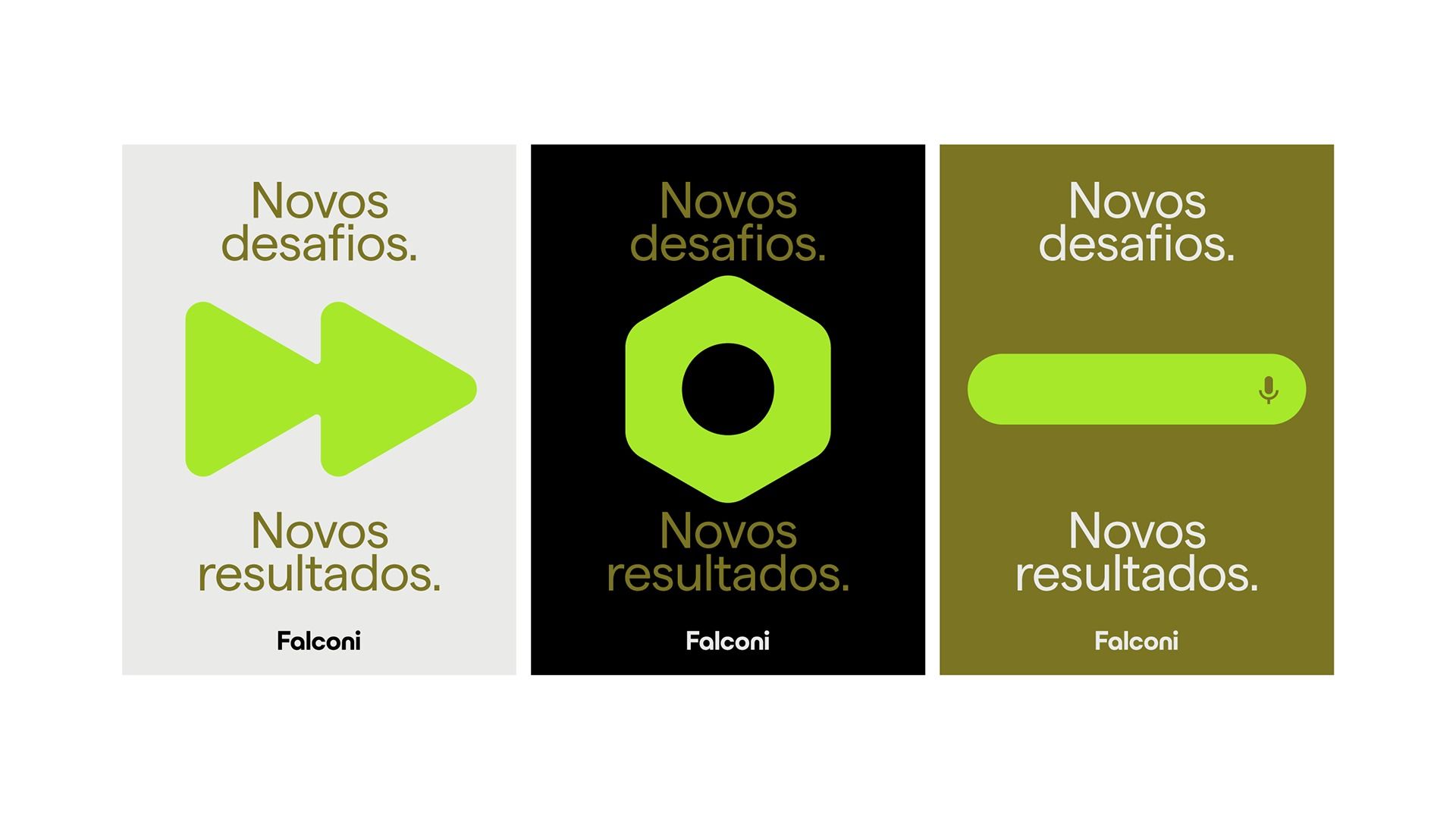
This design utilizes a clean, modern flat design aesthetic with strong color blocking to segment three related pieces of information. The visual language is direct and positive, using simple geometric icons paired with clear typography to convey progress or achievement.
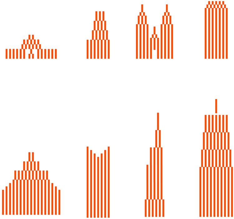
This image presents a series of minimalist vertical bar charts, utilizing a monochromatic palette to visualize data distribution or growth patterns. The design emphasizes structure and quantitative representation through the consistent use of orange lines against a stark white background.
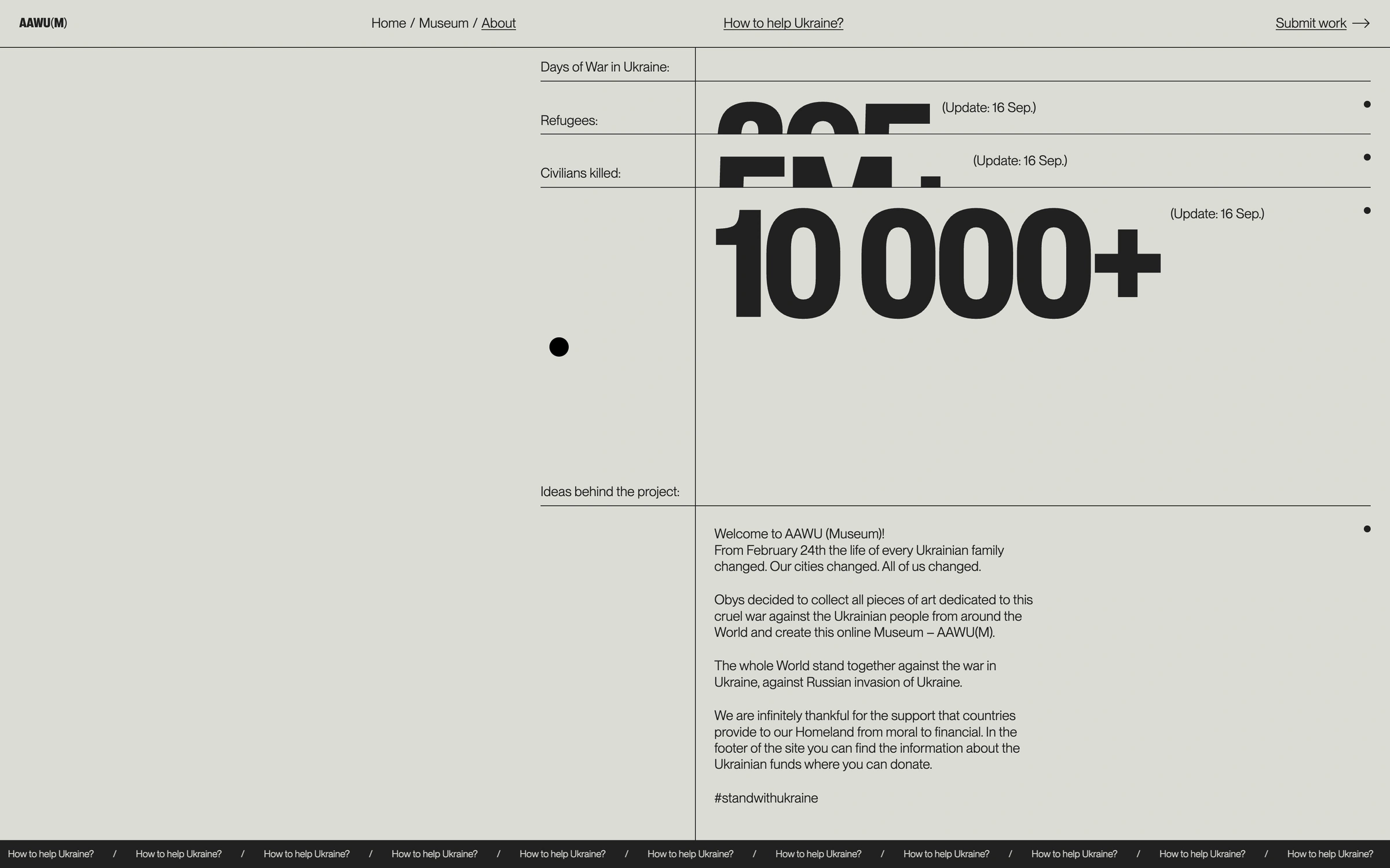
The design employs a stark, minimalist aesthetic characterized by high contrast and ample negative space to prioritize data presentation. The visual language is clean, objective, and direct, relying heavily on typography and simple lines to convey serious information effectively.
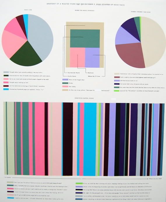
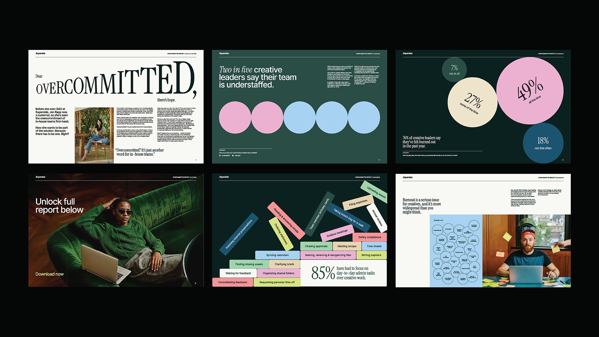
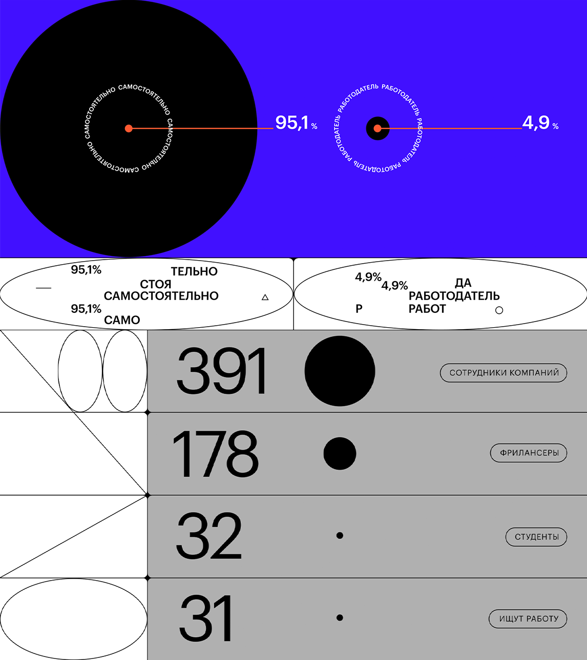
The image presents a complex, data-driven visualization combining a large pie chart with numerous bar graphs and segmented charts. The design is highly structured, utilizing a limited yet varied color palette to convey detailed statistical information in a dense layout.
The image presents a stark, minimalist data visualization using a high-contrast color scheme against a deep blue background. It employs simple geometric shapes and clear percentage indicators to convey statistical information in a direct, analytical manner.
This interface design utilizes a clean, modern aesthetic with a muted color palette dominated by soft pinks, grays, and white. The layout is structured with distinct rectangular modules, suggesting a data-driven or analytical dashboard experience.
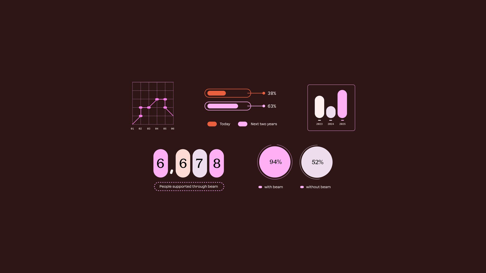
The image presents a minimalist, data-driven infographic style using muted tones and simple geometric shapes to convey statistical information. The design is clean, modern, and focuses heavily on clear visual hierarchy for presenting comparative data points.
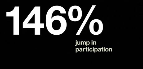
This is a stark, high-contrast graphic featuring large white text against a pure black background. The design is minimalist and direct, relying solely on typography to convey a significant percentage increase.
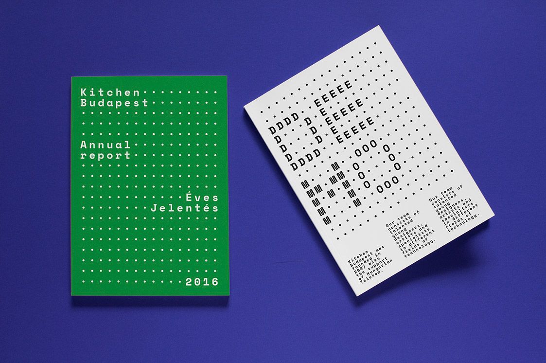
The image presents a clean, minimalist design featuring a green card with white dotted text alongside a white sheet of paper also marked with dotted text. The visual language is stark, relying heavily on negative space and precise typographical elements to convey official or report-like information.
The image presents a stark, minimalist data visualization using high-contrast elements against a black background. It employs large, bold typography and simple geometric shapes to convey quantitative information quickly and directly.
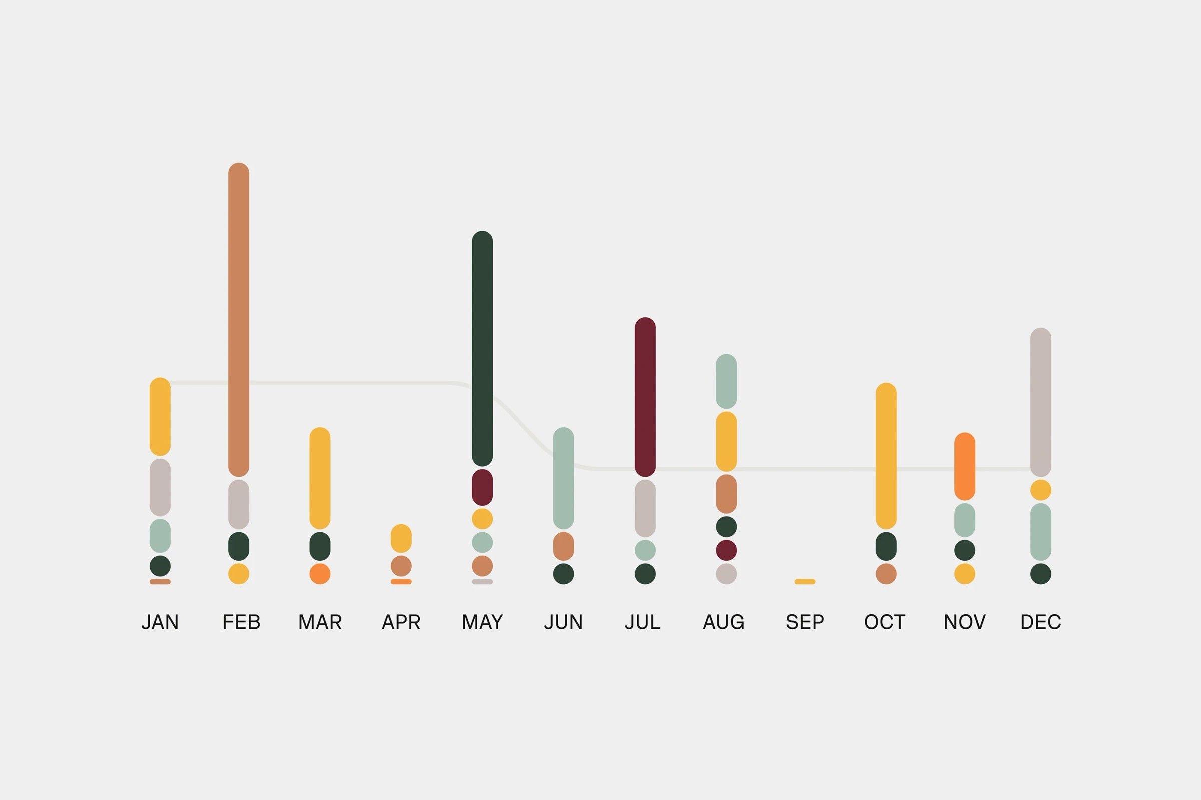
This is a minimalist, data-driven visualization using vertical bar charts to display monthly data points. The design relies heavily on color variation within a muted, neutral background to convey quantitative information clearly and cleanly.
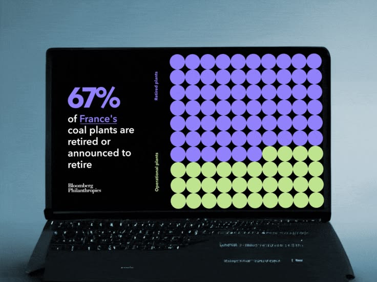
The image presents a data visualization on a laptop screen, using a grid of colored circles to represent statistics about coal plants. The design is clean, modern, and uses a distinct color contrast between purple and lime green to highlight the data.

This is a minimalist line graph visualization set against a dark background, employing a vibrant green line to depict an upward trend. The design is clean, modern, and focuses purely on conveying a positive growth trajectory.
The image displays a clean, modern user interface design characterized by a light gray background and distinct blocks of color for data visualization. The layout is structured with clear sections, suggesting a professional dashboard or analytical tool.
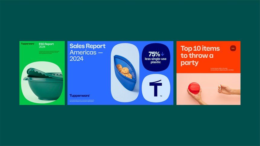
The image is a clean, modern infographic banner using a strong, deep teal/green as a primary background color. It features distinct, segmented panels with white space to separate different reports or data points, conveying a professional and informative tone.
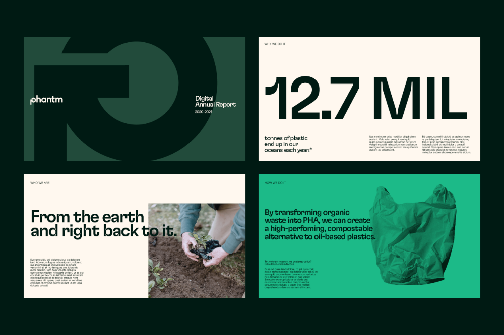
The design presents a clean, modern, and professional aesthetic, utilizing strong negative space and a limited color palette to convey a serious environmental or technical report. The layout is structured with distinct blocks of text and imagery, emphasizing clarity and corporate seriousness.
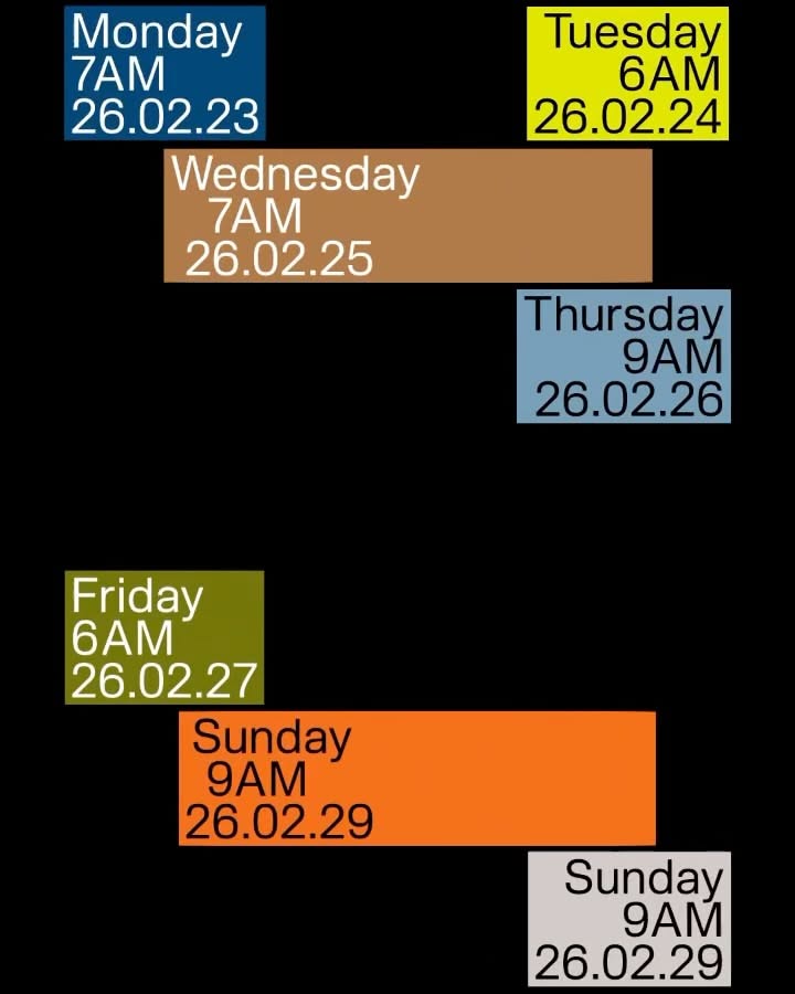
The image presents a stark, functional timeline or schedule using block colors to denote different days and times. The design is highly structured and minimalist, relying on color blocking for immediate information segmentation.
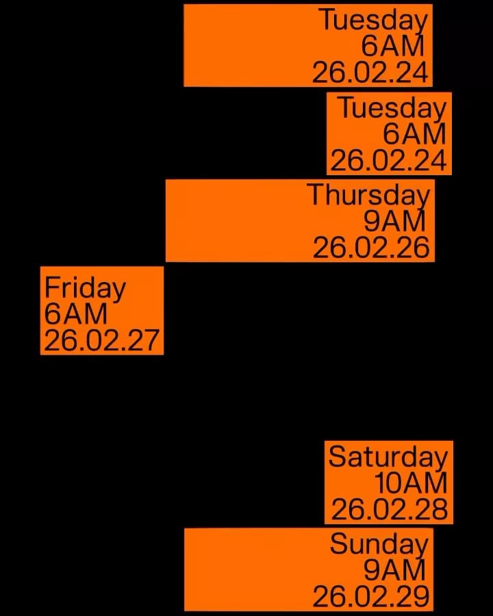
The image presents a stark, minimalist timeline or schedule using high-contrast blocks of orange text against a black background. The design is purely functional, prioritizing clear temporal information through simple typography and strong color blocking.
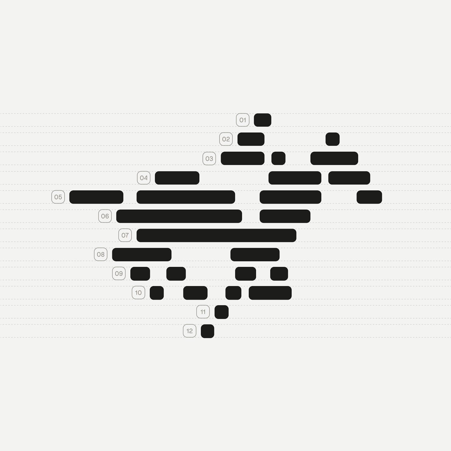
This image is a minimalist, data-visualization style graphic composed of horizontal bars of varying lengths, suggesting a spectrum or performance metric. The design relies heavily on negative space and precise alignment to convey information in a clean, modern manner.
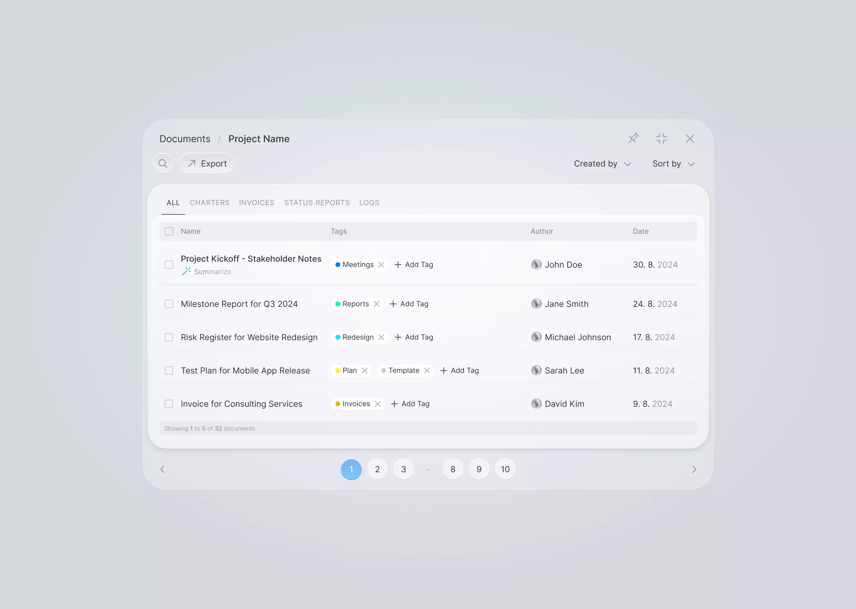
The interface presents a clean, modern, and highly functional document management view. It utilizes ample white space and subtle gray tones to create a professional, organized, and minimalist user experience.